18.2 – Nonlinear regression
Introduction
The linear model is incredibly relevant in so many cases. A quick look “linear model” in PUBMED returns about 22 thousand hits; 3.7 million in Google Scholar; 3 thousand hits in ERIC database. These results compare to search of “statistics” in the same databases: 2.7 million (PUBMED), 7.8 million (Google Scholar), 61.4 thousand (ERIC). But all models are not the same.
Fit of a model to the data can be evaluated by looking at the plots of residuals (Fig. 1), where we expect to find random distribution of residuals across the range of predictor variable.
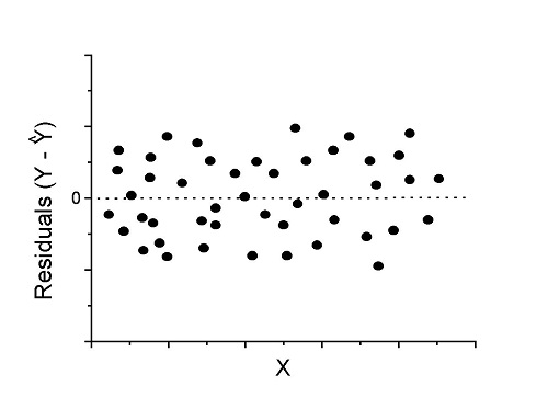
Figure 1. Ideal plot of residuals against values of X, the predictor variable, for a well-supported linear model fit to the data.
However, clearly, there are problems for which assumption of fit to line is not appropriate. We see this, again, in patterns of residuals, e.g., Figure 2.
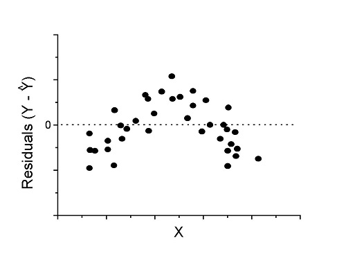
Figure 2. Example of residual plot; pattern suggests nonlinear fit.
Fitting of polynomial linear model
Fit simple linear regression
R code
LinearModel.1 <- lm(cumFreq~Months, data=yuan)

summary(LinearModel.1)

Call:
lm(formula = cumFreq ~ Months, data = yuan)

Residuals:
     Min       1Q   Median      3Q     Max
-0.11070 -0.07799 -0.01728 0.06982 0.13345

Coefficients:
                 Estimate Std. Error t value Pr(>|t|)
(Intercept)     -0.132709   0.045757   -2.90  0.0124 *
Months           0.029605   0.001854   15.97  6.37e-10 ***
---
Signif. codes: 0 '***' 0.001 '**' 0.01 '*' 0.05 '.' 0.1 ' ' 1

Residual standard error: 0.09308 on 13 degrees of freedom
Multiple R-squared: 0.9515, Adjusted R-squared: 0.9477
F-statistic: 254.9 on 1 and 13 DF, p-value: 6.374e-10
We see from the R2 (95%), a high degree of fit to the data. However, residual plot reveals obvious trend (Fig. 3)
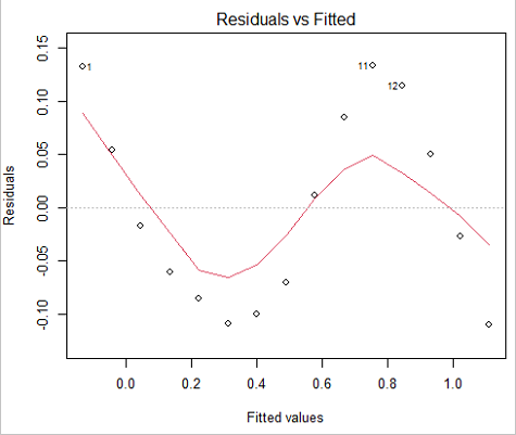
Figure 3. Residual plot
We can fit a polynomial regression.
First, a second order polynomial
LinearModel.2 <- lm(cumFreq ~ poly( Months, degree=2), data=yuan)

summary(LinearModel.2)

Call:
lm(formula = cumFreq ~ poly(Months, degree = 2), data = yuan)

Residuals:
     Min       1Q   Median      3Q     Max
-0.13996 -0.06720 -0.02338 0.07153 0.14277

Coefficients:
                           Estimate Std. Error  t value   Pr(>|t|)
(Intercept)                 0.48900    0.02458   19.891   1.49e-10 ***
poly(Months, degree = 2)1   1.48616    0.09521   15.609   2.46e-09 ***
poly(Months, degree = 2)2   0.06195    0.09521    0.651   0.528
---
Signif. codes: 0 '***' 0.001 '**' 0.01 '*' 0.05 '.' 0.1 ' ' 1

Residual standard error: 0.09521 on 12 degrees of freedom
Multiple R-squared: 0.9531, Adjusted R-squared: 0.9453
F-statistic: 122 on 2 and 12 DF, p-value: 0.0000000106
Second, try a third order polynomial
LinearModel.3 <- lm(cumFreq ~ poly(Months, degree = 3), data=yuan)

summary(LinearModel.3)

Call:
lm(formula = cumFreq ~ poly(Months, degree = 3), data = yuan)

Residuals:
      Min        1Q   Median       3Q      Max
-0.052595 -0.021533 0.001023 0.025166 0.048270

Coefficients:
                           Estimate Std. Error t value   Pr(>|t|)
(Intercept)                0.488995   0.008982  54.442   9.90e-15 ***
poly(Months, degree = 3)1  1.486157   0.034787  42.722   1.41e-13 ***
poly(Months, degree = 3)2  0.061955   0.034787   1.781   0.103
poly(Months, degree = 3)3 -0.308996   0.034787  -8.883   2.38e-06 ***
---
Signif. codes: 0 '***' 0.001 '**' 0.01 '*' 0.05 '.' 0.1 ' ' 1

Residual standard error: 0.03479 on 11 degrees of freedom
Multiple R-squared: 0.9943, Adjusted R-squared: 0.9927
F-statistic: 635.7 on 3 and 11 DF, p-value: 1.322e-12
Which model is best? We are tempted to compare R-squared among the models, but R2 turn out to be untrustworthy here. Instead, we compare using Akaike Information Criterion, AIC
R code/results
AIC(LinearModel.1,LinearModel.2, LinearModel.3)
              df       AIC
LinearModel.1  3 -24.80759
LinearModel.2  4 -23.32771
LinearModel.3  5 -52.83981
Smaller the AIC, better fit.
anova(RegModel.5,LinearModel.3, LinearModel.4)
Analysis of Variance Table

Model 1: cumFreq ~ Months
Model 2: cumFreq ~ poly(Months, degree = 2)
Model 3: cumFreq ~ poly(Months, degree = 3)
  Res.Df   RSS    Df Sum of Sq       F      Pr(>F)
1     13 0.112628
2     12 0.108789  1  0.003838  3.1719 0.1025
3     11 0.013311  1  0.095478 78.9004 0.000002383 ***
---
Signif. codes: 0 '***' 0.001 '**' 0.01 '*' 0.05 '.' 0.1 ' ' 1
Logistic regression
The Logistic regression is a classic example of nonlinear model.
R code
logisticModel <-nls(yuan$cumFreq~DD/(1+exp(-(CC+bb*yuan$Months))), start=list(DD=1,CC=0.2,bb=.5),data=yuan,trace=TRUE)
5.163059 : 1.0 0.2 0.5
2.293604 : 0.90564552 -0.07274945 0.11721201
1.109135 : 0.96341283 -0.60471162 0.05066694
0.429202 : 1.29060000 -2.09743525 0.06785993
0.3863037 : 1.10392723 -2.14457296 0.08133307
0.2848133 : 0.9785669 -2.4341333 0.1058674
0.1080423 : 0.9646295 -3.1918526 0.1462331
0.005888491 : 1.0297915 -4.3908114 0.1982491
0.004374918 : 1.0386521 -4.6096564 0.2062024
0.004370212 : 1.0384803 -4.6264657 0.2068853
0.004370201 : 1.0385065 -4.6269276 0.2068962
0.004370201 : 1.0385041 -4.6269822 0.2068989
summary(logisticModel)

Formula: yuan$cumFreq ~ DD/(1 + exp(-(CC + bb * yuan$Months)))

Parameters:
      Estimate  Std. Error  t value      Pr(>|t|)
DD    1.038504    0.014471    71.77   < 2e-16 ***
CC   -4.626982    0.175109   -26.42  5.29e-12 ***
bb    0.206899    0.008777    23.57  2.03e-11 ***
---
Signif. codes: 0 '***' 0.001 '**' 0.01 '*' 0.05 '.' 0.1 ' ' 1

Residual standard error: 0.01908 on 12 degrees of freedom

Number of iterations to convergence: 11
Achieved convergence tolerance: 0.000006909

> AIC(logisticModel)
[1] -71.54679
Logistic regression is a statistical method for modeling the dependence of a categorical (binomial) outcome variable on one or more categorical and continuous predictor variables (Bewick et al 2005).
The logistic function is used to transform a sigmoidal curve to a more or less straight line while also changing the range of the data from binary (0 to 1) to infinity (-∞,+∞). For event with probability of occurring p, the logistic function is written as

where ln refers to the natural logarithm.
This is an odds ratio. It represents the effect of the predictor variable on the chance that the event will occur.
The logistic regression model then very much resembles the same as we have seen before.

In R and Rcmdr we use the glm() function to model the logistic function. Logistic regression is used to model a binary outcome variable. What is a binary outcome variable? It is categorical! Examples include: Living or Dead; Diabetes Yes or No; Coronary artery disease Yes or No. Male or Female. One of the categories could be scored 0, the other scored 1. For example, living might be 0 and dead might be scored as 1. (By the way, for a binomial variable, the mean for the variable is simply the number of experimental units with “1” divided by the total sample size.)
With the addition of a binary response variable, we are now really close to the Generalized Linear Model. Now we can handle statistical models in which our predictor variables are either categorical or ratio scale. All of the rules of crossed, balanced, nested, blocked designs still apply because our model is still of a linear form.
We write our generalized linear model

just to distinguish it from a general linear model with the ratio-scale Y as the response variable.
Think of the logistic regression as modeling a threshold of change between the 0 and the 1 value. In another way, think of all of the processes in nature in which there is a slow increase, followed by a rapid increase once a transition point is met, only to see the rate of change slow down again. Growth is like that. We start small, stay relatively small until birth, then as we reach our early teen years, a rapid change in growth (height, weight) is typically seed (well, not in my case … at least for the height). The fitted curve I described is a logistic one (other models exist too). Where the linear regression function was used to minimize the squared residuals as the definition of the best fitting line, now we use the logistic as one possible way to describe or best fit this type of a curved relationship between an outcome and one or more predictor variables. We then set out to describe a model which captures when an event is unlikely to occur (the probability of dying is close to zero) AND to also describe when the event is highly likely to occur (the probability is close to one).
A simple way to view this is to think of time being the predictor (X) variable and risk of dying. If we’re talking about the lifetime of a mouse (lifespan typically about 18-36 months), then the risk of dying at one months is very low, and remains low through adulthood until the mouse begins the aging process. Here’s what the plot might look like, with the probability of dying at age X on the Y axis (probability = 0 to 1) (Fig. 4).
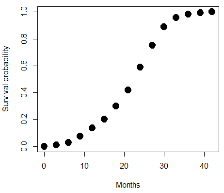
Figure 4. Lifespan of 1881 mice from 31 inbred strains (Data from Yuan et al (2012) available at https://phenome.jax.org/projects/Yuan2).
We ask — of all the possible models we could draw, which best fits the data? The curve fitting process is called the logistic regression.
With some minor, but important differences, running the logistic regression is the same as what you have been doing so far for ANOVA and for linear regression. In Rcmdr, access the logistic regression function by invoking the Generalized Linear Model (Fig. 5).
Rcmdr: Statistics → Fit models → Generalized linear model.
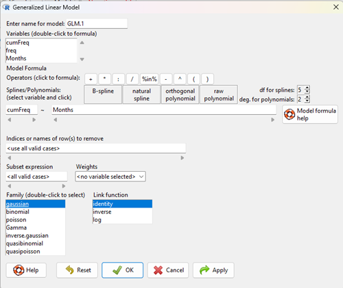
Figure 5. Screenshot Rcmdr GLM menu. For logistic on ratio-scale dependent variable, select gaussian family and identity link function.
Select the model as before. The box to the left accepts your binomial dependent variable; the box at right accepts your factors, your interactions, and your covariates. It permits you to inform R how to handle the factors: Crossed? Just enter the factors and follow each with a plus. If fully crossed, then the interactions may be specified with “:” to explicitly call for a two-way interaction between two (A:B) or a three-way interaction between three (A:B:C) variables. In the later case, if all of the two way interactions are of interest, simply typing A*B*C would have done it. If nested, then use %in% to specify the nesting factor.
R output
> GLM.1 <- glm(cumFreq ~ Months, family=gaussian(identity), data=yuan)

> summary(GLM.1)

Call:
glm(formula = cumFreq ~ Months, family = gaussian(identity),
data = yuan)

Deviance Residuals:
Min 1Q Median 3Q Max
-0.11070 -0.07799 -0.01728 0.06982 0.13345

Coefficients:
Estimate Std. Error t value Pr(>|t|)
(Intercept) -0.132709 0.045757 -2.90 0.0124 *
Months 0.029605 0.001854 15.97 6.37e-10 ***
---
Signif. codes: 0 '***' 0.001 '**' 0.01 '*' 0.05 '.' 0.1 ' ' 1

(Dispersion parameter for gaussian family taken to be 0.008663679)

Null deviance: 2.32129 on 14 degrees of freedom
Residual deviance: 0.11263 on 13 degrees of freedom
AIC: -24.808

Number of Fisher Scoring iterations: 2
Assessing fit of the logistic regression model
Some of the differences you will see with the logistic regression is the term deviance. Deviance in statistics simply means compare one model to another and calculate some test statistic we’ll call “the deviance.” We then evaluate the size of the deviance like a chi-square goodness of fit. If the model fits the data poorly (residuals large relative to the predicted curve), then the deviance will be small and the probability will also be high — the model explains little of the data variation. On the other hand, if the deviance is large, then the probability will be small — the model explains the data, and the probability associated with the deviance will be small (significantly so? You guessed it! P < 0.05).
The Wald test statistic

where n and β refers to any of the n coefficient from the logistic regression equation and SE refers to the standard error if the coefficient. The Wald test is used to test the statistical significance of the coefficients. It is distributed approximately as a chi-squared probability distribution with one degree of freedom. The Wald test is reasonable, but has been found to give values that are not possible for the parameter (e.g., negative probability).
Likelihood ratio tests are generally preferred over the Wald test. For a coefficient, the likelihood test is written as
![]()
where L0 is the likelihood of the data when the coefficient is removed from the model (i.e., set to zero value), whereas L1 is the likelihood of the data when the coefficient is the estimated value of the coefficient. It is also distributed approximately as a chi-squared probability distribution with one degree of freedom.
Questions
[pending]
Data set
| Months | freq | cumFreq |
| 0 | 0 | 0 |
| 3 | 0.01063264221159 | 0.01063264221159 |
| 6 | 0.017012227538543 | 0.027644869750133 |
| 9 | 0.045188729399256 | 0.072833599149389 |
| 12 | 0.064327485380117 | 0.137161084529506 |
| 15 | 0.064859117490697 | 0.202020202020202 |
| 18 | 0.097820308346624 | 0.299840510366826 |
| 21 | 0.118553960659224 | 0.41839447102605 |
| 24 | 0.171185539606592 | 0.589580010632642 |
| 27 | 0.162147793726741 | 0.751727804359383 |
| 30 | 0.137161084529506 | 0.888888888888889 |
| 33 | 0.069643806485912 | 0.958532695374801 |
| 36 | 0.024455077086656 | 0.982987772461457 |
| 39 | 0.011695906432749 | 0.994683678894205 |
| 42 | 0.005316321105795 | 1 |
Chapter 18 content
17.8 – Assumptions and model diagnostics for Simple Linear Regression
Introduction
The assumptions for all linear regression:
- Linear model is appropriate.
The data are well described (fit) by a linear model. - Independent values of Y and equal variances.
Although there can be more than one Y for any value of X, the Y‘s cannot be related to each other (that’s what we mean by independent). Since we allow for multiple Y‘s for each X, then we assume that the variances of the range of Y‘s are equal for each X value (this is similar to our ANOVA assumptions for equal variance by groups). Another term for equal variances is homoscedasticity. - Normality.
For each X value there is a normal distribution of Y‘s (think of doing the experiment over and over). - Error
The residuals (error) are normally distributed with a mean of zero.
Note the mnemonic device: Linear, Independent, Normal, Error or LINE.
Each of the four elements will be discussed below in the context of Model Diagnostics. These assumptions apply to how the model fits the data. There are other assumptions that, if violated, imply you should use a different method for estimating the parameters of the model.
Ordinary least squares makes the additional assumption about the quality of the independent variable that e that measurement of X is done without error. Measurement error is a fact of life in science, but the influence of error on regression differs if the error is associated with the dependent or independent variable. Measurement error in the dependent variable increases the dispersion of the residuals but will not affect the estimates of the coefficients; error associated with the independent variables, however, will affect estimates of the slope. In short, error in X leads to biased estimates of the slope.
The equivalent, but less restrictive practical application of this assumption is that the error in X is at least negligible compared to the measurements in the dependent variable.
Multiple regression makes one more assumption, about the relationship between the predictor variables (the X variables). The assumption is that there is no multicollinearity, a subject we will bring up next time (see Chapter 18).
Model diagnostics
We just reviewed how to evaluate the estimates of the coefficients of the model. Now we need to address a deeper meaning — how well the model explains the data. Consider a simple linear regression first. If Ho: b = 0 is not rejected — then the slope of the regression equation is taken to not differ from zero. We would conclude that if repeated samples were drawn from the population, on average, the regression equation would not fit the data well (lots of scatter) and it would not yield useful prediction.
However, recall that we assume that the fit is linear. One assumption we make in regression is that a line can, in fact, be used to describe the relationship between X and Y.
Here are two very different situations where the slope = 0.
Example 1. Linear Slope = 0, No relationship between X and Y
Example 2. Linear Slope = 0, A significant relationship between X and Y
But even if Ho: b = 0 is rejected (and we conclude that a linear relationship between X and Y is present), we still need to be concerned about the fit of the line to the data — the relationship may be more nonlinear than linear, for example. Here are two very different situations where the slope is not equal to 0.
Example 3. Linear Slope > 0, a linear relationship between X and Y
Example 4. Linear Slope > 0, curve-linear relationship between X and Y
How can you tell the difference? There are many regression diagnostic tests, many more than we can cover, but you can start with looking at the coefficient of determination (low R2 means low fit to the line), and we can look at the pattern of residuals plotted against the either the predicted values or the X variables (my favorite). The important points are:
- In linear regression, you fit a model (the slope + intercept) to the data;
- We want the usual hypothesis tests (are the coefficients different from zero?) and
- We need to check to see if the model fits the data well. Just like in our discussions of chi-square, a “perfect fit would mean that the difference between our model and the data would be zero.
Graph options
Using residual plots to diagnose regression equations
Yes, we need to test the coefficients (intercept Ho = 0; slope Ho = 0) of a regression equation, but we also must decide if a regression is an appropriate description of the data. This topic includes the use of diagnostic tests in regression. We address this question chiefly by looking at
- scatterplots of the independent (predictor) variable(s) vs. dependent (response) variable(s).
what patterns appear between X and Y? Do your eyes tell you “Line”? “Curve”? “No relation”? - coefficient of determination
closer to zero than to one? - patterns of residuals plotted against the X variables (other types of residual plots are used to, this is one of my favorites)
Our approach is to utilize graphics along with statistical tests designed to address the assumptions.
One typical choice is to see if there are patterns in the residual values plotted against the predictor variable. If the LINE assumptions hold for your data set, then the residuals should have a mean of zero with scatter about the mean. Deviations from LINE assumptions will show up in residual plots.
Here are examples of POSSIBLE outcomes:
Figure 1. An ideal plot of residuals
Solution: Proceed! Assumptions of linear regression met.
Compare to plots of residuals that differ from the ideal.
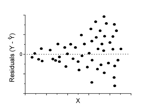
Figure 2. We have a problem. Residual plot shows unequal variance (aka heteroscedasticity).
Solution. Try a transform like the log10-transform.
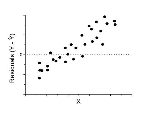
Figure 3. Problem. Residual plot shows systematic trend.
Solution. Linear model a poor fit; May be related to measurement errors for one or more predictor variables. Try adding an additional predictor variable or model the error in your general linear model.
Figure 4. Problem. Residual plot shows nonlinear trend.
Solution. Transform data or use more complex model
This is a good time to mention that in statistical analyses, one often needs to do multiple rounds of analyses, involving description and plots, tests of assumptions, tests of inference. With regression, in particular, we also need to decide if our model (e.g., linear equation) is a good description of the data.
Diagnostic plot examples
Return to our example.Tadpole dataset. To obtain residual plots, Rcmdr: Models → Graphs → Basic diagnostic plots yields four graphs. Graph A is
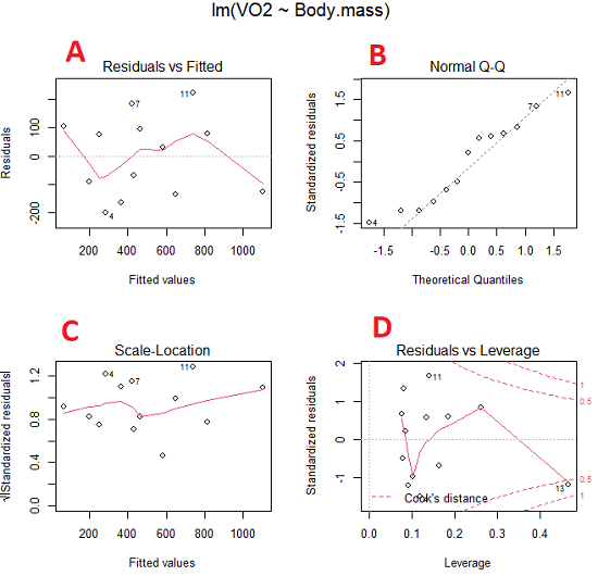
Figure 5. Basic diagnostic plots. A: residual plot; B: Q-Q plot of residuals; C: Scale-location (aka spread-location) plot; D: leverage residual plot.
In brief, we look at plots
A, the residual plot, to see if there are trends in the residuals. We are looking for a spread of points equally above and below the mean of zero. In Figure 5 we count seven points above and six points below zero so there’s no indication of a trend in the residuals vs the fitted VO2 (Y) values.
B, the Q-Q plot is used to see if normality holds. As discussed before, if our data are more or less normally distributed, then points will fall along a straight line in a Q-Q plot.
C, the Scale- or spread-location plot is used to verify equal variances of errors.
D, Leverage plot — looks to see if an outlier has leverage on the fit of the line to the data, i.e., changes the slope. Additionally, provides location of Cook’s distance measure (dashed red lines). Cook’s distance measures the effect on the regression by removing one point at a time and then fitting a line to the data. Points outside the dashed lines have influence.
A note of caution about over-thinking with these plots. R provides a red line to track the points. However, these lines are guides, not judges. We humans are generally good at detecting patterns, but with data visualization, there is the risk of seeing patterns where none exits. In particular, recognizing randomness is not easy. If anything, we may tend to see patterns where none exist, termed apophenia. So yes, by all means look at the graphs, but do so with a plan: red line more or less horizontal? Then no pattern and the regression model is a good fit to the data.
Statistical test options
After building linear models, run statistical diagnostic tests that compliment graphics approaches. Here, simply to introduce the tests, I included the Gosner factor as potential predictor — many of these numerical diagnostics are more appropriate for models with more than one predictor variable, the subject of the next chapter.
Results for the model  were:
were:
lm(formula = VO2 ~ Body.mass + Gosner, data = frogs)

Residuals:
    Min      1Q Median    3Q    Max
-163.12 -125.53 -20.27 83.71 228.56

Coefficients:
           Estimate Std. Error t value  Pr(>|t|)
(Intercept) -595.37     239.87  -2.482 0.03487 *
Body.mass    431.20     115.15   3.745 0.00459 **
Gosner[T.II]  64.96     132.83   0.489 0.63648
---
Signif. codes: 0 '***' 0.001 '**' 0.01 '*' 0.05 '.' 0.1 ' ' 1

Residual standard error: 153.4 on 9 degrees of freedom
  (1 observation deleted due to missingness)
Multiple R-squared: 0.8047, Adjusted R-squared: 0.7613
F-statistic: 18.54 on 2 and 9 DF, p-value: 0.0006432
Question. Note the p-value for the coefficients — do we include a model with both body mass and Gosner Stage? See Chapter 18.5 – Selecting the best model
In R Commander, the diagnostic test options are available via
Rcmdr: Models → Numerical diagnostics
Variance inflation factors (VIF): used to detect multicollinearity among the predictor variables. If correlations are present among the predictor variables, then you can’t rely on the the coefficient estimates — whether predictor A causes change in the response variable depends on whether the correlated B predictor is also included in the model. If correlation between predictor A and B, the statistical effect is increased variance associated with the error of the coefficient estimates. There are VIF for each predictor variable. A VIF of one means there is no correlation between that predictor and the other predictor variables. A VIF of 10 is taken as evidence of serious multicollinearity in the model.
R code:
vif(RegModel.2)
R output
Body.mass Gosner
2.186347 2.186347

round(cov2cor(vcov(RegModel.2)), 3) # Correlations of parameter estimates
         (Intercept) Body.mass Gosner[T.II]
(Intercept)    1.000    -0.958        0.558
Body.mass     -0.958     1.000       -0.737
Gosner[T.II]   0.558    -0.737        1.000
Our interpretation
The output shows a matrix of correlations; the correlation between the two predictor variables in this model was 0.558, large per our discussions in Chapter 16.1 . Not really surprising as older tadpoles (Gosner stage II), are larger tadpoles. We’ll leave the issue of multicollinearity to Chapter 18.1.
Breusch-Pagan test for heteroscedasticity… Recall that heteroscedasticity is another name for unequal variances. This tests pertains to the residuals; we used the scale (spread) location plot (C) above. The test statistic can be calculated as  . The function call is part of the car package, which we download as part of the Rcmdr package. R Commander will pop up a menu of choices for this test. For starters, accept the defaults, enter nothing, and click OK.
R code:
library(zoo, pos=16)
library(lmtest, pos=16)
bptest(VO2 ~ Body.mass + Gosner, varformula = ~ fitted.values(RegModel.2), studentize=FALSE, data=frogs)
R output
Breusch-Pagan test

data:  VO2 ~ Body.mass + Gosner
BP = 0.0040766, df = 1, p-value = 0.9491
Our interpretation
A p-value less than 5% would be interpreted as statistically significant unequal variances among the residuals.
Durbin-Watson for autocorrelation… used to detect serial (auto)correlation among the residuals, specifically, adjacent residuals. Substantial autocorrelation can mean Type I error for one or more model coefficients. The test returns a test statistic that ranges from 0 to 4. A value at midpoint (2) suggests no autocorrelation. Default test for autocorrelation is r > 0.
R code:
dwtest(VO2 ~ Body.mass + Gosner, alternative="greater", data=frogs)
R output
Durbin-Watson test

data:  VO2 ~ Body.mass + Gosner
DW = 2.1336, p-value = 0.4657
alternative hypothesis: true autocorrelation is greater than 0
Our interpretation
The DW statistic was about 2. Per our definition, we conclude no correlations among the residuals.
RESET test for nonlinearity… The Ramsey Regression Equation Specification Error Test is used to interpret whether or not the equation is properly specified. The idea is that fit of the equation is compared against alternative equations that account for possible nonlinear dependencies among predictor and dependent variables. The test statistic follows an F distribution.
R code:
resettest(VO2 ~ Body.mass + Gosner, power=2:3, type="regressor", data=frogs)
R output
RESET test

data:  VO2 ~ Body.mass + Gosner
RESET = 0.93401, df1 = 2, df2 = 7, p-value = 0.437
Our interpretation
Also a nonsignificant test — adding a power term to account for a nonlinear trend gained no model fit benefits, p-value much greater than 5%.
Bonferroni outlier test. Reports the Bonferroni p-values for testing each observation to see if it can be considered to be a mean-shift outlier (a method for identifying potential outlier values — each value is in turn replaced with the mean of its nearest neighbors, Lehhman et al 2020). Compare to results of VIF. The objective of outlier and VIF tests is to verify that the regression model is stable, insensitive to potential leverage (outlier) values.
R code:
outlierTest(LinearModel.3)
R output
No Studentized residuals with Bonferroni p < 0.05
Largest |rstudent|:
  rstudent unadjusted p-value Bonferroni p
7 1.958858        0.085809              NA
Our interpretation
ccc
Response transformation… The concept of transformations of data to improve adherence to statistical assumptions was introduced in Chapters 3.2, 13.1, and 15.
R code:
> summary(powerTransform(LinearModel.3, family=”bcPower”))
R output
bcPower Transformation to Normality
    Est Power Rounded Pwr Wald Lwr Bnd Wald Upr Bnd
Y1     0.9987           1       0.2755       1.7218

Likelihood ratio test that transformation parameter is equal to 0
   (log transformation)
                           LRT df      pval
LR test, lambda = (0) 7.374316  1 0.0066162

Likelihood ratio test that no transformation is needed
                                LRT df    pval
LR test, lambda = (1) 0.00001289284  1 0.99714
Our interpretation
ccc
Questions
- Referring to Figures 1 – 4 on this page, which plot best suggests a regression line fits the data?
- Return to the electoral college data set and your linear models of Electoral vs. POP_2010 and POP_2019. Obtain the four basic diagnostic plots and comment on the fit of the regression line to the electoral college data.
- residual plot
- Q-Q plot
- Scale-location plot
- Leverage plot
- With respect to your answers in question 2, how well does the electoral college system reflect the principle of one person one vote?
Chapter 17 contents
- Introduction
- Simple Linear Regression
- Relationship between the slope and the correlation
- Estimation of linear regression coefficients
- OLS, RMA, and smoothing functions
- Testing regression coefficients
- Regression model fit
- Assumptions and model diagnostics for Simple Linear Regression
- References and suggested readings (Ch17 & 18)
9.1 – Chi-square test: Goodness of fit
Introduction
We ask about the “fit” of our data against predictions from theory, or from rules that set our expectations for the frequency of particular outcomes drawn from outside the experiment. Three examples to illustrate goodness of fit, GOF,  , A, B, and C follow.
A. For example, for a toss of a coin, we expect heads to show up 50% of the time. Out of 120 tosses of a fair coin, we expect 60 heads, 60 tails. Thus, our null hypothesis would be that heads would appear 50% of the time. If we observe 70 heads in an experiment of coin tossing, is this a significantly large enough discrepancy to reject the null hypothesis?
B. For example, simple Mendelian genetics makes predictions about how often we should expect particular combinations of phenotypes in the offspring when the phenotype is controlled by one gene, with 2 alleles and a particular kind of dominance.
For example, for a one locus, two allele system (one gene, two different copies like R and r) with complete dominance, we expect the phenotypic (what you see) ratio will be 3:1 (or  round,
  wrinkle). Our null hypothesis would be that pea shape will obey Mendelian ratios (3:1). Mendel’s round versus wrinkled peas (RR or Rr genotypes give round peas, only rr results in wrinkled peas).
Thus, out of 100 individuals, we would expect 75 round and 25 wrinkled. If we observe 84 round and 16 wrinkled, is this a significantly large enough discrepancy to reject the null hypothesis?
C. For yet another example, in population genetics, we can ask whether genotypic frequencies (how often a particular copy of a gene appears in a population) follow expectations from Hardy-Weinberg model (the null hypothesis would be that they do).
This is a common test one might perform on DNA or protein data from electrophoresis analysis. Hardy-Weinberg is a simple quadratic expansion:
If p = allele frequency of the first copy, and q = allele frequency of the second copy, then p + q = 1,
Given the allele frequencies, then genotypic frequencies would be given by 1 = p2 + 2pq + q2.
Deviations from Hardy-Weinberg expectations may indicate a number of possible causes of allele change (including natural selection, genetic drift, migration).
Thus, if a gene has two alleles,  and
and  , with the frequency for ,
  and for ,
  (equivalently q = 1 – p) in the population, then we would expect 36
  , 16
, 16  , and 48
  individuals. (Nothing changes if we represent the alleles as A and a, or some other system, e.g., dominance/recessive.)
Question. If we observe the following genotypes: 45 individuals, 34 individuals, and 21 individuals, is this a significantly large enough discrepancy to reject the null hypothesis?
Table 1. Summary of our Hardy Weinberg question
| Genotype | Expected | Observed | O – E |
| aa | 70 | 45 | -25 |
| aa’ | 27 | 34 | 7 |
| a’a’ | 3 | 21 | 18 |
| sum | 100 | 100 | 0 |
Recall from your genetics class that we can get the allele frequency values from the genotype values, e.g.,

We call these chi-square tests, tests of goodness of fit. Because we have some theory, in this case Mendelian genetics, or guidance, separate from the study itself, to help us calculate expected values in a chi-square test.
Note 1: The idea of fit in statistics can be reframed as how well does a particular statistical model fit the observed data. A good fit can be summarized by accounting for the differences between the observed values and the comparable values predicted by the model.
 goodness of fit
For k groups, the equation for the chi-square test may be written as

where fi is the frequency (count) observed (in class i) and fi<hat> is the frequency (count) expected if the null hypothesis is true, sum over all k groups. Alternatively, here is a format for the same equation that may be more familiar to you… ?

where Oi is the frequency (count) observed (in class i) and Ei is the frequency (count) expected if the null hypothesis is true.
The degrees of freedom, df, for the GOF are simply the number of categories minus one, k – 1.
Explaining GOF
Why am I using the phrase “goodness of fit?” This concept has broad use in statistics, but in general it applies when we ask how well a statistical model fits the observed data. The chi-square test is a good example of such tests, and we will encounter other examples too. Another common goodness of fit is the coefficient of determination, which will be introduced in linear regression sections. Still other examples are the likelihood ratio test, Akaike Information Criterion (AIC), and Bayesian Information Criterion (BIC), which are all used to assess fit of models to data. (See Graffelman and Weir [2018] for how to use AIC in the context of testing for Hardy Weinberg equilibrium.) At least for the chi-square test it is simple to see how the test statistic increases from zero as the agreement between observed data and expected data depart, where zero would be the case in which all observed values for the categories exactly match the expected values.
This test is designed to evaluate whether or not your data agree with a theoretical expectation (there are additional ways to think about this test, but this is a good place to start). Let’s take our time here and work with an example. The other type of chi-square problem or experiment is one for the many types of experiments in which the response variable is discrete, just like in the GOF case, but we have no theory to guide us in deciding how to obtain the expected values. We can use the data themselves to calculate expected values, and we say that the test is “contingent” upon the data, hence these types of chi-square tests are called contingency tables.
You may be a little concerned at this point that there are two kinds of chi-square problems, goodness of fit and contingency tables. We’ll deal directly with contingency tables in the next section, but for now, I wanted to make a few generalizations.
- Both goodness of fit and contingency tables use the same chi-square equation and analysis. They differ in how the degrees of freedom are calculated.
- Thus, what all chi-square problems have in common, whether goodness of fit or contingency table problems
- You must identify what types of data are appropriate for this statistical procedure? Categorical (nominal data type).
- As always, a clear description of the hypotheses being examined.
For goodness of fit chi-square test, the most important type of hypothesis is called a Null Hypothesis: In most cases the Null Hypothesis (HO) is “no difference” “no effect”…. If HO is concluded to be false (rejected), then an alternative hypothesis (HA) will be assumed to be true. Both are specified before tests are conducted. All possible outcomes are accounted for by the two hypotheses.
From above, we have
- A. HO: Fifty out of 100 tosses will result in heads.
- HA: Heads will not appear 50 times out of 100.
- B. HO: Pea shape will equal Mendelian ratios (3:1).
- HA: Pea shape will not equal Mendelian ratios (3:1).
- C. HO: Genotypic frequencies will equal Hardy-Weinberg expectations.
- HA: Genotypic frequencies will not equal Hardy-Weinberg expectations
Assumptions: In order to use the chi-square, there must be two or more categories. Each observation must be in one and only one category. If some of the observations are truly halfway between two categories then you must make a new category (e.g. low, middle, high) or use another statistical procedure. Additionally, your expected values are required to be integers, not ratio. The number of observed and the number of expected must sum to the same total.
How well does data fit the prediction?
Frequentist approach interprets the test as, how well does the data fit the null hypothesis,  ? When you compare data against a theoretical distribution (e.g., Mendel’s hypothesis predicts the distribution of progeny phenotypes for a particular genetic system), you test the fit of the data against the model’s predictions (expectations). Recall that the Bayesian approach asks how well does the model fit the data?
Table 2. A. 120 tosses of a coin, we count heads 70/120 tosses.
| Expected | Observed | |
| Heads | 60 | 70 |
| Tails | 60 | 50 |
| n | 120 | 120 |

Table 3. B. A possible Mendelian system of inheritance for a one gene, two allele system with complete dominance, observe the phenotypes.
| Expected | Observed | |
| Round | 75 | 84 |
| Wrinkled | 25 | 16 |
| n | 100 | 100 |

Table 4. C. A possible Mendelian system of inheritance for a one gene, two allele system with complete dominance, observe the phenotypes.
| Expected | Observed | |
| p2 | 70 | 45 |
| 2pq | 27 | 34 |
| q2 | 3 | 21 |
| n | 100 | 100 |

For completeness, instead of a goodness of fit test we can treat this problem as a test of independence, a contingency table problem. We’ll discuss contingency tables more in the next section, but or now, we can rearrange our table of observed genotypes for problem C, as a 2X2 table
Table 5. Problem C reported in 2X2 table format.
| Maternal a’ | Paternal a’ | |
| Maternal a | 45 | 17 |
| Paternal a | 17 | 21 |
The contingency table is calculated the same way as the GOF version, but the degrees of freedom are calculated differently: df = number of rows – 1 multiplied by the number of columns – 1.

Thus, for a 2X2 table the df are always equal to 1.
Note that the chi-square value itself says nothing about how any discrepancy between expectation and observed genotype frequencies come about. Therefore, one can rearrange the equation to make clear where deviance from equilibrium, D, occur for the heterozygote (het). We have

where D2 is equal to

φ coefficient
The chi-square test statistic and its inference tells you about the significance of the association, but not the strength or effect size of the association. Not surprisingly, Pearson (1904) came up with a statistic to quantify the strength of association between two binary variables, now called the φ (phi) coefficient. Like the Pearson product moment correlation, the φ (phi) coefficient takes values from -1 to +1.
Note 2: Pearson termed this statistic the mean square contingency coefficient. Yule (1912) termed it the phi coefficient. The correlation between two binary variables is also called the Mathews Correlation Coefficient or MCC (Mathews 1975), which is a common classification tool in machine learning.
The formula for the absolute value of φ coefficient is

Thus, for A, B, and C examples, φ coefficient was 0.167, 0.190, and 0.771. Thus, only weak associations in examples A and B, but strong association in C. We’ll provide a formula to directly calculate φ coefficient from the cells of the table in 9.2 – Chi-square contingency tables.
Carry out the test and interpret results
What was just calculated? The chi-square, , test statistic.
Just like t-tests, we now want to compare our test statistic against a critical value — calculate degrees of freedom (df = k – 1, k equals the numbers of categories), and set a rejection level, Type I error rate. We typically set the Type I error rate at 5%. A table of critical values for the chi-square test is available in Appendix Table Chi-square critical values.
Obtaining Probability Values for the goodness-of-fit test of the null hypothesis:
As you can see from the equation of the chi-square, a perfect fit between the observed and the expected would be a chi-square of zero. Thus, asking about statistical significance in the chi-square test is the same as asking if your test statistic is significantly greater than zero.
The chi-square distribution is used and the critical values depend on the degrees of freedom. Fortunately for and other statistical procedures we have Tables that will tell us what the probability is of obtaining our results when the null hypothesis is true (in the population).
Here is a portion of the chi-square critical values for probability that your chi-square test statistic is less than the critical value (Fig 1).
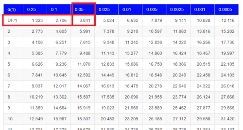
Figure 1. A portion of critical values of the chi-square at alpha 5% for degrees of freedom between 1 and 10. A more inclusive table is provided in the Appendix, Table of Chi-square critical values.
For the first example (A), we have df = 2 – 1 = 1 and we look up the critical value corresponding to the probability in which Type I = 5% are likely to be smaller iff (“if and only if”) the null hypothesis is true. That value is 3.841; our test statistic was 3.330, and therefore smaller than the critical value: so we do not reject the null hypothesis.
Interpolating p-values
How likely is our test statistic value of 3.333 and the null hypothesis was true? (Remember, “true” in this case is a shorthand for our data was sampled from a population in which the HW expectations hold). When I check the table of critical values of the chi-square test for the “exact” p-value, I find that our test statistic value falls between a p-value 0.10 and 0.05 (represented in the table below). We can interpolate
Note 3: Interpolation refers to any method used to estimate a new value from a set of known values. Thus, interpolated values fall between known values. Extrapolation on the other hand refers to methods to estimate new values by extending from a known sequence of values.
Table 6. Interpolated p-value for critical value not reported in chi-square table.
| statistic | p-value |
| 3.841 | 0.05 |
| 3.333 | x |
| 2.706 | 0.10 |
If we assume the change in probability between 2.706 and 3.841 for the chi-square distribution is linear (it’s not, but it’s close), then we can do so simple interpolation.
We set up what we know on the right hand side equal to what we don’t know on the left hand side of the equation,

and solve for x. Then, x is equal to 0.0724
R function pchisq() gives a value of p = 0.0679. Close, but not the same. Of course, you should go with the result from R over interpolation; we mention how to get the approximate p-value by interpolation for completeness, and, in some rare instances, you might need to make the calculation. Interpolating is also a skill used to provide estimates where the researcher needs to estimate (impute) a missing value.
Interpreting p-values
This is a pretty important topic, so much so that we devote an entire section to this very problem — see 8.2 – The controversy over proper hypothesis testing. If you skipped the chapter, but find yourself unsure how to interpret the p-value, then please go back to Ch 8.2. OK, that commercial message, what does it mean to “reject the chi-square null hypothesis?” These types of tests are called goodness of fit in the following sense — if your data agree with the theoretical distribution, then the difference between observed and expected should be very close to zero. If it is exactly zero, then you have a perfect fit. In our coin toss case, if we say that the ratio of heads:tails do not differ significantly from the 50:50 expectation, then we accept the null hypothesis.
You should try the other examples yourself! A hint, the degrees of freedom are one (1) for example B and two (2) for example C.
R code
Printed tables of the critical values from the chi-square distribution, or for any statistical test for that matter are fine, but with your statistical package R and Rcmdr, you have access to the critical value and the p-value of your test statistic simply by asking. Here’s how to get both.
First, lets get the critical value.
Rcmdr: Distributions → Continuous distributions → Chi-squared distribution → Chi-squared quantiles
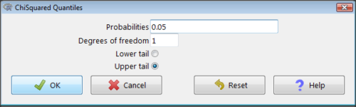
Figure 2. R Commander menu for Chi-squared quantiles.
I entered “0.05” for the probability because that’s my Type I error rate α. Enter “1” for Degrees of freedom, then click “upper tail” because we are interested in obtaining the critical value for α. Here’s R’s response when I clicked “OK.”
qchisq(c(0.05), df=1, lower.tail=FALSE)
[1] 3.841459
Next, let’s get the exact P-value of our test statistic. We had three from three different tests:  for the coin-tossing example,
  for the pea example, and
  for the Hardy-Weinberg example.
Rcmdr: Distributions → Continuous distributions → Chi-squared distribution → Chi-squared probabilities…
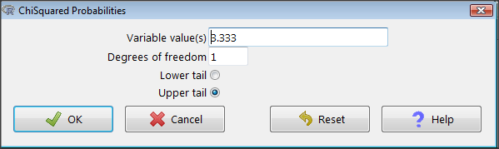
Figure 3. R Commander menu for Chi-squared probabilities.
I entered “3.333” because that is one of the test statistics I want to calculate for probability and “1” for Degrees of freedom because I had k – 1 = 1 df for this problem. Here’s R’s response when I clicked “OK.”
pchisq(c(3.333), df=1, lower.tail=FALSE)
[1] 0.06790291
I repeated this exercise for I got  ; for I got
  .
.
Nice, right? Saves you from having to interpolate probability values from the chi-square table.
3. How to get the goodness of fit in Rcmdr.
R provides the goodness of fit (the command is chisq.text()), but Rcmdr thus far does not provide a menu option to link to the function. Instead, R Commander provides a menu for contingency tables, which also is a chi-square test, but is used where no theory is available to calculate the expected values (see Chapter 9.2). Thus, for the goodness of fit chi-square, we will need to by-pass Rcmdr in favor of the script window. Honestly, other options are as quick or quicker: calculate by hand, use a different software (e.g, Microsoft Excel), or many online sites provide JavaScript tools.
So how to get the goodness of fit chi-square while in R? Here’s one way. At the command line, type
chisq.test (c(O1, O2, ... On), p = c(E1, E2, ... En))
where O1, O2, … On are observed counts for category 1, category 2, up to category n, and E1, E2, … En are the expected proportions for each category. For example, consider our Heads/Tails example above (problem A).
In R, we write and submit
chisq.test(c(70,30),p=c(1/2,1/2))
R returns
Chi-squared test for given probabilities.
data: c(70, 30)
X-squared = 16, df = 1, p-value = 0.00006334
Easy enough. But not much detail — details are available with some additions to the R script. I’ll just link you to a nice website that shows how to add to the output so that it looks like the one below.
mike.chi <- chisq.test(c(70,30),p=c(1/2,1/2))
Lets explore one at time the contents of the results from the chi square function.
names(mike.chi)   #The names function
[1] "statistic" "parameter" "p.value" "method" "data.name" "observed"
[7] "expected" "residuals" "stdres"
Now, call each name in turn.
mike.chi$residuals
[1] 2.828427 -2.828427
mike.chi$obs
[1] 70 30
mike.chi$exp
[1] 50 50
Note 4: “residuals” here simply refers to the difference between observed and expected values. Residuals are an important concept in regression, see Ch17.5
And finally, lets get the summary output of our statistical test.
mike.chi
Chi-squared test for given probabilities.
data: c(70, 30)
X-squared = 16, df = 1, p-value = 6.334e-05
GOF and spreadsheet apps
Easy enough with R, but it may even easier with other tools. I’ll show you how to do this with spreadsheet apps and with and online at graphpad.com.
Let’s take the pea example above. We had 16 wrinkled, 84 round. We expect 25% wrinkled, 75% round.
Now, with R, we would enter
chisq.test(c(16,80),p=c(1/4,3/4))
and the R output
Chi-squared test for given probabilities
data: c(16, 80)
X-squared = 3.5556, df = 1, p-value = 0.05935
Microsoft Excel and the other spreadsheet programs (Apple Numbers, Google Sheets, LibreOffice Calc) can calculate the goodness of fit directly; they return a P-value only. If the observed data are in cells A1 and A2, and the expected values are in B1 and B2, then use the procedure =CHITEST(A1:A2,B1:B2).
Table 7. A spreadsheet with formula visible.
| A | B | C | D | |
| 1 | 80 | 75 | ||
| 2 | 16 | 25 | =CHITEST(A1:A2,B1:B2) |
The P-value (but not the Chi-square test statistic) is returned. Here’s the output from Calc.
Table 8. Spreadsheet example from Table 7 with calculated P-value.
| A | B | C | D | |
| 1 | 80 | 75 | ||
| 2 | 16 | 25 | 0.058714340077662 |
You can get the critical value from MS Excel (=CHIINV(alpha, df), returns the critical value), and the exact probability for the test statistic =CHIDIST(x,df), where x is your test statistic. Putting it all together, a general spreadsheet template for goodness of fit calculations calculations of test statistic and p-value might look like
Table 9. Spreadsheet template with formula to calculate chi-square goodness of fit on two groups.
| A | B | C | D | E | |
| 1 | f1 | 0.75 | |||
| 2 | f2 | 0.25 | |||
| 3 | N | =SUM(A5,A6) |
|||
| 4 | Obs | Exp | Chi.value | Chi.sqr | |
| 5 | 80 | =B1* |
=((A5-B5)^2)/B5 |
=SUM(C5,C6) |
|
| 6 | 16 | =B2* |
=((A6-B6)^2)/B6 |
=CHIDIST(D5, COUNT(A5:A6-1) |
|
| 7 | |||||
| 8 |
 3
3Microsoft Excel can be improved by writing macros, or by including available add-in programs, such as the free PopTools, which is available for Microsoft Windows 32-bit operating systems only.
Another option is to take advantage of the internet — again, many folks have provided java or JavaScript-based statistical routines for educational purposes. Here’s an easy one to use www.graphpad.com.
In most cases, I find the chi-square goodness-of-fit is so simple to calculate by hand that the computer is redundant.
Questions
1. A variety of p-values were reported on this page with no attempt to reflect significant figures or numbers of digits (see Chapter 8.2). Provide proper significant figures and numbers of digits as if these p-values were reported in a science journal.
- 0.0724
- 0.0679
- 0.03766692
- 0.004955794
- 0.00006334
- 6.334e-05
- 0.05935
- 0.058714340077662
2. For a mini bag of M&M candies, you count 4 blue, 2 brown, 1 green, 3 orange, 4 red, and 2 yellow candies.
- What are the expected values for each color?
- Calculate using your favorite spreadsheet app (e.g., Numbers, Excel, Google Sheets, LibreOffice Calc)
- Calculate using R (note R will reply with a warning message that the “Chi-squared approximation may be incorrect”; see 9.2 Yates continuity correction)
- Calculate using Quickcalcs at graphpad.com
- Construct a table and compare p-values obtained from the different applications
3. CYP1A2 enzyme involved with metabolism of caffeine. Folks with C at SNP rs762551 have higher enzyme activity than folks with A. Populations differ for the frequency of C. Using R or your favorite spreadsheet application, compare the following populations against global frequency of C is 33% (frequency of A is 67%).
- 286 persons from Northern Sweden: f(C) = 26%, f(A) = 73%
- 4532 Native Hawaiian persons: f(C) = 22%, f(A) = 78%
- 1260 Native American persons: f(C) = 30%, f(A) = 70%
- 8316 Native American persons: f(C) = 36%, f(A) = 64%
- Construct a table and compare p-values obtained for the four populations.