4.10 – Graph software
Introduction
You may already have experience with use of spreadsheet programs to create bar charts and scatter plots. Microsoft Office Excel, Google Sheets, Numbers for Mac, and LibreOffice Calc are good at these kinds of graphs — although arguably, even the finished graphics from these products are not suitable for most journal publications.
For bar charts, pie charts, and scatter plots, if a spreadsheet app is your preference, go for it, at least for your statistics class. This choice will work for you, at least it will meet the minimum requirements asked of you.
However, you will find spreadsheet apps are typically inadequate for generating the kinds of graphics one would use in even routine statistical analyses (e.g., box plots, dot plots, histograms, scatter plots with trend lines and confidence intervals, etc.). And, without considerable effort, most of the interesting graphics (e.g., box plots, heat maps, mosaic plots, ternary plots, violin plots), are impossible to make with spreadsheet programs.
At this point, you can probably discern that, while I’m not a fan of spreadsheet graphics, I’m also not a purist — you’ll find spreadsheet graphics scattered throughout Mike’s Biostatistics Book. Beyond my personal bias, I can make the positive case for switching from spreadsheet app to R for graphics is that the learning curve for making good graphs with Excel and other spreadsheet apps is as steep as learning how to make graphs in R (see Why do we use R Software?). In fact, for the common graphs, R and graphics packages like lattice, ggplot2, make it easier to create publishing-quality graphics.
Alternatives to base R plot
This is a good point to discuss your choice of graphic software — I will show you how to generate simple graphs in R and R Commander which primarily rely on plotting functions available in the base R package. These will do for most of the homework. R provides many ways to produce elegant, publication-quality graphs. However, because of its power, R graphics requires lots of process iterations in order to get the graph just right. Thus, while R is our software of choice, other apps may be worth looking at for special graphics work.
My list emphasizes open source and or free software available both on Windows and macOS personal computers. Data set used for comparison from Veusz (Table).
| Bees | Butterflies |
|---|---|
| 15 | 13 |
| 18 | 4 |
| 16 | 5 |
| 17 | 7 |
| 14 | 2 |
| 14 | 16 |
| 13 | 18 |
| 15 | 14 |
| 14 | 7 |
| 14 | 19 |
1. GrapheR — R package that provides a basic GUI (Fig 1) that relies on Tcl/Tk — like R Commander — that helps you generate good scatter plots, histograms, and bar charts. Box plot with confidence intervals of medians (Fig 2).
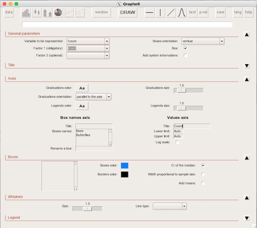
Figure 1. Screenshot of GrapheR GUI menu, box plot options.
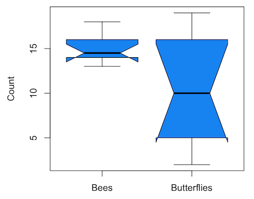
Figure 2. Box plot made with GrapheR.
2. RcmdrPlugin.KMggplot2 — a plugin for R Commander that provides extensive graph manipulation via the ggplot2 package, part of the Tidyverse environment (Fig 3). Box plot with data point, jitter (Fig 4).
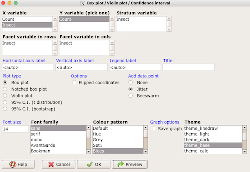
Figure 3. Screenshot of KMggplot2 GUI menu, box plot options.
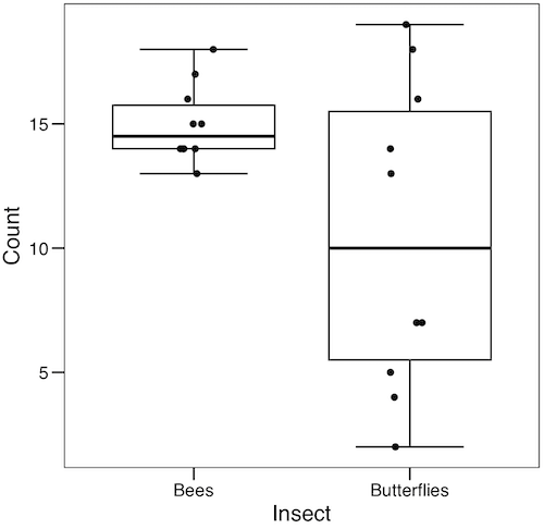
Figure 4. Box plot graph made with GrapheR with jitter applied to avoid overplotting of points.
Note 1: If data points have the same value, overplotting will result — the two points will be represented as a single point on the plot. The jitter function adds noise to points with the same value so that they will be individually displayed. (Fig 4) The beeswarm function provides an alternative to jitter (Fig 5).
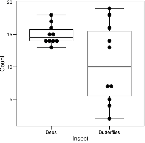
Figure 5. Box plot graph made with GrapheR with beeswarm applied to avoid overplotting of points.
3. A bit more work, but worth a look. Use plotly library to create interactive web application to display your data.
install.packages("plotly")
library(plotly)
fig <- plot_ly(y = Bees, type = "box", name="Bees")
fig <- fig %>% add_trace(y = Butterflies, name="Butterflies")
fig
code modified from example at https://plotly.com/r/box-plots/
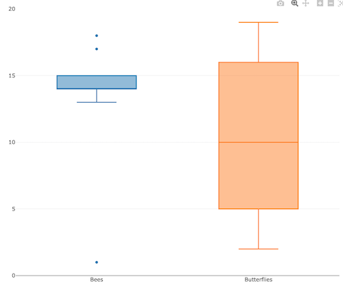
Figure 6. Screenshot of plotly box plot. Live version, data points visible when mouse pointer hover.
4. Veusz, at https://veusz.github.io/. Includes a tutorial to get started. Mac users will need to download the dmg file with the curl command in the terminal app instead of via browser, as explained here.
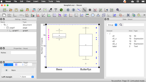
Figure 7. Screenshot of box plot example in Veusz GUI.
5. SciDAVis, “Scientific Data Analysis and Visualization,” is a package capable of generating lots of kinds of graphs along with curve fitting routines and other mathematical processing, https://scidavis.sourceforge.net/. SciDAVis is very similar to QtiPlot and OriginLab, and runs on both macOS and WinPC.
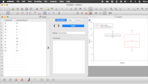
Figure 8. Screenshot SciDAVis app with default box plot.
Note 2: The default options added an unnecessary legend and did not add category labels onto horizontal axis (Fig 8).
More sophisticated graphics can, and when you gain confidence in R, you’ll find that there are many more sophisticated packages that you could add to R to make really impressive graphs. However, the point is to get the best graph, and there are many tools out there that can serve this end.
Chapter 4 contents