4.7 – Q-Q plot
Introduction
Use of graphs by a data analyst may serve different purposes: communication of results or as diagnostics. The Q-Q plot is one example of a graph used as a diagnostic.
The quantile-quantile, or Q–Q plot is a probability plot used to compare graphically two probability distributions. In brief, a set of intervals for the quantiles is chosen for each sample. A point on the plot represents one of the quantiles from the second distribution (y value) against the same quantile from the first distribution (x value).
A common use of Q-Q plot would be to compare data from a sample against a normal distribution. If the sample distribution is similar to a normal distribution, the points in the Q–Q plot will approximately lie on the line y = x.
R code
In R, the Q-Q plot can be obtained directly in Rcmdr.
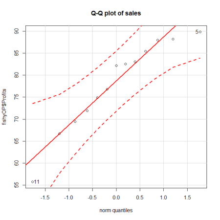
Figure 1. A Q-Q plot, the default command in Rcmdr
Rcmdr: Graphics → Quantile-comparison plot…
After choosing the variable (in this case, Sales), click on Options tab and make additional selections before making the graph. Here, selected normal distribution.
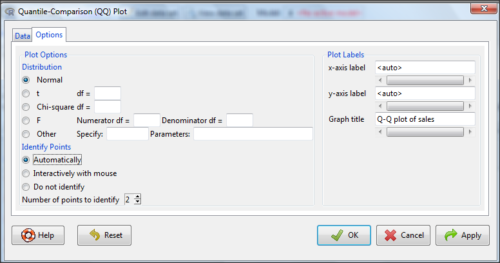
Figure 2. Screenshot of R Commander menu for Q-Q plot
Another version is available in the KMggplot2 package.
Questions
- What is a Q-Q plot used for in statistics?
- Looking at the plot in Figure 1, explain why the confidence lines get further and further away from the straight line.
Quiz Chapter 4.7
Q-Q plots