4.4 – Mosaic plots
Introduction
Mosaic plots are used to display associations among categorical variables. e.g., from a contingency table analysis. Like pie charts, mosaic plots and tree plots (next chapter) are used to show part-to-whole associations. Mosaic plots are simple versions of heat maps (next chapter). Used appropriately, mosaic plots may be useful to show relationships. However, like pie-charts and bar charts, care needs to be taken to avoid their over use; works for a few categories, but quickly loses clarity as numbers of categories increase.
In addition to the function mosaicplot() in the base R package, there are a number of packages in R that will allow you to make these kinds of plots; depending on the analyses we are doing we may use any one of three Rcmdr plugins: RcmdrPlugin.mosaic (depreciated), RcmdrPlugin.KMggplot2, or RcmdrPlugin.EBM.
Example data
Table 1. Records of American and National Leagues baseball teams at home and away midway during 2016 season
| No | Yes | |
|---|---|---|
| AL | 10 | 5 |
| NL | 7 | 8 |
The configuration of major league baseball (MLB) parks differ from city to city. For example, Boston’s American League (AL) Fenway Park has the 30-feet tall “Green Monster” fence in left field and a short distance of only 302 feet along the foul line to right field fence. For comparison, Globe Life Park in Arlington, TX the distance along the foul lines left field (332 feet) and right field (325 feet). So, it suggests that teams may benefit from playing 81 games at their home stadium. To test this hypothesis I selected Win-Loss records of the 30 teams at the midway point of the 2016 season. Data are shown in the Table 1.
mosaicplot() in R base
The function mosaicplot() is included in the base install of R. The following code is one way to directly enter contingency table data like that from Table 1.
myMatrix <- matrix(c(10,  5,  7,  8),  nrow = 2, ncol = 2, byrow = TRUE)
dimnames(myMatrix) <- list(c("AL", "NL"), c("No","Yes"))
myTable <- as.table(myMatrix); myTable
mosaicplot(myTable, color=2:3)
The simple plot is shown in Figure 1. color = “2” is red, color = “3” is green.
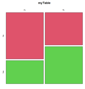
Figure 1. Mosaic plot made with basic function mosaicplot().
mosaic plot from EBM plugin
A good option in Rcmdr is to use the “evidence-based-medicine” or “EBM” plug-in for Rcmdr (RcmdrPlugin.EBM). This plugin generates a real nice mosaic plot for 2 X 2 tables.
After loading the EBM plugin, restart Rcmdr, then select EBM from the menu bar and choose to “Enter two-way table…”
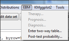
Figure 2. First steps to make mosaic plot in R Commander EBM plug-in.
Complete the data entry for the table as shown in the image below. After entering the values, click the OK button.
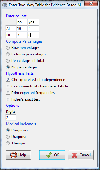
Figure 3. Next steps to make mosaic plot in R Commander EBM plug-in.
Along with the requested statistics a mosaic plot will appear in a pop-up window.
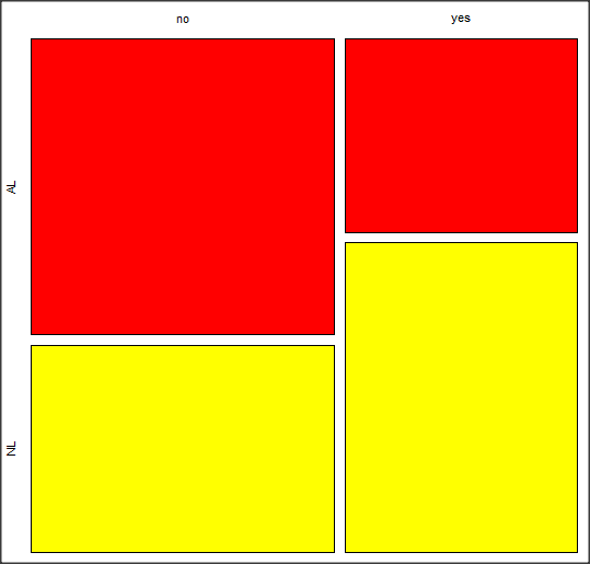
Figure 4. Mosaic plot made from R Commander EBMplug-in
mosaic-like plot KMggplot2 plugin
The KMggplot2 plugin for Rcmdr will also generate a mosaic-like plot. After loading the KMggplot2 plugin, restart Rcmdr, then load a data set with the table (e.g., MLB data in Table 1). Next, from within the KMggplot2 menu select, “Bar chart for discrete variables…”
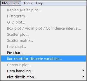
Figure 5. First steps to make mosaic plot in R Commander KMggplot2 plug-in.
From the bar chart context menu make your selections. Note that this function has many options for formatting, so play around with these to make the graph the way you prefer.
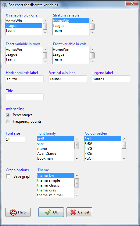
Figure 6. Next steps to make mosaic plot in R Commander KMggplot2 plug-in.
And here is the resulting mosaic-like plot from KMggplot2.
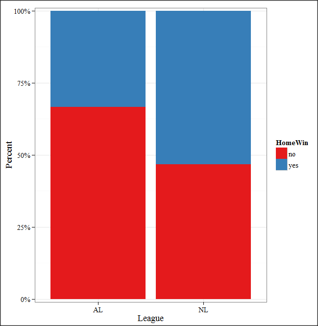
Figure 7. Mosaic-like plot made from R Commander KMggplot2 plug-in.
Questions
1. Most US states have laws that dictate pre-employment drug testing for job candidates; Interestingly, states are increasingly legalizing marijuana use. Data for states plus District of Columbia are presented in the table. Make a mosaic plot of the table.
Table 2. Marijuana use is US states, legal or not legal
| Marijuana-use legal | Marijuana-use not legal | |
|---|---|---|
| Yes | 19 | 12 |
| No | 14 | 6 |
Data adopted from https://www.paycor.com/resource-center/pre-employment-drug-testing-laws-by-state
Quiz Chapter 4.4
Mosaic plots
Depreciated material
As of summer 2020, Rcmdrplugin.mosaic is depreciated. While you can install the archived version, it is not recommended. Therefore, this material is left as is but for information purposes only. For a simple mosaic plot in Rcmdr I recommend working with the RcmdrPlugin.EBM.
Download the RcmdrPlugin.mosaic package, start Rcmdr, then navigate to Tools and choose Load Rcmdr plug-in(s).… Select Rcmdrplugin.mosaic (Fig. 8), then restart Rcmdr (Fig. 9). The plugin adds mosaic plot to the regular Graphics menu of Rcmdr.
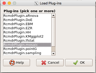
Figure 8. Screenshot of popup menu from Rcmdr with mosaic plugin selected.
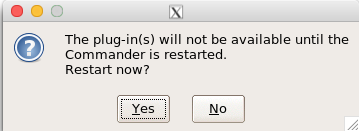
Figure 9. After clicking OK (Fig 8), click Yes to restart Rcmdr. The plugin will then be available.
Load a data set with 2X2 arranged data, or create the variables yourself (Yikes, 30 rows!). The mosaic plugin requires that you submit data in a table format. We can check whether our data are currently in that format. At the R prompt type
is.table(MLB)
And R will return
[1] FALSE
(To be complete, confirm that the data set is a data.frame: is.data.frame(MLB).)
You will need a table before proceeding with the mosaic plug-in. then create a table using a command like the one shown below.
MLBTable <- xtabs(~League+HomeWin, data=MLB)
Once the table is ready, select “mosaic or assoc plot” from the Rcmdr Graphics menu (Fig. 10)
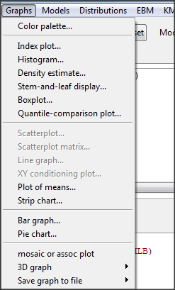
Figure 10. How to access the mosaic plot in R Commander.
A small window will pop up that will allow you to select the table of data you just created (Fig. 11). Note that you may need to hunt around your desktop to find this menu! Select the table (in this example, “MLBTable), then click on “Create plot” button.
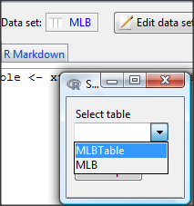
Figure 11. Screenshot of popup menu in mosaic plugin in R Commander.
R Note: The popup from the mosaic menu shown in Fig. 11 will also display the data.frame MLB. If you mistakenly select the dataframe MLB, you’ll get an error message in Rcmdr (Fig. 12). The plugin behaves erratically if you select MLB: On my computer, the function hangs and requires restarting R.
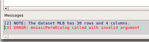
Figure 12. Error message as result of selecting a dataframe for use in mosaic plugin.
After you select the table, two additional windows will pop up: on the left (Fig. 13) is the context menu to change characteristics of the mosaic plot; on the right (not shown) will be a mosaic plot itself in default grey scale colors.
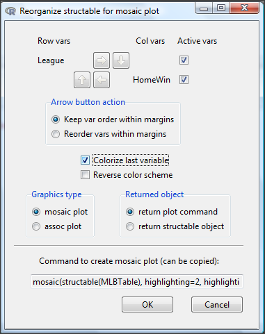
Figure 13. Options for the mosaic plot
At a minimum, change the plot from grey scale to a colorized version by checking the box next to the “Colorize last variable” option. The new plot is shown in Figure 14.
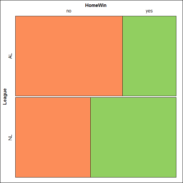
Figure 14. Our new mosaic plot.
OK. Take a moment and look at the plot. What conclusions can be made about our hypothesis — are there any differences between the leagues for home versus road Wins-Loss records?
By default the mosaic command copies the command to the R window. You can change the graph by taking advantage of the options in the brewer palette. Here’s the command for the mosaic image above.
mosaic(structable(MLBTable), highlighting=2, highlighting_fill=brewer.pal.ext(2,"RdYlGn"))
Change the options in the brackets following “brewer.pal.ext.” For example, replace RdYlGn with Blues to make a plot that looks like the following
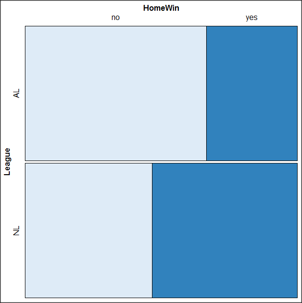
Figure 15. Mosaic plot with changed color scheme.
The colors are selected from the Rcolorbrewer package. For more, see this blog for starters.
Chapter 4 contents
- Graphs and tables (How to report statistics)
- Bar (column) charts
- Histograms
- Box plot
- Mosaic plots
- Scatter plots
- Add a second Y axis
- Q-Q plot
- Ternary plots
- Heat maps
- Graph software
- References and suggested readings