4.9 – Heat maps
Introduction
A heat map is a graph of data from a matrix (Wilksonson and Friendly 2009). Heat maps are common in many disciplines in biology, from ecology (e.g., diversity analyses) to genomics (e.g., gene expression profiling) to economics and demographics (Fig. 1). Instead of plotting numbers, color is used to communicate associations between cells in the rows and columns of the matrix.
Heat maps are useful for suggesting trends and typically do not require specialized knowledge to interpret. Provided a color scale is defined, then heat maps do a good job communicating trends. Viewers may rapidly make comparisons as they scan colors, from cold to hot.
Figure 1 provides a classic heat map, counties of USA by percent ethnicity compared to “white” from Census.gov based on the 2010 census. Scale reads shades of blue to white, high percentage(greater than 96.3%) of whites to lower percentage (less than 71%) of whites, respectively. Map generated with mapping tool at United States Census Bureau TIGERweb.
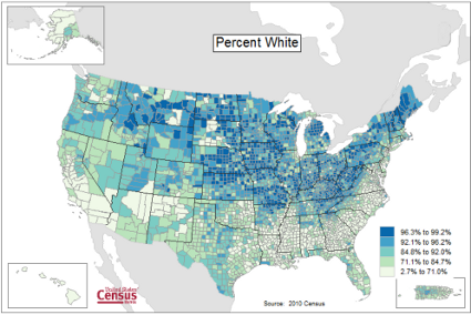
Figure 1. Heat map, USA population by county and percent ethnicity compared to white, graph from census.gov
Note 1: Technically, Figure 1 is an example of a Choropleth Map.
Figure 2 shows gene expression results from a pilot study we did on metal exposure in cultured rat lung cells compared to cells without metal exposure (i.e., the control group). Genes were selected because of their role in the epithelial-mesenchyme transition, EMT. The color scale is typical for such studies: green represents down-regulation, red indicates up-regulation compared to the controls. Black used to show no difference between treatment and control cells.
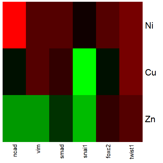
Figure 2. Heat map, gene expression in cultured rat lung cells exposed to metals
Heat maps are good at directing the viewer to areas of strong association between variables, or in the case of comparisons, to draw strong inferences about the association. However, their chief limitations include gradations between colors; like pie charts, it is difficult to interpret the importance of slight changes in color, and the very use of heat map colors does not imply statistical significance (Chapter 8). Some color palettes are poor choices for viewers who may be color blind. A good source about colors is available in the Graphs section of Cookbook for R.
R and heat maps
Lots of specialized packages will do cluster to heat map. Functions include heatmap, heatmap2, heatmap.plus, NeatMap. We’ll step through how to make a heat map with another pilot study data from our lab.
heatmap(). Here’s another heat map, percent DNA in tail from Alkaline Comet Assay (Figure 3). The same cultured cell line, a rat immortalized Type 2-like alveolar lung cell line L2 cells, were grown in media containing witch-hazel tea, a dilute copper solution, or both witch-hazel tea and copper (unpublished data). The hypothesis was that there would be greater DNA damage in cells exposed to copper compared to cells in hazel tea or a combination of copper and hazel tea. Witch hazel is reputed to have antioxidant properties (Pietta et al 1998). A random sample of 10 cells were sampled from each treatment (between 30 and 60 cells counted for each treatment). Within each treatment values were placed in ascending order, so “Cell 1” corresponds to the lowest value for a measured cell in each treatment.
#data arranged in unstacked worksheet
data <- as.matrix(hazelCuUnstack)

#check the import
head(data)

         Copper       Hazel HazelCopper]
[1,] 0.02404672 0.007185706 0.02663191
[2,] 0.06711479 0.027020958 0.03181153
[3,] 0.12196060 0.037725842 0.03743693
[4,] 0.13308991 0.044762867 0.03851548
[5,] 0.13344032 0.045809398 0.18787608
[6,] 0.17537831 0.060942269 0.19494708

#make the heat map
heatmap(data)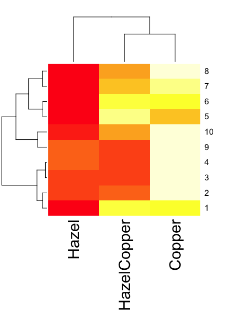
Figure 3. A simple heat map generated by heatmap() function, all default options.
The heatmap() function first runs a cluster analysis to group the cells by columns and rows — so similar cells are grouped together. The row and column dendrograms are default; your data are rearranged by the clustering procedure. To generate the heatmap without the dendrograms, add the following to the R code.
heatmap(data, Rowv = NA, Colv = NA)
ggplot2 and aes(). Not straight forward, but ggplot2 (and therefore the Rcmdr plug-in KMggplot2) can be used. The aes function is part of the “aesthetic mapping” approach (Wickham 2010). The example below takes the same data and introduces use of a custom color palette, brewer.pal. Uses geom_tile, but geom_raster can also be used.
library(RColorBrewer)
#Explore the color profiles available at http://colorbrewer2.org/#type=sequential&scheme=BuGn&n=3
?brewer.pal
hm1.colors <- colorRampPalette(rev(brewer.pal(9, 'RdYlGn')), space='Lab')
#the data set
hazelCu <- read.table("hazelCu.txt", header=TRUE, sep="t", na.strings="NA", dec=".", strip.white=TRUE)
#Confirm the import
head(hazelCu)

Cell Treatment TailPerc
1 1 C 0.02404672
2 2 C 0.06711479
3 3 C 0.12196060
4 4 C 0.13308991
5 5 C 0.13344032
6 6 C 0.17537831

#convert cell number to factor.
hazelCu <- within(hazelCu, {
Cell <- as.factor(Cell)
})

ggplot(hazelCu,aes(x=Treatment,y=Cell,fill=TailPerc)) + geom_tile() + coord_equal() +
scale_fill_gradientn(colours = hm1.colors(100))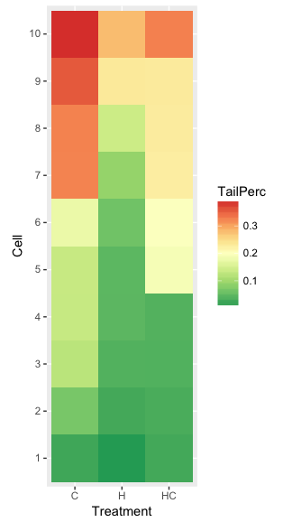
Figure 4. ggplot() and aes() functions used to generate a heat map. Colors from brewer.pal
The color scheme used in Figure 3 is common in gene expression studies: green is negative, cooler, while red is positive, hotter.
Questions
- What are three advantages of heat map for communicating data.
- What are three disadvantages of heat map for communicating data.
- What color pallet is considered “color-friendly” for accessible visualization?
Quiz Chapter 4.9
Heat maps
Chapter 4 contents