13.3 – Test assumption of normality
Introduction
I’ve commented numerous times that your conclusions from statistical inference are only as good as the validity of making the and applying the correct procedures. This implies that we know the assumptions that go into the various statistical tests, and where possible, we critically test the assumptions. From time to time then I will provide you with “tests of assumptions.”
Here’s one. The assumption of normality, that your data were sampled from a population with a normal distribution for the variable of interest, is key and there are a number of ways to test this assumption. Hopefully as you read through the next section you can extend the logic to any distribution; if the data are presumed to come from a binomial, or a Poisson, or a uniform distribution, then the logic of goodness of fit tests would apply.
How to test normality assumption
It’s not a statistical test per se, but the best is to simply plot (histogram) the data. You can do these graphics by hand, or, install the data mining package rattle which will generate nice plots useful for diagnosing normality issues.
Note 1: rattle (R Analytic Tool To Learn Easily) is a great “data-mining” package. We introduced the package in Chapter 3 — Exploring data.
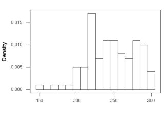
The rattle histogram plot (Fig 1) superimposes a normal curve over the data, which allows you to “eyeball” the data.
First, the eye test. I used the R-package rattle for this on a data set of comet tail lengths of rat lung cells exposed to different amounts of copper in growth media (scroll to bottom of page or click here to get the data).
In addition to the histogram (Fig 1 top image), I plotted the cumulative function (Fig 1 bottom image). In short, if the data set were normal, then the cumulative frequency plot should look like a straight line.
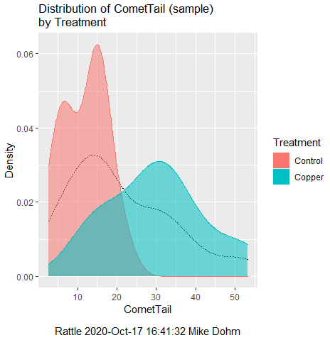
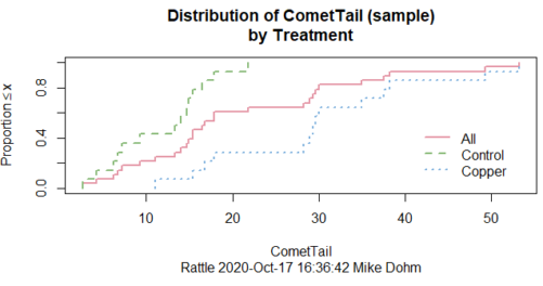
Figure 1. Rattle descriptive graphics on Comet Copper dataset. Dotted line (top image) and red line (bottom image) follow the combined observations regardless of treatment.
So, just looking at the data set, we don’t see clear evidence for a normal-like data set. The top image (Fig 1) looks stacked to the left and the cumulative plot (bottom image) is bumped in the middle, not falling on a straight line. We’ll need to investigate the assumption of normality more for this data set. We’ll begin by discussing some hypothetical points first, then return to the data set.
Goodness of fit tests of normality hypothesis
While graphics and the “eyeball test” are very helpful, you should understand that whether or not your data fits a normal distribution, that’s a testable hypothesis. The null hypothesis is that your sample distribution fits are normal distribution. In general terms, these “fit” hypotheses are viewed as “goodness of fit” tests. Often times, the test is some variation of a  problem: you have your observed (sample distribution) and you compare it to some theoretical expected value (e.g., in this situation, the normal distribution). If your data fit a normal curve, then the test statistics will be close to zero.
We have discussed before that the data should be from a normal distributed population. To the extent this is true, then we can trust our statistical tests are performing the way they are expected to do. We can test the assumption of normality by comparing our sample distribution against a theoretical distribution, the normal curve. I’ve shown several graphs in the past that “looked normal”. What are the alternatives for unimodal (single peak) distributions (Fig 2)?
Kurtosis describes the shape of the distribution, whether it is stacked up in the middle (leptokurtosis), or more spread out and flattened (platykurtosis).
Skewness describes differences from symmetry about the middle. Left skew the tail of the distribution extends to the left, ie, smaller values.
“Leptokurtosis”
“Platykurtosis”
Negative skew, left skewed
Positive skew, right skewed
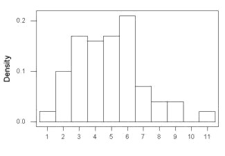
Figure 2. Graphs describing different distributions. From top to bottom: Leptokurtosis, platykurtosis, negative skew, positive skew.
The easiest procedures for goodness of fit tests of normality are based on the distribution and yield a “goodness of fit” test for normal distribution. We discussed the distribution in Chapter 6.9, and used the test in Chapter 9.1.

where O refers to the observed data (what we’ve got) and E refers to the expected (e.g., data from a normal curve with same mean and standard deviation as our sample).
To illustrate, I simulated a data set in R.
Rcmdr: Distributions → Continuous distributions → Normal distribution → Sample from normal distribution
I created 100 values, stored them in column 1, and set the population mean = 125 and population standard deviation = 10. And therefore the population standard error of the mean was 1.0.
The resulting MIN/MAX was from 99.558 to 146.16; the sample mean was 124.59 with a sample standard deviation of 9.9164. And therefore the sample standard error of the mean was 0.9916.
Question: After completing the steps above, your data will be slightly different from mine… Why?
But getting back to the main concept, Does our data agree with a normal curve? We have discussed how to construct histograms and frequency distributions.
Let’s try six categories (why six? we discussed this when we talked about histograms).
All chi-square tests are based on categorical data, so we use the counts per category to get our data. Group the data, then count the number of OBSERVED in each group. To get the EXPECTED values, use the Z-score (normal deviate) with population mean and standard deviation as entered above.
Table 1. Tabulated values for test of normality.
| Number of observations | Weight | Normal deviate (Z) | Expected Proportion | Expected number | (Obs – Exp)2 / Exp |
| 105 | 3 | less than or equal to -2 | 0.0228 | 2.28 | 0.227368421 |
| 105 < 115 | 17 | between -1 & -2 = 0.1587 – 0.0228 | 0.1359 | 13.59 | 0.855636497 |
| 115 < 125 | 34 | between -0 & -1 = 0.5 – 0.1587 | 0.3413 | 34.13 | 0.000495166 |
| 125 < 135 | 30 | between +0 & +1 = 0.5 – 0.1587 | 0.3413 | 34.13 | 0.499762672 |
| 135 < 145 | 15 | between +1 & +2 = 0.9772 – 0.8413 | 0.1359 | 13.59 | 0.146291391 |
| > 145 | 1 | greater than or equal to +2 = 1 – 0.9772 | 0.0228 | 2.28 | 0.718596491 |
 |
Then obtain the critical value of the with df = 6 – 1 = 5 (see Appendix, Table of chi-square critical values , critical = 11.1 with df = 5).
Thus, we would not reject the null hypothesis and would proceed with the assumption that our data could have come from a normally distributed population.
This would be an OK test, but different approaches, although based on a chi-square-like goodness of fit, have been introduced and are generally preferred. We have just shown how one could use the chi-square goodness of fit approach to testing whether your data fit a normal distribution. A number of modified tests based on this procedure have been proposed; we have already introduced and used one (Wilks-Shapiro), which is easily accessed in R.
Rcmdr: Summaries → Wilks-Shapiro
Like Wilks-Shapiro, another common “goodness-of-fit” test of normality is the Anderson-Darling test. This test is now included with Rcmdr, but it’s also available in the package nortest. After the package is installed and you run the library (you should by now be able to do this!), then at the R prompt (>) type:
ad.test(dataset$variable)
replacing “dataset$variable” with the name of your data set and variable name.
In the context of goodness of fit, a perfect fit means the data are exactly distributed as a normal curve, and the test statistics would be zero. Differences away from normality increase the value of the test statistic.
How do these tests perform on data?
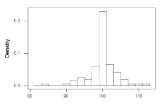
The histogram of our simulated normal data of 100 observations with mean = 125 and standard deviation = 10 (Fig 3).
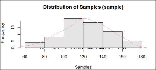
Figure 3. Histogram of simulated normal dataset, μ = 125, σ = 10.
and here’s the cumulative plot (Fig 4).
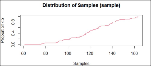
Figure 4. Cumulated frequency of simulated normal dataset, μ = 125, σ = 10.
Results from Anderson-Darling test were A = 0.2491, p-value = 0.7412, where A is the Anderson-Darling test statistic.
Results of the Shapiro-Wilks test on the same data. W = 0.9927, p-value = 0.8716, where W is the Shapiro-Wilks test statistic. We would not reject the null hypothesis in either case because p > 0.05.
Example
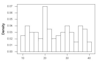
Histogram of a data set, highly skewed to the right. 90 observations in three groups of 30 each, with mean = 0 and standard deviation = 1 (Fig 5).
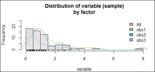
Figure 5. Histogram of simulated normal dataset, μ = 0, σ = 1.
and the cumulative frequency plot (Fig 6).
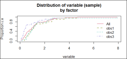
Figure 6. Cumulated frequency of simulated normal dataset, μ = 0, σ = 1.
Results from Anderson-Darling test were A = 9.0662, p-value < 2.2e-16. Results of the Shapiro-Wilks test on the same data. W = 0.6192, p-value = 6.248e-14. Therefore, we would reject the null hypothesis because p < 0.05.
The Shapiro-Wilk test in Rcmdr
Let’s go back to our data set and try tests of normality on the entire data set, i.e., not by treatment groups.
Rcmdr: Statistics → Summaries → Test of normality…
normalityTest(~CometTail, test="shapiro.test", data=CometCopper)

 Shapiro-Wilk normality test

data: CometCopper$CometTail
W = 0.91662, p-value = 0.006038
End of R output
Another test, built on the basic idea of a chi-square goodness of fit is the Anderson Darling test. Some statisticians prefer this test and it is one built-in to some commercial statistical packages (e.g., Minitab). To obtain the Anderson-Darling test in R, you need to install a package. After installing nortest package, run the AD test at the command prompt.
require(nortest)
ad.test(CometCopper$CometTail)

Anderson-Darling normality test

data: CometCopper$CometTail
A = 1.0833, p-value = 0.006787
End of R output.
Note 2: Because you’ve installed Rcmdr the Anderson-Darling test is available (since version 2.6) without installing the nortest package. You can call Anderson-Darling via the menu system, Statistics → Summaries → Test of normality … or type in the script the following command
normalityTest(~CometTail, test="ad.test", data=CometCopper)
In contrast, Shapiro-Wilks test is part of the base R package, so can be called directly
shapiro.test(CometCopper$CometTail)
P-values are both much less than 0.05, so we would reject the assumption of normality for this data set.
Which test of normality?
Why show you two tests for normality, the Shapiro-Wilks and Anderson-Darling? The simple answer is that both are good as general tests of normality, both are widely used in scientific papers, so just pick one and go with it as your general test of normality.
The more complicated answer is that each is designed to be sensitive to different kinds of departure from normality. By some measures, the Shapiro-Wilks test is somewhat better (i.e., more statistical power to test the null hypothesis), than other tests, but this is not something you want to get into as a beginner. So, I show both of them to you so that you are at least introduced to the concept that there are often more than one way to test a hypothesis. The bottom-line is that plots may be best!
Questions
- Work describe in this chapter involves statistical tests of the assumption of normality. It is just as important, maybe more so, to also apply graphics to take advantage of our built-in pattern recognition functions. What graphic techniques, besides histogram, should be used to view the distribution of the data?
- In R, what command would you use so that you can call the variable name,
CometTail, directly instead of having to refer to the variable asCometCopper$CometTail? - Why are Anderson-Darling, Shapiro-Wilks and other related tests referred to as “goodness of fit” tests? You may wish to review discussion in Chapter 9.1.
- The example tests presented for the Comet Copper data set were conducted on the whole set, not by treatment groups. Re-run tests of normality via
Rcmdr, but this time, select the By groups option and select Treatment.
Quiz Chapter 13.3
Test assumption of normality
Data set used in this page
| Treatment | CometTail |
|---|---|
| Control | 17.86 |
| Control | 16.52 |
| Control | 14.93 |
| Control | 14.03 |
| Control | 13.33 |
| Control | 8.81 |
| Control | 14.70 |
| Control | 9.26 |
| Control | 21.78 |
| Control | 6.18 |
| Control | 9.20 |
| Control | 5.54 |
| Control | 6.72 |
| Control | 2.63 |
| Control | 7.19 |
| Control | 5.39 |
| Control | 11.29 |
| Control | 15.44 |
| Control | 17.86 |
| Contro | l4.25 |
| Copper | 53.21 |
| Copper | 38.93 |
| Copper | 18.93 |
| Copper | 30.00 |
| Copper | 28.93 |
| Copper | 15.36 |
| Copper | 17.86 |
| Copper | 17.50 |
| Copper | 21.07 |
| Copper | 29.29 |
| Copper | 28.21 |
| Copper | 16.79 |
| Copper | 21.07 |
| Copper | 37.50 |
| Copper | 38.22 |
| Copper | 17.86 |
| Copper | 29.64 |
| Copper | 11.07 |
| Copper | 35.00 |
| Copper | 49.29 |
Chapter 13 contents
- Introduction
- ANOVA Assumptions
- Why tests of assumption are important
- Test assumption of normality
- Tests for Equal Variances
- References and suggested readings