16.2 – Causation and Partial correlation
Introduction
Science driven by statistical inference and model building is largely motivated by the the drive to identify pathways of cause and effect linking events and phenomena observed all around us. (We first defined cause and effect in Chapter 2.4) The history of philosophy, from the works of Ancient Greece, China, Middle East and so on is rich in the language of cause and effect. From these traditions we have a number of ways to think of cause and effect, but for us it will be enough to review the logical distinction among three kinds of cause-effect associations:
- Necessary cause
- Sufficient cause
- Contributory cause
Here’s how the logic works. If A is a necessary cause of B, then the mere fact that B is present implies that A must also be present. However, that the presence of A does not imply that B will occur. If A is a sufficient cause of B, then the presence of A necessarily implies the presence of B. However, another cause C may alternatively cause B. Enter the contributory or related cause: A cause may be contributory if the presumed cause A (1) occurs before the effect B, and (2) changing A also changes B. A contributory cause does not need to be necessary nor must it be sufficient; contributory causes play a role in cause and effect.
Thus, following this long tradition of thinking about causality we have the mantra, “Correlation does not imply causation.” The exact phrase was written as early as emphasized by Karl Pearson who invented the statistic back in the late 1800s. This well-worn slogan deserves to be on T-shirts and bumper stickers*, and perhaps to be viewed as the single most important concept you can take from a course in philosophy/statistics. But in practice, we will always be tempted to stray from this guidance. The developments in genome-wide-association studies, or GWAS, are designed to look for correlations, as evidenced by statistical linkage analysis, between variation at one DNA base pair and presence/absence of disease or condition in humans and animal models. These are costly studies to do and in the end, the results are just that, evidence of associations (correlations), not proof of genetic cause and effect. We are less likely to be swayed by a correlation that is weak, but what about correlations that are large, even close to one? Is not the implication of high, statistically significant correlation evidence of causation? No, necessary, but not sufficient.
Note 1. A helpful review on causation in epidemiology is available from Parascandola and Weed (2001); see also Kleinberg and Hripcsak (2011). For more on “correlation does not imply causation”, try the Wikipedia entry. Obviously, researchers who engage in genome wide association studies are aware of these issues: see for example discussion by Hu et al (2018) on causal inference and GWAS.
Causal inference (Pearl 2009; Pearl and Mackenzie 2018), in brief, employs a model to explain the association between dependent and multiple, likely interrelated candidate causal variable, which is then subject to testing — is the model stable when the predictor variables are manipulated, when additional connections are considered (eg, predictor variable 1 covaries with one or more other predictor variables in the model). Wright’s path analysis, now included as one approach to Structural Equation Modeling, is used to relate equations (models) of variation in observed variables attributed to direct and indirect effects from predictor variables.
* And yes, a quick Google search reveals lots of bumper stickers and T-shirts available with the causation  sentiment.
Spurious correlations
Correlation estimates should be viewed as hypotheses in the scientific sense of the meaning of hypotheses for putative cause-effect pairings. To drive the point home, explore the web site “Spurious Correlations” at https://www.tylervigen.com/spurious-correlations , which allows you to generate X-Y plots and estimate correlations among many different variables. Some of my favorite correlations from “Spurious Correlations” include (Table 1):
Table 1. Spurious correlations, https://www.tylervigen.com/spurious-correlations
| First variable | Second variable | Correlation |
| Divorce rate in Maine, USA | Per capita USA consumption of margarine | +0.993 |
| Honey producing bee colonies USA | Juvenile arrests for marijuana possession | -0.933 |
| Per capita USA consumption of mozzarella cheese | Civil engineering PhD awarded USA | +0.959 |
| Total number of ABA lawyers USA | Cost of red delicious apples | +0.879 |
These are some pretty strong correlations (cf. effect size discussion, Ch11.4 and 16.1), about as close to +1 as you can get. But really, do you think the amount of cheese that is consumed in the USA has anything to do with the number of PhD degrees awarded in engineering or that apple prices are largely set by the number of lawyers in the USA? Cause and effect implies there must also be some plausible mechanism, not just a strong correlation.
But that does NOT ALSO mean that a high correlation is meaningless. The primary reason a correlation cannot tell about causation is because of the problem (potentially) of an UNMEASURED variable (a confounding variable) being the real driving force (Fig 1).
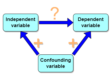
Figure 1. Unmeasured confounding variables influence association between independent and dependent variables, the characters or traits we are interested in.
Here’s a plot of running times for the best, fastest men and women runners for the 100-meter sprint. Running times over 100 meters of top athletes since the 1920s. The data are collated for you and presented at end of this page (scroll or click here).
Here’s a scatterplot (Fig 2).
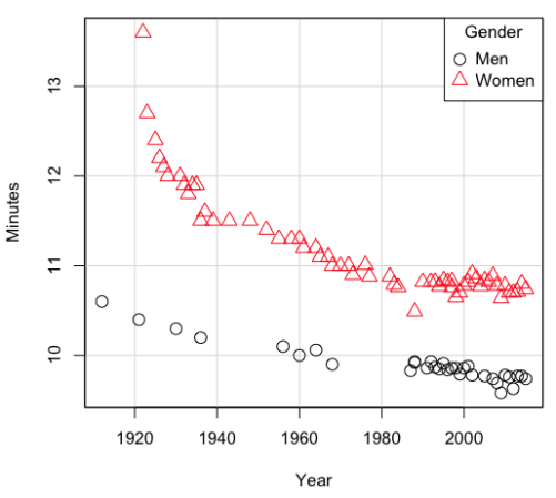
Figure 2. Running times over 100 meters of top athletes since the 1920s.
There’s clearly a negative correlation between years and running times. Is the rate of improvement in running times the same for men and women? Is the improvement linear? What, if any, are the possible confounding variables? Height? weight? Biomechanical differences? Society? Training? Genetics? … Performance enhancing drugs…?
If we measure potential confounding factors, we may be able to determine the strength of correlation between two variables that share variation with a third variable.
The partial correlation
There are several ways to work this problem. The partial correlation is a useful way to handle this problem, i.e., where a measured third variable is positively correlated with the two variable you are interested in.

Without formal mathematical proof presented, r12.3 is the correlation between variables 1 and 2 INDEPENDENT of any covariation with variable 3.
For our running data set, we have the correlation between women’s time for 100m over 9 decades, (r13 = -0.876), between men’s time for 100m over 9 decades (r23 = -0.952), and finally, the correlation we’re interested in, whether men’s and women’s times are correlated (r12 = +0.71). When we use the partial correlation, however, I get r12.3 = -0.819… much less than 0 and significantly different from zero. In other words, men’s and women’s times are not positively correlated independent of the correlation both share with the passage of time (decades)! The interpretation is that men are getting faster at a rate faster than women.
In conclusion, keep your head about you when you are doing analyses. You may not have the skills or knowledge to handle some problems (partial correlation), but you can think simply — why are two variables correlated? One causes the other to increase (or decrease) OR the two are both correlated with another variable.
Testing the partial correlation
Like our simple correlation, the partial correlation may be tested by a t-test, although modified to account for the number of pairwise correlations (Wetzels and Wagenmakers 2012). The equation for the t test statistic is now

with k equal to the number of pairwise correlations and n – 2 – k degrees of freedom.
Examples
Lead exposure and low birth weigh. The data set is numbers of low birth weight births (< 2,500 g regardless of gestational age) and numbers of children with high levels of lead (10 or more micrograms of lead in a deciliter of blood) measured from their blood. Data used for 42 cities and towns of Rhode Island, United States of America (data at end of this page, scroll or click here to access the data).
A scatterplot of number of children with high lead is shown below (Fig 3).
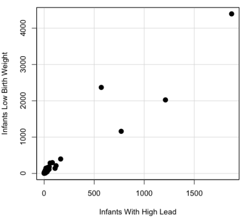
Figure 3. Scatterplot birth weight by lead exposure.
The product moment correlation was r = 0.961, t = 21.862, df = 40, p < 2.2e-16. So, at first blush looking at the scatterplot and the correlation coefficient, we conclude that there is a significant relationship between lead and low birth weight, right?
However, by the description of the data you should recall that counts were reported, not rates (eg, per 100,000 people). Clearly, population size varies among the cities and towns of Rhode Island. West Greenwich had 5085 people whereas Providence had 173,618. We should suspect that there is also a positive correlation between number of children born with low birth weight and numbers of children with high levels of lead. Indeed there are.
Correlation between Low Birth Weight and Population, r = 0.982
Correlation between High Lead levels and Population, r = 0.891
The question becomes, after removing the covariation with population size is there a linear association between high lead and low birth weight? One option is to calculate the partial correlation. To get partial correlations in Rcmdr, select
Statistics → Summaries → Correlation matrix
then select “partial” and select all three variables (select + Ctrl key; (Windows or macOS) (Fig 4).
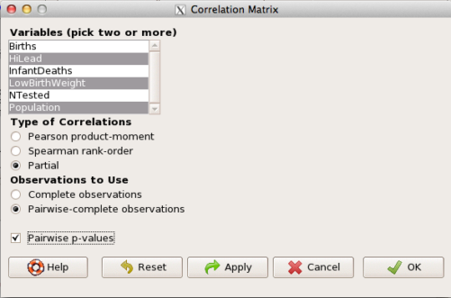
Figure 4. Screenshot Rcmdr partial correlation menu
Results are shown below.
partial.cor(leadBirthWeight[,c("HiLead","LowBirthWeight","Population")], tests=TRUE, use="complete")

Partial correlations:
                 HiLead LowBirthWeight Population
HiLead          0.00000        0.99181   -0.97804
LowBirthWeight  0.99181        0.00000    0.99616
Population     -0.97804        0.99616    0.00000
Thus, after removing the covariation we conclude there is indeed a strong correlation between lead and low birth weights.
Note 2. Some verbiage about correlation tables (matrices). The matrix is symmetric and the information is repeated. I highlighted the diagonal in green. The upper triangle (red) is identical to the lower triangle (blue). When you publish such matrices, don’t publish both the upper and lower triangles; it’s also not necessary to publish the on-diagonal numbers, which are generally not of interest. Thus, the publishable matrix would be
Partial correlations:
                LowBirthWeight Population
HiLead                 0.99181   -0.97804
LowBirthWeight                    0.99616
Another example
Do Democrats prefer cats? The question I was interested in, Do liberals really prefer cats, was inspired by a Time magazine 18 February 2014 article. I collated data on a separate but related question: Do states with more registered Democrats have more cat owners? The data set was compiled from three sources: 2010 USA Census, a 2011 Gallup poll about religious preferences, and from a data book on survey results of USA pet owners (data at end of this page, scroll or click here to access the data).
Note 3: This type of data set involves questions about groups, not individuals. We have access to aggregate statistics for groups (city, county, state, region), but not individuals. Thus, our conclusions are about groups and cannot be used to predict individual behavior, eg, knowing a person votes Green Party does not mean they necessarily share their home with a cat). See ecological fallacy.
This data set also demonstrates use of transformations of the data to improve fit of the data to statistical assumptions (normality, homoscedacity).
The variables, and their definitions, were:
ASDEMS = DEMOCRATS. Democrat advantage: the difference in registered Democrats compared to registered Republicans as a percentage; to improve the distribution qualities the arcsine transform was applied..
ASRELIG = RELIGION. Percent Religious from a Gallup poll who reported that Religion was “Very Important” to them. Also arcsine-transformed to improve normality and homoescedasticity (there you go, throwing $3 words around 🤠 ).
LGCAT = Number of pet cats, log10-transformed, estimated for USA states by survey, except Alaska and Hawaiʻi (not included in the survey by the American Veterinary Association).
LGDOG = Estimated number of pet dogs, log10-transformed for states, except Alaska and Hawaiʻi (not included in the survey by the American Veterinary Association).
LGIPC = Per capita income, log10-transformed.
LGPOP = Population size of each state, log10 transformed.
As always, begin with data exploration. All of the variables were right-skewed, so I applied data transformation functions as appropriate: log10 for the quantitative data and arc sine transform for the frequency variables. Because Democrat Advantage and Percent Religious variables were in percentages, the values were first divided by 100 to make frequencies, then the R function asin() was applied. All analyses were conducted on the transformed data, therefore conclusions apply to the transformed data.
Note 4: As we’ve discussed before, to relate the results to the original scales, back transformations would need to be run on any predictions. Back transformation for log10 would be power of ten; for the arcsine-transform the inverse of the arcsine would be used.
A scatter plot matrix (KMggplo2) plus histograms of the variables along the diagonals shows the results of the transforms and hints at the associations among the variables. A graphic like this one is called a trellis plot; a layout of smaller plots in a grid with the same (preferred) or at least similar axes. Trellis plots (Fig 5) are useful for finding the structure and patterns in complex data. Scanning across a row shows relationships between one variable with all of the others. For example, the first row Y-axis is for the ASDEMS variable; from left to right along the row we have, after the histogram, what look to be weak associations between ASDEMS and ASRELIG, LGCAT, LGDOG, and LGDOG.
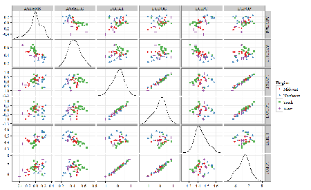
Figure 5. Trellis plot, correlations among variables.
A matrix of partial correlations was produced from the Rcmdr correlation call. Thus, to pick just one partial correlation, the association between DEMOCRATS and RELIGION (reported as “very important”) is negative (r = -0.45) and from the second matrix we retrieve the approximate P-value, unadjusted for the multiple comparisons problem, of p = 0.0024. We quickly move past this matrix to the adjusted P-values and confirm that this particular correlation is statistically significant even after correcting for multiple comparisons. Thus, there is a moderately strong negative correlation between those who reported that religion was very important to them and the difference between registered Democrats and Republicans in the 48 states. Because it is a partial correlation, we can conclude that this correlation is independent of all of the other included variables.
And what about our original question: Do Democrats prefer cats over dogs? The partial correlation after adjusting for all of the other correlated variables is small (r = 0.05) and not statistically different from zero (P-value greater than 5%).
Are there any interesting associations involving pet ownership in this data set? See if you can find it (hint: the correlation you are looking for is also in red).
Partial correlations:
         ASDEMS  ASRELIG LGCAT   LGDOG   LGIPC   LGPOP
ASDEMS   0.0000 -0.4460  0.0487  0.0605  0.1231 -0.0044
ASRELIG -0.4460  0.0000 -0.2291 -0.0132 -0.4685  0.2659
LGCAT    0.0487 -0.2291  0.0000  0.2225 -0.1451  0.6348
LGDOG    0.0605 -0.0132  0.2225  0.0000 -0.6299  0.5953
LGIPC    0.1231 -0.4685 -0.1451 -0.6299  0.0000  0.6270
LGPOP   -0.0044  0.2659  0.6348  0.5953  0.6270  0.0000
Raw P-values, Pairwise two-sided p-values:
         ASDEMS ASRELIG  LGCAT   LGDOG   LGIPC   LGPOP
ASDEMS           0.0024  0.7534  0.6965  0.4259  0.9772
ASRELIG  0.0024          0.1347  0.9325  0.0013  0.0810
LGCAT    0.7534  0.1347          0.1465  0.3473  <.0001
LGDOG    0.6965  0.9325  0.1465          <.0001  <.0001
LGIPC    0.4259  0.0013  0.3473  <.0001          <.0001
LGPOP    0.9772  0.0810  <.0001  <.0001  <.0001
Adjusted P-values, Holm’s method (Benjamini and Hochberg 1995)
         ASDEMS ASRELIG  LGCAT   LGDOG   LGIPC   LGPOP
ASDEMS           0.0241  1.0000  1.0000  1.0000  1.0000
ASRELIG  0.0241          1.0000  1.0000  0.0147  0.7293
LGCAT    1.0000  1.0000          1.0000  1.0000  <.0001
LGDOG    1.0000  1.0000  1.0000          <.0001  0.0002
LGIPC    1.0000  0.0147  1.0000  <.0001          <.0001
LGPOP    1.0000  0.7293  <.0001  0.0002  <.0001
A graph (Fig 6) to summarize the partial correlations: green lines indicate positive correlation, red lines show negative correlations; Strength of association indicated by the line thickness, with thicker lines corresponding to greater correlation.
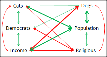
Figure 6. Causal paths among variables.
As you can see, partial correlation analysis is good for a few variables, but as the numbers increase it is difficult to make heads or tails out of the analysis. Better methods for working with these highly correlated data in what we call multivariate data analysis, for example Structural Equation Modeling or Path Analysis.
Questions
- Write up three learning outcomes for this page. Hint: Point your favorite generative AI to this page and ask for help.
- Spurious correlations can be challenging to recognize, and, sometimes, they become part of a challenge to medicine to explain away. A classic spurious correlation is the correlation between rates of MMR vaccination and autism prevalence. Here’s a table of numbers for you
| Year | Herb Supplement Revenue, millions $ | Fertility rate per 1000 births, women age 35 and older+ | MMR per 100K children age 0 -5 | UFC revenue, millions $ | Autism Prevalence per 1000 |
|---|---|---|---|---|---|
| 2000 | 4225 | 47.7 | 179 | 6.7 | |
| 2001 | 4361 | 48.6 | 183 | 4.5 | |
| 2002 | 4275 | 49.9 | 190 | 8.7 | 6.6 |
| 2003 | 4146 | 52.6 | 196 | 7.5 | |
| 2004 | 4288 | 54.5 | 199 | 14.3 | 8 |
| 2005 | 4378 | 55.5 | 197 | 48.3 | |
| 2006 | 4558 | 56.9 | 198 | 180 | 9 |
| 2007 | 4756 | 57.6 | 204 | 226 | |
| 2008 | 4800 | 56.7 | 202 | 275 | 11.3 |
| 2009 | 5037 | 56.1 | 201 | 336 | |
| 2010 | 5049 | 56.1 | 209 | 441 | 14.4 |
| 2011 | 5302 | 57.5 | 212 | 437 | |
| 2012 | 5593 | 58.7 | 216 | 446 | 14.5 |
| 2013 | 6033 | 59.7 | 220 | 516 | |
| 2014 | 6441 | 61.6 | 224 | 450 | 16.8 |
| 2015 | 6922 | 62.8 | 222 | 609 | |
| 2016 | 7452 | 64.1 | 219 | 666 | 18.5 |
| 2017 | 8085 | 63.9 | 213 | 735 | |
| 2018 | 65.3 | 220 | 800 | 25 |
- Make scatterplots of autism prevalence vs
- Herb supplement revenue
- Fertility rate
- MMR vaccination
- UFC revenue
- Calculate and test correlations between autism prevalence vs
- Herb supplement revenue
- Fertility rate
- MMR vaccination
- UFC revenue
- Interpret the correlations — is there any clear case for autism vs MMR?
- What additional information is missing from Table 2? Add that missing variable and calculate partial correlations for autism prevalence vs
- Herb supplement revenue
- Fertility rate
- MMR vaccination
- UFC revenue
- Do a little research: What are some reasons for increase in autism prevalence? What is the consensus view about MMR vaccine and risk of autism?
Quiz Chapter 16.2
Causation and Partial correlation
Data sets
Data used in this page, 100 meter running times since 1900.
| Year | Men | Women |
|---|---|---|
| 1912 | 10.6 | |
| 1913 | ||
| 1914 | ||
| 1915 | ||
| 1916 | ||
| 1917 | ||
| 1918 | ||
| 1919 | ||
| 1920 | ||
| 1921 | 10.4 | |
| 1922 | 13.6 | |
| 1923 | 12.7 | |
| 1924 | ||
| 1925 | 12.4 | |
| 1926 | 12.2 | |
| 1927 | 12.1 | |
| 1928 | 12 | |
| 1929 | ||
| 1930 | 10.3 | |
| 1931 | 12 | |
| 1932 | 11.9 | |
| 1933 | 11.8 | |
| 1934 | 11.9 | |
| 1935 | 11.9 | |
| 1936 | 10.2 | 11.5 |
| 1937 | 11.6 | |
| 1938 | ||
| 1939 | 11.5 | |
| 1940 | ||
| 1941 | ||
| 1942 | ||
| 1943 | 11.5 | |
| 1944 | ||
| 1945 | ||
| 1946 | ||
| 1947 | ||
| 1948 | 11.5 | |
| 1949 | ||
| 1950 | ||
| 1951 | ||
| 1952 | 11.4 | |
| 1953 | ||
| 1954 | ||
| 1955 | 11.3 | |
| 1956 | 10.1 | |
| 1957 | ||
| 1958 | 11.3 | |
| 1959 | ||
| 1960 | 10 | 11.3 |
| 1961 | 11.2 | |
| 1962 | ||
| 1963 | ||
| 1964 | 10.06 | 11.2 |
| 1965 | 11.1 | |
| 1966 | ||
| 1967 | 11.1 | |
| 1968 | 9.9 | 11 |
| 1969 | ||
| 1970 | 11 | |
| 1972 | 10.07 | 11 |
| 1973 | 10.15 | 10.9 |
| 1976 | 10.06 | 11.01 |
| 1977 | 9.98 | 10.88 |
| 1978 | 10.07 | 10.94 |
| 1979 | 10.01 | 10.97 |
| 1980 | 10.02 | 10.93 |
| 1981 | 10 | 10.9 |
| 1982 | 10 | 10.88 |
| 1983 | 9.93 | 10.79 |
| 1984 | 9.96 | 10.76 |
| 1987 | 9.83 | 10.86 |
| 1988 | 9.92 | 10.49 |
| 1989 | 9.94 | 10.78 |
| 1990 | 9.96 | 10.82 |
| 1991 | 9.86 | 10.79 |
| 1992 | 9.93 | 10.82 |
| 1993 | 9.87 | 10.82 |
| 1994 | 9.85 | 10.77 |
| 1995 | 9.91 | 10.84 |
| 1996 | 9.84 | 10.82 |
| 1997 | 9.86 | 10.76 |
| 1998 | 9.86 | 10.65 |
| 1999 | 9.79 | 10.7 |
| 2000 | 9.86 | 10.78 |
| 2001 | 9.88 | 10.82 |
| 2002 | 9.78 | 10.91 |
| 2003 | 9.93 | 10.86 |
| 2004 | 9.85 | 10.77 |
| 2005 | 9.77 | 10.84 |
| 2006 | 9.77 | 10.82 |
| 2007 | 9.74 | 10.89 |
| 2008 | 9.69 | 10.78 |
| 2009 | 9.58 | 10.64 |
| 2010 | 9.78 | 10.78 |
| 2011 | 9.76 | 10.7 |
| 2012 | 9.63 | 10.7 |
| 2013 | 9.77 | 10.71 |
| 2014 | 9.77 | 10.8 |
| 2015 | 9.74 | 10.74 |
| 2016 | 9.8 | 10.7 |
| 2017 | 9.82 | 10.71 |
| 2018 | 9.79 | 10.85 |
| 2019 | 9.76 | 10.71 |
| 2020 | 9.86 | 10.85 |
| 2021 | 9.77 | 10.54 |
| 2022 | 9.76 | 10.62 |
| 2023 | 9.83 | 10.65 |
| 2024 | 9.77 | 10.72 |
Data used in this page, birth weight by lead exposure
| CityTown | Core | Population | NTested | HiLead | Births | LowBirthWeight | InfantDeaths |
|---|---|---|---|---|---|---|---|
| Barrington | n | 16819 | 237 | 13 | 785 | 54 | 1 |
| Bristol | n | 22649 | 308 | 24 | 1180 | 77 | 5 |
| Burrillville | n | 15796 | 177 | 29 | 824 | 44 | 8 |
| Central Falls | y | 18928 | 416 | 109 | 1641 | 141 | 11 |
| Charlestown | n | 7859 | 93 | 7 | 408 | 22 | 1 |
| Coventry | n | 33668 | 387 | 20 | 1946 | 111 | 7 |
| Cranston | n | 79269 | 891 | 82 | 4203 | 298 | 20 |
| Cumberland | n | 31840 | 381 | 16 | 1669 | 98 | 8 |
| East Greenwich | n | 12948 | 158 | 3 | 598 | 41 | 3 |
| East Providence | n | 48688 | 583 | 51 | 2688 | 183 | 11 |
| Exeter | n | 6045 | 73 | 2 | 362 | 6 | 1 |
| Foster | n | 4274 | 55 | 1 | 208 | 9 | 0 |
| Glocester | n | 9948 | 80 | 3 | 508 | 32 | 5 |
| Hopkintown | n | 7836 | 82 | 5 | 484 | 34 | 3 |
| Jamestown | n | 5622 | 51 | 14 | 215 | 13 | 0 |
| Johnston | n | 28195 | 333 | 15 | 1582 | 102 | 6 |
| Lincoln | n | 20898 | 238 | 20 | 962 | 52 | 4 |
| Little Compton | n | 3593 | 48 | 3 | 134 | 7 | 0 |
| Middletown | n | 17334 | 204 | 12 | 1147 | 52 | 7 |
| Narragansett | n | 16361 | 173 | 10 | 728 | 42 | 3 |
| Newport | y | 26475 | 356 | 49 | 1713 | 113 | 7 |
| New Shoreham | n | 1010 | 11 | 0 | 69 | 4 | 1 |
| North Kingstown | n | 26326 | 378 | 20 | 1486 | 76 | 7 |
| North Providence | n | 32411 | 311 | 18 | 1679 | 145 | 13 |
| North Smithfield | n | 10618 | 106 | 5 | 472 | 37 | 3 |
| Pawtucket | y | 72958 | 1125 | 165 | 5086 | 398 | 36 |
| Portsmouth | n | 17149 | 206 | 9 | 940 | 41 | 6 |
| Providence | y | 173618 | 3082 | 770 | 13439 | 1160 | 128 |
| Richmond | n | 7222 | 102 | 6 | 480 | 19 | 2 |
| Scituate | n | 10324 | 133 | 6 | 508 | 39 | 2 |
| Smithfield | n | 20613 | 211 | 5 | 865 | 40 | 4 |
| South Kingstown | n | 27921 | 379 | 35 | 1330 | 72 | 10 |
| Tiverton | n | 15260 | 174 | 14 | 516 | 29 | 3 |
| Warren | n | 11360 | 134 | 17 | 604 | 42 | 1 |
| Warwick | n | 85808 | 973 | 60 | 4671 | 286 | 26 |
| Westerly | n | 22966 | 140 | 11 | 1431 | 85 | 7 |
| West Greenwich | n | 5085 | 68 | 1 | 316 | 15 | 0 |
| West Warwick | n | 29581 | 426 | 34 | 2058 | 162 | 17 |
| Woonsoket | y | 43224 | 794 | 119 | 2872 | 213 | 22 |
Data in this page, Do Democrats prefer cats?
Chapter 16 contents
- Introduction
- Product moment correlation
- Causation and Partial correlation
- Data aggregation and correlation
- Spearman and other correlations
- Instrument reliability and validity
- Similarity and Distance
- References and suggested readings