4.5 – Scatter plots
Introduction
Scatter plots, also called scatter diagrams, scatterplots, or XY plots, display associations between two quantitative, ratio-scaled variables. Each point in the graph is identified by two values: its X value and its Y value. The horizontal axis is used to display the dispersion of the X variable, while the vertical axis displays the dispersion of the Y variable.
The graphs we just looked at with Tufte’s examples Anscombe’s quartet data were scatter plots (Chapter 4 – How to report statistics).
Here’s another example of a scatter plot, data from Francis Galton, data contained in the R package HistData.
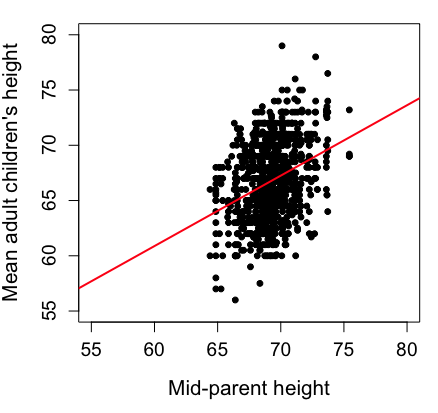
Figure 1. Scatterplot of mid-parent (vertical axis) and their adult children’s (horizontal axis) height, in inches. data from Galton’s 1885 paper, “Regression towards mediocrity in hereditary stature.” The red line is the linear regression fitted line, or “trend” line, which is interpreted in this case as the heritability of height.
The commands I used to make this plot were
library(HistData)
data(GaltonFamilies, package="HistData")
attach(GaltonFamilies)

plot(childHeight~midparentHeight, xlab="Mid-parent height", ylab="Mean adult children's height", xlim=c(55, 80), ylim=c(55,80), cex=0.8, cex.axis=1.2, cex.lab=1.3, pch=c(19), data=GaltonFamilies)
abline(lm(childHeight~midparentHeight), col="red", lwd=2)
I forced the plot function to use the same range of values, set by providing values for xlim and ylim; the default values of the plot command picks a range of data that fits each variable independently. Thus, the default X axis values ranged from 64 to 76 and the Y variable values ranged from 55 to 80. This has the effect of shifting the data, reducing the amount of white space, which a naïve reading of Tufte would suggest is a good idea, but at the expense of allowing the reader to see what would be the main point of the graph: that the children are, on average, shorter than the parents, mean height = 67 vs. 69 inches, respectively. Therefore, Galton’s title begins with the word “regression,” as in the definition of regression as a “return to a former … state” (Oxford Dictionary).
For completeness, cex sets the size of the points (default = 1), and therefore cex.axis and cex.lab apply size changes to the axes and labels, respectively; pch refers to the graph elements or plotting characters, further discussed below (see Figure 54); lm() is a call to the linear model function; col refers to color.
Figure 2 shows the same plot, but without attention to the axis scales.
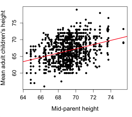
Figure 2. Same plot as Figure 1, but with default settings for axis scales.
Take a moment to compare the graphs in Figure 1 and 2. Setting the scales equal allows you to see that the mid-parent heights were less variable, between 65 and 75 inches, than the mean children height, which ranged from 55 to 80 inches.
And another example, Figure 3. This plot is from the ggplot2() function and was generated from within R Commander’s KMggplot2 plug-in.
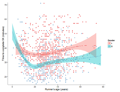
Figure 3. Finishing times in minutes of 1278 runners by age and gender at the 2013 Jamba Juice Banana 5K in Honolulu, Hawaii. Loess smoothing functions by groups of female (red) and male (blue) runners are plotted along with 95% confidence intervals.
Figure 3 is a busy plot. Because there were so many data points, it is challenging to view any discernible pattern, unlike Figure 1 and 2 plots, which featured less data. Use of the loess smoothing function, a transformation of the data to reduce data “noise” to reveal a continuous function, helps reveal patterns in the data:
- across most ages, men completed 5K faster than did females and
- there was an inverse, nonlinear association between runner’s age and time to complete the 5K race.
Take a look at the X-axis. Some runners ages were reported as less than 5 years old (trace the points down to the axis to confirm), and yet many of these youngsters were completing the 5K race in less than 30 minutes. That’s 6-minute mile pace! What might be some explanations for how pre-schoolers could be running so fast?
Design criteria
As in all plotting, maximize information to background. Keep white space minimal and avoid distorting relationships. Some things to consider:
- keep axes same length
- do not connect the dots UNLESS you have a continuous function
- do not draw a trend line UNLESS you are implying causation
Scatter plots in R
We have many options in R to generate scatter plots. We have already demonstrated use of plot() to make scatter plots. Here we introduce how to generate the plot in R Commander.
Rcmdr: Graphs → Scatterplot…
Rcmdr uses the scatterplot function from the car package. In recent versions of R Commander the available options for the scatterplot command are divided into two menu tabs, Data and Options, shown in Figure 4 and Figure 5.
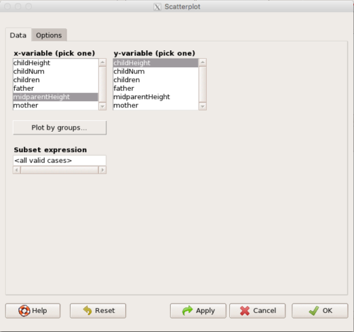
Figure 4. First menu popup in R Commander Scatterplot command, Rcmdr ver. 2.2-3.
Select X and Y variables, choose Plot by groups if multiple grounds are included, e.g., male, female, then click Options tab to complete.
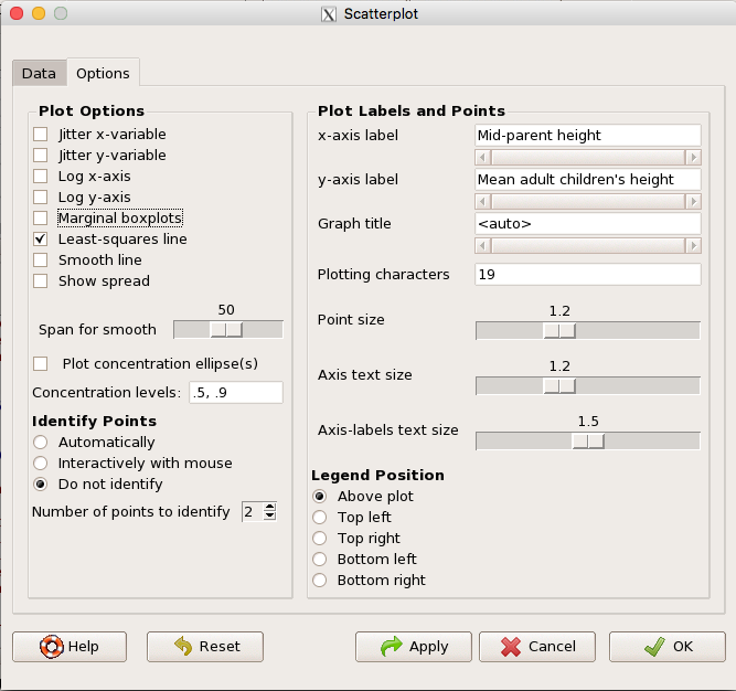
Figure 5. Second menu popup in R Commander scatterplot command., Rcmdr ver. 2.2-3
Set graph options including axes labels and size of the points.
Note 1. Lots of boxes to check and uncheck. Start by unchecking all of the Options and do update the axes labels (see red arrow in image). You can also manipulate the plot “points,” which R refers to as plotting characters (abbreviated pch in plotting commands). The “Plotting characters” box is shown as <auto>, which is an open circle. You can change this to one of 26 different characters by typing in a number between 0 and 25. The default used in Rcmdr scatterplot is “1” for open circle. I typically use “19” for a solid circle.
Here is another example using the default settings in scatterplot() function in the car package, now the default scatter plot command via R Commander (Fig. 4), along with the same graph, but modified to improve the look and usefulness of the graph (Fig. 6). The data set was Puromycin in the package datasets.
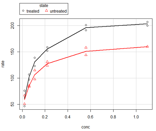
Figure 6. Default scatterplot, package car, from R Commander, version 2.2-4.
Grid lines in graphs should be avoided unless you intend to draw attention to values of particular data points. I prefer to position the figure legend within the frame of the graph, e.g., the open are at the bottom right of the graph. Modified graph shown in Figure 7.
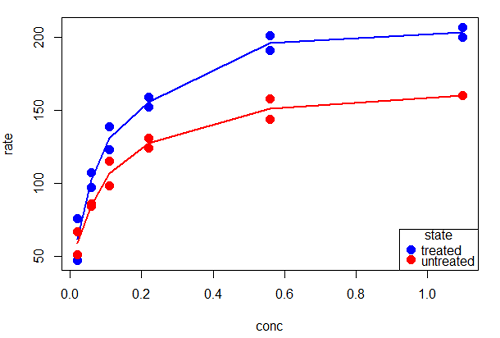
Figure 7. Modified scatterplot, same data from Figure 6
R commands used to make the scatter plot in Figure 7 were
scatterplot(rate~conc|state, col=c("blue", "red"), cex=1.5, pch=c(19,19),
bty="n", reg=FALSE, grid=FALSE, legend.coords="bottomright")
A comment about graph elements in R
In some ways R is too rich in options for making graphs. There are the plot functions in the base package, there’s lattice and ggplot2 which provide many options for graphics, and more. The advice is to start slowly, for example taking advantage of the Figure 8 displays R’s plotting characters and the number you would invoke to retrieve that plotting character.
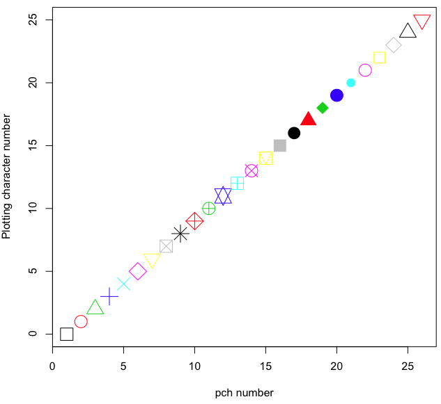
Figure 8. R plotting characters pch = 1 – 25 along with examples of color.
Note 2. To see available colors at the R prompt type
colors()
which returns 667 different colors by name, from
[1] "white" "aliceblue" "antiquewhite"
to
[655] "yellow3" "yellow4" "yellowgreen"
Note 3. There’s a lot more to R plotting. For example, you are not limited to just 25 possible characters. R can print any of the ASCII characters 32:127 or from the extended ASCII code 128:255. See Wikipedia to see the listing of ASCII characters.
Note 4. You can change the size of the plotting character with “cex.”
Here’s the R code used to generate the graph in Figure 8. Remember, any line beginning with # is a comment line, not an R command.
#create a vector with 26 numbers, from 0 to 25
stuff <-c(0:25)
plot(stuff, pch=c(32:58), cex = 2.5, col = c(1:26), 'xlab' = "pch number", 'ylab' = "Plotting character number")
Is it “scatter plot” or “scatterplot”?
Spelling matters, of course, and yet there are many words for which the correct spelling seems to be like “beauty,” it is in the eye of the beholder. Scatter plot is one of these — is it one word or two?
And I’m not just talking about the differences between British and American English for many words, as listed at web sites like http://www.tysto.com/uk-us-spelling-list.html. Scatter plot is one of these terms: you’ll find it spelled as “scatterplot” or as “scatter plot,” in the dictionary (e.g., Oxford English dictionary), with no guidance to choose between them.
The spell checkers in Microsoft Office and Google Docs do not flag “scatterplot” as incorrect, but the spell checker in LibreOffice Writer does.
Thus, in these situations as an author, you can turn to which of the spellings is in common use. I first looked at some of the statistics books on my shelves. I selected 14 (bio)statistics textbooks and checked the index and if present, chapters on graphics for term usage.
Table 1. Frequency of use of different terms for scatter plot in 14 (bio)statistics books currently on Mike’s shelves.
| spelling | number of statistical texts |
frequency |
|---|---|---|
| scatter diagram | 2 | 0.144 |
| scatter plot | 5 | 0.357 |
| scattergram | 1 | 0.071 |
| scatterplot | 5 | 0.357 |
| XY plot | 0 | 0.071 |
Not much help, basically, it is a tie between “scatter plot” and “scatterplot.”
Next, I searched six journals for the interval 1990 – 2016 for use of these terms. Results presented in Table 6 along with journal impact factor for 2014 and number of issues (Table 2).
Table 2. Impact factor and number of issues 1990 – 2016 for six science journals.
| Journal | Impact factor | Issues |
|---|---|---|
| The BMJ | 17.445 | 1374 |
| Ecology | 5.175 | 271 |
| J Exp Biol | 2.897 | 540 |
| Nature | 41.456 | 1454 |
| NEJM | 55.873 | 1377 |
| Science | 33.611 | 1347 |
My methods? I used the journal’s online search functions for the various usage for scatter plot and the results are shown in Figure 9.
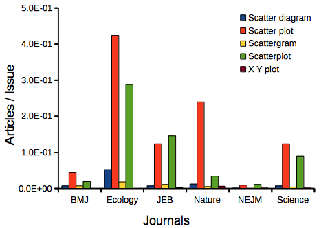
Figure 9. Usage of terms for X Y plots in research articles normalized to number of issues in six journals between 1990 and 2016.
The journals have different numbers of articles; I partially corrected for this by calculating the ratio number of articles with one of the terms divided by the number of issues for the interval 1990 – 2016. It would have been better to count all of the articles, but even I found that to be an excessive effort given the point I’m trying to make here.
Not much help there, although we can see a trend favoring “scatter plot” over any of the other options.
And finally, to completely work over the issue I present results from use of Google’s Ngram Viewer. Ngram Viewer allows you to search words in all of the texts that Google’s folks have scanned into digital form. I searched on the terms in texts between 1950 and 2015, and results are displayed in Figure 10 and Figure 11.
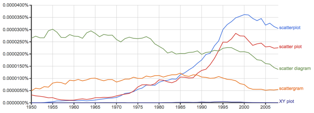
Figure 10. Results from Ngram Viewer for American English, “scatterplot” (blue), “scatter plot” (red), “scatter diagram” (green), “scattergram” (orange), and “XY plot” (purple).
And the same plot, but this time for British sources
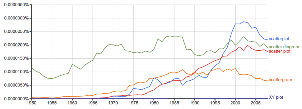
Figure 11. Results from Ngram Viewer for British English. See Figure 10 for key.
Conclusion? It looks like “scatterplot” (blue line) is the preferred usage, but it is close. Except for “scattergram” and “XY plot,” which, apparently, are rarely used. After all of this, it looks like you’re free to make your choice between “scatterplot” or “scatter plot.” I will continue to use “scatter plot.”
Questions
- Using our Comet assay data set (Table 1, Chapter 4.2), create scatter plots to show associations between tail length, tail percent, and olive moment.
- Explore different settings including size of points, amount of white area, and scale of the axes. Evaluate how these changes change the “story” told by the graph.
Chapter 4 contents