4.3 – Box plot
Introduction
Box plots, also called whisker plots, should be your routine choice for exploring ratio scale data. Like bar charts, box plots are used to compare ratio scale data collected for two or more groups. Box plots serve the same purpose as bar charts with error bars, but box plots provide more information.
Purpose and design criteria
Box plots are useful tool for getting a sense of central tendency and spread of data. These types of plots are useful diagnostic plots. Use them during initial stages of data analyses. All summary features of box plots are based on ranks (not sums). So, they are less sensitive to extreme values (outliers). Box plots reveal asymmetry. Standard deviations are symmetric.
The median splits each batch of numbers in half (center line). The “hinge” (median value) splits the remaining halves in half again (the quartiles). The first, second (median), and third quartiles describes the interquartile range, or IQR, 75% of the data (Fig 1). Outlier points can be identified, for example, with an asterisk or by id number (Fig 1).
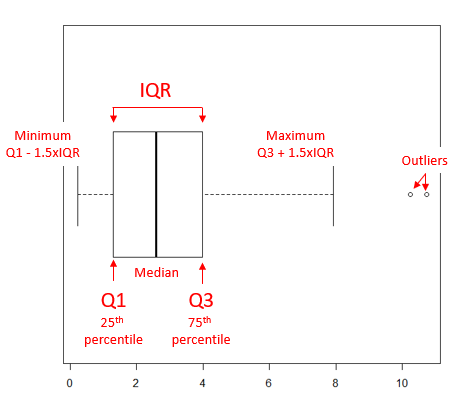
Figure 1. A box plot. Elements of box plot labelled.
We’ll use the data set described in the previous section, so if you have not already done so, get the data from Table 1, Chapter 4.2 into your R software.
Note 1: See Chapter 4.10 — Graph software for additional box plot examples, but made with different R packages or software apps.
R Code
Command line
We’ll provide code for the base graph shown in Figure 2A. At the R prompt, type
boxplot(OliveMoment~Treatment)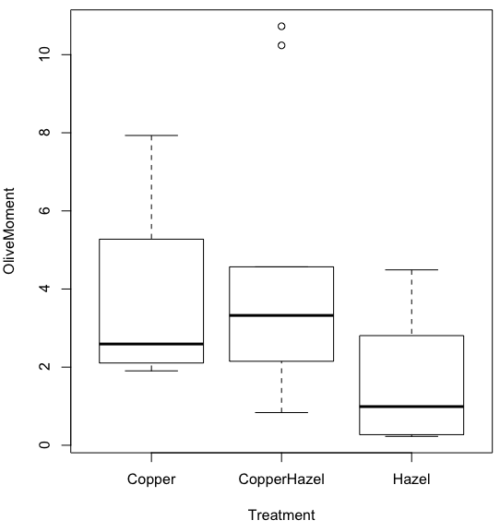
Figure 2A. Box plot, default graph in base package
Boxplot is a common function offered in several packages. In the base installation of R, the function is boxplot(). The car package, which is installed as part of R Commander installation, includes Boxplot(), which is a “wrapper function” for boxplot(). Note the difference: base package is all lower case, car package the “B” is uppercase. One difference, base boxplot() permits horizontal orientation of the plot (Fig 2B).
Note 2: Wrapper functions are code that links to another function, perhaps simplifying working with that function.
boxplot(OliveMoment ~ Treatment, horizontal=TRUE, col="steelblue")

Figure 2B. Same graph, but with color and made horizontal; boxplot(), default graph in base package
Base package boxplot() has additional features and options compared to Note 3: Boxplot() in the car package. i.e., not all barcode() options are wrapped. For example, I had more success adding original points to boxplot() graph (Fig 2C) following the function call with stripchart().
stripchart(OliveMoment ~ Treatment, method = "overplot", pch = 19, add = TRUE)
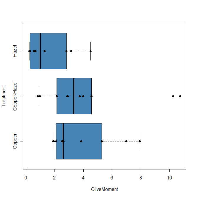
Figure 2C. Same graph, added original points; boxplot(), default graph in base package.
Note 3: boxplot and stripchart functions part of ggplot2 package, part of tidyverse, easily used to generate graphs like Fig 2B and Fig 2C. The overplot option was used to jitter points to avoid overplotting. See below: Apply tidyverse-view to enhance look of boxplot graphic and Fig 9.
Jittering adds random noise to points, which helps view the data better if many points are clustered together. Note however that jitter would add noise to the plot — if the objective is to show an association between two variables, jitter will reduce the apparent association, perhaps even compromising the intent of the graph. Beeswarm also can be used to better visualize clustered points, but uses a nonrandom algorithm to plot points.
Rcmdr: Graph → Boxplot…
Select the response variable, then click on the Plot by: button
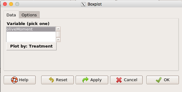
Figure 3. Popup menu in R Commander: Select the response variable and set the Plot by: option.
Next, select the Groups (Factor) variables (Fig 4). Click OK to proceed
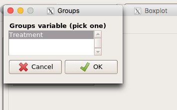
Figure 4. Select the group variable
Back to the Box Plot menu, click “Options” tab to add details to the plot, including a graph title and how outliers are noted (Fig 5),
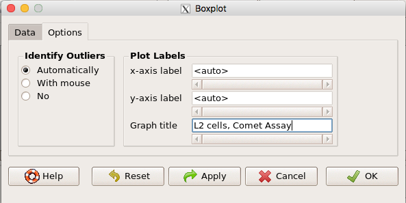
Figure 5. Options tab, enter labels for axes and a title.
And here is the resulting box plot (Fig 6)
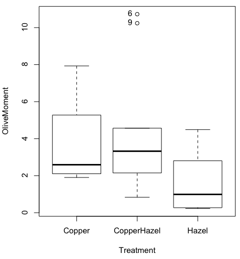
Figure 6. Resulting box plot from car package implemented in R Commander. Outliers are identified by row id number.
The graph is functional, if not particularly compelling. The data set was “olive moments” from Comet Assays of an immortalized rat lung cell line exposed to dilute copper solution (Cu), Hazel tea (Hazel), or Hazel & Copper solution.
Apply Tidyverse-view to enhance look of boxplot graphic
Load the ggplot2 package via the Rcmdr plugin to add options to your graph. As a reminder, to install Rcmdr plugins you must first download and install them from an R mirror like any other package, then load the plugin via Rcmdr Tools → Load Rcmdr plug-in(s)… (Fig 7, Fig 8).
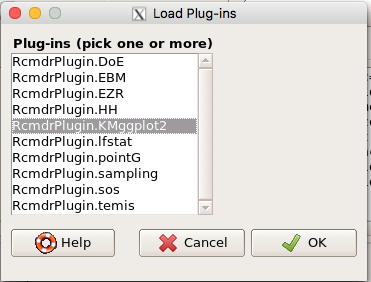
Figure 7. Screen shot of Load Rcmdr plug-ins menu, Click OK to proceed (see Fig 8).
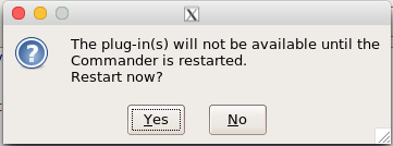
Figure 8. To complete installation of the plug-in, restart R Commander.
Significant improvement, albeit with an “eye of the beholder” caveat, can be made over the base package. For example, ggplot2 provides additional themes to improve on the basic box plot. Figure 8 shows the options available in the Rcmdr plugin KMggplot2, and the default box plot is shown in Fig 9.
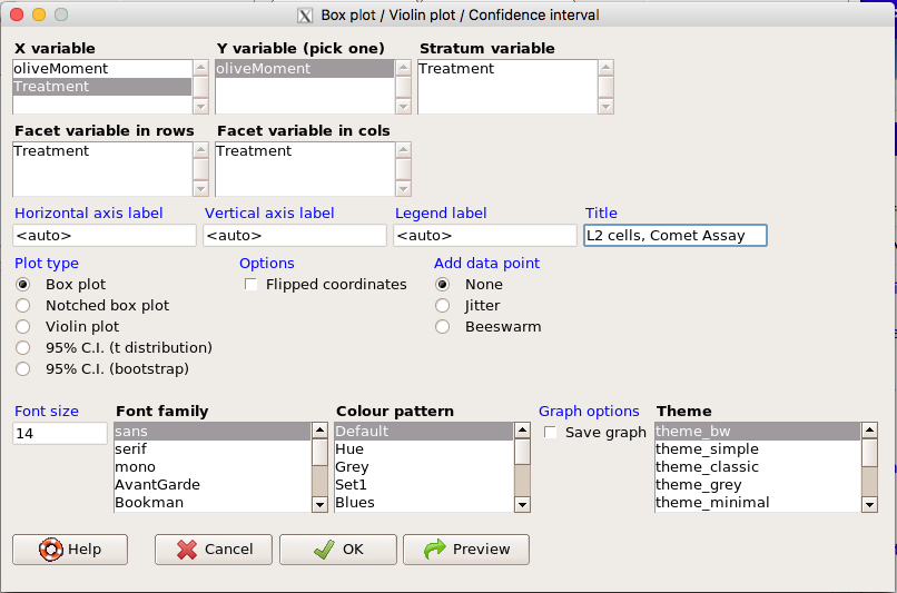
Figure 9. Menu of KMggplot2. A title was added, all else remained set to defaults.
The next series of plots, Fig 10 – 12, explore available formats for the charts.
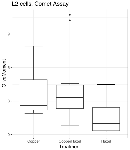
Figure 10. Default box plot from KMggplot.
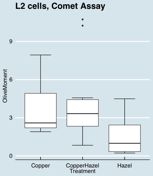
Figure 11. “Economist” theme box plot from KMggplot2.
And finally, since the box plot is often used to explore data sets, some recommend including the actual data points on a box plot to facilitate pattern recognition. This can be accomplished in the KMggplot2 plugin by checking “Jitter” under the Add data points option (see Fig 8). Jitter helps to visualize overlapping points at the expense of accurate representation. I also selected the Tufte theme, which results in the image displayed in Figure 12.
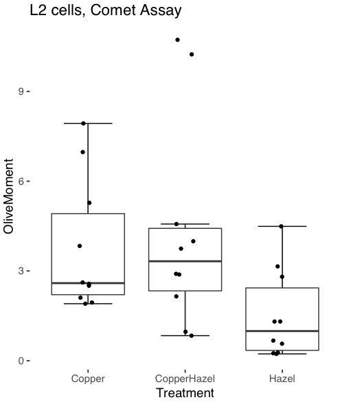
Figure 12. Tufte theme and data points added to the box plot.
Note 4: The Tufte theme is so named for Edward Tufte (2001), Chapter 6 Data-Ink Maximization and Graphical Design.” In brief, the theme follows the “maximal data, minimal ink” principle.
Conclusions
As part of your move from the world of Microsoft Excel graphics to recommended graphs by statisticians, the box plot is used to replace the bar charts plus error bars that you may have learned in previous classes. The second conclusion? I presented a number of versions of the same graph, differing only by style. Pick a style of graphics and be consistent.
Questions
- Why is a box plot preferred over a bar chart for ratio scale data, even if an appropriate error bar is included?
- With your comet data (Table 1, Chapter 4.2), explore the different themes available in the box plot commands available to you in Rcmdr. Which theme do you prefer and why?
Quiz Chapter 4.3
Box plots