4 – How to report statistics
Introduction: Reporting your results.
While you are thinking about exploring data sets and descriptive statistics, please review our overview of data analysis (Chapter 2.4 and 2.5). While the scientific hypotheses come first, how experiments are designed should allow for straight-forward analysis: in other words, statistics can’t rescue poorly designed experiments, nor can it reveal new insight after the fact.
Once the experiments are completed, all projects will go through a similar process:
- Description: Describe and summarize the results.
- Check assumptions.
- Inference: conduct tests of hypotheses.
- Develop and evaluate statistical models.
Clearly this is a simplification, but there’s an expectation your readers will have about a project. Basic questions like how many subjects got better on the treatment? Is there an association between Body Mass Index (BMI) and the primary outcome? Did male and female subjects differ for response to the treatment? Undoubtedly these and related questions form the essence of the inferences, but providing graphs to show patterns may be as important to a reader as any p-value — a number which describes how likely it is that your data would have occurred by chance — eg, from an Analysis of variance.
Each project is unique — sorry, what a breathtakingly obvious statement — but what elements must be included in a results section?
Data visualization.
We describe data in three ways: graphs, tables, and in sentences. In this page we present the basics of when to choose a graph over presenting data in a table or as a series of sentences (ie, text). In the rest of this chapter we introduce the various graphics we will encounter in the course. Chapter 4 covers eight different graphics, but is by no means an exhaustive list of kinds of graphs. Phylogenetic network graphs are presented in Chapter 20.11. Although an important element of presentation in journal articles, we don’t discuss figure legends or table titles; guidelines are typically available by the journal of choice (eg, PLOS ONE journals guidelines).
A quick note about terminology. Data visualization encompasses charts, graphs and plots. Of the three terms, chart is the more generic. Graphs are used to display a function or mapping between two variables; plots are kinds of graphs for a finite set of points. There is a difference among the terms, but I confess, I won’t be consistent. Instead, I will refer to each type of data visualization by its descriptive name: bar chart, box plots, histograms, scatter plot, etc. Note that technically, a scatter plot can refer to a graph, eg, a line drawn to reflect a linear association between the two variables, whereas bar charts and box plots would not be a graph because no function is implied.
Why display data?
Do we just to show a graph to break the monotony of page after page of text or do we attempt to do more with graphs? After all, isn’t “a picture’s worth a thousand words?” In many cases, yes! Graphics allow us to see patterns. Data visualization is a key part of exploratory data analysis (Tukey 1977), or data mining in the parlance of big data (Keim 2001). Data visualization is also a crucial tool in the public health arena, and finding effective graphics to communicate, at times, complex data and information to both public and professional audiences can be challenging (see discussion in Meloncon and Warner 2017).
Graphics are complicated — all the interplay among pixels etc and rendering process — and expensive to do well. Text is much cheaper to publish, even in digital form. But the ability to visualize concepts, that is, to connect ideas to data through our eyes (see Wikipedia), seems to be more the cognitive goal of graphics. Lofty purpose, desirable goal. Yes, it is true that graphics can communicate concepts to the reader, but with some caution. Images distort, and default options in graphics programs are seldom acceptable for conveying messages without bias (Glazer 2011).
Here’s some tips from a book on graphical display (Tufte 1983; see also Camões 2016).
Your goal is to communicate complex ideas with clarity, precision, and efficiency. Graphical displays should:
- show the data
- avoid distorting the data
- present numbers in a small space
- help the viewer’s eye to compare different pieces of data
- serve a clear purpose (description, exploration, tabulation, decoration)
- be closely integrated with statistical and verbal descriptions of a data set.
We accomplish these tasks by following general principles involving scale and a commitment to avoiding bias in our presentation.
Importantly, graphs can show patterns not immediately evident in tables of numbers. See Table 1 for an example of a dataset, “Anscombe’s quartet,” (Anscombe 1973), where a picture is clearly helpful.
Anscombe’s quartet
| X | Y1 | Y2 | Y3 | Y4 |
|---|---|---|---|---|
| 10 | 8.04 | 9.14 | 7.46 | 6.58 |
| 8 | 6.95 | 8.14 | 6.77 | 5.76 |
| 13 | 7.58 | 8.74 | 12.74 | 7.71 |
| 9 | 8.81 | 8.77 | 7.11 | 8.84 |
| 11 | 8.33 | 9.26 | 7.81 | 8.47 |
| 14 | 9.96 | 8.10 | 8.84 | 7.04 |
| 6 | 7.24 | 6.13 | 6.08 | 5.25 |
| 4 | 4.26 | 3.10 | 5.39 | 12.50 |
| 12 | 10.84 | 9.13 | 8.15 | 5.56 |
| 7 | 4.82 | 7.26 | 6.42 | 7.91 |
| 5 | 5.68 | 4.74 | 5.73 | 6.89 |
| Mean (±SD) | 7.50 (2.032) | 7.50 (2.032) | 7.50 (2.032) | 7.50 (2.032) |
The Anscombe dataset is also available in R packages data(Anscombe, package="carData"), or you can copy/paste from Table 1 into a spreadsheet or text file, then load the data file into R (eg, Rcmdr → Load data set). Note that the data set does not include the column summary statistics shown in the last row of the table.
Before proceeding, look again at the table — See any patterns in the table?
Maybe.… Need to be careful as we humans are really good at perceiving patterns, even when no pattern exists.
Now, look just at the last row in the table, the row containing the descriptive statistics (the means and standard deviations). Any patterns?
The means and standard deviations are the same, so nothing really jumps out at you — does that mean that there are no differences among the columns then?
But let’s see what the scatter plots look like before we conclude that the columns of Y ’s are the same (Fig. 1). I’ll also introduce the R package clipr, which is useful for working with your computer’s clipboard.
Note 1: To show clipboard history, on Windows press + V; on macOS, open Finder and select Edit → Show Clipboard.
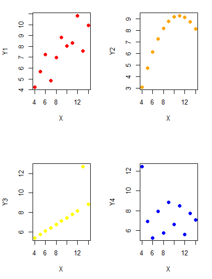
Figure 1. Scatter plot graphs of Anscombe’s quartet (Table 1)
#R code for Figure 1.

require(clipr)
#Copy from the Table and paste into spreadsheet (exclude last row). Highlight and copy data in spreadsheet
myTemp <- read_clip_tbl(read_clip(), header=TRUE, sep = "\t")
#Check that the data have been loaded correctly
head(myTemp)
#attach the data frame, so don't have to refer to variables as myTemp\$variable name
attach(myTemp)
#set the plot area for 4 graphs in 2X2 frame
par(mfrow=c(2,2))
plot(X, Y1, pch=19, col="red", cex=1.2)
plot(X, Y2, pch=19, col="orange",cex=1.2)
plot(X, Y3, pch=19, col="yellow",cex=1.2)
plot(X, Y4, pch=19, col="blue",cex=1.2)
And now we can see that the Y ‘s have different stories to tell. While the summary (descriptive) statistics are the same, the patterns of the association between Y values and the X variable are qualitatively different: Y1 is linear, but diffuse; Y2 is nonlinearly associated with X; Y3, like Y1, is linearly related to X, but one data point seems to be an outlier; and for Y4 we see a diffuse nonlinear trend and an outlier.
So, that’s the big picture here. In working with data, you must look at both ways to “see” data — you need to make graphs and you also need to calculate basic descriptive statistics.
And as to the reporting of these results, sometimes Tables are best (i.e., so others can try different statistical tests), but patterns can be quickly displayed with carefully designed graphs. Clearly, in this case, the graphs were very helpful to reveal trends in the data.
When to report numbers in a sentence? In a table? In a graph?
The choice depends on the message. Usually you want to make a comparison (or series of comparisons). If you are reporting one or two numbers in a comparison, a sentence is fine. “The two feral goat populations had similar mean numbers (120 vs. 125) of kids each breeding period.” If you have only a few comparisons to make, the text table is useful:
Table 2. Data from Kipahoehoe Natural Area Reserve, SW slope of Mauna Loa.
| Location | Number of kids |
|---|---|
| Outside fence | |
| kīpuka | 51 |
| other | 120 |
| Inside fence | |
| kīpuka | 3 |
To conclude, tables are the best way to show exact numbers and tables are preferred over graphs when many comparisons need to be made.
Note 2: A kīpuka is a land area surrounded by recent lava flows. This was a real data set, but I’ve misplaced the citation!
Couldn’t I use a pie chart for this?
Yes, but I will try and persuade you to not. Pie charts are used to show part-whole relationships. If there are just a few groups, and if we don’t care about precise comparisons, pie charts may be effective. Some good examples are Figure 1 O’Neill et al 2020,
Sometimes, people use pie charts for very small data sets (comparing two populations, or three categories, for example). These work well, but as we increase the number of categories, the graphic likely requires additional labels and remarks to clarify the message. The problem with pie charts is that they require interpretation of the angles that define the wedges, so we can’t be very precise about that. Bar charts are much better than pie charts — but can also suffer when many categories are used (Chapter 4.1).
To illustrate the problem, here’s a couple of pie charts from Microsoft Excel (a similar chart can be made with LibreOffice Calc) for our goat data set; compare this graph to the table and to the bar chart below (Fig 2).
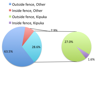
Figure 2. Excel pie chart of Table 2 data set.
A bar chart of the same data (Fig 3).
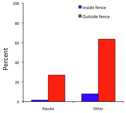
Figure 3. Bar chart of Table 2 data set
The bar chart (Fig 3) is easier to get the message across; more goat kids were found outside the fenced area then inside the fenced in areas. We can also see that more goat kids were found in the “other” areas compared to the kipuka. The pie chart (Fig 2) in my opinion fails to communicate these simple comparisons, conclusions about patterns in the data that clearly would be the take-home message from this project. Aesthetically the bar chart could be improved — a mosaic plot would work well to show the associations in the project results (See Ch 4.4 Mosaic plots). Furthermore, a strong case can be made that the bar chart is over kill — after all, there’s only the four points to show.
Note 3: A much better graph would include the actual counts, eg, a box plot as discussed in Chapter 4.3.
But we are not done with this argument, to use graphics or text to report results. Neither the bar chart (mosaic plot) or the pie chart really work. The reader has to interpret the graphics by extrapolating to the axes to get the numbers. While it may be boring — 1.5 million hits Google search “data tables” boring — tables can be used for comparisons and make the patterns more clear and informative to the reader. Here’s a different version of the table to emphasize the influence of fencing on the goat population.
Table 3. Revised Table 2 to emphasize comparisons between inside and outside the fence line on feral goat population on Mauna Loa.
| Location | Kīpuka | Other |
|---|---|---|
| Outside fence | 51 | 120 |
| Inside fence | 3 | 15 |
Table 3 would be my choice — over a sentence and over a graph. At a glance I can see that more goat kids were found outside of the fenced area, regardless of whether it was in a kipuka or some other area on the mountain side. Table 3 is an improvement over Table 2 because it presents the comparisons in a 2 X 2 format — especially useful when we have a conditional set.
For example, it’s useful to show the breakdown of voting results in tables (numbers of votes for different candidates by voters party affiliation, home district, sex, economic status, etc.). Interested readers can then scan through the table to identify the comparison they are most interested in. But often, a graph is the best choice to display information. One final point, by judiciously combining words, numbers, and images, you should be able to convey even the most complex information in a clear manner! We will not spend a lot of time on these issues, but you will want to pay some attention to these points as you work on your own projects.
Some final comments about how to present data.
What your graph looks like is up to you, lots of people have advice (eg, Klass 2012). But we all know poor graphs when we see them in talks or in papers; we know them when we struggle to make sense of the take-home message. We know them when we feel like we’re missing the take-home message.
Here’s my basic, very subjective take on communicating information with graphics — aka a grammar of graphics, sensu Tufte 2001, and Wilkinson 2005.
- Always include proper labeling: axes, units, legends, and captions.
- Minimize white space (for example, the scatter plots above could be improved simply by increasing the point size of the data points)
- Yes, minimize white space, but always respect the scale, particularly when comparisons are intended.
- Avoid bar charts for comparisons if you are trying to compare more than about three or four things.
- Use color sparingly and with intention: a consistent palette distinguishes groups.
- Avoid overly simple graphs with just a handful of points or bars. Just write it up!
- A graphic in a science report that is worth “a thousand words” probably is too complicated, too much information, and, very likely, whatever message you are trying to convey is better off in the text.
Clever graphics may be visually stunning and, perhaps, serve well to advertise the take home message, but likely they need to be accompanied by a sophisticated text as guide to those take home messages.
Homework to go with this topic.
Homework 2B: Graphs in Mike’s Workbook for biostatistics.
Quiz
In addition to ten general questions in quiz-form about this page contents, a total of 94 questions among the several subchapters, a mix of true or false and multiple choice question format.
Quiz Chapter 4
How to report statistics
Chapter 4 contents