4.2 – Histograms
Introduction
Displaying interval or continuously scaled data. A histogram (frequency or density distribution), is a useful graph to summarize patterns in data, and is commonly used to judge whether or not the sample distribution approximates a normal distribution. Three kind of histograms, depending on how the data are grouped and counted. Lump the data into sequence of adjacent intervals or bins (aka classes), then count how many individuals have values that fall into one of the bins — the display is referred to as a frequency histogram. Sum up all of the frequencies or counts in the histogram and they add to the sample size. Convert from counts to percentages, then the heights of the bars are equal to the relative frequency (percentage) — the display is referred to as a percentage histogram (aka relative frequency histogram). Sum up all of the bin frequencies and they equal one (100%).
Figure 1 shows two frequency histograms of the distribution of ages for female (left panel) and male (right panel) runners at the 2013 Jamba Juice Banana 5K race in Honolulu, Hawaii (link to data set).
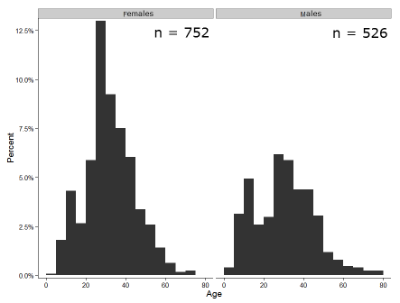
Figure 1. Histograms of age distribution of runners who completed the 2103 Jamba Juice 5K race in Honolulu
The graphs in Fig 1 were produced using R package ggplot2.
The third kind of histogram is referred to as a probability density histogram. The height of the bars are the probability densities, generally expressed as a decimal. The probability density is the bin probability divided by the bin width (size). The area of the bar gives the bin probability and the total area under the curve sums to one.
Which to choose? Both relative frequency histogram and density histogram convey similar messages because both “sum to one (100%), i.e., bin width is the same across all intervals. Frequency histograms may have different bin widths, with more numerous observations, the bin width is larger than cases with fewer observations.
Purpose of the histogram plot
The purpose of displaying the data is to give you or your readers a quick impression of the general distribution of the data. Thus, from our histogram one can see the range of the data and get a qualitative impression of the variability and the central tendency of the data.
Kernel density estimation
Kernel density estimation (KDE) is a non-parametric approach to estimate the probability distribution function. The “kernel” is a window function, where an interval of points is specified and another function is applied only to the points contained in the window. The function applied to the window is called the bandwidth. The kernel smoothing function then is applied to all of the data, resulting in something that looks like a histogram, but without the discreteness of the histogram.
The chief advantage of kernel smoothing over use of histograms is that histogram plots are sensitive to bin size, whereas KDE plot shape are more consistent across different kernel algorithms and bandwidth choices.
Today, statisticians use kernel smoothing functions instead of histograms; these reduce the impact that binning has on histograms, although kernel smoothing still involves choices (smoothing function? default is Gaussian. Widths or bandwidths for smoothing? Varies, but the default is from the variance of the observations). Figure 2 shows smoothed plot of the 752 age observations.
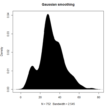
Figure 2. KDE plot of age distribution of female runners who completed the 2103 Jamba Juice 5K race in Honolulu.
Note 1: Remember: the hashtag # preceding R code is used to provide comments and is not interpreted by R
R commands typed at the R prompt were, in order
d <- density(w) #w is a vector of the ages of the 752 females
plot(d, main="Gaussian smoothing")
polygon(d, col="black", border="black") #col and border are settings which allows you to color in the polygon shape, here, black with black border.
Conclusion? A histogram is fine for most of our data. Based on comparing the histogram and the kernel smoothing graph I would reach the same conclusion about the data set. The data are right skewed, maybe kurtotic (peaked), and not normally distributed (see Ch 6.7).
Design criteria for a histogram
The X axis (horizontal axis) displays the units of the variable (e.g., age). The goal is to create a graph that displays the sample distribution. The short answer here is that there is no single choice you can make to always get a good histogram — in fact, statisticians now advice you to use a kernel function in place of histograms if the goal is to judge the distribution of samples.
For continuously distributed data the X-axis is divided into several intervals or bins:
- The number of intervals depends (somewhat) on the sample size and (somewhat) on the range of values. Thus, the shape of the histogram is dependent on your choice of intervals: too many bins and the plot flattens and stretches to either end (over smoothing); too few bins and the plot stacks up and the spread of points is restricted (under smoothing). For both you lose the
- A general rule of thumb: try to have 10 to 15 different intervals. This number of intervals will generally give enough information.
- For large sample size (N=1000 or more) you can use more intervals.
The intervals on the X-axis should be of equal size on the scale of measurement.
- They will not necessarily have the same number of observations in each interval.
- If you do this by hand you need to first determine the range of the data and then divide this number by the number of categories you want. This will give you the size of each category (e.g., range is 25; 25 / 10 = 2.5; each category would be 2.5 unit).
For any given X category the Y-axis then is the Number or Frequency of individuals that are found within that particular X category.
Software
Rcmdr: Graphs → Histogram…
Accepting the defaults to a subset of the 5K data set we get (Fig 3)
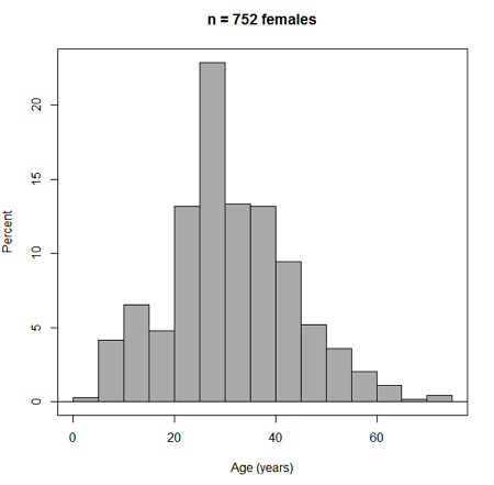
Figure 3. Histogram of 752 observations, Sturge’s rule applied, default histogram
The subset consisted of all females or n = 752 that entered and finished the 5K race with an official time.
R Commander plugin KMggplot2
Install the RcmdrPlugin.KMggplot2as you would any package in R. Start or restart Rcmdr and load the plugin by selecting Rcmdr: Tools → Load Rcmdr plug-in(s)… Once the plugin is installed select Rcmdr: KMggplot2 → Histogram… The popup menu provides a number of options to set to format the image. Settings for the next graph were No. of bins “Scott,” font family “Bookman,” Colour pattern “Set 1,” Theme “theme_wsj2.”
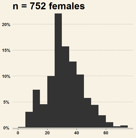
Figure 4. Histogram of 752 observations, Scott’s rule applied, ggplot2 histogram
Selecting the correct bin number
You may be saying to yourself, wow, am I confused. Why can’t I just get a graph by clicking on some buttons? The simple explanation is that the software returns defaults, not finished products. It is your responsibility to know how to present the data. Now, the perfect graph is in the eye of the beholder, but as you gain experience, you will find that the default intervals in R bar graphs have too many categories (recall that histograms are constructed by lumping the data into a few categories, or bins, or intervals, and counting the number of individuals per category => “density” or frequency). How many categories (intervals) should we use?
Figure 5. Default histogram with different bin size.
R’s default number for the intervals seems too much to me for this data set; too many categories with small frequencies. A better choice may be around 5 or 6. Change number of intervals to 5 (click Options, change from automatic to number of intervals = 5). Why 5? Experience is a guide; we can guess and look at the histograms produced.
Improving estimation of bin number
I gave you a rough rule of thumb. As you can imagine there have been many attempts over the years to come up with a rational approach to selecting the intervals used to bin observations for histograms. Histogram function in Microsoft’s Excel (Data Analysis plug-in installed) uses the square root of the sample size as the default bin number. Sturge’s rule is commonly used, and the default choice in some statistical application software (e.g., Minitab, Prism, SPSS). Scott’s approach (Scott 2009), a modification to Sturge’s rule, is the default in the ggplot() function in the R graphics package (the Rcmdr plugin is RcmdrPlugin.KMggplot2). And still another choice, which uses interquartile range (IQR), was offered by Freedman and Diacones (1981). Scargle et al (1998) developed a method, Bayesian blocks, to obtain optimum binning for histograms of large data sets.
What is the correct number of intervals (bins) for histograms?
- Use the square root of the sample size, e.g., at R prompt sqrt∗n∗ = 4.5, round to 5). Follow Sturges’ rule (to get the suggested number of intervals for a histogram, let k = the number of intervals, and k = 1 + 3.322(log10n),
- where n is the sample size. I got k = 5.32, round to nearest whole number = 5).
- Another option was suggested by Freedman and Diacones (1981): find IQR for the set of observations and then the solution to the bin size is k = 2IQRn-1/3, where n is the sample size.
Select Histogram Options, then enter intervals. Here’s the new graph using Sturge’s rule…
Figure 6. Default histogram, bin size set by Sturge’s rule.
OK, it doesn’t look much better. And of course, you’ll just have to trust me on this — it is important to try and make the bin size appropriate given the range of values you have in order that the reader/viewer can judge the graphic correctly.
Two histograms on same plot
In many cases you may wish to compare sample distributions among two or more groups.
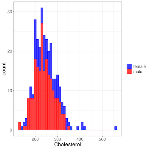
Figure 7. Two histograms on same plot with ggplot2.
R code
Stacked data set, data from Kaggle.
myColors=c(female="blue", male="red")
ggplot(sexChol, aes(chol, fill = sex, color=sex)) +
  geom_histogram(binwidth = 10, alpha=0.75) +
  labs(x = "Cholesterol") +
  theme_bw() +
  theme(legend.title= element_blank(),legend.text=element_text(size=14),
     axis.text=element_text(size=14),axis.title=element_text(size=18)) +
  scale_color_manual(values=myColors) +
  scale_fill_manual(values=myColors)
Base graphics version
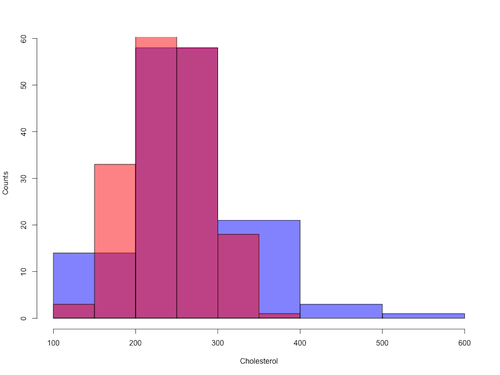
Figure 8. Same data as Fig 7, but using base hist() and plot() functions.
Not an aesthetically pleasing graph (Fig 8), but the idea was to recreate Figure 7 and show regions of overlap. We do this by setting transparent colors (h/t DataAnalytics.org.uk).
First, pick you colors. I like blue and red. Next, we identify how the colors are declared in the three rgb channels. Use the col2rgb() function.
col2rgb("blue")
[,1]
red 0
green 0
blue 255
Create my transparent blue with the alpha setting (125 = 50%). Note the command asks for names, but we won’t use it further.
myBlue <- rgb(0, 0, 255, max = 255, alpha = 125, names = "blue50")
Repeat for 50% transparent red.
col2rgb("red")
[,1]
red 255
green 0
blue 0
myRed <- rgb(255, 0, 0, max = 255, alpha = 125, names = "red50")
Now, we make the plots. Data unstacked, a column with cholesterol values for females (fChol), and another for male cholesterol values mChol). Bin size is different from Figure 7.
hist1 <- hist(fChol, breaks=6, plot=FALSE)
hist2 <- hist(mChol, add=T, breaks=6, plot=FALSE)
Open a Graphics Device so that we can save image to png format. I’ve set width and height in numbers of pixels.
png("base_histograms_two_chol.png", width = 800, height = 600)
Make the graph
plot(hist1, col = myBlue, main="", xlab="Cholesterol", ylab="Counts")
plot(hist2, col = myRed, add = TRUE)
Close the device, the image file is saved to working folder.
dev.off()
Draw region on a histogram
From time to time it may be necessary to highlight a region on a histogram (eg., see Chapters 6.7 – Normal distribution and the normal deviate (Z) and 8 – Inferential statistics). Various solutions to this, but here’s example code using only base R graph options.
First, generate some data from a normal distribution with mean 50 and standard deviation of 10. We show two examples: highlight regions between 40 and 60, and highlight regions
set.seed(123)
data <- rnorm(1000, mean = 50, sd = 10)
As always, a good idea to view at least a portion of the data, stored in object data.
head(data)
R returns
[1] 44.39524 47.69823 65.58708 50.70508 51.29288 67.15065
Next, create the histogram. It’s a good idea to set plot = FALSE, which prevents immediate plotting.
h <- hist(data, breaks = 20, plot = FALSE)
plot(h, main = "Histogram with Highlighted Regions",
     xlab = "Value", ylab = "Frequency")
And last, as the goal was to highlight a region from 40 to 60, we set color to red and impose 30% transparency, no border. The plot is shown in Figure 9.
rect(xleft = 40, ybottom = 0, xright = 60, ytop = max(h$counts),
col = rgb(1, 0, 0, 0.3), border = NA)

Figure 9. Using only base R graphics, a lot with region between 40 and 60 highlighted in red.
The second example, we highlight another region from 70 to 80 in blue, and this time 50% transparency, no border.
rect(xleft = 70, ybottom = 0, xright = 80, ytop = max(h$counts),
col = rgb(0, 0, 1, 0.5), border = NA)
Other options
The base graphs are OK for teaching purposes (and homework answers!), but not examples of data visualization excellence. As part of the tidyverse approach to R programming, ggplot2 includes options to accomplish highlighting regions on plots, including histograms.To draw regions on a histogram plot using ggplot2 in R, you can use geom_rect() or geom_ribbon(). geom_rect() is a good choice to highlight a specific rectangular areas; geom_ribbon() is useful for shading areas under a curve, such as a density plot overlaid on a histogram.

Figure 10. Using geom_ribbon() and ggplot2 package, a plot with region between 40 and 60 highlighted in red.
R code with # comments was:
set.seed(123)
data_normal <- data.frame(rnorm(1000, mean = 50, sd = 10))
# View the dataframe
head(data_normal)
# Output shows need to rename the column.
colnames(data_normal) <- "value"
Note 2: If you use R Commander: Distributions > Continuous distributions > Normal distribution > Sample from normal, the column name will be updated for you. The name will be “obs,” not “value,” however, so where the following code asks for value, replace with obs.
Get the histogram. first, create the plot object, but don’t draw it yet.
myPlot <- ggplot(data_normal, aes(x = value)) +
geom_histogram(bins = 30)
Next, use ggplot_build to extract the bin data.
bin_data <- ggplot_build(myPlot)$data[[1]]
Create a new data frame for the geom_ribbon layer. The ribbon needs x, ymin, and ymax values.
ribbon_data <- bin_data
Set ymin to 0 for the shaded area.
ribbon_data$ymin <- 0
Next, set ymax to the height of the bars (the ‘count’ or ‘y’ column from bin_data).
ribbon_data$ymax <- ribbon_data$count
Filter the ribbon data so that only the region between 40 and 60 is included.
ribbon_data <- ribbon_data[ribbon_data$x >= 40 & ribbon_data$x <= 60, ]
Plot with both layers. Draw the main histogram first (optional: fill to distinguish). Overlay the shaded region using geom_ribbon with the filtered data. Add axes labels. I selected the classic theme; try other themes on your own.
ggplot(data_normal, aes(x = value)) +
     geom_histogram(aes(y = after_stat(count)),
     bins = 30, fill = "lightblue", color = "white") +
     geom_ribbon(data = ribbon_data, aes(x = x,
     ymin = ymin, ymax = ymax), fill = "red",
     alpha = 0.5) +
     labs(x = "Value",y = "Count") +
     theme_classic()
A package tigerstats, now removed from CRAN, was a nice set of tools to accomplish adding regions to a histogram plot with base R graphics. I leave an example which was used to draw regions on a standard normal curve for Chapter 8.
library(tigerstats)
pnormGC(1.645, region="above", mean=0, sd=1,graph=TRUE)
pnormGC(-1.645, region="below", mean=0, sd=1,graph=TRUE)
Questions
Example data set, comet tails and tea

Figure 11. Examples of comet assay results.
The Comet assay, also called single cell gel electrophoresis (SCGE) assay, is a sensitive technique to quantify DNA damage from single cells exposed to potentially mutagenic agents. Undamaged DNA will remain in the nucleus, while damaged DNA will migrate out of the nucleus (Figure 11). The basics of the method involve loading exposed cells immersed in low melting agarose as a thin layer onto a microscope slide, then imposing an electric field across the slide. By adding a DNA selective agent like Sybr Green, DNA can be visualized by fluorescent imaging techniques. A “tail” can be viewed: the greater the damage to DNA, the longer the tail. Several measures can be made, including the length of the tail, the percent of DNA in the tail, and a calculated measure referred to as the Olive Moment, which incorporates amount of DNA in the tail and tail length (Kumaravel et al 2009).
The data presented in Table 1 comes from an experiment in my lab; students grew rat lung cells (ATCC CCL-149), which were derived from type-2 like alveolar cells. The cells were then exposed to dilute copper solutions, extracts of hazel tea, or combinations of hazel tea and copper solution. Copper exposure leads to DNA damage; hazel tea is reported to have antioxidant properties (Thring et al 2011).
| Treatment | Tail | TailPercent | OliveMoment* |
|---|---|---|---|
| Copper-Hazel | 10 | 9.7732 | 2.1501 |
| Copper-Hazel | 6 | 4.8381 | 0.9676 |
| Copper-Hazel | 6 | 3.981 | 0.836 |
| Copper-Hazel | 16 | 12.0911 | 2.9019 |
| Copper-Hazel | 20 | 15.3543 | 3.9921 |
| Copper-Hazel | 33 | 33.5207 | 10.7266 |
| Copper-Hazel | 13 | 13.0936 | 2.8806 |
| Copper-Hazel | 17 | 26.8697 | 4.5679 |
| Copper-Hazel | 30 | 53.8844 | 10.238 |
| Copper-Hazel | 19 | 14.983 | 3.7458 |
| Copper | 11 | 10.5293 | 2.1059 |
| Copper | 13 | 12.5298 | 2.506 |
| Copper | 27 | 38.7357 | 6.9724 |
| Copper | 10 | 10.0238 | 1.9045 |
| Copper | 12 | 12.8428 | 2.5686 |
| Copper | 22 | 32.9746 | 5.2759 |
| Copper | 14 | 13.7666 | 2.6157 |
| Copper | 15 | 18.2663 | 3.8359 |
| Copper | 7 | 10.2393 | 1.9455 |
| Copper | 29 | 22.6612 | 7.9314 |
| Hazel | 8 | 5.6897 | 1.3086 |
| Hazel | 15 | 23.3931 | 2.8072 |
| Hazel | 5 | 2.7021 | 0.5674 |
| Hazel | 16 | 22.519 | 3.1527 |
| Hazel | 3 | 1.9354 | 0.271 |
| Hazel | 10 | 5.6947 | 1.3098 |
| Hazel | 2 | 1.4199 | 0.2272 |
| Hazel | 20 | 29.9353 | 4.4903 |
| Hazel | 6 | 3.357 | 0.6714 |
| Hazel | 3 | 1.2528 | 0.2506 |
Tail refers to length of the comet tail, TailPercent is percent DNA damage in tail, and OliveMoment refers to Olive's (1990), defined as the fraction of DNA in the tail multiplied by tail length
Copy the table into a data frame.
- Create histograms for tail, tail percent, and olive moment
- Change bin size
- Repeat, but with a kernel function.
- Looking at the results from question 1 and 2, how “normal” (i.e., equally distributed around the middle) do the distributions look to you?
- Plot means to compare Tail, Tail percent, and olive moment. Do you see any evidence to conclude that one of the teas protects against DNA damage induced by copper exposure?
Quiz Chapter 4.2
Histograms