20.1 – Area under the curve
draft
Introduction
Area under the curve, AUC, represents the total change in y given change in x. For example, if x is time, and y is oxygen consumption, an AUC would be appropriate to quantify the total oxygen consumption following strenuous exercise (Excess post-exercise oxygen consumption, EPOC) or following a large meal (Specific Dynamic Action, SDA).
In biostatistics, area under the relative (receiver) operating carrier, AUROC, shows characteristics of a diagnostic model, a graphic used to show trade off between sensitivity and specificity. Classifier performance. Used to find the appropriate cut-off. Plot true positive rates against false positive rates as cumulative functions, shows the relationship between sensitivity and specificity for every possible cut off value. Can then calculate AUC to get a measure of the intervention’s ability to discriminate between true and false positive rates.
edit
Related, area under precision-recall curve, AUPRC,
estimate area (1) trapezoid method, (2) average precision score
Area under the curve
Download and install R package MESS; requires geepack, geeM, and Matrix packages
R code
x <- seq(1:10)
y <- c(1,4,5,2,11,22,9,7,5,1)
#length(x)==length(y)
#smooth the data
loxy <- loess(y~x)
#Make a plot (Fig. 1)
plot(x,y, pch=19, cex=2, col="blue")
lines(predict(loxy), type="l", col="red")
where == is an R comparison operator.
And R output
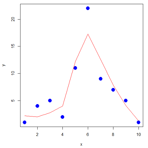
Figure 1. Area under the curve example.
library(MESS)
auc(x,y,from=0,rule=2)
auc(x,loxy$fitted,from=0,rule=2)
And R output
#area under curve for raw data
[1] 67
#area under curve for smoothed data
[1] 66.77616
Area under the receiver operating carrier curve
Download and install ROCR
R code
#modified from https://rviews.rstudio.com/2019/03/01/some-r-packages-for-roc-curves/
library(ROCR)
data(ROCR.simple)
df <- data.frame(ROCR.simple)
pred <- prediction(df$predictions, df$labels)
perf <- performance(pred,"tpr","fpr")
plot(perf,colorize=TRUE)
R output
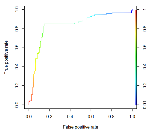
Figure 2. Example ROC curve
The right-hand axes is color codes by AUC values: good tests AUC between 0.8 and 0.9, very good tests greater than 0.9.
Area under the precision recall curve
— under construction
Questions
- Write up three learning outcomes for this page. Hint: Point your favorite generative AI to this page and ask for help
Chapter 20 contents
- Additional topics
- Area under the curve
- Peak detection
- Baseline correction
- Surveys
- Time series
- Dimensional analysis
- Estimating population size
- Diversity indexes
- Survival analysis
- Growth equations and dose response calculations
- Plot a Newick tree
- Phylogenetically independent contrasts
- How to get the distances from a distance tree
- Binary classification
- Meta-analysis
/MD