20.10 – Growth equations and dose response calculations
Introduction
In biology, growth may refer to increase in cell number, change in size of an individual across development, or increase of number of individuals in a population over time. Nonlinear, time-series, several models proposed to fit growth data, including the Gompertz, logistic, and the von Bertalanffy. These models fit many S-shaped growth curves. These models are special cases of generalized linear models, also called Richard curves.
Growth example
This page describes how to use R to analyze growth curve data sets.
| Hours | Abs |
|---|---|
| 0.000 | 0.002207 |
| 0.274 | 0.010443 |
| 0.384 | 0.033688 |
| 0.658 | 0.063257 |
| 0.986 | 0.111848 |
| 1.260 | 0.249240 |
| 1.479 | 0.416236 |
| 1.699 | 0.515578 |
| 1.973 | 0.572632 |
| 2.137 | 0.589528 |
| 2.466 | 0.619091 |
| 2.795 | 0.608486 |
| 3.123 | 0.621136 |
| 3.671 | 0.616850 |
| 4.110 | 0.614689 |
| 4.548 | 0.614643 |
| 5.151 | 0.612465 |
| 5.534 | 0.606082 |
| 5.863 | 0.603933 |
| 6.521 | 0.595407 |
| 7.068 | 0.589006 |
| 7.671 | 0.578372 |
| 8.164 | 0.567749 |
| 8.877 | 0.559217 |
| 9.644 | 0.546451 |
| 10.466 | 0.537907 |
| 11.233 | 0.537826 |
| 11.890 | 0.529300 |
| 12.493 | 0.516551 |
| 13.205 | 0.505905 |
| 14.082 | 0.491013 |
Key to parameter estimates: y0 is the lag, mumax is the growth rate, and K is the asymptotic stationary growth phase. The spline function does not return an estimate for K.
R code
require(growthrates)
#Enter the data. Replace these example values with your own
#time variable (Hours)
Hours <- c(0.000, 0.274, 0.384, 0.658, 0.986, 1.260, 1.479, 1.699, 1.973, 2.137, 2.466, 2.795, 3.123, 3.671, 4.110, 4.548, 5.151, 5.534, 5.863, 6.521, 7.068, 7.671, 8.164, 8.877, 9.644, 10.466, 11.233, 11.890, 12.493, 13.205, 14.082)
#absorbance or concentration variable (Abs)
Abs <- c(0.002207, 0.010443, 0.033688, 0.063257, 0.111848, 0.249240, 0.416236, 0.515578, 0.572632, 0.589528, 0.619091, 0.608486, 0.621136, 0.616850, 0.614689, 0.614643, 0.612465, 0.606082, 0.603933, 0.595407, 0.589006, 0.578372, 0.567749, 0.559217, 0.546451, 0.537907, 0.537826, 0.529300, 0.516551, 0.505905, 0.491013)
#Make a dataframe and check the data; If error, then check that variables have equal numbers of entries
Yeast <- data.frame(Hours,Abs); Yeast
#Obtain growth parameters from fit of a parametric growth model
#First, try some reasonable starting values
p <- c(y0 = 0.001, mumax = 0.5, K = 0.6)
model.par <- fit_growthmodel(FUN = grow_logistic, p = p, Hours, Abs, method=c("L-BFGS-B"))
summary(model.par)
coef(model.par)
#Obtain growth parameters from fit of a nonparametric smoothing spline
model.npar <- fit_spline(Hours,Abs)
summary(model.npar)
coef(spline.md)
#Make plots
par(mfrow = c(2, 1))
plot(Yeast, ylim=c(0,1), cex=1.5,pch=16, main="Parametric Nonlinear Growth Model", xlab="Hours", ylab="Abs")
lines(model.par, col="blue", lwd=2)
plot(model.npar, ylim=c(0,1), lwd=2, main="Nonparametric Spline Fit", xlab="Hours", ylab="Abs")
Results from example code
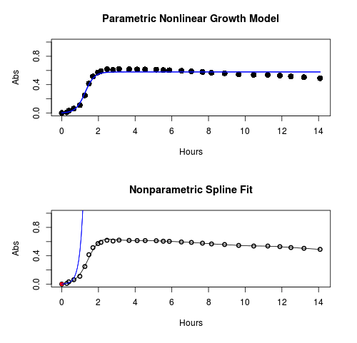
Figure 1. Top: Parametric Nonlinear Growth Model; Bottom: Nonparametric Spline Fit
LD50
In toxicology, the dose of a pathogen, radiation, or toxin required to kill half the members of a tested population of animals or cells is called the lethal dose, 50%, or LD50. This measure is also known as the lethal concentration, LC50, or properly after a specified test duration, the LCt50 indicating the lethal concentration and time of exposure. LD50 figures are frequently used as a general indicator of a substance’s acute toxicity. A lower LD50 is indicative of increased toxicity.
The point at which 50% response of studied organisms to range of doses of a substance (e.g., agonist, antagonist, inhibitor, etc.) to any response, from change in behavior or life history characteristics up to and including death can be described by the methods described in this chapter. The procedures outlined below assume that there is but one inflection point, i.e., an “s-shaped” curve, either up or down; if there are more than one inflection points, then the logistic equations described will not fit the data well and other choices need to be made (see Di Veroli et al 2015). We will use the drc package (Ritz et al 2015).
Example
First we’ll work through use of R. We’ll follow up with how to use Solver in Microsoft Excel.
After starting R, load the drc library.
library(drc)
Consider some hypothetical 24-hour survival data for yeast exposed to salt solutions. Let resp equal the variable for frequency of survival (e.g., calculated from OD660 readings) and NaCl equal the millimolar (mm) salt concentrations or doses.
At the R prompt type
resp <- c(1,1,1,.9,.7,.3,.4,.2,0,0,0)
NaCl=seq(0,1000,100)
#Confirm sequence was correctly created; alternatively, enter the values.
NaCl
[1] 0 100 200 300 400 500 600 700 800 900 1000
#Make a plot
plot(NaCl,resp,pch=19,cex=1.2,col="blue",xlab="NaCl [mm]",ylab="Survival frequency")
And here is the plot (Fig. 2).
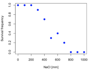
Figure 2. Hypothetical data set, survival of yeast in different salt concentrations.
Note the sigmoidal “S” shape — we’ll need an logistic equation to describe the relationship between survival of yeast and NaCl doses.
The equation for the four parameter logistic curve, also called the Hill-Slope model, is

where c is the parameter for the lower limit of the response, d is the parameter for the upper limit of the response, e is the relative EC50, the dose fitted half-way between the limits c and d, and b is the relative slope around the EC50. The slope, b, is also known as the Hill slope. Because this experiment included a dose of zero, a three parameter logistic curve would be appropriate. The equation simplifies to

EC50 from 4 parameter model
Let’s first make a data frame
dose <- data.frame(NaCl, resp)
Then call up a function, drm, from the drc library and specify the model as the four parameter logistic equation, specified as LL.4(). We follow with a call to the summary command to retrieve output from the drm function. Note that the four-parameter logistic equation
model.dose1 = drm(dose,fct=LL.4())
summary(model.dose1)
And here is the R output.
Model fitted: Log-logistic (ED50 as parameter) (4 parms)
Parameter estimates:
                   Estimate  Std. Error    t-value  p-value
b:(Intercept)      3.753415    1.074050   3.494636   0.0101
c:(Intercept)     -0.084487    0.127962  -0.660251   0.5302
d:(Intercept)      1.017592    0.052460  19.397441   0.0000
e:(Intercept)    492.645128   47.679765  10.332373   0.0000

Residual standard error:
0.0845254 (7 degrees of freedom)
The EC50, technically the LD50 because the data were for survival, is the value of e: 492.65 mM NaCl.
You should always plot the predicted line from your model against the real data and inspect the fit.
At the R prompt type
plot(model.dose1, log="",pch=19,cex=1.2,col="blue",xlab="NaCl [mm]",ylab="Survival frequency")
As long as the plot you made in earlier steps is still available, R will add the line specified in the lines command. Here is the plot with the predicted logistic line displayed (Fig. 3).
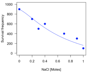
Figure 3. Logistic curve added to Figure 1 plot.
While there are additional steps we can take to decide is the fit of the logistic curve was good to the data, visual inspection suggests that indeed the curve fits the data reasonably well.
More work to do
Because the EC50 calculations are estimates, we should also obtain confidence intervals. The drc library provides a function called ED which will accomplish this. We can also ask what the survival was at 10% and 90% in addition to 50%, along with the confidence intervals for each.
At the R prompt type
ED(model.dose1,c(10,50,90), interval="delta")
And the output is shown below.
Estimated effective doses
(Delta method-based confidence interval(s))
     Estimate Std. Error   Lower   Upper
1:10  274.348     38.291 183.803  364.89
1:50  492.645     47.680 379.900  605.39
1:90  884.642    208.171 392.395 1376.89
Thus, the 95% confidence interval for the EC50 calculated from the four parameter logistic curve was between the lower limit of 379.9 and an upper limit of 605.39 mm NaCl.
EC50 from 3 parameter model
Looking at the summary output from the four parameter logistic function we see that the value for c was -0.085 and p-value was 0.53, which suggests that the lower limit was not statistically different from zero. We would expect this given that the experiment had included a control of zero mm added salt. Thus, we can explore by how much the EC50 estimate changes when the additional parameter c is no longer estimated by calculating a three parameter model with LL.3().
model.dose2 = drm(dose,fct=LL.3())
summary(model.dose2)
R output follows.
Model fitted: Log-logistic (ED50 as parameter) with lower limit at 0 (3 parms)
Parameter estimates:
               Estimate Std. Error   t-value p-value
b:(Intercept)   4.46194    0.76880   5.80378   4e-04
d:(Intercept)   1.00982    0.04866  20.75272   0e+00
e:(Intercept) 467.87842   25.24633  18.53253   0e+00
Residual standard error:
 0.08267671 (8 degrees of freedom)
The EC50 is the value of e: 467.88 mM NaCl.
How do the four and three parameter models compare? We can rephrase this as as statistical test of fit; which model fits the data better, a three parameter or a four parameter model?
At the R prompt type
anova(model.dose1, model.dose2)
The R output follows.
1st mode
fct:      LL.3()
2nd model
fct:      LL.4()
ANOVA table
          ModelDf      RSS Df F value p value
2nd model       8 0.054684
1st model       7 0.050012  1  0.6539  0.4453
Because the p-value is much greater than 5% we may conclude that the fit of the four parameter model was not significantly better than the fit of the three parameter model. Thus, based on our criteria we established in discussions of model fit in Chapter 16 – 18, we would conclude that the three parameter model is the preferred model.
The plot below now includes the fit of the four parameter model (red line) and the three parameter model (green line) to the data (Fig. 4).
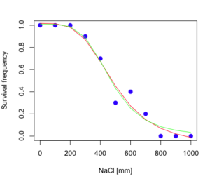
Figure 4. Four parameter (red) and three parameter (green) logistic models fitted to data.
The R command to make this addition to our active plot was
lines(dose,predict(model.dose2, data.frame(x=dose)),col="green")
We continue with our analysis of the three parameter model and produce the confidence intervals for the EC50 (modify the ED() statement above for model.dose2 in place of model.dose1).
Estimated effective doses
(Delta method-based confidence interval(s))
     Estimate Std. Error   Lower  Upper
1:10  285.937     33.154 209.483 362.39
1:50  467.878     25.246 409.660 526.10
1:90  765.589     63.026 620.251 910.93
Thus, the 95% confidence interval for the EC50 calculated from the three parameter logistic curve was between the lower limit of 409.7 and an upper limit of 526.1 mm NaCl. The difference between upper and lower limits was 116.4 mm NaCl, a smaller difference than the interval calculated for the 95% confidence intervals from the four parameter model (225.5 mm NaCl). This demonstrates the estimation trade-off: more parameters to estimate reduces the confidence in any one parameter estimate.
Additional notes of EC50 calculations
Care must be taken that the model fits the data well. What if we did not have observations throughout the range of the sigmoidal shape? We can explore this by taking a subset of the data.
dd = dose[1:6,]
Here, all values after dose 500 were dropped
dd
  resp dose
1  1.0    0
2  1.0  100
3  1.0  200
4  0.9  300
5  0.7  400
6  0.3  500
and the plot does not show an obvious sigmoidal shape (Fig. 5).
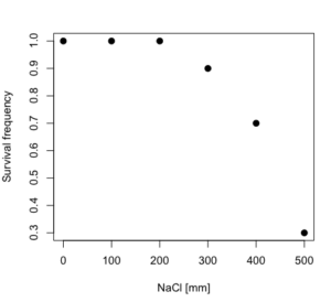
Figure 5. Plot of reduced data set.
We run the three parameter model again, this time on the subset of the data.
model.dosedd = drm(dd,fct=LL.3())
summary(model.dosedd)
Output from the results are
Model fitted: Log-logistic (ED50 as parameter) with lower limit at 0 (3 parms)
Parameter estimates:
                Estimate Std. Error    t-value p-value
b:(Intercept)   6.989842   0.760112   9.195801  0.0027
d:(Intercept)   0.993391   0.014793  67.153883  0.0000
e:(Intercept) 446.882542   5.905728  75.669344  0.0000
Residual standard error:
 0.02574154 (3 degrees of freedom)
Conclusion? The estimate is different, but only just so, 447 vs. 468 mm NaCl.
Thus, within reason, the drc function performs well for the calculation of EC50. Not all tools available to the student will do as well.
NLopt and nloptr
draft
Free open source library for nonlinear optimization.
Steven G. Johnson, The NLopt nonlinear-optimization package, http://github.com/stevengj/nlopt
https://cran.r-project.org/web/packages/nloptr/vignettes/nloptr.html
Alternatives to R
What about online tools? There are several online sites that will allow students to perform these kinds of calculations. Students familiar with MatLab know that it can be used to solve nonlinear equation problems. An open source alternative to MatLab is called GNU Octave, which can be installed on a personal computer or run online at http://octave-online.net. Students also may be aware of other sites, e.g., mycurvefit.com and IC50.tk.
Both of these free services performed well on the full dataset (results not shown), but fared poorly on the reduced subset: mycurvefit returned a value of 747.64 and IC50.tk returned an EC50 estimate of 103.6 (Michael Dohm, pers. obs.).
Simple inspection of the plotted values shows that these values are unreasonable.
EC50 calculations with Microsoft Excel
Most versions of Microsoft Excel include an add-in called Solver, which will permit mathematical modeling. The add-in is not installed as part of the default installation, but can be installed via the Options tab in the File menu for a local installation or via Insert for the Microsoft Office online version of Excel (you need a free Microsoft account). The following instructions are for a local installation of Microsoft Office 365 and were modified from information provided by sharpstatistics.co.uk.
After opening Excel, set up worksheet as follows. Note that in order to use my formulas your spreadsheet values need to be set up exactly as I describe.
- Dose values in column A, beginning with row 2
- Response values in column B, beginning with row 2
- In column F type
bin row 2,cin row 3,din row 4, andein row 5. - In cells G2 – G5, enter the starting values. For this example, I used b = 1, c = 0, d = 1, e = 400.
- For your own data you will have to explore use of different starting values.
- Enter headers in row 1.
- Column A
Dose - Column B
Response - Column C
Predicted - Column D
Squared difference - Column F
Constants
- Column A
- In cell C14 enter
sum squares - In cell D14 enter
=sum(D2:D12)
Here is an image of the worksheet (Fig. 6), with equations entered and values updated, but before Solver run.
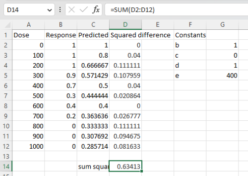
Figure 6. Screenshot Microsoft Excel worksheet containing our data set (col A & B), with formulas added and calculated. Starting values for constants in column G, rows 2 – 4.
Next, enter the functions.
- In cell C2 enter the four parameter logistic formula — type everything between the double quotes: “
=$G$3+(($G$4-$G$3)/(1+(A2/$G$5)^$G$2))“. Next, copy or drag the formula to cell C12 to complete the predictions.- Note: for a three parameter model, replace the above formula with “
=(($G$4)/(1+(A2/$G$5)^$G$2))“.
- Note: for a three parameter model, replace the above formula with “
- In cell D2 type everything between the double quotes: “
=(B2-C2)^2“. - Next, copy or drag the formula to cell
D12to complete the predictions. - Now you are ready to run solver to estimate the values for b, c, d, and e.
- Reminder: starting values must be in cells
G2:G5
- Reminder: starting values must be in cells
- Select cell
D14and start solver by clicking on Data and looking to the right in the ribbon.
Solver is not normally installed as part of the default installation of Microsoft Excel 365. If the add-in has been installed you will see Solver in the Analyze box (Fig. 7).
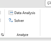
Figure 7. Screenshot Microsoft Excel, Solver add-in available.
If Solver is not installed, go to File → Options → Add-ins (Fig. 8).
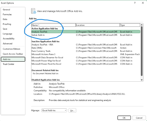
Figure 8. Screenshot Microsoft Excel, Solver add-in available and ready for use.
Go to Microsoft support for assistance with add-ins.
With the spreadsheet completed and Solver available, click on Solver in the ribbon (Fig. 7) to begin. The screen shot from the first screen of Solver is shown below (Fig. 9).
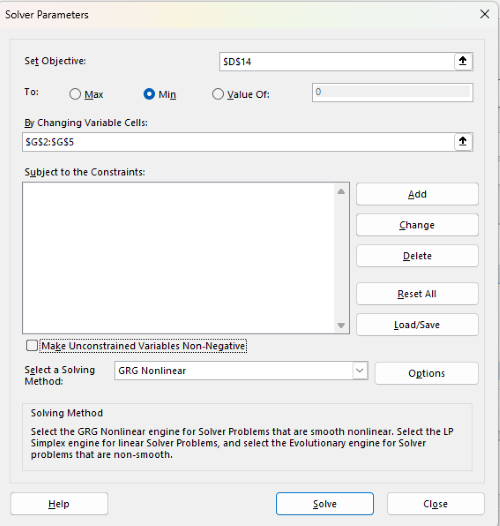
Figure 9. Screenshot Microsoft Excel solver menu.
Setup Solver
- Set Objective, enter the absolute cell reference to the sum squares value, \
$D$14 - Set To: Min.
- For By Changing Variable Cells, enter the range of cells for the four parameters, $G$2:$G$5
- Uncheck the box by “Make Unconstrained Variables Non-Negative.”
- Where constraints refers to any system of equalities or inequalities equations imposed on the algorithm.
- Select a Solving method, choose “GRG Nonlinear,” the nonlinear programming solver option (not shown in Fig. 7, select by clicking on the down arrow).
- Click Solve button to proceed.
GRG Nonlinear is one of many optimization methods. In this case we calculate the minimum of the sum of squares — the difference between observed and predicted values from the logistic equation — given the range of observed values. GRG stands for Generalized Reduced Gradient and finds the local optima — in this case the minimum or valley — without any imposed constraints. See solver.com for additional discussion of this algorithm.
If all goes well, this next screen (Fig. 10) will appear which shows the message, “Solver has converged to the current solution. All constraints are satisfied.”
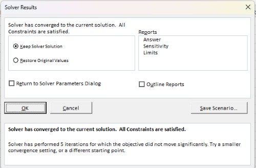
Figure 10. Screenshot solver completed run.
Click OK and note that the values of the parameters have been updated (Table 1).
Table 1. Four parameter logistic model, results from Solver
| Constant | Starting values | Values after solver |
| b | 1 | 3.723008382 |
| c | 0 | -0.088865487 |
| d | 1 | 1.017964505 |
| e | 400 | 493.9703594 |
Note the values obtained by Solver are virtually identical to the values obtained in the drc R package. The differences are probably because of the solver algorithm.
More interestingly, how did Solver do on the subset data set? Here are the results from a three parameter logistic model (Table 2).
Table 2. Three parameter logistic model, results from Solver
| Constant | Starting values | Full dataset, Solver results |
Subset, Solver results |
| b | 1 | 3.723008382 | 6.989855948 |
| d | 1 | 1.017964505 | 0.993391264 |
| e | 400 | 493.9703594 | 446.8819282 |
The results are again very close to results from the drc R package.
Thus, we would conclude that Solver and Microsoft Excel would be a reasonable choice for EC50 calculations, and much better than IC50.tk and mycurvefit.com. The advantages of R over Microsoft Excel is that the model building is more straight forward than entering formulas in the cell reference format required by Excel.
Questions
[pending]
References and suggested readings
Beck B, Chen YF, Dere W, et al. Assay Operations for SAR Support. 2012 May 1 [Updated 2012 Oct 1]. In: Sittampalam GS, Coussens NP, Nelson H, et al., editors. Assay Guidance Manual [Internet]. Bethesda (MD): Eli Lilly & Company and the National Center for Advancing Translational Sciences; 2004-. Available from: www.ncbi.nlm.nih.gov/books/NBK91994/
Di Veroli G. Y., Fornari C., Goldlust I., Mills G., Koh S. B., Bramhall J. L., Richards, F. M., Jodrell D. I. (2015) An automated fitting procedure and software for dose-response curves with multiphasic features. Scientific Reports 5: 14701.
Ritz, C., Baty, F., Streibig, J. C., Gerhard, D. (2015) Dose-Response Analysis Using R PLOS ONE, 10(12), e0146021
Tjørve, K. M., & Tjørve, E. (2017). The use of Gompertz models in growth analyses, and new Gompertz-model approach: An addition to the Unified-Richards family. PloS one, 12(6), e0178691.
Chapter 20 contents
- Additional topics
- Area under the curve
- Peak detection
- Baseline correction
- Surveys
- Time series
- Cluster analysis
- Estimating population size
- Diversity indexes
- Survival analysis
- Growth equations and dose response calculations
- Plot a Newick tree
- Phylogenetically independent contrasts
- How to get the distances from a distance tree
- Binary classification
/MD
9.1 – Chi-square test: Goodness of fit
Introduction
We ask about the “fit” of our data against predictions from theory, or from rules that set our expectations for the frequency of particular outcomes drawn from outside the experiment. Three examples to illustrate goodness of fit, GOF,  , A, B, and C follow.
A. For example, for a toss of a coin, we expect heads to show up 50% of the time. Out of 120 tosses of a fair coin, we expect 60 heads, 60 tails. Thus, our null hypothesis would be that heads would appear 50% of the time. If we observe 70 heads in an experiment of coin tossing, is this a significantly large enough discrepancy to reject the null hypothesis?
B. For example, simple Mendelian genetics makes predictions about how often we should expect particular combinations of phenotypes in the offspring when the phenotype is controlled by one gene, with 2 alleles and a particular kind of dominance.
For example, for a one locus, two allele system (one gene, two different copies like R and r) with complete dominance, we expect the phenotypic (what you see) ratio will be 3:1 (or  round,
  wrinkle). Our null hypothesis would be that pea shape will obey Mendelian ratios (3:1). Mendel’s round versus wrinkled peas (RR or Rr genotypes give round peas, only rr results in wrinkled peas).
Thus, out of 100 individuals, we would expect 75 round and 25 wrinkled. If we observe 84 round and 16 wrinkled, is this a significantly large enough discrepancy to reject the null hypothesis?
C. For yet another example, in population genetics, we can ask whether genotypic frequencies (how often a particular copy of a gene appears in a population) follow expectations from Hardy-Weinberg model (the null hypothesis would be that they do).
This is a common test one might perform on DNA or protein data from electrophoresis analysis. Hardy-Weinberg is a simple quadratic expansion:
If p = allele frequency of the first copy, and q = allele frequency of the second copy, then p + q = 1,
Given the allele frequencies, then genotypic frequencies would be given by 1 = p2 + 2pq + q2.
Deviations from Hardy-Weinberg expectations may indicate a number of possible causes of allele change (including natural selection, genetic drift, migration).
Thus, if a gene has two alleles,  and
and  , with the frequency for ,
  and for ,
  (equivalently q = 1 – p) in the population, then we would expect 36
  , 16
, 16  , and 48
  individuals. (Nothing changes if we represent the alleles as A and a, or some other system, e.g., dominance/recessive.)
Question. If we observe the following genotypes: 45 individuals, 34 individuals, and 21 individuals, is this a significantly large enough discrepancy to reject the null hypothesis?
Table 1. Summary of our Hardy Weinberg question
| Genotype | Expected | Observed | O – E |
| aa | 70 | 45 | -25 |
| aa’ | 27 | 34 | 7 |
| a’a’ | 3 | 21 | 18 |
| sum | 100 | 100 | 0 |
Recall from your genetics class that we can get the allele frequency values from the genotype values, e.g.,

We call these chi-square tests, tests of goodness of fit. Because we have some theory, in this case Mendelian genetics, or guidance, separate from the study itself, to help us calculate expected values in a chi-square test.
Note 1: The idea of fit in statistics can be reframed as how well does a particular statistical model fit the observed data. A good fit can be summarized by accounting for the differences between the observed values and the comparable values predicted by the model.
 goodness of fit
For k groups, the equation for the chi-square test may be written as

where fi is the frequency (count) observed (in class i) and fi<hat> is the frequency (count) expected if the null hypothesis is true, sum over all k groups. Alternatively, here is a format for the same equation that may be more familiar to you… ?

where Oi is the frequency (count) observed (in class i) and Ei is the frequency (count) expected if the null hypothesis is true.
The degrees of freedom, df, for the GOF are simply the number of categories minus one, k – 1.
Explaining GOF
Why am I using the phrase “goodness of fit?” This concept has broad use in statistics, but in general it applies when we ask how well a statistical model fits the observed data. The chi-square test is a good example of such tests, and we will encounter other examples too. Another common goodness of fit is the coefficient of determination, which will be introduced in linear regression sections. Still other examples are the likelihood ratio test, Akaike Information Criterion (AIC), and Bayesian Information Criterion (BIC), which are all used to assess fit of models to data. (See Graffelman and Weir [2018] for how to use AIC in the context of testing for Hardy Weinberg equilibrium.) At least for the chi-square test it is simple to see how the test statistic increases from zero as the agreement between observed data and expected data depart, where zero would be the case in which all observed values for the categories exactly match the expected values.
This test is designed to evaluate whether or not your data agree with a theoretical expectation (there are additional ways to think about this test, but this is a good place to start). Let’s take our time here and work with an example. The other type of chi-square problem or experiment is one for the many types of experiments in which the response variable is discrete, just like in the GOF case, but we have no theory to guide us in deciding how to obtain the expected values. We can use the data themselves to calculate expected values, and we say that the test is “contingent” upon the data, hence these types of chi-square tests are called contingency tables.
You may be a little concerned at this point that there are two kinds of chi-square problems, goodness of fit and contingency tables. We’ll deal directly with contingency tables in the next section, but for now, I wanted to make a few generalizations.
- Both goodness of fit and contingency tables use the same chi-square equation and analysis. They differ in how the degrees of freedom are calculated.
- Thus, what all chi-square problems have in common, whether goodness of fit or contingency table problems
- You must identify what types of data are appropriate for this statistical procedure? Categorical (nominal data type).
- As always, a clear description of the hypotheses being examined.
For goodness of fit chi-square test, the most important type of hypothesis is called a Null Hypothesis: In most cases the Null Hypothesis (HO) is “no difference” “no effect”…. If HO is concluded to be false (rejected), then an alternative hypothesis (HA) will be assumed to be true. Both are specified before tests are conducted. All possible outcomes are accounted for by the two hypotheses.
From above, we have
- A. HO: Fifty out of 100 tosses will result in heads.
- HA: Heads will not appear 50 times out of 100.
- B. HO: Pea shape will equal Mendelian ratios (3:1).
- HA: Pea shape will not equal Mendelian ratios (3:1).
- C. HO: Genotypic frequencies will equal Hardy-Weinberg expectations.
- HA: Genotypic frequencies will not equal Hardy-Weinberg expectations
Assumptions: In order to use the chi-square, there must be two or more categories. Each observation must be in one and only one category. If some of the observations are truly halfway between two categories then you must make a new category (e.g. low, middle, high) or use another statistical procedure. Additionally, your expected values are required to be integers, not ratio. The number of observed and the number of expected must sum to the same total.
How well does data fit the prediction?
Frequentist approach interprets the test as, how well does the data fit the null hypothesis,  ? When you compare data against a theoretical distribution (e.g., Mendel’s hypothesis predicts the distribution of progeny phenotypes for a particular genetic system), you test the fit of the data against the model’s predictions (expectations). Recall that the Bayesian approach asks how well does the model fit the data?
Table 2. A. 120 tosses of a coin, we count heads 70/120 tosses.
| Expected | Observed | |
| Heads | 60 | 70 |
| Tails | 60 | 50 |
| n | 120 | 120 |

Table 3. B. A possible Mendelian system of inheritance for a one gene, two allele system with complete dominance, observe the phenotypes.
| Expected | Observed | |
| Round | 75 | 84 |
| Wrinkled | 25 | 16 |
| n | 100 | 100 |

Table 4. C. A possible Mendelian system of inheritance for a one gene, two allele system with complete dominance, observe the phenotypes.
| Expected | Observed | |
| p2 | 70 | 45 |
| 2pq | 27 | 34 |
| q2 | 3 | 21 |
| n | 100 | 100 |

For completeness, instead of a goodness of fit test we can treat this problem as a test of independence, a contingency table problem. We’ll discuss contingency tables more in the next section, but or now, we can rearrange our table of observed genotypes for problem C, as a 2X2 table
Table 5. Problem C reported in 2X2 table format.
| Maternal a’ | Paternal a’ | |
| Maternal a | 45 | 17 |
| Paternal a | 17 | 21 |
The contingency table is calculated the same way as the GOF version, but the degrees of freedom are calculated differently: df = number of rows – 1 multiplied by the number of columns – 1.

Thus, for a 2X2 table the df are always equal to 1.
Note that the chi-square value itself says nothing about how any discrepancy between expectation and observed genotype frequencies come about. Therefore, one can rearrange the equation to make clear where deviance from equilibrium, D, occur for the heterozygote (het). We have

where D2 is equal to

φ coefficient
The chi-square test statistic and its inference tells you about the significance of the association, but not the strength or effect size of the association. Not surprisingly, Pearson (1904) came up with a statistic to quantify the strength of association between two binary variables, now called the φ (phi) coefficient. Like the Pearson product moment correlation, the φ (phi) coefficient takes values from -1 to +1.
Note 2: Pearson termed this statistic the mean square contingency coefficient. Yule (1912) termed it the phi coefficient. The correlation between two binary variables is also called the Mathews Correlation Coefficient or MCC (Mathews 1975), which is a common classification tool in machine learning.
The formula for the absolute value of φ coefficient is

Thus, for A, B, and C examples, φ coefficient was 0.167, 0.190, and 0.771. Thus, only weak associations in examples A and B, but strong association in C. We’ll provide a formula to directly calculate φ coefficient from the cells of the table in 9.2 – Chi-square contingency tables.
Carry out the test and interpret results
What was just calculated? The chi-square, , test statistic.
Just like t-tests, we now want to compare our test statistic against a critical value — calculate degrees of freedom (df = k – 1, k equals the numbers of categories), and set a rejection level, Type I error rate. We typically set the Type I error rate at 5%. A table of critical values for the chi-square test is available in Appendix Table Chi-square critical values.
Obtaining Probability Values for the goodness-of-fit test of the null hypothesis:
As you can see from the equation of the chi-square, a perfect fit between the observed and the expected would be a chi-square of zero. Thus, asking about statistical significance in the chi-square test is the same as asking if your test statistic is significantly greater than zero.
The chi-square distribution is used and the critical values depend on the degrees of freedom. Fortunately for and other statistical procedures we have Tables that will tell us what the probability is of obtaining our results when the null hypothesis is true (in the population).
Here is a portion of the chi-square critical values for probability that your chi-square test statistic is less than the critical value (Fig 1).
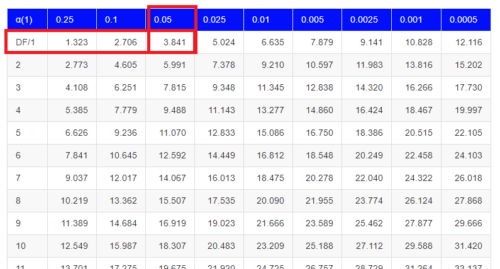
Figure 1. A portion of critical values of the chi-square at alpha 5% for degrees of freedom between 1 and 10. A more inclusive table is provided in the Appendix, Table of Chi-square critical values.
For the first example (A), we have df = 2 – 1 = 1 and we look up the critical value corresponding to the probability in which Type I = 5% are likely to be smaller iff (“if and only if”) the null hypothesis is true. That value is 3.841; our test statistic was 3.330, and therefore smaller than the critical value: so we do not reject the null hypothesis.
Interpolating p-values
How likely is our test statistic value of 3.333 and the null hypothesis was true? (Remember, “true” in this case is a shorthand for our data was sampled from a population in which the HW expectations hold). When I check the table of critical values of the chi-square test for the “exact” p-value, I find that our test statistic value falls between a p-value 0.10 and 0.05 (represented in the table below). We can interpolate
Note 3: Interpolation refers to any method used to estimate a new value from a set of known values. Thus, interpolated values fall between known values. Extrapolation on the other hand refers to methods to estimate new values by extending from a known sequence of values.
Table 6. Interpolated p-value for critical value not reported in chi-square table.
| statistic | p-value |
| 3.841 | 0.05 |
| 3.333 | x |
| 2.706 | 0.10 |
If we assume the change in probability between 2.706 and 3.841 for the chi-square distribution is linear (it’s not, but it’s close), then we can do so simple interpolation.
We set up what we know on the right hand side equal to what we don’t know on the left hand side of the equation,

and solve for x. Then, x is equal to 0.0724
R function pchisq() gives a value of p = 0.0679. Close, but not the same. Of course, you should go with the result from R over interpolation; we mention how to get the approximate p-value by interpolation for completeness, and, in some rare instances, you might need to make the calculation. Interpolating is also a skill used to provide estimates where the researcher needs to estimate (impute) a missing value.
Interpreting p-values
This is a pretty important topic, so much so that we devote an entire section to this very problem — see 8.2 – The controversy over proper hypothesis testing. If you skipped the chapter, but find yourself unsure how to interpret the p-value, then please go back to Ch 8.2. OK, that commercial message, what does it mean to “reject the chi-square null hypothesis?” These types of tests are called goodness of fit in the following sense — if your data agree with the theoretical distribution, then the difference between observed and expected should be very close to zero. If it is exactly zero, then you have a perfect fit. In our coin toss case, if we say that the ratio of heads:tails do not differ significantly from the 50:50 expectation, then we accept the null hypothesis.
You should try the other examples yourself! A hint, the degrees of freedom are one (1) for example B and two (2) for example C.
R code
Printed tables of the critical values from the chi-square distribution, or for any statistical test for that matter are fine, but with your statistical package R and Rcmdr, you have access to the critical value and the p-value of your test statistic simply by asking. Here’s how to get both.
First, lets get the critical value.
Rcmdr: Distributions → Continuous distributions → Chi-squared distribution → Chi-squared quantiles
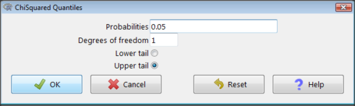
Figure 2. R Commander menu for Chi-squared quantiles.
I entered “0.05” for the probability because that’s my Type I error rate α. Enter “1” for Degrees of freedom, then click “upper tail” because we are interested in obtaining the critical value for α. Here’s R’s response when I clicked “OK.”
qchisq(c(0.05), df=1, lower.tail=FALSE)
[1] 3.841459
Next, let’s get the exact P-value of our test statistic. We had three from three different tests:  for the coin-tossing example,
  for the pea example, and
  for the Hardy-Weinberg example.
Rcmdr: Distributions → Continuous distributions → Chi-squared distribution → Chi-squared probabilities…
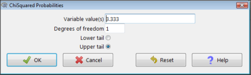
Figure 3. R Commander menu for Chi-squared probabilities.
I entered “3.333” because that is one of the test statistics I want to calculate for probability and “1” for Degrees of freedom because I had k – 1 = 1 df for this problem. Here’s R’s response when I clicked “OK.”
pchisq(c(3.333), df=1, lower.tail=FALSE)
[1] 0.06790291
I repeated this exercise for I got  ; for I got
  .
.
Nice, right? Saves you from having to interpolate probability values from the chi-square table.
3. How to get the goodness of fit in Rcmdr.
R provides the goodness of fit (the command is chisq.text()), but Rcmdr thus far does not provide a menu option to link to the function. Instead, R Commander provides a menu for contingency tables, which also is a chi-square test, but is used where no theory is available to calculate the expected values (see Chapter 9.2). Thus, for the goodness of fit chi-square, we will need to by-pass Rcmdr in favor of the script window. Honestly, other options are as quick or quicker: calculate by hand, use a different software (e.g, Microsoft Excel), or many online sites provide JavaScript tools.
So how to get the goodness of fit chi-square while in R? Here’s one way. At the command line, type
chisq.test (c(O1, O2, ... On), p = c(E1, E2, ... En))
where O1, O2, … On are observed counts for category 1, category 2, up to category n, and E1, E2, … En are the expected proportions for each category. For example, consider our Heads/Tails example above (problem A).
In R, we write and submit
chisq.test(c(70,30),p=c(1/2,1/2))
R returns
Chi-squared test for given probabilities.
data: c(70, 30)
X-squared = 16, df = 1, p-value = 0.00006334
Easy enough. But not much detail — details are available with some additions to the R script. I’ll just link you to a nice website that shows how to add to the output so that it looks like the one below.
mike.chi <- chisq.test(c(70,30),p=c(1/2,1/2))
Lets explore one at time the contents of the results from the chi square function.
names(mike.chi)   #The names function
[1] "statistic" "parameter" "p.value" "method" "data.name" "observed"
[7] "expected" "residuals" "stdres"
Now, call each name in turn.
mike.chi$residuals
[1] 2.828427 -2.828427
mike.chi$obs
[1] 70 30
mike.chi$exp
[1] 50 50
Note 4: “residuals” here simply refers to the difference between observed and expected values. Residuals are an important concept in regression, see Ch17.5
And finally, lets get the summary output of our statistical test.
mike.chi
Chi-squared test for given probabilities.
data: c(70, 30)
X-squared = 16, df = 1, p-value = 6.334e-05
GOF and spreadsheet apps
Easy enough with R, but it may even easier with other tools. I’ll show you how to do this with spreadsheet apps and with and online at graphpad.com.
Let’s take the pea example above. We had 16 wrinkled, 84 round. We expect 25% wrinkled, 75% round.
Now, with R, we would enter
chisq.test(c(16,80),p=c(1/4,3/4))
and the R output
Chi-squared test for given probabilities
data: c(16, 80)
X-squared = 3.5556, df = 1, p-value = 0.05935
Microsoft Excel and the other spreadsheet programs (Apple Numbers, Google Sheets, LibreOffice Calc) can calculate the goodness of fit directly; they return a P-value only. If the observed data are in cells A1 and A2, and the expected values are in B1 and B2, then use the procedure =CHITEST(A1:A2,B1:B2).
Table 7. A spreadsheet with formula visible.
| A | B | C | D | |
| 1 | 80 | 75 | ||
| 2 | 16 | 25 | =CHITEST(A1:A2,B1:B2) |
The P-value (but not the Chi-square test statistic) is returned. Here’s the output from Calc.
Table 8. Spreadsheet example from Table 7 with calculated P-value.
| A | B | C | D | |
| 1 | 80 | 75 | ||
| 2 | 16 | 25 | 0.058714340077662 |
You can get the critical value from MS Excel (=CHIINV(alpha, df), returns the critical value), and the exact probability for the test statistic =CHIDIST(x,df), where x is your test statistic. Putting it all together, a general spreadsheet template for goodness of fit calculations calculations of test statistic and p-value might look like
Table 9. Spreadsheet template with formula to calculate chi-square goodness of fit on two groups.
| A | B | C | D | E | |
| 1 | f1 | 0.75 | |||
| 2 | f2 | 0.25 | |||
| 3 | N | =SUM(A5,A6) |
|||
| 4 | Obs | Exp | Chi.value | Chi.sqr | |
| 5 | 80 | =B1* |
=((A5-B5)^2)/B5 |
=SUM(C5,C6) |
|
| 6 | 16 | =B2* |
=((A6-B6)^2)/B6 |
=CHIDIST(D5, COUNT(A5:A6-1) |
|
| 7 | |||||
| 8 |
 3
3Microsoft Excel can be improved by writing macros, or by including available add-in programs, such as the free PopTools, which is available for Microsoft Windows 32-bit operating systems only.
Another option is to take advantage of the internet — again, many folks have provided java or JavaScript-based statistical routines for educational purposes. Here’s an easy one to use www.graphpad.com.
In most cases, I find the chi-square goodness-of-fit is so simple to calculate by hand that the computer is redundant.
Questions
1. A variety of p-values were reported on this page with no attempt to reflect significant figures or numbers of digits (see Chapter 8.2). Provide proper significant figures and numbers of digits as if these p-values were reported in a science journal.
- 0.0724
- 0.0679
- 0.03766692
- 0.004955794
- 0.00006334
- 6.334e-05
- 0.05935
- 0.058714340077662
2. For a mini bag of M&M candies, you count 4 blue, 2 brown, 1 green, 3 orange, 4 red, and 2 yellow candies.
- What are the expected values for each color?
- Calculate using your favorite spreadsheet app (e.g., Numbers, Excel, Google Sheets, LibreOffice Calc)
- Calculate using R (note R will reply with a warning message that the “Chi-squared approximation may be incorrect”; see 9.2 Yates continuity correction)
- Calculate using Quickcalcs at graphpad.com
- Construct a table and compare p-values obtained from the different applications
3. CYP1A2 enzyme involved with metabolism of caffeine. Folks with C at SNP rs762551 have higher enzyme activity than folks with A. Populations differ for the frequency of C. Using R or your favorite spreadsheet application, compare the following populations against global frequency of C is 33% (frequency of A is 67%).
- 286 persons from Northern Sweden: f(C) = 26%, f(A) = 73%
- 4532 Native Hawaiian persons: f(C) = 22%, f(A) = 78%
- 1260 Native American persons: f(C) = 30%, f(A) = 70%
- 8316 Native American persons: f(C) = 36%, f(A) = 64%
- Construct a table and compare p-values obtained for the four populations.
Chapter 9 contents
5.6 – Sampling from Populations
Introduction
Researchers generally can’t study an entire population. More generally, striving to study each member of a population is not necessary to arrive at answers about the population. For example, consider the question, does taking a multivitamin daily improve health? What are our options? Do we really need to follow every single individual in the United States of America, monitoring their health and noting whether or not the person takes vitamins daily in order to test (inference) this hypothesis? Or, can we get at the same answer by careful experimental design (see Schatzkin et al 2002; Dawsey et al 2014)? Supplement use is wide-spread in the United States, but both health and vitamin use differ by demographics. Young people tend to be healthier than older people and older people tend to take supplements more than younger people.
A subset of the population is measured for some trait or characteristic. From the sample, we hope to refer back to the population. We want to move from anecdote (case histories) to possible generalizations of use to the reference population (all patients with these symptoms). How we sample from the reference population limits our ability to generalize. We need a representative sample: simple to define, hard to achieve.
Statistics becomes necessary if we want to infer something about the entire populations. (Which is usually the point of doing a study!!) Typically tens to thousands of individuals are measured. But in addition, HOW we obtain the sample of individuals from the reference population is CRITICAL.
Kinds of sampling include (adapted from Box 1, Tyrer and Heyman 2016; see also McGarvey et al 2016)
Probability sampling
- random
- stratified
- blocking
- clustered
- systematic
Nonprobability sampling
- convenience, haphazard
- judgement
- quota
- snowball
For an exhaustive, authoritative look at sampling, see Thompson (2012).
How can samples be obtained?
Sampling from a population may be convenient. For one famous example, consider the Bumpus data set. (We introduced this data set in Question 5, Chapter 5.) So the legend goes, Professor Bumpus was walking across the campus of Brown University, the day after a severe winter storm, and came across a number of motionless house sparrows on the ground. Bumpus collected the birds and brought them to his lab. Seventy-two birds recovered; 64 did not (Table1).
Table 1. A subset of Bumpus data set, summarized by sex of birds.
| House sparrows | Lived | Died |
|---|---|---|
| Female | 21 | 28 |
| Male | 51 | 36 |
Bumpus reported differences in body size that correlated with survival (Bumpus 1899), and this report is often taken as an example of Natural Selection (cf. Johnston et al 1972). The Bumpus dataset is clearly convenience sampling. It’s also a case study: a report of a single incident. But given that is is a large sample (n = 136), it is tempting to use the data to inform about about possible characteristics of the birds that survived compared with those that perished.
Another way we collect samples from populations is best termed haphazard. In graduate school I got the opportunity to study locomotor performance of whiptail lizards (Aspidoscelis tigris, A. marmoratus, genus formerly Cnemidophorus**) across a hybrid zone in the Southwest United States (Dohm et al. 1998). During the day we would walk in areas where the lizards were known to occur and capture any individual we saw by hand. (This would sometimes mean sticking our hands down into burrows, which was always exciting — you never really knew if you were going to find your lizard or if you were going to find a scorpion, venomous spider, or …) Lizards collected were returned to the lab for subsequent measures. Clearly, this was not convenience sampling; it involved a lot of work under the hot sun. But just as clearly, we could only catch what we could see and even the best of us would occasionally lose a lizard that had been spotted. Moreover, one suspects we missed many lizards that were present, but not in our view. Lizards that were underground at the time we visited a spot would not be seen nor captured by us; individual lizards that were especially wary of people (Bulova 1994) would also escape us. In other words, we caught the lizards that were catchable and can only assume (hope?) that they were representative of all of these lizards. Applying a grid or quadrant system to the area and then randomly visiting plots within the grid or quadrant might help, but still would not eliminate the potential for biased sampling we faced in this study.
Quota sampling implies selection of subjects by some specific criteria, weighted by the proportions represented in the population. It’s different from stratified sampling because there is no random selection scheme: subjects are selected based on matching some criteria, and collection for that group stops when the sample number matches the proportion in the population. Consider our vitamin supplement survey. If student population at Chaminade University was the reference population, and we have enough money to survey 100 students, then we would want a sample of 70 women students and 30 male students, representing the proportions of the student population.
Snowball sampling implies that you rely on word-of-mouth to complete sampling. After initial recruitment of subjects, sample size for the study increases because early participants refer others to the researchers. This can be a powerful tool for reaching underrepresented communities (e.g., Valerio et al 2016).
Types of Probability sampling
Random sampling is an example of probability sampling. As we defined earlier, simple random sampling requires that you know how many subjects are in the population (N) and then each subject has an equal chance of being selected

Examples of nonprobability sampling include
- convenience sampling
- volunteer sampling
- judgement sampling
Convenience sampling (the first 20 people you meet at the library lanai); volunteer sampling (you stand in front of a room of strangers and ask for any ten people to come forward and take your survey — or more seriously, persons with a terminal disease calling a clinic reportedly known to cure the disease with a radical new, experimental treatment), and judgement sampling (to study tastes in fashion, you decide that only persons over six feet tall should be included because .…).
Random in statistics has a very important, strict meaning. As opposed to our day-to-day usage, random sampling from a population means that the probability that any one individual is chosen to be included in a sample is equal. Formally, this is called simple random sampling to distinguish it from more complex schemes. For a sampling procedure to be random requires a formal procedure for sampling a population with known size (N).
For example, at the end of the semester, I may select the order for student presentations at random. Thus, students in the classroom would be considered the population (groups of students are my sample unit, not individual students!). What is the probability that your group will be called first? Second? We need to know how many groups there are to conduct simple random sampling. Let’s take an extreme and say that all groups have a size of one; there are 26 students in this room, so

or
![\[p=0.0385\]](https://biostatistics.letgen.org/wp-content/ql-cache/quicklatex.com-3245def7444e6f340661142b6c6dd9ef_l3.png "Rendered by QuickLaTeX.com")
of being selected first.
Now to determine the probability of your group being selected second, we need to distinguish between two kinds of sampling:
- Sampling with replacement — after I select the first group, the first group is returned to the pool of groups that have not been selected. In other words, with replacement, your group could be selected first and selected second! The probability of being selected second then remains
![\[p= \frac{1}{26}\]](https://biostatistics.letgen.org/wp-content/ql-cache/quicklatex.com-8535b199acd8acd9f2ea6ee217d9c065_l3.png "Rendered by QuickLaTeX.com")
.
- Sampling without replacement — after I select the first group, then I have
![\[26 -1=25\]](https://biostatistics.letgen.org/wp-content/ql-cache/quicklatex.com-2ba74aa260c2d84d22667281ebf95bc8_l3.png "Rendered by QuickLaTeX.com")
groups left to select the second group, so probability that your group will be second is
![\[p= \frac{1}{25}\]](https://biostatistics.letgen.org/wp-content/ql-cache/quicklatex.com-0becdbbdf1fa6ba7a9edee599208ab67_l3.png "Rendered by QuickLaTeX.com")
. The first group has already been selected and is not available.
Random sampling refers to how subjects are selected from the target, reference population. Random assignment, however, describes the process by which subjects are assigned to treatment groups of an experiment. Random sampling applies to the external validity of the experiment: to the extent that a truly random sample was drawn, then results may be generalized to the study population. Random assignment of subjects to treatment however makes the experiment internally valid: results from the experiment may be interpreted in terms of causality.
R code, sample without replacement
sample(26)
[1] 1 10 11 23 17 13 8 6 19 20 21 16 14 15 5 2 12 4 26 22 9 7 25 18 3 24
R code, sample with replacement
mySample <- sample(26, replace = TRUE); mySample
[1] 9 26 24 9 3 1 23 14 26 6 5 19 17 23 11 12 3 8 7 19 2 16 3 11 1 1
How many elements duplicated?
out <- duplicated(mySample); table(out)
out
FALSE TRUE
17 9
More on sampling in R discussed in Sampling with computers below.
Additional sampling schemes
Simple random sampling is not the only option, but in many cases it is the most desirable. Consider our multivitamin study again. Perhaps studying the entire USA population is a bit extreme. How about working from a list of AARP members, sending out questionnaires to millions of persons on this list, getting back about 20% of the questionnaires, sorting through the responses and identifying the respondent to diet categories and multivitamin use. The researchers had nearly 500,000 persons willing and able to participate in their prospective study (Schatzkin et al 2001; Dawsey et al 2014; Lim et al 2021). It’s an enormous study. But is this really much better than our described lizard experiment? Let’s count the ways: Not all older people are members of AARP (that 500,000? That’s less than 1% of the 50 and older persons in the USA); A large majority of AARP members did not return surveys; Some fraction of the returned surveys were not usable; How representative of diverse aged populations in the United States is AARP?
Simple random sampling may not be practical, particularly if sub-populations, or strata, are present and members of the different sub-populations are not available to the researcher in the same numbers. In ecology, habitat-use studies routinely need to account for the patchiness of the environment in space and time (Wiens 1976; Summerville and Crisp 2021). Thus, samples are drawn in such a way to represent the frequency within each sub-population.
For a simple example, researchers conducting a controlled breeding program of mice don’t use simple random sampling to choose pairs of mates; after all, random sampling without regard of sex of the mice would lead to some pairings of males only, or females only (Fig 1).
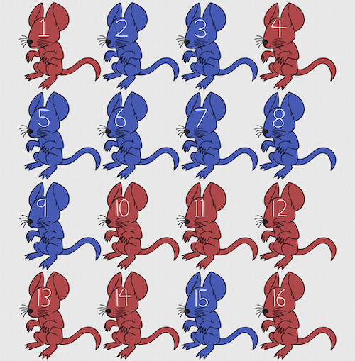
Figure 1. Sixteen mice, eight red and eight blue. Image © 2024 Mia D Graphics
R code
pairs <- c(rep("red", 8), rep("blue", 8))
replicate(2, sample(pairs, 8), simplify = FALSE)
[[1]]
[1] "blue" "blue" "blue" "red" "blue" "red" "blue" "red"

[[2]]
[1] "blue" "blue" "red" "red" "red" "red" "red" "blue"
Oops. If we interpret the output blue = male and red = female, then four out of the eight pairs were same sex pairings.
Thus, the breeding strategy is to random sample from female mice and from male mice and the stratification is sex of the mouse. Alternatively, breeders may select mice to form breeding pairs systematically: From a large colony with dozens of cages, the breeder may select one mouse from every third cage.
Stratified Random Sampling: Individuals in the population are classified into strata or sub-groups: age, economic class, ethnicity, gender, sex …, as many as needed. Then choose a simple random sample from each group, typically in proportion to the size of the sub-groups in the population. Combine those into the overall sample. For example, when I wanted a random sample of mice for my work, I called the supplier and requested that a total of 100 male and female mice be randomly selected from the five colonies they maintained. The reference population is the entire supply of mice at that company (at that time), but I wished to make sure that I got unrelated mice, so I needed to divide the population into groups (the five colonies) before my sample was constructed.
Note 1: The size of the population must be known in advance, just like in simplified random sampling. A more interesting example, the Social Security Administration conducts surveys of popular baby names by year. They post the top ten most popular names based on 1% or 5% (first strata), then by male/female (second strata).
For a simple example of the need for stratified sampling, consider our 16 blue and red mice again. If mice were randomly assigned to treatment group, then by chance unequal samples within strata may be assigned to a treatment group, potentially biasing our conclusions (Fig 2).
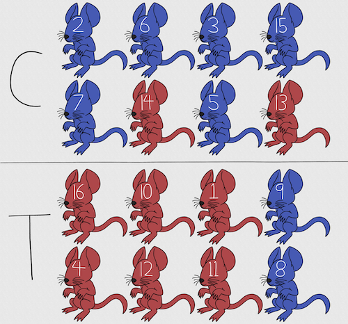
Figure 2. Sixteen mice, randomly assigned to treatment groups C and T; by chance, 75% blue in C and just 25% in T. If color was a confounding factor then our conclusions about the effectiveness of the treatment would be associated with color. Image © 2024 Mia D Graphics
Block sampling: superficially resembles stratified sampling, but refers to how experimental units are assigned to treatment groups. Blocks in experimental design refers to potentially confounding factors for which we wish to control, but are otherwise not interested in. For our example described in Figure 2, mouse color may not be of specific interest for our study and therefore would be considered a blocking effect. Agricultural research provides a host of other blocking situations: plots distributed across an elevation or hydration gradient, growing seasons, and many others. For a biology lab example, edge effects of heated culture plates. A 96-well microplate has 60 inner wells and 36 edge wells (A1 – H1, A12-H12, plus 1st and 12th wells of columns B – H, for a total of 36 wells, Fig 3).
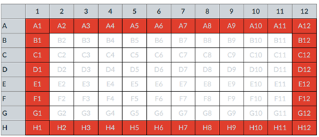
Figure 3. Format of 96-well plate. Red cells = “edge” wells; White cells = “inner” wells; Well reference in grey letter.
For long incubation periods it’s not unexpected that edge wells and inner wells may evaporate at different rates, potentially confounding interpretation of treatment effects if, by chance, treatment samples are more commonly assigned to edge wells. Block sampling implies subjects from treatment groups are randomly assigned to each block, in equal numbers if possible.
Cluster Sampling: In many situations, the population is far too large or too dispersed and scattered for a list of the entire population to be known. And, a random approach ignores that there is a natural grouping — people live next to each other, so there is going to be things in common. A multi-stage approach to sampling will be better than simply taking a random sample approach. Most surveys of opinion (when conducted reputably) use a multi-stage method. For example, if a senator wishes to poll his constituents about an issue, he may his pollster will randomly select a few of the counties from his state (first stage), then randomly select among towns or cities (second stage), to obtain a list of 1000 people to call. In some instances, they might use even more stages. At each stage, they might do a stratified random sample on sex, race, income level, or any other useful variable on which they could get information before sampling. If you are interested in this kind of work, for starters, see Couper and Miller (2009).
There are more types of sampling, and entire books written about the best way to conduct sampling. One important thing to keep in mind is that as long as the sample is large relative to the size of the population, each of the above methods generally will get the same answers (= the statistics generated from the samples will be representative of the population).
As long as some attempt is made to randomize, then you can say that the procedure is probability sampling. Nonprobability, or haphazard sampling, describes the other possibility, that is, each element is selected arbitrarily by a non-formal selecting of individual. … all the fish or birds that you catch may not be a random sample of those present in a population. For example,
- wild Pacific salmon do not feed on the surface, hatchery salmon feed on the surface. …
- all the individuals who respond to a survey.
- Phone surveys, web surveys, person on the street surveys… how random, how representative?
Sampling with computers
Now to determine the probability of your group being selected second, we need to distinguish between two kinds of sampling:
Sampling with replacement — after I select the first group, the first group is returned to the pool of groups that have not been selected. In other words, with replacement, your group could be selected first and selected second! The probability of being selected second then remains
Sampling without replacement — after I select the first group, then I have
![\[26 -1\]](https://biostatistics.letgen.org/wp-content/ql-cache/quicklatex.com-a314c642fc0677b3377f14c515483660_l3.png "Rendered by QuickLaTeX.com")
groups left to select the second group, so probability that your group will be second is
![\[p = \frac{1}{26-1}\]](https://biostatistics.letgen.org/wp-content/ql-cache/quicklatex.com-084877df14c9128a49a3f35d237c7b53_l3.png "Rendered by QuickLaTeX.com")
. The first group has already been selected and is not available, and so on.
Sampling is usually easiest if a computer is used. Computers use algorithms to generate pseudo-random numbers. We call the resulting numbers pseudo-random to distinguish them from truly random physical processes (e.g., radioactive decay). For more information about random numbers, please see random.org.
If all you wish to do is select a few observations or you need to use a random procedure to select subjects prior to observations, then these websites can provide a very quick, useful tool.
Sampling in Microsoft Excel or LibreOffice Calc
Microsoft’s Excel is pretty good at sampling, but requires knowledge of included functions. Here are the steps to generate random numbers and select with and without replacement in Excel. I’ll give you two cases.
1. For random numbers, enter the function =rand() in a cell, then drag the cell handle to fill in cells to N (in our case = 26, so A1 to A26). This function generates a random (more or less!) number between 0 and 1. We want digits between 1 and 26, not fractions between 0 and 1, so combine INT function with RAND function
=INT(27*RAND())
Note 2: To get between 1 and 9, multiply by 10 instead of 27; to get between 1 and 100, multiply by 101, etc.
In Excel to sample with replacement, simply pick the first two cells (the algorithm Excel used already has conducted sample with replacement. See next item for method to sample without replacement in Excel. You have to have installed the Data Analysis Tool Pak. Here’s instructions for Office 2010.
If you have a Mac and Office 2008, there is no Data Analysis Tool Pak, so to get this function in your Excel, install a third-party add-in program (e.g., StatPlus, a free add-in, really nice, adds a lot of function to your Excel). If you have the 2011 version of Office for Mac, then the Data Analysis Tool Pak is included, but like your Windows counterparts, you have to install it (click here for instructions).
2. Let’s say that we have already given each group a number between 1 and 26 and we enter those numbers in sequence in column A.
To sample without replacement, select Tools → Data Analysis… (if this option is not available, you’ll have to add it — see Excel help for instructions, Fig 4).
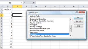
Figure 4. Screenshot of Sampling in Data Analysis menu, Microsoft Excel
Enter the cells with the numbers you wish to select from. In our example, column A has the numbers 1 through 26 representing each group in our class. I entered A:A as the Input Range.
Next, select “Random” and enter the number of samples. I want two.
Click OK and the output will be placed into cell B3 (my choice); I could have just as easily had Excel put the answer into a new worksheet.
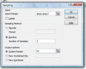
Figure 5. Screenshot of input required for Sampling in Data Analysis menu, Microsoft Excel
To sample with replacement from column A (with our 1 through 26), type in the formula B1
=INT(27*RAND())and the formula C1
=INDEX(A:A,RANK(B1,B:B))then drag the cell handles to fill in the columns (first column B, then column C).
That’ll do it for MS Excel or LibreOffice Calc.
Sampling with R (Rcmdr)
It’s much easier with much more control to get sampling in Rcmdr (R) than in Excel. Sampling in R is based on the function called sample() and sample.int(). I will present just the sample() command here.
sample(x, size, replace = FALSE, prob = NULL)Example
You want to sample ten integers between 1 and 10
sample(10)R output
sample(10)
[1]  5  1 10  8  7  3  4  9  2  6
You have a list of subjects, A1 through A10
subjects = c("A1","A2","A3","A4","A5","A6","A7","A8","A9","A10")
sample(subjects, 3, replace = FALSE, prob = NULL)
R output
sample(subjects, 3, replace = FALSE, prob = NULL)
[1] "A5" "A2" "A9"
Could use this to arrange random order for ten subjects
sample(subjects, 10, replace = FALSE, prob = NULL)
[1] "A9" "A3" "A8" "A2" "A1" "A4" "A10" "A7" "A5" "A6"
Try with replacement; To sample with replacement, type in TRUE after replace in the sample() function. The R output follows
sample(x, 10, replace = TRUE, prob = NULL)
[1]  5  5  3  5  3  7  3  5 10  6
R’s randomness is based on pseudonumbers and is, therefore, not truly random (actually, this is true of just about all computer-based algorithms unless they are based on some chaotic process). We can use this pseudo part to our advantage: if we want to reproduce our “random” process, we can seed the random number algorithm to a value (e.g., 100), with the command in the Script Window
set.seed(100)For 10 random integers (e.g., observations), type in the Script window
sample(10)R returns the following in the Output Window
sample(10)
[1] 4 5 7 3 10 9 2 1 6 8
Sampling was done without replacement. Here’s another selection round,
First without setting a seed value
sample(10)
[1] 10 4 7 3 8 1 2 9 6 5
Try again to see if get the same 10
sample(10)
[1]  1  4  8  2  9  6  5 10  3  7
Now to demonstrate how setting the seed allows you to draw repeated samples that are the same.
Note 3: If I need to precede the sample command with a set.seed() call, then sampling is repeatable.
set.seed(100)
sample(10)
[1] 4 3 5 1 9 6 10 2 8 7
and try again
set.seed(100)
sample(10)
[1] 4 3 5 1 9 6 10 2 8 7
Additional R packages that help with sampling schemes include: sampling() and spatialsample, which is part of the BiodiversityR package, which is available as a plugin for R Commander.
Questions
- For our two descriptions of experiments in section 6.1 (the sample of patients; the sample of frogs), which sampling technique was used?
- What purpose is served by
set.seed()in a sampling trial? - Consider our question, Does taking a multivitamin daily improve health? Imagine you have a grant willing to support a long-term prospective study to follow up to one thousand people for ten years. List at least three concerns with proposed solutions about how sampling of subjects for the study.
- Imagine you wish to conduct a detailed survey to learn about student preferences. Your survey will include many questions, so you decide to ask just ten students. Student population is 70% female, 30% male.
- Assuming you select at random (simple random sampling), what is the chance that no male students will be included in your survey?
- You are able to increase the number of surveys to 20, 30, 40, or 50. What is the chance that no male students will be included in your survey for each of these increased sample numbers?
- What can you conclude about the effects of increasing survey sample size on representativeness of students for the survey?
- Discuss how you could apply a stratified sampling scheme to this survey and whether or not this approach improves representativeness.
- Why are random numbers generated by a computer called pseudo random numbers?
Chapter 5 contents
4.10 – Graph software
Introduction
You may already have experience with use of spreadsheet programs to create bar charts and scatter plots. Microsoft Office Excel, Google Sheets, Numbers for Mac, and LibreOffice Calc are good at these kinds of graphs — although arguably, even the finished graphics from these products are not suitable for most journal publications.
For bar charts, pie charts, and scatter plots, if a spreadsheet app is your preference, go for it, at least for your statistics class. This choice will work for you, at least it will meet the minimum requirements asked of you.
However, you will find spreadsheet apps are typically inadequate for generating the kinds of graphics one would use in even routine statistical analyses (e.g., box plots, dot plots, histograms, scatter plots with trend lines and confidence intervals, etc.). And, without considerable effort, most of the interesting graphics (e.g., box plots, heat maps, mosaic plots, ternary plots, violin plots), are impossible to make with spreadsheet programs.
At this point, you can probably discern that, while I’m not a fan of spreadsheet graphics, I’m also not a purist — you’ll find spreadsheet graphics scattered throughout Mike’s Biostatistics Book. Beyond my personal bias, I can make the positive case for switching from spreadsheet app to R for graphics is that the learning curve for making good graphs with Excel and other spreadsheet apps is as steep as learning how to make graphs in R (see Why do we use R Software?). In fact, for the common graphs, R and graphics packages like lattice, ggplot2, make it easier to create publishing-quality graphics.
Alternatives to base R plot
This is a good point to discuss your choice of graphic software — I will show you how to generate simple graphs in R and R Commander which primarily rely on plotting functions available in the base R package. These will do for most of the homework. R provides many ways to produce elegant, publication-quality graphs. However, because of its power, R graphics requires lots of process iterations in order to get the graph just right. Thus, while R is our software of choice, other apps may be worth looking at for special graphics work.
My list emphasizes open source and or free software available both on Windows and macOS personal computers. Data set used for comparison from Veusz (Table).
| Bees | Butterflies |
|---|---|
| 15 | 13 |
| 18 | 4 |
| 16 | 5 |
| 17 | 7 |
| 14 | 2 |
| 14 | 16 |
| 13 | 18 |
| 15 | 14 |
| 14 | 7 |
| 14 | 19 |
1. GrapheR — R package that provides a basic GUI (Fig. 1) that relies on Tcl/Tk — like R Commander — that helps you generate good scatter plots, histograms, and bar charts. Box plot with confidence intervals of medians (Fig. 2).
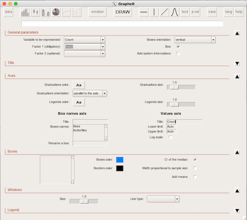
Figure 1. Screenshot of GrapheR GUI menu, box plot options
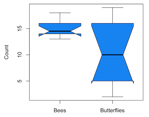
Figure 2. Box plot made with GrapheR.
2. RcmdrPlugin.KMggplot2 — a plugin for R Commander that provides extensive graph manipulation via the ggplot2 package, part of the Tidyverse environment (Fig. 3). Box plot with data point, jitter (Fig. 4)
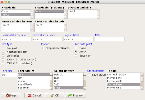
Figure 3. Screenshot of KMggplot2 GUI menu, box plot options
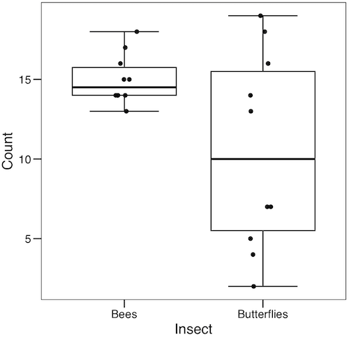
Figure 4. Box plot graph made with GrapheR with jitter applied to avoid overplotting of points.
Note: If data points have the same value, overplotting will result — the two points will be represented as a single point on the plot. The jitter function adds noise to points with the same value so that they will be individually displayed. (Fig. 4) The beeswarm function provides an alternative to jitter (Fig. 5).
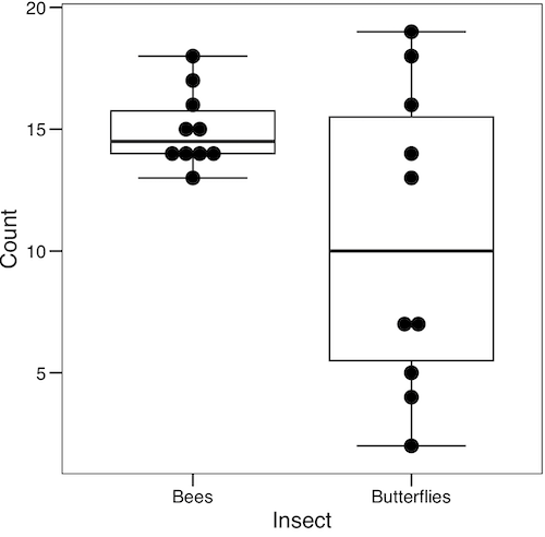
Figure 5. Box plot graph made with GrapheR with beeswarm applied to avoid overplotting of points.
3. A bit more work, but worth a look. Use plotly library to create interactive web application to display your data.
install.packages("plotly")
library(plotly)
fig <- plot_ly(y = Bees, type = "box", name="Bees")
fig <- fig %>% add_trace(y = Butterflies, name="Butterflies")
fig
code modified from example at https://plotly.com/r/box-plots/
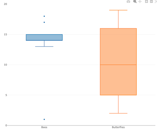
Figure 6. Screenshot of plotly box plot. Live version, data points visible when mouse pointer hover.
4. Veusz, at https://veusz.github.io/. Includes a tutorial to get started. Mac users will need to download the dmg file with the curl command in the terminal app instead of via browser, as explained here.
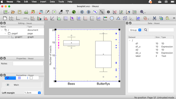
Figure 7. Screenshot of box plot example in Veusz GUI.
5. SciDAVis is a package capable of generating lots of kinds of graphs along with curve fitting routines and other mathematical processing, https://scidavis.sourceforge.net/. SciDAVis is very similar to QtiPlot and OriginLab.
Figure 8. Add screenshot
More sophisticated graphics can, and when you gain confidence in R, you’ll find that there are many more sophisticated packages that you could add to R to make really impressive graphs. However, the point is to get the best graph, and there are many tools out there that can serve this end.
Chapter 4 contents
2.2 – Why do we use R Software?
- Why R? The case for using R in biostatistics education.
- How to get started with R .
- Why R Commander, why not RStudio? .
- Wait! Why don’t we use Microsoft Excel? .
- Statistics comparisons between R and MS Excel .
- Graphics comparison between R and MS Excel .
- So, you’re telling me I don’t need a spreadsheet application? .
- Still not convinced? .
- Why install R on your computer?.
- Help with R?.
- Questions .
- Chapter 2 contents.
Why R? The case for using R in biostatistics education
.
Why do we use R Software? Or put another way: Dr D, Why are you making me use R?
Truth? You can probably use just about any acceptable statistical application to get the work done and achieve the learning objectives we have for beginning biostatistics. However, we will use the R statistical language as our primary statistical software in this course. Part of the justification is that all statistical software applications come with a learning curve, so you’d start at zero regardless of which application I used for the course. In selecting software for statistics I have several criteria. The software should be:
- if not exactly easy, the software should have a reasonable learning curve
- widely accessible and compatible with
allmost personal computers - well-respected and widely used by professionals
- free software
- open source
- well-supported for the purposes of data analysis and data processing
- really good for making graphics, from the basics to advanced
- capable to handle diverse kinds of statistical tests
R meets all of these criteria. R history began back in 1993 and has always been available as free software under the terms of the Free Software Foundation’s GNU General Public License in source code form. R compiles and runs on a wide variety of UNIX platforms and similar systems, including GNU/LINUX, FreeBSD, and various Linux distros like the popular Ubuntu®, in addition to their more famous Microsoft Windows® and Apple macOS® distributions. To facilitate access to the software, numerous mirror sites are available from sites around the world, with cloud.r-project.org supported by RStudio perhaps the most widely used. From January 2023 to December 2023, more than 8 million downloads of base R were made from the RStudio CRAN mirror site (CRAN stands for Comprehensive R Archive Network; a mirror refers to a website or server that holds a copy of files from another website/server to make the files available from more than one place).
changelog file, which allow one to track numbers of downloads for any package from their mirror site — https://cloud.r-project.org/. Here’s the code and recent counts for downloads of R itself (about 400K over a four week period).
install.packages("cranlogs")
library(cranlogs)
# How many downloads of base R first four weeks of Fall semester?
 out <- cran_downloads("R", from = "2023-09-04", to = "2023-09-29")
sum(out$count)
R output
[1] 887417
R is straight-forward to use once you learn how to work with the language, but has a steep learning curve; after all, it’s a programming language. The GUI R Commander helps in this process, and eventually, your use of code will become second nature. After the initial growing pains are behind you, RStudio likely will be a better solution over R Commander. However, while we need statistical software to do statistics, students in my BI311 course must keep in mind that learning objectives for most biostatistics course are about the concepts and interpretation of statistics, not just use of the software. In other words, learning how to use R is not the focus of BI311 nor will you likely achieve R programming competency by the end of the semester. I certainly encourage students to strive for competency and I give frequent bonus opportunities to demonstrate coding skills during the semester.
Thus you might ask if the purpose of the course isn’t to learn R, why work with R instead of a more familiar app or software, e.g., Microsoft Excel® (hereafter simply referred to as Excel), or Google Sheets, or even my favorite open-source office alternative, LibreOffice Calc? Or, perhaps even just one of the many online calculators, if the course learning objective is to “just” learn about statistics?
First, I believe that real data derived from real biology or biomedical problems are essential elements to a first course in biostatistics. That’s not a particularly unique perspective although I don’t have survey results of other statistics instructors to back up the claim. Real problems involve observations on multiple subjects, many variables — large data sets; this alone precludes use of hand calculations and calculators. As a corollary, we will not spend a great deal of time learning the in’s and out’s of the algorithms that form particular statistical tests. Now, do understand that there is a tremendous benefit to understanding statistics by working through the equations, by looking at the algorithms, and there’s no escaping the need for understanding that probability provides the foundation of statistics inference (Chapter 8). Thus, for most of us, the statistical software available to us provides an appropriate framework for applying correct statistical tests to our projects. Therefore, the decision is about which statistical package we should use.
Second, R is perhaps the choice in academia for statistical software. A PUBMED search found more than 1500 citations of R. Visit Robert A. Muenchen’s web page (The popularity of data analysis software, r4stats.com) to see updated statistics on statistical software use. Those of you continuing on to graduate school or to professional schools will find that many of your statistically literate colleagues use R and not one of the commercial programs. While there are many excellent commercial packages (Table 1), and in some cases you can make spreadsheet programs do statistics (typically add-ins are required), all statistical software come with steep learning curves. Thus, part of my selling point to you is that learning to use R is at the cutting-edge in your field and, given that all of the software you could use can have have their challenges, it is best to work with something that will be around and is in wide use, without the burden of a financial investment.
Table 1. A selective list of statistical software.
| Software | Student license? | Limited or full function version | macOS | Windows 11 | Fee* | Academic license type |
|---|---|---|---|---|---|---|
| GraphPad Prism | Subscription, $142 per year | Full | Yes | Yes | $202 | annual subscription |
| JMP | Yes, but with purchase of selected textbook | Limited | Yes | Yes | $100 | monthly subscription |
| Minitab | Subscription, $54.99 per year | Full | Yes | Yes | $1610 | annual subscription |
| IBM SPSS | Rental, $76 per year | Full | Yes | Yes | $260 | annual rental |
| SigmaSTAT | No | NA | No | Yes | $299 | perpetual |
| MySTAT | Yes, free | Limited | No | Yes | NA | |
| SYSTAT | No | NA | No | Yes | $739 | perpetual |
| Stata | Subscription, $94 per year | Full | Yes | Yes | $325 | annual subscription |
see Wikipedia for list of additional software
Third, what about online sites like plot.ly where, for free, you can plot and, in some cases, calculate statistics? What about the web application at Brightstat, which claims to provide an SPSS-like experience online (Stricker 2008)? While it is true that there are many wonderful websites that can perform many of the statistical tests we will use this semester, these sites are not suitable for more than occasional use.
How to get started with R
.
First, a few words about my approach to the software in my biostatistics course. I note to students during the semester that our course is not a programming course, but rather, programming skills are acquired along the way. Our focus is how to do statistical analysis, how to design experiments, etc. Coding skills without understanding of the why we’re doing it is not unlike learning to cook by following a great recipe as opposed to learning about the art and science of flavor (NPR Science Friday, March 15, 2024) — the homework is solved but the why we can support our conclusions may be obscure.
We set aside the first couple of class meetings simply to setup student’s Windows PC or Apple macOS computers to do data science; for students with access to Chromebooks or iPad tablets, we need to set them up to run R in the Cloud (eg., Google Colaboratory) — in other words, there’s a lot of pre-work that can present barriers to actual doing statistics in R (or other software). Once we have the environment set up for the students, I utilize a “tell-show-do” approach to learning how to code. The “tell” part includes sharing script; the “do” part is mostly done by students outside of class as part of completing homework. First work with the language can be frustrating, so I also encourage a “five minute” rule — if it ain’t working, stop. So, by all means when Run through a troubleshooting checklist, but please don’t continue to struggle — the gap is between the instructions and where the student is with the material — it’s a me as instructor problem, not a student must work harder problem!
The R statistical language, accompanied by additional packages to extend its capabilities beyond basic math and statistical functions, provided a complete statistical environment. R is best viewed as a programming language for statistics (data analysis), and data processing. Power users of R learn how to write scripts that do t-tests, ANOVA, regression, etc. The scripts are just lines of code that R understands and it provides the user tremendous control over analysis and inference of data sets. Because of this flexibility and power, however, R can be intimidating at first. So, we’ll start slowly with scripts, introducing just what we need to get started and build from there. We’ll be addressing R issues in more depth over the next several weeks, but for the first week, our goal(s) should be to make sure each of you knows how to start/exit R, how to create and utilize a working directory, and how to use R as a calculator. You obtain your copy of R from the R Project for Statistical Computing, available at https://www.r-project.org. Instructions to install R are provided in Install R. A ten-part tutorial to get started using R is provided in Mike’s Workbook for Biostatistics.
Note 2. A working directory or working folder is something you create on your computer to contain the files and sub-directories of a project. It sets the default location for files you may need to have R read. For example, all of your work for a course (data files, script files, Markdown files), may be stored in a folder called BI311 on your Desktop. For example, on a macOS, the path to the working folder would be
/Users/username/Desktop/BI311
Why R Commander, why not RStudio?
.
We utilize an R package that provides a menu-driven context to much of the typical statistics one needs to do biostatistics. The package is called R Commander (Rcmdr), which provides a graphic user interface or GUI. Rcmdr therefore significantly eases the learning curve for doing statistics with R. We use a package called R Commander, which provides drop down menus for most of the typical kinds of analyses. Rcmdr is in use in many courses across the world (more than 20K downloads in September 2023), and among the other GUI available for R, Rcmdr is among the best supported GUI available for R. R Commander function is extended by plug-ins; as of August 2023, there were 36 plugins that extend Rcmdr’s capabilities. Instructions to install R Commander are provided in Install R Commander.
Note 3. Other options to improve use of R include use of RStudio®, which is an integrated development environment or IDE. RStudio is really nice to use, and, happily, you can run R Commander within RStudio — but with windows popping up outside of the RStudio windowing framework if the default MDI environment to organize is set. (The solution? R Commander runs best when SDI option is selected during RStudio install.) I am also increasingly using shiny apps within the course to help with concept presentation; in the future, I plan to provide a complete shiny app which would allow BI311 students to work interactively with the statistics presented in this text, something like the radiant-rstats project. However, for use in our course, R Commander provides a familiar look as students develop knowledge in the course: simply point and click to access the statistical functions.
Wait! Why don’t we use Excel? My instructor in {insert course here} used Excel…
.
A very reasonable question for you to ask — why don’t we use Microsoft Excel or Google Sheets for statistics? Moreover, it is highly likely that you have gained at least some introduction to descriptive statistics and graphing with spreadsheets in former courses — shouldn’t we learn statistics within a software framework you are already familiar?
After all, “Can’t Microsoft Excel do statistics?” Mostly the answer is, no, not really (Fig 1).
Figure 1. “Spreadsheets,” xkcd.com no. 2180
MS Excel, Google Sheets, Apple Numbers, and for that matter, Calc, the spreadsheet application in my favorite office app LibreOffice (LibreOffice is a free, open-source alternative to Microsoft Office), can be used to calculate many descriptive statistics. With some effort, these applications can be extended by use of either Analysis ToolPak or Solver Add-ins to do more complicated statistics like regression and analysis of variance, and curve fitting.
Note 4. Perhaps you’re thinking: I’m a data science student — it’s not whether we chose between use of spreadsheet apps or R, we should be using Python, shouldn’t we? DrD — this is an open question, and if you judge the job market as the arbiter, I’d say learn Python over R. However, from the point of view of learning statistics, my vote would be R — far more packages developed to accomplish our tasks, and, at least for this course, we are not teaching coding: our focus is on using statistics to explore (describe) and ask questions about data collected by observation or experimentation.
While we’re on the subject in 2025, it looks like the job market is in Machine Learning, which means R or Python knowledge will be a given, but advantage will go to those who know Alteryx or it’s open source alternative KNIME for data science workflow design — from data collection to model development.
However, use of MS Excel for statistical analysis involves learning a number of commands, syntax, and developing workflows that are neither intuitive nor standard. Some publishers have provided add-ins that are reportedly designed to simplify this process (eg, XLStat, UNISTAT, Real Statistics using Excel). None of these options are free and none are in use in any major way by scientists (see Robert Muenchen’s The popularity of data analysis software). The free add-ins of Analysis ToolPak and Solver may work for you if you own a Windows PC, but only Solver is included for the Mac versions of Excel. MacOS users may download and install StatPlus:MacLE, which is a limited, but free alternative to the Analysis ToolPak add-in; for a complete package a Pro version is available (licenses started at $89, web site: www.analystsoft.com/en/products/statplusmacle/).
An additional caution: you should be aware that there have been reports over the years that algorithms selected by Microsoft for Excel have not always been to industry standards (e.g., McCullogh and Wilson 2005). In short, the fit of Excel and other spreadsheet apps for use in statistics is not a simple one. To do the kinds of statistics we will use routinely in class, Excel would need to be modified with add-ins, and the add-ins would be the result of programming by someone. And you would still need to learn how to write the code.
What about graphics? You may like Microsoft Excel’s ability to do graphics. Indeed, Excel, Google Sheets, and LibreOffice Calc can be used to generate many typical kinds of statistical plots. But again, in comparison to R, spreadsheet app graphics are limited and require a deal of effort to generate acceptable plots. I think you’ll be surprised at how straight-forward R is. Here’s an example, first rendered in Microsoft Excel, then in base R. And importantly, the kinds of plots Excel does well at are not necessarily the plots suitable for research publication. For example, Excel allows you to make bar charts easily, but cannot do box plots. Box plots are preferred over bar (column) charts for ratio scale data.
Note 5. base R refers to the core R programming language along with many functions and graphics routines. We extend capabilities of base R by adding packages, like R Commander.
Statistics comparisons between R and MS Excel
.
About that learning curve. Let’s compare R and MS Excel for basic functions common in data analysis. Similar conclusions hold for comparisons to Google Sheets and LibreOffice Calcs.
Note 6. If you search for variants of this question, you’ll find other’s making the argument that the learning curve for many data science tasks is, perhaps surprisingly, shorter for R than it is for Excel. For example, see Amieroh Abrahams 2023 article at https://www.jumpingrivers.com/blog/comparing-r-excel-data-wrangling/ .
Table 2 lists the observations we can use to conduct comparisons of the applications.
Table 2. A simple data set, one variable, A, with 24 observations
| varA |
|---|
| 12 |
| 14 |
| 20 |
| 25 |
| 28 |
| 29 |
| 32 |
| 34 |
| 35 |
| 39 |
| 47 |
| 47 |
| 50 |
| 53 |
| 54 |
| 71 |
| 79 |
| 87 |
| 89 |
| 96 |
| 105 |
| 122 |
| 130 |
| 132 |
One of the first steps in data analysis is to produce what are called descriptive statistics. Common descriptive statistics are the mean and the sample standard deviation. Let’s compare Excel and R for retrieving these two statistics.
With Excel, to calculate the arithmetic mean of 24 numbers, enter the values into a single column of 24 rows, then enter “=average(A2:A25)“, without the quotes, into a new cell of the spreadsheet. “A2:A25” refers to where data would be contained in column A rows 2 through 25. Typically the first row in a worksheet would contain the name of the variable, e.g., “A.” Depending on the significant figures set, the estimate returned by Excel for the mean of A is 59.58333333.
Similarly, to obtain the standard deviation, type =stdev(A2:A25), into a new cell of the spreadsheet. Again, depending on the significant figures set, Excel returns a value of 37.05215674 for the standard deviation of A.
In contrast, to obtain the mean and standard deviation for a variable in an R data set, all you would type at the R prompt (>), or in the script window
Note 7. Always run your code as a script. Entering code at the R prompt means you are working at the command-line interface, and you work one line at a time. This is not an efficient way to interact with R. Instead, I recommend you always create and work from a script document. For beginners, that’s why I recommend R Commander, which includes a script window. Simply type your code in the script window, highlight the code you wish to run, and run by clicking submit button (or Ctrl+R Win11 or Cmd+Enter macOS). When you are ready to move on from R Commander, RStudio is the IDE of choice.
and then submit the code is:
A <- c(12, 14, 20, 25, 28, 29, 32, 34, 35, 39, 47, 47, 50, 53, 54, 71, 79, 87, 89, 96, 105, 122, 130, 132)where the “c” is a function to combine arguments into a vector and saved to the object A, followed at the new line by
mean(A)Hit enter after entering the command) and R returns
[1] 59.58333For the standard deviation, write the R base function sd()
sd(A)Hit enter after entering the command and R returns
[1] 37.05216It’s not much of a difference, but note that to get the mean (arithmetic average) I typed seven characters in R, but 16 characters in Excel; similarly, for the standard deviation I typed in 5 characters in R, but 13 characters in Excel. That’s a savings of 56% and 62%, respectively. Excel tries to help by using AutoComplete to anticipate what you want to enter, but AutoComplete doesn’t always work properly (e.g., see gene name errors generated by use of default Microsoft Excel settings, Ziemann et al 2016).
Note 8. I use spreadsheets all of the time for data entry and data management. Make sure AutoComplete and AutoCorrect options are turned off and these problems are much less.
In conclusion, R is quicker for descriptive statistics.
Graphics comparison between R and MS Excel
.
MS Excel is often cited for its graphics capabilities (Camões 2016). We can make the familiar scatter plots, bar charts, and pie charts in Excel. These plots and more are easily obtained in R. I won’t elaborate here about graphics, we talk at some length about graphics in Chapter 4. But here’s one example in R.
Let’s plot B vs A. We already provided the data for variable A, here’s the data for variable B.
17, 21, 21, 26, 27, 32, 28, 42, 40, 30, 71, 53, 56, 61, 55, 89, 82, 63, 116, 162, 116, 154, 137, 149Don’t recall how to assign a set of numbers to an object, B, in R? See above and look again at how we assigned the numbers to object A.
To get a simple scatter plot (Fig 2), I may write at the R prompt.
plot(A,B)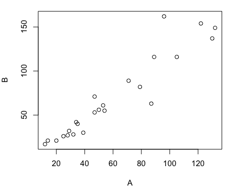
Figure 2. Basic scatter plot made in R, plot(A,B).
And here’s the comparable default plot (Fig 3) from Microsoft Excel, Office 365
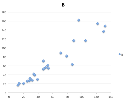
Figure 3. Basic scatterplot made in Microsoft Excel.
Now, both graphs need some work, and to be fair, these are just the defaults. With some effort, you can make an Excel graph look pretty good. But note — the defaults in Excel don’t generate axis labels, while R default plot does. Excel adds a useless title and legend; both need to be removed. Excel also adds grid lines where typically one would not include these in a scientific plot.
Count the steps to generate an acceptable scatter plot (Table 3). I’ve also added R Commander (Rcmdr) steps for comparisons (Rcmdr lets you use drop-down menus like Excel or Google Sheets or LibreOffice Calcs).
Table 3. Steps needed to make a simple scatterplot in R, R Commander, or Microsoft Excel.
| Steps | R | Rcmdr | Excel 365 |
| 1 | write the function | Select Graphs | Highlight columns |
| 2 | Select scatterplot | Select from Menu “Insert” | |
| 3 | Select variables | Select scatterplot | |
| 4 | Uncheck options | Select type of scatterplot | |
| 5 | Delete legend | ||
| 6 | Remove grids | ||
| 7 | Insert X-axis label | ||
| 8 | Insert Y-axis label |
Conclusion? R is quicker for routine statistical plots like a scatter plot. And I didn’t even count the steps needed to change MS Excel’s dreadful diamond icon points.
That’s one step in R, four steps in Rcmdr, but eight steps for Microsoft Excel. LibreOffice Calc is a little better at four steps, but like MS Excel, you’d need to change several components to the graph (Fig 4).
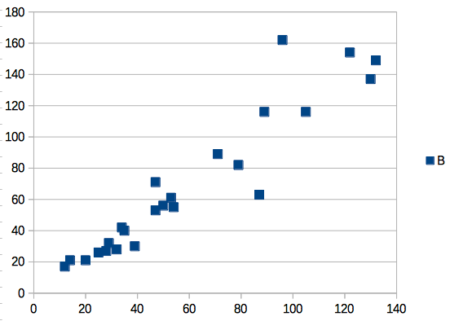
Figure 4. Basic scatterplot made in LibreOffice Calc.
Note 9. In R vernacular, these are referred to as pch, or point characters: pch = 23 returns a blue diamond character; for a blue square like Figure 4, add to the plot() command as
plot(A,B, pch = 22)
So, you’re telling me I don’t need a spreadsheet application?
.
No, not at all. We use spreadsheets, and more generally, databases, to store data. Spreadsheets apps are designed to make data entry and data management approachable and efficient. They remain an important tool for researchers (Browman and Woo 2017).
R is not that great of a spreadsheet; packages are available to seamlessly tie your spreadsheet and database data to R via ODBC. We will routinely enter and manipulate data in MS Excel, then import the data into R for analysis.
Spreadsheet apps like MS Excel and Google Sheets (see also LibreOffice Calc) are great at being a spreadsheet program, R is great at being a statistical software program. You should take advantage of what the tools do best.
Still not convinced?
.
R is in use all over the world, by students and professionals alike and if one is going to spend the time to learn how to use a statistics software program, you should learn a standard program, like R.
And it’s not just me. Read about R in this 2009 New York Times piece, “Data analysts captivated by R’s power.” Look who purchased (April 2015) Revolution Analytics, a major player in the development of the R programming language.
Note 10. The answer was Microsoft. For several years Microsoft supported R development via Microsoft Machine Learning Server & Microsoft R Open. However, as of July 2023, this service is no longer available. See Microsoft R application network retirement.
Why install R on your computer?
.
Convenience. Control. Offline.
At the Biology department of Chaminade University, we have installed and maintain R, Rcmdr, and RStudio along with all required packages on our Macbook Pro® Lab computers for your use during class and during optional, proctored biostatistics work sessions. Since 2018, R is increasingly available “in the cloud” (e.g., RStudio Cloud), which would mean you could run R in your browser and avoid installation on your computer. You can run significant analysis with R in the cloud via the free Google Colaboratory and CoCalc are now available: I encourage you to look into these platforms. Unfortunately, these services are not quite ready for the classroom. For example, RStudio in the Cloud is free to use on a limited basis, but quickly requires a significant subscription cost with increasing use. Google Colab and GoCalcs require use of Jupyter notebooks, which add yet another layer to the learning curve without focusing on learning statistics. Second, although access to their servers is easy, running simultaneous connections via Chaminade’s single public IP address is likely to lead to problems for us. Third, I want you to use R Commander (Rcmdr) to assist in the learning curve — Rcmdr cannot be run in the Cloud (i.e., RStudio in the Cloud, Google Colaboratory, or CoCalc).
Therefore, you are encouraged to install R, Rcmdr, and even RStudio, onto your own computers, in part because of the convenience, but also because R is not generally available to students on campus, i.e., only the Biology department’s computers have the up-to-date R software installed.
To get started, go to your Canvas website and view How to install R on your own computer.
An additional benefit to installing a version of R on your computer, you’ll understand more about the software if you take the time to install and if need be, troubleshoot your installation of the software. Moreover, there’s a considerable amount of help out there for R. For example, a simple Google search(keywords: tutorial “install R”), returns more than 700K hits, and more than 40K January 2023 alone (add “after:2023-01-01” to Google search box). In fact, there’s so much out there that you’ll want to sample from several sites and select the voice that works best for you.
Questions
.
- Conduct the search on Google for tutorials on installing R; find 10 sites and rank them 1 to 10, with 1 being the site you like best and 10 being the one you like least.
- For example, I like https://bookdown.org/ndphillips/YaRrr/, which is an online book for working with R and includes detailed instructions for installing R.
- What are the three reasons I offered to justify use of R over other candidate statistical applications?
- R may be installed on the public computers available to you in the lab. Check to see if this is true, and if so, what version of R is installed?
- What does Rcmdr stand for?
- In your own words, define and contrast GUI applications from IDE applications
- Try some R work yourself
- In R (or Rcmdr), copy and paste the code above for the
Avariable, then create theBvariable. What happens when you type the variable name by itself at the R prompt? - Make a plot of
AandB, but this time plotAagainstB.- What can you conclude about the axis order in the function?
- In R (or Rcmdr), copy and paste the code above for the
Chapter 2 contents
.
4 – How to report statistics
Introduction
While you are thinking about exploring data sets and descriptive statistics, please review our overview of data analysis (Chapter 2.4 and 2.5). While the scientific hypotheses come first, how experiments are designed should allow for straight-forward analysis: in other words, statistics can’t rescue poorly designed experiments, nor can it reveal new insight after the fact.
Once the experiments are completed, all projects will go through a similar process.
- Description: Describe and summarize the results
- Check assumptions
- Inference: conduct tests of hypotheses
- Develop and evaluate statistical models
Clearly this is a simplification, but there’s an expectation your readers will have about a project. Basic questions like how many subjects got better on the treatment? Is there an association between Body Mass Index (BMI) and the primary outcome? Did male and female subjects differ for response to the treatment? Undoubtedly these and related questions form the essence of the inferences, but providing graphs to show patterns may be as important to a reader as any p-value — a number which describes how likely it is that your data would have occurred by chance — e.g., from an Analysis of variance.
Each project is unique, but what elements must be included in a results section?
Data visualization
We describe data in three ways: graphs, tables, and in sentences. In this page we present the basics of when to choose a graph over presenting data in a table or as a series of sentences (i.e., text). In the rest of this chapter we introduce the various graphics we will encounter in the course. Chapter 4 covers eight different graphics, but is by no means an exhaustive list of kinds of graphs. Phylogenetic network graphs are presented in Chapter 20.11. Although an important element of presentation in journal articles, we don’t discuss figure legends or table titles; guidelines are typically available by the journal of choice (e.g., PLOS ONE journals guidelines).
A quick note about terminology. Data visualization encompasses charts, graphs and plots. Of the three terms, chart is the more generic. Graphs are used to display a function or mapping between two variables; plots are kinds of graphs for a finite set of points. There is a difference among the terms, but I confess, I won’t be consistent. Instead, I will refer to each type of data visualization by its descriptive name: bar chart, pie chart, scatter plot, etc. Note that technically, a scatter plot can refer to a graph, e.g., a line drawn to reflect a linear association between the two variables, whereas bar charts and pie charts would not be a graph because no function is implied.
Why display data?
Do we just to show a graph to break the monotony of page after page of text or do we attempt to do more with graphs? After all, isn’t “a picture’s worth a thousand words?” In many cases, yes! Graphics allow us to see patterns. Visualization is a key part of exploratory data analysis, or data mining in the parlance of big data. Data visualization is also a crucial tool in the public health arena, and finding effective graphics to communicate, at times, complex data and information to both public and professional audiences can be challenging (see discussion in Meloncon and Warner 2017).
Graphics are complicated and expensive to do well. Text is much cheaper to publish, even in digital form. But the ability to visualize concepts, that is, to connect ideas to data through our eyes (see Wikipedia), seems to be more the cognitive goal of graphics. Lofty purpose, desirable goal. Yes, it is true that graphics can communicate concepts to the reader, but with some caution. Images distort, and default options in graphics programs are seldom acceptable for conveying messages without bias (Glazer 2011).
Here’s some tips from a book on graphical display (Tufte 1983; see also Camões 2016).
Your goal is to communicate complex ideas with clarity, precision, and efficiency. Graphical displays should:
- show the data
- avoid distorting the data
- present numbers in a small space
- help the viewer’s eye to compare different pieces of data
- serve a clear purpose (description, exploration, tabulation, decoration)
- be closely integrated with statistical and verbal descriptions of a data set.
We accomplish these tasks by following general principles involving scale and a commitment to avoiding bias in our presentation.
Importantly, graphs can show patterns not immediately evident in tables of numbers. See Table 1 for an example of a dataset, “Anscombe’s quartet,” (Anscombe 1973), where a picture is clearly helpful.
Anscombe’s quartet
| X | Y1 | Y2 | Y3 | Y4 |
|---|---|---|---|---|
| 10 | 8.04 | 9.14 | 7.46 | 6.58 |
| 8 | 6.95 | 8.14 | 6.77 | 5.76 |
| 13 | 7.58 | 8.74 | 12.74 | 7.71 |
| 9 | 8.81 | 8.77 | 7.11 | 8.84 |
| 11 | 8.33 | 9.26 | 7.81 | 8.47 |
| 14 | 9.96 | 8.10 | 8.84 | 7.04 |
| 6 | 7.24 | 6.13 | 6.08 | 5.25 |
| 4 | 4.26 | 3.10 | 5.39 | 12.50 |
| 12 | 10.84 | 9.13 | 8.15 | 5.56 |
| 7 | 4.82 | 7.26 | 6.42 | 7.91 |
| 5 | 5.68 | 4.74 | 5.73 | 6.89 |
| Mean (±SD) | 7.50 (2.032) | 7.50 (2.032) | 7.50 (2.032) | 7.50 (2.032) |
The Anscombe dataset is also available in R package stats, or you can copy/paste from Table 1 into a spreadsheet or text file, then load the data file into R (e.g., Rcmdr → Load data set). Note that the data set does not include the column summary statistics shown in the last row of the table.
Before proceeding, look again at the table — See any patterns in the table?
Maybe.… Need to be careful as we humans are really good at perceiving patterns, even when no pattern exists.
Now, look just at the last row in the table, the row containing the descriptive statistics (the means and standard deviations). Any patterns?
The means and standard deviations are the same, so nothing really jumps out at you — does that mean that there are no differences among the columns then?
But let’s see what the scatter plots look like before we conclude that the columns of Y ’s are the same (Fig. 1). I’ll also introduce the R package clipr, which is useful for working with your computer’s clipboard.
To show clipboard history, on Windows 10/11 press Windows logo key plus V; on macOS, open Finder and select Edit → Show Clipboard.
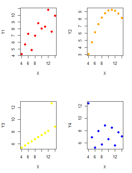
Figure 1. Scatter plot graphs of Anscombe’s quartet (Table 1)
#R code for Figure 1.

require(clipr)
#Copy from the Table and paste into spreadsheet (exclude last row). Highlight and copy data in spreadsheet
myTemp <- read_clip_tbl(read_clip(), header=TRUE, sep = "\t")
#Check that the data have been loaded correctly
head(myTemp)
#attach the data frame, so don't have to refer to variables as myTemp\$variable name
attach(myTemp)
#set the plot area for 4 graphs in 2X2 frame
par(mfrow=c(2,2))
plot(X, Y1, pch=19, col="red", cex=1.2)
plot(X, Y2, pch=19, col="orange",cex=1.2)
plot(X, Y3, pch=19, col="yellow",cex=1.2)
plot(X, Y4, pch=19, col="blue",cex=1.2)
And now we can see that the Y ‘s have different stories to tell. While the summary (descriptive) statistics are the same, the patterns of the association between Y values and the X variable are qualitatively different: Y1 is linear, but diffuse; Y2 is nonlinearly associated with X; Y3, like Y1, is linearly related to X, but one data point seems to be an outlier; and for Y4 we see a diffuse nonlinear trend and an outlier.
So, that’s the big picture here. In working with data, you must look at both ways to “see” data — you need to make graphs and you also need to calculate basic descriptive statistics.
And as to the reporting of these results, sometimes Tables are best (i.e., so others can try different statistical tests), but patterns can be quickly displayed with carefully designed graphs. Clearly, in this case, the graphs were very helpful to reveal trends in the data.
When to report numbers in a sentence? In a table? In a graph?
The choice depends on the message. Usually you want to make a comparison (or series of comparisons). If you are reporting one or two numbers in a comparison, a sentence is fine. “The two feral goat populations had similar mean numbers (120 vs. 125) of kids each breeding period.” If you have only a few comparisons to make, the text table is useful:
Table 2. Data from Kipahoehoe Natural Area Reserve, SW slope of Mauna Loa.
| Location | Number of kids |
|---|---|
| Outside fence | |
| kīpuka | 51 |
| other | 120 |
| Inside fence | |
| kīpuka | 3 |
To conclude, tables are the best way to show exact numbers and tables are preferred over graphs when many comparisons need to be made. (Note: this was a real data set, but I’ve misplaced the citation!)
A kīpuka is a land area surrounded by recent lava flows.
Couldn’t I use a pie chart for this?
Yes, but I will try and persuade you to not. Pie charts are used to show part-whole relationships. If there are just a few groups, and if we don’t care about precise comparisons, pie charts may be effective. Some good examples are Figure 1 O’Neill et al 2020,
Sometimes, people use pie charts for very small data sets (comparing two populations, or three categories, for example). These work well, but as we increase the number of categories, the graphic likely requires additional labels and remarks to clarify the message. The problem with pie charts is that they require interpretation of the angles that define the wedges, so we can’t be very precise about that. Bar charts are much better than pie charts — but can also suffer when many categories are used (Chapter 4.1).
To illustrate the problem, here’s a couple of pie charts from Microsoft Excel (a similar chart can be made with LibreOffice Calc) for our goat data set; compare this graph to the table and to the bar chart below (Fig. 2).
Figure 2. Excel pie chart of Table 2 data set
A bar chart of the same data (Fig. 3)
Figure 3. Bar chart of Table 2 data set
The bar chart (Fig. 3) is easier to get the message across; more goat kids were found outside the fenced area then inside the fenced in areas. We can also see that more goat kids were found in the “other” areas compared to the kipuka. The pie chart (Fig. 2) in my opinion fails to communicate these simple comparisons, conclusions about patterns in the data that clearly would be the take-home message from this project. Aesthetically the bar chart could be improved — a mosaic plot would work well to show the associations in the project results (See Ch 4.4 Mosaic plots).
But we are not done with this argument, to use graphics or text to report results. Neither the bar chart (mosaic plot) or the pie chart really work. The reader has to interpret the graphics by extrapolating to the axes to get the numbers. While it may be boring — 1.5 million hits Google search “data tables” boring — tables can be used for comparisons and make the patterns more clear and informative to the reader. Here’s a different version of the table to emphasize the influence of fencing on the goat population.
Table 3. Revised Table 2 to emphasize comparisons between inside and outside the fence line on feral goat population on Mauna Loa.
| Location | Kīpuka | Other |
|---|---|---|
| Outside fence | 51 | 120 |
| Inside fence | 3 | 15 |
Table 3 would be my choice — over a sentence and over a graph. At a glance I can see that more goat kids were found outside of the fenced area, regardless of whether it was in a kipuka or some other area on the mountain side. Table 3 is an improvement over Table 2 because it presents the comparisons in a 2 X 2 format — especially useful when we have a conditional set.
For example, it’s useful to show the breakdown of voting results in tables (numbers of votes for different candidates by voter’s party affiliation, home district, sex, economic status, etc.). Interested readers can then scan through the table to identify the comparison they are most interested in. But often, a graph is the best choice to display information. One final point, by judiciously combining words, numbers, and images, you should be able to convey even the most complex information in a clear manner! We will not spend a lot of time on these issues, but you will want to pay some attention to these points as you work on your own projects.
Some final comments about how to present data
What your graph looks like is up to you, lots of people have advice (e.g., Klass 2012). But we all know poor graphs when we see them in talks or in papers; we know them when we struggle to make sense of the take-home message. We know them when we feel like we’re missing the take-home message.
Here’s my basic take on communicating information with graphics.
- Minimize white space (for example, the scatter plots above could be improved simply by increasing the point size of the data points)
- Avoid bar charts for comparisons if you are trying to compare more than about three or four things.
- A graphic in a science report that is worth “a thousand words” probably is too complicated, too much information, and, very likely, whatever message you are trying to convey is better off in the text.
Chapter 4 contents