16.2 – Causation and Partial correlation
Introduction
Science driven by statistical inference and model building is largely motivated by the the drive to identify pathways of cause and effect linking events and phenomena observed all around us. (We first defined cause and effect in Chapter 2.4) The history of philosophy, from the works of Ancient Greece, China, Middle East and so on is rich in the language of cause and effect. From these traditions we have a number of ways to think of cause and effect, but for us it will be enough to review the logical distinction among three kinds of cause-effect associations:
- Necessary cause
- Sufficient cause
- Contributory cause
Here’s how the logic works. If A is a necessary cause of B, then the mere fact that B is present implies that A must also be present. Note however, that the presence of A does not imply that B will occur. If A is a sufficient cause of B, then the presence of A necessarily implies the presence of B. However, another cause C may alternatively cause B. Enter the contributory or related cause: A cause may be contributory if the presumed cause A (1) occurs before the effect B, and (2) changing A also changes B. Note that a contributory cause does not need to be necessary nor must it be sufficient; contributory causes play a role in cause and effect.
Thus, following this long tradition of thinking about causality we have the mantra, “Correlation does not imply causation.” The exact phrase was written as early as emphasized by Karl Pearson who invented the statistic back in the late 1800s. This well-worn slogan deserves to be on T-shirts and bumper stickers*, and perhaps to be viewed as the single most important concept you can take from a course in philosophy/statistics. But in practice, we will always be tempted to stray from this guidance. The developments in genome-wide-association studies, or GWAS, are designed to look for correlations, as evidenced by statistical linkage analysis, between variation at one DNA base pair and presence/absence of disease or condition in humans and animal models. These are costly studies to do and in the end, the results are just that, evidence of associations (correlations), not proof of genetic cause and effect. We are less likely to be swayed by a correlation that is weak, but what about correlations that are large, even close to one? Is not the implication of high, statistically significant correlation evidence of causation? No, necessary, but not sufficient.
Notes. A helpful review on causation in epidemiology is available from Parascandola and Weed (2001); see also Kleinberg and Hripcsak (2011). For more on “correlation does not imply causation”, try the Wikipedia entry. Obviously, researchers who engage in genome wide association studies are aware of these issues: see for example discussion by Hu et al (2018) on causal inference and GWAS.
Causal inference (Pearl 2009; Pearl and Mackenzie 2018), in brief, employs a model to explain the association between dependent and multiple, likely interrelated candidate causal variable, which is then subject to testing — is the model stable when the predictor variables are manipulated, when additional connections are considered (e.g., predictor variable 1 covaries with one or more other predictor variables in the model). Wright’s path analysis, now included as one approach to Structural Equation Modeling, is used to relate equations (models) of variation in observed variables attributed to direct and indirect effects from predictor variables.
* And yes, a quick Google search reveals lots of bumper stickers and T-shirts available with the causation  sentiment.
Spurious correlations
Correlation estimates should be viewed as hypotheses in the scientific sense of the meaning of hypotheses for putative cause-effect pairings. To drive the point home, explore the web site “Spurious Correlations” at https://www.tylervigen.com/spurious-correlations , which allows you to generate X-Y plots and estimate correlations among many different variables. Some of my favorite correlations from “Spurious Correlations” include (Table 1):
Table 1. Spurious correlations, https://www.tylervigen.com/spurious-correlations
| First variable | Second variable | Correlation |
| Divorce rate in Maine, USA | Per capita USA consumption of margarine | +0.993 |
| Honey producing bee colonies USA | Juvenile arrests for marijuana possession | -0.933 |
| Per capita USA consumption of mozzarella cheese | Civil engineering PhD awarded USA | +0.959 |
| Total number of ABA lawyers USA | Cost of red delicious apples | +0.879 |
These are some pretty strong correlations (cf. effect size discussion, Ch11.4), about as close to +1 as you can get. But really, do you think the amount of cheese that is consumed in the USA has anything to do with the number of PhD degrees awarded in engineering or that apple prices are largely set by the number of lawyers in the USA? Cause and effect implies there must also be some plausible mechanism, not just a strong correlation.
But that does NOT ALSO mean that a high correlation is meaningless. The primary reason a correlation cannot tell about causation is because of the problem (potentially) of an UNMEASURED variable (a confounding variable) being the real driving force (Fig. 1).
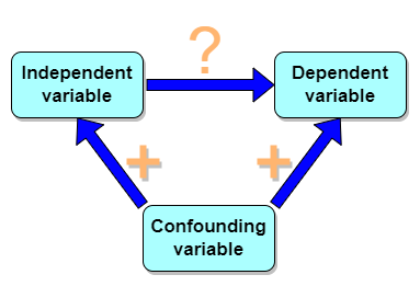
Figure 1. Unmeasured confounding variables influence association between independent and dependent variables, the characters or traits we are interested in.
Here’s a plot of running times for the best, fastest men and women runners for the 100-meter sprint. Running times over 100 meters of top athletes since the 1920s. The data are collated for you and presented at end of this page (scroll or click here).
Here’s a scatterplot (Fig. 2).
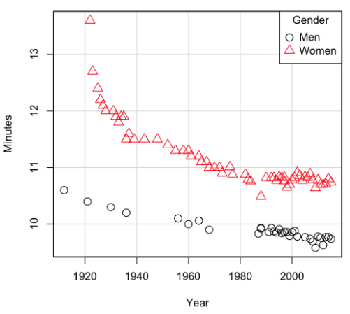
Figure 2. Running times over 100 meters of top athletes since the 1920s.
There’s clearly a negative correlation between years and running times. Is the rate of improvement in running times the same for men and women? Is the improvement linear? What, if any, are the possible confounding variables? Height? weight? Biomechanical differences? Society? Training? Genetics? … Performance enhancing drugs…?
If we measure potential confounding factors, we may be able to determine the strength of correlation between two variables that share variation with a third variable.
The partial correlation
There are several ways to work this problem. The partial correlation is a useful way to handle this problem, i.e., where a measured third variable is positively correlated with the two variable you are interested in.

Without formal mathematical proof presented, r12.3 is the correlation between variables 1 and 2 INDEPENDENT of any covariation with variable 3.
For our running data set, we have the correlation between women’s time for 100m over 9 decades, (r13 = -0.876), between men’s time for 100m over 9 decades (r23 = -0.952), and finally, the correlation we’re interested in, whether men’s and women’s times are correlated (r12 = +0.71). When we use the partial correlation, however, I get r12.3 = -0.819… much less than 0 and significantly different from zero. In other words, men’s and women’s times are not positively correlated independent of the correlation both share with the passage of time (decades)! The interpretation is that men are getting faster at a rate faster than women.
In conclusion, keep your head about you when you are doing analyses. You may not have the skills or knowledge to handle some problems (partial correlation), but you can think simply — why are two variables correlated? One causes the other to increase (or decrease) OR the two are both correlated with another variable.
Testing the partial correlation
Like our simple correlation, the partial correlation may be tested by a t-test, although modified to account for the number of pairwise correlations (Wetzels and Wagenmakers 2012). The equation for the t test statistic is now

with k equal to the number of pairwise correlations and n – 2 – k degrees of freedom.
Examples
Lead exposure and low birth weigh. The data set is numbers of low birth weight births (< 2,500 g regardless of gestational age) and numbers of children with high levels of lead (10 or more micrograms of lead in a deciliter of blood) measured from their blood. Data used for 42 cities and towns of Rhode Island, United States of America (data at end of this page, scroll or click here to access the data).
A scatterplot of number of children with high lead is shown below (Fig 3).
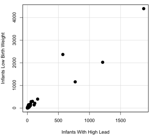
Figure 3. Scatterplot birth weight by lead exposure.
The product moment correlation was r = 0.961, t = 21.862, df = 40, p < 2.2e-16. So, at first blush looking at the scatterplot and the correlation coefficient, we conclude that there is a significant relationship between lead and low birth weight, right?
However, by the description of the data you should note that counts were reported, not rates (e.g., per 100,000 people). Clearly, population size varies among the cities and towns of Rhode Island. West Greenwich had 5085 people whereas Providence had 173,618. We should suspect that there is also a positive correlation between number of children born with low birth weight and numbers of children with high levels of lead. Indeed there are.
Correlation between Low Birth Weight and Population, r = 0.982
Correlation between High Lead levels and Population, r = 0.891
The question becomes, after removing the covariation with population size is there a linear association between high lead and low birth weight? One option is to calculate the partial correlation. To get partial correlations in Rcmdr, select
Statistics → Summaries → Correlation matrix
then select “partial” and select all three variables (Ctrl key) (Fig. 4)
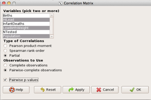
Figure 4. Screenshot Rcmdr partial correlation menu
Results are shown below.
partial.cor(leadBirthWeight[,c("HiLead","LowBirthWeight","Population")], tests=TRUE, use="complete")

Partial correlations:
                 HiLead LowBirthWeight Population
HiLead          0.00000        0.99181   -0.97804
LowBirthWeight  0.99181        0.00000    0.99616
Population     -0.97804        0.99616    0.00000
Thus, after removing the covariation we conclude there is indeed a strong correlation between lead and low birth weights.
Note. A little bit of verbiage about correlation tables (matrices). Note that the matrix is symmetric and the information is repeated. I highlighted the diagonal in green. The upper triangle (red) is identical to the lower triangle (blue). When you publish such matrices, don’t publish both the upper and lower triangles; it’s also not necessary to publish the on-diagonal numbers, which are generally not of interest. Thus, the publishable matrix would be
Partial correlations:
                LowBirthWeight Population
HiLead                 0.99181   -0.97804
LowBirthWeight                    0.99616
Another example
Do Democrats prefer cats? The question I was interested in, Do liberals really prefer cats, was inspired by a Time magazine 18 February 2014 article. I collated data on a separate but related question: Do states with more registered Democrats have more cat owners? The data set was compiled from three sources: 2010 USA Census, a 2011 Gallup poll about religious preferences, and from a data book on survey results of USA pet owners (data at end of this page, scroll or click here to access the data).
Note: This type of data set involves questions about groups, not individuals. We have access to aggregate statistics for groups (city, county, state, region), but not individuals. Thus, our conclusions are about groups and cannot be used to predict individual behavior, e.g., knowing a person votes Green Party does not mean they necessarily share their home with a cat). See ecological fallacy.
This data set also demonstrates use of transformations of the data to improve fit of the data to statistical assumptions (normality, homoscedacity).
The variables, and their definitions, were:
ASDEMS = DEMOCRATS. Democrat advantage: the difference in registered Democrats compared to registered Republicans as a percentage; to improve the distribution qualities the arcsine transform was applied..
ASRELIG = RELIGION. Percent Religous from a Gallup poll who reported that Religion was “Very Important” to them. Also arcsine-transformed to improve normality and homoescedasticity (there you go, throwing $3 words around 🤠 ).
LGCAT = Number of pet cats, log10-transformed, estimated for USA states by survey, except Alaska and Hawaii (not included in the survey by the American Veterinary Association).
LGDOG = Estimated number of pet dogs, log10-transformed for states, except Alaska and Hawaii (not included in the survey by the American Veterinary Association).
LGIPC = Per capita income, log10-transformed.
LGPOP = Population size of each state, log10 transformed.
As always, begin with data exploration. All of the variables were right-skewed, so I applied data transformation functions as appropriate: log10 for the quantitative data and arc sine transform for the frequency variables. Because Democrat Advantage and Percent Religious variables were in percentages, the values were first divided by 100 to make frequencies, then the R function asin() was applied. All analyses were conducted on the transformed data, therefore conclusions apply to the transformed data. To relate the results to the original scales, back transformations would need to be run on any predictions. Back transformation for log10 would be power of ten; for the arcsine-transform the inverse of the arcsine would be used.
A scatter plot matrix (KMggplo2) plus histograms of the variables along the diagonals shows the results of the transforms and hints at the associations among the variables. A graphic like this one is called a trellis plot; a layout of smaller plots in a grid with the same (preferred) or at least similar axes. Trellis plots (Fig. 5) are useful for finding the structure and patterns in complex data. Scanning across a row shows relationships between one variable with all of the others. For example, the first row Y-axis is for the ASDEMS variable; from left to right along the row we have, after the histogram, what look to be weak associations between ASDEMS and ASRELIG, LGCAT, LGDOG, and LGDOG.
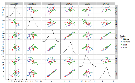
Figure 5. Trellis plot, correlations among variables.
A matrix of partial correlations was produced from the Rcmdr correlation call. Thus, to pick just one partial correlation, the association between DEMOCRATS and RELIGION (reported as “very important”) is negative (r = -0.45) and from the second matrix we retrieve the approximate P-value, unadjusted for the multiple comparisons problem, of p = 0.0024. We quickly move past this matrix to the adjusted P-values and confirm that this particular correlation is statistically significant even after correcting for multiple comparisons. Thus, there is a moderately strong negative correlation between those who reported that religion was very important to them and the difference between registered Democrats and Republicans in the 48 states. Because it is a partial correlation, we can conclude that this correlation is independent of all of the other included variables.
And what about our original question: Do Democrats prefer cats over dogs? The partial correlation after adjusting for all of the other correlated variables is small (r = 0.05) and not statistically different from zero (P-value greater than 5%).
Are there any interesting associations involving pet ownership in this data set? See if you can find it (hint: the correlation you are looking for is also in red).
Partial correlations:
         ASDEMS  ASRELIG LGCAT   LGDOG   LGIPC   LGPOP
ASDEMS   0.0000 -0.4460  0.0487  0.0605  0.1231 -0.0044
ASRELIG -0.4460  0.0000 -0.2291 -0.0132 -0.4685  0.2659
LGCAT    0.0487 -0.2291  0.0000  0.2225 -0.1451  0.6348
LGDOG    0.0605 -0.0132  0.2225  0.0000 -0.6299  0.5953
LGIPC    0.1231 -0.4685 -0.1451 -0.6299  0.0000  0.6270
LGPOP   -0.0044  0.2659  0.6348  0.5953  0.6270  0.0000
Raw P-values, Pairwise two-sided p-values:
         ASDEMS ASRELIG  LGCAT   LGDOG   LGIPC   LGPOP
ASDEMS           0.0024  0.7534  0.6965  0.4259  0.9772
ASRELIG  0.0024          0.1347  0.9325  0.0013  0.0810
LGCAT    0.7534  0.1347          0.1465  0.3473  <.0001
LGDOG    0.6965  0.9325  0.1465          <.0001  <.0001
LGIPC    0.4259  0.0013  0.3473  <.0001          <.0001
LGPOP    0.9772  0.0810  <.0001  <.0001  <.0001
Adjusted P-values, Holm’s method (Benjamini and Hochberg 1995)
         ASDEMS ASRELIG  LGCAT   LGDOG   LGIPC   LGPOP
ASDEMS           0.0241  1.0000  1.0000  1.0000  1.0000
ASRELIG  0.0241          1.0000  1.0000  0.0147  0.7293
LGCAT    1.0000  1.0000          1.0000  1.0000  <.0001
LGDOG    1.0000  1.0000  1.0000          <.0001  0.0002
LGIPC    1.0000  0.0147  1.0000  <.0001          <.0001
LGPOP    1.0000  0.7293  <.0001  0.0002  <.0001
A graph (Fig. 6) to summarize the partial correlations: green lines indicate positive correlation, red lines show negative correlations; Strength of association indicated by the line thickness, with thicker lines corresponding to greater correlation.
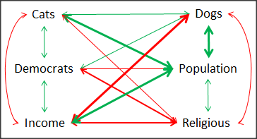
Figure 6. Causal paths among variables.
As you can see, partial correlation analysis is good for a few variables, but as the numbers increase it is difficult to make heads or tails out of the analysis. Better methods for working with these highly correlated data in what we call multivariate data analysis, for example Structural Equation Modeling or Path Analysis.
Questions
- True of False. We know that correlations should not be interpreted as “cause and effect.” However, it is safe to assume that a correlation very close to the limits (r = 1 or r = -1) is likely to mean that one of the variables causes the other to vary.
- Spurious correlations can be challenging to recognize, and, sometimes, they become part of a challenge to medicine to explain away. A classic spurious correlation is the correlation between rates of MMR vaccination and autism prevalence. Here’s a table of numbers for you
Table 2. Autism rates and additional “causal” variables.
| Year | Herb Supplement Revenue, millions  |
Autism Prevalence per 1000 | |||
| 2000 | 4225 | 47.7 | 179 | 6.7 | |
| 2001 | 4361 | 48.6 | 183 | 4.5 | |
| 2002 | 4275 | 49.9 | 190 | 8.7 | 6.6 |
| 2003 | 4146 | 52.6 | 196 | 7.5 | |
| 2004 | 4288 | 54.5 | 199 | 14.3 | 8 |
| 2005 | 4378 | 55.5 | 197 | 48.3 | |
| 2006 | 4558 | 56.9 | 198 | 180 | 9 |
| 2007 | 4756 | 57.6 | 204 | 226 | |
| 2008 | 4800 | 56.7 | 202 | 275 | 11.3 |
| 2009 | 5037 | 56.1 | 201 | 336 | |
| 2010 | 5049 | 56.1 | 209 | 441 | 14.4 |
| 2011 | 5302 | 57.5 | 212 | 437 | |
| 2012 | 5593 | 58.7 | 216 | 446 | 14.5 |
| 2013 | 6033 | 59.7 | 220 | 516 | |
| 2014 | 6441 | 61.6 | 224 | 450 | 16.8 |
| 2015 | 6922 | 62.8 | 222 | 609 | |
| 2016 | 7452 | 64.1 | 219 | 666 | 18.5 |
| 2017 | 8085 | 63.9 | 213 | 735 | |
| 2018 | 65.3 | 220 | 800 | 25 |
- Make scatterplots of autism prevalence vs
- Herb supplement revenue
- Fertility rate
- MMR vaccination
- UFC revenue
- Calculate and test correlations between autism prevalence vs
- Herb supplement revenue
- Fertility rate
- MMR vaccination
- UFC revenue
- Interpret the correlations — is there any clear case for autism vs MMR?
- What additional information is missing from Table 2? Add that missing variable and calculate partial correlations for autism prevalence vs
- Herb supplement revenue
- Fertility rate
- MMR vaccination
- UFC revenue
- Do a little research: What are some reasons for increase in autism prevalence? What is the consensus view about MMR vaccine and risk of autism?
Data used in this page, 100 meter running times since 1900.
| Year | Men | Women |
| 1912 | 10.6 | |
| 1913 | ||
| 1914 | ||
| 1915 | ||
| 1916 | ||
| 1917 | ||
| 1918 | ||
| 1919 | ||
| 1920 | ||
| 1921 | 10.4 | |
| 1922 | 13.6 | |
| 1923 | 12.7 | |
| 1924 | ||
| 1925 | 12.4 | |
| 1926 | 12.2 | |
| 1927 | 12.1 | |
| 1928 | 12 | |
| 1929 | ||
| 1930 | 10.3 | |
| 1931 | 12 | |
| 1932 | 11.9 | |
| 1933 | 11.8 | |
| 1934 | 11.9 | |
| 1935 | 11.9 | |
| 1936 | 10.2 | 11.5 |
| 1937 | 11.6 | |
| 1938 | ||
| 1939 | 11.5 | |
| 1940 | ||
| 1941 | ||
| 1942 | ||
| 1943 | 11.5 | |
| 1944 | ||
| 1945 | ||
| 1946 | ||
| 1947 | ||
| 1948 | 11.5 | |
| 1949 | ||
| 1950 | ||
| 1951 | ||
| 1952 | 11.4 | |
| 1953 | ||
| 1954 | ||
| 1955 | 11.3 | |
| 1956 | 10.1 | |
| 1957 | ||
| 1958 | 11.3 | |
| 1959 | ||
| 1960 | 10 | 11.3 |
| 1961 | 11.2 | |
| 1962 | ||
| 1963 | ||
| 1964 | 10.06 | 11.2 |
| 1965 | 11.1 | |
| 1966 | ||
| 1967 | 11.1 | |
| 1968 | 9.9 | 11 |
| 1969 | ||
| 1970 | 11 | |
| 1972 | 10.07 | 11 |
| 1973 | 10.15 | 10.9 |
| 1976 | 10.06 | 11.01 |
| 1977 | 9.98 | 10.88 |
| 1978 | 10.07 | 10.94 |
| 1979 | 10.01 | 10.97 |
| 1980 | 10.02 | 10.93 |
| 1981 | 10 | 10.9 |
| 1982 | 10 | 10.88 |
| 1983 | 9.93 | 10.79 |
| 1984 | 9.96 | 10.76 |
| 1987 | 9.83 | 10.86 |
| 1988 | 9.92 | 10.49 |
| 1989 | 9.94 | 10.78 |
| 1990 | 9.96 | 10.82 |
| 1991 | 9.86 | 10.79 |
| 1992 | 9.93 | 10.82 |
| 1993 | 9.87 | 10.82 |
| 1994 | 9.85 | 10.77 |
| 1995 | 9.91 | 10.84 |
| 1996 | 9.84 | 10.82 |
| 1997 | 9.86 | 10.76 |
| 1998 | 9.86 | 10.65 |
| 1999 | 9.79 | 10.7 |
| 2000 | 9.86 | 10.78 |
| 2001 | 9.88 | 10.82 |
| 2002 | 9.78 | 10.91 |
| 2003 | 9.93 | 10.86 |
| 2004 | 9.85 | 10.77 |
| 2005 | 9.77 | 10.84 |
| 2006 | 9.77 | 10.82 |
| 2007 | 9.74 | 10.89 |
| 2008 | 9.69 | 10.78 |
| 2009 | 9.58 | 10.64 |
| 2010 | 9.78 | 10.78 |
| 2011 | 9.76 | 10.7 |
| 2012 | 9.63 | 10.7 |
| 2013 | 9.77 | 10.71 |
| 2014 | 9.77 | 10.8 |
| 2015 | 9.74 | 10.74 |
| 2016 | 9.8 | 10.7 |
| 2017 | 9.82 | 10.71 |
| 2018 | 9.79 | 10.85 |
| 2019 | 9.76 | 10.71 |
| 2020 | 9.86 | 10.85 |
Data used in this page, birth weight by lead exposure
| CityTown | Core | Population | NTested | HiLead | Births | LowBirthWeight | InfantDeaths |
| Barrington | n | 16819 | 237 | 13 | 785 | 54 | 1 |
| Bristol | n | 22649 | 308 | 24 | 1180 | 77 | 5 |
| Burrillville | n | 15796 | 177 | 29 | 824 | 44 | 8 |
| Central Falls | y | 18928 | 416 | 109 | 1641 | 141 | 11 |
| Charlestown | n | 7859 | 93 | 7 | 408 | 22 | 1 |
| Coventry | n | 33668 | 387 | 20 | 1946 | 111 | 7 |
| Cranston | n | 79269 | 891 | 82 | 4203 | 298 | 20 |
| Cumberland | n | 31840 | 381 | 16 | 1669 | 98 | 8 |
| East Greenwich | n | 12948 | 158 | 3 | 598 | 41 | 3 |
| East Providence | n | 48688 | 583 | 51 | 2688 | 183 | 11 |
| Exeter | n | 6045 | 73 | 2 | 362 | 6 | 1 |
| Foster | n | 4274 | 55 | 1 | 208 | 9 | 0 |
| Glocester | n | 9948 | 80 | 3 | 508 | 32 | 5 |
| Hopkintown | n | 7836 | 82 | 5 | 484 | 34 | 3 |
| Jamestown | n | 5622 | 51 | 14 | 215 | 13 | 0 |
| Johnston | n | 28195 | 333 | 15 | 1582 | 102 | 6 |
| Lincoln | n | 20898 | 238 | 20 | 962 | 52 | 4 |
| Little Compton | n | 3593 | 48 | 3 | 134 | 7 | 0 |
| Middletown | n | 17334 | 204 | 12 | 1147 | 52 | 7 |
| Narragansett | n | 16361 | 173 | 10 | 728 | 42 | 3 |
| Newport | y | 26475 | 356 | 49 | 1713 | 113 | 7 |
| New Shoreham | n | 1010 | 11 | 0 | 69 | 4 | 1 |
| North Kingstown | n | 26326 | 378 | 20 | 1486 | 76 | 7 |
| North Providence | n | 32411 | 311 | 18 | 1679 | 145 | 13 |
| North Smithfield | n | 10618 | 106 | 5 | 472 | 37 | 3 |
| Pawtucket | y | 72958 | 1125 | 165 | 5086 | 398 | 36 |
| Portsmouth | n | 17149 | 206 | 9 | 940 | 41 | 6 |
| Providence | y | 173618 | 3082 | 770 | 13439 | 1160 | 128 |
| Richmond | n | 7222 | 102 | 6 | 480 | 19 | 2 |
| Scituate | n | 10324 | 133 | 6 | 508 | 39 | 2 |
| Smithfield | n | 20613 | 211 | 5 | 865 | 40 | 4 |
| South Kingstown | n | 27921 | 379 | 35 | 1330 | 72 | 10 |
| Tiverton | n | 15260 | 174 | 14 | 516 | 29 | 3 |
| Warren | n | 11360 | 134 | 17 | 604 | 42 | 1 |
| Warwick | n | 85808 | 973 | 60 | 4671 | 286 | 26 |
| Westerly | n | 22966 | 140 | 11 | 1431 | 85 | 7 |
| West Greenwich | n | 5085 | 68 | 1 | 316 | 15 | 0 |
| West Warwick | n | 29581 | 426 | 34 | 2058 | 162 | 17 |
| Woonsoket | y | 43224 | 794 | 119 | 2872 | 213 | 22 |
Data in this page, Do Democrats prefer cats?
Chapter 16 contents
- Introduction
- Product moment correlation
- Causation and Partial correlation
- Data aggregation and correlation
- Spearman and other correlations
- Instrument reliability and validity
- Similarity and Distance
- References and suggested readings
4.10 – Graph software
Introduction
You may already have experience with use of spreadsheet programs to create bar charts and scatter plots. Microsoft Office Excel, Google Sheets, Numbers for Mac, and LibreOffice Calc are good at these kinds of graphs — although arguably, even the finished graphics from these products are not suitable for most journal publications.
For bar charts, pie charts, and scatter plots, if a spreadsheet app is your preference, go for it, at least for your statistics class. This choice will work for you, at least it will meet the minimum requirements asked of you.
However, you will find spreadsheet apps are typically inadequate for generating the kinds of graphics one would use in even routine statistical analyses (e.g., box plots, dot plots, histograms, scatter plots with trend lines and confidence intervals, etc.). And, without considerable effort, most of the interesting graphics (e.g., box plots, heat maps, mosaic plots, ternary plots, violin plots), are impossible to make with spreadsheet programs.
At this point, you can probably discern that, while I’m not a fan of spreadsheet graphics, I’m also not a purist — you’ll find spreadsheet graphics scattered throughout Mike’s Biostatistics Book. Beyond my personal bias, I can make the positive case for switching from spreadsheet app to R for graphics is that the learning curve for making good graphs with Excel and other spreadsheet apps is as steep as learning how to make graphs in R (see Why do we use R Software?). In fact, for the common graphs, R and graphics packages like lattice, ggplot2, make it easier to create publishing-quality graphics.
Alternatives to base R plot
This is a good point to discuss your choice of graphic software — I will show you how to generate simple graphs in R and R Commander which primarily rely on plotting functions available in the base R package. These will do for most of the homework. R provides many ways to produce elegant, publication-quality graphs. However, because of its power, R graphics requires lots of process iterations in order to get the graph just right. Thus, while R is our software of choice, other apps may be worth looking at for special graphics work.
My list emphasizes open source and or free software available both on Windows and macOS personal computers. Data set used for comparison from Veusz (Table).
| Bees | Butterflies |
|---|---|
| 15 | 13 |
| 18 | 4 |
| 16 | 5 |
| 17 | 7 |
| 14 | 2 |
| 14 | 16 |
| 13 | 18 |
| 15 | 14 |
| 14 | 7 |
| 14 | 19 |
1. GrapheR — R package that provides a basic GUI (Fig. 1) that relies on Tcl/Tk — like R Commander — that helps you generate good scatter plots, histograms, and bar charts. Box plot with confidence intervals of medians (Fig. 2).
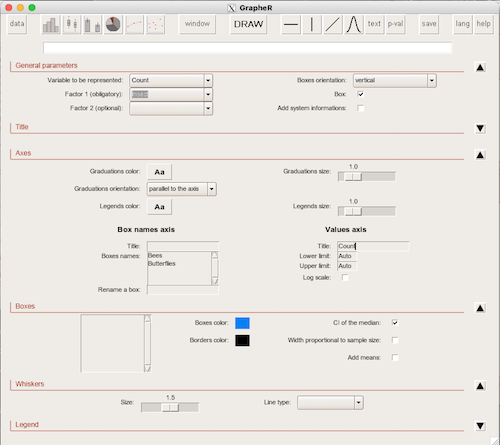
Figure 1. Screenshot of GrapheR GUI menu, box plot options
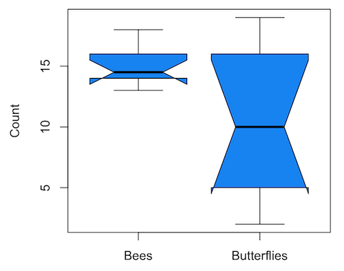
Figure 2. Box plot made with GrapheR.
2. RcmdrPlugin.KMggplot2 — a plugin for R Commander that provides extensive graph manipulation via the ggplot2 package, part of the Tidyverse environment (Fig. 3). Box plot with data point, jitter (Fig. 4)
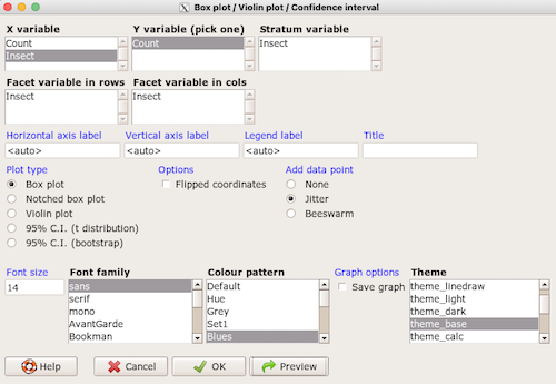
Figure 3. Screenshot of KMggplot2 GUI menu, box plot options
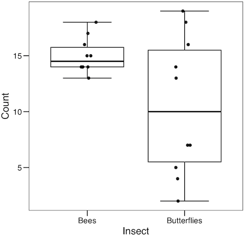
Figure 4. Box plot graph made with GrapheR with jitter applied to avoid overplotting of points.
Note: If data points have the same value, overplotting will result — the two points will be represented as a single point on the plot. The jitter function adds noise to points with the same value so that they will be individually displayed. (Fig. 4) The beeswarm function provides an alternative to jitter (Fig. 5).
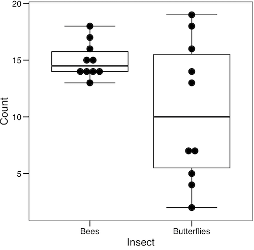
Figure 5. Box plot graph made with GrapheR with beeswarm applied to avoid overplotting of points.
3. A bit more work, but worth a look. Use plotly library to create interactive web application to display your data.
install.packages("plotly")
library(plotly)
fig <- plot_ly(y = Bees, type = "box", name="Bees")
fig <- fig %>% add_trace(y = Butterflies, name="Butterflies")
fig
code modified from example at https://plotly.com/r/box-plots/
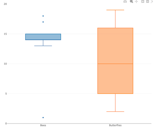
Figure 6. Screenshot of plotly box plot. Live version, data points visible when mouse pointer hover.
4. Veusz, at https://veusz.github.io/. Includes a tutorial to get started. Mac users will need to download the dmg file with the curl command in the terminal app instead of via browser, as explained here.
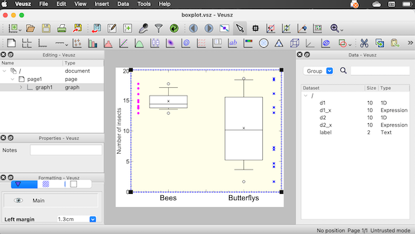
Figure 7. Screenshot of box plot example in Veusz GUI.
5. SciDAVis is a package capable of generating lots of kinds of graphs along with curve fitting routines and other mathematical processing, https://scidavis.sourceforge.net/. SciDAVis is very similar to QtiPlot and OriginLab.
Figure 8. Add screenshot
More sophisticated graphics can, and when you gain confidence in R, you’ll find that there are many more sophisticated packages that you could add to R to make really impressive graphs. However, the point is to get the best graph, and there are many tools out there that can serve this end.
Chapter 4 contents
4.7 – Q-Q plot
Introduction
Use of graphs by a data analyst may serve different purposes: communication of results or as diagnostics. The Q-Q plot is one example of a graph used as a diagnostic.
The quantile-quantile, or Q–Q plot is a probability plot used to compare graphically two probability distributions. In brief, a set of intervals for the quantiles is chosen for each sample. A point on the plot represents one of the quantiles from the second distribution (y value) against the same quantile from the first distribution (x value).
A common use of Q-Q plot would be to compare data from a sample against a normal distribution. If the sample distribution is similar to a normal distribution, the points in the Q–Q plot will approximately lie on the line y = x.
R code
In R, the Q-Q plot can be obtained directly in Rcmdr.
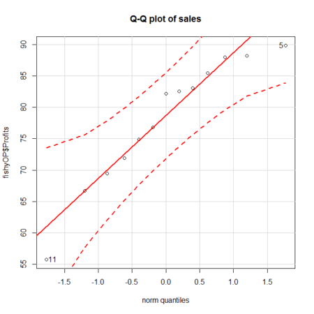
Figure 1. A Q-Q plot, the default command in Rcmdr
Rcmdr: Graphics → Quantile-comparison plot…
After choosing the variable (in this case, Sales), click on Options tab and make additional selections before making the graph. Here, selected normal distribution.
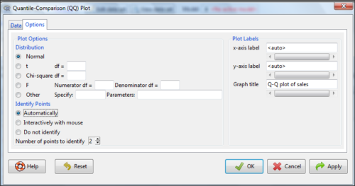
Figure 2. Screenshot of R Commander menu for Q-Q plot
Another version is available in the KMggplot2 package.
Questions
- What is a Q-Q plot used for in statistics?
- Looking at the plot in Figure 1, explain why the confidence lines get further and further away from the straight line.
Chapter 4 contents
4.5 – Scatter plots
add Bland-Altman, Volcano
Introduction
Scatter plots, also called scatter diagrams, scatterplots, or XY plots, display associations between two quantitative, ratio-scaled variables. Each point in the graph is identified by two values: its X value and its Y value. The horizontal axis is used to display the dispersion of the X variable, while the vertical axis displays the dispersion of the Y variable.
The graphs we just looked at with Tufte’s examples Anscombe’s quartet data were scatter plots (Chapter 4 – How to report statistics).
Here’s another example of a scatter plot, data from Francis Galton, data contained in the R package HistData.
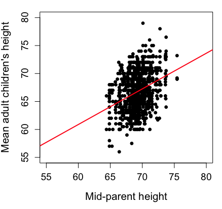
Figure 1. Scatterplot of mid-parent (vertical axis) and their adult children’s (horizontal axis) height, in inches. data from Galton’s 1885 paper, “Regression towards mediocrity in hereditary stature.” The red line is the linear regression fitted line, or “trend” line, which is interpreted in this case as the heritability of height.
Note 1. Sorry about that title — being rather short of stature myself, not sure I’m keen to learn further what Galton was implying with that “mediocrity” quip.
The commands I used to make the plot in Figure 1 were
library(HistData)
data(GaltonFamilies, package="HistData")
attach(GaltonFamilies)

plot(childHeight~midparentHeight, xlab="Mid-parent height", ylab="Mean adult children's height", xlim=c(55, 80), ylim=c(55,80), cex=0.8, cex.axis=1.2, cex.lab=1.3, pch=c(19), data=GaltonFamilies)
abline(lm(childHeight~midparentHeight), col="red", lwd=2)
I forced the plot function to use the same range of values, set by providing values for xlim and ylim; the default values of the plot command picks a range of data that fits each variable independently. Thus, the default X axis values ranged from 64 to 76 and the Y variable values ranged from 55 to 80. This has the effect of shifting the data, reducing the amount of white space, which a naïve reading of Tufte would suggest is a good idea, but at the expense of allowing the reader to see what would be the main point of the graph: that the children are, on average, shorter than the parents, mean height = 67 vs. 69 inches, respectively. Therefore, Galton’s title begins with the word “regression,” as in the definition of regression as a “return to a former … state” (Oxford Dictionary).
For completeness, cex sets the size of the points (default = 1), and therefore cex.axis and cex.lab apply size changes to the axes and labels, respectively; pch refers to the graph elements or plotting characters, further discussed below (see Fig 8); lm() is a call to the linear model function; col refers to color.
Figure 2 shows the same plot, but without attention to the axis scales, and, more in keeping with Tufte’s principle of maximize data, minimize white space.
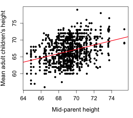
Figure 2. Same plot as Figure 1, but with default settings for axis scales.
Take a moment to compare the graphs in Figure 1 and 2. Setting the scales equal allows you to see that the mid-parent heights were less variable, between 65 and 75 inches, than the mean children height, which ranged from 55 to 80 inches.
And another example, Figure 3. This plot is from the ggplot2() function and was generated from within R Commander’s KMggplot2 plug-in.
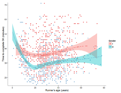
Figure 3. Finishing times in minutes of 1278 runners by age and gender at the 2013 Jamba Juice Banana 5K in Honolulu, Hawaii. Loess smoothing functions by groups of female (red) and male (blue) runners are plotted along with 95% confidence intervals.
Figure 3 is a busy plot. Because there were so many data points, it is challenging to view any discernible pattern, unlike Figure 1 and 2 plots, which featured less data. Use of the loess smoothing function, a transformation of the data to reduce data “noise” to reveal a continuous function, helps reveal patterns in the data:
- across most ages, men completed 5K faster than did females and
- there was an inverse, nonlinear association between runner’s age and time to complete the 5K race.
Take a look at the X-axis. Some runners ages were reported as less than 5 years old (trace the points down to the axis to confirm), and yet many of these youngsters were completing the 5K race in less than 30 minutes. That’s 6-minute mile pace! What might be some explanations for how pre-schoolers could be running so fast?
Design criteria
As in all plotting, maximize information to background. Keep white space minimal and avoid distorting relationships. Some things to consider:
- keep axes same length
- do not connect the dots UNLESS you have a continuous function
- do not draw a trend line UNLESS you are implying causation
Scatter plots in R
We have many options in R to generate scatter plots. We have already demonstrated use of plot() to make scatter plots. Here we introduce how to generate the plot in R Commander.
Rcmdr: Graphs → Scatterplot…
Rcmdr uses the scatterplot function from the car package. In recent versions of R Commander the available options for the scatterplot command are divided into two menu tabs, Data and Options, shown in Figure 4 and Figure 5.
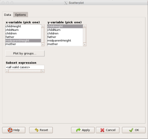
Figure 4. First menu popup in R Commander Scatterplot command, Rcmdr ver. 2.2-3.
Select X and Y variables, choose Plot by groups if multiple grounds are included, e.g., male, female, then click Options tab to complete.
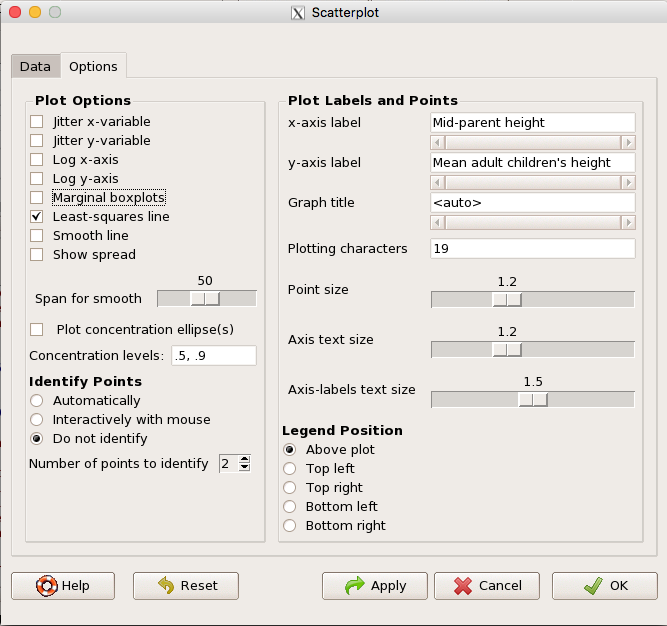
Figure 5. Second menu popup in R Commander scatterplot command., Rcmdr ver. 2.2-3
Set graph options including axes labels and size of the points.
Note 2. Lots of boxes to check and uncheck. Start by unchecking all of the Options and do update the axes labels (see red arrow in image). You can also manipulate the plot “points,” which R refers to as plotting characters (abbreviated pch in plotting commands). The “Plotting characters” box is shown as <auto>, which is an open circle. You can change this to one of 26 different characters by typing in a number between 0 and 25. The default used in Rcmdr scatterplot is “1” for open circle. I typically use “19” for a solid circle.
Here is another example using the default settings in scatterplot() function in the car package, now the default scatter plot command via R Commander (Fig. 4), along with the same graph, but modified to improve the look and usefulness of the graph (Fig. 6). The data set was Puromycin in the package datasets.
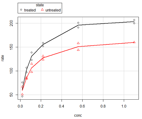
Figure 6. Default scatterplot, package car, from R Commander, version 2.2-4.
Grid lines in graphs should be avoided unless you intend to draw attention to values of particular data points. I prefer to position the figure legend within the frame of the graph, e.g., the open are at the bottom right of the graph. Modified graph shown in Figure 7.
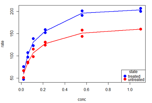
Figure 7. Modified scatterplot, same data from Figure 6
R commands used to make the scatter plot in Figure 7 were
scatterplot(rate~conc|state, col=c("blue", "red"), cex=1.5, pch=c(19,19),
bty="n", reg=FALSE, grid=FALSE, legend.coords="bottomright")
A comment about graph elements in R
In some ways R is too rich in options for making graphs. There are the plot functions in the base package, there’s lattice and ggplot2 which provide many options for graphics, and more. The advice is to start slowly, for example taking advantage of the Figure 8 displays R’s plotting characters and the number you would invoke to retrieve that plotting character.
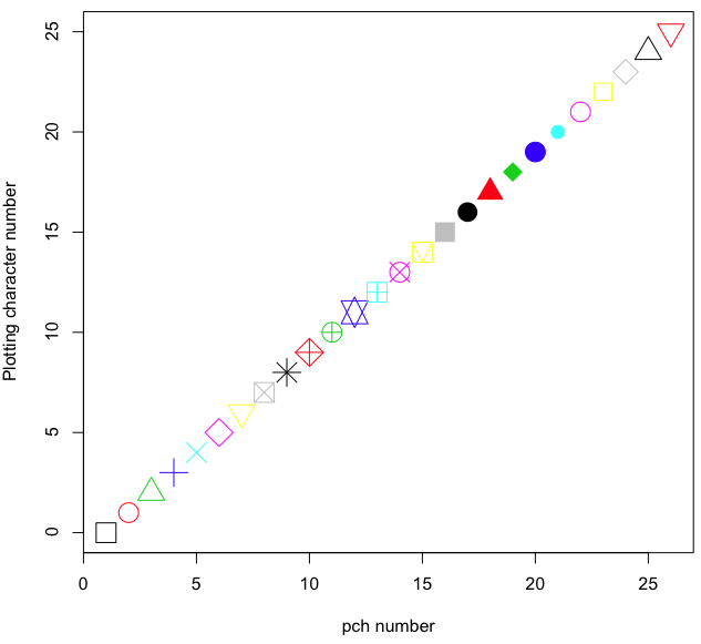
Figure 8. R plotting characters pch = 1 – 25 along with examples of color.
Note 3. To see available colors at the R prompt type
colors()
which returns 667 different colors by name, from
[1] "white" "aliceblue" "antiquewhite"
to
[655] "yellow3" "yellow4" "yellowgreen"
Note 4. There’s a lot more to R plotting. For example, you are not limited to just 25 possible characters. R can print any of the ASCII characters 32:127 or from the extended ASCII code 128:255. See Wikipedia to see the listing of ASCII characters.
Note 5. You can change the size of the plotting character with “cex.”
Here’s the R code used to generate the graph in Figure 8. Remember, any line beginning with # is a comment line, not an R command.
#create a vector with 26 numbers, from 0 to 25
stuff <-c(0:25)
plot(stuff, pch=c(32:58), cex = 2.5, col = c(1:26), 'xlab' = "pch number", 'ylab' = "Plotting character number")
Is it “scatter plot” or “scatterplot”?
Spelling matters, of course, and yet there are many words for which the correct spelling seems to be like “beauty,” it is “in the eye of the beholder” (Molly Bawn, 1878, by Margaret Hungerford). Scatter plot is one of these — is it one word or two, or is it something else entirely?
Scatter plot is one of these terms: you’ll find it spelled as “scatterplot” or as “scatter plot,” in the dictionary (e.g., Oxford English dictionary), with no guidance to choose between them. And I’m not just talking about the differences between British and American English spelling traditions.
Note 6. The spell checkers in Microsoft Office and Google Docs do not flag “scatterplot” as incorrect, but the spell checker in LibreOffice Writer does (per obs).
Thus, in these situations as an author, you can turn to which of the spellings is in common use. I first looked at some of the statistics books on my shelves. I selected 14 (bio)statistics textbooks and checked the index and if present, chapters on graphics for term usage.
Table 1. Frequency of use of different terms for scatter plot in 14 (bio)statistics books currently on Mike’s shelves.
| spelling | number of statistical texts | frequency |
|---|---|---|
| scatter diagram | 2 | 0.144 |
| scatter plot | 5 | 0.357 |
| scattergram | 1 | 0.071 |
| scatterplot | 5 | 0.357 |
| XY plot | 0 | 0.071 |
Not much help, basically, it is a tie between “scatter plot” and “scatterplot.”
Next, I searched six journals for the interval 1990 – 2016 for use of these terms. Results presented in Table 6 along with journal impact factor for 2014 and number of issues (Table 2).
Table 2. Impact factor and number of issues 1990 – 2016 for six science journals.
| Journal | Impact factor | Issues |
|---|---|---|
| BMJ | 17.445 | 1374 |
| Ecology | 5.175 | 271 |
| J. Exp. Biol | 2.897 | 540 |
| Nature | 41.456 | 1454 |
| NEJM | 55.873 | 1377 |
| Science | 33.611 | 1347 |
My methods? I used the journal’s online search functions for the various usage for scatter plot and the results are shown in Figure 9.
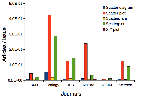
Figure 9. Usage of terms for X Y plots in research articles normalized to number of issues in six journals between 1990 and 2016.
The journals have different numbers of articles; I partially corrected for this by calculating the ratio number of articles with one of the terms divided by the number of issues for the interval 1990 – 2016. It would have been better to count all of the articles, but even I found that to be an excessive effort given the point I’m trying to make here.
Not much help there, although we can see a trend favoring “scatter plot” over any of the other options.
And finally, to completely work over the issue I present results from use of Google’s Ngram Viewer. Ngram Viewer allows you to search words in all of the texts that Google’s folks have scanned into digital form. I searched on the terms in texts between 1950 and 2015, and results are displayed in Figure 10 and Figure 11.
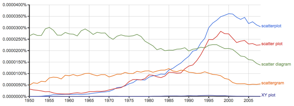
Figure 10. Results from Ngram Viewer for American English, “scatterplot” (blue), “scatter plot” (red), “scatter diagram” (green), “scattergram” (orange), and “XY plot” (purple).
And the same plot, but this time for British sources
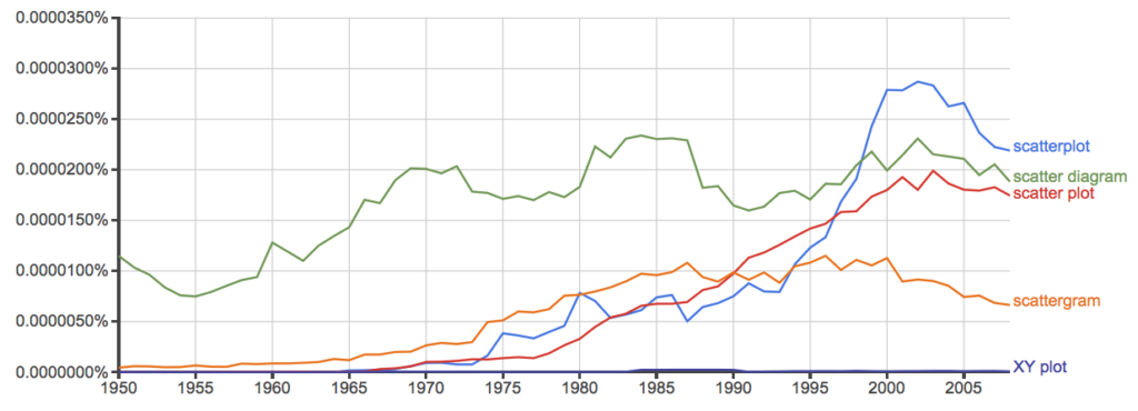
Figure 11. Results from Ngram Viewer for British English. See Figure 10 for key.
Conclusion? It looks like “scatterplot” (blue line) is the preferred usage, but it is close. Except for “scattergram” and “XY plot,” which, apparently, are rarely used. After all of this, it looks like you’re free to make your choice between “scatterplot” or “scatter plot.” I will continue to use “scatter plot.”
Bland-Altman plot
Also known as Tukey mean-difference plot, the Bland-Altman plot is used to describe agreement between two ratio scale variables (Bland and Altman 1986, Giavarina 2015), for example agreement between two different methods used to measure the same samples.
Note 6. Agreement — aka concordance or reproducibility — in the statistical sense is consistent with our everyday conception — consistency among sets of observations on the same object, sample, or unit. We introduce and develop additional agreement statistics in Chapter 9.2 and Chapter 12.3. Additional note for my students — note that I didn’t define agreement by including the term “agree”, thereby avoiding a circular definition (for an amusing clarification on the phrase, see Logically Fallacious). It’s a common short-fall I’ve seen thus far in AI-tools.
Consider use of imageJ by two different observers to record number of pixels of a unit measure (1 cm) on a series of digital images — there’s subjectivity in drawing the lines (where to start, where to end) — do they agree? Data set below. blandr package, blandr.draw function.
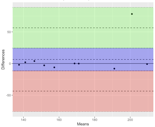
Figure 12. Bland-Altman plot of 1 cm unit measure in pixel number by imageJ from digital images by two independent observers. Purple central region is 95% CI. Lower and upper dashed horizontal lines represent bounds of “acceptable” agreement.
blandr.draw(Obs1, Obs2)
The plot makes it easy to identify questionable points, for example, the one point in upper right quadrant looks suspect.
Volcano plot
Used to show events that differ between two groups of subjects (e.g., p-values), and is common in gene expression studies of an exposed group vs a control group (e.g., fold changes).
ccc
[pending]
Figure 13. Volcano plot, gene expression fold change.
ccc
Questions
- Using our Comet assay data set (Table 1, Chapter 4.2), create scatter plots to show associations between tail length, tail percent, and olive moment.
- Explore different settings including size of points, amount of white area, and scale of the axes. Evaluate how these changes change the “story” told by the graph.
Data sets
Number of pixels of 1 cm length from unit measure on ten digital images. recorded by two independent observers, Obs1 and Obs2.
 Obs1, Obs2
171.026, 171.105
136.528, 138.521
148.084, 144.222
142.014, 140.057
150.213, 153.118
187.011, 195.092
168.760, 168.668
154.302 ,160.381
209.022, 209.876
240.067, 161.805
Gene expression
ccc
Chapter 4 contents
4.4 – Mosaic plots
Introduction
Mosaic plots are used to display associations among categorical variables. e.g., from a contingency table analysis. Like pie charts, mosaic plots and tree plots (next chapter) are used to show part-to-whole associations. Mosaic plots are simple versions of heat maps (next chapter). Used appropriately, mosaic plots may be useful to show relationships. However, like pie-charts and bar charts, care needs to be taken to avoid their over use; works for a few categories, but quickly loses clarity as numbers of categories increase.
In addition to the function mosaicplot() in the base R package, there are a number of packages in R that will allow you to make these kinds of plots; depending on the analyses we are doing we may use any one of three Rcmdr plugins: RcmdrPlugin.mosaic (depreciated), RcmdrPlugin.KMggplot2, or RcmdrPlugin.EBM.
Example data
Table 1. Records of American and National Leagues baseball teams at home and away midway during 2016 season
| No | Yes | |
|---|---|---|
| AL | 10 | 5 |
| NL | 7 | 8 |
The configuration of major league baseball (MLB) parks differ from city to city. For example, Boston’s American League (AL) Fenway Park has the 30-feet tall “Green Monster” fence in left field and a short distance of only 302 feet along the foul line to right field fence. For comparison, Globe Life Park in Arlington, TX the distance along the foul lines left field (332 feet) and right field (325 feet). So, it suggests that teams may benefit from playing 81 games at their home stadium. To test this hypothesis I selected Win-Loss records of the 30 teams at the midway point of the 2016 season. Data are shown in the Table 1.
mosaicplot() in R base
The function mosaicplot() is included in the base install of R. The following code is one way to directly enter contingency table data like that from Table 1.
myMatrix <- matrix(c(10,  5,  7,  8),  nrow = 2, ncol = 2, byrow = TRUE)
dimnames(myMatrix) <- list(c("AL", "NL"), c("No","Yes"))
myTable <- as.table(myMatrix); myTable
mosaicplot(myTable, color=2:3)
The simple plot is shown in Figure 1. color = “2” is red, color = “3” is green.
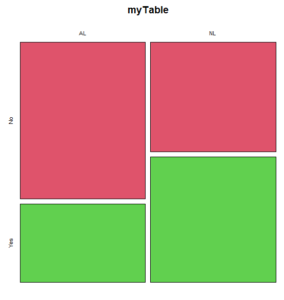
Figure 1. Mosaic plot made with basic function mosaicplot().
mosaic plot from EBM plugin
A good option in Rcmdr is to use the “evidence-based-medicine” or “EBM” plug-in for Rcmdr (RcmdrPlugin.EBM). This plugin generates a real nice mosaic plot for 2 X 2 tables.
After loading the EBM plugin, restart Rcmdr, then select EBM from the menu bar and choose to “Enter two-way table…”
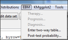
Figure 2. First steps to make mosaic plot in R Commander EBM plug-in.
Complete the data entry for the table as shown in the image below. After entering the values, click the OK button.
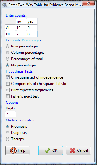
Figure 3. Next steps to make mosaic plot in R Commander EBM plug-in.
Along with the requested statistics a mosaic plot will appear in a pop-up window.
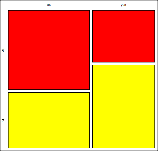
Figure 4. Mosaic plot made from R Commander EBMplug-in
mosaic-like plot KMggplot2 plugin
The KMggplot2 plugin for Rcmdr will also generate a mosaic-like plot. After loading the KMggplot2 plugin, restart Rcmdr, then load a data set with the table (e.g., MLB data in Table 1). Next, from within the KMggplot2 menu select, “Bar chart for discrete variables…”
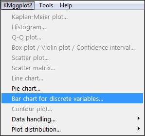
Figure 5. First steps to make mosaic plot in R Commander KMggplot2 plug-in.
From the bar chart context menu make your selections. Note that this function has many options for formatting, so play around with these to make the graph the way you prefer.
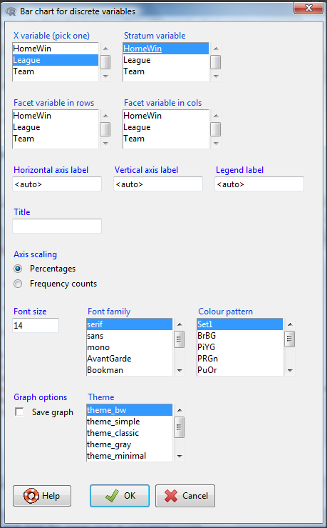
Figure 6. Next steps to make mosaic plot in R Commander KMggplot2 plug-in.
And here is the resulting mosaic-like plot from KMggplot2.
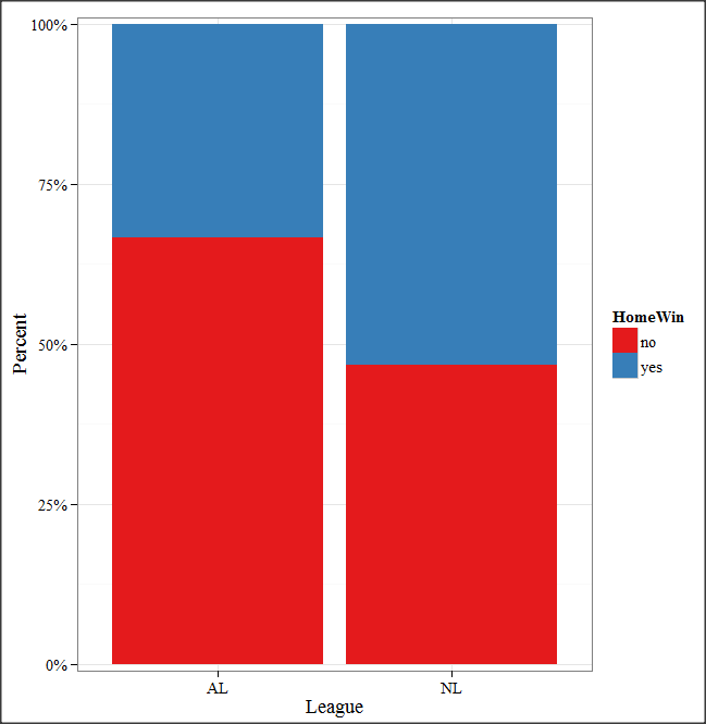
Figure 7. Mosaic-like plot made from R Commander KMggplot2 plug-in.
Questions
1. Most US states have laws that dictate pre-employment drug testing for job candidates; Interestingly, states are increasingly legalizing marijuana use. Data for states plus District of Columbia are presented in the table. Make a mosaic plot of the table.
Table 2. Marijuana use is US states, legal or not legal
| Marijuana-use legal | Marijuana-use not legal | |
|---|---|---|
| Yes | 19 | 12 |
| No | 14 | 6 |
Data adopted from https://www.paycor.com/resource-center/pre-employment-drug-testing-laws-by-state
Depreciated material
As of summer 2020, Rcmdrplugin.mosaic is depreciated. While you can install the archived version, it is not recommended. Therefore, this material is left as is but for information purposes only. For a simple mosaic plot in Rcmdr I recommend working with the RcmdrPlugin.EBM.
Download the RcmdrPlugin.mosaic package, start Rcmdr, then navigate to Tools and choose Load Rcmdr plug-in(s).… Select Rcmdrplugin.mosaic (Fig. 8), then restart Rcmdr (Fig. 9). The plugin adds mosaic plot to the regular Graphics menu of Rcmdr.
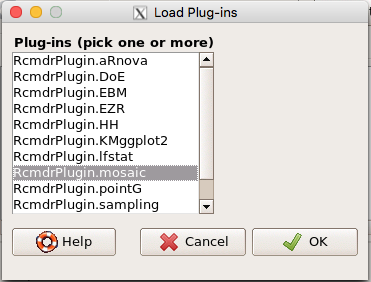
Figure 8. Screenshot of popup menu from Rcmdr with mosaic plugin selected.
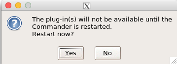
Figure 9. After clicking OK (Fig 8), click Yes to restart Rcmdr. The plugin will then be available.
Load a data set with 2X2 arranged data, or create the variables yourself (Yikes, 30 rows!). The mosaic plugin requires that you submit data in a table format. We can check whether our data are currently in that format. At the R prompt type
is.table(MLB)
And R will return
[1] FALSE
(To be complete, confirm that the data set is a data.frame: is.data.frame(MLB).)
You will need a table before proceeding with the mosaic plug-in. then create a table using a command like the one shown below.
MLBTable <- xtabs(~League+HomeWin, data=MLB)
Once the table is ready, select “mosaic or assoc plot” from the Rcmdr Graphics menu (Fig. 10)
Figure 10. How to access the mosaic plot in R Commander.
A small window will pop up that will allow you to select the table of data you just created (Fig. 11). Note that you may need to hunt around your desktop to find this menu! Select the table (in this example, “MLBTable), then click on “Create plot” button.
Figure 11. Screenshot of popup menu in mosaic plugin in R Commander.
R Note: The popup from the mosaic menu shown in Fig. 11 will also display the data.frame MLB. If you mistakenly select the dataframe MLB, you’ll get an error message in Rcmdr (Fig. 12). The plugin behaves erratically if you select MLB: On my computer, the function hangs and requires restarting R.
Figure 12. Error message as result of selecting a dataframe for use in mosaic plugin.
After you select the table, two additional windows will pop up: on the left (Fig. 13) is the context menu to change characteristics of the mosaic plot; on the right (not shown) will be a mosaic plot itself in default grey scale colors.
Figure 13. Options for the mosaic plot
At a minimum, change the plot from grey scale to a colorized version by checking the box next to the “Colorize last variable” option. The new plot is shown in Figure 14.
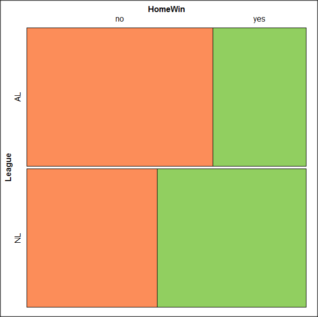
Figure 14. Our new mosaic plot.
OK. Take a moment and look at the plot. What conclusions can be made about our hypothesis — are there any differences between the leagues for home versus road Wins-Loss records?
By default the mosaic command copies the command to the R window. You can change the graph by taking advantage of the options in the brewer palette. Here’s the command for the mosaic image above.
mosaic(structable(MLBTable), highlighting=2, highlighting_fill=brewer.pal.ext(2,"RdYlGn"))
Change the options in the brackets following “brewer.pal.ext.” For example, replace RdYlGn with Blues to make a plot that looks like the following
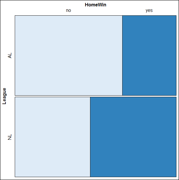
Figure 15. Mosaic plot with changed color scheme.
The colors are selected from the Rcolorbrewer package. For more, see this blog for starters.
Chapter 4 contents
- Graphs and tables (How to report statistics)
- Bar (column) charts
- Histograms
- Box plot
- Mosaic plots
- Scatter plots
- Add a second Y axis
- Q-Q plot
- Ternary plots
- Heat maps
- Graph software
- References and suggested readings
4.3 – Box plot
Introduction
Box plots, also called whisker plots, should be your routine choice for exploring ratio scale data. Like bar charts, box plots are used to compare ratio scale data collected for two or more groups. Box plots serve the same purpose as bar charts with error bars, but box plots provide more information.
Purpose and design criteria
Box plots are useful tool for getting a sense of central tendency and spread of data. These types of plots are useful diagnostic plots. Use them during initial stages of data analyses. All summary features of box plots are based on ranks (not sums). So, they are less sensitive to extreme values (outliers). Box plots reveal asymmetry. Standard deviations are symmetric.
The median splits each batch of numbers in half (center line). The “hinge” (median value) splits the remaining halves in half again (the quartiles). The first, second (median), and third quartiles describes the interquartile range, or IQR, 75% of the data (Fig. 1). Outlier points can be identified, for example, with an asterisk or by id number (Fig. 1).
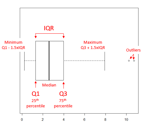
Figure 1. A box plot. Elements of box plot labelled.
We’ll use the data set described in the previous section, so if you have not already done so, get the data from Table 1, Chapter 4.2 into your R software.
See Chapter 4.10 — Graph software for additional box plot examples, but made with different R packages or software apps.
R Code
Command line
We’ll provide code for the base graph shown in Figure 2A. At the R prompt, type
boxplot(OliveMoment~Treatment)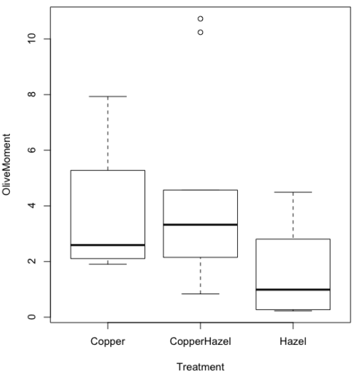
Figure 2A. Box plot, default graph in base package
Boxplot is a common function offered in several packages. In the base installation of R, the function is boxplot(). The car package, which is installed as part of R Commander installation, includes Boxplot(), which is a “wrapper function” for boxplot(). Note the difference: base package is all lower case, car package the “B” is uppercase. One difference, base boxplot() permits horizontal orientation of the plot (Fig. 2B).
Wrapper functions are code that links to another function, perhaps simplifying working with that function.
boxplot(OliveMoment ~ Treatment, horizontal=TRUE, col="steelblue")

Figure 2B. Same graph, but with color and made horizontal; boxplot(), default graph in base package
Base package boxplot() has additional features and options compared to Boxplot() in the car package. i.e., not all barcode() options are wrapped. For example, I had more success adding original points to boxplot() graph (Fig. 2C) following the function call with stripchart().
stripchart(OliveMoment ~ Treatment, method = "overplot", pch = 19, add = TRUE)
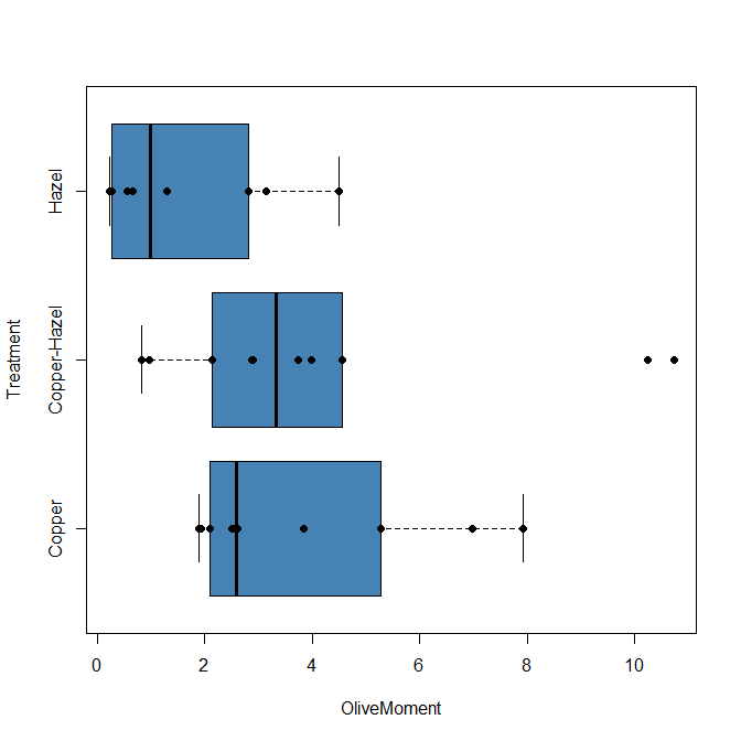
Figure 2C. Same graph, added original points; boxplot(), default graph in base package.
boxplot and stripchart functions part of ggplot2 package, part of tidyverse, easily used to generate graphs like Fig 2B and Fig 2C. The overplot option was used to jitter points to avoid overplotting. See below: Apply tidyverse-view to enhance look of boxplot graphic and Fig. 9.
Jittering adds random noise to points, which helps view the data better if many points are clustered together. Note however that jitter would add noise to the plot — if the objective is to show an association between two variables, jitter will reduce the apparent association, perhaps even compromising the intent of the graph. Beeswarm also can be used to better visualize clustered points, but uses a nonrandom algorithm to plot points.
Rcmdr: Graph → Boxplot…
Select the response variable, then click on the Plot by: button
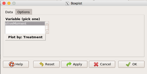
Figure 3. Popup menu in R Commander: Select the response variable and set the Plot by: option.
Next, select the Groups (Factor) variables (Fig. 4). Click OK to proceed
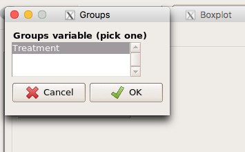
Figure 4. Select the group variable
Back to the Box Plot menu, click “Options” tab to add details to the plot, including a graph title and how outliers are noted (Fig 5),
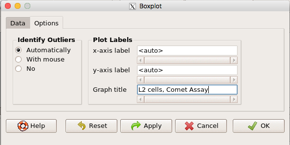
Figure 5. Options tab, enter labels for axes and a title.
And here is the resulting box plot (Fig 6)
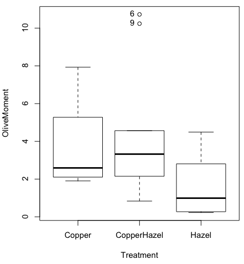
Figure 6. Resulting box plot from car package implemented in R Commander. Outliers are identified by row id number.
The graph is functional, if not particularly compelling. The data set was “olive moments” from Comet Assays of an immortalized rat lung cell line exposed to dilute copper solution (Cu), Hazel tea (Hazel), or Hazel & Copper solution.
Apply Tidyverse-view to enhance look of boxplot graphic
Load the ggplot2 package via the Rcmdr plugin to add options to your graph. As a reminder, to install Rcmdr plugins you must first download and install them from an R mirror like any other package, then load the plugin via Rcmdr Tools → Load Rcmdr plug-in(s)… (Fig 6, Fig 7).
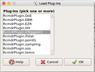
Figure 6. Screen shot of Load Rcmdr plug-ins menu, Click OK to proceed (see Fig 7)
Figure 7. To complete installation of the plug-in, restart R Commander.
Significant improvement, albeit with an “eye of the beholder” caveat, can be made over the base package. For example, ggplot2 provides additional themes to improve on the basic box plot. Figure 8 shows the options available in the Rcmdr plugin KMggplot2, and the default box plot is shown in Fig 9.
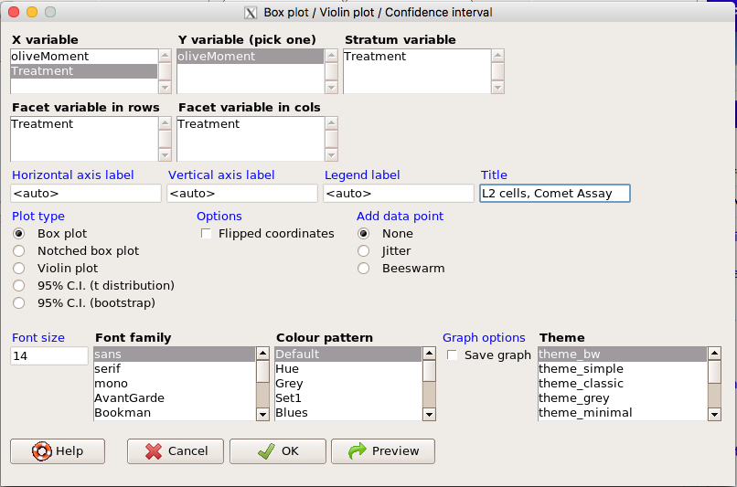
Figure 8. Menu of KMggplot2. A title was added, all else remained set to defaults.
The next series of plots explore available formats for the charts.
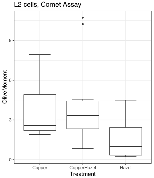
Figure 9. Default box plot from KMggplot
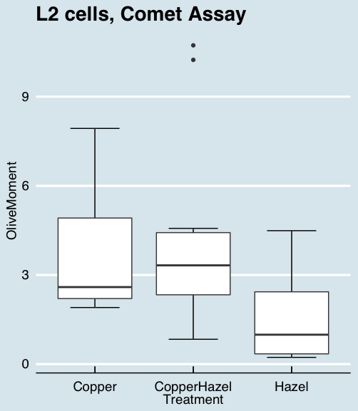
Figure 10. “Economist” theme box plot from KMggplot2
And finally, since the box plot is often used to explore data sets, some recommend including the actual data points on a box plot to facilitate pattern recognition. This can be accomplished in the KMggplot2 plugin by checking “Jitter” under the Add data points option (see Fig 8). Jitter helps to visualize overlapping points at the expense of accurate representation. I also selected the Tufte theme, which results in the image displayed in Figure 11.
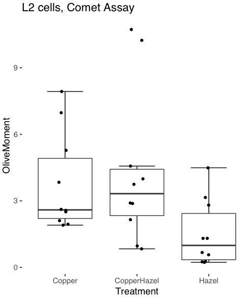
Figure 11. Tufte theme and data points added to the box plot.
Note. The Tufte theme is so named for Edward Tufte (2001), Chapter 6 Data-Ink Maximization and Graphical Design.” In brief, the theme follows the “maximal data, minimal ink” principle.
Conclusions
As part of your move from the world of Microsoft Excel graphics to recommended graphs by statisticians, the box plot is used to replace the bar charts plus error bars that you may have learned in previous classes. The second conclusion? I presented a number of versions of the same graph, differing only by style. Pick a style of graphics and be consistent.
Questions
- Why is a box plot preferred over a bar chart for ratio scale data, even if an appropriate error bar is included?
- With your comet data (Table 1, Chapter 4.2), explore the different themes available in the box plot commands available to you in Rcmdr. Which theme do you prefer and why?
Chapter 4 contents
4.2 – Histograms
Introduction
Displaying interval or continuously scaled data. A histogram (frequency or density distribution), is a useful graph to summarize patterns in data, and is commonly used to judge whether or not the sample distribution approximates a normal distribution. Three kind of histograms, depending on how the data are grouped and counted. Lump the data into sequence of adjacent intervals or bins (aka classes), then count how many individuals have values that fall into one of the bins — the display is referred to as a frequency histogram. Sum up all of the frequencies or counts in the histogram and they add to the sample size. Convert from counts to percentages, then the heights of the bars are equal to the relative frequency (percentage) — the display is referred to as a percentage histogram (aka relative frequency histogram). Sum up all of the bin frequencies and they equal one (100%).
Figure 1 shows two frequency histograms of the distribution of ages for female (left panel) and male (right panel) runners at the 2013 Jamba Juice Banana 5K race in Honolulu, Hawaii (link to data set).
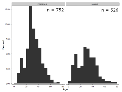
Figure 1. Histograms of age distribution of runners who completed the 2103 Jamba Juice 5K race in Honolulu
The graphs in Fig. 1 were produced using R package ggplot2.
The third kind of histogram is referred to as a probability density histogram. The height of the bars are the probability densities, generally expressed as a decimal. The probability density is the bin probability divided by the bin width (size). The area of the bar gives the bin probability and the total area under the curve sums to one.
Which to choose? Both relative frequency histogram and density histogram convey similar messages because both “sum to one (100%), i.e., bin width is the same across all intervals. Frequency histograms may have different bin widths, with more numerous observations, the bin width is larger than cases with fewer observations.
Purpose of the histogram plot
The purpose of displaying the data is to give you or your readers a quick impression of the general distribution of the data. Thus, from our histogram one can see the range of the data and get a qualitative impression of the variability and the central tendency of the data.
Kernel density estimation
Kernel density estimation (KDE) is a non-parametric approach to estimate the probability distribution function. The “kernel” is a window function, where an interval of points is specified and another function is applied only to the points contained in the window. The function applied to the window is called the bandwidth. The kernel smoothing function then is applied to all of the data, resulting in something that looks like a histogram, but without the discreteness of the histogram.
The chief advantage of kernel smoothing over use of histograms is that histogram plots are sensitive to bin size, whereas KDE plot shape are more consistent across different kernel algorithms and bandwidth choices.
Today, statisticians use kernel smoothing functions instead of histograms; these reduce the impact that binning has on histograms, although kernel smoothing still involves choices (smoothing function? default is Gaussian. Widths or bandwidths for smoothing? Varies, but the default is from the variance of the observations). Figure 2 shows smoothed plot of the 752 age observations.
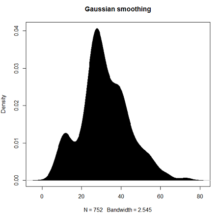
Figure 2. KDE plot of age distribution of female runners who completed the 2103 Jamba Juice 5K race in Honolulu
Note: Remember: the hashtag # preceding R code is used to provide comments and is not interpreted by R
R commands typed at the R prompt were, in order
d <- density(w) #w is a vector of the ages of the 752 females
plot(d, main="Gaussian smoothing")
polygon(d, col="black", border="black") #col and border are settings which allows you to color in the polygon shape, here, black with black border.
Conclusion? A histogram is fine for most of our data. Based on comparing the histogram and the kernel smoothing graph I would reach the same conclusion about the data set. The data are right skewed, maybe kurtotic (peaked), and not normally distributed (see Ch 6.7).
Design criteria for a histogram
The X axis (horizontal axis) displays the units of the variable (e.g., age). The goal is to create a graph that displays the sample distribution. The short answer here is that there is no single choice you can make to always get a good histogram — in fact, statisticians now advice you to use a kernel function in place of histograms if the goal is to judge the distribution of samples.
For continuously distributed data the X-axis is divided into several intervals or bins:
- The number of intervals depends (somewhat) on the sample size and (somewhat) on the range of values. Thus, the shape of the histogram is dependent on your choice of intervals: too many bins and the plot flattens and stretches to either end (over smoothing); too few bins and the plot stacks up and the spread of points is restricted (under smoothing). For both you lose the
- A general rule of thumb: try to have 10 to 15 different intervals. This number of intervals will generally give enough information.
- For large sample size (N=1000 or more) you can use more intervals.
The intervals on the X-axis should be of equal size on the scale of measurement.
- They will not necessarily have the same number of observations in each interval.
- If you do this by hand you need to first determine the range of the data and then divide this number by the number of categories you want. This will give you the size of each category (e.g., range is 25; 25 / 10 = 2.5; each category would be 2.5 unit).
For any given X category the Y-axis then is the Number or Frequency of individuals that are found within that particular X category.
Software
Rcmdr: Graphs → Histogram…
Accepting the defaults to a subset of the 5K data set we get (Fig. 3)
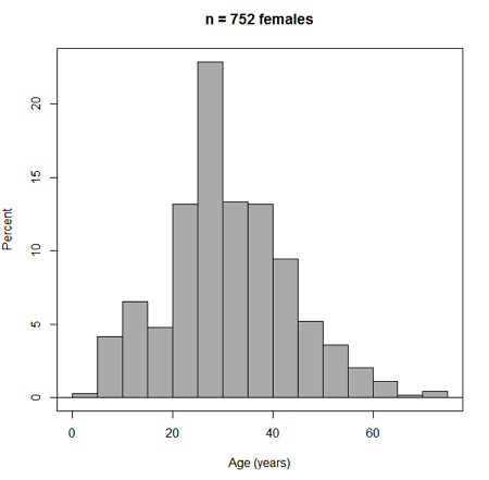
Figure 3. Histogram of 752 observations, Sturge’s rule applied, default histogram
The subset consisted of all females or n = 752 that entered and finished the 5K race with an official time.
R Commander plugin KMggplot2
Install the RcmdrPlugin.KMggplot2as you would any package in R. Start or restart Rcmdr and load the plugin by selecting Rcmdr: Tools → Load Rcmdr plug-in(s)… Once the plugin is installed select Rcmdr: KMggplot2 → Histogram… The popup menu provides a number of options to set to format the image. Settings for the next graph were No. of bins “Scott,” font family “Bookman,” Colour pattern “Set 1,” Theme “theme_wsj2.”
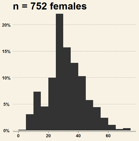
Figure 4. Histogram of 752 observations, Scott’s rule applied, ggplot2 histogram
Selecting the correct bin number
You may be saying to yourself, wow, am I confused. Why can’t I just get a graph by clicking on some buttons? The simple explanation is that the software returns defaults, not finished products. It is your responsibility to know how to present the data. Now, the perfect graph is in the eye of the beholder, but as you gain experience, you will find that the default intervals in R bar graphs have too many categories (recall that histograms are constructed by lumping the data into a few categories, or bins, or intervals, and counting the number of individuals per category => “density” or frequency). How many categories (intervals) should we use?
Figure 5. Default histogram with different bin size.
R’s default number for the intervals seems too much to me for this data set; too many categories with small frequencies. A better choice may be around 5 or 6. Change number of intervals to 5 (click Options, change from automatic to number of intervals = 5). Why 5? Experience is a guide; we can guess and look at the histograms produced.
Improving estimation of bin number
I gave you a rough rule of thumb. As you can imagine there have been many attempts over the years to come up with a rational approach to selecting the intervals used to bin observations for histograms. Histogram function in Microsoft’s Excel (Data Analysis plug-in installed) uses the square root of the sample size as the default bin number. Sturge’s rule is commonly used, and the default choice in some statistical application software (e.g., Minitab, Prism, SPSS). Scott’s approach (Scott 2009), a modification to Sturge’s rule, is the default in the ggplot() function in the R graphics package (the Rcmdr plugin is RcmdrPlugin.KMggplot2). And still another choice, which uses interquartile range (IQR), was offered by Freedman and Diacones (1981). Scargle et al (1998) developed a method, Bayesian blocks, to obtain optimum binning for histograms of large data sets.
What is the correct number of intervals (bins) for histograms?
- Use the square root of the sample size, e.g., at R prompt sqrt∗n∗ = 4.5, round to 5). Follow Sturges’ rule (to get the suggested number of intervals for a histogram, let k = the number of intervals, and k = 1 + 3.322(log10n),
- where n is the sample size. I got k = 5.32, round to nearest whole number = 5).
- Another option was suggested by Freedman and Diacones (1981): find IQR for the set of observations and then the solution to the bin size is k = 2IQRn-1/3, where n is the sample size.
Select Histogram Options, then enter intervals. Here’s the new graph using Sturge’s rule…
Figure 6. Default histogram, bin size set by Sturge’s rule.
OK, it doesn’t look much better. And of course, you’ll just have to trust me on this — it is important to try and make the bin size appropriate given the range of values you have in order that the reader/viewer can judge the graphic correctly.
Two histograms on same plot
In many cases you may wish to compare sample distributions among two or more groups.
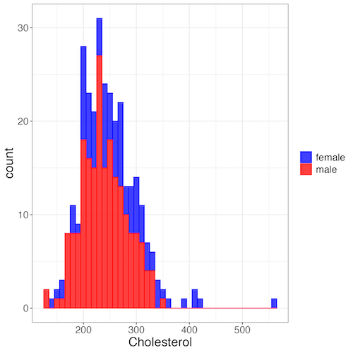
Figure 7. Two histograms on same plot with ggplot2.
R code
Stacked data set, data from Kaggle.
myColors=c(female="blue", male="red")
ggplot(sexChol, aes(chol, fill = sex, color=sex)) +
  geom_histogram(binwidth = 10, alpha=0.75) +
  labs(x = "Cholesterol") +
  theme_bw() +
  theme(legend.title= element_blank(),legend.text=element_text(size=14),
     axis.text=element_text(size=14),axis.title=element_text(size=18)) +
  scale_color_manual(values=myColors) +
  scale_fill_manual(values=myColors)
Base graphics version
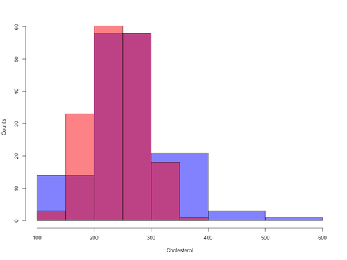
Figure 8. Same data as Fig 7, but using base hist() and plot() functions.
Not an aesthetically pleasing graph (Fig 8), but the idea was to recreate Figure 7 and show regions of overlap. We do this by setting transparent colors (h/t DataAnalytics.org.uk).
First, pick you colors. I like blue and red. Next, we identify how the colors are declared in the three rgb channels. Use the col2rgb() function.
col2rgb("blue")
[,1]
red 0
green 0
blue 255
Create my transparent blue with the alpha setting (125 = 50%). Note the command asks for names, but we won’t use it further.
myBlue <- rgb(0, 0, 255, max = 255, alpha = 125, names = "blue50")
Repeat for 50% transparent red.
col2rgb("red")
[,1]
red 255
green 0
blue 0
myRed <- rgb(255, 0, 0, max = 255, alpha = 125, names = "red50")
Now, we make the plots. Data unstacked, a column with cholesterol values for females (fChol), and another for male cholesterol values mChol). Bin size is different from Figure 7.
hist1 <- hist(fChol, breaks=6, plot=FALSE)
hist2 <- hist(mChol, add=T, breaks=6, plot=FALSE)
Open a Graphics Device so that we can save image to png format. I’ve set width and height in numbers of pixels.
png("base_histograms_two_chol.png", width = 800, height = 600)
Make the graph
plot(hist1, col = myBlue, main="", xlab="Cholesterol", ylab="Counts")
plot(hist2, col = myRed, add = TRUE)
Close the device, the image file is saved to working folder.
dev.off()
Questions
Example data set, comet tails and tea

Figure 9. Examples of comet assay results.
The Comet assay, also called single cell gel electrophoresis (SCGE) assay, is a sensitive technique to quantify DNA damage from single cells exposed to potentially mutagenic agents. Undamaged DNA will remain in the nucleus, while damaged DNA will migrate out of the nucleus (Figure 7). The basics of the method involve loading exposed cells immersed in low melting agarose as a thin layer onto a microscope slide, then imposing an electric field across the slide. By adding a DNA selective agent like Sybr Green, DNA can be visualized by fluorescent imaging techniques. A “tail” can be viewed: the greater the damage to DNA, the longer the tail. Several measures can be made, including the length of the tail, the percent of DNA in the tail, and a calculated measure referred to as the Olive Moment, which incorporates amount of DNA in the tail and tail length (Kumaravel et al 2009).
The data presented in Table 1 comes from an experiment in my lab; students grew rat lung cells (ATCC CCL-149), which were derived from type-2 like alveolar cells. The cells were then exposed to dilute copper solutions, extracts of hazel tea, or combinations of hazel tea and copper solution. Copper exposure leads to DNA damage; hazel tea is reported to have antioxidant properties (Thring et al 2011).
| Treatment | Tail | TailPercent | OliveMoment* |
|---|---|---|---|
| Copper-Hazel | 10 | 9.7732 | 2.1501 |
| Copper-Hazel | 6 | 4.8381 | 0.9676 |
| Copper-Hazel | 6 | 3.981 | 0.836 |
| Copper-Hazel | 16 | 12.0911 | 2.9019 |
| Copper-Hazel | 20 | 15.3543 | 3.9921 |
| Copper-Hazel | 33 | 33.5207 | 10.7266 |
| Copper-Hazel | 13 | 13.0936 | 2.8806 |
| Copper-Hazel | 17 | 26.8697 | 4.5679 |
| Copper-Hazel | 30 | 53.8844 | 10.238 |
| Copper-Hazel | 19 | 14.983 | 3.7458 |
| Copper | 11 | 10.5293 | 2.1059 |
| Copper | 13 | 12.5298 | 2.506 |
| Copper | 27 | 38.7357 | 6.9724 |
| Copper | 10 | 10.0238 | 1.9045 |
| Copper | 12 | 12.8428 | 2.5686 |
| Copper | 22 | 32.9746 | 5.2759 |
| Copper | 14 | 13.7666 | 2.6157 |
| Copper | 15 | 18.2663 | 3.8359 |
| Copper | 7 | 10.2393 | 1.9455 |
| Copper | 29 | 22.6612 | 7.9314 |
| Hazel | 8 | 5.6897 | 1.3086 |
| Hazel | 15 | 23.3931 | 2.8072 |
| Hazel | 5 | 2.7021 | 0.5674 |
| Hazel | 16 | 22.519 | 3.1527 |
| Hazel | 3 | 1.9354 | 0.271 |
| Hazel | 10 | 5.6947 | 1.3098 |
| Hazel | 2 | 1.4199 | 0.2272 |
| Hazel | 20 | 29.9353 | 4.4903 |
| Hazel | 6 | 3.357 | 0.6714 |
| Hazel | 3 | 1.2528 | 0.2506 |
Tail refers to length of the comet tail, TailPercent is percent DNA damage in tail, and OliveMoment refers to Olive's (1990), defined as the fraction of DNA in the tail multiplied by tail length
Copy the table into a data frame.
- Create histograms for tail, tail percent, and olive moment
- Change bin size
- Repeat, but with a kernel function.
- Looking at the results from question 1 and 2, how “normal” (i.e., equally distributed around the middle) do the distributions look to you?
- Plot means to compare Tail, Tail percent, and olive moment. Do you see any evidence to conclude that one of the teas protects against DNA damage induced by copper exposure?
Chapter 4 contents
4.1 – Bar (column) charts
Introduction
Bar chart, also called a bar graph, or column chart in many spreadsheet apps (e.g., Google Sheets, Microsoft Excel, Libreoffice Calc — “bar charts” is reserved for horizontal bar plots), are used to compare counts among two or more categories, i.e., an alternative to pie charts (Fig. 1).
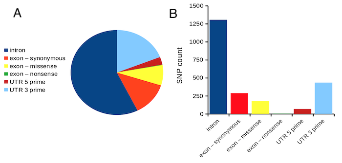
Figure 1. Single nucleotide variants for human gene ACTB by DNA and functional element (data collected 19 May 2022 from NCBI SNP database with Advanced search query). A. Pie chart. Note that slide for “exon – nonsense” is not visible. B. Bar chart – color coded bars to facilitate comparison with pie chart.
Although bar charts are common in the literature (Cumming et al 2007; Streit and Gehlenborg 2014), bar charts may not be a good choice for comparisons of ratio scale data (Streit and Gehlenbor 2014). Bar charts for ratio data are misleading. Parts of the range implied by the bar may never have been observed: the bars of the chart always start at zero. Box (whisker) plots are better for comparisons of ratio scale data and are presented in the next section of this chapter. That said, I will go ahead and present how to create bar chars for both count, generally considered acceptable, and ratio scale data, for which their use is controversial.
Purpose of the bar chart
Like all graphics, a bar chart should tell a story. The purpose of displaying data is to give your readers a quick impression of the general differences among two or more groups of the data. For counts, that’s where the bar chart comes in. The bar chart is preferred over the pie chart because differences are represented by lengths of the bars in the bar chart. Differences among categories in a pie chart are reflected by angles, and it seems that humans are much better at judging lengths than angles.
Bar chart with counts
Figure 2. A simple bar chart
myCombo <- seq(0,10, by=1)
myCounts <- choose(10, myCombo)    #combinations
barplot(myCounts, names.arg = myCombo, xlab = "Number correct", ylab = "Count",col = "darkblue")
A stacked bar chart is used to
myCombo <- seq(0,10, by=1)
myCounts <- choose(10, myCombo)    #combinations
barplot(myCounts, names.arg = myCombo, xlab = "Number correct", ylab = "Count",col = "darkblue")
Figure 3. The luxury ship RMS Titanic, which sunk 15 April 1912, More than 1500 souls were lost. Public domain image, Wikipedia. Click image to view full sized image.
Stacked bar chart, data set TitanicSurvival in package carData.
Figure 4. A stacked bar chart, survival Titanic
Barplot(passengerClass, by=survived, style="divided", legend.pos="above", xlab="passengerClass", ylab="Frequency")Bar charts with error bars
Although many data visualization specialists argue against the bar chart, their use is well established. For the familiar bar chart with ratio scale data, the X (horizontal) axis displays the categories of one variable (e.g., location, or treatment group). You plot groups to emphasize comparisons. The Y (vertical) axis then is the mean for each group.
You need error bars. If the mean is displayed, some measure of precision should be (must be?) displayed (Cumming et al 2007). And, as you should recall by now, your choices are standard deviation (Chapter 3.2), standard error of the mean (SEM) (Chapters 3.2, 3.4), or confidence interval (see Chapter 3.4). It is strongly advised, that without a representation of precision, one should not interpret trends or group differences from representations of means (i.e., height of bars) alone.
The bar charts on this page are means plus or minus the standard error of the mean, + SEM. We’ll discuss which choice to make.
Examples
The Copper_rats_PMID3357063 dataset will be used for the next series of graphs (Data set). Refer to Mike’s Workbook for Biostatistics Part07 to review how to import the data.
A portion of the data set is shown below
head(Copper)
         Diet     Body    Heart    Liver
1 Adequate-Cu 320.1381 1.125037 10.259657
2 Adequate-Cu 329.6879 1.158982 9.843295
3 Adequate-Cu 327.9838 1.090374 9.855975
4 Adequate-Cu 334.6669 1.118183 9.942997
5 Adequate-Cu 338.3134 1.172636 9.860971
6 Adequate-Cu 345.4608 1.056183 8.885820
The data set consists of organ weights (heart, liver) from rats fed a diet adequate in copper, deficient in copper, and then a third group who received the adequate diet from perspective of amount of copper, but calorie restricted to match the decreased feeding rates of the rats fed the copper deficient diet. Copper is an essential trace element in our diet. The data set was simulated from descriptive statistics (means, standard deviation, number of subjects) of published data by sampling from a normal distribution. (Table 1, Ovecka et al 1988).
On we go with some graphs.
Note. R has many options to create bar charts, and especially ggplot2 can be used to great advantage, but there is a learning curve. One of the great things about R is that folks help each other by sharing code. For example, http://www.cookbook-r.com/Graphs/Plotting_means_and_error_bars_(ggplot2)/
But, I’m still learning about R graphics, and for bar charts with error bars, I find other packages more straight-forward. So, I’ll use this moment to point out that making a good graph is more about the end product then the particular tools. I have been using other tools for years to make my graphics, so I tend to default on these options first. Graphs presented here are mostly from Veusz software program (pronounced “views”). I like it because the software allows me to edit any of the elements of the graph.
Here’s a typical looking bar chart with ratio scale data: means ± SEM. Let’s look at them more critically.
Figure 5. A bar chart with error bars (standard error of the mean).
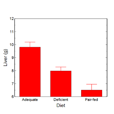
Figure 6. Another bar chart. with standard errors of mean
When making comparisons, make sure the axes have the same scale, or consider putting the graphs together.
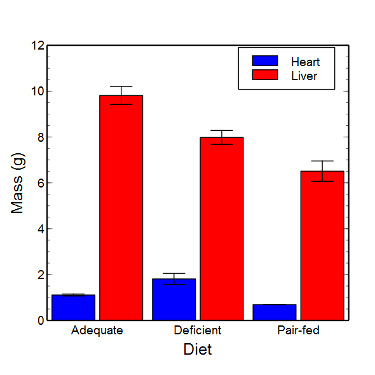
Figure 7. Bar chart that allows for a comparison among levels of a a factor (organs, liver vs. heart).
Analysis note: For variables that covary with body size (for example, on average, tall people generally are heavier too), is how to present (and analyze) the data in such a way that body size is accounted for. Here, the solution was to express organ weight as the ratio of organ weight to body weight for the mice. This may or may not be a good solution, and the answer is too complicated for us now (has to do with a thing called allometric scaling), but I wanted to at least present the issue and show how the graphics can be improved to handle some of these concerns.
Here’s the organ weights again, but taken as ratio of body mass.
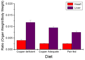
Figure 8. Same chart as in Figure 6, but on ratios.
Note 2. Lets be clear about expectations of you for statistics class. Now, R (and Rcmdr) do lots of graphics, pretty much anything you want, but it is not as friendly as it could be. For BI311 homework, the default graphics available via Rcmdr will generally be adequate for assignments. R and Rcmdr has many bar chart options, but there isn’t a straightforward way to get the error bars, unless you are willing to enter some code to the command line or learn a particular package (like gplots or ggplot2).
How to make a bar chart with error bars in R
Option 1. First, let’s try a work-around. Instead of an error bar option for bar chart menu, Rcmdr provides a plot of means that allows you to plot with error bars. These are equivalent graphs, the “bar chart” and the “plot of means”, though you should favor the bar chart format for publishing.
Rcmdr: Graphs → Plot of means…
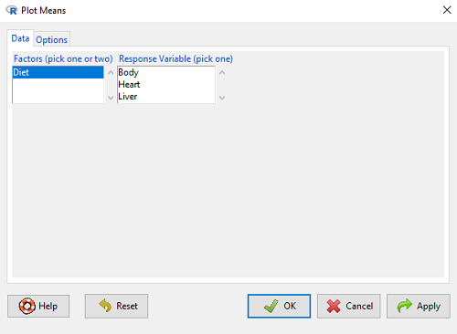
Figure 9. Rcmdr menu popup for Plots Means
Here, Rcmdr takes the data and calculates the mean and your choice of standard errors or deviations, confidence intervals, or no error bars. the resulting graph is below.
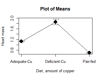
Figure 10. Plot of means
That’s an ugly graph (Fig. 10). Functional, good enough for data exploration and preliminary results, and certainly good enough for a Biostatistics homework or report. Additionally, connecting the dots here is a no-no. It implies that if we had measured categories between “adequate copper” and “deficient copper,” then the points would fall on those lines. That would be a complete guess. So, why did I include the connecting lines? That was the default setting for the command, and it makes the point — think before you click. One argument for connecting points in a graph is that it makes it easier for the reader to visualize trends.
This graph (Fig. 10) is fine for exploring data, but you will want to do better for publication.
Let’s make some better graphs with R
Once you are ready to go beyond the default settings available in Rcmdr, there is tremendous functionality in R for graphics. To access R’s potential, you’ll need to get into the commands a bit. I’m going to continue to try and shield you from the programming aspects of R, but from time to time you really need to see what is possible with R. Graphics is one such area. I use the package gplots, with 23 different graphing functions (type at R prompt ?gplots to call up the manual pages).
gplots should be among the packages on your R installation; if not, then install the package and run library(gplots) to complete the installation. We’ll try the barchart2 function.
But first, we need to get means for each of our groups.
At the R command prompt:
hrtWt <- tapply(Dataset$HeartWt, list(Group=Dataset$Group), mean, na.rm=TRUE) This code extracts means from our HeartWt variable for each Group, then stores the three (in this case, because our data set has 3 groups) in the place holder I had called hrtWt. To verify that the three means are there, type “hrtWt” without the quotes then enter.
You should see
hrtWt Group Cu adequate Cu deficient Pair-fed
               1.200000     1.566667 0.900000
R functions used: tapply, list, mean; na.rm was not needed but would be used to remove all missing values (recall during our import phase we were asked how missing observations were noted in our file; the default is NA).
Next, I want to apply standard error bars
stdDEV <- tapply(Dataset$HeartWt, list(Group=Dataset$Group), sd, na.rm=TRUE)
cil <- hrtWt-(stdDEV/sqrt(3))
ciu <- hrtWt+(stdDEV/sqrt(3))
I used cil and ciu to designate the lower cil and upper ciu values for my ± SEM (standard error of the mean). ciu stands for “confidence interval lower;” ciu stands for “confidence interval upper.”
Finally, here’s the plot command
barplot2(hrtWt, beside = TRUE, main=c("Mice fed different amounts of copper in diet"), col = c("blue", "red", "green"), xlab="Copper in diet", ylab="Heart mass (g)", ylim = c(0, 2), plot.ci=TRUE, ci.l=cil, ci.u=ciu)Now, draw a box around the graphic
box()Whew!
What does your new graph look like? My graph is below (Fig. 11).
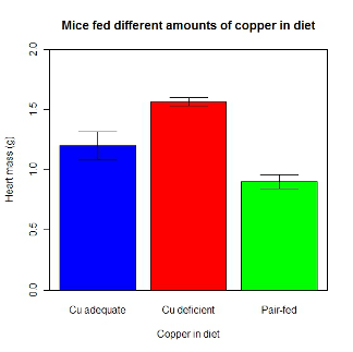
Figure 11. A bar chart using barplot2.
This works and the point is that once the script is written it easy to make small changes as you need in the future to make nice graphs.
If you are impatient like me, I like a GUI option, at least to start crafting the graph. The Rcmdr plugin KMggplot2 provides a good set of tools to make bar charts with error bars. An even better option I think is to use a software package that is designed for graphics, at least simple graphics like a bar chart. I use SciDAVis and Veusz for simple graphs like pie charts and bar charts; much easier to control.
ggplot2 bar charts with error bars
Nevertheless, here’s how to make a bar chart with error bars using ggplot2 (Fig. 11). First, we need to create a statistics summary. The script printed here was modified from scripts at R Graph Cookbook website.
require(plyr)
summarySE <- function(data=NULL, measurevar, groupvars=NULL, na.rm=FALSE,
     conf.interval=.95, .drop=TRUE) {
length2 <- function (x, na.rm=FALSE) {
     if (na.rm) sum(!is.na(x))
     else length(x)
}

#returns a vector with N, mean, and sd
datac <- ddply(data,groupvars, .drop=.drop,
    .fun = function(xx,col){
      c(N=length2(xx[[col]],na.rm=na.rm),
      mean=mean(xx[[col]],na.rm=na.rm),
      sd=sd(xx[[col]],na.rm=na.rm)
     )
    },
    measurevar
   )

#Rename the "mean" column
datac <- rename(datac,c("mean"=measurevar))

#Calculate the standard error of the mean
datac$se <- datac$sd/sqrt(datac$N)

#Get confidence interval
ciMult <- qt(conf.interval/2 + .5, datac$N-1)
datac$ci <- datac$se*ciMult

return(datac)
}
Applying this function to the BMI dataset yields the following output.
sumBMI <- summarySE(BMI, measurevar="BMI", groupvars=c("Sex", "Smoke"));sumBMI

   Sex Smoke   N      BMI       sd        se       ci
1    F    No  23 26.83567 7.610271 1.5868511 3.290928
2    F   Yes  14 25.76133 4.658625 1.2450698 2.689810
3    M    No  10 26.35731 3.363575 1.0636557 2.406156
4    M   Yes  27 26.71879 4.675631 0.8998256 1.849618
Now we are ready to make the bar chart with error bars
ggplot(tgc,aes(x=Smoke,y=BMI,fill=Sex)) +
 geom_bar(position=position_dodge(),stat="identity",color="black") +
 geom_errorbar(aes(ymin=BMI,ymax=BMI+se),width=.2,position=position_dodge(.9))
Figure 12. A barchart from ggplot2
Questions
1. Why should you use box plots and not bar charts to display comparisons for a ratio scale variable between categories? Obtain a copy of the article by Streit and Gehlenbor 2014 — it’s free! After reading, summarize the pro and cons for box plots over bar charts with error bars.
2. Enter the following data into R. The data are sulfate levels in water, parts per million.
type = c("Palolo Stream","Chaminade tap water", "Aquafina","Dasani")
sulfateppm =c(11, 14, 5, 12)
try = data.frame(type,sulfateppm)
byWater = tapply(try$sulfateppm,list(Group=try$type),mean)
Make a simple bar chart using the boxplot2 function in gplots package.
3. Change the range of values on the vertical axis to 0, 20
4. Change the color of the bars from gray to blue
5. Add a label to the vertical axis, “Sulfates, ppm” (without the quotes)
6. Add a box around the graph.
Data set
| Diet | Body | Heart | Liver |
|---|---|---|---|
| Adequate-Cu | 320.1381 | 1.125037 | 10.259657 |
| Adequate-Cu | 329.6879 | 1.158982 | 9.843295 |
| Adequate-Cu | 327.9838 | 1.090374 | 9.855975 |
| Adequate-Cu | 334.6669 | 1.118183 | 9.942997 |
| Adequate-Cu | 338.3134 | 1.172636 | 9.860971 |
| Adequate-Cu | 345.4608 | 1.056183 | 8.88582 |
| Adequate-Cu | 343.089 | 1.081261 | 10.166647 |
| Adequate-Cu | 328.3403 | 1.111278 | 10.124185 |
| Adequate-Cu | 324.9723 | 1.189194 | 10.158402 |
| Adequate-Cu | 325.2378 | 1.14715 | 9.939521 |
| Deficient-Cu | 195.5052 | 1.90973 | 7.907565 |
| Deficient-Cu | 182.7809 | 1.823672 | 8.430167 |
| Deficient-Cu | 184.3701 | 1.632249 | 7.619104 |
| Deficient-Cu | 193.7867 | 1.831765 | 8.742489 |
| Deficient-Cu | 180.0417 | 1.710367 | 7.975879 |
| Deficient-Cu | 208.5349 | 2.495623 | 8.652445 |
| Deficient-Cu | 182.3048 | 1.262053 | 7.257726 |
| Deficient-Cu | 203.0413 | 2.153639 | 8.081782 |
| Deficient-Cu | 193.3829 | 1.986028 | 7.807328 |
| Deficient-Cu | 195.0523 | 1.76975 | 8.297611 |
| Pair-fed | 211.0858 | 0.6911343 | 6.251177 |
| Pair-fed | 210.4041 | 0.6928067 | 7.696669 |
| Pair-fed | 208.5969 | 0.6911901 | 6.973803 |
| Pair-fed | 209.3333 | 0.7039211 | 6.629303 |
| Pair-fed | 208.8889 | 0.7077486 | 6.038704 |
| Pair-fed | 208.2994 | 0.7004535 | 6.606877 |
| Pair-fed | 209.4524 | 0.6915543 | 6.228888 |
| Pair-fed | 210.2699 | 0.6984497 | 6.638466 |
| Pair-fed | 208.8142 | 0.7214847 | 6.353705 |
| Pair-fed | 209.2977 | 0.6848656 | 6.536642 |