4.3 – Box plot
Introduction
Box plots, also called whisker plots, should be your routine choice for exploring ratio scale data. Like bar charts, box plots are used to compare ratio scale data collected for two or more groups. Box plots serve the same purpose as bar charts with error bars, but box plots provide more information.
Purpose and design criteria
Box plots are useful tool for getting a sense of central tendency and spread of data. These types of plots are useful diagnostic plots. Use them during initial stages of data analyses. All summary features of box plots are based on ranks (not sums). So, they are less sensitive to extreme values (outliers). Box plots reveal asymmetry. Standard deviations are symmetric.
The median splits each batch of numbers in half (center line). The “hinge” (median value) splits the remaining halves in half again (the quartiles). The first, second (median), and third quartiles describes the interquartile range, or IQR, 75% of the data (Fig. 1). Outlier points can be identified, for example, with an asterisk or by id number (Fig. 1).
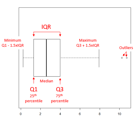
Figure 1. A box plot. Elements of box plot labelled.
We’ll use the data set described in the previous section, so if you have not already done so, get the data from Table 1, Chapter 4.2 into your R software.
See Chapter 4.10 — Graph software for additional box plot examples, but made with different R packages or software apps.
R Code
Command line
We’ll provide code for the base graph shown in Figure 2A. At the R prompt, type
boxplot(OliveMoment~Treatment)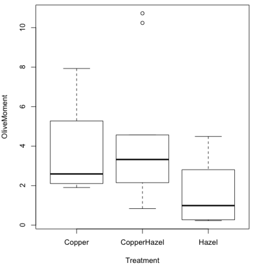
Figure 2A. Box plot, default graph in base package
Boxplot is a common function offered in several packages. In the base installation of R, the function is boxplot(). The car package, which is installed as part of R Commander installation, includes Boxplot(), which is a “wrapper function” for boxplot(). Note the difference: base package is all lower case, car package the “B” is uppercase. One difference, base boxplot() permits horizontal orientation of the plot (Fig. 2B).
Wrapper functions are code that links to another function, perhaps simplifying working with that function.
boxplot(OliveMoment ~ Treatment, horizontal=TRUE, col="steelblue")

Figure 2B. Same graph, but with color and made horizontal; boxplot(), default graph in base package
Base package boxplot() has additional features and options compared to Boxplot() in the car package. i.e., not all barcode() options are wrapped. For example, I had more success adding original points to boxplot() graph (Fig. 2C) following the function call with stripchart().
stripchart(OliveMoment ~ Treatment, method = "overplot", pch = 19, add = TRUE)
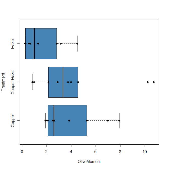
Figure 2C. Same graph, added original points; boxplot(), default graph in base package.
boxplot and stripchart functions part of ggplot2 package, part of tidyverse, easily used to generate graphs like Fig 2B and Fig 2C. The overplot option was used to jitter points to avoid overplotting. See below: Apply tidyverse-view to enhance look of boxplot graphic and Fig. 9.
Jittering adds random noise to points, which helps view the data better if many points are clustered together. Note however that jitter would add noise to the plot — if the objective is to show an association between two variables, jitter will reduce the apparent association, perhaps even compromising the intent of the graph. Beeswarm also can be used to better visualize clustered points, but uses a nonrandom algorithm to plot points.
Rcmdr: Graph → Boxplot…
Select the response variable, then click on the Plot by: button
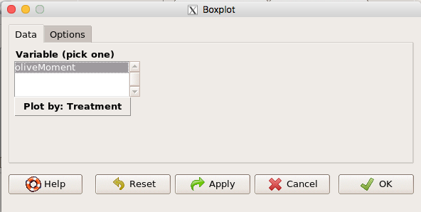
Figure 3. Popup menu in R Commander: Select the response variable and set the Plot by: option.
Next, select the Groups (Factor) variables (Fig. 4). Click OK to proceed
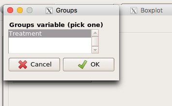
Figure 4. Select the group variable
Back to the Box Plot menu, click “Options” tab to add details to the plot, including a graph title and how outliers are noted (Fig 5),
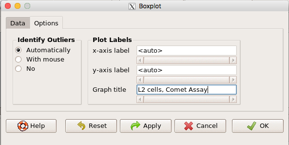
Figure 5. Options tab, enter labels for axes and a title.
And here is the resulting box plot (Fig 6)
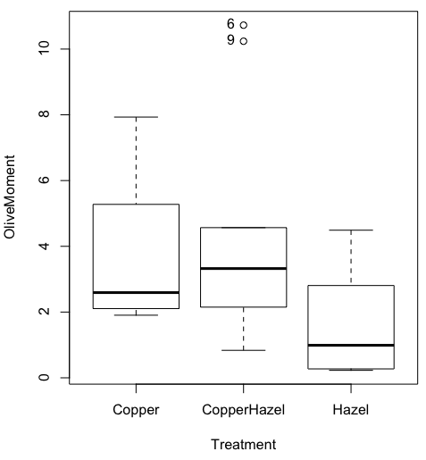
Figure 6. Resulting box plot from car package implemented in R Commander. Outliers are identified by row id number.
The graph is functional, if not particularly compelling. The data set was “olive moments” from Comet Assays of an immortalized rat lung cell line exposed to dilute copper solution (Cu), Hazel tea (Hazel), or Hazel & Copper solution.
Apply Tidyverse-view to enhance look of boxplot graphic
Load the ggplot2 package via the Rcmdr plugin to add options to your graph. As a reminder, to install Rcmdr plugins you must first download and install them from an R mirror like any other package, then load the plugin via Rcmdr Tools → Load Rcmdr plug-in(s)… (Fig 6, Fig 7).
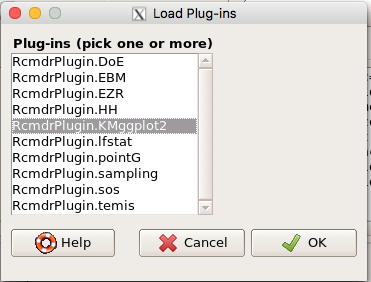
Figure 6. Screen shot of Load Rcmdr plug-ins menu, Click OK to proceed (see Fig 7)
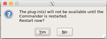
Figure 7. To complete installation of the plug-in, restart R Commander.
Significant improvement, albeit with an “eye of the beholder” caveat, can be made over the base package. For example, ggplot2 provides additional themes to improve on the basic box plot. Figure 8 shows the options available in the Rcmdr plugin KMggplot2, and the default box plot is shown in Fig 9.
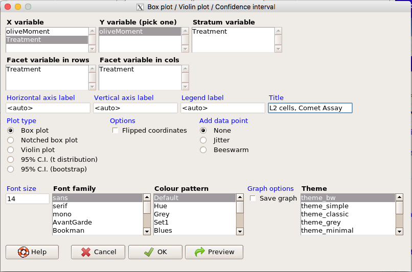
Figure 8. Menu of KMggplot2. A title was added, all else remained set to defaults.
The next series of plots explore available formats for the charts.
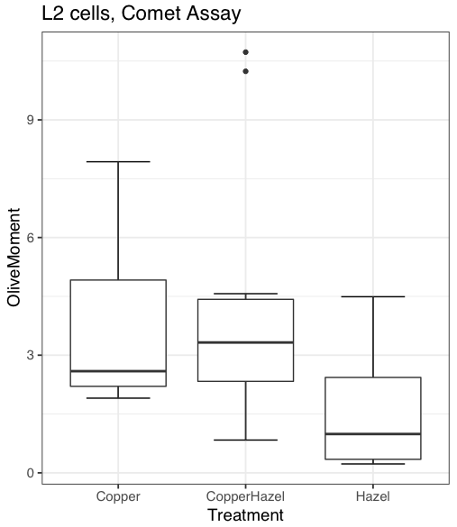
Figure 9. Default box plot from KMggplot
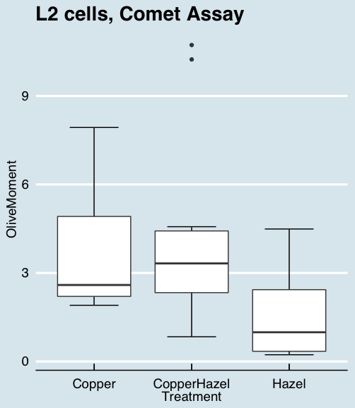
Figure 10. “Economist” theme box plot from KMggplot2
And finally, since the box plot is often used to explore data sets, some recommend including the actual data points on a box plot to facilitate pattern recognition. This can be accomplished in the KMggplot2 plugin by checking “Jitter” under the Add data points option (see Fig 8). Jitter helps to visualize overlapping points at the expense of accurate representation. I also selected the Tufte theme, which results in the image displayed in Figure 11.
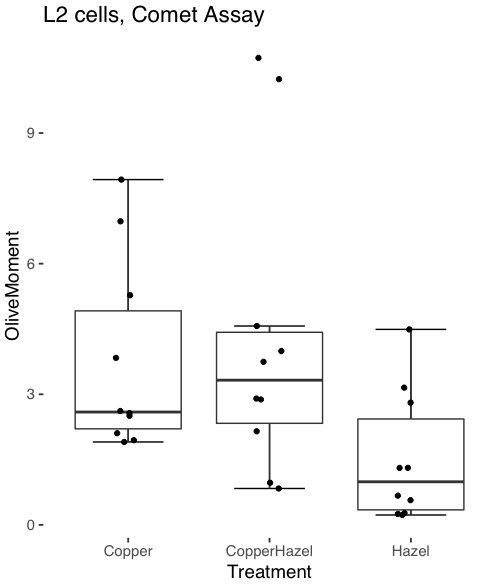
Figure 11. Tufte theme and data points added to the box plot.
Note. The Tufte theme is so named for Edward Tufte (2001), Chapter 6 Data-Ink Maximization and Graphical Design.” In brief, the theme follows the “maximal data, minimal ink” principle.
Conclusions
As part of your move from the world of Microsoft Excel graphics to recommended graphs by statisticians, the box plot is used to replace the bar charts plus error bars that you may have learned in previous classes. The second conclusion? I presented a number of versions of the same graph, differing only by style. Pick a style of graphics and be consistent.
Questions
- Why is a box plot preferred over a bar chart for ratio scale data, even if an appropriate error bar is included?
- With your comet data (Table 1, Chapter 4.2), explore the different themes available in the box plot commands available to you in Rcmdr. Which theme do you prefer and why?
Chapter 4 contents
4.2 – Histograms
Introduction
Displaying interval or continuously scaled data. A histogram (frequency or density distribution), is a useful graph to summarize patterns in data, and is commonly used to judge whether or not the sample distribution approximates a normal distribution. Three kind of histograms, depending on how the data are grouped and counted. Lump the data into sequence of adjacent intervals or bins (aka classes), then count how many individuals have values that fall into one of the bins — the display is referred to as a frequency histogram. Sum up all of the frequencies or counts in the histogram and they add to the sample size. Convert from counts to percentages, then the heights of the bars are equal to the relative frequency (percentage) — the display is referred to as a percentage histogram (aka relative frequency histogram). Sum up all of the bin frequencies and they equal one (100%).
Figure 1 shows two frequency histograms of the distribution of ages for female (left panel) and male (right panel) runners at the 2013 Jamba Juice Banana 5K race in Honolulu, Hawaii (link to data set).
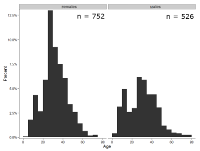
Figure 1. Histograms of age distribution of runners who completed the 2103 Jamba Juice 5K race in Honolulu
The graphs in Fig. 1 were produced using R package ggplot2.
The third kind of histogram is referred to as a probability density histogram. The height of the bars are the probability densities, generally expressed as a decimal. The probability density is the bin probability divided by the bin width (size). The area of the bar gives the bin probability and the total area under the curve sums to one.
Which to choose? Both relative frequency histogram and density histogram convey similar messages because both “sum to one (100%), i.e., bin width is the same across all intervals. Frequency histograms may have different bin widths, with more numerous observations, the bin width is larger than cases with fewer observations.
Purpose of the histogram plot
The purpose of displaying the data is to give you or your readers a quick impression of the general distribution of the data. Thus, from our histogram one can see the range of the data and get a qualitative impression of the variability and the central tendency of the data.
Kernel density estimation
Kernel density estimation (KDE) is a non-parametric approach to estimate the probability distribution function. The “kernel” is a window function, where an interval of points is specified and another function is applied only to the points contained in the window. The function applied to the window is called the bandwidth. The kernel smoothing function then is applied to all of the data, resulting in something that looks like a histogram, but without the discreteness of the histogram.
The chief advantage of kernel smoothing over use of histograms is that histogram plots are sensitive to bin size, whereas KDE plot shape are more consistent across different kernel algorithms and bandwidth choices.
Today, statisticians use kernel smoothing functions instead of histograms; these reduce the impact that binning has on histograms, although kernel smoothing still involves choices (smoothing function? default is Gaussian. Widths or bandwidths for smoothing? Varies, but the default is from the variance of the observations). Figure 2 shows smoothed plot of the 752 age observations.
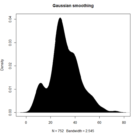
Figure 2. KDE plot of age distribution of female runners who completed the 2103 Jamba Juice 5K race in Honolulu
Note: Remember: the hashtag # preceding R code is used to provide comments and is not interpreted by R
R commands typed at the R prompt were, in order
d <- density(w) #w is a vector of the ages of the 752 females
plot(d, main="Gaussian smoothing")
polygon(d, col="black", border="black") #col and border are settings which allows you to color in the polygon shape, here, black with black border.
Conclusion? A histogram is fine for most of our data. Based on comparing the histogram and the kernel smoothing graph I would reach the same conclusion about the data set. The data are right skewed, maybe kurtotic (peaked), and not normally distributed (see Ch 6.7).
Design criteria for a histogram
The X axis (horizontal axis) displays the units of the variable (e.g., age). The goal is to create a graph that displays the sample distribution. The short answer here is that there is no single choice you can make to always get a good histogram — in fact, statisticians now advice you to use a kernel function in place of histograms if the goal is to judge the distribution of samples.
For continuously distributed data the X-axis is divided into several intervals or bins:
- The number of intervals depends (somewhat) on the sample size and (somewhat) on the range of values. Thus, the shape of the histogram is dependent on your choice of intervals: too many bins and the plot flattens and stretches to either end (over smoothing); too few bins and the plot stacks up and the spread of points is restricted (under smoothing). For both you lose the
- A general rule of thumb: try to have 10 to 15 different intervals. This number of intervals will generally give enough information.
- For large sample size (N=1000 or more) you can use more intervals.
The intervals on the X-axis should be of equal size on the scale of measurement.
- They will not necessarily have the same number of observations in each interval.
- If you do this by hand you need to first determine the range of the data and then divide this number by the number of categories you want. This will give you the size of each category (e.g., range is 25; 25 / 10 = 2.5; each category would be 2.5 unit).
For any given X category the Y-axis then is the Number or Frequency of individuals that are found within that particular X category.
Software
Rcmdr: Graphs → Histogram…
Accepting the defaults to a subset of the 5K data set we get (Fig. 3)
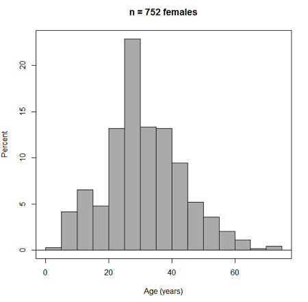
Figure 3. Histogram of 752 observations, Sturge’s rule applied, default histogram
The subset consisted of all females or n = 752 that entered and finished the 5K race with an official time.
R Commander plugin KMggplot2
Install the RcmdrPlugin.KMggplot2as you would any package in R. Start or restart Rcmdr and load the plugin by selecting Rcmdr: Tools → Load Rcmdr plug-in(s)… Once the plugin is installed select Rcmdr: KMggplot2 → Histogram… The popup menu provides a number of options to set to format the image. Settings for the next graph were No. of bins “Scott,” font family “Bookman,” Colour pattern “Set 1,” Theme “theme_wsj2.”
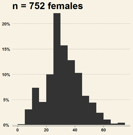
Figure 4. Histogram of 752 observations, Scott’s rule applied, ggplot2 histogram
Selecting the correct bin number
You may be saying to yourself, wow, am I confused. Why can’t I just get a graph by clicking on some buttons? The simple explanation is that the software returns defaults, not finished products. It is your responsibility to know how to present the data. Now, the perfect graph is in the eye of the beholder, but as you gain experience, you will find that the default intervals in R bar graphs have too many categories (recall that histograms are constructed by lumping the data into a few categories, or bins, or intervals, and counting the number of individuals per category => “density” or frequency). How many categories (intervals) should we use?
Figure 5. Default histogram with different bin size.
R’s default number for the intervals seems too much to me for this data set; too many categories with small frequencies. A better choice may be around 5 or 6. Change number of intervals to 5 (click Options, change from automatic to number of intervals = 5). Why 5? Experience is a guide; we can guess and look at the histograms produced.
Improving estimation of bin number
I gave you a rough rule of thumb. As you can imagine there have been many attempts over the years to come up with a rational approach to selecting the intervals used to bin observations for histograms. Histogram function in Microsoft’s Excel (Data Analysis plug-in installed) uses the square root of the sample size as the default bin number. Sturge’s rule is commonly used, and the default choice in some statistical application software (e.g., Minitab, Prism, SPSS). Scott’s approach (Scott 2009), a modification to Sturge’s rule, is the default in the ggplot() function in the R graphics package (the Rcmdr plugin is RcmdrPlugin.KMggplot2). And still another choice, which uses interquartile range (IQR), was offered by Freedman and Diacones (1981). Scargle et al (1998) developed a method, Bayesian blocks, to obtain optimum binning for histograms of large data sets.
What is the correct number of intervals (bins) for histograms?
- Use the square root of the sample size, e.g., at R prompt sqrt∗n∗ = 4.5, round to 5). Follow Sturges’ rule (to get the suggested number of intervals for a histogram, let k = the number of intervals, and k = 1 + 3.322(log10n),
- where n is the sample size. I got k = 5.32, round to nearest whole number = 5).
- Another option was suggested by Freedman and Diacones (1981): find IQR for the set of observations and then the solution to the bin size is k = 2IQRn-1/3, where n is the sample size.
Select Histogram Options, then enter intervals. Here’s the new graph using Sturge’s rule…
Figure 6. Default histogram, bin size set by Sturge’s rule.
OK, it doesn’t look much better. And of course, you’ll just have to trust me on this — it is important to try and make the bin size appropriate given the range of values you have in order that the reader/viewer can judge the graphic correctly.
Two histograms on same plot
In many cases you may wish to compare sample distributions among two or more groups.
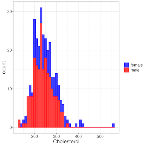
Figure 7. Two histograms on same plot with ggplot2.
R code
Stacked data set, data from Kaggle.
myColors=c(female="blue", male="red")
ggplot(sexChol, aes(chol, fill = sex, color=sex)) +
  geom_histogram(binwidth = 10, alpha=0.75) +
  labs(x = "Cholesterol") +
  theme_bw() +
  theme(legend.title= element_blank(),legend.text=element_text(size=14),
     axis.text=element_text(size=14),axis.title=element_text(size=18)) +
  scale_color_manual(values=myColors) +
  scale_fill_manual(values=myColors)
Base graphics version
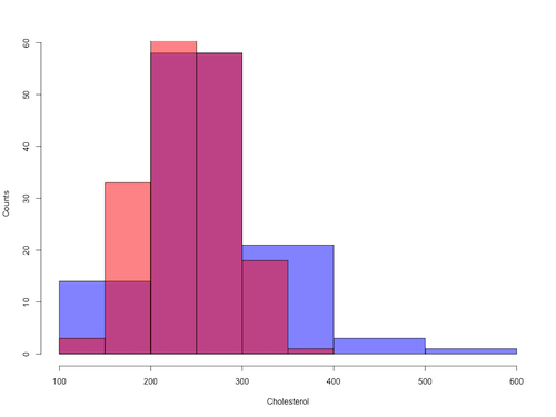
Figure 8. Same data as Fig 7, but using base hist() and plot() functions.
Not an aesthetically pleasing graph (Fig 8), but the idea was to recreate Figure 7 and show regions of overlap. We do this by setting transparent colors (h/t DataAnalytics.org.uk).
First, pick you colors. I like blue and red. Next, we identify how the colors are declared in the three rgb channels. Use the col2rgb() function.
col2rgb("blue")
[,1]
red 0
green 0
blue 255
Create my transparent blue with the alpha setting (125 = 50%). Note the command asks for names, but we won’t use it further.
myBlue <- rgb(0, 0, 255, max = 255, alpha = 125, names = "blue50")
Repeat for 50% transparent red.
col2rgb("red")
[,1]
red 255
green 0
blue 0
myRed <- rgb(255, 0, 0, max = 255, alpha = 125, names = "red50")
Now, we make the plots. Data unstacked, a column with cholesterol values for females (fChol), and another for male cholesterol values mChol). Bin size is different from Figure 7.
hist1 <- hist(fChol, breaks=6, plot=FALSE)
hist2 <- hist(mChol, add=T, breaks=6, plot=FALSE)
Open a Graphics Device so that we can save image to png format. I’ve set width and height in numbers of pixels.
png("base_histograms_two_chol.png", width = 800, height = 600)
Make the graph
plot(hist1, col = myBlue, main="", xlab="Cholesterol", ylab="Counts")
plot(hist2, col = myRed, add = TRUE)
Close the device, the image file is saved to working folder.
dev.off()
Questions
Example data set, comet tails and tea

Figure 9. Examples of comet assay results.
The Comet assay, also called single cell gel electrophoresis (SCGE) assay, is a sensitive technique to quantify DNA damage from single cells exposed to potentially mutagenic agents. Undamaged DNA will remain in the nucleus, while damaged DNA will migrate out of the nucleus (Figure 7). The basics of the method involve loading exposed cells immersed in low melting agarose as a thin layer onto a microscope slide, then imposing an electric field across the slide. By adding a DNA selective agent like Sybr Green, DNA can be visualized by fluorescent imaging techniques. A “tail” can be viewed: the greater the damage to DNA, the longer the tail. Several measures can be made, including the length of the tail, the percent of DNA in the tail, and a calculated measure referred to as the Olive Moment, which incorporates amount of DNA in the tail and tail length (Kumaravel et al 2009).
The data presented in Table 1 comes from an experiment in my lab; students grew rat lung cells (ATCC CCL-149), which were derived from type-2 like alveolar cells. The cells were then exposed to dilute copper solutions, extracts of hazel tea, or combinations of hazel tea and copper solution. Copper exposure leads to DNA damage; hazel tea is reported to have antioxidant properties (Thring et al 2011).
| Treatment | Tail | TailPercent | OliveMoment* |
|---|---|---|---|
| Copper-Hazel | 10 | 9.7732 | 2.1501 |
| Copper-Hazel | 6 | 4.8381 | 0.9676 |
| Copper-Hazel | 6 | 3.981 | 0.836 |
| Copper-Hazel | 16 | 12.0911 | 2.9019 |
| Copper-Hazel | 20 | 15.3543 | 3.9921 |
| Copper-Hazel | 33 | 33.5207 | 10.7266 |
| Copper-Hazel | 13 | 13.0936 | 2.8806 |
| Copper-Hazel | 17 | 26.8697 | 4.5679 |
| Copper-Hazel | 30 | 53.8844 | 10.238 |
| Copper-Hazel | 19 | 14.983 | 3.7458 |
| Copper | 11 | 10.5293 | 2.1059 |
| Copper | 13 | 12.5298 | 2.506 |
| Copper | 27 | 38.7357 | 6.9724 |
| Copper | 10 | 10.0238 | 1.9045 |
| Copper | 12 | 12.8428 | 2.5686 |
| Copper | 22 | 32.9746 | 5.2759 |
| Copper | 14 | 13.7666 | 2.6157 |
| Copper | 15 | 18.2663 | 3.8359 |
| Copper | 7 | 10.2393 | 1.9455 |
| Copper | 29 | 22.6612 | 7.9314 |
| Hazel | 8 | 5.6897 | 1.3086 |
| Hazel | 15 | 23.3931 | 2.8072 |
| Hazel | 5 | 2.7021 | 0.5674 |
| Hazel | 16 | 22.519 | 3.1527 |
| Hazel | 3 | 1.9354 | 0.271 |
| Hazel | 10 | 5.6947 | 1.3098 |
| Hazel | 2 | 1.4199 | 0.2272 |
| Hazel | 20 | 29.9353 | 4.4903 |
| Hazel | 6 | 3.357 | 0.6714 |
| Hazel | 3 | 1.2528 | 0.2506 |
Tail refers to length of the comet tail, TailPercent is percent DNA damage in tail, and OliveMoment refers to Olive's (1990), defined as the fraction of DNA in the tail multiplied by tail length
Copy the table into a data frame.
- Create histograms for tail, tail percent, and olive moment
- Change bin size
- Repeat, but with a kernel function.
- Looking at the results from question 1 and 2, how “normal” (i.e., equally distributed around the middle) do the distributions look to you?
- Plot means to compare Tail, Tail percent, and olive moment. Do you see any evidence to conclude that one of the teas protects against DNA damage induced by copper exposure?
Chapter 4 contents
3.3 – Measures of dispersion
Introduction
The statistics of data exploration involve calculating estimates of the middle, central tendency, and the variability, or dispersion, about the middle. Statistics about the middle were presented in the previous section, Chapter 3.1. Statistics about measures of dispersion, and how to calculate them in R, are presented in this page. Use of Z score to standardize or normalize scores is introduced. Statistical bias is also introduced.
Describing the middle of the data gives your reader a sense of what was the typical observation for that variable. Next, your reader will want to know something about the variation about the middle value — what was the smallest value observed? What was the largest value observed? Were data widely scattered or clumped about the middle?
Measures of dispersion or variability are descriptive statistics used to answer these kinds of questions. Variability statistics are very important and we will use them throughout the course. A key descriptive statement of your data, how variable?
Note: data is plural = a bunch of points or values; datum is the singular and rarely used.
Examine the two figures below (Fig. 1 and Fig 2): the two sample frequency distributions (put data into several groups, from low to high, and membership is counted for each group) have similar central tendencies (mean), but they have different degrees of variability (standard deviation).
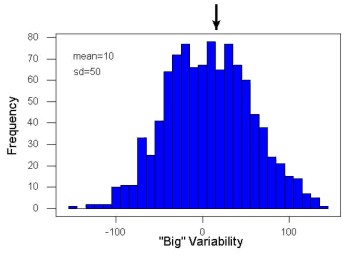
Figure 1. A histogram which displays a sampling of data with a mean of 10 (arrow marks the spot) and standard deviation (sd) of 50 units.
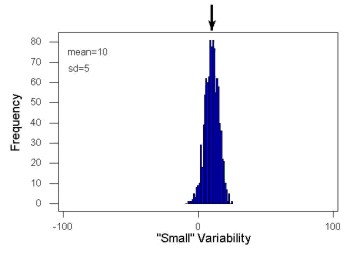
Figure 2. A histogram which displays a sampling of data with the same mean of 10 (arrow marks the spot) displayed in Fig. 1, but with a smaller standard deviation (sd) of 5 units.
Clearly, knowing something about the middle of a data set is only part of the required information we need when we explore a data set; we need measures of dispersion as well. Provided certain assumptions about the frequency of observations hold, estimates of the middle (e.g., mean, median) and the dispersion (e.g., standard deviation) are adequate to describe the properties of any observed data set.
For measures of dispersion or variability, the most common statistics are: Range, Mean Deviation, Variance, Standard Deviation, and Coefficient of Variation.
The range
The range is reported as one number, the difference between maximum and minimum values.

Arrange the data from low to high, subtract the minimum, Xmin, from the maximum, Xmax, value and that’s the range.
For example, the minimum height of a collection of fern trees might be 1 meter whereas the maximum height might be 2.2 meters. Therefore, the range is 1.2 meters (= 2.2 – 1).
The range is useful, but may be misleading (as index of true variability in population) if there is one or more exceptional “outlier” (one individual that has an exceptionally large or small value). I often just report Xmin and Xmax. That’s the way R does it, too.
If you recall, we used the following as an example data set.
x = c(4,4,4,4,5,5,6,6,6,7,7,8,8,8,15)The command for range in R is simply range().
range(x)
[1] 4 15
There is apparently no universally accepted symbol for “range,” so we report the statistic as range = 15 – 4 = 11.
You may run into an interquartile range, which is abbreviated as IQR. It is a trimmed range, which means, like the trimmed mean, it will be robust to outlier observations. To calculate this statistic, divide the data into fourths, termed quartiles. For our example variable, x, we can get the quartiles in R
quantile(x)
  0%  25%  50%  75% 100%
 4.0  4.5  6.0  7.5 15.0
Thus, we see that 25% of the observations are 4.5 (or less), the second quartile is the median, and 75% of the observations are less than 7.5. The IQR is the difference between the first quartile, Q1, and the third quartile, Q3.
The command for obtaining the IQR in R is simply IQR(). Yes. You have to capitalize “IQR” — R is case sensitive; that means IqR is not the same as IQR or iqr.
IQR(x)
[1] 3.5
and we report the statistic as IQR = 3.5. Thus, 75% of the observations are within 3.5 points of the median. The IQR is used in box plots (Chapter 4). Quartiles are special cases of the more general quantile; quantiles divide up the range of values into groups with equal probabilities. For quartiles, four groups at 25% intervals. Other common quantiles include deciles (ten equal groups, 10% intervals) and percentiles (100 groups, 1% intervals).
The mean deviation

Subtract each observation from the sample mean; each  is called a deviate: some observations will be positive (greater than
  ) and some will be negative (less than ).
Take the absolute value of the deviation and then add up the absolute values of the deviations from the mean. At the end, divide by the sample size, n. Large values for this statistic implies that much of the data is spread out, far from the mean. Small values in turn imply that each observation is close to the mean.
Note that the mean deviation will always be positive, which is why we take the absolute. By taking the absolute value of each deviate, then the sum is greater than zero. Now, we rarely use this statistic by itself — but that difference is integral to much of the statistical tests we will use. Look for this difference in other equations!
In R, we can get the mean deviation with the mad() function. At the R prompt, then
mad(x)
[1] 2.9652
Population variance and population standard deviation
The population variance is appropriate for describing variability about the middle for a census. Again, a census implies every member of the population was measured. Equation of the population variance is

The population standard deviation also describes the variability about the middle, but has the advantage of being in the same units as the quantity (i.e., no “squared” term). Equation of the population standard deviation is

Sample variance and sample standard deviation
The above statements about the population variance and standard deviation hold for the sample statistics. Equation of the sample variance

and the equation of the sample standard deviation

Of course, instead of taking the square-root of the sample variance, the sample standard deviation could be calculated directly.

n - 1 instead of N. This is Bessel’s correction and we will take a few moments here and in class to show you why this correction makes sense. Bessel’s correction to the sample variance illustrates a basic issue in statistics: when estimating something, we want the estimator (i.e., the equation), to be an unbiased value for the population parameter it is intended to estimate.Statistical bias is an important concept in its own right; bias is a problem because it refers to a situation in which an estimator consistently returns a value different from the population parameter for which it is intended to estimate. Thus, the sample mean is said to be an unbiased estimator of the population mean. Here, bias means that the formula will give you a good estimate of the value. This turns out not to be the case for the sample variance if you divide by n instead of n - 1. Now, for very large values of n, this is not much of an issue, but it shows up when n is small. In R you get what you ask for — if you ask for the sample standard deviation, the software will return the correct value; calculators, go to watch out for this — not all of them are good at communicating which standard deviation they are calculating, the population or the sample standard deviation.
Winsorized variances
Like the trimmed mean and winsorized mean (Ch3.2), we may need to construct a robust estimate of variability less sensitive to extreme outliers. Winsorized refers to procedures to replace extreme values in the sample with a smaller value. As noted in Chapter 3.2, we chose the level ahead of time, e.g., 90%. Winorized values then The winsorized variance is just the sample variance of the winsorized values. winvar() from the WRS2 package.
Making use of the sample standard deviation
Given an estimate of the mean and an estimate of the standard deviation, one can quickly determine the kinds of observations made and how frequently they are expected to be found in a sample from a population (assuming a particular population distribution). For example, it is common in journal articles for authors to provide a table of summary statistics like the mean and standard deviation to describe characteristics of the study population (aka the reference population), or samples of subjects drawn from the study population (aka the sample population). The CDC provides reports of attributes of for a sample of adults (more than forty thousand) from the USA population (Fryar et al 2018). Table 1 shows a sample of results for height, weight, and waist circumference for men aged 20 – 39 years.
Table 1. Summary statistics mean ( standard deviation) of height, weight, and waist circumference of 20-39 year old men USA.
| Years | Height, inches | Weight, pounds | Waist Circumference, inches |
|---|---|---|---|
| 1999 – 2000 | 69.4 (0.1) | 185.8 (2.0) | 37.1 (0.3) |
| 2007 – 2008 | 69.4 (0.2) | 189.9 (2.1) | 37.6 (0.3) |
| 2015 – 2016 | 69.3 (0.1) | 196.9 (3.1) | 38.7 (0.4) |
We introduced the normal deviate as a way to normalize scores, and which we we will use extensively in our discussion of the normal distribution in Chapter 6.7, as a way to standardize a sample distribution, assuming a normal curve.

For data that are normally distributed, the standard deviation can be used to tell us a lot about the variability of the data:
62.26% of the data will lie between  of
of
95.46% of the data will lie between  of
of
99.0% of the data will lie between  of
of
This is known as the empirical rule, where 68% of the observations will be within one standard deviation, 95% of observations will be within two standard deviations, and 99% of observations will be within three standard deviations.
For example, men aged 20 years in the USA are on average μ = 5 feet 11 inches tall, with a standard deviation of σ = 3 inches. Consider a sample of 1000 men from this population. Assuming a normal distribution, we predict that 623 (62.26%) will be between 5 ft. 8 in. and 6 ft. 2 in. ( ).
).
Where did the 5 ft. 8 in. and the 6 ft. 2 in. come from /? We add or subtract multiples of standard deviations. Thus, 6 ft. 2 in. = 5 ft. 11 in.  (replace σ = 3) and 5 ft. 8 in. = 5 ft. 11 in.
  (again, replace σ = 3″).
Can generalize to any distribution. Chebyshev’s inequality (or theorem) guarantees that no more than a particular fraction  of observations can be a specified
  standard deviations distance away from the mean ( needs to be greater than 1). Thus, for
  standard deviations, we expect a minimum of 75% of values within (
 ) two standard deviations away from the mean, or for
  , then 89% of values will be within (
 ) three standard deviations from the mean.
Hopefully you are now getting a sense how this knowledge allows you to plan an experiment.
For example, for a sample of 1000 observations of height of men, how many do we expect to be greater than 6 ft. 7 in. tall? Apply the empirical rule and do a little math — 79 inches (6 ft. 7 in) minus 71 inches (the mean) is equal to 8. Divide 8 by 3 (our value of  ) you’ll get 2.66667; so, 6 ft. 7 in. tall is about 2.67 X standard deviations greater than the mean. From Chebyshev’s inequality we have
  , or 14% of observations less than or greater than the mean (
 ). Our question asks only about expected number of observations greater than
  ; divide 14% in half — we therefore expect about 70 individuals out of 1000 men sampled to be 6 ft. 7 in. or taller. Note we made no assumption about the shape of the distribution. If we assume the sample of observations comes from the normal distribution, then we can apply the Z score: about 4 individuals out of 1000 expected to be from the mean (see R code in Note box). We extend the Z-score work in Chapter 6.7.
R code:
round(1000*(pnorm(c(79), mean=71, sd=3,lower.tail=FALSE)),0)
or alternatively
round(1000*(pnorm(c(2.67), mean=0, sd=1,lower.tail=FALSE)),0)
R output
[1] 4
R Commander command
Rcmdr: Distributions → Continuous distributions → Normal distribution → Normal probabilities …, select Upper tail.
Another example, this time with a data set available in R, the diabetic retinopathy data set in the survival package.
data(diabetic, package="survival")
Ages of the 394 subjects ranged from 1 to 58. Mean was 20.8 + 14.81 years. How many out of 100 subjects do we expect greater than 50 years old? With Chebyshev’s inequality we have  , or 25.7% of observations less than or greater than the mean, so about 13. If we assume normality, then Z score (Upper tail) is 28.5% and we expect 28 subjects older than 50. Checking the data set, only eight subjects were older than 50. Our estimate by Chebyshev’s inequality was closer to the truth. Why /? Take a look at the histogram (Ch4) of the ages (Fig 3).
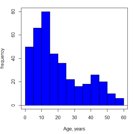
Figure 3. Histogram of ages of subjects in the diabetic retinopathy data set in the survival package.
Doesn’t look like a normal distribution, does it/?.
Z-score or Chebyshev’s inequality, which to use /? Chebyshev’s inequality is more general — it can be used whether the variables is discrete or continuous and without assumption about the distribution. In contrast, the Z score assumes more is known about the variable: random, continuous, drawn from a normally distributed population. Thus, as long as these assumptions hold, the Z score approach will give a better answer. Makes intuitive sense — if we know more, our predictions should be better.
In summary from the above points, and perhaps more formally for our purposes, the standard deviation is a good statistic to describe variability of observations on subjects, it’s integral to the concept of precision of an estimate and is part of any equation for calculating confidence intervals (CI). For any estimated statistic, a good rule of thumb is to always include a confidence interval calculation. We introduced these intervals in our discussion of risk analysis (approximate CI of NNT), and we will return to confidence intervals more formally when we introduce t-tests.
When you hear people talk about “margin of error” in a survey, typically they are referring to the standard deviation — to be more precise, they are referring to a calculation that includes the standard deviation, the standard error and an accounting for confidence in the estimate (see also Chapter 3.5 – Statistics of error).
Corrected Sums of Squares
Now, take a closer look at the sample variance formula. We see a deviate

The variance is the average of the squared deviations from the mean. Because of the “squared” part, this statistic will always be positive and greater (or typically, equal to) zero. The variance has squared units (e.g., if the units were grams, then the variance units are grams2). The sample standard deviation has the same units as the quantity (i.e., no “squared” term). The numerator is called a sums of squares, and will be abbreviated as SS. Much like the deviate, will show up frequently as we move forward in statistics (e.g., it’s key to understanding ANOVA).
Other standard deviations of means
Just as we discussed for the arithmetic average, there will be corresponding standard deviations for the other kinds of means. With the geometric mean, one would calculate the standard deviation of the geometric mean, sgm, as

where exp is the exponential function, ln refers to natural logarithm, and  refers to the sample geometric mean.
For the sample harmonic mean, it turns out there isn’t a straight-forward formula, only an approximation (which I will spare you — it involves use of expectations and moments).
Base R, and therefore Rcmdr, doesn’t have built in functions for these, although you could download and install some R packages which do (e.g., package NCStats, and the function is geosd() ).
If we run into data types appropriate for the geometric or harmonic means and standard deviations I will point these out; for now, I present these for completeness only.
Coefficient of variation (CV)
An unfortunate property of the standard deviation is that it is related (= “correlated”) to the mean. Thus, if the mean of a sample of 100 individuals is 5 and variability is about 20%, then the standard deviation is about 1; compare to a sample of 100 individuals with mean = 25 and 20% variability, the standard deviation is about 5. For means ranging from 1 to 100, here’s a plot to show you what I am talking about.
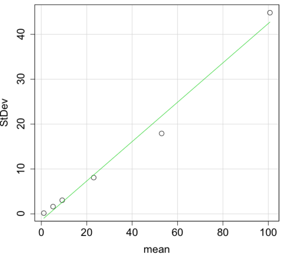
Figure 4. Scatter plot of the standard deviation (StDev) by the mean. Data sets were simulated.
The data presented in the Fig. 4 graph were simulated. Is this bias, a correlation between mean and standard deviation, something you’d see in “real” data? Here’s a plot of height in inches at withers for dog breeds (Fig. 5). A line is drawn (ordinary linear regression, see Chapter 12) and as you can see, as the mean increases, the variability as indicated by the standard deviation also increases.
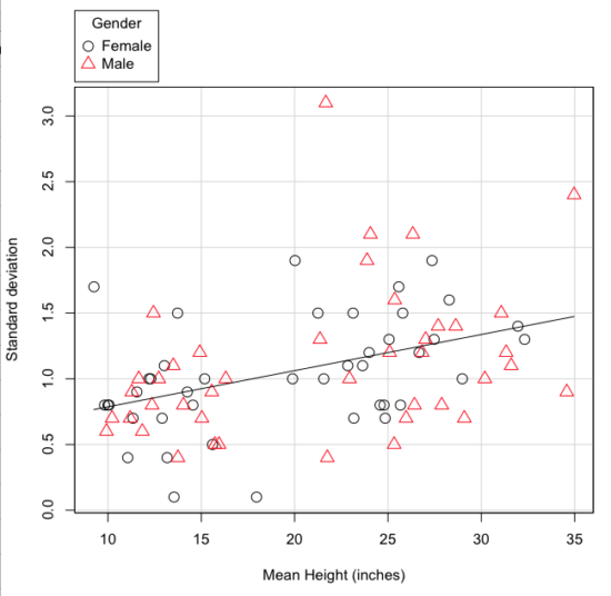
Figure 5. Plot of the standard deviation by the mean for heights of different breeds of dogs.
So, to compare variability estimates among groups when the means also vary, we need a new statistic, the coefficient of variation, abbreviated CV. Many statistics textbooks not aimed at biologists do not provide this estimator (e.g., check your statistics book).
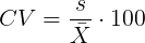
This is simply the standard deviation of the sample divided by the sample mean, then multiplied by 100 to give a percent. The CV is useful when comparing the distributions of different types of data with different means.
Many times, the standard deviation of a distribution will be associated with the mean of the data.
Example. The standard deviation in height of elephants will be larger on the centimeter scale than the standard deviation of the height of mice. However, the amount of variability RELATIVE to the mean may be similar between elephants and mice. The CV might indicate that the relative variability of the two organisms is the same.
The standard deviation will also be influenced by the scale of measurement. If you measure on the mm scale versus the meter scale the magnitude of the SD will change. However, the CV will be the same!
By dividing the standard deviation by the mean you remove the measurement scale dependence of the standard deviation and generally, you also remove the relationship of the standard deviation with the mean. Therefore, CV is useful when comparing the variability of the data from distributions with different means.
One disadvantage is that the CV is only useful for ratio scale data (i.e., those with a true zero).
The coefficient of variation is also one of the statistics useful for describing the precision of a measurement. See Chapter 3.4 Estimating parameters.
Standard error of the mean (SEM)
All estimates should be accompanied by a statistic that describes the accuracy of the measure. Combined with the confidence interval (Chapter 3.4), one such statistic is called the standard error of the mean, or SEM for short. For the error associated with calculation of our sample mean, it is defined as the sample standard deviation divided by the square root of n, the sample size.
sem → 
The concept of error for estimates is a crucial concept. All estimates are made with error and for many statistics, a calculation is available to estimate the error (see Chapter 3.4).
Although related to each other, the concepts of sample standard deviation and sample standard error have distinct interpretations in statistics. The standard deviation quantifies the amount of variation of observations from the mean, while the standard error quantifies the difference between the sample mean and the population mean. The standard error will always be smaller than the standard deviation and is best left for reporting accuracy of a measure and statistical inference rather than description.
Questions
- For a sample data set like
y = c(1,1,3,6), you should now be able to calculate, by hand, the
• range
• mean
• median
• mode
• standard deviation - If the difference between Q1 and Q3 is called the interquartile range, what do we call Q2?
- For our example data set,
x <- c(4,4,4,4,5,6,6,6,7,7,8,8,8,8,8)calculate
• IQR
• sample standard deviation, s
• coefficient of variation - Use the
sample()command in R to draw samples of size 4, 8, and 12 from your example data set stored inx. Repeat the calculations from question 3. For examplex4 <- sample(x,4)will randomly select four observations from x, and will store it in the object x4, like so (your numbers probably will differ!)x4 <- sample(x,4); x4 [1] 8 6 8 6 - Repeat the exercise in question 4 again using different samples of 4, 8, and 12. For example, when I repeat sample(
x,4) a second time I getsample(x,4) [1] 8 4 8 6 - For Table 1, determine how many multiples of the standard deviation for observations greater than 95-percentile (e.g., determine the observation value for a person who is in the 95-percentile for Height in the different decades, etc.
- Calculate the sample range, IQR, sample standard deviation, and coefficient of variation for the following data sets
• Basal 5 hour fasting plasma glucose-to-insulin ratio of four inbred strains of mice,x <- c(44, 100, 105, 107) #(data from Berglund et al 2008)
• Height in inches of mothers,mom <- c(67, 66.5, 64, 58.5, 68, 66.5) #(data from GaltonFamilies in R package HistData)
and fathers,dad <- c(78.5, 75.5, 75, 75, 74, 74) #(data from GaltonFamilies in R package HistData)
• Carbon dioxide (CO2) readings from Mauna Loa for the month of December for
years <-c (1960, 1965, 1970, 1975, 1980, 1985, 1990, 1995, 2000, 2005, 2010, 2015, 2020)years <-c (1960, 1965, 1970, 1975, 1980, 1985, 1990, 1995, 2000, 2005, 2010, 2015, 2020) #obviously, do not calculate statistics on years; you can use to make a plotco2 <- c(316.19, 319.42, 325.13, 330.62, 338.29, 346.12, 354.41, 360.82, 396.83, 380.31, 389.99, 402.06, 414.26) #(data from Dr. Pieter Tans, NOAA/GML (gml.noaa.gov/ccgg/trends/) and Dr. Ralph Keeling, Scripps Institution of Oceanography (scrippsco2.ucsd.edu/))
• Body mass of Rhinella marina (formerly Bufo marinus) (see Fig. 1),bufo <- c(71.3, 71.4, 74.1, 85.4, 85.4, 86.6, 97.4, 99.6, 107, 115.7, 135.7, 156.2)
Chapter 3 contents