16 – Correlation, Similarity, and Distance
Introduction
We continue with our discussion and introduction of inferential statistics. Recall that as we analyze a data set, we generally want to begin by describing it (central tendency, measures of variability), and we also want to plot the data. To begin our introduction to correlation and regression, first we describe how to produce graphs to help show linear association or in some cases, cause and effect — the latter perhaps the primary reason for using regression.
Graphical representation
The previous statistical procedures we have examined have used one or more categorical or qualitative variables (Chapter 3). For example,
- Chi-Square Analyses: variables are all categorical, including the response variable (Chapter 9).
- T-tests: one categorical (Factor) variable and one (Dependent, Outcome, Response) variable that was continuous or interval scale (Chapter 8.5, 10).
- ANOVA Analyses: one or more variables are categorical (Factors, the independent variables) and one (Dependent, Outcome, Response) variable that was continuous or interval scale (Chapter 12, 14).
The convention in graphing ANOVA (or Chi-Square) is to use the Factor or Independent variables as the
X-axis and to have the dependent variable (Response) as the Y-axis. We called these bar charts (Chapter 4.1).
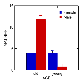
Figure 1. Bar chart with error bars
Box plots (Chapter 4.3) are also useful, and perhaps the preferred choice to display this type of comparison (one involving groups) (Fig. 2).
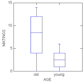
Figure 2. Box plots
In correlation (and regression) analyses we will have two or more continuous or interval scale variables. To show relationships among continuous variables, a scatter plot, also called an X-Y plot, works well (Chapter 4.5).
In correlation, no causation is implied, so either variable can be placed on the X-axis. The convention of graphing in regression is to place the independent variable as the X-axis and the dependent variable as the Y-axis (Fig. 3). Another consideration: if one variable is considered fixed and the other random, then the fixed variable would be assigned to the horizontal axis.
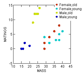
Figure 3. Scatterplot with groups
To produce a scatterplot (also called an X-Y plot) in Rcmdr, select Graph → Plot → and select the Y and X variables. Use a combination of Options, Frame, and Edit Attributes selections to modify the default graph.
Chapter 16 contents
4.1 – Bar (column) charts
Introduction
Bar chart, also called a bar graph, or column chart in many spreadsheet apps (e.g., Google Sheets, Microsoft Excel, Libreoffice Calc — “bar charts” is reserved for horizontal bar plots), are used to compare counts among two or more categories, i.e., an alternative to pie charts (Fig. 1).
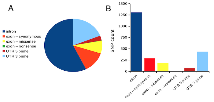
Figure 1. Single nucleotide variants for human gene ACTB by DNA and functional element (data collected 19 May 2022 from NCBI SNP database with Advanced search query). A. Pie chart. Note that slide for “exon – nonsense” is not visible. B. Bar chart – color coded bars to facilitate comparison with pie chart.
Although bar charts are common in the literature (Cumming et al 2007; Streit and Gehlenborg 2014), bar charts may not be a good choice for comparisons of ratio scale data (Streit and Gehlenbor 2014). Bar charts for ratio data are misleading. Parts of the range implied by the bar may never have been observed: the bars of the chart always start at zero. Box (whisker) plots are better for comparisons of ratio scale data and are presented in the next section of this chapter. That said, I will go ahead and present how to create bar chars for both count, generally considered acceptable, and ratio scale data, for which their use is controversial.
Purpose of the bar chart
Like all graphics, a bar chart should tell a story. The purpose of displaying data is to give your readers a quick impression of the general differences among two or more groups of the data. For counts, that’s where the bar chart comes in. The bar chart is preferred over the pie chart because differences are represented by lengths of the bars in the bar chart. Differences among categories in a pie chart are reflected by angles, and it seems that humans are much better at judging lengths than angles.
Bar chart with counts
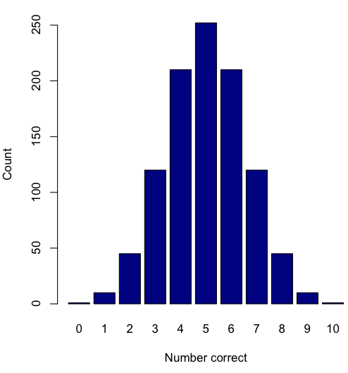
Figure 2. A simple bar chart
myCombo <- seq(0,10, by=1)
myCounts <- choose(10, myCombo)    #combinations
barplot(myCounts, names.arg = myCombo, xlab = "Number correct", ylab = "Count",col = "darkblue")
A stacked bar chart is used to
myCombo <- seq(0,10, by=1)
myCounts <- choose(10, myCombo)    #combinations
barplot(myCounts, names.arg = myCombo, xlab = "Number correct", ylab = "Count",col = "darkblue")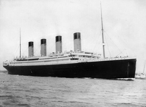
Figure 3. The luxury ship RMS Titanic, which sunk 15 April 1912, More than 1500 souls were lost. Public domain image, Wikipedia. Click image to view full sized image.
Stacked bar chart, data set TitanicSurvival in package carData.
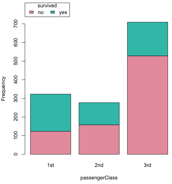
Figure 4. A stacked bar chart, survival Titanic
Barplot(passengerClass, by=survived, style="divided", legend.pos="above", xlab="passengerClass", ylab="Frequency")Bar charts with error bars
Although many data visualization specialists argue against the bar chart, their use is well established. For the familiar bar chart with ratio scale data, the X (horizontal) axis displays the categories of one variable (e.g., location, or treatment group). You plot groups to emphasize comparisons. The Y (vertical) axis then is the mean for each group.
You need error bars. If the mean is displayed, some measure of precision should be (must be?) displayed (Cumming et al 2007). And, as you should recall by now, your choices are standard deviation (Chapter 3.2), standard error of the mean (SEM) (Chapters 3.2, 3.4), or confidence interval (see Chapter 3.4). It is strongly advised, that without a representation of precision, one should not interpret trends or group differences from representations of means (i.e., height of bars) alone.
The bar charts on this page are means plus or minus the standard error of the mean, + SEM. We’ll discuss which choice to make.
Examples
The Copper_rats_PMID3357063 dataset will be used for the next series of graphs (Data set). Refer to Mike’s Workbook for Biostatistics Part07 to review how to import the data.
A portion of the data set is shown below
head(Copper)
         Diet     Body    Heart    Liver
1 Adequate-Cu 320.1381 1.125037 10.259657
2 Adequate-Cu 329.6879 1.158982 9.843295
3 Adequate-Cu 327.9838 1.090374 9.855975
4 Adequate-Cu 334.6669 1.118183 9.942997
5 Adequate-Cu 338.3134 1.172636 9.860971
6 Adequate-Cu 345.4608 1.056183 8.885820
The data set consists of organ weights (heart, liver) from rats fed a diet adequate in copper, deficient in copper, and then a third group who received the adequate diet from perspective of amount of copper, but calorie restricted to match the decreased feeding rates of the rats fed the copper deficient diet. Copper is an essential trace element in our diet. The data set was simulated from descriptive statistics (means, standard deviation, number of subjects) of published data by sampling from a normal distribution. (Table 1, Ovecka et al 1988).
On we go with some graphs.
Note. R has many options to create bar charts, and especially ggplot2 can be used to great advantage, but there is a learning curve. One of the great things about R is that folks help each other by sharing code. For example, http://www.cookbook-r.com/Graphs/Plotting_means_and_error_bars_(ggplot2)/
But, I’m still learning about R graphics, and for bar charts with error bars, I find other packages more straight-forward. So, I’ll use this moment to point out that making a good graph is more about the end product then the particular tools. I have been using other tools for years to make my graphics, so I tend to default on these options first. Graphs presented here are mostly from Veusz software program (pronounced “views”). I like it because the software allows me to edit any of the elements of the graph.
Here’s a typical looking bar chart with ratio scale data: means ± SEM. Let’s look at them more critically.
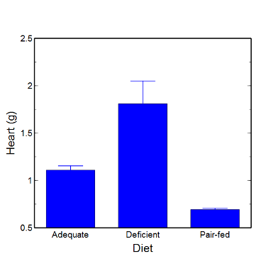
Figure 5. A bar chart with error bars (standard error of the mean).
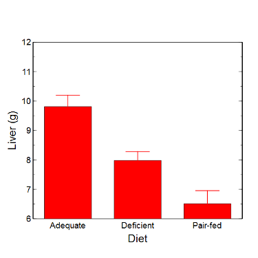
Figure 6. Another bar chart. with standard errors of mean
When making comparisons, make sure the axes have the same scale, or consider putting the graphs together.
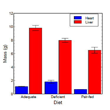
Figure 7. Bar chart that allows for a comparison among levels of a a factor (organs, liver vs. heart).
Analysis note: For variables that covary with body size (for example, on average, tall people generally are heavier too), is how to present (and analyze) the data in such a way that body size is accounted for. Here, the solution was to express organ weight as the ratio of organ weight to body weight for the mice. This may or may not be a good solution, and the answer is too complicated for us now (has to do with a thing called allometric scaling), but I wanted to at least present the issue and show how the graphics can be improved to handle some of these concerns.
Here’s the organ weights again, but taken as ratio of body mass.
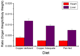
Figure 8. Same chart as in Figure 6, but on ratios.
Note 2. Lets be clear about expectations of you for statistics class. Now, R (and Rcmdr) do lots of graphics, pretty much anything you want, but it is not as friendly as it could be. For BI311 homework, the default graphics available via Rcmdr will generally be adequate for assignments. R and Rcmdr has many bar chart options, but there isn’t a straightforward way to get the error bars, unless you are willing to enter some code to the command line or learn a particular package (like gplots or ggplot2).
How to make a bar chart with error bars in R
Option 1. First, let’s try a work-around. Instead of an error bar option for bar chart menu, Rcmdr provides a plot of means that allows you to plot with error bars. These are equivalent graphs, the “bar chart” and the “plot of means”, though you should favor the bar chart format for publishing.
Rcmdr: Graphs → Plot of means…
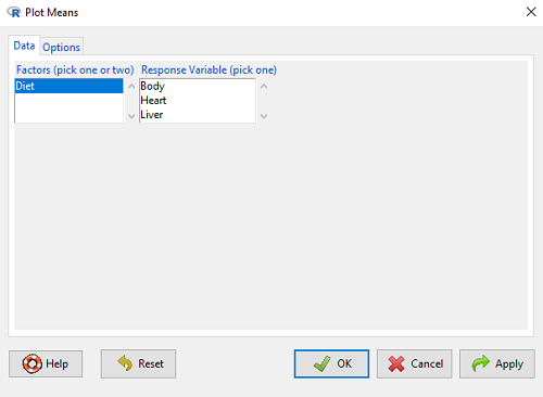
Figure 9. Rcmdr menu popup for Plots Means
Here, Rcmdr takes the data and calculates the mean and your choice of standard errors or deviations, confidence intervals, or no error bars. the resulting graph is below.
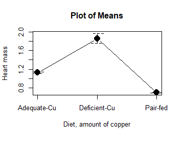
Figure 10. Plot of means
That’s an ugly graph (Fig. 10). Functional, good enough for data exploration and preliminary results, and certainly good enough for a Biostatistics homework or report. Additionally, connecting the dots here is a no-no. It implies that if we had measured categories between “adequate copper” and “deficient copper,” then the points would fall on those lines. That would be a complete guess. So, why did I include the connecting lines? That was the default setting for the command, and it makes the point — think before you click. One argument for connecting points in a graph is that it makes it easier for the reader to visualize trends.
This graph (Fig. 10) is fine for exploring data, but you will want to do better for publication.
Let’s make some better graphs with R
Once you are ready to go beyond the default settings available in Rcmdr, there is tremendous functionality in R for graphics. To access R’s potential, you’ll need to get into the commands a bit. I’m going to continue to try and shield you from the programming aspects of R, but from time to time you really need to see what is possible with R. Graphics is one such area. I use the package gplots, with 23 different graphing functions (type at R prompt ?gplots to call up the manual pages).
gplots should be among the packages on your R installation; if not, then install the package and run library(gplots) to complete the installation. We’ll try the barchart2 function.
But first, we need to get means for each of our groups.
At the R command prompt:
hrtWt <- tapply(Dataset$HeartWt, list(Group=Dataset$Group), mean, na.rm=TRUE) This code extracts means from our HeartWt variable for each Group, then stores the three (in this case, because our data set has 3 groups) in the place holder I had called hrtWt. To verify that the three means are there, type “hrtWt” without the quotes then enter.
You should see
hrtWt Group Cu adequate Cu deficient Pair-fed
               1.200000     1.566667 0.900000
R functions used: tapply, list, mean; na.rm was not needed but would be used to remove all missing values (recall during our import phase we were asked how missing observations were noted in our file; the default is NA).
Next, I want to apply standard error bars
stdDEV <- tapply(Dataset$HeartWt, list(Group=Dataset$Group), sd, na.rm=TRUE)
cil <- hrtWt-(stdDEV/sqrt(3))
ciu <- hrtWt+(stdDEV/sqrt(3))
I used cil and ciu to designate the lower cil and upper ciu values for my ± SEM (standard error of the mean). ciu stands for “confidence interval lower;” ciu stands for “confidence interval upper.”
Finally, here’s the plot command
barplot2(hrtWt, beside = TRUE, main=c("Mice fed different amounts of copper in diet"), col = c("blue", "red", "green"), xlab="Copper in diet", ylab="Heart mass (g)", ylim = c(0, 2), plot.ci=TRUE, ci.l=cil, ci.u=ciu)Now, draw a box around the graphic
box()Whew!
What does your new graph look like? My graph is below (Fig. 11).
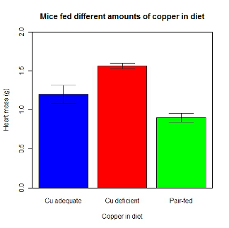
Figure 11. A bar chart using barplot2.
This works and the point is that once the script is written it easy to make small changes as you need in the future to make nice graphs.
If you are impatient like me, I like a GUI option, at least to start crafting the graph. The Rcmdr plugin KMggplot2 provides a good set of tools to make bar charts with error bars. An even better option I think is to use a software package that is designed for graphics, at least simple graphics like a bar chart. I use SciDAVis and Veusz for simple graphs like pie charts and bar charts; much easier to control.
ggplot2 bar charts with error bars
Nevertheless, here’s how to make a bar chart with error bars using ggplot2 (Fig. 11). First, we need to create a statistics summary. The script printed here was modified from scripts at R Graph Cookbook website.
require(plyr)
summarySE <- function(data=NULL, measurevar, groupvars=NULL, na.rm=FALSE,
     conf.interval=.95, .drop=TRUE) {
length2 <- function (x, na.rm=FALSE) {
     if (na.rm) sum(!is.na(x))
     else length(x)
}

#returns a vector with N, mean, and sd
datac <- ddply(data,groupvars, .drop=.drop,
    .fun = function(xx,col){
      c(N=length2(xx[[col]],na.rm=na.rm),
      mean=mean(xx[[col]],na.rm=na.rm),
      sd=sd(xx[[col]],na.rm=na.rm)
     )
    },
    measurevar
   )

#Rename the "mean" column
datac <- rename(datac,c("mean"=measurevar))

#Calculate the standard error of the mean
datac$se <- datac$sd/sqrt(datac$N)

#Get confidence interval
ciMult <- qt(conf.interval/2 + .5, datac$N-1)
datac$ci <- datac$se*ciMult

return(datac)
}
Applying this function to the BMI dataset yields the following output.
sumBMI <- summarySE(BMI, measurevar="BMI", groupvars=c("Sex", "Smoke"));sumBMI

   Sex Smoke   N      BMI       sd        se       ci
1    F    No  23 26.83567 7.610271 1.5868511 3.290928
2    F   Yes  14 25.76133 4.658625 1.2450698 2.689810
3    M    No  10 26.35731 3.363575 1.0636557 2.406156
4    M   Yes  27 26.71879 4.675631 0.8998256 1.849618
Now we are ready to make the bar chart with error bars
ggplot(tgc,aes(x=Smoke,y=BMI,fill=Sex)) +
 geom_bar(position=position_dodge(),stat="identity",color="black") +
 geom_errorbar(aes(ymin=BMI,ymax=BMI+se),width=.2,position=position_dodge(.9))
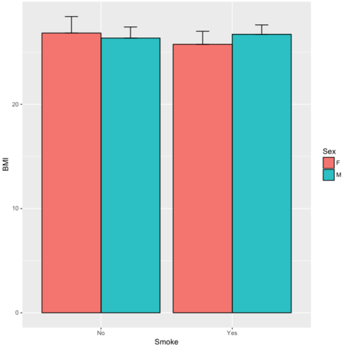
Figure 12. A barchart from ggplot2
Questions
1. Why should you use box plots and not bar charts to display comparisons for a ratio scale variable between categories? Obtain a copy of the article by Streit and Gehlenbor 2014 — it’s free! After reading, summarize the pro and cons for box plots over bar charts with error bars.
2. Enter the following data into R. The data are sulfate levels in water, parts per million.
type = c("Palolo Stream","Chaminade tap water", "Aquafina","Dasani")
sulfateppm =c(11, 14, 5, 12)
try = data.frame(type,sulfateppm)
byWater = tapply(try$sulfateppm,list(Group=try$type),mean)
Make a simple bar chart using the boxplot2 function in gplots package.
3. Change the range of values on the vertical axis to 0, 20
4. Change the color of the bars from gray to blue
5. Add a label to the vertical axis, “Sulfates, ppm” (without the quotes)
6. Add a box around the graph.
Data set
| Diet | Body | Heart | Liver |
|---|---|---|---|
| Adequate-Cu | 320.1381 | 1.125037 | 10.259657 |
| Adequate-Cu | 329.6879 | 1.158982 | 9.843295 |
| Adequate-Cu | 327.9838 | 1.090374 | 9.855975 |
| Adequate-Cu | 334.6669 | 1.118183 | 9.942997 |
| Adequate-Cu | 338.3134 | 1.172636 | 9.860971 |
| Adequate-Cu | 345.4608 | 1.056183 | 8.88582 |
| Adequate-Cu | 343.089 | 1.081261 | 10.166647 |
| Adequate-Cu | 328.3403 | 1.111278 | 10.124185 |
| Adequate-Cu | 324.9723 | 1.189194 | 10.158402 |
| Adequate-Cu | 325.2378 | 1.14715 | 9.939521 |
| Deficient-Cu | 195.5052 | 1.90973 | 7.907565 |
| Deficient-Cu | 182.7809 | 1.823672 | 8.430167 |
| Deficient-Cu | 184.3701 | 1.632249 | 7.619104 |
| Deficient-Cu | 193.7867 | 1.831765 | 8.742489 |
| Deficient-Cu | 180.0417 | 1.710367 | 7.975879 |
| Deficient-Cu | 208.5349 | 2.495623 | 8.652445 |
| Deficient-Cu | 182.3048 | 1.262053 | 7.257726 |
| Deficient-Cu | 203.0413 | 2.153639 | 8.081782 |
| Deficient-Cu | 193.3829 | 1.986028 | 7.807328 |
| Deficient-Cu | 195.0523 | 1.76975 | 8.297611 |
| Pair-fed | 211.0858 | 0.6911343 | 6.251177 |
| Pair-fed | 210.4041 | 0.6928067 | 7.696669 |
| Pair-fed | 208.5969 | 0.6911901 | 6.973803 |
| Pair-fed | 209.3333 | 0.7039211 | 6.629303 |
| Pair-fed | 208.8889 | 0.7077486 | 6.038704 |
| Pair-fed | 208.2994 | 0.7004535 | 6.606877 |
| Pair-fed | 209.4524 | 0.6915543 | 6.228888 |
| Pair-fed | 210.2699 | 0.6984497 | 6.638466 |
| Pair-fed | 208.8142 | 0.7214847 | 6.353705 |
| Pair-fed | 209.2977 | 0.6848656 | 6.536642 |
Chapter 4 contents
4 – How to report statistics
Introduction
While you are thinking about exploring data sets and descriptive statistics, please review our overview of data analysis (Chapter 2.4 and 2.5). While the scientific hypotheses come first, how experiments are designed should allow for straight-forward analysis: in other words, statistics can’t rescue poorly designed experiments, nor can it reveal new insight after the fact.
Once the experiments are completed, all projects will go through a similar process.
- Description: Describe and summarize the results
- Check assumptions
- Inference: conduct tests of hypotheses
- Develop and evaluate statistical models
Clearly this is a simplification, but there’s an expectation your readers will have about a project. Basic questions like how many subjects got better on the treatment? Is there an association between Body Mass Index (BMI) and the primary outcome? Did male and female subjects differ for response to the treatment? Undoubtedly these and related questions form the essence of the inferences, but providing graphs to show patterns may be as important to a reader as any p-value — a number which describes how likely it is that your data would have occurred by chance — e.g., from an Analysis of variance.
Each project is unique, but what elements must be included in a results section?
Data visualization
We describe data in three ways: graphs, tables, and in sentences. In this page we present the basics of when to choose a graph over presenting data in a table or as a series of sentences (i.e., text). In the rest of this chapter we introduce the various graphics we will encounter in the course. Chapter 4 covers eight different graphics, but is by no means an exhaustive list of kinds of graphs. Phylogenetic network graphs are presented in Chapter 20.11. Although an important element of presentation in journal articles, we don’t discuss figure legends or table titles; guidelines are typically available by the journal of choice (e.g., PLOS ONE journals guidelines).
A quick note about terminology. Data visualization encompasses charts, graphs and plots. Of the three terms, chart is the more generic. Graphs are used to display a function or mapping between two variables; plots are kinds of graphs for a finite set of points. There is a difference among the terms, but I confess, I won’t be consistent. Instead, I will refer to each type of data visualization by its descriptive name: bar chart, pie chart, scatter plot, etc. Note that technically, a scatter plot can refer to a graph, e.g., a line drawn to reflect a linear association between the two variables, whereas bar charts and pie charts would not be a graph because no function is implied.
Why display data?
Do we just to show a graph to break the monotony of page after page of text or do we attempt to do more with graphs? After all, isn’t “a picture’s worth a thousand words?” In many cases, yes! Graphics allow us to see patterns. Visualization is a key part of exploratory data analysis, or data mining in the parlance of big data. Data visualization is also a crucial tool in the public health arena, and finding effective graphics to communicate, at times, complex data and information to both public and professional audiences can be challenging (see discussion in Meloncon and Warner 2017).
Graphics are complicated and expensive to do well. Text is much cheaper to publish, even in digital form. But the ability to visualize concepts, that is, to connect ideas to data through our eyes (see Wikipedia), seems to be more the cognitive goal of graphics. Lofty purpose, desirable goal. Yes, it is true that graphics can communicate concepts to the reader, but with some caution. Images distort, and default options in graphics programs are seldom acceptable for conveying messages without bias (Glazer 2011).
Here’s some tips from a book on graphical display (Tufte 1983; see also Camões 2016).
Your goal is to communicate complex ideas with clarity, precision, and efficiency. Graphical displays should:
- show the data
- avoid distorting the data
- present numbers in a small space
- help the viewer’s eye to compare different pieces of data
- serve a clear purpose (description, exploration, tabulation, decoration)
- be closely integrated with statistical and verbal descriptions of a data set.
We accomplish these tasks by following general principles involving scale and a commitment to avoiding bias in our presentation.
Importantly, graphs can show patterns not immediately evident in tables of numbers. See Table 1 for an example of a dataset, “Anscombe’s quartet,” (Anscombe 1973), where a picture is clearly helpful.
Anscombe’s quartet
| X | Y1 | Y2 | Y3 | Y4 |
|---|---|---|---|---|
| 10 | 8.04 | 9.14 | 7.46 | 6.58 |
| 8 | 6.95 | 8.14 | 6.77 | 5.76 |
| 13 | 7.58 | 8.74 | 12.74 | 7.71 |
| 9 | 8.81 | 8.77 | 7.11 | 8.84 |
| 11 | 8.33 | 9.26 | 7.81 | 8.47 |
| 14 | 9.96 | 8.10 | 8.84 | 7.04 |
| 6 | 7.24 | 6.13 | 6.08 | 5.25 |
| 4 | 4.26 | 3.10 | 5.39 | 12.50 |
| 12 | 10.84 | 9.13 | 8.15 | 5.56 |
| 7 | 4.82 | 7.26 | 6.42 | 7.91 |
| 5 | 5.68 | 4.74 | 5.73 | 6.89 |
| Mean (±SD) | 7.50 (2.032) | 7.50 (2.032) | 7.50 (2.032) | 7.50 (2.032) |
The Anscombe dataset is also available in R package stats, or you can copy/paste from Table 1 into a spreadsheet or text file, then load the data file into R (e.g., Rcmdr → Load data set). Note that the data set does not include the column summary statistics shown in the last row of the table.
Before proceeding, look again at the table — See any patterns in the table?
Maybe.… Need to be careful as we humans are really good at perceiving patterns, even when no pattern exists.
Now, look just at the last row in the table, the row containing the descriptive statistics (the means and standard deviations). Any patterns?
The means and standard deviations are the same, so nothing really jumps out at you — does that mean that there are no differences among the columns then?
But let’s see what the scatter plots look like before we conclude that the columns of Y ’s are the same (Fig. 1). I’ll also introduce the R package clipr, which is useful for working with your computer’s clipboard.
To show clipboard history, on Windows 10/11 press Windows logo key plus V; on macOS, open Finder and select Edit → Show Clipboard.
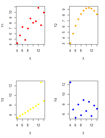
Figure 1. Scatter plot graphs of Anscombe’s quartet (Table 1)
#R code for Figure 1.

require(clipr)
#Copy from the Table and paste into spreadsheet (exclude last row). Highlight and copy data in spreadsheet
myTemp <- read_clip_tbl(read_clip(), header=TRUE, sep = "\t")
#Check that the data have been loaded correctly
head(myTemp)
#attach the data frame, so don't have to refer to variables as myTemp\$variable name
attach(myTemp)
#set the plot area for 4 graphs in 2X2 frame
par(mfrow=c(2,2))
plot(X, Y1, pch=19, col="red", cex=1.2)
plot(X, Y2, pch=19, col="orange",cex=1.2)
plot(X, Y3, pch=19, col="yellow",cex=1.2)
plot(X, Y4, pch=19, col="blue",cex=1.2)
And now we can see that the Y ‘s have different stories to tell. While the summary (descriptive) statistics are the same, the patterns of the association between Y values and the X variable are qualitatively different: Y1 is linear, but diffuse; Y2 is nonlinearly associated with X; Y3, like Y1, is linearly related to X, but one data point seems to be an outlier; and for Y4 we see a diffuse nonlinear trend and an outlier.
So, that’s the big picture here. In working with data, you must look at both ways to “see” data — you need to make graphs and you also need to calculate basic descriptive statistics.
And as to the reporting of these results, sometimes Tables are best (i.e., so others can try different statistical tests), but patterns can be quickly displayed with carefully designed graphs. Clearly, in this case, the graphs were very helpful to reveal trends in the data.
When to report numbers in a sentence? In a table? In a graph?
The choice depends on the message. Usually you want to make a comparison (or series of comparisons). If you are reporting one or two numbers in a comparison, a sentence is fine. “The two feral goat populations had similar mean numbers (120 vs. 125) of kids each breeding period.” If you have only a few comparisons to make, the text table is useful:
Table 2. Data from Kipahoehoe Natural Area Reserve, SW slope of Mauna Loa.
| Location | Number of kids |
|---|---|
| Outside fence | |
| kīpuka | 51 |
| other | 120 |
| Inside fence | |
| kīpuka | 3 |
To conclude, tables are the best way to show exact numbers and tables are preferred over graphs when many comparisons need to be made. (Note: this was a real data set, but I’ve misplaced the citation!)
A kīpuka is a land area surrounded by recent lava flows.
Couldn’t I use a pie chart for this?
Yes, but I will try and persuade you to not. Pie charts are used to show part-whole relationships. If there are just a few groups, and if we don’t care about precise comparisons, pie charts may be effective. Some good examples are Figure 1 O’Neill et al 2020,
Sometimes, people use pie charts for very small data sets (comparing two populations, or three categories, for example). These work well, but as we increase the number of categories, the graphic likely requires additional labels and remarks to clarify the message. The problem with pie charts is that they require interpretation of the angles that define the wedges, so we can’t be very precise about that. Bar charts are much better than pie charts — but can also suffer when many categories are used (Chapter 4.1).
To illustrate the problem, here’s a couple of pie charts from Microsoft Excel (a similar chart can be made with LibreOffice Calc) for our goat data set; compare this graph to the table and to the bar chart below (Fig. 2).
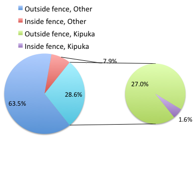
Figure 2. Excel pie chart of Table 2 data set
A bar chart of the same data (Fig. 3)
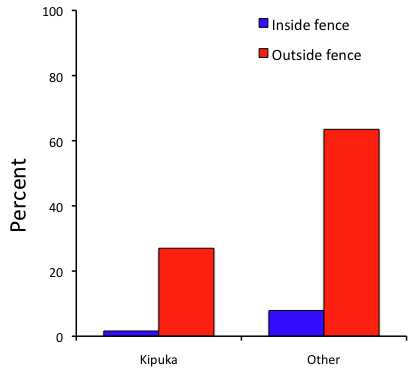
Figure 3. Bar chart of Table 2 data set
The bar chart (Fig. 3) is easier to get the message across; more goat kids were found outside the fenced area then inside the fenced in areas. We can also see that more goat kids were found in the “other” areas compared to the kipuka. The pie chart (Fig. 2) in my opinion fails to communicate these simple comparisons, conclusions about patterns in the data that clearly would be the take-home message from this project. Aesthetically the bar chart could be improved — a mosaic plot would work well to show the associations in the project results (See Ch 4.4 Mosaic plots).
But we are not done with this argument, to use graphics or text to report results. Neither the bar chart (mosaic plot) or the pie chart really work. The reader has to interpret the graphics by extrapolating to the axes to get the numbers. While it may be boring — 1.5 million hits Google search “data tables” boring — tables can be used for comparisons and make the patterns more clear and informative to the reader. Here’s a different version of the table to emphasize the influence of fencing on the goat population.
Table 3. Revised Table 2 to emphasize comparisons between inside and outside the fence line on feral goat population on Mauna Loa.
| Location | Kīpuka | Other |
|---|---|---|
| Outside fence | 51 | 120 |
| Inside fence | 3 | 15 |
Table 3 would be my choice — over a sentence and over a graph. At a glance I can see that more goat kids were found outside of the fenced area, regardless of whether it was in a kipuka or some other area on the mountain side. Table 3 is an improvement over Table 2 because it presents the comparisons in a 2 X 2 format — especially useful when we have a conditional set.
For example, it’s useful to show the breakdown of voting results in tables (numbers of votes for different candidates by voter’s party affiliation, home district, sex, economic status, etc.). Interested readers can then scan through the table to identify the comparison they are most interested in. But often, a graph is the best choice to display information. One final point, by judiciously combining words, numbers, and images, you should be able to convey even the most complex information in a clear manner! We will not spend a lot of time on these issues, but you will want to pay some attention to these points as you work on your own projects.
Some final comments about how to present data
What your graph looks like is up to you, lots of people have advice (e.g., Klass 2012). But we all know poor graphs when we see them in talks or in papers; we know them when we struggle to make sense of the take-home message. We know them when we feel like we’re missing the take-home message.
Here’s my basic take on communicating information with graphics.
- Minimize white space (for example, the scatter plots above could be improved simply by increasing the point size of the data points)
- Avoid bar charts for comparisons if you are trying to compare more than about three or four things.
- A graphic in a science report that is worth “a thousand words” probably is too complicated, too much information, and, very likely, whatever message you are trying to convey is better off in the text.
Chapter 4 contents