17.1 – Simple linear regression
Introduction
Linear regression is a toolkit for developing linear models of cause and effect between a ratio scale data type, response or dependent variable, often labeled “Y,” and one or more ratio scale data type, predictor or independent variables, X. Like ANOVA, linear regression is a special case of the general linear model. Regression and correlation both test linear hypotheses: we state that the relationship between two variables is linear (the alternative hypothesis) or it is not (the null hypothesis). The difference?
- Correlation is a test of association (are variables correlated, we ask?), but are not tests of causation: we do not imply that one variable causes another to vary, even if the correlation between the two variables is large and positive, for example. Correlations are used in statistics on data sets not collected from explicit experimental designs incorporated to test specific hypotheses of cause and effect.
- Linear regression is to cause and effect as correlation is to association. With regression and ANOVA, which again, are special cases of the general linear model (LM), we are indeed making a case for a particular understanding of the cause of variation in a response variable: modeling cause and effect is the goal.
We start our LM model as 
where “~”, tilda, is an operator used by R in formulas to define the relationship between the response variable and the predictor variable(s).
From R Commander we call the linear model function by Statistics → Fit models → Linear model … , which brings up a menu with several options (Fig. 1).
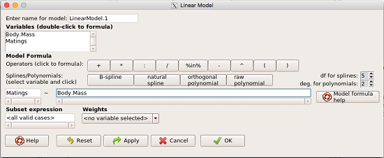
Figure 1. R commander menu interface for linear model.
Our model was
Matings ~ Body.Mass
R commander will keep track of the models created and enter a name for the object. You can, and probably should, change the object name yourself. The example shown in Figure 1 is a simple linear regression, with Body.Mass as the Y variable and Matings the X variable. No other information need be entered and one would simply click OK to begin the analysis.
Example
The purpose of regression is similar to ANOVA. We want a model, a statistical representation to explain the data sample. The model is used to show what causes variation in a response (dependent) variable using one or more predictors (independent variables). In life history theory, mating success is an important trait or characteristic that varies among individuals in a population. For example we may be interested in determining the effect of age (X1) and body size (X2) on mating success for a bird species. We could handle the analysis with ANOVA, but we would lose some information. In a clinical trial, we may predict that increasing Age (X1) and BMI (X2) causes increase blood pressure (Y).
Our causal model looks like

Let’s review the case for ANOVA first.
The response (dependent variable), the number of successful matings for each individual male bird, would be a quantitative (interval scale) variable. (Reminder: You should be able to tell me what kind of analysis you would be doing if the dependent variable was categorical!) If we use ANOVA, then factors have levels. For example, we could have several adult birds differing in age (factor 1) and of different body sizes. Age and body size are quantitative traits, so, in order to use our standard ANOVA, we would have to assign individuals to a few levels. We could group individuals by age (e.g., < 6 months, 6 – 10 months, > 12 months) and for body size (e.g., small, medium, large). For the second example, we might group the subjects into age classes (20-30, 30-40, etc), and by AMA recommended BMI levels (underweight < 18.5, normal weight 18.5 – 24.9, overweight 25-29.9, obese > 30).
We have not done anything wrong by doing so, but if you are a bit uneasy by this, then your intuition will be rewarded later when we point out that in most cases you are best to leave it as a quantitative trait. We proceed with the test of ANOVA, but we are aware that we’ve lost some information — continuous variables (age, body size, BMI) were converted to categories — and so we suspect (correctly) that we’ve lost some power to reject the null hypothesis. By the way, when you have a “factor” that is a continuous variable, we call it a “covariate.” Factor typically refers to a categorical explanatory (independent) variable.
We might be tempted to use correlation — at least to test if there’s a relationship between Body Mass and Number of Matings. Correlation analysis is used to measure the intensity of association between a pair of variables. Correlation is also used to to test whether the association is greater than that expected by chance alone. We do not express one as causing variation in the other variable, but instead, we ask if the two variables are related (covary). We’ve already talked about some properties of correlation: it ranges from -1 to +1 and the null hypothesis is that the true association between two variables is equal to zero. We will formalize the correlation next time to complete our discussion of the linear relationship between two variables.
But regression is appropriate here because we are indeed making a causal claim: we selected Age and Body Size, and we selected Age and BMI in the second example wish to develop a model so we can predict and maybe even advise.
Least squares regression explained
Regression is part of the general linear model family of tests. If there is one linear predictor variable, then that is a simple linear regression (SLR), also called ordinary least squares (OLS), if there are two or more linear predictor variables, then that is a multiple linear regression (MLR, Chapter 18).
First, consider one predictor variable. We begin by looking at how we might summarize the data by fitting a line to the data; we see that there’s a relationship between mass and mating success in both young and old females (and maybe in older males).
The data set was
Table 1. Our data set of number of matings by male bird by body mass (g).
| ID | Body.Mass | Matings |
| 1 | 29 | 0 |
| 2 | 29 | 2 |
| 3 | 29 | 4 |
| 4 | 32 | 4 |
| 5 | 32 | 2 |
| 6 | 35 | 6 |
| 7 | 36 | 3 |
| 8 | 38 | 3 |
| 9 | 38 | 5 |
| 10 | 38 | 8 |
| 11 | 40 | 6 |
Note 1: I’ve lost track where Table 1 data set came from! It’s likely a simulated set inspired by my readings back in 2005.
And a scatterplot of the data (Fig. 2)
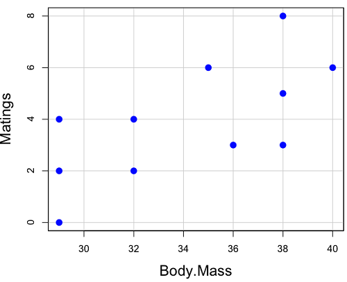
Figure 2. Number of matings by body mass (g) of the male bird.
There’s some scatter, but our eyes tell us that as body size increases, the number of matings also increases. We can go so far as to say that we can predict (imperfectly) that larger birds will have more matings. We fit the best fit line to the data and added the line to our scatterplot (Fig. 3). The best fit line meets the requirements that the error about the line is minimized (see below). Thus, we would predict about six matings for a 40 g bird, but only two matings for a 28 g bird. And this is a good feature of regression, prediction, as long as used with some caution.
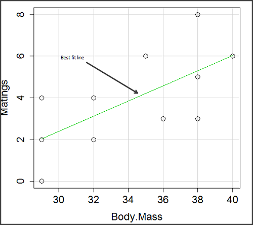
Figure 3. Same data as in Fig. 2, but with the “best fit” line.
Note that prediction works best for the range of data for which the regression model was built. Outside the range of values, we predict with caution.
The simplest linear relationship between two variables is the SLR. This would be the parameter version (population, not samples), where

 = the Y-intercept coefficient and it is defined as

solve for intercept by setting X = 0.
 = the regression coefficient (slope)

Note that the denominator is just our corrected sums of squares that we’ve seen many times before. The numerator is the cross-product and is referred to as the covariance.
ε = the error or “residual”

The residual is an important concept in regression. We briefly discussed “what’s left over,” in ANOVA, where an observation Yi is equal to the population mean plus the factor effect of level i plus the remainder or “error”.
In regression, we speak of residuals as the departure (difference) of an actual Yi (observation) from the predicted Y ( , say “why-hat”).
the linear regression predicts Y

and what remains unexplained by the regression equation is called the residual
There will be as many residuals as there were observations.
But why THIS particular line? We could draw lines anywhere through the points. Well, this line is termed the “best fit“ because it is the only line that minimizes the sum of the squared deviations for all values of Y (the observations) and the predicted . The best fit line minimizes the sum of the squared residuals.

Thus, like ANOVA, we can account for the total sums of squares (SSTot) as equal to the sums of squares (variation), explained by the regression model, SSreg, plus what’s not explained, what’s left over, the residual sums of squares, SSres, aka SSerror.

How well does our model explain — fit — our data? We cover this topic in Chapter 17.3 — Estimation of linear regression coefficients, but for now, we introduce  , the coefficient of determination.

ranges from zero (0%), the linear model fails completely to explain the data, to one (100%), the linear model explains perfectly every datum.
Models used to predict new values
Once a line has been estimated, one use is to predict new observations not previously measured!
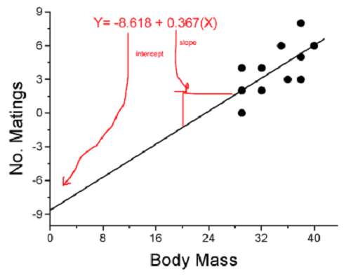
Figure 4. Figure 3 redrawn to extend the line to the Y intercept.
This is an important use of models in statistics: use an equation to fit to some data, then predict Y values from new values of X. To use the equation, simply insert new values of X into the equation, because the slope and intercept are already “known.” Then for any Xi we can determine  (predicted Y value that is on the best fit regression line).
This is what people do when they say
“if you are a certain weight (or BMI) you have this increased risk of heart disease”
“if you have this number of black rats in the forest you will have this many nestlings survive to leave the nest”
“if you have this much run-off pollution into the ocean you have this many corals dying”
“if you add this much enzyme to the solution you will have this much resulting product”.
R Code
We can use the drop down menu in Rcmdr to do the bulk of the work, supplemented with a little R code entered and run from the script window. Scrape data from Table 1 and save to R as bird.matings.
LinearModel.3 <- lm(Matings ~ Body.Mass, data=bird.matings)
summary(LinearModel.3)
Output from R — we’ll pull apart the important parts, color-highlights used to help orient the reader as we go.
Call:
lm(formula = Matings ~ Body.Mass, data = bird.matings)

Residuals:
     Min       1Q   Median      3Q     Max
-2.29237 -1.34322 -0.03178 1.33792 2.70763

Coefficients:
            Estimate Std. Error  t value  Pr(>|t|)
(Intercept)  -8.4746     4.6641   -1.817    0.1026
Body.Mass     0.3623     0.1355    2.673    0.0255 *
---
Signif. codes: 0 '***' 0.001 '**' 0.01 '*' 0.05 '.' 0.1 ' ' 1

Residual standard error: 1.776 on 9 degrees of freedom
Multiple R-squared: 0.4425, Adjusted R-squared: 0.3806
F-statistic: 7.144 on 1 and 9 DF, p-value: 0.02551
What are the values for the coefficients? See Estimate .
Table 2. Coefficient estimates.
| Value | |
 , Y-intercept , Y-intercept |
-8.4746 |
 , Slope , Slope |
0.3623 |
Get the sum of squares from the ANOVA table
myAOV.full <- anova(LinearModel.3); myAOV.full
Output from R, the ANOVA table
Analysis of Variance Table

Response: Matings
           Df  Sum Sq  Mean Sq  F value     Pr(>F)
Body.Mass   1  22.528  22.5277   7.1438   0.02551 *
Residuals   9  28.381   3.1535
---
Signif. codes: 0 '***' 0.001 '**' 0.01 '*' 0.05 '.' 0.1 ' ' 1
Looking for , the coefficient of determination? From the R output identify Multiple R-squared. We find 0.4425. Grab the SSreg and SSTot from the ANOVA table and confirm

Note 2: The value of increases with each additional predictor variable included in the model, whether statistically significant contributor or not, regardless of whether the association between the predictor is simply due to chance. The Adjusted R-squared is an attempt to correct for this bias.
The residual standard error, RSE, is another model fit statistic.

The smaller the residual standard error, the better the model fit to the data. See Residual standard error: 1.776 and MSE = 3.1535 above.
And the “statistical significance?” See Pr(>|t|) .There were tests for each coefficient,  and
and  :
:
Table 3. Coefficient estimates.
| P-value | |
| , Y-intercept |
0.1026 |
| , Slope |
0.0255 |
And, at last, note that p-value, Pr(>F), reported in the Analysis of Variance Table, is the same as the p-value for the slope reported as Pr(>|t|).
Make a prediction:
How many matings expected for a 40 g male?
predict(LinearModel.3, data.frame(Body.Mass=40))
R output
1
6.016949
Answer: we predict 6 matings for a 40g male.
See below for predicting confidence limits.
How to extract information from an R object
We can do more. Explore all that is available in the objects LinearModel.3 and myAOV.full with the str() command.
Note 3: str() command lets us look at an object created in R. Type ?str or help(str) to bring up the R documentation. Here, we use str() to look at the structure of the objects we created. “Classes” refers to the R programming class attribute inherited by the object. We first used str() in Chapter 8.3.
str(LinearModel.3)
Output from R
List of 12
$ coefficients : Named num [1:2] -8.475 0.362
..- attr(*, "names")= chr [1:2] "(Intercept)" "Body.Mass"
$ residuals : Named num [1:11] -2.0318 -0.0318 1.9682 0.8814 -1.1186 ...
..- attr(*, "names")= chr [1:11] "1" "2" "3" "4" ...
$ effects : Named num [1:11] -12.965 4.746 2.337 1.327 -0.673 ...
..- attr(*, "names")= chr [1:11] "(Intercept)" "Body.Mass" "" "" ...
$ rank : int 2
$ fitted.values: Named num [1:11] 2.03 2.03 2.03 3.12 3.12 ...
..- attr(*, "names")= chr [1:11] "1" "2" "3" "4" ...
$ assign : int [1:2] 0 1
$ qr :List of 5
..$ qr : num [1:11, 1:2] -3.317 0.302 0.302 0.302 0.302 ...
.. ..- attr(*, "dimnames")=List of 2
.. .. ..$ : chr [1:11] "1" "2" "3" "4" ...
.. .. ..$ : chr [1:2] "(Intercept)" "Body.Mass"
.. ..- attr(*, "assign")= int [1:2] 0 1
..$ qraux: num [1:2] 1.3 1.3
..$ pivot: int [1:2] 1 2
..$ tol : num 0.0000001
..$ rank : int 2
..- attr(*, "class")= chr "qr"
$ df.residual : int 9
$ xlevels : Named list()
$ call : language lm(formula = Matings ~ Body.Mass, data = bird_matings)
$ terms :Classes 'terms', 'formula' language Matings ~ Body.Mass
.. ..- attr(*, "variables")= language list(Matings, Body.Mass)
.. ..- attr(*, "factors")= int [1:2, 1] 0 1
.. .. ..- attr(*, "dimnames")=List of 2
.. .. .. ..$ : chr [1:2] "Matings" "Body.Mass"
.. .. .. ..$ : chr "Body.Mass"
.. ..- attr(*, "term.labels")= chr "Body.Mass"
.. ..- attr(*, "order")= int 1
.. ..- attr(*, "intercept")= int 1
.. ..- attr(*, "response")= int 1
.. ..- attr(*, ".Environment")=<environment: R_GlobalEnv>
.. ..- attr(*, "predvars")= language list(Matings, Body.Mass)
.. ..- attr(*, "dataClasses")= Named chr [1:2] "numeric" "numeric"
.. .. ..- attr(*, "names")= chr [1:2] "Matings" "Body.Mass"
$ model :'data.frame': 11 obs. of 2 variables:
..$ Matings : num [1:11] 0 2 4 4 2 6 3 3 5 8 ...
..$ Body.Mass: num [1:11] 29 29 29 32 32 35 36 38 38 38 ...
..- attr(*, "terms")=Classes 'terms', 'formula' language Matings ~ Body.Mass
.. .. ..- attr(*, "variables")= language list(Matings, Body.Mass)
.. .. ..- attr(*, "factors")= int [1:2, 1] 0 1
.. .. .. ..- attr(*, "dimnames")=List of 2
.. .. .. .. ..$ : chr [1:2] "Matings" "Body.Mass"
.. .. .. .. ..$ : chr "Body.Mass"
.. .. ..- attr(*, "term.labels")= chr "Body.Mass"
.. .. ..- attr(*, "order")= int 1
.. .. ..- attr(*, "intercept")= int 1
.. .. ..- attr(*, "response")= int 1
.. .. ..- attr(*, ".Environment")=<environment: R_GlobalEnv>
.. .. ..- attr(*, "predvars")= language list(Matings, Body.Mass)
.. .. ..- attr(*, "dataClasses")= Named chr [1:2] "numeric" "numeric"
.. .. .. ..- attr(*, "names")= chr [1:2] "Matings" "Body.Mass"
- attr(*, "class")= chr "lm"
Yikes! A lot of the output is simply identifying how R handled our data.frame and applied the lm() function.
Note 4: The “how” refers to the particular algorithms used by R. For example, qraux, pivot, and tol refer to arguments used in the QR decomposition of the matrix (derived from our data.frame) used to solve our linear least squares problem.
However, it’s from this command we learn what is available to extract in our object. For example, what were the actual fitted values (, the predicted Y values) from our linear equation? I marked the relevant str() output above in yellow. We call these from the object with the R code
RegModel.1$fitted.values
and R returns
       1        2        3        4        5        6        7        8        9       10       11
2.031780 2.031780 2.031780 3.118644 3.118644 4.205508 4.567797 5.292373 5.292373 5.292373 6.016949
Here’s another look at an object, str(myAOV.full), and how to extract useful values.
Output from R
Classes 'anova' and 'data.frame': 2 obs. of 5 variables:
$ Df : int 1 9
$ Sum Sq : num 22.5 28.4
$ Mean Sq: num 22.53 3.15
$ F value: num 7.14 NA
$ Pr(>F) : num 0.0255 NA
- attr(*, "heading")= chr [1:2] "Analysis of Variance Table\n" "Response: Matings"
Extract the sum of squares: type the object name then $ Sum Sq at the R prompt.
myAOV.full $"Sum Sq"
Output from R
[1] 22.52773 28.38136
Get the residual sum of squares
SSE.myAOV.full <- myAOV.full $"Sum Sq"[2]; SSE.myAOV.full
Output from R
[1] 22.52773
Get the regression sum of squares
SSR.myAOV.full <- myAOV.full $"Sum Sq"[1]; SSR.myAOV.full
Output from R
[1] 50.90909
Now, get the total sums of squares for the model

ssTotal.myAOV.full <- SSE.myAOV.full + SSR.myAOV.full; ssTotal.myAOV.full
Calculate the coefficient of determination
myR_2 <- 1 - (SSE.myAOV.full/(ssTotal.myAOV.full)); myR_2
Output from R
[1] 0.4425091
Which matches what we got before, as it should.
Regression equations may be useful to predict new observations
True. However, you should avoid making estimates beyond the range of the X – values that were used to calculate the best fit regression equation! Why? The answer has to do with the shape of the confidence interval around the regression line.
I’ve drawn an exaggerated confidence interval (CI), for a regression line between an X and a Y variable. Note that the CI is narrow in the middle, but wider at the end. Thus, we have more confidence in predicting new Y values for data that fall within the original data because this is the region where we are most confident.
Calculating the CI for the linear model follows from CI calculations for other estimates. It is a simple concept — both the intercept and slope were estimated with error, so we combine these into a way to generalize our confidence in the regression model as a whole given the error in slope and intercept estimation.

The calculation of confidence interval for the linear regression involves the standard error of the residuals, the sample size, and expressions relating the standard deviation of the predictor variable X — we use the t distribution.
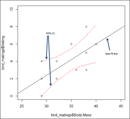
Figure 5. 95% confidence interval about the best fit line.
How I got this graph
plot(bird_matings$Body.Mass,bird_matings$Mating,xlim=c(25,45),ylim=c(0,10))
mylm <- lm(bird_matings$Mating~bird_matings$Body.Mass)
predict(mylm, interval = c("confidence"))
abline(mylm, col = "black")
x<-bird_matings$Body.Mass
lines(x, prd[,2], col= "red", lty=2)
lines(x, prd[,3], col= "red", lty=2)
Nothing wrong with my code, but getting all of this to work in R might best be accomplished by adding another package, a plug-in for Rcmdr called RcmdrPlugin.HH. HH refers to “Heiberger and Holland,” and provides software support for their textbook Statistical Analysis and Data Display, 2nd edition.
Assumptions of OLS, an introduction
We will cover assumptions of Ordinary Least Squares in detail in 17.8, Assumptions and model diagnostics for Simple Linear Regression. For now, briefly, the assumptions for OLS regression include:
- Linear model is appropriate: the data are well described (fit) by a linear model
- Independent values of Y and equal variances. Although there can be more than one Y for any value of X, the Y’s cannot be related to each other (that’s what we mean by independent). Since we allow for multiple Y’s for each X, then we assume that the variances of the range of Ys are equal for each X value (this is similar to our ANOVA assumptions for equal variance by groups).
- Normality. For each X value there is a normal distribution of Ys (think of doing the experiment over and over)
- Error (residuals) are normally distributed with a mean of zero.
Additionally, we assume that measurement of X is done without error (the equivalent, but less restrictive practical application of this assumption is that the error in X is at least negligible compared to the measurements in the dependent variable). Multiple regression makes one more assumption, about the relationship between the predictor variables (the X variables). The assumption is that there is no multicolinearity: the X variables are not related or associated to each other.
In some sense the first assumption is obvious if not trivial — of course a “line” needs to fit the data so why not plow ahead with the OLS regression method, which has desirable statistical properties and let the estimation of slopes, intercept and fit statistics guide us? One of the really good things about statistics is that you can readily test your intuition about a particular method using data simulated to meet, or not to meet, assumptions.
Coming up with datasets like these can be tricky for beginners. Thankfully, others have stepped in and provide tools useful for data simulations which greatly facilitate the kinds of testing of assumptions — and more importantly, how assumptions influence our conclusions — statisticians greatly encourage us all to do (see Chatterjee and Firat 2007).
Questions
- True or False. Regression analysis results in a model of the cause-effect relationship between a dependent and one (simple linear) or more (multiple) predictor variables. The equation can be used to predict new observations of the dependent variable.
- True or False. The value of X at the Y-intercept is always equal to zero in a simple linear regression.
- Predict new values for number of matings for male birds of 20g and 60g.
- Anscombe’s quartet (Anscombe 1973) is a famous example of this approach and the fictitious data can be used to illustrate the fallacy of relying solely on fit statistics and coefficient estimates.
Here are the data (modified from Anscombe 1973, p. 19) — I leave it to you to discover the message by using linear regression on Anscombe’s data set. Hint: play naïve and generate the appropriate descriptive statistics, make scatterplots for each X, Y set, then run regression statistics, first on each of the X, Y pairs (there were four sets of X, Y pairs).
| Set 1 | Set 2 | Set 3 | Set 4 | ||||
| x1 | y1 | x2 | y2 | x3 | y3 | x4 | y4 |
| 10 | 8.04 | 10 | 9.14 | 10 | 7.46 | 8 | 6.58 |
| 8 | 6.95 | 8 | 8.14 | 8 | 6.77 | 8 | 5.76 |
| 13 | 7.58 | 13 | 8.74 | 13 | 12.74 | 8 | 7.71 |
| 9 | 8.81 | 9 | 8.77 | 9 | 7.11 | 8 | 8.84 |
| 11 | 8.33 | 11 | 9.26 | 11 | 7.81 | 8 | 8.47 |
| 14 | 9.96 | 14 | 8.1 | 14 | 8.84 | 8 | 7.04 |
| 6 | 7.24 | 6 | 6.13 | 6 | 6.08 | 8 | 5.25 |
| 4 | 4.26 | 4 | 3.1 | 4 | 5.39 | 19 | 12.5 |
| 12 | 10.84 | 12 | 9.13 | 12 | 8.15 | 8 | 5.56 |
| 7 | 4.82 | 7 | 7.26 | 7 | 6.42 | 8 | 7.91 |
| 5 | 5.68 | 5 | 4.74 | 5 | 5.73 | 8 | 6.89 |
Chapter 17 contents
- Introduction
- Simple Linear Regression
- Relationship between the slope and the correlation
- Estimation of linear regression coefficients
- OLS, RMA, and smoothing functions
- Testing regression coefficients
- ANCOVA – analysis of covariance
- Regression model fit
- Assumptions and model diagnostics for Simple Linear Regression
- References and suggested readings (Ch17 & 18)
4.5 – Scatter plots
add Bland-Altman, Volcano
Introduction
Scatter plots, also called scatter diagrams, scatterplots, or XY plots, display associations between two quantitative, ratio-scaled variables. Each point in the graph is identified by two values: its X value and its Y value. The horizontal axis is used to display the dispersion of the X variable, while the vertical axis displays the dispersion of the Y variable.
The graphs we just looked at with Tufte’s examples Anscombe’s quartet data were scatter plots (Chapter 4 – How to report statistics).
Here’s another example of a scatter plot, data from Francis Galton, data contained in the R package HistData.
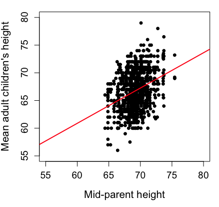
Figure 1. Scatterplot of mid-parent (vertical axis) and their adult children’s (horizontal axis) height, in inches. data from Galton’s 1885 paper, “Regression towards mediocrity in hereditary stature.” The red line is the linear regression fitted line, or “trend” line, which is interpreted in this case as the heritability of height.
Note 1. Sorry about that title — being rather short of stature myself, not sure I’m keen to learn further what Galton was implying with that “mediocrity” quip.
The commands I used to make the plot in Figure 1 were
library(HistData)
data(GaltonFamilies, package="HistData")
attach(GaltonFamilies)

plot(childHeight~midparentHeight, xlab="Mid-parent height", ylab="Mean adult children's height", xlim=c(55, 80), ylim=c(55,80), cex=0.8, cex.axis=1.2, cex.lab=1.3, pch=c(19), data=GaltonFamilies)
abline(lm(childHeight~midparentHeight), col="red", lwd=2)
I forced the plot function to use the same range of values, set by providing values for xlim and ylim; the default values of the plot command picks a range of data that fits each variable independently. Thus, the default X axis values ranged from 64 to 76 and the Y variable values ranged from 55 to 80. This has the effect of shifting the data, reducing the amount of white space, which a naïve reading of Tufte would suggest is a good idea, but at the expense of allowing the reader to see what would be the main point of the graph: that the children are, on average, shorter than the parents, mean height = 67 vs. 69 inches, respectively. Therefore, Galton’s title begins with the word “regression,” as in the definition of regression as a “return to a former … state” (Oxford Dictionary).
For completeness, cex sets the size of the points (default = 1), and therefore cex.axis and cex.lab apply size changes to the axes and labels, respectively; pch refers to the graph elements or plotting characters, further discussed below (see Fig 8); lm() is a call to the linear model function; col refers to color.
Figure 2 shows the same plot, but without attention to the axis scales, and, more in keeping with Tufte’s principle of maximize data, minimize white space.
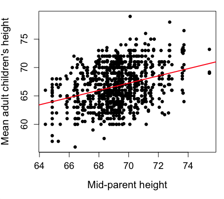
Figure 2. Same plot as Figure 1, but with default settings for axis scales.
Take a moment to compare the graphs in Figure 1 and 2. Setting the scales equal allows you to see that the mid-parent heights were less variable, between 65 and 75 inches, than the mean children height, which ranged from 55 to 80 inches.
And another example, Figure 3. This plot is from the ggplot2() function and was generated from within R Commander’s KMggplot2 plug-in.
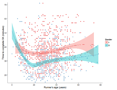
Figure 3. Finishing times in minutes of 1278 runners by age and gender at the 2013 Jamba Juice Banana 5K in Honolulu, Hawaii. Loess smoothing functions by groups of female (red) and male (blue) runners are plotted along with 95% confidence intervals.
Figure 3 is a busy plot. Because there were so many data points, it is challenging to view any discernible pattern, unlike Figure 1 and 2 plots, which featured less data. Use of the loess smoothing function, a transformation of the data to reduce data “noise” to reveal a continuous function, helps reveal patterns in the data:
- across most ages, men completed 5K faster than did females and
- there was an inverse, nonlinear association between runner’s age and time to complete the 5K race.
Take a look at the X-axis. Some runners ages were reported as less than 5 years old (trace the points down to the axis to confirm), and yet many of these youngsters were completing the 5K race in less than 30 minutes. That’s 6-minute mile pace! What might be some explanations for how pre-schoolers could be running so fast?
Design criteria
As in all plotting, maximize information to background. Keep white space minimal and avoid distorting relationships. Some things to consider:
- keep axes same length
- do not connect the dots UNLESS you have a continuous function
- do not draw a trend line UNLESS you are implying causation
Scatter plots in R
We have many options in R to generate scatter plots. We have already demonstrated use of plot() to make scatter plots. Here we introduce how to generate the plot in R Commander.
Rcmdr: Graphs → Scatterplot…
Rcmdr uses the scatterplot function from the car package. In recent versions of R Commander the available options for the scatterplot command are divided into two menu tabs, Data and Options, shown in Figure 4 and Figure 5.
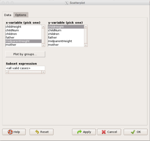
Figure 4. First menu popup in R Commander Scatterplot command, Rcmdr ver. 2.2-3.
Select X and Y variables, choose Plot by groups if multiple grounds are included, e.g., male, female, then click Options tab to complete.
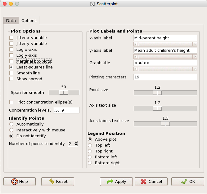
Figure 5. Second menu popup in R Commander scatterplot command., Rcmdr ver. 2.2-3
Set graph options including axes labels and size of the points.
Note 2. Lots of boxes to check and uncheck. Start by unchecking all of the Options and do update the axes labels (see red arrow in image). You can also manipulate the plot “points,” which R refers to as plotting characters (abbreviated pch in plotting commands). The “Plotting characters” box is shown as <auto>, which is an open circle. You can change this to one of 26 different characters by typing in a number between 0 and 25. The default used in Rcmdr scatterplot is “1” for open circle. I typically use “19” for a solid circle.
Here is another example using the default settings in scatterplot() function in the car package, now the default scatter plot command via R Commander (Fig. 4), along with the same graph, but modified to improve the look and usefulness of the graph (Fig. 6). The data set was Puromycin in the package datasets.
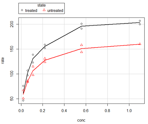
Figure 6. Default scatterplot, package car, from R Commander, version 2.2-4.
Grid lines in graphs should be avoided unless you intend to draw attention to values of particular data points. I prefer to position the figure legend within the frame of the graph, e.g., the open are at the bottom right of the graph. Modified graph shown in Figure 7.
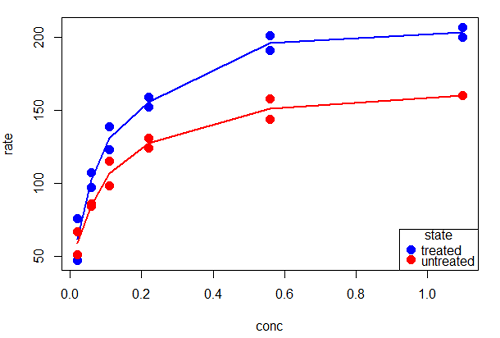
Figure 7. Modified scatterplot, same data from Figure 6
R commands used to make the scatter plot in Figure 7 were
scatterplot(rate~conc|state, col=c("blue", "red"), cex=1.5, pch=c(19,19),
bty="n", reg=FALSE, grid=FALSE, legend.coords="bottomright")
A comment about graph elements in R
In some ways R is too rich in options for making graphs. There are the plot functions in the base package, there’s lattice and ggplot2 which provide many options for graphics, and more. The advice is to start slowly, for example taking advantage of the Figure 8 displays R’s plotting characters and the number you would invoke to retrieve that plotting character.
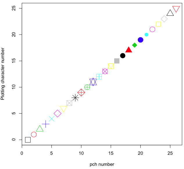
Figure 8. R plotting characters pch = 1 – 25 along with examples of color.
Note 3. To see available colors at the R prompt type
colors()
which returns 667 different colors by name, from
[1] "white" "aliceblue" "antiquewhite"
to
[655] "yellow3" "yellow4" "yellowgreen"
Note 4. There’s a lot more to R plotting. For example, you are not limited to just 25 possible characters. R can print any of the ASCII characters 32:127 or from the extended ASCII code 128:255. See Wikipedia to see the listing of ASCII characters.
Note 5. You can change the size of the plotting character with “cex.”
Here’s the R code used to generate the graph in Figure 8. Remember, any line beginning with # is a comment line, not an R command.
#create a vector with 26 numbers, from 0 to 25
stuff <-c(0:25)
plot(stuff, pch=c(32:58), cex = 2.5, col = c(1:26), 'xlab' = "pch number", 'ylab' = "Plotting character number")
Is it “scatter plot” or “scatterplot”?
Spelling matters, of course, and yet there are many words for which the correct spelling seems to be like “beauty,” it is “in the eye of the beholder” (Molly Bawn, 1878, by Margaret Hungerford). Scatter plot is one of these — is it one word or two, or is it something else entirely?
Scatter plot is one of these terms: you’ll find it spelled as “scatterplot” or as “scatter plot,” in the dictionary (e.g., Oxford English dictionary), with no guidance to choose between them. And I’m not just talking about the differences between British and American English spelling traditions.
Note 6. The spell checkers in Microsoft Office and Google Docs do not flag “scatterplot” as incorrect, but the spell checker in LibreOffice Writer does (per obs).
Thus, in these situations as an author, you can turn to which of the spellings is in common use. I first looked at some of the statistics books on my shelves. I selected 14 (bio)statistics textbooks and checked the index and if present, chapters on graphics for term usage.
Table 1. Frequency of use of different terms for scatter plot in 14 (bio)statistics books currently on Mike’s shelves.
| spelling | number of statistical texts | frequency |
|---|---|---|
| scatter diagram | 2 | 0.144 |
| scatter plot | 5 | 0.357 |
| scattergram | 1 | 0.071 |
| scatterplot | 5 | 0.357 |
| XY plot | 0 | 0.071 |
Not much help, basically, it is a tie between “scatter plot” and “scatterplot.”
Next, I searched six journals for the interval 1990 – 2016 for use of these terms. Results presented in Table 6 along with journal impact factor for 2014 and number of issues (Table 2).
Table 2. Impact factor and number of issues 1990 – 2016 for six science journals.
| Journal | Impact factor | Issues |
|---|---|---|
| BMJ | 17.445 | 1374 |
| Ecology | 5.175 | 271 |
| J. Exp. Biol | 2.897 | 540 |
| Nature | 41.456 | 1454 |
| NEJM | 55.873 | 1377 |
| Science | 33.611 | 1347 |
My methods? I used the journal’s online search functions for the various usage for scatter plot and the results are shown in Figure 9.
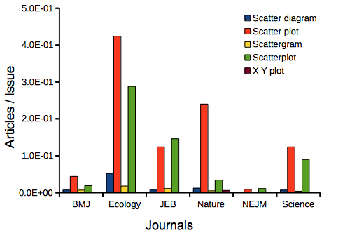
Figure 9. Usage of terms for X Y plots in research articles normalized to number of issues in six journals between 1990 and 2016.
The journals have different numbers of articles; I partially corrected for this by calculating the ratio number of articles with one of the terms divided by the number of issues for the interval 1990 – 2016. It would have been better to count all of the articles, but even I found that to be an excessive effort given the point I’m trying to make here.
Not much help there, although we can see a trend favoring “scatter plot” over any of the other options.
And finally, to completely work over the issue I present results from use of Google’s Ngram Viewer. Ngram Viewer allows you to search words in all of the texts that Google’s folks have scanned into digital form. I searched on the terms in texts between 1950 and 2015, and results are displayed in Figure 10 and Figure 11.
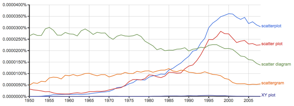
Figure 10. Results from Ngram Viewer for American English, “scatterplot” (blue), “scatter plot” (red), “scatter diagram” (green), “scattergram” (orange), and “XY plot” (purple).
And the same plot, but this time for British sources
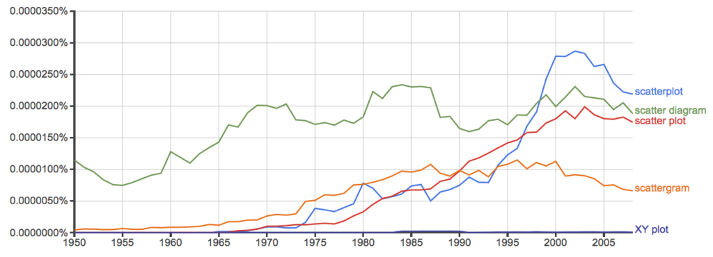
Figure 11. Results from Ngram Viewer for British English. See Figure 10 for key.
Conclusion? It looks like “scatterplot” (blue line) is the preferred usage, but it is close. Except for “scattergram” and “XY plot,” which, apparently, are rarely used. After all of this, it looks like you’re free to make your choice between “scatterplot” or “scatter plot.” I will continue to use “scatter plot.”
Bland-Altman plot
Also known as Tukey mean-difference plot, the Bland-Altman plot is used to describe agreement between two ratio scale variables (Bland and Altman 1986, Giavarina 2015), for example agreement between two different methods used to measure the same samples.
Note 6. Agreement — aka concordance or reproducibility — in the statistical sense is consistent with our everyday conception — consistency among sets of observations on the same object, sample, or unit. We introduce and develop additional agreement statistics in Chapter 9.2 and Chapter 12.3. Additional note for my students — note that I didn’t define agreement by including the term “agree”, thereby avoiding a circular definition (for an amusing clarification on the phrase, see Logically Fallacious). It’s a common short-fall I’ve seen thus far in AI-tools.
Consider use of imageJ by two different observers to record number of pixels of a unit measure (1 cm) on a series of digital images — there’s subjectivity in drawing the lines (where to start, where to end) — do they agree? Data set below. blandr package, blandr.draw function.
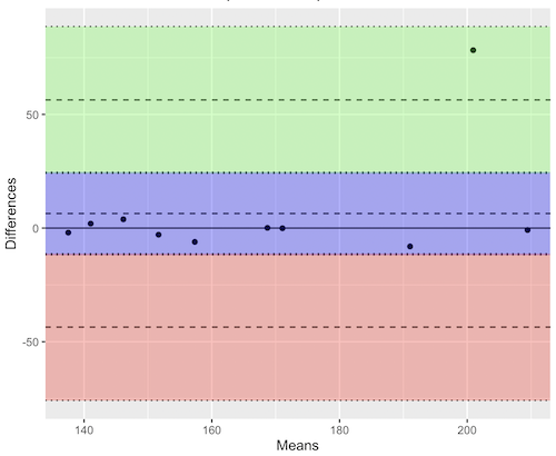
Figure 12. Bland-Altman plot of 1 cm unit measure in pixel number by imageJ from digital images by two independent observers. Purple central region is 95% CI. Lower and upper dashed horizontal lines represent bounds of “acceptable” agreement.
blandr.draw(Obs1, Obs2)
The plot makes it easy to identify questionable points, for example, the one point in upper right quadrant looks suspect.
Volcano plot
Used to show events that differ between two groups of subjects (e.g., p-values), and is common in gene expression studies of an exposed group vs a control group (e.g., fold changes).
ccc
[pending]
Figure 13. Volcano plot, gene expression fold change.
ccc
Questions
- Using our Comet assay data set (Table 1, Chapter 4.2), create scatter plots to show associations between tail length, tail percent, and olive moment.
- Explore different settings including size of points, amount of white area, and scale of the axes. Evaluate how these changes change the “story” told by the graph.
Data sets
Number of pixels of 1 cm length from unit measure on ten digital images. recorded by two independent observers, Obs1 and Obs2.
 Obs1, Obs2
171.026, 171.105
136.528, 138.521
148.084, 144.222
142.014, 140.057
150.213, 153.118
187.011, 195.092
168.760, 168.668
154.302 ,160.381
209.022, 209.876
240.067, 161.805
Gene expression
ccc
Chapter 4 contents
4 – How to report statistics
Introduction
While you are thinking about exploring data sets and descriptive statistics, please review our overview of data analysis (Chapter 2.4 and 2.5). While the scientific hypotheses come first, how experiments are designed should allow for straight-forward analysis: in other words, statistics can’t rescue poorly designed experiments, nor can it reveal new insight after the fact.
Once the experiments are completed, all projects will go through a similar process.
- Description: Describe and summarize the results
- Check assumptions
- Inference: conduct tests of hypotheses
- Develop and evaluate statistical models
Clearly this is a simplification, but there’s an expectation your readers will have about a project. Basic questions like how many subjects got better on the treatment? Is there an association between Body Mass Index (BMI) and the primary outcome? Did male and female subjects differ for response to the treatment? Undoubtedly these and related questions form the essence of the inferences, but providing graphs to show patterns may be as important to a reader as any p-value — a number which describes how likely it is that your data would have occurred by chance — e.g., from an Analysis of variance.
Each project is unique, but what elements must be included in a results section?
Data visualization
We describe data in three ways: graphs, tables, and in sentences. In this page we present the basics of when to choose a graph over presenting data in a table or as a series of sentences (i.e., text). In the rest of this chapter we introduce the various graphics we will encounter in the course. Chapter 4 covers eight different graphics, but is by no means an exhaustive list of kinds of graphs. Phylogenetic network graphs are presented in Chapter 20.11. Although an important element of presentation in journal articles, we don’t discuss figure legends or table titles; guidelines are typically available by the journal of choice (e.g., PLOS ONE journals guidelines).
A quick note about terminology. Data visualization encompasses charts, graphs and plots. Of the three terms, chart is the more generic. Graphs are used to display a function or mapping between two variables; plots are kinds of graphs for a finite set of points. There is a difference among the terms, but I confess, I won’t be consistent. Instead, I will refer to each type of data visualization by its descriptive name: bar chart, pie chart, scatter plot, etc. Note that technically, a scatter plot can refer to a graph, e.g., a line drawn to reflect a linear association between the two variables, whereas bar charts and pie charts would not be a graph because no function is implied.
Why display data?
Do we just to show a graph to break the monotony of page after page of text or do we attempt to do more with graphs? After all, isn’t “a picture’s worth a thousand words?” In many cases, yes! Graphics allow us to see patterns. Visualization is a key part of exploratory data analysis, or data mining in the parlance of big data. Data visualization is also a crucial tool in the public health arena, and finding effective graphics to communicate, at times, complex data and information to both public and professional audiences can be challenging (see discussion in Meloncon and Warner 2017).
Graphics are complicated and expensive to do well. Text is much cheaper to publish, even in digital form. But the ability to visualize concepts, that is, to connect ideas to data through our eyes (see Wikipedia), seems to be more the cognitive goal of graphics. Lofty purpose, desirable goal. Yes, it is true that graphics can communicate concepts to the reader, but with some caution. Images distort, and default options in graphics programs are seldom acceptable for conveying messages without bias (Glazer 2011).
Here’s some tips from a book on graphical display (Tufte 1983; see also Camões 2016).
Your goal is to communicate complex ideas with clarity, precision, and efficiency. Graphical displays should:
- show the data
- avoid distorting the data
- present numbers in a small space
- help the viewer’s eye to compare different pieces of data
- serve a clear purpose (description, exploration, tabulation, decoration)
- be closely integrated with statistical and verbal descriptions of a data set.
We accomplish these tasks by following general principles involving scale and a commitment to avoiding bias in our presentation.
Importantly, graphs can show patterns not immediately evident in tables of numbers. See Table 1 for an example of a dataset, “Anscombe’s quartet,” (Anscombe 1973), where a picture is clearly helpful.
Anscombe’s quartet
| X | Y1 | Y2 | Y3 | Y4 |
|---|---|---|---|---|
| 10 | 8.04 | 9.14 | 7.46 | 6.58 |
| 8 | 6.95 | 8.14 | 6.77 | 5.76 |
| 13 | 7.58 | 8.74 | 12.74 | 7.71 |
| 9 | 8.81 | 8.77 | 7.11 | 8.84 |
| 11 | 8.33 | 9.26 | 7.81 | 8.47 |
| 14 | 9.96 | 8.10 | 8.84 | 7.04 |
| 6 | 7.24 | 6.13 | 6.08 | 5.25 |
| 4 | 4.26 | 3.10 | 5.39 | 12.50 |
| 12 | 10.84 | 9.13 | 8.15 | 5.56 |
| 7 | 4.82 | 7.26 | 6.42 | 7.91 |
| 5 | 5.68 | 4.74 | 5.73 | 6.89 |
| Mean (±SD) | 7.50 (2.032) | 7.50 (2.032) | 7.50 (2.032) | 7.50 (2.032) |
The Anscombe dataset is also available in R package stats, or you can copy/paste from Table 1 into a spreadsheet or text file, then load the data file into R (e.g., Rcmdr → Load data set). Note that the data set does not include the column summary statistics shown in the last row of the table.
Before proceeding, look again at the table — See any patterns in the table?
Maybe.… Need to be careful as we humans are really good at perceiving patterns, even when no pattern exists.
Now, look just at the last row in the table, the row containing the descriptive statistics (the means and standard deviations). Any patterns?
The means and standard deviations are the same, so nothing really jumps out at you — does that mean that there are no differences among the columns then?
But let’s see what the scatter plots look like before we conclude that the columns of Y ’s are the same (Fig. 1). I’ll also introduce the R package clipr, which is useful for working with your computer’s clipboard.
To show clipboard history, on Windows 10/11 press Windows logo key plus V; on macOS, open Finder and select Edit → Show Clipboard.
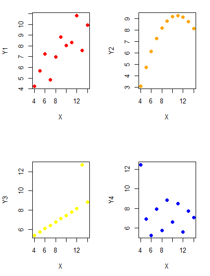
Figure 1. Scatter plot graphs of Anscombe’s quartet (Table 1)
#R code for Figure 1.

require(clipr)
#Copy from the Table and paste into spreadsheet (exclude last row). Highlight and copy data in spreadsheet
myTemp <- read_clip_tbl(read_clip(), header=TRUE, sep = "\t")
#Check that the data have been loaded correctly
head(myTemp)
#attach the data frame, so don't have to refer to variables as myTemp\$variable name
attach(myTemp)
#set the plot area for 4 graphs in 2X2 frame
par(mfrow=c(2,2))
plot(X, Y1, pch=19, col="red", cex=1.2)
plot(X, Y2, pch=19, col="orange",cex=1.2)
plot(X, Y3, pch=19, col="yellow",cex=1.2)
plot(X, Y4, pch=19, col="blue",cex=1.2)
And now we can see that the Y ‘s have different stories to tell. While the summary (descriptive) statistics are the same, the patterns of the association between Y values and the X variable are qualitatively different: Y1 is linear, but diffuse; Y2 is nonlinearly associated with X; Y3, like Y1, is linearly related to X, but one data point seems to be an outlier; and for Y4 we see a diffuse nonlinear trend and an outlier.
So, that’s the big picture here. In working with data, you must look at both ways to “see” data — you need to make graphs and you also need to calculate basic descriptive statistics.
And as to the reporting of these results, sometimes Tables are best (i.e., so others can try different statistical tests), but patterns can be quickly displayed with carefully designed graphs. Clearly, in this case, the graphs were very helpful to reveal trends in the data.
When to report numbers in a sentence? In a table? In a graph?
The choice depends on the message. Usually you want to make a comparison (or series of comparisons). If you are reporting one or two numbers in a comparison, a sentence is fine. “The two feral goat populations had similar mean numbers (120 vs. 125) of kids each breeding period.” If you have only a few comparisons to make, the text table is useful:
Table 2. Data from Kipahoehoe Natural Area Reserve, SW slope of Mauna Loa.
| Location | Number of kids |
|---|---|
| Outside fence | |
| kīpuka | 51 |
| other | 120 |
| Inside fence | |
| kīpuka | 3 |
To conclude, tables are the best way to show exact numbers and tables are preferred over graphs when many comparisons need to be made. (Note: this was a real data set, but I’ve misplaced the citation!)
A kīpuka is a land area surrounded by recent lava flows.
Couldn’t I use a pie chart for this?
Yes, but I will try and persuade you to not. Pie charts are used to show part-whole relationships. If there are just a few groups, and if we don’t care about precise comparisons, pie charts may be effective. Some good examples are Figure 1 O’Neill et al 2020,
Sometimes, people use pie charts for very small data sets (comparing two populations, or three categories, for example). These work well, but as we increase the number of categories, the graphic likely requires additional labels and remarks to clarify the message. The problem with pie charts is that they require interpretation of the angles that define the wedges, so we can’t be very precise about that. Bar charts are much better than pie charts — but can also suffer when many categories are used (Chapter 4.1).
To illustrate the problem, here’s a couple of pie charts from Microsoft Excel (a similar chart can be made with LibreOffice Calc) for our goat data set; compare this graph to the table and to the bar chart below (Fig. 2).
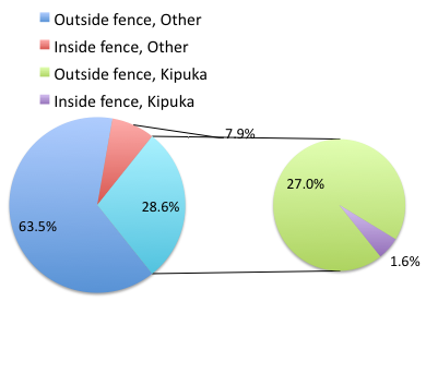
Figure 2. Excel pie chart of Table 2 data set
A bar chart of the same data (Fig. 3)
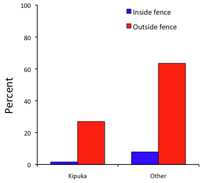
Figure 3. Bar chart of Table 2 data set
The bar chart (Fig. 3) is easier to get the message across; more goat kids were found outside the fenced area then inside the fenced in areas. We can also see that more goat kids were found in the “other” areas compared to the kipuka. The pie chart (Fig. 2) in my opinion fails to communicate these simple comparisons, conclusions about patterns in the data that clearly would be the take-home message from this project. Aesthetically the bar chart could be improved — a mosaic plot would work well to show the associations in the project results (See Ch 4.4 Mosaic plots).
But we are not done with this argument, to use graphics or text to report results. Neither the bar chart (mosaic plot) or the pie chart really work. The reader has to interpret the graphics by extrapolating to the axes to get the numbers. While it may be boring — 1.5 million hits Google search “data tables” boring — tables can be used for comparisons and make the patterns more clear and informative to the reader. Here’s a different version of the table to emphasize the influence of fencing on the goat population.
Table 3. Revised Table 2 to emphasize comparisons between inside and outside the fence line on feral goat population on Mauna Loa.
| Location | Kīpuka | Other |
|---|---|---|
| Outside fence | 51 | 120 |
| Inside fence | 3 | 15 |
Table 3 would be my choice — over a sentence and over a graph. At a glance I can see that more goat kids were found outside of the fenced area, regardless of whether it was in a kipuka or some other area on the mountain side. Table 3 is an improvement over Table 2 because it presents the comparisons in a 2 X 2 format — especially useful when we have a conditional set.
For example, it’s useful to show the breakdown of voting results in tables (numbers of votes for different candidates by voter’s party affiliation, home district, sex, economic status, etc.). Interested readers can then scan through the table to identify the comparison they are most interested in. But often, a graph is the best choice to display information. One final point, by judiciously combining words, numbers, and images, you should be able to convey even the most complex information in a clear manner! We will not spend a lot of time on these issues, but you will want to pay some attention to these points as you work on your own projects.
Some final comments about how to present data
What your graph looks like is up to you, lots of people have advice (e.g., Klass 2012). But we all know poor graphs when we see them in talks or in papers; we know them when we struggle to make sense of the take-home message. We know them when we feel like we’re missing the take-home message.
Here’s my basic take on communicating information with graphics.
- Minimize white space (for example, the scatter plots above could be improved simply by increasing the point size of the data points)
- Avoid bar charts for comparisons if you are trying to compare more than about three or four things.
- A graphic in a science report that is worth “a thousand words” probably is too complicated, too much information, and, very likely, whatever message you are trying to convey is better off in the text.
Chapter 4 contents