4.6 – Adding a second Y axis
Introduction
Scatter plots are used to show association between two continuous variables. However, it is not uncommon to have a third variable for which association between the same X variable is expected. Thus, a common scatter plot includes a second Y axis. These graphs are a bit more involved to make regardless of which application used. The purpose of this short section is to provide a way to create a plot with two Y axes against a common X axis. Additional plotting options are also provided and explained.
The data set
The first draft of this post was written in September 4, 2019, peak time for hurricanes. Hurricane Dorian passed the Bahamas as a category 4 storm heading for Florida. For context I include a screenshot of imagery from NOAA; you can see Dorian along the Florida coastline as well as four additional storms lined up from the coast of Africa across the Atlantic Ocean (Fig 1).
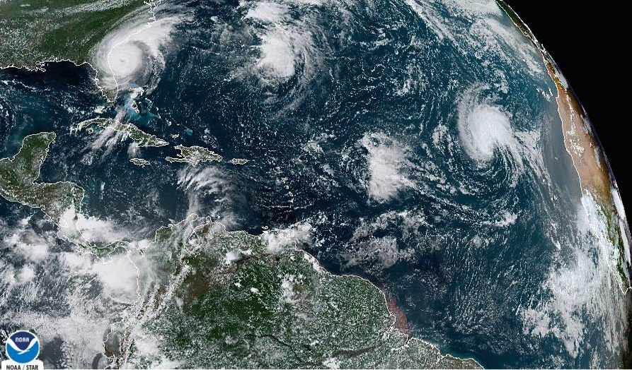
Figure 1. Screenshot from NOAA GOES-East – Sector view: Tropical Atlantic – GeoColor, 4 September 2019. Click image to view full sized image.
The data set here is the number of Atlantic Ocean Category 1, 2, 3, 4, or 5 storms since 1900, tabulated by decade. Storms are categorized by wind speed according to the Saffir-Simpson Hurricane Wind Scale, or SSHWS.
Note 1: Since September 2019 there have been 36 major hurricanes: 2019, October – December = 3; 2020 = 13; 2021 = 3; 2022 = 3; 2023 = 2; 2024 = 12.
Additional data, average levels of carbon dioxide (CO2), a greenhouse gas, measured at Mauna Loa and average global temperature index from NOAA were also acquired for the same period. (The temperature index is called anomaly data as it is the difference of temperature between the average temperatures between 1950 and 1980).
#Create the time data, 12 decades, with 2010 based on 8 years only -- up to 2018
decade <- seq(1900,2010, by = 10)
#Saffir-Simpson Hurricane Wind Scale; compiled from Wikipedia, checked against NOAA
cat01 <- c(2,0,1,3,0,9,4,11,18,11,27,46)
cat02 <- c(2,0,1,3,10,4,5,4,3,13,9,8)
cat03 <- c(7,2,3,1,4,10,9,5,4,12,11,7)
cat04 <- c(1,6,5,8,9,10,9,5,5,10,15,8)
cat05 <- c(0,0,2,6,0,2,4,3,3,2,9,4)
#land ocean anomaly temperature index, NOAA
tempIndex <- c(-0.317,-0.329,-0.241,-0.123,0.042,-0.048,-0.028,0.034,0.247,0.387,0.591,0.791)
#mauna kea CO2, mean by decade, record starts 1958
co2 <- c(NA,NA,NA,NA,NA,316.0,320.3,330.9,345.5,360.5,378.6,399.0)
Note 2: Corresponding temperature anomalies and CO2 data: cc
Combine all of the variables into a single data frame.
storms <- data.frame(decade,tempIndex,cat01,cat02,cat03,cat04,cat05,co2)
head(storms)
Output from R should look like
  decade tempIndex cat01 cat02 cat03 cat04 cat05 co2
1   1900    -0.317     2     2     7     1     0  NA
2   1910    -0.329     0     0     2     6     0  NA
3   1920    -0.241     1     1     3     5     2  NA
4   1930    -0.123     3     3     1     8     6  NA
5   1940     0.042     0    10     4     9     0  NA
6   1950    -0.048     9     4    10    10     2 316
Create a new variable with all categories of storms summed by decade.
#Sum all of the storms
allHur <- cat01+cat02+cat03+cat04+cat05
#Add new variable to the data frame
storms$allHur <- allHur
#Attach the data frame so you don't have to keep referring to the data frame when you call variables.
attach(storms)
Now, create a simple scatter plot, number of hurricanes by decade (Fig 2).
plot(decade,allHur,pch=16)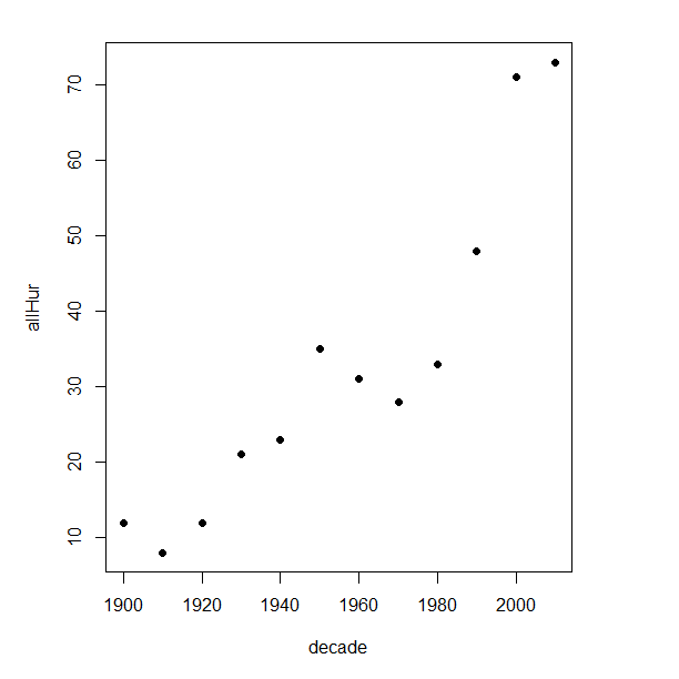
Figure 2. Plot of hurricanes from 1900 to present by decade.
Note 3: Best data come from the satellites, which means use of data since the 1980s would be more appropriate. IPCC reports climate change is projected to increase the intensity of hurricanes, with higher wind speeds and more rainfall. While there is not a consensus on the frequency of storms, the proportion of the most intense storms (Category 4 and 5) is expected to increase, and rapid intensification is also likely to become more common (Masson-Delmotte, et al (2021), IPCC Sixth Assessment Report (AR6) – The Physical Science Basis).
A note on data management
This note is not needed for the plots. However, it’s as good a place as any to comment about how to work with your data in R. For the hurricane data, I set the data frame storms as an unstacked (wide) worksheet. The code that follows shows how to use the reshape2 package, part of the tidyverse set of packages for data manipulation, to convert the data frame from unstacked (wide) to stacked (long).
#code modified from examples presented by Thomas Eisfeld
library(reshape2)
library(dplyr)
tryMe <- melt(storms, id.vars=c("decade", "tempIndex", "co2"), variable.name = "SSHWS", value.name = "hurricanes")
head(tryMe)
You can also take a stacked (long) worksheet and convert it to unstacked (wide) with dcast().
tryAgain <- dcast(tryMe, decade + tempIndex + co2 ~ SSHWS)Make the plots
At last, here’s the code for adding a second Y axis. Code modified from https://www.r-bloggers.com/r-single-plot-with-two-different-y-axes/. The work flow begins by setting parameters of the plotting window, creating the first plot, followed up by adding the second plot (par=TRUE), setting graphing elements, then adding labels and a legend.
First plot example: Total number of hurricanes by decades, with Temperature Index by decades. Number of hurricanes represented on first (left) axis and Temperature Index represented on second (right) axis (Fig 3).
par(mar = c(5,5,2,5))
#Create the first plot
plot(tryAgain$decade, tryAgain$allHur, pch=16, cex=1.5, col="black", xlab="Decades", ylab="Hurricanes", main="Atlantic Hurricanes by Decade")
the syntax par(mar = c(bottom, left, top, right))
#Add the second plot
par(new=T)
plot(tryAgain$decade, tryAgain$tempIndex, type="l", lty="dashed", lwd=2, col="red3", axes=F, xlab=NA, ylab=NA)
axis(side=4)
mtext(side=4,line=3,"Temperature Index")

#Add a legend
legend("topleft",legend=c("Hurricanes", "Temperature Index"),lty=c(0,2), pch=c(16,NA), col=c("black", "red3"))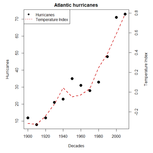
Figure 3. Total number of hurricanes by decades, with Temperature Index by decades. Number of hurricanes represented on first (left) axis and Temperature Index represented on second (right) axis.
Next plot example: Total number of hurricanes by decades, with Atmospheric CO2 measured at Mauna Loa by decades. Number of hurricanes represented on first (left) axis and Atmospheric CO2 represented on second (right) axis (Fig 4).
par(mar = c(5,5,2,5))
plot(tryAgain$decade, tryAgain$allHur, pch=16, cex=1.5, col="black", xlab="Decades", ylab="Hurricanes", main="Atlantic Hurricanes by Decade")
Create space for the second plot in the same frame (use T or TRUE, both work).
par(new=T)Code for the second plot. Note that axes=F (“F” or “FALSE” works) is used to suppress printing axes — Recall that lines were already created by the first plot; if you do not add this, then additional lines are added to the plot.”NA” is used to suppress adding labels; if you do not add this code, then labels will be printed over the existing labels created for the first plot. The code axis=4 sets the right-hand Y axis to active. The next code, mtext() is used to place the axis label for the second Y axis.
plot(tryAgain$decade, tryAgain$co2, type="l", lty="dashed", lwd=2, col="red3", axes=F, xlab=NA, ylab=NA)
axis(side=4)
mtext(side=4,line=3,"Mean CO2, ppm")
Add the legend.
legend("topleft",legend=c("Hurricanes", "CO2"),lty=c(0,2), pch=c(16,NA), col=c("black", "blue"))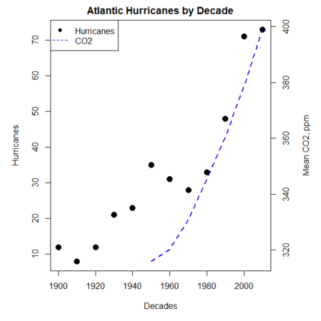
Figure 4. Total number of hurricanes by decades, with Atmospheric CO2 measured at Mauna Kea by decades. Number of hurricanes represented on first (left) axis and Atmospheric CO2 represented on second (right) axis.
Go ahead and try these plots. Change the settings (e.g., lty, pch, cex, col), and note how the graphs look.
Bubble (chart) plot
From the basic scatter plot a variety of variants have been developed to convey additional information about ratio scale variables. The bubble chart is one common example and can be used as an alternative to adding a second Y-axis in some cases. A bubble plot uses the area of a bubble to represent a third variable, while a second y-axis is used to display a second set of data with its own scale on the same chart.
In brief, a third variable is added, mapped to circle size. Spreadsheet apps also include options to make bubble charts and the wonderful plot.ly library provides a vehicle to produce sophisticated graphs including bubble charts online or as a package in R — and it works well with the ggplot2 package. A nice bubble chart introduction is available at Atlassian.
Examples of bubble charts with R code are provided in Ch16.3. That said, what’s one more? Here’s example R code:
ggplot(storms, aes(x = decade, y = tempIndex, size = total_storms)) +
  geom_point(alpha = 0.7, color = "lightgreen") + # Added color = "lightgreen"
  scale_size_continuous(range = c(3, 15)) +
  labs(title = "Temperature Index vs. Decade with Total Storms",
       x = "Decade",
       y = "Land Ocean Anomaly Temperature Index",
       size = "Total Storms") +
  theme_classic()
and the plot, Figure 4.
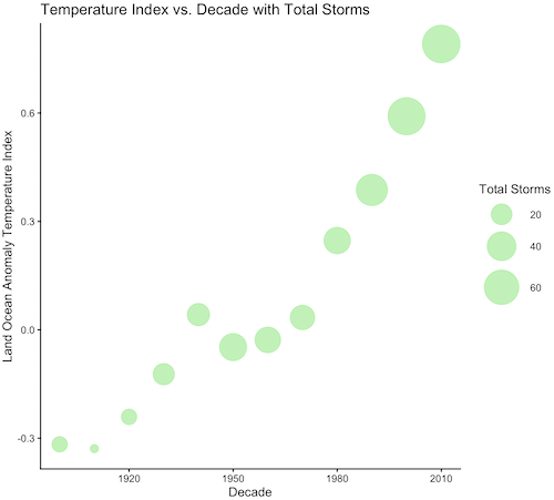
Figure 4. Bubble plot of association between total hurricanes and Land-Ocean Temperature Anomalies by Decade.
If you are interested in trying yourself, a bubble chart yourself, CO2 datas with the hurricane data set is a good candidate for a bubble plot.
Questions
-
Using the
plot()command, make the following graphs- One scatter plot for each category of storm by decade
- Explore the kinds of graph elements available by changing
pchvalues. Create your own - Change point size by changing valued for
cex
- Create a new plot with Decade on X axis, Temperature Index on first Y axis, and CO2 on the second Y axis.
- Include a legend for the plot.
- What is a Q-Q plot used for in statistics?
- Looking at the plot in Figure 5, explain why the confidence lines get further and further away from the straight line.
- What are some advantages and disadvantages of heat map for communicating data.
- What color pallet is considered “color-friendly” for accessible visualization?
- Create a table with three columns.
- In column 1, list the name for each graph type discussed in Chapter 5.
- In column 2, state the kind of data appropriate for each graph.
- In column 3, enter the name of a function in the base R package you can use to make the graph
- In column 4, enter the name of a function from the ggplot2 package you can use to make the graph
Quiz Chapter 4.6
Adding a second Y axis
Chapter 4 contents