14.4 – Randomized block design
Introduction
Randomized Block Designs and Two-Factor ANOVA
In previous lectures, we have introduced you to the standard factorial ANOVA, which may be characterized as being crossed, balanced, and replicated. We expect additional factors (covariates) may contribute to differences among our experimental units, but rather than testing them — which would increase need for additional experimental units because of increased number of groups to test — we randomize our subjects. Randomization is intended to disrupt trends of confounding variables (aka covariates). If the resulting experiment has missing values (see Chapter 5), then we can say that the design is partially replicated; if only one observation is made per group, then the design is not replicated — and perhaps, not very useful!!
A special type of Two-factor ANOVA which includes a “blocking” factor and a treatment factor.
Randomization is one way to control for “uninteresting” confounding factors. Clearly, there will be scenarios in which randomization is impossible. For example, it is impossible to randomly assign subjects to The blocking factor is similar to the 10.3 – Paired t-test. In the paired t-test we had two individuals or groups that we paired (e.g. twins). One specific design is called the Randomized Block Design and we can have more than 2 members in the group. We arrange the experimental units into similar groups, i.e., the blocking factor. Examples of blocking factors may include day (experiments are run over different days), location (experiments may be run at different locations in the laboratory), nucleic acid kits (different vendors), operator (different assistants may work on the experiments), etcetera.
In general we may not be directly interested in the blocking factor. This blocking factor is used to control some factor(s) that we suspect might affect the response variable. Importantly, this has the effect of reducing the sums of squares by an amount equal to the sums of squares for the block. If variability removed by the blocking is significant, Mean Square Error (MSE) will be smaller, meaning that the F for treatment will be bigger — meaning we have a more powerful ANOVA than if we had ignored the blocking.
Statistical Testing in Randomized Block Designs
“Blocks” is a Random Factor because we are “sampling” a few blocks out of a larger possible number of blocks. Treatment is a Fixed Factor, usually.
The statistical model is

The Sources of Variation are simpler than the more typical Two-Factor ANOVA because we do not calculate all the sources of variation – the interaction is not tested! (Table 1).
Table 1. Sources of variation for a two-way ANOVA, randomized block design
|
Sources of Variation & Sum of Squares
|
DF
|
Mean Squares
|
 |
 |
 |
 |
 |
 |
 |
 |
 |
 |
 |
 |

Critical Value F0.05(2), (a – 1), (Total DF – a – b)
In the exercise example above: Factor A = exercise or management plan.
Notice that we do not look at the interaction MS or the Blocking Factor (typically).
Learn by doing
Rather than me telling you, try on your own. We’ll begin with a worked example, then proceed to introduce you to three problems. Click here (Ch 14.8)for general discussion of Rcmdr and linear models for models other than the standard 2-way ANOVA (Chapter 14.8).
Worked example
Wheel running by mice is a standard measure of activity behavior. Even wild mice will use wheels (Meijer and Roberts 2014). For example, we conduct a study of family parity to see if offspring from the first, second, or third sets of births from wheel-running behavior in mice (total revs per 24 hr period). Each set of offspring from a female could be treated as a block. Data are for 3 female offspring from each pairing. This type of data set would look like this:
Table 2. Wheel running behavior by three offspring from each of three birth cohorts among four maternal sets (moms).
|
Revolutions of wheel per 24-hr period
|
||||
|
Block
|
Dam 1
|
Dam 2
|
Dam 3
|
Dam 4
|
|
b1
|
1100
|
1566
|
945
|
450
|
|
b1
|
1245
|
1478
|
877
|
501
|
|
b1
|
1115
|
1502
|
892
|
394
|
|
b2
|
999
|
451
|
644
|
605
|
|
b2
|
899
|
405
|
650
|
612
|
|
b2
|
745
|
344
|
605
|
700
|
|
b3
|
1245
|
702
|
1712
|
790
|
|
b3
|
1300
|
612
|
1745
|
850
|
|
b3
|
1750
|
508
|
1680
|
910
|
Thus, there were nine offspring for each female mouse (Dam1 – Dam4), three offspring per each of three litters of pups. The litters are the blocks. We need to get the data stacked to run in R. I’ve provided the dataset for you, scroll to end of this page or click here.
Question 1. Describe the problem and identify the treatment and blocking factors.
Answer. Each female has three litters. We’re primarily interested in genetics (and maternal environment) of wheel running behavior, which is associated with the moms (Treatment factor). The questions is whether there is an effect of birth parity on wheel running behavior. Offspring of a first-time mother may experience different environment than offspring of experienced mother. In this case, parity effects is an interesting question, nevertheless, blocking is the appropriate way to handle this type of problem.
Question 2. What is the statistical model?
Answer. Response variable, Y, is wheel running. Let α the effect of Dam and β the birth cohorts (i.e., the blocking effect).
Question 3. Test the model.
Answer. We fit the main effects, Dam and Block Fig 1.

Rcmdr: Statistics → Fit models → Linear model
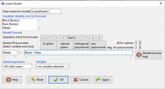
Figure 1. Screenshot Rcmdr Linear Model menu.
then run the ANOVA summary to get the ANOVA table. Rcmdr: Models → Hypothesis tests → ANOVA table.
Output
Anova Table (Type II tests)

Response: Wheel
           Sum Sq  Df  F value    Pr(>F)
Dam       1467020   3   4.4732   0.01036 *
Block     1672166   2   7.6482   0.00207 **
Residuals 3279544  30
Question 4. Conclusions?
Answer. The null hypotheses are:
Treatment factor: Offspring of the different dams have same wheel running activity of offspring.
Blocking factor: No effect of litter parity on wheel running activity of offspring.
Both the treatment factor (p = 0.01036) and the blocking factor (p = 0.00207) were statistically significant.
Try on your own
Problem 1.
Or we might want to measure the Systolic Blood Pressure of individuals that are on different exercise regimens. However, we are not able to measure all the individuals on the same day at the same time. We suspect that time of day and the day of the year might effect an individuals blood pressure. Given this constraint, the best research design in this circumstance is to measure one individual on each exercise regime at the same time. These different individuals will then be in the same “block” because they share in common the time that their blood pressure was measured. This type of data set would look like this (Table 2):
Table 2. Simulated blood pressure of five subjects on three different exercise regimens.†
|
Subject
|
No
Exercise |
Moderate Exercise
|
Intense Exercise
|
|
1
|
120
|
115
|
114
|
|
2
|
135
|
130
|
131
|
|
3
|
115
|
110
|
109
|
|
4
|
112
|
107
|
106
|
|
5
|
108
|
103
|
102
|
Let’s make a line graph to help us visualize trends (Fig 2).
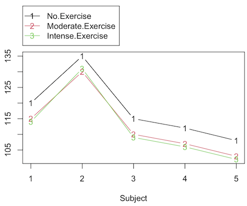
Figure 2. Line graph of data presented in Table 2.
Question 1. Describe the problem and identify the treatment and blocking factors.
Question 2. What is the statistical model?
Question 3. Test the model.
Question 4. Conclusions?
†You’ll need to arrange the data like the data set for the worked example.
Problem 2.
Another example in conservation biology or agriculture. There may be three different management strategies for promoting the recovery of a plant species. A good research design would be to choose many plots of land (blocks) and perform each treatment (management strategy) on a portion of each plot of land (block). A researcher would start with an equal number of plantings in the plots and see how many grew. The plots of land (blocks) share in common many other aspects of that particular plot of land that may effect the recovery of a species.
Table 3. Growth of plants in 5 different plots subjected to one of three management plans (simulated data set).†
|
Plot No.
|
No Management Used
|
Management
Plan 1 |
Management
Plan 2 |
|
1
|
0
|
11
|
14
|
|
2
|
2
|
13
|
15
|
|
3
|
3
|
11
|
19
|
|
4
|
4
|
10
|
16
|
|
5
|
5
|
15
|
12
|
†You’ll need to arrange the data the same arrangement as for the worked example.
These are examples of Two-Factor ANOVA but we are usually only interested in the treatment Factor. We recognize that the blocking factor may contribute to differences among groups and so wish to control for the fact that we carried out the experiments at different times (e.g., seasons) or at different locations (e.g., agriculture plots)
Question 1. Describe the problem and identify the treatment and blocking factors. Make a line graph to help visualize.
Question 2. What is the statistical model?
Question 3. Test the model.
Question 4. Conclusions?
Repeated-Measures Experimental Design
If multiple measures are taken on the same individual, then we have a repeated-measures experiment. This is a Randomized Block Design. In other words, each animal gets all levels of a treatment (assigned randomly). Thus, samples (individuals) are not independent and the analysis needs to take this into account. Just like for paired-T tests, one can imagine a number of experiments in biomedicine that would conform to this design.
Problem 3.
The data are total blood cholesterol levels for 7 individuals given 3 different drugs (from example given in Zar 1999, Ex 12.5, pp. 257-258).
Table 5. Repeated measures of blood cholesterol levels of seven subjects on three different drug regimens.†
|
Subjects
|
Drug1
|
Drug2
|
Drug3
|
|
1
|
164
|
152
|
178
|
|
2
|
202
|
181
|
222
|
|
3
|
143
|
136
|
132
|
|
4
|
210
|
194
|
216
|
|
5
|
228
|
219
|
245
|
|
6
|
173
|
159
|
182
|
|
7
|
161
|
157
|
165
|
†You’ll need to arrange the data like the data set for the worked example.
Question 1: Is there an interaction term in this design? Make a line graph to help visualize.
Question 2: Are individuals a fixed or a random effect?
Question 2. What is the statistical model?
Question 3. Test the model. Note that we could have done the experiment with 21 randomly selected subjects and a one-factor ANOVA. However, the repeated measures design is best IF there is some association (“correlation”) between the data in each row. The computations are identical to the randomized block analysis.
Question 4. Conclusions?
Problem 4.

Figure 3. Juvenile garter snake, image from GetArchive, public domain.
Here is a second example of a repeated measures design experiment. Garter snakes (Fig 3) respond to odor cues to find prey. Snakes use their tongues to “taste” the air for chemicals, and flick their tongues rapidly when in contact with suitable prey items, less frequently for items not suitable for prey. In the laboratory, researchers can test how individual snakes respond to different chemical cues by presenting each snake with a swab containing a particular chemical. The researcher then counts how many times the snake flicks its tongue in a certain time period (data presented p. 301, Glover and Mitchell 2016).
Table 6. Tongue flick counts of naïve newborn snakes to extracts†
|
Snake
|
Control (dH2O)
|
Fish mucus
|
Worm mucus
|
|
1
|
3
|
6
|
6
|
|
2
|
0
|
22
|
22
|
|
3
|
0
|
12
|
12
|
|
4
|
5
|
24
|
24
|
|
5
|
1
|
16
|
16
|
|
6
|
2
|
16
|
16
|
†You’ll need to arrange the data like the data set for the worked example.
Question 1. Describe the problem and identify the treatment and blocking factors. Make a line graph to help visualize.
Question 2. What is the statistical model?
Question 3. Test the model.
Question 4. Conclusions?
Additional questions
- The advantage of a randomized block design over a completely randomized design is that we may compare treatments by using ________________ experimental units.
A. randomly selected
B. the same or nearly the same
C. independent
D. dependent
E. All of the above - Which of the following is NOT found in an ANOVA table for a randomized block design?
A. Sum of squares due to interaction
B. Sum of squares due to factor 1
C. Sum of squares due to factor 2
D. None of the above are correct - A clinician wishes to compare the effectiveness of three competing brands of blood pressure medication. She takes a random sample of 60 people with high blood pressure and randomly assigns 20 of these 60 people to each of the three brands of blood pressure medication. She then measures the decrease in blood pressure that each person experiences. This is an example of (select all that apply)
A. a completely randomized experimental design
B. a randomized block design
C. a two-factor factorial experiment
D. a random effects or Type II ANOVA
E. a mixed model or Type III ANOVA
F. a fixed effects model or Type I ANOVA - A clinician wishes to compare the effectiveness of three competing brands of blood pressure medication. She takes a random sample of 60 people with high blood pressure and randomly assigns 20 of these 60 people to each of the three brands of blood pressure medication. She then measures the blood pressure before treatment and again 6 weeks after treatment for each person. This is an example of (select all that apply)
A. a completely randomized experimental design
B. a randomized block design
C. a two-factor factorial experiment
D. a random effects or Type II ANOVA
E. a mixed model or Type III ANOVA
F. a fixed effects model or Type I ANOVA
Data sets used in this page
Problem 1 data set
| Block | Dam | Wheel |
| B1 | D1 | 1100 |
| B1 | D2 | 1566 |
| B1 | D3 | 945 |
| B1 | D4 | 450 |
| B1 | D1 | 1245 |
| B1 | D2 | 1478 |
| B1 | D3 | 877 |
| B1 | D4 | 501 |
| B1 | D1 | 1115 |
| B1 | D2 | 1502 |
| B1 | D3 | 892 |
| B1 | D4 | 394 |
| B2 | D1 | 999 |
| B2 | D2 | 451 |
| B2 | D3 | 644 |
| B2 | D4 | 605 |
| B2 | D1 | 899 |
| B2 | D2 | 405 |
| B2 | D3 | 650 |
| B2 | D4 | 612 |
| B2 | D1 | 745 |
| B2 | D2 | 344 |
| B2 | D3 | 605 |
| B2 | D4 | 700 |
| B3 | D1 | 1245 |
| B3 | D2 | 702 |
| B3 | D3 | 1712 |
| B3 | D4 | 790 |
| B3 | D1 | 1300 |
| B3 | D2 | 612 |
| B3 | D3 | 1745 |
| B3 | D4 | 850 |
| B3 | D1 | 1750 |
| B3 | D2 | 508 |
| B3 | D3 | 1680 |
| B3 | D4 | 910 |
Chapter 14 contents
12.3 – Fixed effects, random effects, and agreement
Introduction
Within discussions of one-way ANOVA models the distinction between two general classes of models needs to be made clear by the researcher. The distinction lies in how the levels of the factor are selected. If the researcher selects the levels, then the model is a Fixed Effects Model, also called a Model I ANOVA. On the other hand, if the levels of the factor were selected by random sampling from all possible levels of the factor, then the model is a Random Effects Model, also called a Model II ANOVA. This page is about such models and I’ll introduce the intraclass correlation coefficient, abbreviated as ICC, as a way to illustrate applications of Model II ANOVA.
Here’s an example to help the distinction. Consider an experiment to see if over the counter painkillers are as good as prescription pain relievers at reducing numbers of migraines over a six week period. The researcher selects Tylenol®, Advil®, Bayer® Aspirin, and Sumatriptan (Imitrex®), the latter an example of a medicine only available by prescription. This is clearly an example of fixed effects; the researcher selected the particular medicines for use.
Random effects, in contrast, implies that the researcher draws up a list of all over the counter pain relievers and draws at random three medicines; the researcher would also randomly select from a list of all available prescription medicines.
Fixed effects are probably the more common experimental approaches. To be complete, there is a third class of ANOVA called a Mixed Model or Model III ANOVA, but this type of model only applies to multidimensional ANOVA (e.g., two-way ANOVA or higher), and we reserve our discussion of the Model III until we discuss multidimensional ANOVA (Table 1).
Table 1. ANOVA models
| ANOVA model | Treatments are |
| I | Fixed effects |
| II | Random effects |
| III | Mixed, both fixed & random effects |
Although the calculations for the one-way ANOVA under Model I or Model II are the same, the interpretation of the statistical significance is different between the two.
In Model I ANOVA, any statistical difference applies to the differences among the levels selected, but cannot be generalized back to the population. In contrast, statistical significance of the Factor variable in Model II ANOVA cannot be interpreted as specific differences among the levels of the treatment factor, but instead, apply to the population of levels of the factor. In short, Model I ANOVA results apply only to the study, whereas Model II ANOVA results may be interpreted as general effects, applicable to the population.
This distinction between fixed effects and random effects can be confusing, but it has broad implications for how we interpret our results in the short-term. This conceptual distinction between how the levels of the factor are selected also has general implications for our ability to acquire generalizable knowledge by meta-analysis techniques (Hunter and Schmidt 2000). Often we wish to generalize our results: we can do so only if the levels of the factor were randomly selected in the first place from all possible levels of the factor. In reality, this may not often be the case. It is not difficult to find examples in the published literature in which the experimental design is clearly fixed effects (i.e., the researcher selected the treatment levels for a reason), and yet in the discussion of the statistical results, the researcher will lapse into generalizations.
Random Effects Models and agreement
Model II ANOVA is common in settings in which individuals are measured more than once. For example, in behavioral science or in sports science, subjects are typically measured for the response variable more than once over a course of several trials. Another common setting of Model II ANOVA is where more than one raters are judging an event or even a science project. In all of these cases what we are asking is about whether or not the subjects are consistent, in other words, we are asking about the precision of the instrument or measure.
In the assessment of learning by students, for example, different approaches may be tried and the instructor may wish to investigate whether the interventions can explain changes in test scores. To assess instrument validity — an item score from a grading rubric (Goertzen and Klaus 2023), tumor budding as biomarker for colorectal cancer (Bokhorst et al 2020) — agreement or concordance among two or more raters or judges (inter-rater reliability) needs to be established (same citations and references therein). For binomial data, we would be tempted to use the phi coefficient, Is it actually reliable Cohen’s kappa (two judges) or Fleiss Kappa (two or more judges) is a better tool. Phi coefficient and both assessment scores were introduced in Chapter 9.2.
For ratio scale data, agreement among scores of two or more scores from judges There is an enormous number of articles on reliability measures in the social sciences and you should be aware of a classical paper on reliability by Shrout and Fleiss (1979) (see also McGraw and Wong, 1996). Both the ICC and the Pearson product moment correlation, r, which we will introduce in Chapter 16, are measures of strength of linear association between two ratio scale variables (Jinyuan et al 2016). But ICC is more appropriate for association between repeat measures of the same thing, e.g., repeat measures of running speed or agreement between judges. In contrast, the product moment correlation can be used to describe association between any two variables, e.g., between repeat measures of running speed, but also between say running speed and maximum jumping height. The concept of repeatability of individual behavior or other characteristics is also a common theme in genetics and so you should not be surprised to learn that the concept actually traces to RA Fisher and his invention of ANOVA. Just as in the case of the sociology literature, there are many papers on the use and interpretation of repeatability in the evolutionary biology literature (e.g., Lessels and Boag 1987; Boake 1989; Falconer and Mackay 1996; Dohm 2002; Wolak et al 2012).
There are many ways to analyze these kinds of data but a good way is to treat this problem as a one-way ANOVA with Random Effects. Thus, the Random Effects model permits the partitioning of the variation in the study into two portions: the amount that is due to differences among the subjects or judges or intervention versus the amount that is due to variation within the subjects themselves. The Factor is the Subjects and the levels of the factor are how ever many subjects are measured twice or more for the response variable.
If the subjects performance is repeatable, then the Mean Square Between (Among) Subjects,  , component will be greater than the Mean Square Error component,
  , of the model. There are many measures of repeatability or reliability, but the intraclass correlation coefficient or ICC is one of the most common. The ICC may be calculated from the Mean Squares gathered from a Random Effects one-way ANOVA. ICC can take any value between zero and one.

where

and

B and W refers to the among group (between or among groups mean square) and the within group components of variation (error mean square), respectively, from the ANOVA, MS refers to the Mean Squares, and k is the number of repeat measures for each experimental unit. In this formulation k is assumed to be the same for each subject.
By example, when a collection of sprinters run a race, if they ran it again, would the outcome be the same, or at least predictable? If the race is run over and over again and the runners cross the finish lines at different times each race, then much of the variation in performance times will be due to race differences largely independent of any performance abilities of the runners themselves and the Mean Square Error term will be large and the Between subjects Mean Square will be small. In contrast, if the race order is preserved race after race: Jenny is 1st, Ellen is 2nd, Michael is third, and so on, race after race, then differences in performance are largely due to individual differences. In this case, the Between-subjects Mean Square will be large as will the ICC, whereas the Mean Square for Error will be small, and so will the ICC.
Can the intraclass correlation be negative?
In theory, no. Values for ICC range between zero and one. The familiar Pearson product moment correlation, Chapter 16, takes any value between -1 and +1. However, in practice, negative values for ICC will result if  .
.
In other words, if the within group variability is greater than the among group variability, then negative ICC are possible. The question is whether negative estimates are ever biologically relevant or, simply result of limitations of the estimation procedure. Small ICC values and few repeats increases the risk of negative ICC estimates. Thus, a negative ICC would be “simply a(n) “unfortunate” estimate (Liljequist et al 2019). However, there may be situations in which negative ICC is more than unfortunate. For example, repeatability, a quantitative genetics concept (Falconer and Mackay 1996), can be negative (Nakagawa and Schielzeth 2010).

Repeatability reflects the consistency of individual traits over time (or spatially, e.g., scales on on a snake), is defined as the ratio of within individual differences and among individuals differences. Thus, within individual variance is attributed to general environmental effects,  , whereas variance among individuals is both genetic and environmental. Scenarios for which repeated measures on the same individual may occur under environmental conditions, termed specific environmental effects or
  by Falconer and Mackay (1996), that negatively affect performance are not hard to imagine — it remains to be determined how common these conditions are and whether or not estimates of repeatability are negative.
ICC Example
I extracted 15 data points from a figure about nitrogen metabolism in kidney patients following treatment with antibiotics (Figure 1, Mitch et al 1977). I used a web application called WebPlot Digitizer (https://apps.automeris.io/wpd/), but you can also accomplish this task within R via the digitize package. I was concerned about how steady my hand was using my laptop’s small touch screen, a problem that very much can be answered by thinking statistically, and taking advantage of the ICC. So, rather than taking just one estimate of each point I repeated the protocol for extracting the points from the figure three times generating a total of three points for each of the 15 data points or 45 points in all. How consistent was I?
Let’s look at the results just for three points, #1, 2, and 3.
In the R script window enter
points = c(1,2,3,1,2,3,1,2,3)
Change points to character so that the ANOVA command will treat the numbers as factor levels.
points = as.character(points)
extracts = c(2.0478, 12.2555, 16.0489, 2.0478, 11.9637, 16.0489, 2.0478, 12.2555, 16.0489)
Make a data frame, assign to an object, e.g., “digitizer”
digitizer = data.frame(points, extracts)
The dataset “digitizer” should now be attached and available to you within Rcmdr. Select digitizer data set and proceed with the one-way ANOVA.
Output from oneway ANOVA command
Model.1 <- aov(extracts ~ points, data=digitizer)

 summary(Model.1)
            Df    Sum Sq   Mean Sq  F value     Pr(>F)
points       2 313.38895 156.69448 16562.49 5.9395e-12 ***
Residuals    6   0.05676   0.00946
---
Signif. codes:  0 '***' 0.001 '**' 0.01 '*' 0.05 '.' 0.1 ' ' 1

numSummary(digitizer$extracts , groups=digitizer$points,
+   statistics=c("mean", "sd"))
         mean           sd data:n
1  2.04780000 0.0000000000      3
2 12.15823333 0.1684708085      3
3 16.04890000 0.0000000000      3
End R output. We need to calculate the ICC

I’d say that’s pretty repeatable and highly precise measurement!
But is it accurate? You should be able to disentangle accuracy from precision based on our previous discussion (Chapter 3.5), but now in the context of a practical way to quantify precision.
ICC calculations in R
We could continue to calculate the ICC by hand, but better to have a function. Here’s a crack at the function to calculate ICC along with a 95% confidence interval.
myICC <- function(m, k, dfN, dfD) {
 testMe <- anova(m)
 MSB <- testMe$"Mean Sq"[1]
 MSE <- testMe$"Mean Sq"[2]
 varB <- MSB - MSE/k
 ICC <- varB/(varB+MSE)
 fval <- qf(c(.025), df1=dfN, df2=dfD, lower.tail=TRUE)
 CI = (k*MSE*fval)/(MSB+MSE*(k-1)*fval)
 LCIR = ICC-CI
 UCIR = ICC+CI
 myList = c(ICC, LCIR, UCIR)
 return(myList)
}
The user supplies the ANOVA model object (e.g., Model.1 from our example), k, which is the number of repeats per unit, and degrees of freedom for the among groups comparison (2 in this example), and the error mean square (6 in this case). Our example, run the function
m2ICC = myICC(Model.1, 3, 2,6); m2ICC
and R returns
[1] 0.9999396 0.9999350 0.9999442
with the ICC reported first, 0.9999396, followed by the lower limit (0.9999350) and the upper limit (0.9999442) of the 95% confidence interval.
In lieu of your own function, at several packages available for R will calculate the intraclass correlation coefficient and its variants. These packages are: irr, psy, psych, and rptR. For complex experiments involving multiple predictor variables, these packages are helpful for obtaining the correct ICC calculation (cf Shrout and Fleiss 1979; McGraw and Wong 1996). For the one-way ANOVA it is easier to just extract the information you need from the ANOVA table and run the calculation directly. We do so for a couple of examples.
Example: Are marathon runners consistent more consistent than my commute times?
A marathon is 26 miles, 385 yards (42.195 kilometers) long (World Athletics.org). And yet, tens of thousands of people choose to run in these events. For many, running a marathon is a one-off, the culmination of a personal fitness goal. For others, its a passion and a few are simply extraordinary, elite runners who can complete the courses in 2 to 3 hours (Table 3). That’s about 12.5 miles per hour. For comparison, my 20 mile commute on the H1 freeway on Oahu typically takes about 40 minutes to complete, or 27 miles per hour (Table 2, yes, I keep track of my commute times, per Galton’s famous maxim: “Whenever you can, count”).
Table 2. A sampling of commute speeds, miles per hour (mph), on the H1 freeway during DrD’s morning commute
| Week | Monday | Tuesday | Wednesday | Thursday | Friday |
| 1 | 28.5 | 23.8 | 28.5 | 30.2 | 26.9 |
| 2 | 25.8 | 22.4 | 29.3 | 26.2 | 27.7 |
| 3 | 26.2 | 22.6 | 24.9 | 24.2 | 34.3 |
| 4 | 23.3 | 26.9 | 31.3 | 26.2 | 30.2 |
Calculate the ICC for my commute speeds.
Run the one-way ANOVA to get the necessary mean squares and input the values into our ICC function. We have
require(psych)
m2ICC = myICC(AnovaModel.1, 4, 4,11); m2ICC
[1] 0.7390535 0.6061784 0.8719286
Repeatability, as estimated by the ICC, was 0.74 (95% CI 0.606, 0.872), for repeat measures of commute times.
We can ask the same about marathon runners — how consistent from race to race are these runners? The following data are race times drawn from a sample of runners who completed the Honolulu Marathon in both 2016 and 2017 in 2 to 3 hours (times recorded in minutes). In other words, are elite runners consistent?
Table 3. Honolulu marathon running times (min) for eleven repeat, elite runners.
| ID | Time |
|---|---|
| P1 | 179.9 |
| P1 | 192.0 |
| P2 | 129.9 |
| P2 | 130.8 |
| P3 | 128.5 |
| P3 | 129.6 |
| P4 | 179.4 |
| P4 | 179.7 |
| P5 | 174.3 |
| P5 | 181.7 |
| P6 | 177.2 |
| P6 | 176.2 |
| P7 | 169.0 |
| P7 | 173.4 |
| P8 | 174.1 |
| P8 | 175.2 |
| P9 | 175.1 |
| P9 | 174.2 |
| P10 | 163.9 |
| P10 | 175.9 |
| P11 | 179.3 |
| P11 | 179.8 |
Stacked worksheet, P refers to person, therefore P1 is person ID 1, P2 is person ID 2, and so on.
After running a one-way ANOVA, here are results for the marathon runners
m2ICC = myICC(Model.1, 2, 10,11); m2ICC
[1] 0.9780464 0.9660059 0.9900868
Repeatability, as estimated by the ICC, was 0.98 (95% CI 0.966, 0.990), for repeat measures of marathon performance. Put more simply, knowing what a runner did in 2016 I would be able to predict their 2017 race performance with high confidence, 98%!
And now, we compare: the runners are more consistent!
Clearly this is an apples-to-oranges comparison, but it gives us a chance to think about how we might make such comparisons. The ICC will change because of differences among individuals. For example, if individuals are not variable, then xx too little variation.
Visualizing repeated measures
If just two measures, then a profile plot will do. We introduced profile plots in the paired t-test chapter (Ch10.3). For more than two repeated measures, a line graph will do (see question 9 below). Another graphic increasingly used is the waterfall plot (waterfall chart), particularly for before and after measures or other comparisons against a baseline. For example, it’s a natural question for our eleven marathon runners — how much did they improve on the second attempt of the same course? Figure 2 shows my effort to provide a visual.
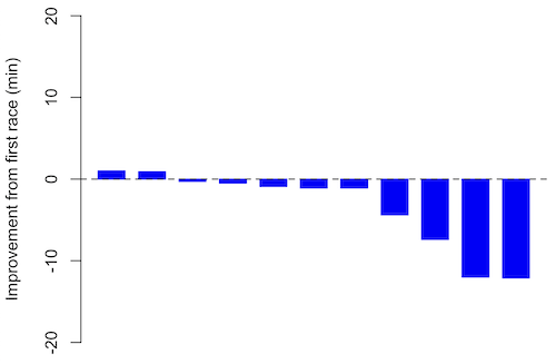
Figure 1. Simple waterfall plot or race improvement for Table 3 data. Dashed horizontal line at zero.
R code
Data wrangling: Create a new variable, e.g., race21, by subtracting the first time from the second time. Multiply by -1 so that improvement (faster time in second race) is positive. Finally, apply descending sort so that improvement is on the left and increasingly poorer times are on the right.
barplot(base21, col="blue", border="blue", space=0.5, ylim=c(-20,20),ylab="Improvement from first race (min)")
abline(h=0, lty=2)
From the graph we quickly see that few of the racers improved their times the second time around.
An example for you to work, from our Measurement Day
If you recall, we had you calculate length and width measures on shells from samples of gastropod and bivalve species. In the table are repeated measures of shell length, by caliper in mm, for a sample of Conus shells (Fig 2 and Table 4).
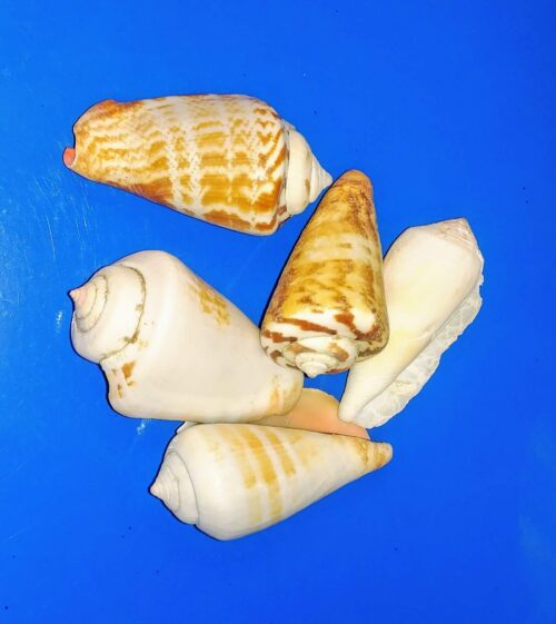
Figure 2. Conus shells, image by M. Dohm
Repeated measures of the same 12 Conus shells.
Table 4. Unstacked dataset of repeated length measures on 12 shells
| Sample | Measure1 | Measure2 | Measure3 |
|---|---|---|---|
| 1 | 45.74 | 46.44 | 46.79 |
| 2 | 48.79 | 49.41 | 49.67 |
| 3 | 52.79 | 53.45 | 53.36 |
| 4 | 52.74 | 53.14 | 53.14 |
| 5 | 53.25 | 53.45 | 53.15 |
| 6 | 53.25 | 53.64 | 53.65 |
| 7 | 31.18 | 31.59 | 31.44 |
| 8 | 40.73 | 41.03 | 41.11 |
| 9 | 43.18 | 43.23 | 43.2 |
| 10 | 47.1 | 47.64 | 47.64 |
| 11 | 49.53 | 50.32 | 50.24 |
| 12 | 53.96 | 54.5 | 54.56 |
Maximum length from from anterior end to apex with calipers. Repeated measures were conducted blind to shell id, sampling was random over three separate time periods.
Questions
- Consider data in Table 2, Table 3, and Table 4. True or False: The arithmetic mean is an appropriate measure of central tendency. Explain your answer.
- Enter the shell data into R; Best to copy and stack the data in your spreadsheet, then import into R or R Commander. Once imported, don’t forget to change Sample to character, otherwise R will treat Sample as ratio scale data type. Run your one-way ANOVA and calculate the intraclass correlation (ICC) for the dataset. Is the shell length measure repeatable?
- True or False. A fixed effects ANOVA implies that the researcher selected levels of all treatments.
- True or False. A random effects ANOVA implies that the researcher selected levels of all treatments.
- A clinician wishes to compare the effectiveness of three competing brands of blood pressure medication. She takes a random sample of 60 people with high blood pressure and randomly assigns 20 of these 60 people to each of the three brands of blood pressure medication. She then measures the decrease in blood pressure that each person experiences. This is an example of (select all that apply)
A. a completely randomized experimental design
B. a randomized block design
C. a two-factor factorial experiment
D. a random effects or Type II ANOVA
E. a mixed model or Type III ANOVA
F. a fixed effects model or Type I ANOVA - A clinician wishes to compare the effectiveness of three competing brands of blood pressure medication. She takes a random sample of 60 people with high blood pressure and randomly assigns 20 of these 60 people to each of the three brands of blood pressure medication. She then measures the blood pressure before treatment and again 6 weeks after treatment for each person. This is an example of (select all that apply)
A. a completely randomized experimental design
B. a randomized block design
C. a two-factor factorial experiment
D. a random effects or Type II ANOVA
E. a mixed model or Type III ANOVA
F. a fixed effects model or Type I ANOVA - The advantage of a randomized block design over a completely randomized design is that we may compare treatments by using ________________ experimental units.
A. randomly selected
B. the same or nearly the same
C. independent
D. dependent
E. All of the above - The marathon results in Table 2 are paired data, results of two races run by the same individuals. Make a profile plot for the data (see Ch10.3 for help).
- A profile plot is used to show paired data; for two or more repeat measures, use a line graph instead.
A. Produce a line graph for data in Table 4. The line graph is an option in R Commander (Rcmdr: Graphs Line graph…), and can be generated with the following simple R code:
lineplot(Sample, Measure1, Measure2, Measure3)
B. What trends, if any, do you see? Report your observations.
C. Make another line plot for data in Table 2. Report any trend and include your observations.
Chapter 12 contents
- Introduction
- The need for ANOVA
- One way ANOVA
- Fixed effects, random effects, and agreement
- ANOVA from “sufficient statistics”
- Effect size for ANOVA
- ANOVA posthoc tests
- Many tests one model
- References and suggested readings
6.2 – Ratios and probabilities
Introduction
Let’s define our terms. An event is some occurrence. As you know, a ratio is one number, the numerator, divided by another called the denominator. A proportion is a ratio where the numerator is a part of the whole. A rate is a ratio of the frequency of an event during a certain period of time. A rate may or may not be a proportion, and a ratio need not be a proportion, but proportions and rates are all kinds of ratios. If we combine ratios, proportions, and/or rates, we construct an index.
Ratios
Yes, data analysis can be complicated, but we start with this basic idea. Much of the statistics is based on frequency measures, e.g., ratios, rates, proportions, indexes, and scales.
Ratios are the association between two numbers, one random variable divided by another. Ratios are used as descriptors and the numerator and denominator do not need to be of the same kind. Business and economics are full of ratios. For example, Return on investment (ROI), eg, earnings equals net income divided by number of shares outstanding, the Price-Earnings, or P/E ratio, is the ratio of the price of a stock to the earnings per stock, as well as many others are used to summarize performance of a business, and to compare performance of one business against another.
Note 1: ROI also stands for region of interest — a sample in a data set identified by the analyst for a particular interest. Often refers to a specific area in an image.
Ratios are deceptively convenient way to standardize a variable for comparisons, i.e., how many times one number contains another. For example, when estimating bird counts for different areas, or different birding effort (intensity, time searched), we may correct counts by accounting for area in which counts were made or the total time spent counting, for a per-unit ratio (Liermann et al 2004).
Practice: There were 1,326 day undergraduate students enrolled in 2014 at Chaminade University of Honolulu and the Sullivan Library added 8469 new items (ebooks, journals, etc.,) to its collection during 2014. What is the ratio of new items per student?

Data collected from Chaminade University website at www.chaminade.edu on 3 July 2014.
Practice: For another example, what is ratio of annual institutional aid a student at Chaminade University may expect to receive compared to a student at Hawaii Pacific University?

Thus, in 2014, Chaminade offered more than twice the institutional aid to its students then does HPU (both institutions are private universities, data from retrieved on 3 July 2014 from www.cappex.com).
Fold-change
The ratio between two quantities, e.g., to compare mRNA expression levels of genes from organisms exposed to different conditions, researchers may report fold-change.
An example of calculation of fold change. Rates of the expression from cells exposed to heavy metal divided by expression under basal conditions. Gene expression under different treatments may be evaluated by calculating fold-change as the log base2 of the ratio of expression of a gene for one treatment divided by expression of same gene from control conditions. Copper is an essential trace element, but excess exposure to copper is known to damage human health, including chronic obstructive pulmonary disease. One proposed mechanism is that cell injury promotes an epithelial-to-mesenchyme shift. In a pilot study we investigated gene expression changes by quantitative real-time polymerase chain reaction (qPCR) in a rat lung Type II alveolar cell line exposed to copper sulfate compared to unexposed cells. Record cycle threshold values, CT, for each gene, where CT is number of cycles required for the fluorescent signal to exceed background levels; CT is inversely proportional to amount of cDNA (mRNA) in the sample. Genes investigated were ECAD, FOXC2, NCAD, SMAD, SNAI1, TWIST, and VIM, with ATCB as reference gene. ECAD expression is marker of epithelial cells, whereas FOXC2, NCAD, SNAI1, TWIST, and VIM expression marker of mesenchymal cells. After calculating  values, geometric means of normalized values of three replicates each are shown in Table 1.
Note 2: Logarithm transform was used because gene expression levels vary widely on the original scale and any log-transform will reduce the variability. log-base 2 specifically was used for fold-change in particular because it is easy to interpret and provides symmetry (all log-transforms provide this symmetry). For example, log(1/2, 2) returns -1, while log(2/1, 2) returns +1. Thus, base 2, we see a decrease by half or doubling of original scale is a fold change of  . In contrast,
 log(1/2, 10) returns -0.301, while log(2/1, 10) returns +0.301.
Table 1. Mean and fold change of gene expression values from qPCR for several genes from a rat lung cell line.
| Control | Copper-sulfate | Fold change | |
| ECAD | 34.6 | 35.7 | 0.6 |
| NCAD | 28.5 | 24.0 | 27.2 |
| SMAD | 29.5 | 25.0 | 28.2 |
| SNAI1 | 25.5 | 28.1 | 0.2 |
| FOXC2 | 27.6 | 27.0 | 1.9 |
| VIM | 23.1 | 16.4 | 134.4 |
| TWIST | 25.1 | 22.9 | 5.6 |
At face value, following four hour exposure to copper sulfate in media, some evidence that the epithelial cell line adopted gene expression profile of mesenchyme-like cells. However, weakness of fold-change is clear from Table 1: the quantity is sensitive to small values. ECAD expression in the cell line is low, thus high numbers of PCR cycles (mean = 36) and treated cells not much fewer (mean = 34.4).
Note 3: Calculation of is included. Geomean CT were
| Control | CuSO4 | |
| ACTB | 32.2 | 32.5 |
| NCAD | 28.5 | 24.0 |
For control cells, 
For treatment cells, 
and 
log2, 
table value differs by rounding
Rates
Rates are a class of ratios in which the denominator is some measure of time. For example, the four year graduation rate of some Hawaii universities are shown in Table 2.
Table 2. Percent students graduation with bachelor’s degrees within four years or six years (cohort 2014, data source NCES.ed.gov)
| School | Private/Public | Four-year, Percent graduation |
Six-year, Percent graduation |
| Chaminade University | Private (non-profit) | 43 | 58 |
| Hawaii Pacific University | Private (non-profit) | 31 | 46 |
| University of Hawaii – Hilo | Public | 15 | 38 |
| University of Hawaii – Manoa | Public | 35 | 62 |
| University of Hawaii – West Oahu | Public | 16 | 39 |
| University of Phoenix | Private (for profit) | 0 | 19 |
Examples of rates
Rates are common in biology. To name just a few
- Basal metabolic rate (BMR), often measured by indirect calorimetry, reported in units kilo Joules per hour.
- Birth and death rates, components of population growth rate.
- Phred quality score, error rates of incorrectly called nucleotide bases by the sequencer
- Growth rate, which may refer to growth of the individual (somatic growth rate), or increase of number of individuals in a population per unit time
- Molecular clock hypothesis, rate of amino acid (protein) or nucleotide (DNA) substitution is approximately constant per year over evolutionary time.
Proportions
Proportions are also ratios, but they are used to describe one part to the whole. For example, 902 women (self-reported) day undergraduate students enrolled in 2014 at Chaminade University in Honolulu, Hawaii.
Practice: Given that the total enrollment for Chaminade in 2014 was of 1,326, calculate the proportion of female students to the total student body.

More practice: A common statistic in agriculture is germination percentage, count the number of seeds that sprout over a period of time divided by total number of seeds planted multiplied by 100. Figure 1 shows an example of a germination trial for five tomato seeds. Seed in position 3 (left to right 1 – 5) failed to germinate, whereas the other four seeds display range of seedling growth. (A seed coat is observed next to plant 2.)

Figure 1. Example planting of five tomato seeds, day 5, on agar Petri dish (M. Dohm).
Observations conducted over 10 days. Germination defined as evidence of radicle by day 10. Data collected by student for biostatistics project. A random sample of results from three plates is presented in Table 3.
Table 3. Germination of tomato seeds on agar Petri dishes.
| Plate* | 1 | 2 | 3 | 4 | 5 |
| 18 | Yes | No | Yes | Yes | Yes |
| 13 | Yes | Yes | Yes | No | Yes |
| 20 | No | Yes | Yes | Yes | Yes |
* Random sample of three plates drawn from among 30 plates.
We calculate the percent germination for the 15 seeds planted as

Thus, for the sample of plates the germination percent was 80%, which, coincidently, is the same result if germination percent was calculated for the five seeds displayed in Figure 1.
Comparing proportions
In some cases you may wish to compare two proportions or two ratios. The hypothesis tested is the difference between the two ratios, and the test is if the confidence interval of the difference includes zero. If it does, then we would conclude there is no statistical difference between the two proportions. In R, use the prop.test function. For example, 63 women were on team sport rosters at Chaminade in 2014, a proportion of 59% of all student athletes (n = 106). Recall from the example above that women were 68% of all students at Chaminade University. Title IX compliance requires that a university “maintain policies, practices and programs that do not discriminate against anyone on the basis of gender” (NCAA, http://www.ncaa.org/about/resources/inclusion/title-ix-frequently-asked-questions). In terms of athletic programs, then, universities are required to provide participation opportunities for women and men that are substantially proportionate to their respective rates of enrollment of full-time undergraduate students (NCAA, http://www.ncaa.org/about/resources/inclusion/title-ix-frequently-asked-questions)
Consider Chaminade University: Is there a statistical difference between proportion of women athletes and their proportion of total enrollment? We introduce statistical inference in Chapter 8, but for now, this is a test of the null hypothesis that the difference between the two proportions is zero.
At the R prompt type (remember, anything after the # sign is a comment and ignored by R).
women = c(62,902)  #where 62 is the number of women athletes and 902 is the number of women students
students = c(106,1326)  #106 is the number of student athletes and 1326 is all students
prop.test(women,students)  #the default is a two-tailed test, i.e., no group differences
And R returns
2-sample test for equality of proportions with continuity correction
 data: women out of students
X-squared = 3.6331, df = 1, p-value = 0.05664
alternative hypothesis: two.sided
95 percent confidence interval:
 -0.197532407 0.006861073
sample estimates:
 prop 1 prop 2
0.5849057 0.6802413
What is the conclusion of the test?
When you compare two groups, you’re asking whether the two groups are equal (the null hypothesis). Mathematically, that’s the same as saying the difference between the two groups is equal to zero.
First check the lower and upper limits of the confidence interval. A confidence interval is one way to report a range of plausible values for an estimate (see Ch 7.6 – Confidence intervals). It’s called a confidence interval because a probability is assigned to the range of values; a 95% confidence interval is interpreted as we’re 95% certain the true population value is somewhere between the reported limits. For our Chaminade University Title IX question, recall that we are asking whether the value of zero is included. The lower limit was -0.1975 and some change; the upper limit was 0.0068 and some change. Thus, zero is included and we would conclude that there was no statistical difference between the two proportions.
The second relevant output to look at is the p-value, or probability value. If the p-value is less than 5%, we typically reject the tested hypothesis. We will talk more about p-values and their relationship to inference testing in Chapter 8; for now, pay attention to the confidence interval (introduced in Chapter 3.4); if zero is included, then we conclude no substantial differences between the two proportions.
Relative change
It’s common practice to report on the amount of change between two quantities recorded over time. Relative change in root length b
To make percent increase (decrease), simply multiple 100%.
(1) 
Indexes
Indexes are composite statistics that combine indicators. Indexes are common in business and economics, eg, Dow Jones Industrial average combines stock prices from 30 companies listed on the New York Stock Exchange and the CPI, or Consumer Protection Index, constructed by the US Bureau of Labor Statistics from a “market basket of consumer goods and services, used by the government and other institutions to track inflation. The CPI itself is made up of numerous indexes to account for regional price differences and other factors.
Some indexes presented in this book include
- Grade point average
- Body Mass Index (BMI)
- Comet assay indexes (tail intensity, tail length, tail moment) are used to assess DNA damage among organisms exposed to environmental contaminants (e.g., Mincarelli et al., 2019).
- Encephalization index, ratio of brain to body weight among species. Used to compare cognitive abilities.
Scales
Agreement scales for surveys, e.g., Likert scale or sliding scale (Sullivan and Artino 2013). For example, after learning about Theranos, students were asked:
How serious is this violation in your opinion?
| Not serious
0 |
Slightly serious
0 |
Moderately serious
2 |
Serious
4 |
Very serious
19 |
a 5-point scale.
Although an intuitive measure, how fast can an individual run, challenging to determine whether individual’s performance is at physiological maximum. Particularly for measures of performance capacity that involves behavior (motivation), may apply a race quality scale (eg., binary scale “good” or “bad” Husak et al 2006).
These examples reflect ordinal scales. Many of the nonparametric tests discussed in Chapter 15 are suitable for analysis of scales.
Limitations of ratios
Although the indexes may be easy to communicate, statistically, indexes have many drawbacks. Chief among these, variation in ratios may be due to change in numerator or denominator. Ratios and any index calculated by combining ratios seem simple enough, but have complicated statistical properties. Over the years, several authors have made critical suggestions for use of ratios and indexes. Some key references are Packard and Boardman (1988), Jasienski and Oikos (1999), Nee et al (2005), and Karp et al (2012). For example, ratios, computing trait value by body weight, are often used to compare some trait among individuals or species that differ in body size. However, this normalization attempt only removes the covariation between size and the trait if there is a 1:1 relationship between size and the trait. More typically, relationship between the trait and body size is allometric, i.e., the slope is not equal to one. Thus, ratio will over-correct for large size and under-correct for small size. The proper solution is to conduct the comparison as part of an analysis of covariance (ANCOVA, see Chapter 17.6).
Example
Which is the safer mode of travel: car or airplane?
The following discussion covers travel safety in the United States of America for a typical year, 2000*.
Note 4: *The following discussion excludes the 241 airline passenger deaths associated to the terrorist attacks of September 11 2001 in the USA; the NTSB also “…exclude(s illegal acts) for the purpose of accident rate computation. It also does not include considerations of 2020-2021 and effects of the COVID-19 pandemic on numbers of flights. The purpose of this discussion is not to convince you about the safety of modes of travel. Moreover, the following analysis is not necessarily the proper way to frame or analyze risk, but, rather, the purpose of this discussion is to highlight the impact of assumptions on estimating risk.
Between 2000 and 2023, there were 779 deaths associated with accidents of major air carriers in the USA. Year 2009 was the last multiple-casualty crash of a major U.S. carrier (Colgan Air Flight 3407); between 2010 and 2021, two fatal accidents, two fatalities were reported.
We’ve all heard the claim that it’s much safer to fly with a major airline than it is to travel by car (e.g., 1 January 2012 article in online edition of San Francisco Chronicle). There are a variety of arguments, but one statistical argument goes as follows. In 2000 in the United States, 638,902,993 persons traveled by major air carrier, whereas there were 190,625,023 licensed drivers. In 2000, 92 persons died in air travel (again, major carriers only), whereas 37,526 persons died in vehicle crashes (includes drivers and passengers). Thus, the risk of dying in air travel is given as the proportion  , or 1.44e-07 (0.000014%), whereas the comparable proportion for death by motor vehicle is
  , or 1.97e-04 (0.0197%).
In other words, we can expect one death (actually 1.4) for every ten million airline passengers, but 20 deaths (actually 19.7) for every one hundred thousand licensed drivers. Thus, flying is a thousand times safer than driving (actual result 1,367 times; divide the rate of motor vehicle-caused deaths for licensed drivers by the rate for airlines). Proportions are hard to compare sometimes, especially when the per capita numbers differ (ten million vs. 100,000 in this case).
We can put the numbers onto a probability tree and get a sense of what we are looking at (Fig 2).

Figure 2. A probability tree to help visualize comparison of deaths (“yes”) by car travel and by airline travel in the United States for the year 2000.
Comparing rates and proportions
Without going into the details, we will do so in Chapter 9 Inferences on Categorical Data, comparing two rates is a chi-square, χ2, contingency table type of problem. More specifically, however, it is a binomial problem (Chapter 3.1, Chapter 6.5); there are two outcomes, death or no death, and we can describe how likely the event is to occur as a proportion. Because the numbers are large, we can use rely on the normal distribution for comparing the two proportions. We’ll explain this more in the next chapters, but for now it may be enough to present the equation for the comparison of two proportions under the assumption of normality, proportion z test.

and the null hypothesis (see Chapter 8) tested as that the two proportions are equal. This may be written as
H0 : p1-p2=0
We can assign statistical significance to the differences in events for the two modes of travel under this set of assumptions. Rcmdr has a nice menu-driven system for comparing proportions, but for now I will simply list the R commands.
At the R prompt type each line then submit the command.
total = 100000000
prop.test(c(19700,14),c(total,total)))
And the R output
prop.test(c(19700,14),c(total,total))

    2-sample test for equality of proportions with continuity
    correction

data:  c(19700, 14) out of c(total, total)
X-squared = 19658, df = 1, p-value < 2.2e-16
alternative hypothesis: two.sided
95 percent confidence interval:
 0.0001940984 0.0001996216
sample estimates:
  prop 1   prop 2
1.97e-04 1.40e-07
There’s a bit to unpack here. R is consistent; when it reports results of a statistical test, it typically returns the value of the test statistic (χ2 = 19658), the degrees of freedom for the test (df = 1), and the p-value (< 2.2e-16).
prop.test() were calculated by the Wilson Score method not the Wald method. While both are parametric tests and therefore sensitive to departures from normality (see Chapter 13.3), formulation of Wilson score method makes fewer assumptions (involving approximations of the population proportions) and therefore is considered more accurate.By convention in statistics, if a p-value, where “p” stands for probability, is less than 5%, we would say that our results are statistically significant from the null hypothesis. Looks pretty convincing to me, the difference of 19,700 deaths compared to 14 deaths is clearly different by any criterion and by the results of the statistical test, the p-value is several orders of magnitude smaller than 5%.
Safer to fly. By far, not even close. And similar conclusions would be reached if we compare different years, or averages over many years, or if we used a different way to express the amount of travel (e.g., miles/year) by these modes of transportation.
Are you convinced, really? Is it safer to fly?
Let’s try a little statistical reasoning — what assumptions did I make to do these calculations? We recognize immediately that many more people travel by car: that there are way more cars being driven then there are airline planes being flown. The question then is, have we properly adjusted for this difference? Here are a few considerations. My source for the numbers is the NTS 2001 book published by the U.S. Department of Transportation (www.dot.gov). We are conducting a risk analysis, and the first step is to make sure that we are comparing “apples with apples.” Here are two alternative solutions that at least compare, “Red Delicious” apples with “Macintosh” apples.
Option 1. There are many, many more licensed drivers than there are licensed commercial airline pilots. The standard comparison offered in the background above compared deaths per licensed car driver, but a different metric for air travel, the rate per passenger. This isn’t as bad of a comparison as it may seem — after all, the majority of deaths in car accidents are of the driver themselves. But it isn’t that hard to make the direct comparison — just find out how many commercial pilots there are — a direct comparison with licensed car drivers (stated above as 190,625,023). From the FAA we see that in 2009 there were 125,738 persons with commercial certificates. Since there are only 20 major airline carriers in the United States now (a few more were active in 2000, but we’ll put this aside), the number of licenses is an over estimate of the actual number we want — how many pilots of commercial airlines — but lets use this number for starters — after all, just because a person has a drivers license doesn’t mean they drive or ride in a car.
Number of deaths/yr: Let’s use 2000 data, a typical year prior to 9/11 (and excluding the Covid-19 pandemic). Airlines: 92 deaths; motor vehicles (includes passenger cars, trucks, etc., but not motorcycles): 37,526 deaths (drivers = 25,567; passengers = 10,695; 86 others).
Which mode of travel is riskier? I get a rate a rate of 7.3 X 10⁻⁴ deaths per commercial pilot, or
92125738
compared to a rate for car drivers of 1.97 X 10⁻⁴ deaths.
To summarize what we have so far, I get a result that suggests car travel is almost four times safer
7.3 x 10-41.97 x 10-4→7.31.97 = 3.7
then traveling by commercial airliner. In whole numbers, these results translate to seven deaths for every 10,000 commercial pilots compared to two deaths for every 10,000 licensed car drivers (Fig 3).
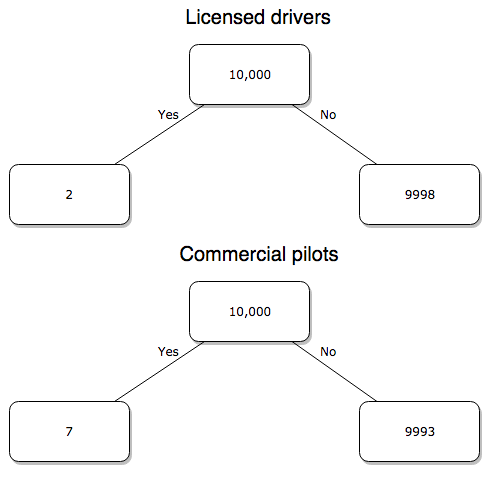
Figure 3. Comparing totals of deaths adjusted by numbers of licensed drivers and by licensed commercial airline pilots in the United States.
R work follows. Enter and submit each command on a separate line in the script window
total = 10000
prop.test(c(2,7),c(total,total))
And the R output
prop.test(c(2,7),c(total,total))

    2-sample test for equality of proportions with continuity
    correction

data:  c(2, 7) out of c(total, total)
X-squared = 1.7786, df = 1, p-value = 0.1823
alternative hypothesis: two.sided
95 percent confidence interval:
 -0.001187816  0.000187816
sample estimates:
prop 1 prop 2
 2e-04  7e-04
What’s happened? The p-value (0.1823) is not less than 5% and so we would conclude under this scenario that there is no difference between the proportions of deaths between the two modes of travel. Let’s keep going.
Option 2. There are many, many more cars on the road then there are airplanes flying commercial passengers. The standard comparison offered in the background information above identified death rates per individual driver, but used a different metric for airline travelers (number of deaths per passenger), which confuses individuals with travelers: what we need is the number of individuals that traveled by airliner, not the total number of passengers (which is many times higher, because of repeat flyers). How can we make a fair comparison for the two modes of travel? Most people never fly whereas most people drive (or ride in a car) frequently in the United States. To me, risk of travel might be better expressed in terms of a per trip rate. I want to know, what are my chances of dying each time I get into my car versus each time I fly on a commercial jet in the United States?
Number of trips/yr. For airlines, I use the number of departures (2000 = 8,951,773). But for cars, we need to decide how to get a similar number. It’s not available directly from the DOT (and would be difficult to get — studies with randomly selected drivers can yield as many as 5 trips per day for licensed drivers). I took the number of licensed drivers and bound the problem — at the low end, let’s say that only 2 trips per week (e.g., 50 weeks) are taken by licensed drivers (100 trips); at the upper end, let’s take 2 trips per day per week, or 500 trips/year. Thus, at the low end, we have 1.91 X10¹⁰ trips per year; at the upper end, 9.53 X 10¹⁰ trips per year.
Which mode of travel is riskier? Using the number of deaths/yr listed above in Option 1, I get a rate of 1.03 X 10⁻⁵ deaths/trip for air carriers
928.95 x 10⁶
compared to a rate of 1.97 X 10⁻⁶ deaths/trip for cars (lower bound) or 3.9 X 10⁻⁷ deaths/trip for cars (upper bound). Here’s what the numbers look for in a tree (taking the lower number of trips per year for cars, Fig 4).
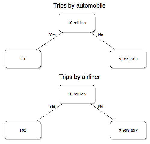
Figure 4. Comparing totals of deaths adjusted by numbers of car trips and by numbers of airline trips in the United States.
R work follow
total = 10000000
prop.test(c(20,103),c(total,total))
And the R output
prop.test(c(20,103),c(total,total))

    2-sample test for equality of proportions with continuity
    correction

data:  c(20, 103) out of c(total, total)
X-squared = 54.667, df = 1, p-value = 1.428e-13
alternative hypothesis: two.sided
95 percent confidence interval:
 -1.057370e-05 -6.026305e-06
sample estimates:
  prop 1   prop 2
2.00e-06 1.03e-05
Now we have another really small p-value (1.428e-13), which suggests a statistically significant difference between the modes of air travel, but the difference in deaths is switched. I now have a result that suggests car travel is much safer then traveling with a commercial airliner! These calculations suggest that you are as much as 26 (upper bounds, five times for lower bounds) times more likely to die from a plane crash then you are behind the wheel. In whole numbers, these results indicate one death for every 100,000 airline flights compared to 1 death for every 500,000 (lower estimate) or 2,500,000 car trips!
Do I have it right and the standard answer is wrong? As Lee Corso says often on ESPN’s College GameDay program, “Not so fast, my friend!” (Wikipedia). Mark Twain was right to hold the skeptic’s view. Begin by listing the assumptions and by checking the logic of the comparisons (there are still holes in my logic!!). For one, if I am considering my risk of dying by mode of travel, it is far more likely that I will be in a car accident than I will an airline accident, simply because I don’t travel by airline that much. When we consider lifetime risk, we can see why the assertion that it is “safer to fly than drive” is true — we’re far more likely to belong to one of the reference populations involving automobiles (e.g., those who drive frequently, for many years) than we are to be among the frequent flyers reference populations.
Questions
1. Review and provide your own examples for
- index
- rate
- ratio
- proportion
2. Return to my story about travel safety, airlines vs cars: am I using “statistic” or “statistics?”
3. Like travel safety, we are often confronted by risk comparisons like the following: Which animal is more deadly to humans, dogs or sharks? Between the two, which lead to more hospitalizations in the United States? Work through your assumptions and use results from the International Shark Attack file.
- If a person lives in Nebraska, and never visits the ocean, how does a “shark attack” risk analysis apply? Is it a fair comparison to make between dog attacks and shark attacks? Why or why not.
4. Go to cappex.com/colleges and update institutional (gift) aid offered by Chaminade and HPU. Compare to University of Hawaii-Manoa.
5. Calculate percent increase for
- Annual atmospheric CO2 1980 and 2022.
Chapter 6 content
- Introduction
- Some preliminaries
- Ratios and probabilities
- Combinations and permutations
- Types of probability
- Discrete probability distributions
- Continuous distributions
- Normal distribution and the normal deviate (Z)
- Moments
- Chi-square distribution
- t distribution
- F distribution
- References and suggested readings
8.3 – Sampling distribution and hypothesis testing
Introduction
Understanding the relationship between sampling distributions, probability distributions, and hypothesis testing is the crucial concept in the NHST — Null Hypothesis Significance Testing — approach to inferential statistics. is crucial, and many introductory text books are excellent here. I will add some here to their discussion, perhaps with a different approach, but the important points to take from the lecture and text are as follows.
Our motivation in conducting research often culminates in the ability (or inability) to make claims like:
- “Total cholesterol greater than 185 mg/dl increases risk of coronary artery disease.”
- “Average height of US men aged 20 is 70 inches (1.78 m).”
- “Species of amphibians are disappearing at unprecedented rates.”
Lurking beneath these statements of “fact” for populations (just what IS the population for #1, for #2, and for #3?) is the understanding that not ALL members of the population were recorded.
How do we go from our sample to the population we are interested in? Put another way — How good is our sample? We’ve talked about how “biostatistics” can be generalized as sets of procedures you use to make inferences about what’s happening in populations. These procedures include:
- Have an interesting question
- Experimental design (Observational study? Experimental study?)
- Sampling from populations (Random? Haphazard?)
- Hypotheses: HO and HA
- Estimate parameters (characterize the population)
- Tests of hypotheses (inferences)
We have control of each of these — we choose what to study, we design experiments to test our hypotheses…We have already introduced these topics (Chapters 6 – 8).
We also obtain estimates of parameters, and inferential statistics applies to how we report our descriptive statistics (Chapter 3). Estimates of parameters like the sample mean and sample standard deviation can be assessed for accuracy and precision (e.g., confidence intervals).
Sampling distribution
Imagine drawing a sample of 30 from a population, calculating the sample mean for a variable (e.g., systolic blood pressure), then calculating a second sample mean after drawing a new sample of 30 from the same population. Repeat, accumulating one estimate of the mean, over and over again. What will be the shape of this distribution of sample means? The Central Limit Theorem states that the shape will be a normal distribution, regardless of whether or not the population distribution was normal, as long as the sample size is large (i.e., Law of Large Numbers). We alluded to this concept when we introduced discrete and continuous distributions (Chapter 6).
It’s this result from theoretical statistics that allows us to calculate the probability of an event from a sample without actually carrying out repeated sampling or measuring the entire population.
A worked example
To demonstrate the CLT we want R to help us generate many samples from a particular distribution and calculate the same statistic on each sample. We could make a for loop, but the replicate() function provides a simpler framework. We’ll sample from the chi-square distribution. You should extend this example to other distributions on your own, see Question 5 below.
Note 1: This example is much simpler to enter and run code in the script window, adjusting code directly as needed. If you wish to try to run this through Rcmdr, you’ll need to take a number of steps, and likely need to adjust the code and rerun anyway. Some of the steps in would be Rcmdr: Distributions → Continuous distributions → Chi-squared distribution → Sample from chi-square distribution…, then running Numerical summaries and saving the output to an object (e.g., out), extracting the values from the object (e.g., out$Table, confirm by running command str(out)— str() is an R utility to display the structure of an object), then testing the object for normality Rcmdr: Statistics → Test of normality, select Shapiro-Wilk, etc.. In other words, sometimes a GUI is a good idea, but in many cases, work with the script!
Generate x replicate samples (e.g., x = 10, 100, 1000, one million) of 30 each from chi-square distribution with one degree of freedom, test the distribution against null hypothesis (assume normal distributed, e.g., Shapiro-Wilk test, see Chapter 13.3), then make a histogram (Chapter 4.2).
x.10 <- replicate(10, {
my.mean <- rchisq(30, 1)
mean(my.mean)
})

normalityTest(~x.10, test="shapiro.test")
hist(x.10, col="orange")
Result from R
Shapiro-Wilk normality test

data: x.10
W = 0.87016, p-value = 0.1004
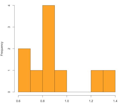
Figure 1. means of ten replicate samples drawn at random from chi-square distribution, df = 1.
Modify the code to draw 100 samples, we get
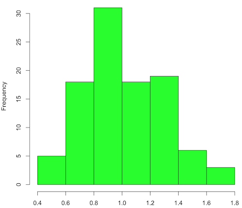
Figure 2. means of 100 replicate samples drawn at random from chi-square distribution, df = 1. Results from Shapiro-Wilks test: W = 0.97426, p-value = 0.04721
And finally, modify the code to draw one million samples, we get
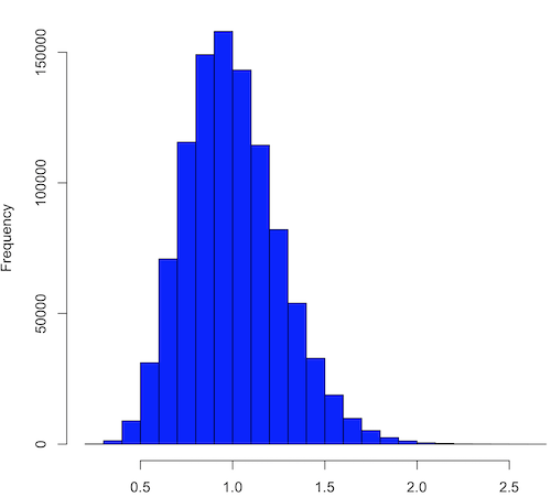
Figure 3. means of one million replicate samples drawn at random from chi-square distribution, df = 1. Normality test will fail to run, sample size of 5000 limit.
How to apply sampling distribution to hypothesis testing
First, a reminder of some definitions.
Estimate = we will always (almost) concern ourselves with how good our sample mean (such values are called estimates) is relative to the population mean, the thing we really want, but can only hope to get an estimate of.
Accuracy = how close to the true value is our measure?
Precision = how repeatable is our measure?
How can we tell if we have a good estimate? We want an estimate with an evaluation for accuracy and for precision. The sampling error provides an assessment of precision, whereas the confidence interval provides a statement of accuracy. We need an estimate of the sampling error for the statistic,
Sample standard error of the mean
We introduced sample error of the mean in section 3.4 of Chapter 3. Everything we measure can have a corresponding statement about how accurate (sampling error) is our estimate! First, we begin by asking, “how accurate is the mean that we estimate from a sample of a population?” How do we answer this? We could prove it in the mathematical sense of proof (and people have and do) OR we can use the computer to help. We’ll try this approach in a minute.
What we will show relates to the standard error of the population mean (SEM) or
![\[s_{\bar{X}}\]](https://biostatistics.letgen.org/wp-content/ql-cache/quicklatex.com-80914fc397fd287f7f198558ca241048_l3.png "Rendered by QuickLaTeX.com")
, whose equation is shown below.

or equivalently, from the standard deviation we have

Note that the SEM takes the variance and divides through by the sample size. In general, then, the larger the sample size, the smaller the “error” around the mean. As we work through the different statistical tests, t-tests, analysis of variance, and related, you will notice that the test statistic is calculated as a ratio between a difference or comparison divided by some form of an error measurement. This is to remind you that “everything is variable.”
A note on standard deviation (SD) and standard error of the mean (SEM): SD estimates the variability of a sample of Xi‘s whereas SEM estimates the variability of a sample of means.
Let’s return to our thought problem and see how to demonstrate a solution. First, what is the population? Second, can we get the true population mean?
One way, a direct (but impossible?) approach would be to measure it — get all of the individuals in a population and measure them, then calculate the population mean. Then, we could compare our original sample mean against the true mean and see how close it was. This can be accomplished in some limited cases. For example, the USA conducts a census of her population every ten years, a procedure which costs billions of dollars. We can then compare samples from the different states or counties to the USA mean. And these statistics are indeed available via the census.gov website. But even the census uses sampling — individuals are randomly selected to answer more questions and from this sample trends in the population are inferred.
So, sampling from populations is the way to go for most questions we will encounter. The procedures we will use to show how a sample mean relates to the population mean are general and may be used to show how any estimate of a variable (sample mean and sample standard deviation, etc.), relates to properties of a parameter. We’ll get to the other issues, but for now, think about sample size.
Sampling from populations is necessary and inevitable, and, to a certain extent, under your control. But how many individuals do we need? The quick answer is for me to direct your attention to the equation for the SEM. Can you see in that ratio the secret to obtaining more precise estimates? There are many ways to approach this question, but let’s use the tools from last time, those based on properties of a normal distribution.
If we can view the sampling as having come from a population at least approximately normally distributed for our variable, then we can now examine empirically the effect of different sample sizes on the estimate of the mean.
A hint: variability is important!
From one population we obtain two samples, A and B. Sample sizes are

Assume for now that we know the true mean (μ) and standard deviation (σ) for the population. Note. This is one of the points of why we use computer simulation so much to teach statistics — it allows us to specify what the truth is, then see how our statistical tools work or how our assumptions affect our statistically based conclusions.

Confidence intervals
Reliability is another word for precision. We define a confidence interval as a statistic to report the reliability of our estimated statistic. We introduced confidence interval in Chapter 3.4. At least in principle, confidence intervals can be calculated for all statistics (mean, variance, etc.,) and for all data types. Confidence intervals define a lower limit, L, and an upper limit, U, and that you are making a statement that you are “95% certain that the true value (parameter value) is between these two limits.
We previously reported how to calculate an approximate confidence intervals for proportions and for NNT; simply multiple standard error estimate by 2. Here we introduce an improved approximate calculation of the 95% confidence interval for the sample mean

where Z is something you would look up from the table of the normal distribution. For a 95% confidence interval, 100% – 95% = 5% and divide 5% by two: the lower limit corresponds to 2.5% and the upper limit corresponds to 2.5% on our normal distribution. We look up the table and we find that Z for 0.025 is 1.96 and that is the value we would plug into our equation above. For large sample sizes, you can get a pretty decent estimate of the confidence interval by replacing 1.96 with “2.”
Questions
1. What is the probability of having a sample mean greater than 50 (mean > 50) for a sample of n = 9 ?
We’ll use a slight modification of the Z-score equation we introduced in Chapter 6.6 — the modification here is that previously we referred to the distribution of Xi‘s and how likely a particular observation would be. Instead, we can use the Z score with the standard normal distribution (aka Z-distribution), approach to solving how likely an estimated sample mean is given the population parameters μ and σ. Recall the Z score

We have everything we need except the SEM, which we can calculate by dividing the standard deviation by squared root of sample size.
For
![\[\bar{X} = 50\]](https://biostatistics.letgen.org/wp-content/ql-cache/quicklatex.com-e1a072ca9f8d1aa2fff8a8f5a829a9d5_l3.png "Rendered by QuickLaTeX.com")
, σ = 12.0 (given above), and μ = 47, n = 9, plug in the values:

Therefore, after applying the equation for Z score,  . This corresponds to how far away from the standard mean of zero.
Look up from the table of normal distribution. The answer is  , which corresponds to that
  is EQUAL to or GREATER than 0.75, which is what we wanted. Translated, this implies that, given the level of variability in the sample, 22.66% of your sample means would be greater than 50! We write:
  .
.
Some care needs to be taken when reading these tables — make sure you understand how the direction (less than, greater than) away from the mean is tabulated.
2. Instead of greater, how would you get the probability less than 50?
Total area under the curve is 1 (100%), so subtract  .
.
I recommend that you do these by hand first, then check your answers. You’ll need to be able to do this for exams.
Here’s how to use Rcmdr to do these kind of problems.
Rcmdr: Distributions → Continuous distributions → Normal distribution → Normal probabilities …
Figure 5. Screenshot Rcmdr menu to get normal probability
Here’s the answer from Rcmdr
pnorm(c(50), mean=47, sd=12, lower.tail=TRUE)

[1] 0.5987063
3. Now, try a larger sample size. For  , what is the probability of having a sample mean greater than 50 (
 )?
)?
, μ = 47, σ = 12, n = 50 and
![\[SEM = \frac{12.0}{\sqrt{50}} = 1.697\]](https://biostatistics.letgen.org/wp-content/ql-cache/quicklatex.com-62a98310dcd72f847a8190d0d36a8e66_l3.png "Rendered by QuickLaTeX.com")
Therefore, after applying the equation for Z score,  . Look up (Normal table, subtract answer from 1) and we get
  .
.
Or 3.84% of your sample means would be greater than 50! We write:  .
.
Said another way: If you have a sample size of 50 () and you obtain a mean greater than 50 then there is only a 3.84% chance that the TRUE MEAN IS 47.
4. What happens if the variability is smaller? Chance σ from 12 to 6 then repeat questions 1 and 4.
5. Repeat the demonstration of Central Limit Theorem and Law of Large Numbers for discrete distributions
- binomial distribution. Replace
rchisq()withrbinom(n, size, prob)in thereplicate()function example. See Chapter 6.5 - poisson distribution. Replace
rchisq()withrpois(n, lambda)in thereplicate()function example. See Chapter 6.5
Chapter 8 contents
- Introduction
- The null and alternative hypotheses
- The controversy over proper hypothesis testing
- Sampling distribution and hypothesis testing
- Tails of a test
- One sample t-test
- Confidence limits for the estimate of population mean
- References and suggested readings
7.5 – Odds ratio
Introduction
We introduced the concept of odds 7.1 — Epidemiology definitions. As a reminder, odds are a way to communicate the chance (likelihood) that a particular event will take place. Odds are calculates as the number of individuals with the event divided by the number of individuals without the event.
Odds ratio definition: is a measure of effect size for the association between two binary (yes/no) variables. It is the ratio of the odds of an event occurring in one group to the odds of the same event happening in another group. The odds ratio (OR) is a way to quantify the strength of association between one condition and another.
Note 1: Effect size — the size of the difference between groups — is discussed further in Chapter 9.2 and Chapter 11.4.
How are odds ratios calculated? The probabilities are conditional; recall that conditional probability of some event A, given the occurrence of some other event B.
Let  equal probability of the event occurring (y = Yes) in A,
  equal probability of the event not occurring (n = No) in A,
  equal probability of the event occurring in B, and
  equal probability of the event not occurring in B.
| A | |||
| Yes | No | ||
| B | Yes | |
|
| No | |
|
|
These sum to one: 
The conditional probabilities are
| A | |||
| Yes | No | ||
| B | Yes |  |
 |
| No |  |
 |
|
and finally then, the odds ratio (OR) is

If you have the raw numbers you can calculate the odds ratio directly, too.
| A | |||
| Yes | No | ||
| B | Yes | a | b |
| No | c | d | |
and the odds ratio is then

or, equivalently

Example
Comparing proportions is a frequent need in court. Gray (2002) provided an example from Title IX of the Education Act of 1972 case Cohen v. Brown University. Under the Act, discrimination based on gender is prohibited. The case concerned participation in collegiate athletics by women. The case data were that of the 5722 undergraduate students, 51% were women, but of the 987 athletes, only 38% were women. A mosaic plot shows graphically these proportions (Fig. 1, males in red bars, females in yellow bars).
Figure 1. Mosaic plot of athletes to non-athletes in college. Males red, females yellow, data from Gray 2002.
Alternatively, use a Venn diagram to describe the distribution (Fig. 2). Circles that overlap show regions of commonality.
Figure 2. Venn Diagram of athletes to non-athletes in college. Female athletes (n = 375), male athletes (n = 612), data from Gray 2002.
where the orange region

R code for the Venn diagram was
library(VennDiagram)
area1 = 5722
area2 = 987
cross.area = 375
draw.pairwise.venn(area1,area2,cross.area,category=c("Students","Athletes"),
euler.d = TRUE, scaled = TRUE, inverted = FALSE, print.mode = "percent",
fill=c("Red","Yellow"),cex = 1.5, lty="blank", cat.fontfamily = rep("sans", 2),
cat.cex = 1.7, cat.pos = c(0, 180), ext.pos=0)
The question raised before the court was whether these proportions meet the demand of “substantially proportionate.” What exactly the law means by “substantially proportionate” was left to the courts and the lawyers to work out (Gray 2002). Title IX suggests that “substantially proportionate” is a statistical problem and the two sides of the argument must address the question from that perspective.
What is the chance that an undergraduate student was an athlete and female? 38% And the chance that an undergraduate student was an athlete and male? 62% Clearly 38% is not 62%; did the plaintiffs have a case?
Graphs like Figure 1 and Figure 2 help communicate but can’t provide a sense of whether the differences are important. Let’s start by looking at the numbers. Working with the proportions we have the following break down for numbers of students (Table 1) or as proportions (Table 2).
Table 1. Gray’s raw data displayed in a 2 x 2 format.
| Athletes | |||
| Yes | No | ||
| Undergraduates | Male | 612 | 2192 |
| Female | 375 | 2543 | |
Together, the numbers total 5,722.
The Odds Ratio (OR) would be

Or from the proportions (Table 2)
Table 2. Data from Table 1 as proportions.
| Athletes | |||
| Yes | No | ||
| Undergraduates | Male | 0.107 | 0.383 |
| Female | 0.066 | 0.444 | |
adding all of these frequencies together equal 1. Carry out the calculation of odds (Table 3), the conditional probabilities (in bold).
Table 3. Odds calculated from Table 2 inputs.
| Athletes | |||
| Yes | No | ||
| Undergraduates | Male | 0.218
|
0.782
|
| Female | 0.129
|
0.871
|
|


Calculate the odds ratio

Thankfully, whether we use the raw number format or the proportion format, we got the same results!
Odds ratio interpretation
Because the Odds Ratio (OR) was greater than 1, males students were more likely to be athletes than female students. If there was no difference in proportion of male and female athletes, the odds ratio would be close to one. That is a test of statistical inference (e.g., a contingency table), but for now, if one is included in the confidence interval, then this would be evidence that there was no difference between the proportions.
And in R? Simple enough, just create a matrix then apply the Fisher test. which we will discuss further in Chapter 9.5.
title9 <- matrix(c(612, 2192, 375, 2543), nrow=2))
fisher.test(title9)
and results
p-value < 2.2e-16
alternative hypothesis: true odds ratio is not equal to 1
95 percent confidence interval:
1.641245 2.185576
sample estimates:
odds ratio
1.893143
Thankfully, they agree. But note, we now have confidence intervals and a p-value, which we use to conduct inference: were the odds “significantly different from 1?” We would conclude, yes! Between the lower limit (1.64) and the upper limit (2.19), the value “1” was excluded. Moreover, the p-value at 2.2e-16 was much less than the standard type I error cut-off of 5% (see Chapter 8).
Before we leave the interpretation, sometimes a calculated odds-ratio is less than one. If our calculated odds ratio for the Title IX case described in Table 1 was less than 1, (say, the numbers were flipped, Table 4) we then the interpretation would be females were more likely to be athletes on college campus.
Table 4. Table 1 data, but order of entry changed.
| Athletes | |||
| Yes | No | ||
| Undergraduates | Female | 375 | 2543 |
| Male | 612 | 2192 | |
Now, calculating the odds via Fisher exact test, the odds ratio is less than one (0.53):
Fisher's Exact Test for Count Data
p-value < 2.2e-16
alternative hypothesis: true odds ratio is not equal to 1
95 percent confidence interval:
0.4575452 0.6092936
sample estimates:
odds ratio
0.5282222
Note this result is for the same data (Table 1 vs Table 4), just the order by which the groups are specified changed. Of course they are related to each other mathematically, and in a simple way. Note that taking the inverse (reciprocal) odds ratio.

will return the comparison we wanted in the first place — the odds a student athlete was male. As long as you keep track of the comparison, of the groups, it may be easier to communicate results when the reported odds ratio is greater than one.
Relative risk v. odds ratio
We introduced another way to quantify this association as the Relative Risk (RR) and Absolute Risk Reductions in the previous section. Both can be used to describe the risk of the treatment (exposed) group relative to the control (nonexposed) group. RR is the ratio the treated to control group. OR is the ratio between odds of treated (exposed) and control (nonexposed). What’s the difference? OR is more general — it can be used in situations in which the researcher choses the number of affected individuals in the groups and, therefore, the base rate or prevalence of the condition in the population is not known or is not representative of the population, whereas RR is appropriate when prevalence is known (this is a general point, but see Schechtman 2002 for a nice discussion).
The odds ratio is related to relative risk, but not over the entire range of possible risk. Odds of an event is simply the number of individuals with the event divided by the number without the event. Odds of an event therefore can range from zero (event cannot occur) to infinity (event must occur). For example, odds of eight (1.89:1) means that nearly two male students were student athletes at Brown University for every one female student.
In contrast, the risk of an event occurring is the number of individuals with the event divided by the total number of people at risk of having that event. Risk is expressed as a percentage (Davies et al 1998). Thus, for our example, odds of 1.89:1 correspond to a risk of 1.89 divided by (1 + 1.89) equals 65%.
To get the relative risk we can use

or 1.7% for our example.
In this example we could use either odds or relative risk; the key distinction is that we knew how many events happened in both groups. If this information is missing for one group (e.g., control group of the case-control design), then only the odds ratio would be appropriate.
From cumulative wisdom in the literature (e.g., Tamhane et al 2107), if prevalence is less than ten percent, OR ≈ RR. We can relate RR and OR as

where n11 and n21 are the frequency with the condition for group 1 and group 2, respectively, and n12 and n22 are the frequency without the condition for group 1 and group 2, respectively. For the examples on this page group 1 is the treatment group and group 2 is the control group.
Hazard ratio
The hazard ratio is the ratio of hazard rates. Hazard rates are like the relative risk rates, but are specific to a period of time. Hazard rates come from a technique called Survival Analysis (introduced in Chapter 20.9). Survival analysis can be thought of as following a group of subjects over time until something (the event) happens. By following two groups, perhaps one group exposed to a suspected carcinogen vs. another group matched in other respects except the exposure, at the end of the trial, we’ll have two hazard rates: the rate for the exposed group and the rate for the control group. If there is no difference, then the hazard ratio will be one.
Hazard ratios are more appropriate for clinical trials; relative risk is more appropriate for observational studies.
For a hazard ratio, it is often easier to think of it as a probability (between 0 to 1). To translate a hazard ratio to a probability use the following equation

Questions
- Distinguish between odds ratio, relative risk, and hazard ratio.
- Refer to problem 1 introduced in 7.4 – Epidemiology: Relative risk and absolute risk, explained
- In 2017-18, males were 43% of the 18.8 million enrolled students at U.S. 2- and 4-year colleges, and 56% of the 4.95 million student athletes at that time. Calculate the odds, and confidence interval, that a student athlete was male in 2017-18. How do your results compare to the OR of 1.89 for Table 1 (from Gray 2002)?
Chapter 7 contents
7.3 – Conditional Probability and Evidence Based Medicine
- Introduction
- Probability and independent events
- Example of multiple, independent events
- Probabilistic risk analysis
- Conditional probability of non-independent events
- Diagnosis from testing
- Standard million
- Per capita rate
- Practice and introduce PPV and Youden’s J
- Evidence Based Medicine
- Software
- Example
- Questions
- Chapter 7 contents
Introduction
This section covers a lot of ground. We begin by addressing how probability of multiple events are calculated assuming each event is independent. The assumption of independence is then relaxed, and how to determine probability of an event happening given another event has already occurred, conditional probability, is introduced. Use of conditional probability to interpret results of a clinical test are also introduced, along with the concept of “evidence-based-medicine,” or EBM.
Probability and independent events
Probability distributions are mathematical descriptions of the probabilities of how often different possible outcomes occur. We also introduced basic concepts related to working with the probabilities involving more than one event.
For review, for independent events, you multiply the individual chance that each event occurs to get the overall probability.
Example of multiple, independent events

Figure 1. Now that’s a box full of kittens. Creative Commons License, source: https://www.flickr.com/photos/83014408@N00/160490011
What is the chance of five kittens in a litter of five to be of the same sex? In feral cat colonies, siblings in a litter share the same mother, but not necessarily the same father, superfecundation. Singleton births are independent events, thus the probability of the first kitten is female is 50%; the second kitten is female, also 50%; and so on. We can multiply the independent probabilities (hence, the multiplicative rule), to get our answer:
kittens <- c(0.5, 0.5, 0.5, 0.5, 0.5)
prod(kittens)
[1] 0.03125
Probabilistic risk analysis
Risk analysis is the use of information to identify hazards and to estimate the risk. A more serious example. Consider the 1986 Space Shuttle Challenger Disaster (Hastings 2003). Among the crew killed was Ellison Onizuka, the first Asian American to fly in space (Fig. 2, first on left back row). Onizuka was born and raised on Hawai`i and graduated from Konawaena High School in 1964.

Figure 2. STS-51-L crew: (front row) Michael J. Smith, Dick Scobee, Ronald McNair; (back row) Ellison Onizuka, Christa McAuliffe, Gregory Jarvis, Judith Resnik. Image by NASA – NASA Human Space Flight Gallery, Public Domain.
The shuttle was destroyed just 73 seconds after lift off (Fig. 3).

Figure 3. Space Shuttle Challenger launches from launchpad 39B Kennedy Space Center, FL, at the start of STS-51-L. Hundreds of shorebirds in flight. Image by NASA – NASA Human Space Flight Gallery, Public Domain.
This next section relies on material and analysis presented in the Rogers Commission Report June 1986. NASA had estimated that the probability of one engine failure would be 1 in 100 or 0.01; two engine failures would mean the shuttle would be lost. Thus, the probability of two rockets failing at the same time was calculated as 0.01 X 0.01, which is 0.0001 or 0.01%.
NASA had planned to fly the fleet of shuttles 100 times per year, which would translate to a shuttle failure once in 100 years. The Challenger launch on January 28, 1986, represented only the 25th flight of the shuttle fleet.
One difference on launch day was that the air temperature at Cape Canaveral was quite low for that time of year, as low as 22 °F overnight.
Attention was pointed at the large O-rings in the boosters (engines). In all, there were six of these O-rings. Testing suggested that, at the colder air temperatures, the chance that one of the rings would fail was 0.023. Thus, the chance of success was only 0.977. Assuming independence, what is the chance that the shuttle would experience O-ring failure?
shuttle <- c(0.977, 0.977, 0.977, 0.977, 0.977, 0.977)
#probability of success then was
prod(shuttle)
[1] 0.869

#and therefore probability of failure was
1 - prod(shuttle)
[1] 0.1303042
Conditional probability of non-independent events
But in many other cases, independence of events cannot be assumed. The probability of an event given that another event has occurred is referred to as conditional probability. Conditional probability is used extensively to convey risk. We’ve touched on some of these examples already:
- the risk of subsequent coronary events given high cholesterol;
- the risk of lung cancer given a person smokes tobacco;
- the risk of mortality from breast cancer given that regular mammography screening was conducted.
There are many, many examples in medicine, insurance, you name it. It is even an important concept that judges and lawyers need to be able to handle (e.g., Berry 2008).
A now famous example of conditional probability in the legal arena came from arguments over the chance that a husband or partner who beats his wife will subsequently murder her — this was an argument raised by the prosecution during pre-trial in the 1995 OJ Simpson trial (The People of the State of California v. Orenthal James Simpson), and successfully argued by O.J. Simpson’s attorneys… judge ruled in favor of the defense and evidence of OJ Simpson’s prior abuse were not included in trial). Gigerenzer (2002) and others have called this reverse Prosecutor’s Fallacy, where the more typical scenario is that the prosecution provides a list of probabilities about characteristics of the defendant, leaving the jury to conclude that no one else could have possibly fit the description.
In the OJ Simpson case, the argument went something like this. From the CDC we find that an estimated 1.3 million women are abused each year by their partner or former partner; each year about 1000 women are murdered. One thousand divided by 1.3 million is a small number, so even when there is abuse the argument goes, 99% of the time there is not murder. The Simpson judge ruled in favor of the defense and much of the evidence of abuse was excluded.
Something is missing from the defense’s argument. Nicole Simpson did not belong to a population of battered women — she belonged to the population of murdered women. When we ask, if a woman is murdered, what is the chance that she knew her murderer, we find that more than 55% knew their murderer — and of that 55%, 93% were killed by a current partner. The key is Nicole Simpson (and Ron Goldman) was murdered and OJ Simpson was an ex-partner who had been guilty of assault against Nicole Simpson. Now, it goes from an impossibly small chance, to a much greater chance. Conditional probability, and specifically Baye’s rule, is used for these kinds of problems.
Diagnosis from testing
Let’s turn our attention to medicine. A growing practice in medicine is to claim that decision making in medicine should be based on approaches that give us the best decisions. A search of PubMed texts for “evidence based medicine” found more than 91,944 (13 October 2021, and increase of thirteen thousand since last I looked (10 October, 2019). Evidence based medicine (EBM) is the “conscientious, explicit, judicious and reasonable use of modern, best evidence in making decisions about the care of individual patients” (Masic et al 2008). By evidence, we may mean results from quantitative, systematic reviews, meta-analysis, of research on a topic of medical interest, e.g., Cochrane Reviews.
Note 1: Primary research refers to generating or collecting original data in pursuit of tests of hypotheses. Both systematic reviews and meta-analysis are secondary research or “research on research.” As opposed to a literature review, systematic review make explicit how studies were searched for and included; if enough reasonably similar quantitative data are obtained through this process, the reviewer can combine the data and conduct an analysis to assess whether a treatment is effective (De Vries 2018).
As you know, no diagnostic test is 100% fool-proof. For many reasons, test results come back positive when the person truly does not have the condition — this is a false positive result. Correctly identifying individuals who do not have the condition, 100% – false positive rate, is called the specificity of a test. Think of specificity in this way — provide the test 100 true negative samples (e.g., 100 samples from people who do not have cancer) — how many times out of 100 does the test correctly return a “negative”? If 99 times out of 100, then the specificity rate for this test is 99%. Which is pretty good. But the test results mean more if the condition/disease is common; for rare conditions, even 99% is not good enough. Incorrect assignments are rare, we believe, in part because the tests are generally quite accurate. However, what we don’t consider is that detection and diagnosis from tests also depend on how frequent the incidence of the condition is in the population. Paradoxically, the lower the base rate, the poorer diagnostic value even a sensitive test may have.
To summarize our jargon for interpreting a test or assay, so far we have
- True positive (a), the person has a disease and the test correctly identifies the person as having the disease.
- False positive (b), test result incorrectly identifies disease; the person does not have the disease, but the test classifies the person as having the disease.
- False negative (c), test result incorrectly classifies person does not have disease, but the person actually has the disease.
- True negative (d), the person does not have the disease and the test correctly categorizes the person as not having the disease.
- Sensitivity of test is the proportion of persons who test positive and do have the disease (true positives):

If a test has 75% sensitivity, then out of 100 individuals who do have the disease, then 75 will test positive (TP = true positive). - Specificity of a test refers to the rate that a test correctly classifies a person that does not have the disease (TN = true negatives):

If a test has 90% specificity, then out of 100 individuals who truly do not have the disease, then 90 will test negative (= true negatives).
A worked example. A 50 year old male patient is in the doctor’s office. The doctor is reviewing results from a diagnostic test, e.g., a FOBT — fecal occult blood test — a test used as a screening tool for colorectal cancer (CRC). The doctor knows that the test has a sensitivity of about 75% and specificity of about 90%. Prevalence of CRC in this age group is about 0.2%. Figure 4 shows our probability tree using our natural numbers approach (Fig. 4).
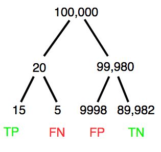
Figure 4. Probability tree for FOBT test; Good test outcomes shown in green: TP stands for true positive and TN stands for true negative. Poor outcomes of a test shown in red: FN stands for false negative and FP stands for false positive.
The associated probabilities for the four possible outcomes of these kinds of tests (e.g., what’s the probability of a person who has tested positive in screening tests actually has the disease?) are shown in Table 1.
Table 1. A 2 X 2 table of possible outcomes of a diagnostic test.
| Person really has the disease | ||
| Test Result | Yes | No |
| Positive | a TP |
b FP |
| Negative | c FN |
d TN |
Baye’s rule is often given in probabilities,
![\begin{align*} p\left ( D\mid \oplus \right )=\frac{p\left ( D \right )\cdot p\left (\oplus\mid D \right )}{[p\left ( D \right )\cdot p\left (\oplus \right )+p\left ( ND \right )\cdot p\left (\oplus \mid ND \right )]} \end{align*}](https://biostatistics.letgen.org/wp-content/ql-cache/quicklatex.com-fd988801ed9f7a29c963f2df79fcf35c_l3.png "Rendered by QuickLaTeX.com")
Baye’s rule, where truth is represented by either D (the person really does have the disease”) or ND (the person really does not have the disease”) and ⊕ is symbol for “exclusive or” and reads “not D” in this example.
An easier way to see this is to use frequencies instead. Now, the formula is

Simplified Baye’s rule, where a is the number of people who test positive and DO HAVE the disease and b is the number of people who test positive and DO NOT have the disease.
Standardized million
Where did the 100,000 come from? We discussed this in chapter 2: it’s a simple trick to adjust rates to the same population size. We use this to work with natural numbers instead of percent or frequencies. You choose to correct to a standardized population based on the raw incidence rate. A rough rule of thumb:
Table 2. Relationship between standard population size and incidence rate.
| Raw IR rate about | IR | Standard population |
| 1/10 | 10% | 1000 |
| 1/100 | 1% | 10,000 |
| 1/1000 | 0.1% | 100,000 |
| 1/10,000 | 0.01% | 1,000,000 |
| 1/100,000 | 0.001% | 10,000,000 |
| 1/1,000,000 | 0.0001% | 100,000,000 |
The raw incident rate is simply the number of new cases divided by the total population.
Per capita rate
Yet another standard manipulation is to consider the average incidence per person, or per capita rate. The Latin “per capita” translates to “by head” (Google translate), but in economics, epidemiology, and other fields it is used to reflect rates per person. Tuberculosis is a serious infectious disease of primarily the lungs. Incidence rates of tuberculosis in the United States have trended down since the mid 1900s: 52.6 per 100K in 1953 to 2.7 per 100K in 2019 (CDC). Corresponding per capita values are 5.26 x 10⁻⁴ and 2.7 x 10⁻⁵, respectively. Divide the rate by 100,000 to get per person rate.
Practice and introduce PPV and Youden’s J
Let’s break these problems down, and in doing so, introduce some terminology common to the field of “risk analysis” as it pertains to biology and epidemiology. Our first example considers the fecal occult blood test, FOBT, test. Blood in the stool may (or may not) indicate polys or colon cancer. (Park et al 2010).
The table shown above will appear again and again throughout the course, but in different forms.
Table 3. A 2 X 2 table of possible outcomes of FOBT test.
| Person really has the disease | |||
| Yes | No | ||
| Positive | 15 | 9998 | PPV = 15/(15+9998) = 0.15% |
| Negative | 5 | 89,982 | NPV = 89982/(89982+5) = 99.99% |
We want to know how good is the test, particularly if the goal is early detection? This is conveyed by the PPV, positive predictive value of the test. Unfortunately, the prevalence of a condition is also at play: the lower the prevalence, the lower the PPV must be, because most positive tests will be false when population prevalence is low.
Youden (1950) proposed a now widely adopted index that summarizes how effective a test is. Youden’s J is the sum of specificity and sensitivity minus one.

where Se stands for sensitivity of the test and Sp stands for sensitivity of the test.
Youden’s J takes on values between 0, for a terrible test, and 1, for a perfect test. For our FOBT example, Youden’s J was 0.65. This statistic looks like it’s independent of prevalence, but it’s use as a decision criterion (e.g., a cutoff value, above which test is positive, below test is considered negative), assumes that the cost of misclassification (false positives, false negatives) are equal. Prevalence affects number of false positives and false negatives for a given diagnostic test, so any decision criterion based on Youden’s J will also be influenced by prevalence (Smits 2010).
Another worked example. A study on cholesterol-lowering drugs (statins) reported a relative risk reduction of death from cardiac event by 22%. This does not mean that for every 1000 people fitting the population studied, 220 people would be spared from having a heart attack. In the study, the death rate per 1000 people was 32 for the statin versus 41 for the placebo — recall that a placebo is a control treatment offered to overcome potential patient psychological bias (see Chapter 5.4). The absolute risk reduction due to statin is only 41 – 32 or 9 in 1000 or 0.9%. By contrast, relative risk reduction is calculated as the ratio of the absolute risk reduction (9) divided by the proportion of patients who died without treatment (41), which is 22% (LIPID Study Group 1998).
Note that risk reduction is often conveyed as a relative rather than as an absolute number. The distinction is important for understanding arguments based in conditional probability. Thus, the question we want to ask about a test is summarized by absolute risk reduction (ARR) and number needed to treat (NNT), and for problems that include control subjects, relative risk reduction (RRR). We expand on these topics in the next section, 7.4 – Epidemiology: Relative risk and absolute risk, explained.
Evidence Based Medicine
One culture change in medicine is the explicit intent to make decisions based on evidence (Masic et al 2008). Of course, the joke then is, well, what were doctors doing before, diagnosing without evidence? The comic strip xkcd offers one possible answer (Fig. 5).
Figure 5. A summary of “evidence based medical” decisions, perhaps? https://xkcd.com/1619/
As you can imagine, there’s considerable reflection about the EBM movement (see discussions in response to Accad and Francis 2018, e.g., Goh 2018). More practically, our objective is for you to be able to work your way through word problems involving risk analysis. You can expect to be asked to calculate, or at least set up for calculation, any of the statistics listed above (e.g., False negative, false positive, etc.). Practice problems are listed at the end of this section, and additional problems are provided to you (Homework 4). You’ll also want to check your work, and in any real analysis, you’d most likely want to use R.
Software
R has several epidemiology packages, and with some effort, can save you time. Another option is to run your problems in OpenEpi, a browser-based set of tools. OpenEpi is discussed with examples in the next section, 7.4.
Here, we illustrate some capabilities of the epiR package, expanded more also in the next section, 7.4. We’ll use the example from Table 3.
R code
library(epiR)
Table3 <- matrix(c(15, 5, 9998, 89982), nrow = 2, ncol = 2)
epi.tests(Table3)
R output
         Outcome + Outcome -   Total
Test +          15      9998   10013
Test -           5     89982   89987
Total           20     99980  100000

Point estimates and 95% CIs:
--------------------------------------------------------------
Apparent prevalence *                      0.10 (0.10, 0.10)
True prevalence *                          0.00 (0.00, 0.00)
Sensitivity *                              0.75 (0.51, 0.91)
Specificity *                              0.90 (0.90, 0.90)
Positive predictive value *                0.00 (0.00, 0.00)
Negative predictive value *                1.00 (1.00, 1.00)
Positive likelihood ratio                  7.50 (5.82, 9.67)
Negative likelihood ratio                  0.28 (0.13, 0.59)
False T+ proportion for true D- *          0.10 (0.10, 0.10)
False T- proportion for true D+ *          0.25 (0.09, 0.49)
False T+ proportion for T+ *               1.00 (1.00, 1.00)
False T- proportion for T- *               0.00 (0.00, 0.00)
Correctly classified proportion *          0.90 (0.90, 0.90)
--------------------------------------------------------------
* Exact CIs
Oops! I wanted PPV, which by hand calculation was 0.15%, but R reported “0.00?” This is a significant figure reporting issue. The simplest solution is to submit options(digits=6) before the command, then save the output from epi.tests() to an object and use summary(). For example
options(digits=6)
myEpi <- epi.tests(Table3)
summary(myEpi)
And R returns
     statistic           est        lower        upper
1           ap  0.1001300000 0.0982761568  0.102007072
2           tp  0.0002000000 0.0001221693  0.000308867
3           se  0.7500000000 0.5089541283  0.913428531
4           sp  0.9000000000 0.8981238085  0.901852950
5      diag.ac  0.8999700000 0.8980937508  0.901823014
6      diag.or 27.0000000000 9.8110071871 74.304297826
7         nndx  1.5384615385 1.2265702376  2.456532054
8       youden  0.6500000000 0.4070779368  0.815281481
9       pv.pos  0.0014980525 0.0008386834  0.002469608
10      pv.neg  0.9999444364 0.9998703379  0.999981958
11      lr.pos  7.5000000000 5.8193604069  9.666010707
12      lr.neg  0.2777777778 0.1300251423  0.593427490
13      p.rout  0.8998700000 0.8979929278  0.901723843
14       p.rin  0.1001300000 0.0982761568  0.102007072
15      p.tpdn  0.1000000000 0.0981470498  0.101876192
16      p.tndp  0.2500000000 0.0865714691  0.491045872
17      p.dntp  0.9985019475 0.9975303919  0.999161317
18      p.dptn  0.0000555636 0.0000180416  0.000129662
There we go — pv.pos reported as 0.0014980525, which, after turning to a percent and rounding, we have 0.15%. Note also the additional statistics provided — a good rule of thumb — always try to save the output to an object, then view the object, e.g., with summary(). Refer to help pages for additional details of the output (?epi.tests).
What about R Commander menus?
Note 2: Fall 2023 — I have not been able to run the EBM plugin successfully! Simply returns an error message — — on data sets which have in the past performed perfectly. Thus, until further notice, do not use the EBM plugin. Instead, use commands in the epiR package. I’m leaving the text here on the chance the error with the plugin is fixed.
Rcmdr has a plugin that will calculate ARR, RRR and NNT. The plugin is called RcmdrPlugin.EBM (Leucuta et al 2014) and it would be downloaded as for any other package via R.
Download the package from your selected R mirror site, then start R Commander.
install.packages("RcmdrPlugin.EBM")
From within R Commander (Fig. 6), select
Tools → Load Rcmdr plug-in(s)…
Figure 6. To install an Rcmdr plugin, first go to Rcmdr → Tools → Load Rcmdr plug-in(s)…
Next, select from the list the plug-in you want to load into memory, in this case, RcmdrPlugin.EBM (Fig 7).
Figure 7. Select the Rcmdr plugin, then click the “OK” button to proceed.
Restart Rcmdr again (Fig. 8),

Figure 8. Select “Yes” to restart R Commander and finish installation of the plug-in.
and the menu “EBM” should be visible in the menu bar (Fig. 9).
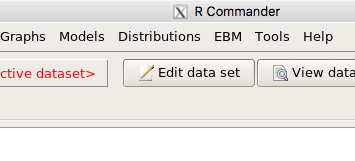
Figure 9. After restart of R Commander the EBM plug-in is now visible in the menu.
Note that you will need to repeat these steps each time you wish to work with a plug-in, unless you modify your .RProfile file. See
Rcmdr → Tools → Save Rcmdr options…
Clicking on the EBM menu item brings up the template for the Evidence Based Medicine module. We’ll mostly work with 2 X 2 tables (e.g., see Table 1) , so select the “Enter two-way table…” option to proceed (Fig. 10).
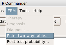
Figure 10. Select “Enter two-way table…”.
And finally, Figure 11 shows the two-way table entry cells along with options. We’ll try a problem by hand then use the EBM plugin to confirm and gain additional insight.
Figure 11. Two-way table Rcmdr EBM plug-in.
For assessing how good a test or assay is, use the Diagnosis option in the EBM plugin. For situations with treated and control groups, use Therapy option. For situations in which you are comparing exposure groups (e.g., smokers vs non-smokers), use the Prognosis option.
Example
Here’s a simple one (problem from Gigerenzer 2002).
About 0.01% of men in Germany with no known risk factors are currently infected with HIV. If a man from this population actually has the disease, there is a 99.9% chance the tests will be positive. If a man from this population is not infected, there is a 99.9% chance that the test will be negative. What is the chance that a man who tests positive actually has the disease?
Start with the reference, or base population (Figure 12). It’s easy to determine the rate of HIV infection in the population if you use numbers. For 10,000 men in this group, exactly one man is likely to have HIV (0.0001X10,000), whereas 9,999 would not be infected.
For the man who has the disease it’s virtually certain that his results will be positive for the virus (because the sensitivity rate = 99.9%). For the other 9,999 men, one will test positive (the false positive rate = 1 – specificity rate = 0.01%).
Thus, for this population of men, for every two who test positive, one has the disease and one does not, so the probability even given a positive test is only 100*1/2 = 50%. This would also be the test’s Positive Predictive Value.
Note that if the base rate changes, then the final answer changes! For example, if the base rate was 10%
It also helps to draw a tree to help you determine the numbers (Fig. 12)
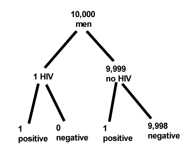
Figure 12. Draw a probability tree to help with the frequencies.
From our probability tree in Figure 12 it is straight-forward to collect the information we need.
- Given this population, how many are expected to have HIV? Two.
- Given the specificity and sensitivity of the assay for HIV, how many persons from this population will test positive? Two.
- For every positive test result, how many men from this population will actually have HIV? One.
Thus, given this population with the known risk associated, the probability that a man testing positive actually has HIV is 50% (=1/(1+1)).
Use the EBM plugin. Select two-way table, then enter the values as shown in Fig. 13.
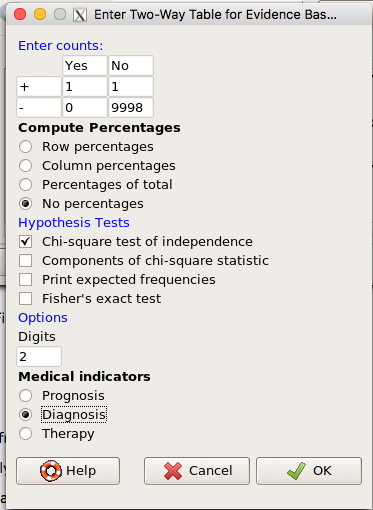
Figure 13. EBM plugin with data entry
Select the “Diagnosis” option — we are answering the question: How probable is a positive result given information about sensitivity and specificity of a diagnosis test. The results from the EBM functions are given below
Rcmdr> .Table
      Yes No
   +  1    1
   -  0 9998
Rcmdr> fncEBMCrossTab(.table=.Table, .x='', .y='', .ylab='', .xlab='',
Rcmdr+ .percents='none', .chisq='1', .expected='0', .chisqComp='0', .fisher='0',
Rcmdr+ .indicators='dg', .decimals=2)
# Notations for calculations
        Disease + Disease -
Test +      "a"         "b"
Test -      "c"         "d"
# Sensitivity (Se) = 100 (95% CI 2.5 - 100) %. Computed using formula: a / (a + c)
# Specificity (Sp) = 99.99 (95% CI 99.94 - 100) %. Computed using formula: d / (b + d)
# Diagnostic accuracy (% of all correct results) = 99.99 (95% CI 99.94 - 100) %. Computed using formula: (a + d) / (a + b + c + d)
# Youden's index = 1 (95% CI 0.02 - 1). Computed using formula: Se + Sp - 1
# Likelihood ratio of a positive test = 9999 (95% CI 1408.63 - 70976.66). Computed using formula: Se / (Sp - 1)
# Likelihood ratio of a negative test = 0 (95% CI 0 - NaN). Computed using formula: (1 - Se) / Sp
# Positive predictive value = 50 (95% CI 1.26 - 98.74) %. Computed using formula: a / (a + b)
# Negative predictive value = 100 (95% CI 99.96 - 100) %. Computed using formula: d / (c + d)
# Number needed to diagnose = 1 (95% CI 1 - 40.91). Computed using formula: 1 / [Se - (1 - Sp)]
Note that the formula’s used to calculate Sensitivity, Specificity, etc., follow our Table 1 (compare to “Notations for calculations”). The use of EBM provides calculations of our confidence intervals.
Questions
- The sensitivity of the fecal occult blood test (FOBT) is reported to be 0.68. What is the False Negative Rate?
- The specificity of the fecal occult blood test (FOBT) is reported to be 0.98. What is the False Positive Rate?
- For men between 50 and 54 years of age, the rate of colon cancer is 61 per 100,000. If the false negative rate of the fecal occult blood test (FOBT) is 10%, how many persons who have colon cancer will test negative?
- For men between 50 and 54 years of age, the rate of colon cancer is 61 per 100,000. If the false positive rate of the fecal occult blood test (FOBT) is 10%, how many persons who do not have colon cancer will test positive?
- A study was conducted to see if mammograms reduced mortality
Mammogram Deaths/1000 women No 4 Yes 3 data from Table 5-1 p. 60 Gigerenzer (2002)
What is the RRR? - A study was conducted to see if mammograms reduced mortality
Mammogram Deaths/1000 women No 4 Yes 3 data from Table 5-1 p. 60 Gigerenzer (2002)
What is the NNT? - Does supplemental Vitamin C decrease risk of stroke in Type II diabetic women? A study conducted on 1923 women, a total of 57 women had a stroke, 14 in the normal Vitamin C level and 32 in the high Vitamin C level. What is the NNT between normal and high supplemental Vitamin C groups?
- Sensitivity of a test is defined as
A. False Positive Rate
B. True Positive Rate
C. False Negative Rate
D. True Negative Rate - Specificity of a test is defined as
A. False Positive Rate
B. True Positive Rate
C. False Negative Rate
D. True Negative Rate - In thinking about the results of a test of a null hypothesis, Type I error rate is equivalent to
A. False Positive Rate
B. True Positive Rate
C. False Negative Rate
D. True Negative Rate - During the Covid-19 pandemic, number of reported cases each day were published. For example, 155 cases were reported for 9 October 2020 by Department of Health. What is the raw incident rate?
Chapter 7 contents
- Introduction
- Epidemiology definitions
- Epidemiology basics
- Conditional Probability and Evidence Based Medicine
- Epidemiology: Relative risk and absolute risk, explained
- Odds ratio
- Confidence intervals
- References and suggested readings
6.7 – Normal distribution and the normal deviate (Z)
Introduction
In chapter 3.3 we introduced the normal distribution and the Z score, aka normal deviate, as part of a discussion about how some knowledge about characteristics of the dispersion of our data sampled from a population could be used to calculate how many samples we need (the empirical rule). We introduced Chebyshev’s inequality as a general approach to this problem, where little is known about the distribution of the population and contrasted it with the Z score, for cases where the distribution is known to be Gaussian or the normal distribution. The normal distribution is one of the most important distributions in classical statistics. All normal distributions are bell-shaped and symmetric about the mean. To describe a normal distribution only two parameters are needed: the population mean, μ, and the population standard deviation, σ. The normal distribution with mean equal to zero and standard deviation equal to one is called the standard normal, or Z distribution. With use of the Z score any normal distribution can be quickly converted to the standard normal distribution.
Proportions of a Normal Distribution
This concept will become increasingly important for the many statistical tests we will learn over the next few weeks. What is the proportion of the populations that is greater than some specific value? Below, again, I have generated a large data set, now with population mean µ = 5 and σ = 2. The red line corresponds to the equation of the normal curve using our values of µ = 5 and σ = 2.
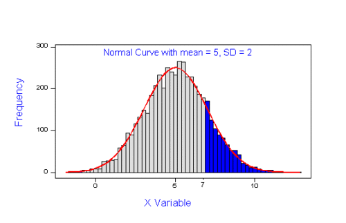
Figure 1. Frequency of observations expected to be greater than 7 from a large population with mean µ = 5 and σ = 2
Note that this is a crucial step! We assume that our sample distribution is really a sample from a population density (= “area under the curve”) function (= “an equation”) for a normal random (= “population”) variable.
Once I (you) make this assumption, then we have powerful and easy to use tools at our command to answer questions like
Question: What proportion of the population is greater than 7? (colored in blue).
This gets to the heart of the often-asked question, How many samples should I measure? If we know something about the mean and the variability, then we can predict how many samples will be of a particular kind. Let’s solve the problem.
The Z score
We could use the formula for the normal curve (and a lot of repetitions), but fortunately, some folks have provided tables that short-cut this procedure. R and other programs also can find these numbers because the formulas are “built in” to the base packages. First, lets introduce a simple formula that lets us standardize our population numbers so that we can use established tables of probabilities for the normal distribution.
Below, we will see how to use Rcmdr for these kinds of problems.
However, it’s one of the basic tasks in statistics that you should be able to do by hand. We’ll use the Z score as a way to take advantage of known properties of the standard normal curve.

Z = 1 (with the mean and SD). Z (say “Z-score”) is called the normal deviate (aka “standard normal score”; it is also called the “Z-score”); it gives us a short cut for finding the proportion of data greater than 7 in this case).
We use the normal deviate to do a couple of things; one use is to standardize a sample of observations so that they have a mean of zero and a standard deviation of one (the Z distribution). The data would then said to have been normalized.
The second use is to make predictions about how often a particular observation is likely to be encountered. As you can imagine, this last use is very helpful for designing an experiment — if we need to see a specified difference, we can conduct a pilot study (or refer to the literature) to determine a mean and level of variability for our observation of choice, plug these back into the normal equation and predict how likely we can expect to see a particular difference. In other words, this is one way to answer that question — how many observations need I make for my experiment to be valid?
Table of normal distribution
A portion of the table of the normal curve is provided at our web site and in your workbook. For our discussions, here’s another copy to look at (Fig. 2).
Figure 2. Portion of the table of the normal distribution. Only values equal to or greater than Z = 0 are visible.
See Table 1 in the Appendix for a full version of the normal table.
We read values of Z from the first column and the first row. For Z = 0.23 we would scan the top row, scoot over to fourth column, then trace to where the row and column intersect (Fig. 3); the frequency of occurrence of values at Z = 0.23 is 0.409046 or 40.9% (Fig. 3).
Figure 3. Highlight Z = 0.23, frequency is 0.409046.
Z on the standard normal table is going to range between -4 and +4, with Z = 0 corresponding to 0.500. The Normal table values are symmetrical about the mean of zero.
What to make of the values of Z, from -4, -3, … +2, +3, up to +4 and beyond? These are the standard deviations! Recall that using the Z score you corrected to mean of zero (got it!), and a standard deviation of one! A Z of 2 is twice the standard deviation; a Z = 3 is therefore three times the standard deviation, and so forth. The distribution is symmetrical: you get the same frequency for negative as for positive values. So on the “X” axis on a standard normal distribution, we have units of standard deviation plus (greater) or minus (less) than the mean. In Figure 4, area less than -1 standard deviations is highlighted (Fig. 4).
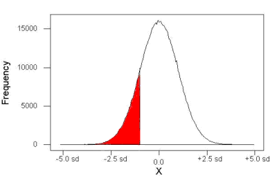
Figure 4. Plot of standard normal distribution; area less than -1 σ.
Question. How many multiples of standard deviations would you have for a Z score of Z = 1.75?
Answer = 1.75 times
Examples
See Table 1 in the Appendix for a full version of the normal table as you read this section.
What proportion of the data set will have values greater than 7? After applying our Z score equation, I get Z = 1.0 and for a Z of 1.0 = 0.1587 or 15.87% of the observations are greater than 7.
What proportion of the data set will have values less than -7? After applying our Z score equation, I get Z = -1.0. Taking advantage of symmetry argument, I just take my Z = -1.0 and make it positive — instead of values smaller than -1.0 we now have values greater than +1.0. And for a Z of 1.0 = 0.1587 or 15.87% of the observations are greater than 7, which means that 15.87% will be -7 or smaller.
What proportion of the data set will have values greater than 8? Again, apply the Z score equation I get Z of 1.5 = 0.0668 or 6.68% of the observations are greater than Z.
What proportion of the population is between 5 and 7 ? (colored in red). Draw the problem (example shown in Figure 5).
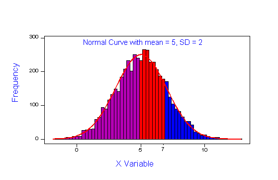
Figure 5. proportion of the population is between 5 and 7 (sorry about all of the colors — I kind of went crazy)
Worked problem
1 – (proportion beyond 7) – (proportion less than 5)
1 – (0.1587) – (proportion less than 5)
And the proportion less than 5?
Use Z-score equation again. Now we find that
Z = 0
And look up Z of 0 from the table = 0.5 proportion or 50.0%
Therefore, the proportion between 5 & 7 equals
1 -0.1587 – 0.50 = 0.3413
Answer = 34.13 % of the observations are between 5 and 7 when the mean µ = 5 and s = 2.
Questions
1. Repeat the worked problem, but this time, find the proportion
- between 2 and 6?
- between 3 and 5?
- less than 5?
- greater than 7?
Chapter 6 contents
- Introduction
- Some preliminaries
- Ratios and probabilities
- Combinations and permutations
- Types of probability
- Discrete probability distributions
- Continuous distributions
- Normal distribution and the normal deviate (Z)
- Moments
- Chi-square (Χ2) distribution
- t distribution
- F distribution
- References and suggested readings
6.5 – Discrete probability distributions
Binomial distribution
Discrete refers to particular outcomes. Discrete data types include all of the categorical types we have discussed, including binary, ordinal, and nominal.
The binomial probability distribution is a discrete distribution for the number of successes, k, in a sequence of n independent trials, where the outcome of each trial can take on only one of two possible outcomes. For cases of 0 or 1, yes or no, “heads” or “tails,” male or female, we talk about the binomial distribution, because the outcomes are discrete and there can be only two possible (binary) outcomes.
Fair coins have two sides; tossing a coin we expect “heads” or “tails,” but rarely, some coin types (e.g., USA nickels) may land and come to rest on edge or side. We still consider the coin toss having binary outcomes, by definition, even though a coin may land on edge about one toss in six thousand (Murray and Teare 1993) because the exception is extremely rare. h/t Dr. Jerry Coyne.
The mathematical function of the binomial is written as
![\begin{align*} Pr\left [ X \ successes \right ] = \left ( \frac{n}{X} \right )p^X \left ( 1-p \right )^{n-X} \end{align*}](https://biostatistics.letgen.org/wp-content/ql-cache/quicklatex.com-5c4b33b69c9a6ce28235c51834327347_l3.png "Rendered by QuickLaTeX.com")
where the binomial coefficient is given by

and X refers to the number of ways to choose “success” from n observations.
Consider an example.
We have to define what we mean by success. For coin toss, this might be the number of heads.
The mean for the binomial this is given simply as

where X is “Heads” (the category of successes for our example), and p corresponds to the probability the selected event occurs, in this case, “Heads.”
The variance of the binomial distribution is given by

Here’s a density plot of two trials with success 2% with n (x) equal to 20 (Fig. 1).
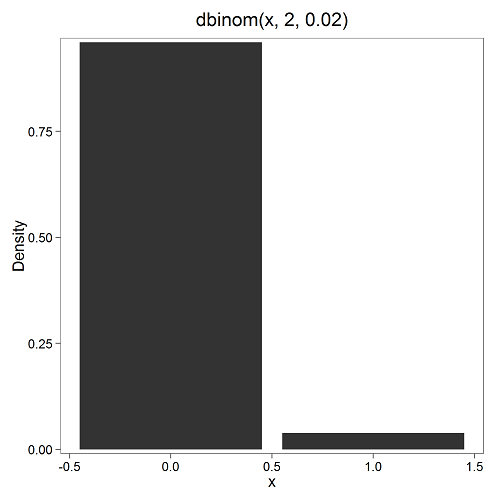
Figure 1. plot generated with KMggplot2 Rcmdr plugin
Here’s the R code
Create the trials, 1 through 20, then create an object to hold the number of trials
nSize=1:20
Size <- length(nSize); Size
R returns
[1] 20
Assign the probability value to an object
prob <- 0.02
Next, calculate the mean, mu, and the variance, var, for the binomial with prob = 0.02 and number of trials Size = 20
mu <- Size*prob
var <- Size*prob*(1-prob)
Print the mean and variance; lets assign them to an object then print the object
stats <- c(mu, var); stats
And R returns
[1] 0.400 0.392
And here’s a real-world example. Twinning in humans is rare. In Hawaii in the 1990’s the rate of twin births (monozygotic and dizygotic) was about 20 for every 1000 births or 2%. “Success” here then is twin births.
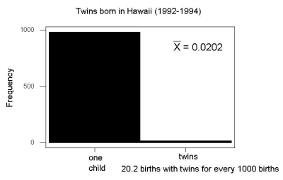
Figure 2. Example of binomial-like distribution: reported twins born in Hawaii.
Interestingly, rates of twins have since increased in Hawaii (31 out of 1000 births) and in the United States overall (33 out of 1000 births) (Table 2, NCHS Data Brief No. 80, 2012). Data were for year 2009.
Out of 10 births, what is the probability of two twin births in Hawaii?
![\begin{align*} Pr\left [ 2 \ twinbirths \right ] = \left ( \frac{10}{2} \right ) 0.031^2 \left ( 1 - 0.031 \right )^{10-2} \end{align*}](https://biostatistics.letgen.org/wp-content/ql-cache/quicklatex.com-65965fd393d815506757b84eda02c026_l3.png "Rendered by QuickLaTeX.com")
You can solve this with your calculator (yikes!), or take advantage of online calculators (GraphPad QuickCalcs), or use R and Rcmdr.
In R, simply type at the prompt
dbinom(2,10,0.031)
[1] 0.03361446
Try in R Commander.
Rcmdr → Distributions → Discrete distributions → Binomial distribution → Binomial probabilities …

Figure 3. Rcmdr menu to get binomial probability
Note I used p = 0.033 the rate for entire USA. Here’s the output
> .Table <- data.frame(Pr=dbinom(0:10, size=10, prob=0.033))
> rownames(.Table) <- 0:10
> .Table
Pr
0  7.149320e-01
1  2.439789e-01
2  3.746728e-02 ← Answer, 0.0375 or 3.75%
3  3.409639e-03
4  2.036263e-04
5  8.338782e-06
6  2.371422e-07
7  4.624430e-09
8  5.918028e-11
9  4.487991e-13
10 1.531579e-15
And here is the output for our example from Hawaii (p = 0.031).
> .Table <- data.frame(Pr=dbinom(0:10, size=10, prob=0.031))
> rownames(.Table) <- 0:10
> .Table
Pr
0  7.298570e-01
1  2.334940e-01
2  3.361446e-02 ← Answer, 0.0336 or 3.36%
3  2.867694e-03
4  1.605494e-04
5  6.163507e-06
6  1.643178e-07
7  3.003893e-09
8  3.603741e-11
9  2.561999e-13
10 8.196283e-16
We use the binomial distribution as the foundation for the binomial test, i.e., the test of an observed proportion against an expected population level proportion in a Bernoulli trial.
Hypergeometric distribution
The binomial distribution is used for cases of sampling with replacement from a population. When sampling without replacement is done, the hypergeometric distribution is used. It is the number of successes, k, in a sequence of n independent trials drawn from a fixed population. This sampling scheme means that each draw is no longer independent — with each draw you decrease the remaining number of observations and thus change the proportion.
The mathematical function of the hypergeometric is written as
![\begin{align*} Pr\left [X = k \right ] = \frac{\left ( \frac{K}{k} \right )\left ( \frac{N - K}{n - k} \right )}{\left ( \frac{N}{n} \right )} \end{align*}](https://biostatistics.letgen.org/wp-content/ql-cache/quicklatex.com-4c3fda04d51bcfab12f92b7cd77ff0ad_l3.png "Rendered by QuickLaTeX.com")
where N is the population size, K is the number of successes in that population, and n and k are defined as above. Lets look apply this to the twinning problem.
In 2009, 2200 women gave birth in Hawaii County, Hawaii. Out of 10 births, what is the probability of 2 twin births in Hawaii?
Assuming “risk” of twinning is the same rate as in rest of USA, then we have expected 72 successes in this population (0.033 * 2200).
Here’s the graph (Fig. 4).
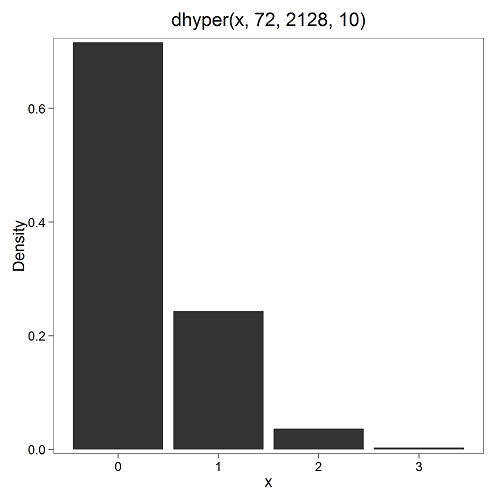
Figure 4. Plot of hypergeometric distribution twinning Hawaii.
where the X axis values shows the number of events with successes (twin births). Taking the bin 2 (we wanted to know about probability of 2 out of ten), we can draw a line back to the Y-axis to get our probability — looks like about 5% roughly. Plot drawn with KMggplot2
To get the actual probability,
Rcmdr → Distributions → Discrete distributions → Hypergeometric distribution → Hypergeometric probabilities …

Figure 5. Rcmdr menu to get hypergeometric probability
where m is the number of successes, n is the number of “failures,” and k is the number of trials.
> .Table
Pr
0 0.716453457
1 0.243438645
2 0.036688041 ← Answer, 0.0367 or 3.67%
3 0.003228871
The reference to white and black balls and urns is a device described by Bernoulli himself and has been used by others ever since to discuss probability problems (called the urn problem) and so I apply it here to be consistent. The urn contains a number of white (x) and a number of black (y) balls mixed together. One ball is drawn randomly from the urn — what color is it? The ball is then is either returned into the urn (replacement) or it is left out (without replacement) as in the hypergeometric problem, and the selection process is repeated.
Besides applications in gambling and balls-in-urns problems, this distribution is the basis for many tests of gene enrichment from microarray analyses. The hypergeometric forms the basis of the Fisher Exact test (see Chapter 9.5).
Discrete uniform distribution
For discrete cases of “1,” “2,” “3,” “4,” “5,” or “6,” on the single toss of fair dice, we can talk about the discrete uniform distribution because all possible outcomes are equally likely. If you are branded as a “card-counter” in Las Vegas, all you’ve done is reached an understanding of the uniform distribution of card suits!
One biological example would be the fate of a random primary oocyte in the human (mammal) female — three out of four will become polar bodies, eventually reabsorbed, whereas one in four will develop into a secondary oocyte (egg); the uniform distribution has to do with the counts of the products — each of the four primary oocytes has the same (apparently) chance (25%) of becoming the egg.
The uniform distribution exists also for continuous data types.
Poisson distribution
An extension from the binomial case is that, rather than following success or failure, you may have the following scenario. Consider a wind-dispersed seed released from a plant. If we markup the area around the plant in grids, we could then count the number of seeds within each grid. Most grids will have no seeds, some grids will have one seed, a few grids may have two seeds, etc. Multiple seeds in grids is a rare event. The graph might look like
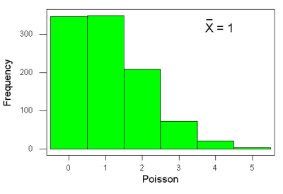
Figure 6. Example, poisson-like graph: the number of wind-dispersed seeds within each grid.
The Poisson has interesting properties, one being that the expected mean is equal to the variance. An equation is
![\begin{align*} Pr\left [X\right ] = \frac{\mu^X e^{-\mu}}{X!} \end{align*}](https://biostatistics.letgen.org/wp-content/ql-cache/quicklatex.com-b172e19511712bb9114f43372f907b6c_l3.png "Rendered by QuickLaTeX.com")
where μ is the mean (or could substitute with variance!), e is the natural logarithm, and X is number of successes you are interested in. For example, if μ = 1, what is the probability of observing a grid with five seeds? Simple enough to do this by hand, but let’s use Rcmdr instead. Here’s the graph (Fig. 7) from Rcmdr (KMggplot2 plugin)
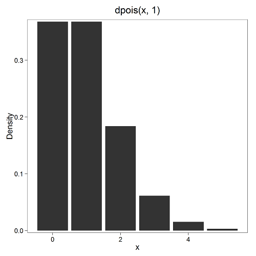
Figure 7. ggplot2 poisson μ= 1.
and for the actual probability we have from R
dpois(5, lambda = 1)
[1] 0.003065662
Rcmdr → Distributions → Discrete distributions → Poisson distribution → Poisson probabilities … (Fig. 8)
The only thing to enter is the mean (some call μ lambda with symbol λ).

Figure 8. Rcmdr menu, poisson probability
Here’s the output from R. For intervals 0, 1, 2, 3, …, 6 (Rcmdr just enters this range for you!
> .Table <- data.fram(Pr=dpois(0:6, lambda = 1))
> rownames(.Table) <- 0:6
> .Table
Pr
0 0.3678794412
1 0.3678794412
2 0.1839397206
3 0.0613132402
4 0.0153283100
5 0.0030656620 ← Answer, 0.0307 or 3.07%
6 0.0005109437
Next — Continuous distributions
And finally, for ratio (continuous) scale data, which can take on any value, we can express the chance that probability of a given point as a continuous function, with the normal distribution being one of the most important examples (there are others, like the F-distribution). Many statistical procedures assume that the data we use can be viewed as having come from a “normally distributed population.” See Chapter 6.6.
Questions
1. For each of the following scenarios, identify the most likely distribution that may be assumed
- litter size of 100 toy poodle females. A toy poodle is a purebred dog breed: range of litter size is 1 – 4 pups (Borge et al 2011)
- Mean litter size and total number of litters born per season of the year for litters registered within The Norwegian Kennel Club in 2006 and 2007: means by season were Fall 5, Winter 5, Spring 5, Summer 5 (Borge et al 2011)
- C-reactive protein (CRP) blood levels may increase when a person has any number of diseases that cause inflammation. Although CRP is reported as mg/dL, Doctors evaluate a patient’s CRP status as all measures below 1.0 are normal, all measures above 1 are above 1.0.
2. Quarterback sacks by game for the NFL team Seahawks, years 2011 through 2022 are summarized below (data extracted from https://www.pro-football-reference.com/ ).
| Sacks | How many games? |
| 0 | 25 |
| 1 | 46 |
| 2 | 49 |
| 3 | 39 |
| 4 | 25 |
| 5 | 14 |
| 6 | 8 |
| 7 | 2 |
| 8 | 1 |
| 9 | 0 |
a) Assuming a Poisson distribution, what are the mean (lambda) and variance?
b) The table covers a total of 112 games. How many sacks (events) were observed?
c) What is the probability of the Seahawks getting zero sacks in a game (in 2022, a season was 17 games; prior years a season was 16 games)?
Chapter 6 contents
- Introduction
- Some preliminaries
- Ratios and proportions
- Combinations and permutations
- Types of probability
- Discrete probability distributions
- Continuous distributions
- Normal distribution and the normal deviate
- Moments
- Chi-square distribution
- t distribution
- F distribution
- References and suggested readings
6.3 – Combinations and permutations
Events
The simplest place to begin with probability is to define an event — an event is an outcome — a “Heads” from a toss of coin, or the chance that the next card dealt is an ace in a game of Blackjack. In these simple cases we can enumerate how likely these events are given a number of chances or trials. For example, if the coin is tossed once, then the coin will either land “Heads” or “”Tails” (Fig. 1).
Figure 1. Heads (left) and Tails (right) of a USA quarter.
We can then ask what is the likelihood of ten “Heads” in ten tosses of a fair coin?
And this gets us to some basic rules of probability:
- if successive events are independent, then we multiply the probability
- if events are not independent, then the probability adds
- do we sample without replacement, i.e., an object can only be used once?
- do we sample with replacement, i.e., an object gets placed “back in the deck” and can be used again and again
Combinations and Permutations
Combinations ignore the order of the events; permutations are ordered combinations. For replacement, the formula for permutations is simply 
In the case of the ten “Heads,” in ten successive trials, the probability is  “ten-times” or
  = 0.0009766 (in R, just type
 0.5^10 or (1/2)^10 at the R prompt).
Examples of permutations in biology include,
Given the four nucleotide bases of DNA, adenine (A), cytosine (C), guanine (G), and thymine (T), how many codons are possible?

where the three (3) refers to the codon, three nucleotide genetic code. Codons are trinucleotide sequences of DNA or RNA that correspond to a specific amino acid.
How often do we expect to find by chance the heptamer (i.e., seven bases) consensus TATA box sequence, TATAWAW (W can be either Adenine or Thymine, per Standard IUB/IUPAC nucleic acid code)?

thus, we would expect at random to find TATA box sequences every 16,384 bases along the genome. For the human genome of 3.3 billion bases then we would expect at random more than 200,000 TATA box consensus sequences.
Another way to put this is to ask how many combinations of ten tosses gets us ten “Heads” then weigh this against all possible outcomes of tossing a coin ten times — how many times do we get zero Heads? Two “Heads”? And so on. This introduces the combinatorial.

where n is the number of choices (the list of events) and r is how many times you choose or trials. The exclamation point is called the factorial. The factorial instructs you to multiply the number over and over again, “down to one.” For example, if the number is 10, then

In R, just type factorial(10) at the R prompt.
factorial(10)
[1] 3628800
An example
Consider an Extrasensory Perception, ESP, experiment. We place photocopies of two kinds of cards, “Queen” and “King,” into ten envelopes, one card per envelope (Fig. 2). Thus, an envelope either contains a “Queen” or a “King.”

Figure 2. Playing cards with images commemorating 150th anniversary of Charles Darwin’s Origin of Species. (Design John R. C. White, Master of the Worshipful Company of Makers of Playing Cards 2008 to 2009.)
We shuffle the envelopes containing the cards and volunteers guess the contents of the envelopes, one at a time. We score the correct choices after all envelopes had been guessed. (It’s really hard to set these kinds of experiments up to rule out subtle cues and other kinds of experimental error! Diaconis 1978, Pigliucci 2010, pp. 77 – 83.) By chance alone we would expect 50% correct (e.g., one way to game the system would have been for the volunteer simply to guess “Queen” every time; since we had placed five “Queen” cards the volunteer would end up being right 50%).
What are the possible combinations?
Let’s start with one correct; the volunteer could be right by guessing the first one correctly, then getting the next nine wrong, or equivalently, the first choice was wrong, but the second was correct followed by eight incorrect choices, and so on.
We need math!
Let n = 10 and r = 1
Using the formula above we have

or ten ways to get one out of ten correct. This is the number of combinations without replacement.
In R, we can use the function choose(), included in the base install of R. At the R prompt type
choose(10,1)
and R returns
[1] 10
For permutations, use choose(n,k)*factorial(k).
To get permutations for larger sets, you’ll need to write a function or take advantage of functions written by others and available in packages for R. See gtools package, which contains programming tools for R. There are several packages that can be used to expand capabilities of working with permutations and combinations. For example, install a package and library called combinat and then run the combn() function, together with the dim() function, which will return
dim(combn(10,1))[2]
[1] 10
R explained
In the combn() the “10” is the total number of envelopes and the “1” is how many correct guesses. We also used the dim() function to give us the size of the result. The dim() function returns two numbers, the number of rows and the number of columns — combn() returns a matrix and so dim() saves you the trouble of counting the outcomes — the “[2]” tells R to return the total number of columns in the matrix created by combn(). Here’s the output from combn() , but without the dim() function
combn(10,1)
     [,1] [,2] [,3] [,4] [,5] [,6] [,7] [,8] [,9] [,10]
[1,]    1    2    3    4    5    6    7    8    9    10
in order, we see that there is one case where the success came the first time [1,1], another case where success came on the second try [1,2] and so on.
We can write a simple function to return the combinations
for (many in seq(0, 10, by = 1)){
    print(choose(10, many))
}
an inelegant function, but it works well enough, returning
[1] 1
[1] 10
[1] 45
[1] 120
[1] 210
[1] 252
[1] 210
[1] 120
[1] 45
[1] 10
[1] 1
Note that there’s only one way to get zero correct, only one way to get all ten correct.
For completion, what would be the permutations? Use the permn() function (same combinat library) along with length() function to get the number of permutations
length(permn(10))
[1] 3628800
Continue the example
Back to our ESP problem. If we continue with the formula, how many ways to get two correct? Three correct? And so on, we can show the results in a bar graph (Fig. 3).
Figure 3. Bar chart of the combinations of correct guesses out of 10 attempts (graph was presented in Chapter 4.1).
The graph in Figure 3 was made in R
Combos <- seq(0,10, by=1)
HowMany <- c(1,10,45,120,210,252,210,120,45,10,1)
barplot(HowMany, names.arg = Combos, xlab = "Number correct", ylab = "Count",col = "darkblue")
If you recall, we had two students score eight out of ten. Is this evidence of “ESP?” It certainly seems pretty good, but how rare is this to score 8 out of 10? The total number of outcomes was

Eight out of ten could be achieved in 45 different ways, so

So, eight out of ten is pretty unlikely! Is it evidence for ESP powers in our Biostatistics class? In fact, at the traditional Type I error rate of 5% used in biology and other sciences to evaluate inferences from statistical tests (See Chapter 8), we would say that this observation was statistically significant. Given that this would be an extraordinary claim, this should give you an important clue that statistical significance is not the same thing as evidence for the claim of ESP.
This is a good example where frequentist approach may not be the best approach — the Bayesian prior probability for ESP is vanishingly low.
In other words, Is our result biologically significant? Probably not, but I’ll keep my eyes on you, just in case.
Conclusions
Combinations or permutations?
Combinations refers to groups of n things taken k times without repetition. Note that order does not matter, just the combination of things. Permutations, on the other hand, specifically relate the number of ways a particular arrangement can show up.
Questions
- Calculate the combinations, from zero correct to ten correct, from our ESP experiment, i.e., confirm the numbers reported in Figure 3.
- Consider our ESP tests based on guessing cards. Let’s say that one subject repeatedly reports correct guesses at a rate greater than expected by chance. Why or why not should we view this as evidence the person may have extrasensory perception?
- Consider a common DNA triplet repeat, the three letter CAG.
- How many permutations are there for this triplet (word)?
- How many combinations are there for this triplet (word)?
- We call them combination locks, but given the definition of combination, is that the correct use of the term? Explain (and for those of you who insist on searching for “the answer,” cite your sources).
Chapter 6 contents
- Introduction
- Some preliminaries
- Ratios and probabilities
- Combinations and permutations
- Types of probability
- Discrete probability distributions
- Continuous distributions
- Normal distribution and the normal deviate (Z)
- Moments
- Chi-square distribution
- t distribution
- F distribution
- References and suggested readings
5.2 – Experimental units, Sampling units
Introduction
Sampling units refer to the measured items, the focus of data collection; samples are selected from populations. Often, sampling units are the same thing as individuals. For example, if we are interested in the knowing whether men are more obese than women in Hawai’i, we would select individuals from the population; we would measure individuals. Thus, the sampling unit would be individuals, and the measurement unit would be percent body fat recorded for each individual. The data set would be the collection of all body fat measures for all individuals in the study, and we would then make inferences (draw conclusions) about the differences, if any, between adult males and females for body fat.
But sampling units can also refer to something more restrictive than the individual. For example, we may be interested in how stable, or consistent, is a person’s body fat over time. If we take a body fat measure once per year over a decade on the same group of adults, then the sampling unit refers to each observation of body fat recorded (once per year, ten times for an individual), and the population we are most likely to be referring to is the collection of all such readings (ten is arbitrary — we could have potentially measured the same individual thousands of times).
In some cases the researcher may wish to compare groups of individuals and not the individuals themselves. For example, a 2001 study sought to see if family structure influenced the metabolic (glycemic) control of children with diabetes (Thompson et al 2001). The researchers compared how well metabolic control was achieved in children of single parents and two-parent families. Thus, the sampling units would be families and not the individual children.
Experimental units
Experimental units refers to the level at which treatments are independently applied in a study. Often, but not always, treatments are applied directly to individuals and therefore the sampling units and experimental units in these cases would be the same.
Question 1: What is the sampling unit in the following cell experiment?
A technician thaws a cryo tube containing about ½ million A549 cells (Foster et al 1998) and grows the cells in a T-75 culture flask (the 75 corresponds to 75 cm2 growing area) in a CO2 incubator at 37 °C. After the cells reach about 70% confluency, which may represent hundreds of thousands of cells, the technician aliquots 1000 cells into twelve wells of a plate for a total of 12000 cells. To three wells the technician adds a cytokine, to another three wells he adds a cytokine inhibitor, and to another three wells he adds both the cytokine and it’s inhibitor, and to the last three wells he adds DMSO, which was the solvent for both the cytokine and the inhibitor. He then returns the plate to the incubator and 24 hours later extracts all of the cells and performs a multiplex quantitative PCR to determine gene expression of several target genes known to be relevant to cell proliferation.
The described experiment would be an example of a routine, but not trivial procedure the technician would do in the course of working on the project in a molecular biology laboratory.
The choices for numbers provided in the description we may consider for the number of sampling units are:
- 1000 cells
- 12,000 cells
- ½ million cells
- 3 wells
- 12 wells
- The target genes
- None of the above
The correct answer is G, None of the above.
“None of the above” because the correct answer is … there was just one sampling unit! All cells trace back to that single cryo tube.
To answer the question, start from the end and work your way back. What we are looking for is independence of samples and at what level in the experiment we find independence. Our basic choice is between numbers of cells and numbers of wells. Clearly, cells are contained in the wells, so all of the cells in one well share the same medium, being treated the same way, including all the way back to the cryo tube — all of the cells came from that one tube so this lack of independence traces all the way back to the source of the cells. Thus, the answer can’t be related to cell number. How many wells did the technician set up? Twelve total. So, the maximum number of sampling units would be twelve, unless the samples are not independent. And clearly the wells (samples) are not independent because, again, all cells in the twelve wells trace back to a single cryo tube. Thus, from both perspectives, wells and cells, the answer is actually just one sampling unit! (Cumming et al 2007; Lazic 2010). Finally, the genes themselves are the targets of our study — they are the variables, not the samples. Moreover, the same logic applies — all copies of the genes are in effect descended from the few cells used to start the population.
Experimental and sampling units often, but not always the same
Question 2: What is the experimental unit in the described cell experiment?
- 1000 cells
- 12,000 cells
- ½ million cells
- 3 wells
- 12 wells
- The target genes
- None of the above
The correct answer is E, 12 wells. Noted above, the technician applied treatments to 12 wells. There were two treatments, cytokine and cytokine-inhibitor (Table 1).
Table 1. Translate experiment description to a table to better visualize the design
| Well | DMSO | Cytokine | Inhibitor |
|---|---|---|---|
| 1 | Yes | Yes | No |
| 2 | Yes | Yes | No |
| 3 | Yes | Yes | No |
| 4 | Yes | No | Yes |
| 5 | Yes | No | Yes |
| 6 | Yes | No | Yes |
| 7 | Yes | Yes | Yes |
| 8 | Yes | Yes | Yes |
| 9 | Yes | Yes | Yes |
| 10 | Yes | No | No |
| 11 | Yes | No | No |
| 12 | Yes | No | No |
Replication: Groups and individuals as sampling units
The correct identification of levels at which sampling independence occurs is crucial to successful interpretation of inferential statistics. Note replication in Table 1: three cytokine, three cytokine-inhibitor, three with both. Sampling error rate is evaluated at the level of the sampling units. Technical replication of sampling units allows one to evaluate errors of measurement (e.g., instrument noise) (Blainey et al 2014). Replication of sampling units increases statistical power, the ability to correctly reject hypotheses. If the correct design reflects sampling units are groups and not individuals, then by counting the individuals as the independent sampling units would lead the researcher to think his design has more replication than it actually does. The consequence on the inferential statistics is that he will more likely reject a correct null hypothesis, in other words, the risk of elevated type I error occurs (Chapter 8 – Inferential statistics). This error, confusing individual and group sampling units, is called pseudoreplication (Lazic 2010).
Consider a simpler experimental design scenario depicted in Figure 2: Three different water treatments (e.g., concentrations of synthetic progestins, Zeilinger et al. 2009) in bowls A, B, and C; three fish in bowl A, three fish in bowl B, and three fish in bowl C. The outcome variable might be a stress indicator, e.g., plasma cortisol (Luz et al 2008).
Figure 1. Three aquariums, three fish. Image modified from https://www.pngrepo.com/svg/153528/aquarium
Question 3: What were the experimental units for the fish in the bowl experiment (Fig 1)?
- Three bowls
- Nine fish
- Three water treatments
The correct answer is A, 3 bowls. The treatments were allocated to the bowls, not to individual fish. The three fish in each bowl provides technical replication for the effects of bowl A, bowl B, and bowl C, but does not provide replication for the effects of the water treatments. Adding three bowls for each water treatment, each with three fish, would be the simplest correction of the design, but may not be available to the researcher because of space or cost limitations. The design would then include nine bowls and 27 fish. If resources are not available to simply scale up the design, then the researcher could repeat the study several times, taking care to control nuisance variables. Alternatively, if the treatments were applied to the individual fish, then the experimental units become the individual fish and the bowls reduced to a blocking effect (Chapter 14.4), where differences may exist among the bowls, but they are no longer the level by which measurements are made. Note that if pseudoreplication is present in a study, this may be accounted for by specifying the error structure in a linear mixed model (e.g., random effects, blocking effects, etc., see Chapter 14 and Chapter 18).
Question 4: What were the sampling units for the fish in the bowl experiment (Fig. 2)?
- Three bowls
- Nine fish
- Three water treatments
The correct answer is B, the individual fish. If instead of aqueous application of synthetic progestin, treatments were applied directly to each fish via injection, what would be the answers to Question 3 and Question 4?
Choices like these clearly involve additional compromises and assumptions about experimental design and inference about hypotheses.
Conclusion
Sampling units, experimental units, and the concept of level at which units are independent within an experiment were introduced. Lack of independence yields the problem of pseudoreplication in an experiment, which will increase the chance that we will detect differences between our treatment groups, when no such difference exists!
Questions


Figure 2. Three Miracle-Grow AeroGarden planters, each with nine seedlings of an Arabidopsis thaliana strain.
1. Nine seeds each of three strains of Arabidopsis thaliana were germinated in three Miracle-Grow AeroGarden® hydroponic planters (Fig. 2). Each planter had nine or ten vials with sphagnum peat. All seeds from a strain were planted in the same apparatus, one seed per vial. What were the experimental units?
- planters
- seeds
- strains of Arabidopsis
- vials in the planters
2. This experimental design is an example of pseudoreplication, but at what level?
- planters
- seeds
- strains of Arabidopsis
- vials in the planters
3. How would you re-do this experiment to avoid pseudoreplication? (Hint: you can’t add more planters!)