20.5 – Time series
Introduction
Time series refers to any measure recorded over time. Stationary time series do not have trends or seasonality, just random (white) noise; differencing, or nonstationary time series do have trends and or seasonality. Stationary time series will not have predictable patterns over the long term, but for us, what this distinction says is that statistics like autocorrelation, the mean and standard deviation remains the same over time. Nonstationary times series can be made stationary by transformation, with taking a differencing approach, subtracting each observation from its preceding one to remove trends and seasonality, one common approach.
All kinds of examples of time series analysis can be made, with stock market price fluctuations (Hamilton 1994) and meteorological forecasting (Mudelsee 2014) as common examples. Time series analysis are also important in clinical situations, for example, analysis of temporal patterns in ECG and blood pressure data, which helps predict risks, monitor patient health, and understand disease trends. In ecology, perhaps the most famous time series data set is the Hudson’s Bay Company fur-trade records, which show a 9- to 11-year predator-prey population cycle between populations of the Canadian lynx (the predator) and the snowshoe hare (the prey) (Krebs et al 1995).
Significant autocorrelation — the correlation between any two observations in a data series separated by a specific time interval or lag — represents the extent to which a time series is correlated with its past values. For example, autocorrelation could measure the association between a person’s heart rate today and its heart rate yesterday, or between its heart rate today and the heart rate from last week. It is not simply the relationship between today’s heart rate and, for instance, today’s environmental temperature. This kind of comparison, between two sets of time series, calls for a cross-correlation or predictive correlation. A cross-correlation measures the correlation between the first series (temperature) and a lagged version of the second series (heart rate some minutes or hours later). Examples of such correlations include our familiar product moment correlation, but generalized across all possible time lags.
Note 1: See RHRV package, the R Heart Rate Variability (HRV) analysis package, for framework to analyze heartbeat, ECG, and other cardiac recordings. See also Chapter 20.3 – Baseline correction for an example of a myogram analysis with baseline drift.
There’s much to the analysis of time series, but one key concept is the moving average. Along with any trend or pattern due to seasonality, time series data are expected to exhibit noise or random variation associated with each point in the series. The moving average is an attempt to smooth out data to reveal underlying trends and are fundamental to seasonal decomposition and forecasting. We calculate a series of averages of different subsets of the data, making it easier to spot long-term patterns by filtering out short-term noise, like fluctuations or outliers.
For example, to calculate the 5-beat moving average of a heartbeat, you would average the last 5 individual heartbeat values. As each new heartbeat is recorded, the oldest one is dropped, and a new average is calculated, creating a smoother trend line that shows a clearer overall picture rather than focusing on individual, potentially spiky, beat-to-beat variations. Rate-responsive or adaptive pacemakers use moving averages to determine the appropriate pacing rate. This helps provide a smoother and more stable heart rate response to the patient’s activity.
Note 2: For some really cool work on adaptive pacemakers, see Kumar et al 2018.
This statistical approach should sound familiar — we introduced without much fanfare use of LOESS (Locally Estimated Scatterplot Smoothing) to smooth data to improve pattern detection in Chapter 4.5 and Chapter 17.4. While a moving average takes average of a fixed number of recent data points, LOESS is a more powerful non-parametric regression technique that fits local polynomial regressions to subsets of the data to create a smooth curve.
In time series analysis, the autocorrelation function (ACF) measures the linear relationship between a time series and a lagged version of itself. It quantifies how correlated a series is with its past values ( ) and
) and  ), where
  is the lag or time interval. An ACF plot, or correlogram, visually displays these correlation coefficients at different lags to help identify patterns, assess randomness, and determine appropriate time series models like ARIMA. ACF is related to moving averages because the ACF plot helps to identify the order of a moving average model, which depends on the ACF’s behavior at different lags.
Note 3: A time-series plot shows how a single variable changes over time, while an ACF (Autocorrelation Function) plot visualizes the correlation between a time series and a lagged version of itself.
Like many pages in Mike’s Biostatistics Book, this page only begins to introduce the subject. For a more thorough introduction, see Introduction to Time Series Analysis, NIST. See also the text by Shumway and Stoffer (2025).
ARIMA and ARMA models
ARIMA and ARMA models are fundamental tools for analyzing time series data in biostatistics, especially when the goal is to understand temporal patterns or forecast future values. An ARMA model combines two ideas: autoregression (AR), where the current value depends on previous values, and moving average (MA), where the current value depends on previous error terms. An ARIMA model extends this by adding differencing—the “I” for Integrated—which helps remove trends and make the series stationary. These models are widely used in public health, epidemiology, and biological monitoring because many variables (e.g., infection rates, physiological signals) show correlation over time.
Note 4: We introduced ARMA models in our Generalized Linear models introduction, Chapter 18.4.
Both ARMA and ARIMA models rely on the concepts of lagged dependence and error smoothing, but ARIMA is more flexible because it explicitly accommodates nonstationary data. An ARMA(p, q) model is appropriate when the time series is already stationary or has been preprocessed to remove trend and seasonality.  is the autoregressive order, the number of lagged observations used to forecast the current value, and
  is the moving average order, the number of lagged forecast errors included in the model.
In contrast, ARIMA(p, d, q) includes a differencing parameter  that automatically transforms the series to stationarity before fitting the ARMA structure. Thus, ARIMA models are typically used for data with a clear trend or evolving mean, while ARMA models are a subset applied to stable series without differencing. In practice, ARIMA is more commonly applied because real-world biological and clinical time series often exhibit trends.
R code
In R, ARMA and ARIMA models can be fit using the forecast or stats packages. The code below shows simple examples of each using a generic time series object  . An ARMA(2,1) model can be fit with:
arma_model <- arima(y, order = c(2, 0, 1))
summary(arma_model)
where the middle “0” indicates no differencing. For an ARIMA(1,1,1) model, which includes first differencing to remove trend, the code is:
arima_model <- arima(y, order = c(1, 1, 1))
summary(arima_model)
ccc
R packages
To conduct time series analysis we can use built in functions like ts() and decompose(). HoltWinters() also useful, now part of stats. Lots of specialized time series packages with advanced features, including forecast, timeSeries (Financial time series), season (Seasonal analysis of health data), and many others. For a more extensive package, see asta, which was designed to accompany the excellent book, now in its 5th edition, Time Series Analysis and its Applications: With R Examples, by Shumway and Stoffer (2025).
Note 4: Caution — newer versions of R have HoltWinters() and related functions included with base package stats.
Rcmdr package for time series was RcmdrPlugin.epack , removed from CRAN as of 2018.
For up-to-date listing of time series packages, see https://cran.r-project.org/web/views/TimeSeries.html
Time series data sets included in R and Rcmdr
R Code
data(co2, package="datasets")
co2 <- as.data.frame(co2)
#convert to time series data type with ts()
tCO2 <- ts(co2,frequency=12,start=c(1959),end=c(1997))
plot.ts(tCO2)
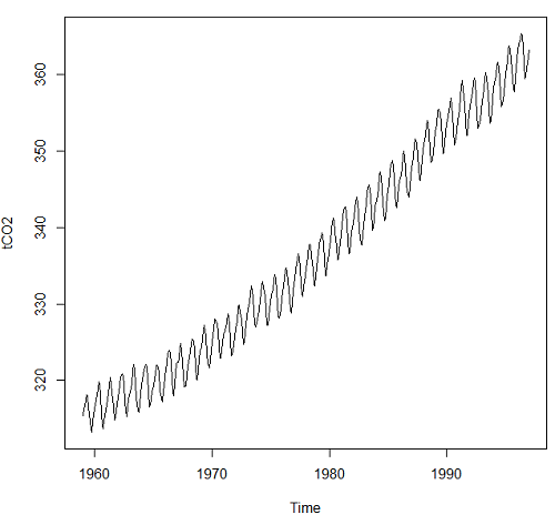
Figure 1. Time series plot of CO2 data set, the Keeling curve, from package datasets, comes with Rcmdr installation.
Other datasets included with R
carData::Arrests
carData::Bfox
carData::CanPop
Example
Get up-to-date CO2 data from NOAA as text file. Download to your computer, load and clean in your favorite spreadsheet app. Months came as numbers 1,2,3, etc., I changed to text, Jan, Feb, Mar, etc. I grabbed three columns: year, month, ppm for import to R.
head(maunaLoa)
R output
> head(maunaLoa)
  year month  ppm
1 1958 Mar 315.70
2 1958 Apr 317.45
3 1958 May 317.51
4 1958 Jun 317.24
5 1958 Jul 315.86
6 1958 Aug 314.93
However, it turns out the time series functions are easiest to work if only the ppm data are included.
tCO2 <- ts(maunaLoa[,"ppm"],frequency=12,start=c(1958,3),end=c(2020,10))
head(tCO2)
R output
> head(tCO2)
        Mar    Apr    May    Jun    Jul    Aug
1958 315.70 317.45 317.51 317.24 315.86 314.93
Get our plot (Figure 2).
plot(tCO2)
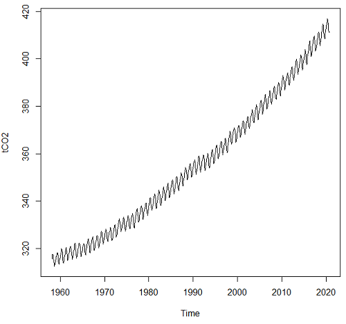
Figure 2. CO2 ppm monthly average data from NOAA, last data October 2020.
Seasonal time series comes with a trend component, a seasonal component, and a random component.
R code
dectCO2 <- decompose(tCO2)
head(dectCO2)
plot(dectCO2)
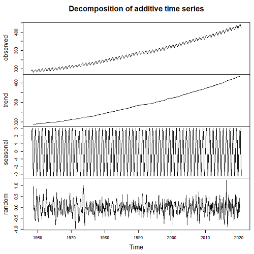
Figure 3. Observed (panel, top), trends over time (panel, second from top), seasonal changes (panel, second from bottom), and random error (panel, bottom).
Forecasting
Excellent resource at https://otexts.com/fpp2/
Exponential smoothing, weighted averages of past observations, weighted so that more recent observations are more influential.
Holt-Winters method extracts seasonal component (additive or multiplicative).
#set start value to value of first observation
tCO2cast <- HoltWinters(tCO2, l.start=315.42)
#Predict for next ten years. Because frequency in ts() was monthly, ten years is h=120
forecastCO2 <- forecast(tCO2cast, h=120)
plot(forecastCO2, fcol="red")
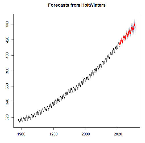
Figure 4. Data in black, predicted values in red (additive) shaded by confidence interval.
Questions
- Write up three learning outcomes for this page. Hint: Point your favorite generative AI to this page and ask for help.
- For the co2 dataset included in Rcmdr (co2, datasets), obtain forecast for year 2020 and compare against actual 2020 data (see Figure 2).
- Positive clinical samples between September 2015 and November 2020 for flu virus in the USA are provided in the data set below (scroll or click here). The frequency of observations was weekly. Apply
decompose()and obtain the seasonal and trend components of the data set. Which month does the peak positive sample occur? - Total pounds of fish (variable = Pounds) and pounds of Akule and Opelu (variable = Akule.Opelu) caught by commercial industry in Hawaiʻi, from 2000 to 2018 are provided in the data set below (scroll or click here). Apply
decompose()and obtain the seasonal and trend components of the data set for Total pounds and again for Akule (Selar crumenophthalmus) and Opelu (Decapterus macarellus). Is there evidence for trends, and if so, describe the trend. Is there evidence of seasonality? If so, which month did peak fishing occur?
Quiz Chapter 20.5
Time series
References and suggested reading
Hamilton, J. D. (1994). Time Series Analysis. Princeton University Press.
Krebs, C. J., Boutin, S., Boonstra, R., Sinclair, A. R. E., Smith, J. N. M., Dale, M. R. T., Martin, K., & Turkington, R. (1995). Impact of food and predation on the snowshoe hare cycle. Science, 269(25 August), 1112–1115.
Kumar, A., Komaragiri, R., & Kumar, M. (2018). From Pacemaker to Wearable: Techniques for ECG Detection Systems. Journal of Medical Systems, 42(2), 34.
Chapter 6.4. Introduction to Time Series Analysis, in NIST/SEMATECH e-Handbook of Statistical Methods, https://www.itl.nist.gov/div898/handbook/index.htm, (first reviewed by Mike in 2019).
Mudelsee, M. (2016). Climate time series Classical statistics and bootstrap methods (2nd ed., Vol. 51). Springer.
Shumway, R. H., & Stoffer, D. S. (2025). Time Series Analysis and Its Applications: With R Examples (5th ed.). Springer.
Data set this page
Flu, extracted 28 Nov 2020 from https://gis.cdc.gov/grasp/fluview/fluportaldashboard.html
| Year | Date | Week | Positive |
|---|---|---|---|
| 2015 | 09/28/15 | 40 | 1.056 |
| 2015 | 10/05/15 | 41 | 1.297 |
| 2015 | 10/12/15 | 42 | 1.109 |
| 2015 | 10/19/15 | 43 | 1.108 |
| 2015 | 10/26/15 | 44 | 1.123 |
| 2015 | 11/02/15 | 45 | 1.382 |
| 2015 | 11/09/15 | 46 | 1.193 |
| 2015 | 11/16/15 | 47 | 1.385 |
| 2015 | 11/23/15 | 48 | 1.395 |
| 2015 | 11/30/15 | 49 | 1.475 |
| 2015 | 12/07/15 | 50 | 2.512 |
| 2015 | 12/14/15 | 51 | 2.287 |
| 2015 | 12/21/15 | 52 | 2.46 |
| 2016 | 01/04/16 | 1 | 2.931 |
| 2016 | 01/11/16 | 2 | 4.254 |
| 2016 | 01/18/16 | 3 | 5.485 |
| 2016 | 01/25/16 | 4 | 6.96 |
| 2016 | 02/01/16 | 5 | 9.699 |
| 2016 | 02/08/16 | 6 | 12.549 |
| 2016 | 02/15/16 | 7 | 15.536 |
| 2016 | 02/22/16 | 8 | 18.362 |
| 2016 | 02/29/16 | 9 | 21.11 |
| 2016 | 03/07/16 | 10 | 23.645 |
| 2016 | 03/14/16 | 11 | 19.972 |
| 2016 | 03/21/16 | 12 | 18.471 |
| 2016 | 03/28/16 | 13 | 16.227 |
| 2016 | 04/04/16 | 14 | 14.016 |
| 2016 | 04/11/16 | 15 | 13.236 |
| 2016 | 04/18/16 | 16 | 12.346 |
| 2016 | 04/25/16 | 17 | 10.262 |
| 2016 | 05/02/16 | 18 | 8.121 |
| 2016 | 05/09/16 | 19 | 6.686 |
| 2016 | 05/16/16 | 20 | 5.811 |
| 2016 | 05/23/16 | 21 | 4.719 |
| 2016 | 05/30/16 | 22 | 3.06 |
| 2016 | 06/06/16 | 23 | 3.02 |
| 2016 | 06/13/16 | 24 | 1.829 |
| 2016 | 06/20/16 | 25 | 1.712 |
| 2016 | 06/27/16 | 26 | 1.223 |
| 2016 | 07/04/16 | 27 | 0.903 |
| 2016 | 07/11/16 | 28 | 0.869 |
| 2016 | 07/18/16 | 29 | 0.849 |
| 2016 | 07/25/16 | 30 | 0.782 |
| 2016 | 08/01/16 | 31 | 0.934 |
| 2016 | 08/08/16 | 32 | 0.901 |
| 2016 | 08/15/16 | 33 | 0.803 |
| 2016 | 08/22/16 | 34 | 1.405 |
| 2016 | 08/29/16 | 35 | 1.678 |
| 2016 | 09/05/16 | 36 | 1.461 |
| 2016 | 09/12/16 | 37 | 1.513 |
| 2016 | 09/19/16 | 38 | 1.741 |
| 2016 | 09/26/16 | 39 | 1.784 |
| 2016 | 10/03/16 | 40 | 1.57 |
| 2016 | 10/10/16 | 41 | 1.359 |
| 2016 | 10/17/16 | 42 | 1.403 |
| 2016 | 10/24/16 | 43 | 1.509 |
| 2016 | 10/31/16 | 44 | 1.916 |
| 2016 | 11/07/16 | 45 | 2.201 |
| 2016 | 11/14/16 | 46 | 2.576 |
| 2016 | 11/21/16 | 47 | 3.348 |
| 2016 | 11/28/16 | 48 | 3.319 |
| 2016 | 12/05/16 | 49 | 4.26 |
| 2016 | 12/12/16 | 50 | 6.683 |
| 2016 | 12/19/16 | 51 | 10.782 |
| 2016 | 12/26/16 | 52 | 13.999 |
| 2017 | 01/02/17 | 1 | 13.344 |
| 2017 | 01/09/17 | 2 | 15.373 |
| 2017 | 01/16/17 | 3 | 18.287 |
| 2017 | 01/23/17 | 4 | 18.53 |
| 2017 | 01/30/17 | 5 | 21.422 |
| 2017 | 02/06/17 | 6 | 24.153 |
| 2017 | 02/13/17 | 7 | 24.512 |
| 2017 | 02/20/17 | 8 | 24.725 |
| 2017 | 02/27/17 | 9 | 19.772 |
| 2017 | 03/06/17 | 10 | 19.271 |
| 2017 | 03/13/17 | 11 | 19.034 |
| 2017 | 03/20/17 | 12 | 19.711 |
| 2017 | 03/27/17 | 13 | 18.482 |
| 2017 | 04/03/17 | 14 | 15.425 |
| 2017 | 04/10/17 | 15 | 12.74 |
| 2017 | 04/17/17 | 16 | 9.696 |
| 2017 | 04/24/17 | 17 | 6.768 |
| 2017 | 05/01/17 | 18 | 5.918 |
| 2017 | 05/08/17 | 19 | 5.333 |
| 2017 | 05/15/17 | 20 | 4.863 |
| 2017 | 05/22/17 | 21 | 4.352 |
| 2017 | 05/29/17 | 22 | 4.165 |
| 2017 | 06/05/17 | 23 | 3.386 |
| 2017 | 06/12/17 | 24 | 3.062 |
| 2017 | 06/19/17 | 25 | 2.649 |
| 2017 | 06/26/17 | 26 | 2.534 |
| 2017 | 07/03/17 | 27 | 2.178 |
| 2017 | 07/10/17 | 28 | 2.164 |
| 2017 | 07/17/17 | 29 | 1.839 |
| 2017 | 07/24/17 | 30 | 1.806 |
| 2017 | 07/31/17 | 31 | 1.948 |
| 2017 | 08/07/17 | 32 | 1.9 |
| 2017 | 08/14/17 | 33 | 1.343 |
| 2017 | 08/21/17 | 34 | 1.434 |
| 2017 | 08/28/17 | 35 | 1.935 |
| 2017 | 09/04/17 | 36 | 1.888 |
| 2017 | 09/11/17 | 37 | 1.896 |
| 2017 | 09/18/17 | 38 | 1.669 |
| 2017 | 09/25/17 | 39 | 1.703 |
| 2017 | 10/02/17 | 40 | 2.202 |
| 2017 | 10/09/17 | 41 | 2.09 |
| 2017 | 10/16/17 | 42 | 2.176 |
| 2017 | 10/23/17 | 43 | 2.583 |
| 2017 | 10/30/17 | 44 | 3.607 |
| 2017 | 11/06/17 | 45 | 4.245 |
| 2017 | 11/13/17 | 46 | 5.3 |
| 2017 | 11/20/17 | 47 | 7.088 |
| 2017 | 11/27/17 | 48 | 7.305 |
| 2017 | 12/04/17 | 49 | 10.745 |
| 2017 | 12/11/17 | 50 | 15.355 |
| 2017 | 12/18/17 | 51 | 22.777 |
| 2017 | 12/25/17 | 52 | 25.386 |
| 2018 | 01/01/18 | 1 | 25.365 |
| 2018 | 01/08/18 | 2 | 26.942 |
| 2018 | 01/15/18 | 3 | 27.034 |
| 2018 | 01/22/18 | 4 | 27.37 |
| 2018 | 01/29/18 | 5 | 27.064 |
| 2018 | 02/05/18 | 6 | 26.998 |
| 2018 | 02/12/18 | 7 | 26.117 |
| 2018 | 02/19/18 | 8 | 22.616 |
| 2018 | 02/26/18 | 9 | 18.487 |
| 2018 | 03/05/18 | 10 | 15.694 |
| 2018 | 03/12/18 | 11 | 15.581 |
| 2018 | 03/19/18 | 12 | 15.328 |
| 2018 | 03/26/18 | 13 | 15.114 |
| 2018 | 04/02/18 | 14 | 12.689 |
| 2018 | 04/09/18 | 15 | 11.249 |
| 2018 | 04/16/18 | 16 | 9.398 |
| 2018 | 04/23/18 | 17 | 7.999 |
| 2018 | 04/30/18 | 18 | 6.259 |
| 2018 | 05/07/18 | 19 | 4.393 |
| 2018 | 05/14/18 | 20 | 3.166 |
| 2018 | 05/21/18 | 21 | 2.39 |
| 2018 | 05/28/18 | 22 | 1.529 |
| 2018 | 06/04/18 | 23 | 1.577 |
| 2018 | 06/11/18 | 24 | 1.299 |
| 2018 | 06/18/18 | 25 | 1.023 |
| 2018 | 06/25/18 | 26 | 1.114 |
| 2018 | 07/02/18 | 27 | 1.003 |
| 2018 | 07/09/18 | 28 | 0.916 |
| 2018 | 07/16/18 | 29 | 1.053 |
| 2018 | 07/23/18 | 30 | 0.995 |
| 2018 | 07/30/18 | 31 | 0.954 |
| 2018 | 08/06/18 | 32 | 0.957 |
| 2018 | 08/13/18 | 33 | 0.764 |
| 2018 | 08/20/18 | 34 | 1.336 |
| 2018 | 08/27/18 | 35 | 1.504 |
| 2018 | 09/03/18 | 36 | 1.747 |
| 2018 | 09/10/18 | 37 | 1.687 |
| 2018 | 09/17/18 | 38 | 1.699 |
| 2018 | 09/24/18 | 39 | 1.497 |
| 2018 | 10/01/18 | 40 | 1.749 |
| 2018 | 10/08/18 | 41 | 1.697 |
| 2018 | 10/15/18 | 42 | 1.993 |
| 2018 | 10/22/18 | 43 | 2.055 |
| 2018 | 10/29/18 | 44 | 2.174 |
| 2018 | 11/05/18 | 45 | 2.733 |
| 2018 | 11/12/18 | 46 | 3.157 |
| 2018 | 11/19/18 | 47 | 3.928 |
| 2018 | 11/26/18 | 48 | 3.915 |
| 2018 | 12/03/18 | 49 | 6.232 |
| 2018 | 12/10/18 | 50 | 10.364 |
| 2018 | 12/17/18 | 51 | 14.265 |
| 2018 | 12/24/18 | 52 | 16.352 |
| 2019 | 12/31/18 | 1 | 12.139 |
| 2019 | 01/07/19 | 2 | 12.722 |
| 2019 | 01/14/19 | 3 | 16.317 |
| 2019 | 01/21/19 | 4 | 19.392 |
| 2019 | 01/28/19 | 5 | 22.549 |
| 2019 | 02/04/19 | 6 | 25.134 |
| 2019 | 02/11/19 | 7 | 26.026 |
| 2019 | 02/18/19 | 8 | 26.241 |
| 2019 | 02/25/19 | 9 | 26.074 |
| 2019 | 03/04/19 | 10 | 25.607 |
| 2019 | 03/11/19 | 11 | 26.132 |
| 2019 | 03/18/19 | 12 | 22.481 |
| 2019 | 03/25/19 | 13 | 19.304 |
| 2019 | 04/01/19 | 14 | 14.942 |
| 2019 | 04/08/19 | 15 | 11.909 |
| 2019 | 04/15/19 | 16 | 8.611 |
| 2019 | 04/22/19 | 17 | 5.844 |
| 2019 | 04/29/19 | 18 | 4.82 |
| 2019 | 05/06/19 | 19 | 3.84 |
| 2019 | 05/13/19 | 20 | 3.542 |
| 2019 | 05/20/19 | 21 | 3.42 |
| 2019 | 05/27/19 | 22 | 3.083 |
| 2019 | 06/03/19 | 23 | 2.79 |
| 2019 | 06/10/19 | 24 | 2.316 |
| 2019 | 06/17/19 | 25 | 1.902 |
| 2019 | 06/24/19 | 26 | 2.081 |
| 2019 | 07/01/19 | 27 | 2.429 |
| 2019 | 07/08/19 | 28 | 2.017 |
| 2019 | 07/15/19 | 29 | 2.218 |
| 2019 | 07/22/19 | 30 | 2.377 |
| 2019 | 07/29/19 | 31 | 2.398 |
| 2019 | 08/05/19 | 32 | 2.054 |
| 2019 | 08/12/19 | 33 | 2.082 |
| 2019 | 08/19/19 | 34 | 2.362 |
| 2019 | 08/26/19 | 35 | 3.455 |
| 2019 | 09/02/19 | 36 | 3.097 |
| 2019 | 09/09/19 | 37 | 2.484 |
| 2019 | 09/16/19 | 38 | 2.757 |
| 2019 | 09/23/19 | 39 | 2.744 |
| 2019 | 09/30/19 | 40 | 1.31 |
| 2019 | 10/07/19 | 41 | 1.479 |
| 2019 | 10/14/19 | 42 | 1.552 |
| 2019 | 10/21/19 | 43 | 2.253 |
| 2019 | 10/28/19 | 44 | 3.057 |
| 2019 | 11/04/19 | 45 | 5.163 |
| 2019 | 11/11/19 | 46 | 6.756 |
| 2019 | 11/18/19 | 47 | 9.546 |
| 2019 | 11/25/19 | 48 | 10.939 |
| 2019 | 12/02/19 | 49 | 11.655 |
| 2019 | 12/09/19 | 50 | 16.154 |
| 2019 | 12/16/19 | 51 | 22.533 |
| 2019 | 12/23/19 | 52 | 26.934 |
| 2020 | 12/30/19 | 1 | 23.488 |
| 2020 | 01/06/20 | 2 | 23.119 |
| 2020 | 01/13/20 | 3 | 26.083 |
| 2020 | 01/20/20 | 4 | 28.281 |
| 2020 | 01/27/20 | 5 | 30.147 |
| 2020 | 02/03/20 | 6 | 30.26 |
| 2020 | 02/10/20 | 7 | 29.675 |
| 2020 | 02/17/20 | 8 | 28.322 |
| 2020 | 02/24/20 | 9 | 25.752 |
| 2020 | 03/02/20 | 10 | 22.491 |
| 2020 | 03/09/20 | 11 | 15.813 |
| 2020 | 03/16/20 | 12 | 7.502 |
| 2020 | 03/23/20 | 13 | 2.322 |
| 2020 | 03/30/20 | 14 | 1.031 |
| 2020 | 04/06/20 | 15 | 0.618 |
| 2020 | 04/13/20 | 16 | 0.623 |
| 2020 | 04/20/20 | 17 | 0.218 |
| 2020 | 04/27/20 | 18 | 0.263 |
| 2020 | 05/04/20 | 19 | 0.326 |
| 2020 | 05/11/20 | 20 | 0.306 |
| 2020 | 05/18/20 | 21 | 0.213 |
| 2020 | 05/25/20 | 22 | 0.165 |
| 2020 | 06/01/20 | 23 | 0.34 |
| 2020 | 06/08/20 | 24 | 0.28 |
| 2020 | 06/15/20 | 25 | 0.381 |
| 2020 | 06/22/20 | 26 | 0.282 |
| 2020 | 06/29/20 | 27 | 0.21 |
| 2020 | 07/06/20 | 28 | 0.176 |
| 2020 | 07/13/20 | 29 | 0.376 |
| 2020 | 07/20/20 | 30 | 0.15 |
| 2020 | 07/27/20 | 31 | 0.133 |
| 2020 | 08/03/20 | 32 | 0.176 |
| 2020 | 08/10/20 | 33 | 0.132 |
| 2020 | 08/17/20 | 34 | 0.227 |
| 2020 | 08/24/20 | 35 | 0.315 |
| 2020 | 08/31/20 | 36 | 0.202 |
| 2020 | 09/07/20 | 37 | 0.186 |
| 2020 | 09/14/20 | 38 | 0.4 |
| 2020 | 09/21/20 | 39 | 0.225 |
| 2020 | 09/28/20 | 40 | 0.33 |
| 2020 | 10/05/20 | 41 | 0.401 |
| 2020 | 10/12/20 | 42 | 0.35 |
| 2020 | 10/19/20 | 43 | 0.251 |
| 2020 | 10/26/20 | 44 | 0.201 |
| 2020 | 11/02/20 | 45 | 0.177 |
| 2020 | 11/09/20 | 46 | 0.222 |
Data set in this page
Fish, Hawaiʻi state DLNR, Pounds refers to total catch, Akule.Opelu refers to pounds for the two kinds of fish.
| Year | Month | Pounds | Akule.Opelu |
|---|---|---|---|
| 1999 | Jan | 2064023 | 85331 |
| 1999 | Feb | 2286785 | 89537 |
| 1999 | Mar | 2083789 | 112897 |
| 1999 | Apr | 2446840 | 136301 |
| 1999 | May | 2300842 | 103692 |
| 1999 | Jun | 2340116 | 134432 |
| 1999 | Jul | 2646429 | 138814 |
| 1999 | Aug | 2254408 | 96569 |
| 1999 | Sep | 1926381 | 56598 |
| 1999 | Oct | 2233789 | 76834 |
| 1999 | Nov | 1730672 | 134706 |
| 1999 | Dec | 1762375 | 92255 |
| 2000 | Jan | 1501164 | 147104 |
| 2000 | Feb | 1993373 | 104165 |
| 2000 | Mar | 2220831 | 132028 |
| 2000 | Apr | 2398180 | 119224 |
| 2000 | May | 2557229 | 121268 |
| 2000 | Jun | 2510298 | 145200 |
| 2000 | Jul | 2270954 | 93883 |
| 2000 | Aug | 1912654 | 69107 |
| 2000 | Sep | 1365264 | 65007 |
| 2000 | Oct | 1615117 | 51208 |
| 2000 | Nov | 1388453 | 117493 |
| 2000 | Dec | 1802926 | 121486 |
| 2001 | Jan | 1481810 | 170702 |
| 2001 | Feb | 1496356 | 44575 |
| 2001 | Mar | 1579528 | 101764 |
| 2001 | Apr | 1184591 | 89388 |
| 2001 | May | 2091424 | 124193 |
| 2001 | Jun | 1966886 | 61122 |
| 2001 | Jul | 2113931 | 73266 |
| 2001 | Aug | 1926661 | 29386 |
| 2001 | Sep | 1353429 | 30268 |
| 2001 | Oct | 1338289 | 29577 |
| 2001 | Nov | 1747198 | 80350 |
| 2001 | Dec | 1458336 | 22817 |
| 2002 | Jan | 1517609 | 107406 |
| 2002 | Feb | 1729084 | 31030 |
| 2002 | Mar | 1747985 | 67691 |
| 2002 | Apr | 2109451 | 101043 |
| 2002 | May | 2069921 | 57251 |
| 2002 | Jun | 1640151 | 100501 |
| 2002 | Jul | 1979382 | 87584 |
| 2002 | Aug | 1831678 | 65566 |
| 2002 | Sep | 1734201 | 53162 |
| 2002 | Oct | 1779207 | 93867 |
| 2002 | Nov | 2191825 | 106167 |
| 2002 | Dec | 2576191 | 67881 |
| 2003 | Jan | 1910500 | 49420 |
| 2003 | Feb | 2075168 | 55006 |
| 2003 | Mar | 2245753 | 71616 |
| 2003 | Apr | 1562751 | 102993 |
| 2003 | May | 2440228 | 106600 |
| 2003 | Jun | 1842907 | 101715 |
| 2003 | Jul | 1957279 | 48453 |
| 2003 | Aug | 2143823 | 69130 |
| 2003 | Sep | 1503212 | 74525 |
| 2003 | Oct | 1611779 | 70949 |
| 2003 | Nov | 1668167 | 54004 |
| 2003 | Dec | 2312537 | 43054 |
| 2004 | Jan | 1605595 | 75751 |
| 2004 | Feb | 1705533 | 94864 |
| 2004 | Mar | 2079402 | 120305 |
| 2004 | Apr | 1883704 | 90950 |
| 2004 | May | 1830168 | 111599 |
| 2004 | Jun | 1918622 | 76392 |
| 2004 | Jul | 2029787 | 98937 |
| 2004 | Aug | 1928009 | 72577 |
| 2004 | Sep | 1620224 | 82650 |
| 2004 | Oct | 1854643 | 74587 |
| 2004 | Nov | 1981567 | 59753 |
| 2004 | Dec | 2022272 | 44353 |
| 2005 | Jan | 2088821 | 60972 |
| 2005 | Feb | 2106948 | 59469 |
| 2005 | Mar | 2386327 | 84551 |
| 2005 | Apr | 2122171 | 101099 |
| 2005 | May | 2369953 | 79042 |
| 2005 | Jun | 2342117 | 104814 |
| 2005 | Jul | 2281871 | 71065 |
| 2005 | Aug | 2124303 | 53383 |
| 2005 | Sep | 1734986 | 37195 |
| 2005 | Oct | 1920131 | 48632 |
| 2005 | Nov | 1969506 | 88235 |
| 2005 | Dec | 2323933 | 98768 |
| 2006 | Jan | 1702766 | 50553 |
| 2006 | Feb | 2060204 | 89037 |
| 2006 | Mar | 2244570 | 33916 |
| 2006 | Apr | 2068922 | 74430 |
| 2006 | May | 2164076 | 108689 |
| 2006 | Jun | 1935951 | 89503 |
| 2006 | Jul | 1968513 | 93758 |
| 2006 | Aug | 1741802 | 111080 |
| 2006 | Sep | 1508897 | 44537 |
| 2006 | Oct | 1892535 | 46747 |
| 2006 | Nov | 2208173 | 82938 |
| 2006 | Dec | 1381412 | 42260 |
| 2007 | Jan | 2211384 | 114496 |
| 2007 | Feb | 2391437 | 60618 |
| 2007 | Mar | 2724021 | 94251 |
| 2007 | Apr | 2639245 | 90078 |
| 2007 | May | 3168913 | 129258 |
| 2007 | Jun | 2706972 | 116628 |
| 2007 | Jul | 2523392 | 129345 |
| 2007 | Aug | 2272502 | 88997 |
| 2007 | Sep | 2121837 | 71560 |
| 2007 | Oct | 2472996 | 52915 |
| 2007 | Nov | 3040118 | 107555 |
| 2007 | Dec | 2934174 | 39239 |
| 2008 | Jan | 2656539 | 44672 |
| 2008 | Feb | 3101819 | 35213 |
| 2008 | Mar | 2816846 | 74421 |
| 2008 | Apr | 3064837 | 63355 |
| 2008 | May | 3560993 | 52287 |
| 2008 | Jun | 2920219 | 33685 |
| 2008 | Jul | 2516561 | 31288 |
| 2008 | Aug | 2338205 | 62171 |
| 2008 | Sep | 2314458 | 31311 |
| 2008 | Oct | 2407240 | 42766 |
| 2008 | Nov | 2060666 | 75102 |
| 2008 | Dec | 2329268 | 74508 |
| 2009 | Jan | 2198569 | 44459 |
| 2009 | Feb | 2314764 | 33206 |
| 2009 | Mar | 1846459 | 64879 |
| 2009 | Apr | 2659230 | 36638 |
| 2009 | May | 2692440 | 77011 |
| 2009 | Jun | 2387175 | 49217 |
| 2009 | Jul | 2672895 | 55033 |
| 2009 | Aug | 2174027 | 40398 |
| 2009 | Sep | 2259153 | 51386 |
| 2009 | Oct | 2386749 | 58095 |
| 2009 | Nov | 2081706 | 51798 |
| 2009 | Dec | 2702871 | 55148 |
| 2010 | Jan | 2059964 | 40855 |
| 2010 | Feb | 2632985 | 100598 |
| 2010 | Mar | 2430562 | 39887 |
| 2010 | Apr | 2652013 | 40528 |
| 2010 | May | 2460228 | 71483 |
| 2010 | Jun | 2743053 | 120553 |
| 2010 | Jul | 2278847 | 96315 |
| 2010 | Aug | 2618427 | 62854 |
| 2010 | Sep | 2483861 | 66613 |
| 2010 | Oct | 2503321 | 53353 |
| 2010 | Nov | 2370032 | 104360 |
| 2010 | Dec | 2431047 | 57919 |
| 2011 | Jan | 2527241 | 37755 |
| 2011 | Feb | 2786453 | 51863 |
| 2011 | Mar | 3789076 | 40188 |
| 2011 | Apr | 3148826 | 60494 |
| 2011 | May | 3015187 | 49037 |
| 2011 | Jun | 2718583 | 58380 |
| 2011 | Jul | 2284521 | 43096 |
| 2011 | Aug | 2475519 | 33612 |
| 2011 | Sep | 2461640 | 48697 |
| 2011 | Oct | 2420554 | 49929 |
| 2011 | Nov | 2059769 | 63045 |
| 2011 | Dec | 2882776 | 64430 |
| 2012 | Jan | 2825116 | 42894 |
| 2012 | Feb | 2653892 | 23528 |
| 2012 | Mar | 2544758 | 39839 |
| 2012 | Apr | 3050109 | 47250 |
| 2012 | May | 3264666 | 41357 |
| 2012 | Jun | 2798204 | 56808 |
| 2012 | Jul | 3331174 | 46853 |
| 2012 | Aug | 2864088 | 62682 |
| 2012 | Sep | 2219536 | 33641 |
| 2012 | Oct | 2482162 | 47478 |
| 2012 | Nov | 2545142 | 49232 |
| 2012 | Dec | 3129507 | 35924 |
| 2013 | Jan | 2902748 | 32373 |
| 2013 | Feb | 2388197 | 21922 |
| 2013 | Mar | 2831279 | 41718 |
| 2013 | Apr | 2467444 | 54619 |
| 2013 | May | 3131153 | 57183 |
| 2013 | Jun | 2819983 | 33484 |
| 2013 | Jul | 3473180 | 44240 |
| 2013 | Aug | 2586863 | 52288 |
| 2013 | Sep | 2459258 | 38145 |
| 2013 | Oct | 3228317 | 48533 |
| 2013 | Nov | 2998732 | 53187 |
| 2013 | Dec | 3023918 | 33381 |
| 2014 | Jan | 2503733 | 31233 |
| 2014 | Feb | 2615184 | 33134 |
| 2014 | Mar | 2808639 | 38876 |
| 2014 | Apr | 2857514 | 45819 |
| 2014 | May | 3363746 | 58283 |
| 2014 | Jun | 2778689 | 54266 |
| 2014 | Jul | 2828847 | 41221 |
| 2014 | Aug | 3074061 | 39744 |
| 2014 | Sep | 2703440 | 40668 |
| 2014 | Oct | 2744813 | 37263 |
| 2014 | Nov | 2541143 | 72020 |
| 2014 | Dec | 3325799 | 44128 |
| 2015 | Jan | 3130822 | 54942 |
| 2015 | Feb | 2806020 | 45098 |
| 2015 | Mar | 3560866 | 53378 |
| 2015 | Apr | 3341695 | 43642 |
| 2015 | May | 3717487 | 70583 |
| 2015 | Jun | 3678283 | 56578 |
| 2015 | Jul | 3954460 | 53615 |
| 2015 | Aug | 3016100 | 42015 |
| 2015 | Sep | 2209724 | 38904 |
| 2015 | Oct | 2795409 | 55583 |
| 2015 | Nov | 3426753 | 70399 |
| 2015 | Dec | 3357454 | 51095 |
| 2016 | Jan | 3087231 | 54089 |
| 2016 | Feb | 3374485 | 48683 |
| 2016 | Mar | 3260054 | 45472 |
| 2016 | Apr | 2930106 | 63926 |
| 2016 | May | 3383331 | 76757 |
| 2016 | Jun | 3209613 | 45557 |
| 2016 | Jul | 2765143 | 37198 |
| 2016 | Aug | 2732867 | 40213 |
| 2016 | Sep | 2180347 | 41660 |
| 2016 | Oct | 2298348 | 34699 |
| 2016 | Nov | 2545574 | 71924 |
| 2016 | Dec | 3691485 | 37448 |
| 2017 | Jan | 3383297 | 48974 |
| 2017 | Feb | 2856584 | 35716 |
| 2017 | Mar | 3413039 | 39789 |
| 2017 | Apr | 3361156 | 30625 |
| 2017 | May | 3576410 | 31092 |
| 2017 | Jun | 3348469 | 27734 |
| 2017 | Jul | 2741187 | 27041 |
| 2017 | Aug | 2675625 | 32476 |
| 2017 | Sep | 2700675 | 33394 |
| 2017 | Oct | 2779159 | 31373 |
| 2017 | Nov | 2817012 | 40681 |
| 2017 | Dec | 3726216 | 33955 |
| 2018 | Jan | 3361591 | 46166 |
| 2018 | Feb | 2625263 | 29890 |
| 2018 | Mar | 3219102 | 31454 |
| 2018 | Apr | 3593287 | 25954 |
| 2018 | May | 3798285 | 35908 |
| 2018 | Jun | 3362829 | 31899 |
| 2018 | Jul | 2735326 | 30968 |
| 2018 | Aug | 2397549 | 19849 |
| 2018 | Sep | 2323735 | 29324 |
| 2018 | Oct | 2472451 | 28927 |
| 2018 | Nov | 2687466 | 40497 |
| 2018 | Dec | 3236293 | 36603 |
/MD
Chapter 20 contents
- Additional topics
- Area under the curve
- Peak detection
- Baseline correction
- Surveys
- Time series
- Dimensional analysis
- Estimating population size
- Diversity indexes
- Survival analysis
- Growth equations and dose response calculations
- Plot a Newick tree
- Phylogenetically independent contrasts
- How to get the distances from a distance tree
- Binary classification
- Meta-analysis
/MD
20.3 – Baseline correction
draft
Introduction
Signal processing is the analysis and manipulation of signals to extract meaningful information and improve data quality. signal processing is a crucial pre-processing step before analysis, as it involves cleaning and preparing raw data to improve its quality and highlight important features for accurate analysis. Common pre-processing tasks include filtering noise, filling in missing data, and feature extraction, all of which are done before the main analytical steps like feature extraction and classification can be performed.
A baseline refers to an initial measurement before an intervention. A starting point. Provides an objective comparison to judge whether or not an intervention has led to change.
Baseline drift is a gradual, slow shift in the signal’s zero-point over time, while intensity drift is a more general term for a change in a peak’s amplitude, often due to baseline changes. Noise is rapid, random fluctuation that obscures the signal itself. The key differences lie in their speed and effect: drift is a slow, low-frequency, long-term issue that shifts the entire baseline, whereas noise is a fast, high-frequency, short-term issue that adds random variation to the signal
For measures conducted over time, a baseline correction may be applied during initial data processing to correct for signal distortion, background noise, or baseline drift — the gradual change over time in what is expected to be measurement of an unchanging signal.
Note 1: Signal distortion is an unwanted change to the original signal’s waveform, while background noise is an unrelated, external signal that is added to the original signal.
Many applications, numerous examples.
Quantitative PCR, qPCR: baseline correction is the process of identifying and subtracting the background fluorescence noise from the early cycles of a real-time PCR run to accurately measure the signal from specific DNA amplification (see Ruijter et al 2009).
Chromatography: baseline correction is a technique to remove background noise and drift from a chromatogram to make peaks more visible and accurate for analysis (see Niezen et al 2022).
Standard and basal metabolic rate by indirect calorimetry: baseline drift is an error where the instrument’s signal gradually changes over time, independent of the subject’s actual oxygen consumption ( ), while baseline correction is a data processing technique used to computationally adjust the recorded data to counteract this drift and improve accuracy (see Hayes et al 1992; Lighton 2017).
Colorimetric spectrometry: baseline drift is an unwanted phenomenon where the signal’s baseline gradually shifts over time or wavelength due to instrumental or environmental factors, while baseline correction is a data processing technique used to computationally remove this drift and other background noise from the measured spectrum.
Statistical considerations
When processing a biological signal such as an electromyogram (EMG), it’s important to remember that even the baseline—the part of the recording where we assume “nothing is happening” — is only an estimate of the true baseline noise level. To account for this, choose two kinds of time windows: a baseline window (before the event of interest) and a signal window (during the activity you want to measure).
Note 1: In signal processing, a window function’s purpose is to isolate a portion of a signal for analysis and reduce spectral leakage by smoothing the signal’s boundaries.
The goal is to compare these windows in a way that fairly adjusts for natural fluctuations in the baseline. One common approach is a regression-weighted correction, which simply means using a statistical line that represents how the baseline trends upward or downward over time, then adjusting the signal based on that line rather than assuming the baseline is perfectly flat. Another approach is to use a spline, which is a smooth, flexible curve that adapts to gradual changes in the baseline. Splines can correct for slow drifts in the recording without over-correcting the actual signal. Together, these methods help ensure that any “activity” you detect is more likely to be real muscle activation and not just shifts in the baseline.
R code
Package(s):
baseline
Signal
Examples
To illustrate, consider a myogram signal trace (EMG) recorded over several minutes. The trace will show fluctuations in electrical activity over time, which reflects muscle rest, contraction, and relaxation. The trace will exhibit a baseline at rest, spikes or bursts of activity during contractions, and varying levels of intensity depending on the muscle’s effort. An increase in the frequency and amplitude of these spikes indicates a stronger, more forceful contraction, while a period of no activity will show as a flat line. In a real-world scenario with an active muscle or a prolonged recording, the trace is typically corrupted by both noise (high-frequency, random variations) and baseline drift (slow, low-frequency shifts from the zero point). Among several statistics, analyst may calculate from the signal (1) the Root Mean Square (RMS) Amplitude, a measure of the signal’s magnitude and represents the overall intensity of muscle activity, (2) Mean Power Frequency (MPF), or the the frequency domain analysis of myogram signals. The MPF is calculated to assess muscle fatigue (fatigue often causes a shift to lower frequencies), and others (eg, Potvin and Bent 1997, Smilios et al 2010). Principle to the analysis, moving average or LOESS approaches may be used to smooth the data, reduce noise, and identify underlying trends or patterns in muscle activity over the multiple-minute duration.
To demonstrate pre-processing steps to correct for baseline drift, we need a data set. Here, we simulate a couple of myogram-like traces.
R code to simulate myogram data with baseline drift and random walk noise. A random walk tends to wander and works well for simulating biological drift.
# Example
# Define simulation parameters
duration_sec <- 5 # Total duration in seconds
sampling_rate_hz <- 1000 # Sampling rate (1000 Hz = 1 ms interval)
peak_center_time <- 2.5 # Time of the muscle contraction peak
amplitude <- 5 # Peak amplitude of the myogram
drift_magnitude <- 0.01 # Factor to control the magnitude of baseline drift
noise_level_sd <- 0.1 # Standard deviation of the white noise
Generate the data
my_data <- simulate_myogram_with_drift(
duration = duration_sec,
hz = sampling_rate_hz,
peak_time = peak_center_time,
peak_amplitude = amplitude,
drift_factor = drift_magnitude,
noise_sd = noise_level_sd
)
head(my_data)
Plot the simulated data
plot(my_dataSignal, type = 'l', col = 'blue', main = "Simulated Myogram Data with Baseline Drift", xlab = "Time", ylab = "Signal Value") lines(my_data
which gives us graph like Figure 1.
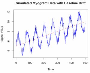
Figure 1. Simulated myogram data with baseline drift.
Alternatively, use ggplot (Fig 2).
library(ggplot2)
ggplot(my_data, aes(x = Time, y = Signal)) +
geom_line(color = “blue”) +
geom_line(aes(y = Drift), color = “red”, linetype = “dashed”, alpha = 0.6) +
geom_line(aes(y = TrueSignal), color = “green”, linetype = “dotted”, alpha = 0.8) +
labs(title = “Simulated Myogram Data with Baseline Drift”,
x = “Time (seconds)”,
y = “Signal Amplitude”) +
theme_minimal() +
scale_color_manual(values = c(“blue”, “red”, “green”),
labels = c(“Total Signal”, “Baseline Drift”, “True Myogram”)) +
theme(legend.position = “bottom”)
# You can access the data for further analysis using the ‘my_data’ data frame
head(my_data)
}
version 2
# R code to simulate myogram data with baseline drift
# 1. Define simulation parameters
set.seed(123) # for reproducibility
n_samples <- 500 # number of data points (time steps)
time <- 1:n_samples
baseline_start <- 5
drift_rate <- 0.01 # slope of the linear drift
signal_amplitude <- 2
noise_sd <- 0.5 # standard deviation of the noise
# 2. Simulate the baseline drift
# A simple linear drift is used here. You could also use a random walk (RW).
baseline_drift <- baseline_start + drift_rate * time
# 3. Simulate the biological signal (myogram activity)
# Using a sinusoidal function as an example of a rhythmic signal
biological_signal <- signal_amplitude * sin(time * 0.1)
# 4. Simulate random noise (white noise)
noise <- rnorm(n_samples, mean = 0, sd = noise_sd)
# 5. Combine all components to get the final simulated myogram data
myogram_data <- baseline_drift + biological_signal + noise
# 6. Create a data frame for plotting and analysis
sim_data <- data.frame(Time = time, Signal = myogram_data)
# 7. Visualize the data using base R graphics or ggplot2
plot(sim_data Signal, type = ‘l’, col = ‘blue’,
main = “Simulated Myogram Data with Baseline Drift”,
xlab = “Time”, ylab = “Signal Value”, ylim = range(myogram_data, baseline_drift))
lines(sim_data$Time, baseline_drift, col = ‘red’, lty = 2) # Overlay the drift line
legend(“topleft”, legend = c(“Simulated Myogram”, “Baseline Drift”),
col = c(“blue”, “red”), lty = c(1, 2), cex = 0.8)
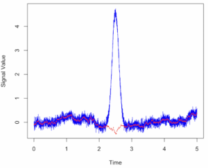
Figure 2. Simulated myogram data with random walk noise and baseline drift.
# You can also use the ggplot2 package for more sophisticated plotting
# install.packages(“ggplot2”)
# library(ggplot2)
# ggplot(sim_data, aes(x = Time, y = Signal)) +
# geom_line(color = “blue”) +
# geom_line(aes(y = baseline_drift), color = “red”, linetype = “dashed”) +
# labs(title = “Simulated Myogram Data with Baseline Drift”,
# y = “Signal Value”) +
# theme_minimal()
Questions
- Write up three learning outcomes for this page. Hint: Point your favorite generative AI to this page and ask for help
References
Hayes, J. P., Speakman, J. R., & Racey, P. A. (1992). Sampling bias in respirometry. Physiological Zoology, 65, 604–619.
Lighton, J. R. B. (2017). Limitations and requirements for measuring metabolic rates: A mini review. European Journal of Clinical Nutrition, 71(3), 301–305.
Liland, K. H. (2015). 4S Peak Filling–baseline estimation by iterative mean suppression. MethodsX, 2, 135-140.
Liland, K. H., & Mevik, T. A. B. H. (2011). Optimal baseline correction for multivariate calibration using open-source software. Life Science Instruments, (3), 7.
Niezen, L. E., Schoenmakers, P. J., & Pirok, B. W. J. (2022). Critical comparison of background correction algorithms used in chromatography. Analytica Chimica Acta, 1201, 339605.
Ruijter, J. M., Ramakers, C., Hoogaars, W. M. H., Karlen, Y., Bakker, O., van den Hoff, M. J. B., & Moorman, A. F. M. (2009). Amplification efficiency: Linking baseline and bias in the analysis of quantitative PCR data. Nucleic Acids Research, 37(6), e45.
Potvin, J. R., & Bent, L. R. (1997). A validation of techniques using surface EMG signals from dynamic contractions to quantify muscle fatigue during repetitive tasks. Journal of Electromyography and Kinesiology, 7(2), 131–139.
Smilios, I., Hakkinen, K., & Tokmakidis, S. P. (2010). Power Output and Electromyographic Activity During and After a Moderate Load Muscular Endurance Session. The Journal of Strength and Conditioning Research, 24(8), 2122–2131.
Chapter 20 contents
- Additional topics
- Area under the curve
- Peak detection
- Baseline correction
- Surveys
- Time series
- Dimensional analysis
- Estimating population size
- Diversity indexes
- Survival analysis
- Growth equations and dose response calculations
- Plot a Newick tree
- Phylogenetically independent contrasts
- How to get the distances from a distance tree
- Binary classification
- Meta-analysis
/MD
20.2 – Peak detection
draft
Introduction
algorithm
extract characteristics
shape
signal
noise
intensity
filtering
window length
R code
packages
peakDetection
findpeaks
Example
ccc
Questions
- Write up three learning outcomes for this page. Hint: Point your favorite generative AI to this page and ask for help
References and suggested readings
Shin, H. S., Lee, C., & Lee, M. (2009). Adaptive threshold method for the peak detection of photoplethysmographic waveform. Computers in biology and medicine, 39(12), 1145-1152.
Chapter 20 contents
- Additional topics
- Area under the curve
- Peak detection
- Baseline correction
- Surveys
- Time series
- Dimensional analysis
- Estimating population size
- Diversity indexes
- Survival analysis
- Growth equations and dose response calculations
- Plot a Newick tree
- Phylogenetically independent contrasts
- How to get the distances from a distance tree
- Binary classification
- Meta-analysis
/MD
20.1 – Area under the curve
draft
Introduction
Area under the curve, AUC, represents the total change in y given change in x. For example, if x is time, and y is oxygen consumption, an AUC would be appropriate to quantify the total oxygen consumption following strenuous exercise (Excess post-exercise oxygen consumption, EPOC) or following a large meal (Specific Dynamic Action, SDA).
In biostatistics, area under the relative (receiver) operating carrier, AUROC, shows characteristics of a diagnostic model, a graphic used to show trade off between sensitivity and specificity. Classifier performance. Used to find the appropriate cut-off. Plot true positive rates against false positive rates as cumulative functions, shows the relationship between sensitivity and specificity for every possible cut off value. Can then calculate AUC to get a measure of the intervention’s ability to discriminate between true and false positive rates.
edit
Related, area under precision-recall curve, AUPRC,
estimate area (1) trapezoid method, (2) average precision score
Area under the curve
Download and install R package MESS; requires geepack, geeM, and Matrix packages
R code
x <- seq(1:10)
y <- c(1,4,5,2,11,22,9,7,5,1)
#length(x)==length(y)
#smooth the data
loxy <- loess(y~x)
#Make a plot (Fig. 1)
plot(x,y, pch=19, cex=2, col="blue")
lines(predict(loxy), type="l", col="red")
where == is an R comparison operator.
And R output
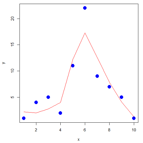
Figure 1. Area under the curve example.
library(MESS)
auc(x,y,from=0,rule=2)
auc(x,loxy$fitted,from=0,rule=2)
And R output
#area under curve for raw data
[1] 67
#area under curve for smoothed data
[1] 66.77616
Area under the receiver operating carrier curve
Download and install ROCR
R code
#modified from https://rviews.rstudio.com/2019/03/01/some-r-packages-for-roc-curves/
library(ROCR)
data(ROCR.simple)
df <- data.frame(ROCR.simple)
pred <- prediction(df$predictions, df$labels)
perf <- performance(pred,"tpr","fpr")
plot(perf,colorize=TRUE)
R output
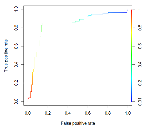
Figure 2. Example ROC curve
The right-hand axes is color codes by AUC values: good tests AUC between 0.8 and 0.9, very good tests greater than 0.9.
Area under the precision recall curve
— under construction
Questions
- Write up three learning outcomes for this page. Hint: Point your favorite generative AI to this page and ask for help
Chapter 20 contents
- Additional topics
- Area under the curve
- Peak detection
- Baseline correction
- Surveys
- Time series
- Dimensional analysis
- Estimating population size
- Diversity indexes
- Survival analysis
- Growth equations and dose response calculations
- Plot a Newick tree
- Phylogenetically independent contrasts
- How to get the distances from a distance tree
- Binary classification
- Meta-analysis
/MD
14.8 – More on the linear model in Rcmdr
Introduction
During the last lectures, we could have used the Two-Way ANOVA command in R or Rcmdr
R code: How to analyze multifactorial ANOVA problems
Rcmdr: Statistics → Means → Multiway ANOVA
To analyze our two factor data sets. As long as the design meets the following conditions, by all means use this command because it is simple and precisely correct.
- Both factors are fixed, not random.
- Each level of first factor is crossed with each level of the second factor.
- No missing data (the design is fully replicated and balanced).
If any of the three points do not fit your two-way design, then you’ll need a different, more general and powerful ANOVA procedure in R and Rcmdr to analyze these types of designs. You’ll need the lm() function (Fig. 1).
Rcmdr: Statistics → Fit models → Linear model…
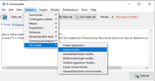
Figure 1. Linear model menu in Rcmdr, version 2.7.0
Some R basics with the lm() function, the general linear model.

Response  is specified by linear predictor(s), either factors or covariates (ratio-scale predictor variables). We communicate to R what the model is by using operators. The four more commonly used operators are
 the basic way to include the model terms, i.e., the mode predictors
 which is interpreted as the interaction of all the variables and the factors in the term
 is interpreted as factor crossing
Not shown, but  indicates the term on the left is nested within the term on the right.
A few examples: we’ll have three factors, A, B, and C. For our one-way ANOVA, the model specification would be

For our crossed, balanced two-way ANOVA, the model specification would be

or equivalently

And for our block ANOVA problem?
Click here to get entire List of model commands in R.
How would we analyze our snake experiment?
Table 1. The snake data set
| Snake | Source | flick |
| 1 | dH2O | 3 |
| 2 | dH2O | 0 |
| 3 | dH2O | 0 |
| 4 | dH2O | 5 |
| 5 | dH2O | 1 |
| 6 | dH2O | 2 |
| 1 | fish | 6 |
| 2 | fish | 22 |
| 3 | fish | 12 |
| 4 | fish | 24 |
| 5 | fish | 16 |
| 6 | fish | 16 |
| 1 | worm | 6 |
| 2 | worm | 22 |
| 3 | worm | 12 |
| 4 | worm | 24 |
| 5 | worm | 16 |
| 6 | worm | 16 |
We have two factors, but one factor is a Block (repeated measures on individuals). We need to tell R and Rcmdr what our model is. We’ll return to talk about models next time, a very important topic!! For now, think of a model as adding the independent variables together to predict the response variable.
In our Snake example, it’s a two-way ANOVA, but one factor is individual snake, the other is a treatment, and we have repeat measures, so there cannot be an interaction.
We tell R and Rcmdr which columns contain the Response, and under Model, we enter the columns with the two factors.
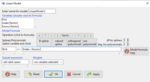
Figure 2. Menu of linear model with repeat measures model, Rcmdr, version 2.7.0.
You must also tell R and Rcmdr which factors in the model (if any) are random to get the correct F statistics. Almost without exception, blocking factors are always treated as Random
The output looks like this (see below). More complicated, true (which means more information!), but things marked in red we’ve seen before.
LinearModel.2 <- lm(flick ~ Snake +Source, data=L16SnakeTaste)

summary(LinearModel.2)

Call:
lm(formula = flick ~ Snake + Source, data = L16SnakeTaste)

Residuals:
Min 1Q Median 3Q Max
-5.2222 -0.7222 0.0278 1.5694 7.4444

Coefficients:
             Estimate Std. Error t value Pr(>|t|)
(Intercept)    -4.444      2.523  -1.762 0.10862
Snake[T.2]      9.667      3.090   3.128 0.01072 *
Snake[T.3]      3.000      3.090   0.971 0.35451
Snake[T.4]     12.667      3.090   4.099 0.00215 **
Snake[T.5]      6.000      3.090   1.942 0.08085 .
Snake[T.6]      6.333      3.090   2.050 0.06755 .
Source[T.fish] 14.167      2.185   6.484 0.0000704 ***
Source[T.worm] 14.167      2.185   6.484 0.0000704 ***
---
Signif. codes: 0 '***' 0.001 '**' 0.01 '*' 0.05 '.' 0.1 ' ' 1

Residual standard error: 3.784 on 10 degrees of freedom
Multiple R-squared: 0.8858, Adjusted R-squared: 0.8058
F-statistic: 11.08 on 7 and 10 DF, p-value: 0.0005337
Contrast coding
When a factor (categorical variable) is used in a linear model (lm() or aov()), R must convert the factor into one or more numeric predictor variables. Contrast coding tells us how to represent the factor in the model, how to interpret the coefficients associated with the factor, how the hypothesis tests of the coefficients are handled, and whether or not Type III sums of squares tests are valid. R can handle contrast coding in a couple of ways, either as a dummy contrast (each group if the factor is contrasted to a baseline) or effects coding, where group means are compared to the grand mean. The command summary(lm()) reports contrast coding that was used in the linear model. Every kind of contrast leads to the same fitted values and same overall F-test, but coefficient estimates and t-tests change.
Note 1: Type I sums of squares tests are affected by the order of the predictors in the model, not by type of contrast coding used. R Commander defaults to Type II tests, which are generally unaffected by coding contrasts used. In contrast, Type III tests are affected by the type of coding contrasts used — Type III tests require sum-to-zero (effects) contrasts.
For the ANOVA table, we call up the command via
Rcmdr: Models → Hypothesis tests → ANOVA table… (Fig. 3).
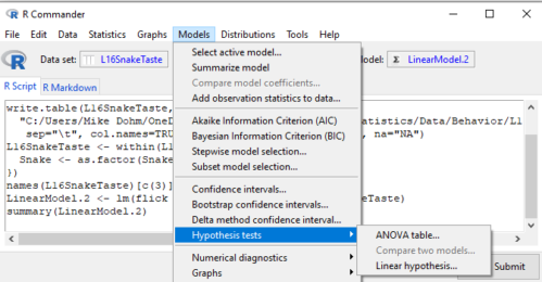
Figure 3. Rcmdr: Models → Hypothesis tests → ANOVA table… Rcmdr, version 2.7.0
Confirm that the model object is active (in this case, the object was LinearModel.2), accept the defaults about types of tests and marginality, and submit OK. The output is
Anova(LinearModel.2, type="II")
Anova Table (Type II tests)

Response: flick
          Sum Sq Df F value Pr(>F)
Snake     307.61  5  4.2956 0.02396 *
Source    802.78  2 28.0256 0.00007954 ***
Residuals 143.22 10
---
Signif. codes: 0 '***' 0.001 '**' 0.01 '*' 0.05 '.' 0.1 ' ' 1
End R output
You do not need to know all of the output; all of that output is there for a reason, of course, but for now, here’s what R and Rcmdr has to say (from the help menu):
The sequential sums of squares is the added sums of squares given that prior terms are in the model. These values depend upon the model order. The adjusted sums of squares are the sums of squares given that all other terms are in the model. These values do not depend upon the model order.
You should try our snake example again, but this time, remove the tongue flick response to the dH2O for the first snake — a missing value. (just type into the cell NA).
How would you use GLM to analyze a simple two-way ANOVA, a fully crossed, fully replicated (“balanced”) design? We could use the Two-way ANOVA command in R and Rcmdr, or we could use lm(). Try it with the data set from random vs nonrandom lecture.
Another example
Below, you see how the model is entered. To let R know that I wish R and Rcmdr to test the interaction, I need to add a Model term for that source of variation. I accomplish this by typing “Diet*Drug” (without the quotes).

Figure 4. Crossed, balanced design. Linear model menu, Rcmdr, version 1.9.2
After clicking OK, the following output from the lm function is returned. How does this compare to output from the two-way ANOVA command in R and Rcmdr?
You should try both and compare!
Rcmdr: Models → Hypothesis tests → ANOVA table
Anova(LinearModel.17, type="II")
Anova Table (Type II tests)
Response: chol_randomized
             Sum Sq  Df F value   Pr(>F)
diet         141.08   2  1.3061 0.28745
drug         351.88   2  3.2577 0.05403 .
diet:drug    235.50   4  1.0901 0.38124
Residuals   1458.19  27
End R output
Nested ANOVA
The nested ANOVA may be analyzed in multiple ways in R and Rcmdr, but I prefer the lm() function because it is the most general. For Nested ANOVA, we can also use lm(). Here’s where it gets a little tricky. Put in the Response variable (Chol), then click in the box for model: Select both factors, then type in / after the factor that’s nesting factor. For our nested model example (14.5 – Nested designs), Manufacturer Source was nested within Drug.
Table 3. Nested design example data set from Chapter 14 – Nested design
| Drug | Source | Chol |
| 1 | 1 | 202.6 |
| 1 | 1 | 207.8 |
| 1 | 1 | 190.2 |
| 1 | 1 | 211.7 |
| 1 | 1 | 201.5 |
| 1 | 2 | 189.3 |
| 1 | 2 | 198.5 |
| 1 | 2 | 208.4 |
| 1 | 2 | 205.3 |
| 1 | 2 | 210 |
| 2 | 3 | 212.3 |
| 2 | 3 | 204.4 |
| 2 | 3 | 221.6 |
| 2 | 3 | 209.2 |
| 2 | 3 | 222.1 |
| 2 | 4 | 203.6 |
| 2 | 4 | 209.8 |
| 2 | 4 | 204.1 |
| 2 | 4 | 201.8 |
| 2 | 4 | 202.6 |
| 3 | 5 | 189.1 |
| 3 | 5 | 219.9 |
| 3 | 5 | 196 |
| 3 | 5 | 205.3 |
| 3 | 5 | 204 |
| 3 | 6 | 194.7 |
| 3 | 6 | 192.8 |
| 3 | 6 | 226.5 |
| 3 | 6 | 200.9 |
| 3 | 6 | 219.7 |
Note 2: If you were working with a CROSSED model, then you would enter the two factors and indicate the interaction by typing Drug*Source (if these are the two factors involved in the interaction).
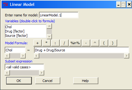
Figure 5. Nested design, linear model menu, Rcmdr, version 1.9.2
Fortunately, R and Rcmdr’s help system is quite extensive here, so when in doubt, check the help box…
Output from the linear model for the Nested Example looks like the one below.
The General Linear Model function in R and therefore Rcmdr returns information about our design plus Sums of Squares, Mean squares, and P-values. R and Rcmdr default’s to use of sequential evaluation of effects. Adjusted evaluation is useful for when you have a covariate (like body size or another confounding variable) that should be evaluated first before the factors are evaluated. We will use the sequential analysis.
Rcmdr: Models → Hypothesis tests → ANOVA table
Anova(LinearModel.15, type="II")
Anova Table (Type II tests)
Response: Chol
             Sum Sq Df F value Pr(>F)
Drug         225.14  2  1.1743 0.3262
Drug:Source  269.27  3  0.9363 0.4385
Residuals   2300.61 24
End R output
Repeatability and ANOVA
We need to tell Rcmdr how to structure the error term; you need the data frame to be arranged so
aovRes <- aov(dH2O ~ Source + Error(Source/Subject), data=SnakeTaste)
#Print the results
aovRes
Anova Table (Type II tests)
Response: dH2O
            Sum Sq Df F value   Pr(>F)
Subject     307.61  5  4.2956 0.02396 *
Source      802.78  2 28.0256 0.00007954 ***
Residuals   143.22 10
---
Signif. codes:  0 '***' 0.001 '**' 0.01 '*' 0.05 '.' 0.1 ' ' 1
#What components are available in the aovRes object?
names(aovRes)
[1] "Sum Sq"  "Df"      "F value" "Pr(>F)"
How do I extract the “F value” for Subjects?
str(aovRes)
Questions
1. What are three learning objectives from this page?
2. Be able to distinguish use of lm() and aov() and the summary output with respect to testing of linear models.
Quiz Chapter 14.8
More on the linear model in Rcmdr
Data sets
Table 1. The snake data set
| Snake | Source | flick |
| 1 | dH2O | 3 |
| 2 | dH2O | 0 |
| 3 | dH2O | 0 |
| 4 | dH2O | 5 |
| 5 | dH2O | 1 |
| 6 | dH2O | 2 |
| 1 | fish | 6 |
| 2 | fish | 22 |
| 3 | fish | 12 |
| 4 | fish | 24 |
| 5 | fish | 16 |
| 6 | fish | 16 |
| 1 | worm | 6 |
| 2 | worm | 22 |
| 3 | worm | 12 |
| 4 | worm | 24 |
| 5 | worm | 16 |
| 6 | worm | 16 |
Chapter 14 contents
14.7 – Rcmdr Multiway ANOVA
Introduction
We have been talking about the two-way randomized, balanced, replicated design. Here, we take you step by step through use of R to conduct the multiway ANOVA.
R code: Multiway ANOVA
Rcmdr: Statistics → Means → Multiway ANOVA… we will review this as Option 1
or
Rcmdr: Statistics → Fit Models → Linear model… we will review this as Option 2
In either case, as a reminder, your data set must be stacked worksheet, like the data in this worksheet
Table 1. Data set, example.14.7†
| Diet | Population | Response |
| A | 1 | 4 |
| A | 1 | 6 |
| A | 1 | 5 |
| A | 2 | 5 |
| A | 2 | 8 |
| A | 2 | 9 |
| B | 1 | 12 |
| B | 1 | 15 |
| B | 1 | 11 |
| B | 2 | 5 |
| B | 2 | 7 |
| B | 2 | 8 |
Option 1
Your first option is to use the ANOVA menus via “Means.” This is a perfectly good way to handle a standard two-way, fully-crossed, fixed effects model. However, other designs will not run with this command and R will return a report of errors for ANOVA models that do not conform to the replicated, balanced, crossed design.
Rcmdr: Statistics → Means → Multiway Analysis of variance …
Factors: highlight “Diet” AND “Population”
Response variable: pick one (in this window, all we see is “Response”)
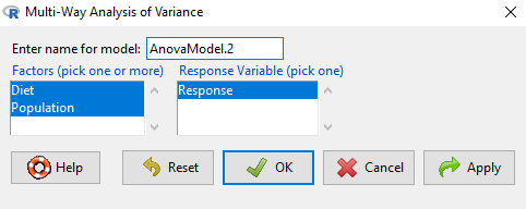
Figure 1. Screenshot Rcmdr multi-way ANOVA.
†Note 1: Don’t forget to convert numeric Population to factor. Assuming Population is part of a data.frame called example.14.7, then example.14.7$Population <- factor(example.14.7$Population).
Interpret the output
AnovaModel.2 <- (lm(Response ~ Diet*Population, data=example.14.7))

Anova(AnovaModel.2)

Anova Table (Type II tests)
Response: Response
                  Sum Sq    Df    F value      Pr(>F)
Diet              36.750     1    12.2500    0.008079 **
Population        10.083     1     3.3611    0.104104
Diet:Population   52.083     1    17.3611    0.003136 **
Residuals         24.000     8
---
Signif. codes: 0 '***' 0.001 '**' 0.01 '*' 0.05 '.' 0.1 ' ' 1
tapply(example.14.7 Response, list(Diet=example.14.7 Diet,
+ Population=example.14.7 Population), mean, na.rm=TRUE) # means
Population
Diet 1 2
A 5.00000 7.333333
B 12.66667 6.666667

tapply(example.14.7 Response, list(Diet=example.14.7 Diet,
+ Population=example.14.7 Population), sd, na.rm=TRUE) # std. deviations
Population
Diet 1 2
A 1.000000 2.081666
B 2.081666 1.527525

tapply(example.14.7 Response, list(Diet=example.14.71 Diet,
+ Population=example.14.7 Population), function(x) sum(!is.na(x))) # counts
Population
Diet 1 2
A 3 3
B 3 3
End R output.
Note 2: What is the “Type II tests”? When you fit a model with categorical predictors using lm() or aov(), you test hypothesis for each effect (main effects and interactions). These tests differ depending on how the model partitions the variance among predictors. See Note 2 in Chapter 12.7 for description of Type I, Type II, and Type III sums of squares.
Summary of multi-way ANOVA command
The multi-way ANOVA command returns our ANOVA table plus the adjusted means, along with standard deviations and number of observations (counts). The adjusted means would then be good to put into a chart to present group comparisons following adjustments from the effects of levels within groups.
Rcmdr: Models → Graphs → Predictor effect plots …
Here’s the chart (hint:  )
)
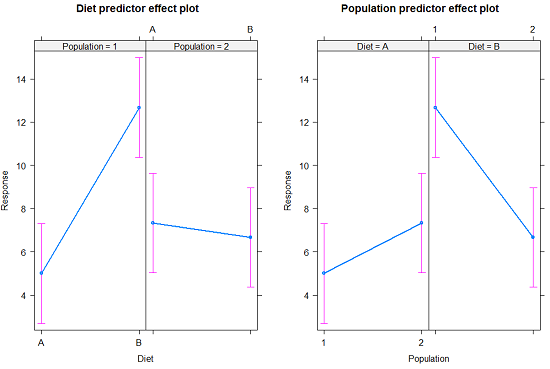
Figure 2. Predictor effect plots, Diet and Population on Response variable.
Option 2
A more general approach is to use the General linear model. This approach can handle the standard 2-way fixed effects ANOVA (above), but any other model as well. The model is Response ~ Diet*Population.
Rcmdr: Statistics → Fit Models → Linear model…
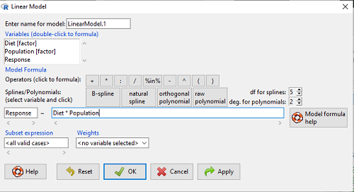
Figure 3. Screenshot Rcmdr linear model menu.
Interpret the output
LinearModel.1 <- lm(Response ~ Diet * Population, data=example.14.7)

summary(LinearModel.1)

Call:
lm(formula = Response ~ Diet * Population, data = example.14.7)

Residuals:
Min 1Q Median 3Q Max
-2.3333 -1.1667 0.1667 1.0833 2.3333

Coefficients:
                        Estimate    Std. Error ..t value .  Pr(>|t|)
(Intercept) .              5.000         1.000 .   5.000    .0.00105 **
Diet[T.B] .                7.667       ..1.414 .   5.421    .0.00063 ***
Population[T.2]           .2.333       ..1.414 .   1.650    .0.13757
Diet[T.B]:Population[T.2] -8.333       ..2.000    -4.167    .0.00314 **
---
Signif. codes: 0 '***' 0.001 '**' 0.01 '*' 0.05 '.' 0.1 ' ' 1

Residual standard error: 1.732 on 8 degrees of freedom
Multiple R-squared: 0.8047, Adjusted R-squared: 0.7315
F-statistic: 10.99 on 3 and 8 DF, p-value: 0.003285
End R output
Lots to sort through, so let’s begin with what is in common between the two approaches, the Multi-way ANOVA command versus the linear model command.
Compare R output from ANOVA and linear model
As a direct output, the linear model option does not provide an ANOVA summary table. Instead of our ANOVA table the linear model returns estimates of coefficients along with t-test results for each coefficient of the model from the lm() command output
Recall that we can get ANOVA tables through the following R commands via Rcmdr.
Rcmdr: Models → Hypothesis tests → ANOVA Table.
Let’s do so for this linear model (accept the default for type of tests = “Type II”).
And the output from lm() stored in the object LinearModel.1 is
Anova(LinearModel.1, type="II")
Anova Table (Type II tests)

Response: Response
                Sum Sq Df F value   Pr(>F)
Diet            36.750  1 12.2500 0.008079 **
Population      10.083  1  3.3611 0.104104
Diet:Population 52.083  1 17.3611 0.003136 **
Residuals       24.000  8
---
Signif. codes:  0 '***' 0.001 '**' 0.01 '*' 0.05 '.' 0.1 ' ' 1
End R output
Now, we’re in business, and, using the lm() function, we have the estimates for each model coefficient plus our ANOVA table.
Same answer! Of course. Which to choose, Option 1 or Option 2? Use the lm() options; more flexible, covers more designs than the multiway ANOVA which is strictly for the crossed fully replicated design.
Note 3: Rcmdr uses Anova(), not anova(). anova() is a generic function, part of the base statistics package, and it returns an ANOVA table. Anova() is not a wrapper to anova(), it is a different function, part of the car package. It uses different default methods and different types of sums of squares: Type-II or Type-III analysis-of-variance tables for model objects produced by lm(), glm(), etc. See Note 2 in Chapter 12.7 for description of Type I, Type II, and Type III sums of squares.
Questions
- Write out the two-way model described for the data in Table 1.
- Write the null hypotheses and provide a summary of the statistical significance of the model.
Quiz Chapter 14.7
Rcmdr Multiway ANOVA
Chapter 14 contents
14.6 – Some other ANOVA designs
Introduction
There are several additional ANOVA models in common use. The crossed, balanced design is but one example of the two-way ANOVA. And, from a consideration of two factors it logically follows that there can be more than two factors as part of the design of an experiment. As the number of factors increase, the number of two-way, three-way, and even higher-order interactions are possible and at least in principle may be estimated.
Our purpose here is to highlight several, but certainly not all possible experimental designs from the perspective of ANOVA. Examples are provided. Keep in mind that the general linear model approach unifies these designs.
Some of the classical experimental ANOVA designs one sees include
- Two-way randomized complete block design
- Two-way factorial with no replication design
- Repeat-measures ANOVA with one factor
- Nested ANOVA
- Three-way ANOVA
- Split-plot ANOVA
- Latin squares ANOVA
Put simply, these designs differ in how the groups are arranged and how members of the groups are included.
Two-way randomized complete block design
This design refers to the “textbook” design. For each, factor A and factor B, there are multiple levels, in this example three levels of Factor A and three levels of Factor B, and subjects (sampling units) are randomly assigned to each level. However, one of the factors is, perhaps, of less interest, yet certainly accounts for variation in the response variable.
| Factor B | ||||
| 1 | 2 | 3 | ||
| Factor A | 1 |  |
 |
 |
| 2 |  |
 |
 |
|
| 3 |  |
 |
 |
|
where n1,1, n2,1, etc. represents the number of subjects in each cell. Thus, in this design there are nine groups. Typically, minimum replication would be three subjects per group.
Two-way factorial with no replication design
While it may seem obvious that a good experiment should have replication, there are situations in which replication is impossible. While this seems rather odd, this scenario very much describes a typical microarray, gene expression project.
| Factor B | ||||
| 1 | 2 | 3 | ||
| Factor A | 1 | |
|
|
| 2 | |
|
|
|
| 3 | |
|
|
|
where, again, n1,1, n2,1, etc., represents the number of subjects in each cell and there are nine groups in this study. With no replication, then no more than one subject per group.
Repeated-measures ANOVA
When subjects in the study are measured multiple times for the dependent variable, this is called a repeated-measures design. We introduced the design for the simple case of before and after measures on the same individuals in Chapter 12.3. It’s straight-forward to extend the design concept to more than two measures on the subjects. The blocking effect is the individual (see Chapter 14.4), and, therefore, a random effect (see Chapters 12.3 and 14.3) in this type of experimental design.
Although straightforward in concept, repeated measure designs have many complications in practice. For example, long-term studies can expect for subjects to drop out of the study, resulting in censored data. Another complication, the assumption is that there is no carry over effect — it doesn’t matter the order different treatments are applied to the subjects. Think of this assumption as akin to the equal variances assumption in ANOVA; just like unequal variances effects Type I error rates in ANOVA, deviations from sphericity inflate Type I error rates in repeated-measures designs.
Sphericity assumption is described in two ways:
Assumption of sphericity — the ranking of individuals remains the same across treatment levels — no interaction between individual and treatment. Sphericity assumption is always met if there are just two levels of the repeated measure, e.g., before and after.
Compound symmetry assumption — the variances and covariances are equal across the study: the changes experienced by the subjects are the same across the study regardless of the order of treatments.
Tests for sphericity include:
Mauchly test: mauchly.test(object)
If results of tests for violations of sphericity warrant, corrections are available. One recommended correction is called Greenhouse-Giesser correction, which adjusts the degrees of freedom and so results in a better p-value estimate. A second correction is called Huyhn-Feldt correction; this correction, too, adjusts the degrees of freedom to improve the p-value estimate.
Three-way ANOVA
It is relatively straightforward to imagine an experiment that involves three or more factors. The analysis and interpretation of such designs, while feasible, becomes somewhat complicated especially for the mixed models (Model III).
Consider just the case of a fixed-effects 3-way ANOVA. How many tests of null hypotheses are there?
- Three tests for main effects.
- Three tests of two-way interactions.
- A test for a three-way interaction.
Thus, there are seven separate null hypotheses from a three-way ANOVA with fixed effects! As you can imagine, large sample sizes are needed for such designs, and the “higher-order” interactions (e.g., three-way interaction) can be difficult to interpret and may lack biological significance.
ANOVA designs without random assignment to treatment levels
Latin square design
We have introduced you to several ANOVA experimental designs that employed randomization for assignment of subjects to treatment groups. The purpose of randomization is even out differences due to confounding variables. However, if we know in advance something about the direction of the influence of these confounding variables, strictly random assignment is not in fact the best design. For example, the Latin square design is common in agriculture research and is very useful for situations in which two gradients are present (e.g., soil moisture levels, soil nutrient levels).
| Dry soil ←→ Wet soil | ||||
| Soil Nutrients
low |
T1 | T4 | T3 | T2 |
| T3 | T2 | T1 | T4 | |
| T2 | T3 | T4 | T1 | |
| T4 | T1 | T2 | T3 | |
Split-Plot Design
Another design from agriculture research is especially useful to ecotoxicology research. We mentioned the repeated measures design in which individuals are measured more than once and each individual receives all levels of the treatment in a random order (cross-over design). However, this design assumes that there are no carry-over effects (see Hills and Armitage 1979; For ecology/evolution definition see O’Connor et al 2014). While this assumption may hold for many experiments, we can also imagine many more situations in which this is undoubtedly false. For example, if we wish to measure the effects of ozone and relative humidity on frog behavior, we might consider using the individual as its own control. But we also wish to compare frog behavior following ozone exposure against behavior exhibited in clean air. But we are likely to violate the carry-over assumption. If a frog receives ozone then air, the effects of ozone may inhibit activity for several days after the initial exposure, which would then influence subsequent measures. The solution to this dilemma is to use what’s called a split plot design. The design combines elements of nesting.
Consider our frog experiment. There would be three factors:
Factor 1 = Exposure (air or ozone),
Factor 2 = Saturation (dry, intermediate, wet),
Factor 3 = Individual (each frog is measured 3 times).
The design table would look like
| Exposure | |||||||
| Air | Ozone | ||||||
| Humidity | Dry | Frog1 | Frog2 | Frog3 | Frog4 | Frog5 | Frog6 |
| Intermediate | Frog1 | Frog2 | Frog3 | Frog4 | Frog5 | Frog6 | |
| Wet | Frog1 | Frog2 | Frog3 | Frog4 | Frog5 | Frog6 | |
Thus, the design is crossed for one factor (saturation), but nested for another factor (individuals are nested within Exposure factor).
Questions
- Which of the study designs mentioned so far are sensitive to carry-over effects?
- With respect to how levels of Factors are assigned, distinguish the split-plot design from the Latin square design.
Quiz Chapter 14.6
Some other ANOVA designs
Chapter 14 contents
14.5 – Nested designs
Introduction
Crossed versus nested design
Factors are independent variables whose values we control and wish to study because we believe they have an effect on the dependent variable. While it is logical to think of factors and levels within factors as independent variables fully under our control, a moments reflection will come up with examples in which the groups (levels) depend on the factor.
Crossed – each level of a factor is in each level of the other factor. This was illustrated in Chapter 14.1 on Crossed, balanced, fully replicated two-way ANOVA.
Nested – levels of one factor are NOT the same in each of the levels of the other factor. Nested designs are an important experimental design in science, and they have some advantages over the 2-way ANOVA design (for one), but they also have limitations.
Classic examples of nesting: culturing and passage of cell lines in routine cell colony maintenance means that even repeated experiments are done on different experimental units. Cells derived from one vial are different from cells derived from a different vial. Similarly, although mice from an inbred strain are thought to be genetically identical, environments vary across time, so mice from the same strain but born or purchased at different times are necessarily different. These scenarios involving time create a natural block effect. Thus, cells are nested by block effect passage number and mice are nested by block effect colony time. We introduced randomized block design in the previous Chapter 14.4.
Statistical model
If Factor B is nested within Factor A, then a group or level within Factor B occurs only within a level of Factor A. Like the randomized block model, there will be no way to estimate the interaction in a nested two-way ANOVA. Our statistical model then is

Examples
Example 1. Three different drugs, 6 different sources of the drugs. The researcher obtains three different drugs from 6 different companies and wants to know if one of the drugs is better than another drug (Factor A) in lowering the blood cholesterol in women. There is always the possibility that different companies will be better or worse at making the drug. So the researchers also use the Factor Source (Factor B) to examine this possibility. Unfortunately they can not obtain all drugs from the same sources. This leads to a Nested ANOVA — notice that each drug is obtained from a different source.
We CANNOT perform the typical two-factor ANOVA because we cannot get a mean of the different drugs by combining the same levels of the Sources: the data is NOT crossed. The Sources of the drugs (Factor B) are NESTED within the type of Drug (Factor A): each source is only found in one of the Drug categories. So, we can’t calculate a mean for the Drug levels independent of the SOURCE from which the drug came.
Table 1. Example of a nested design
|
Drug A
|
Drug B
|
Drug C
|
|||
|
Source 1
|
Source 2
|
Source 3
|
Source 4
|
Source 5
|
Source 6
|
|
202.6
|
189.3
|
212.3
|
203.6
|
189.1
|
194.7
|
|
207.8
|
198.5
|
204.4
|
209.8
|
219.9
|
192.8
|
|
190.2
|
208.4
|
221.6
|
204.1
|
196.0
|
226.5
|
|
211.7
|
205.3
|
209.2
|
201.8
|
205.3
|
200.9
|
|
201.5
|
210.0
|
222.1
|
202.6
|
204.0
|
219.7
|
Scroll to end of this page to get the data set in stacked worksheet format, or click here.
Compare Table 1 to CROSSED data structure (Table 2) — a typical two-factor ANOVA — which would look like
Table 2. Contents of Table 1 presented as crossed design
|
Drug A
|
Drug B
|
Drug C
|
|||
|
Source 1
|
Source 2
|
Source 1
|
Source 2
|
Source 1
|
Source 2
|
|
202.6
|
189.3
|
?
|
?
|
?
|
?
|
|
207.8
|
198.5
|
?
|
?
|
?
|
?
|
|
190.2
|
208.4
|
?
|
?
|
?
|
?
|
|
211.7
|
205.3
|
?
|
?
|
?
|
?
|
|
201.5
|
210.0
|
?
|
?
|
?
|
?
|
We can take a mean of the different drugs by combining the same levels of the Sources. Here’s the nested design (Table 3).
Table 3. Group means, nested design
|
Drug A
|
Drug B
|
Drug C
|
|||
|
Source 1
|
Source 2
|
Source 3
|
Source 4
|
Source 5
|
Source 6
|
|
202.76
|
202.3
|
213.92
|
204.38
|
202.86
|
206.92
|
We can take a mean of the different drugs by combining the same levels of the Sources. Here’s the crossed design (Table 4).
Table 4. Groups means by crossed design.
|
Drug A
|
Drug B
|
Drug C
|
|||
|
Source 1
|
Source 2
|
Source 1
|
Source 2
|
Source 1
|
Source 2
|
|
202.76
|
202.3
|
?
|
?
|
?
|
?
|
Why the “?” in Table 2 and 4? Manufacturing source 1 & 2 do not sell Drug B and Drug C. So, there cannot be a crossed design.
Why can’t we just use a One-Way ANOVA? Can’t we just ANALYZE the three DRUGS separately, ignoring the source issue (after all, the drugs are not all made by the same manufacturer)? But it is not a one-way ANOVA problem… Here’s why.
The researcher suspects that the response of a particular drug might be dependent upon the particular source from which the drug was purchased. So, the type of source from which the drug was purchased is another FACTOR. Thus, drugs from one source might have more (less) affect compared to drugs from another source regardless of the type of drug. However, each drug is NOT available from each source. Thus the research design can NOT be crossed and Drug is NESTED within Source.
We can ask ONLY two questions (hypotheses) from this NESTED ANOVA research design:
HO: There is no difference in the average effect of the drugs on (tumor size, cholesterol level, blood pressure, etc.)
HA: There is a difference in the average effect of the drugs on (tumor size, cholesterol level, blood pressure, etc.)
HO: There is no difference in the average effect of the drugs on (tumor size, cholesterol level, blood pressure, etc.) purchased from different manufacturers.
HA: There is a difference in the average effect of the drugs on (tumor size, cholesterol level, blood pressure, etc.) purchased from different manufacturers.
Notice that we do NOT examine the effect of the interaction between Drug type and source of the drug. Why not?
Table 5. Sources of Variation in Nested ANOVA
| Source of Variation |
Sum of Squares
|
DF
|
Mean Squares
|
| Total |  |
 |
|
| Among all subgroups |  |
 |
|
| Among Groups |  |
 |
 |
| Among Subgroups |  |
 |
 |
| Error |
Subtract all of the subgroup Sums of Squares from the Total Sums of Squares
|
 |
 |
Testing nested ANOVA with one main factor
Perhaps surprisingly given the number of terms above, there are only two hypothesis tests, and, only one of REAL interest to us. There are exceptions (e.g., quantitative genetics provides many examples), but we are generally most interested in the among group test — this is the test of the main factor. In our example, the main factor was DRUG and whether the drugs differed in their effects on cholesterol levels. The second test is important in the sense that we prefer that it contributes little or no variation to the differences in cholesterol levels. But it might.
Table 6. F statistics for nested ANOVA
| F for the main effect is given as |  |
| F for the subgroup is given by |  |
| and of course, use the appropriate DF when testing the F values!! The Critical Value F0.05 (2), df numerator, df denominator | |
One way to look at this: it would not make sense to conclude that an effect of the main group was significant if the variation in the subgroups was much, much larger. That’s in part why we test the main effect with the subgroups MS and not the error MS. If variation due to the nested variable is not significant, then it is an estimate of the error variance, too.
The nested model we are describing is a two factor ANOVA, but it is incomplete (compared to the balanced, fully crossed 2-way design we’ve talked about before). We don’t have scores in every cell. Instead, each level of nested factor is paired with one and only one level of the other factor. In our example, Source is paired with only one other level of the other factor Drug (e.g., Source 1 goes with Drug 1 only), but the main effect is paired with 2 levels of the nesting factor (e.g., Drug 1 is manufactured at Source 1 and Source 2).
Note that nesting is strictly one way. Drug is not nested within source, for example.
Some important points about testing the null hypotheses in a nested design. For one, the test of the effect of the nesting factor (Source) is confounded by the interaction between the main factor. We don’t actually know if the interaction is present, but we also get no way to test for it because of the incomplete design. We must therefore be cautious in our interpretation of the effect of the nested factor.
Consider our example. We want to interpret the effect of source as the contribution to the response based on variation among the different suppliers of the drugs. It might be good to know that some drug manufacturer is better (or worse) than others. However, differences among the sources for the different drugs are completely contained in the main effect factor (the test of effects of the different drugs themselves on the response). Therefore, the observed differences between sources COULD be entirely due to the effects of the different drugs and have nothing to do with variation among sources!!
Questions
- Identify the response variable and whether the described factor (in all caps) is suitable for crossed design or nested design
a. In a breeding colony of lab mice, BREEDERS are used to generate up to five LITTERS; effects on offspring REPRODUCTIVE SUCCESS.
b. Effects of individual TEACHERS at different SCHOOLS on STUDENT LEARNING in biology.
c. Lisinopril, an ACE-inhibitor drug prescribed for treatment of high blood pressure, is now a generic drug, meaning a number of COMPANIES can manufacture and distribute the medication. Millions of DOSES of lisinopril are made each year; drug companies are required by the FDA to record when a dose is made and to record these dates by LOT NUMBER. - Work the example data set provide in this page. After loading the data set into Rcmdr (R), use linear model. The command to nest requires use of the forward slash, /. For example, if factor b is nested within factor a, then a/b. The linear model formula then,
Model <- lm(Obs ~ a/b, data=source)
- Describe the problem, i.e., what is a? What is b? What are the hypotheses?
- What is the statistical model?
- Test the model.
- Conclusions?
Quiz Chapter 14.5
Nested designs
Data set used in this page
| Drug | Source | Obs |
| A | s1 | 202.6 |
| A | s1 | 207.8 |
| A | s1 | 190.2 |
| A | s1 | 211.7 |
| A | s1 | 201.5 |
| A | s2 | 189.3 |
| A | s2 | 198.5 |
| A | s2 | 208.4 |
| A | s2 | 205.3 |
| A | s2 | 210 |
| B | s3 | 212.3 |
| B | s3 | 204.4 |
| B | s3 | 221.6 |
| B | s3 | 209.2 |
| B | s3 | 222.1 |
| B | s4 | 203.6 |
| B | s4 | 209.8 |
| B | s4 | 204.1 |
| B | s4 | 201.8 |
| B | s4 | 202.6 |
| C | s5 | 189.1 |
| C | s5 | 219.9 |
| C | s5 | 196 |
| C | s5 | 205.3 |
| C | s5 | 204 |
| C | s6 | 194.7 |
| C | s6 | 192.8 |
| C | s6 | 226.5 |
| C | s6 | 200.9 |
| C | s6 | 219.7 |
Chapter 14 contents
14.4 – Randomized block design
Introduction
Randomized Block Designs and Two-Factor ANOVA
In previous lectures, we have introduced you to the standard factorial ANOVA, which may be characterized as being crossed, balanced, and replicated. We expect additional factors (covariates) may contribute to differences among our experimental units, but rather than testing them — which would increase need for additional experimental units because of increased number of groups to test — we randomize our subjects. Randomization is intended to disrupt trends of confounding variables (aka covariates). If the resulting experiment has missing values (see Chapter 5), then we can say that the design is partially replicated; if only one observation is made per group, then the design is not replicated — and perhaps, not very useful!!
A special type of Two-factor ANOVA which includes a “blocking” factor and a treatment factor.
Randomization is one way to control for “uninteresting” confounding factors. Clearly, there will be scenarios in which randomization is impossible. For example, it is impossible to randomly assign subjects to The blocking factor is similar to the 10.3 – Paired t-test. In the paired t-test we had two individuals or groups that we paired (e.g. twins). One specific design is called the Randomized Block Design and we can have more than 2 members in the group. We arrange the experimental units into similar groups, i.e., the blocking factor. Examples of blocking factors may include day (experiments are run over different days), location (experiments may be run at different locations in the laboratory), nucleic acid kits (different vendors), operator (different assistants may work on the experiments), etcetera.
In general we may not be directly interested in the blocking factor. This blocking factor is used to control some factor(s) that we suspect might affect the response variable. Importantly, this has the effect of reducing the sums of squares by an amount equal to the sums of squares for the block. If variability removed by the blocking is significant, Mean Square Error (MSE) will be smaller, meaning that the F for treatment will be bigger — meaning we have a more powerful ANOVA than if we had ignored the blocking.
Statistical Testing in Randomized Block Designs
“Blocks” is a Random Factor because we are “sampling” a few blocks out of a larger possible number of blocks. Treatment is a Fixed Factor, usually.
The statistical model is

The Sources of Variation are simpler than the more typical Two-Factor ANOVA because we do not calculate all the sources of variation – the interaction is not tested! (Table 1).
Table 1. Sources of variation for a two-way ANOVA, randomized block design
|
Sources of Variation & Sum of Squares
|
DF
|
Mean Squares
|
 |
|
 |
 |
 |
 |
 |
 |
 |
 |
 |
 |

Critical Value F0.05(2), (a – 1), (Total DF – a – b)
In the exercise example above: Factor A = exercise or management plan.
Notice that we do not look at the interaction MS or the Blocking Factor (typically).
Learn by doing
Rather than me telling you, try on your own. We’ll begin with a worked example, then proceed to introduce you to three problems. Click here (Ch 14.8)for general discussion of Rcmdr and linear models for models other than the standard 2-way ANOVA (Chapter 14.8).
Worked example
Wheel running by mice is a standard measure of activity behavior. Even wild mice will use wheels (Meijer and Roberts 2014). For example, we conduct a study of family parity to see if offspring from the first, second, or third sets of births from wheel-running behavior in mice (total revs per 24 hr period). Each set of offspring from a female could be treated as a block. Data are for 3 female offspring from each pairing. This type of data set would look like this:
Table 2. Wheel running behavior by three offspring from each of three birth cohorts among four maternal sets (moms).
|
Revolutions of wheel per 24-hr period
|
||||
|
Block
|
Dam 1
|
Dam 2
|
Dam 3
|
Dam 4
|
|
b1
|
1100
|
1566
|
945
|
450
|
|
b1
|
1245
|
1478
|
877
|
501
|
|
b1
|
1115
|
1502
|
892
|
394
|
|
b2
|
999
|
451
|
644
|
605
|
|
b2
|
899
|
405
|
650
|
612
|
|
b2
|
745
|
344
|
605
|
700
|
|
b3
|
1245
|
702
|
1712
|
790
|
|
b3
|
1300
|
612
|
1745
|
850
|
|
b3
|
1750
|
508
|
1680
|
910
|
Thus, there were nine offspring for each female mouse (Dam1 – Dam4), three offspring per each of three litters of pups. The litters are the blocks. We need to get the data stacked to run in R. I’ve provided the full dataset for readers, scroll to end of this page or click here.
Question 1. Describe the problem and identify the treatment and blocking factors.
Answer. Each female has three litters. We’re primarily interested in genetics (and maternal environment) of wheel running behavior, which is associated with the moms (Treatment factor). The questions is whether there is an effect of birth parity on wheel running behavior. Offspring of a first-time mother may experience different environment than offspring of experienced mother. In this case, parity effects is an interesting question, nevertheless, blocking is the appropriate way to handle this type of problem.
Question 2. What is the statistical model?
Answer. Response variable, Y, is wheel running. Let α the effect of Dam and β the birth cohorts (i.e., the blocking effect).
Question 3. Test the model.
Answer. We fit the main effects, Dam and Block Fig 1.

Rcmdr: Statistics → Fit models → Linear model
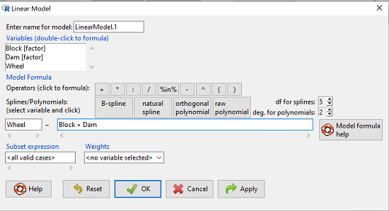
Figure 1. Screenshot Rcmdr Linear Model menu.
then run the ANOVA summary to get the ANOVA table. Rcmdr: Models → Hypothesis tests → ANOVA table.
R Output
Anova Table (Type II tests)

Response: Wheel
           Sum Sq  Df  F value    Pr(>F)
Dam       1467020   3   4.4732   0.01036 *
Block     1672166   2   7.6482   0.00207 **
Residuals 3279544  30
Question 4. Conclusions?
Answer 4. The null hypotheses are:
Treatment factor: Offspring of the different dams have same wheel running activity of offspring.
Blocking factor: No effect of litter parity on wheel running activity of offspring.
Both the treatment factor (p = 0.01036) and the blocking factor (p = 0.00207) were statistically significant.
Questions
Problem 1.
Or we might want to measure the Systolic Blood Pressure of individuals that are on different exercise regimens. However, we are not able to measure all the individuals on the same day at the same time. We suspect that time of day and the day of the year might effect an individuals blood pressure. Given this constraint, the best research design in this circumstance is to measure one individual on each exercise regime at the same time. These different individuals will then be in the same “block” because they share in common the time that their blood pressure was measured. This type of data set would look like this (Table 2):
Table 2. Simulated blood pressure of five subjects on three different exercise regimens.†
|
Subject
|
No
Exercise |
Moderate Exercise
|
Intense Exercise
|
|
1
|
120
|
115
|
114
|
|
2
|
135
|
130
|
131
|
|
3
|
115
|
110
|
109
|
|
4
|
112
|
107
|
106
|
|
5
|
108
|
103
|
102
|
Let’s make a line graph to help us visualize trends (Fig 2).
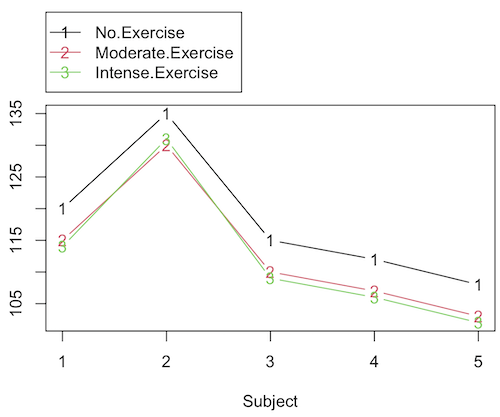
Figure 2. Line graph of data presented in Table 2.
Question 1. Describe the problem and identify the treatment and blocking factors.
Question 2. What is the statistical model?
Question 3. Test the model.
Question 4. Conclusions?
†You’ll need to arrange the data like the data set for the worked example.
Problem 2.
Another example in conservation biology or agriculture. There may be three different management strategies for promoting the recovery of a plant species. A good research design would be to choose many plots of land (blocks) and perform each treatment (management strategy) on a portion of each plot of land (block). A researcher would start with an equal number of plantings in the plots and see how many grew. The plots of land (blocks) share in common many other aspects of that particular plot of land that may effect the recovery of a species.
Table 3. Growth of plants in 5 different plots subjected to one of three management plans (simulated data set).†
|
Plot No.
|
No Management Used
|
Management
Plan 1 |
Management
Plan 2 |
|
1
|
0
|
11
|
14
|
|
2
|
2
|
13
|
15
|
|
3
|
3
|
11
|
19
|
|
4
|
4
|
10
|
16
|
|
5
|
5
|
15
|
12
|
†You’ll need to arrange the data the same arrangement as for the worked example.
These are examples of Two-Factor ANOVA but we are usually only interested in the treatment Factor. We recognize that the blocking factor may contribute to differences among groups and so wish to control for the fact that we carried out the experiments at different times (e.g., seasons) or at different locations (e.g., agriculture plots)
Question 5. Describe the problem and identify the treatment and blocking factors. Make a line graph to help visualize.
Question 6. What is the statistical model?
Question 7. Test the model.
Question 8. Conclusions?
Repeated-Measures Experimental Design
If multiple measures are taken on the same individual, then we have a repeated-measures experiment. This is a Randomized Block Design. In other words, each animal gets all levels of a treatment (assigned randomly). Thus, samples (individuals) are not independent and the analysis needs to take this into account. Just like for paired-T tests, one can imagine a number of experiments in biomedicine that would conform to this design.
Problem 3.
The data are total blood cholesterol levels for 7 individuals given 3 different drugs (from example given in Zar 1999, Ex 12.5, pp. 257-258).
Table 5. Repeated measures of blood cholesterol levels of seven subjects on three different drug regimens.†
|
Subjects
|
Drug1
|
Drug2
|
Drug3
|
|
1
|
164
|
152
|
178
|
|
2
|
202
|
181
|
222
|
|
3
|
143
|
136
|
132
|
|
4
|
210
|
194
|
216
|
|
5
|
228
|
219
|
245
|
|
6
|
173
|
159
|
182
|
|
7
|
161
|
157
|
165
|
†You’ll need to arrange the data like the data set for the worked example.
Question 9: Is there an interaction term in this design? Make a line graph to help visualize.
Question 10: Are individuals a fixed or a random effect?
Question 11. What is the statistical model?
Question 12. Test the model. Note that we could have done the experiment with 21 randomly selected subjects and a one-factor ANOVA. However, the repeated measures design is best IF there is some association (“correlation”) between the data in each row. The computations are identical to the randomized block analysis.
Question 13. Conclusions?
Problem 4.
Figure 3. Juvenile garter snake, image from juvenile garter snake in hand, public domain.
Here is a second example of a repeated measures design experiment. Garter snakes (Fig 3) respond to odor cues to find prey. Snakes use their tongues to “taste” the air for chemicals, and flick their tongues rapidly when in contact with suitable prey items, less frequently for items not suitable for prey. In the laboratory, researchers can test how individual snakes respond to different chemical cues by presenting each snake with a swab containing a particular chemical. The researcher then counts how many times the snake flicks its tongue in a certain time period (data presented p. 301, Glover and Mitchell 2016).
Table 6. Tongue flick counts of naïve newborn snakes to extracts†
|
Snake
|
Control (dH2O)
|
Fish mucus
|
Worm mucus
|
|
1
|
3
|
6
|
6
|
|
2
|
0
|
22
|
22
|
|
3
|
0
|
12
|
12
|
|
4
|
5
|
24
|
24
|
|
5
|
1
|
16
|
16
|
|
6
|
2
|
16
|
16
|
†You’ll need to arrange the data like the data set for the worked example.
Question 14. Describe the problem and identify the treatment and blocking factors. Make a line graph to help visualize.
Question 15. What is the statistical model?
Question 16. Test the model.
Question 17. Conclusions?
Quiz Chapter 14.4
Randomized block design
Data sets used in this page
Problem 1 data set
| Block | Dam | Wheel |
|---|---|---|
| B1 | D1 | 1100 |
| B1 | D2 | 1566 |
| B1 | D3 | 945 |
| B1 | D4 | 450 |
| B1 | D1 | 1245 |
| B1 | D2 | 1478 |
| B1 | D3 | 877 |
| B1 | D4 | 501 |
| B1 | D1 | 1115 |
| B1 | D2 | 1502 |
| B1 | D3 | 892 |
| B1 | D4 | 394 |
| B2 | D1 | 999 |
| B2 | D2 | 451 |
| B2 | D3 | 644 |
| B2 | D4 | 605 |
| B2 | D1 | 899 |
| B2 | D2 | 405 |
| B2 | D3 | 650 |
| B2 | D4 | 612 |
| B2 | D1 | 745 |
| B2 | D2 | 344 |
| B2 | D3 | 605 |
| B2 | D4 | 700 |
| B3 | D1 | 1245 |
| B3 | D2 | 702 |
| B3 | D3 | 1712 |
| B3 | D4 | 790 |
| B3 | D1 | 1300 |
| B3 | D2 | 612 |
| B3 | D3 | 1745 |
| B3 | D4 | 850 |
| B3 | D1 | 1750 |
| B3 | D2 | 508 |
| B3 | D3 | 1680 |
| B3 | D4 | 910 |
Chapter 14 contents
14.3 – Fixed effects, Random effects
Introduction
With few exceptions (eg, repeatability and intraclass correlation calculations, Chapter 12.3), we have been discussing the Model I ANOVA or fixed-effects ANOVA– fixed implies that we select the levels for the factor. It may not be obvious — in hindsight it is — but levels may also be randomly selected, eg, nature provides the levels. Thus, levels are random and the model is a random-effects ANOVA. Beginning with our discussions of ANOVA, it becomes increasingly important to incorporate concept of models in statistics. As you have been working in R and Rcmdr with the lm() function, you have been forced to address the statistical model concept — you enter the response variable then type in both factors and create a term for the interaction.
We’ve just completed an experiment in which the response (cholesterol levels) of 36 individuals, from one of three drug treatments (placebo, Drug A, Drug B), given one of 3 types of diets (low, medium, or high carbohydrate), was observed. Thus, we say that the specific treatments of drug and diet contribute to variation in cholesterol levels. More formally, we say that the observed response of the kth individual (Yijk) is equal to the overall mean (m) plus the added effect of Drug (a) plus the added effect of Diet (b) plus the interaction between Diet and Population (ab) plus unidentified sources of variation generally called error (e). In symbols, we write

where i is the number of levels of the first factor (in our example, Diet had 2 levels, so i = A or i = B), j is the number of levels of the second factor (in our example, Population had 2 levels, so j = 1, or j = 2), and k is the total number of observations in the experiment (12 in our example, so k = 1, 2, …, 11, 12). Thus, we can think of each term “adding up” to give us the observed value.
Although it is a bit confusing at first, these equations help us understand how the experiment was conducted and therefore how to analyze and interpret the results.
Model I, Model II & Model III ANOVA
Statisticians recognize that how levels of the factors were selected for an experiment impact conclusions from ANOVAs. The key: whether or not the levels of the factor were selected (1) randomly from all possible levels of the factor or (2) specifically selected by the experimenters. We introduced the concepts of fixed and random effects in Chapter 12.3. For one-way ANOVA, the distinction between fixed and random effects influences the interpretation, but not the calculation of the ANOVA components. For two or more treatment factors, both the interpretations and the calculations of ANOVA components are affected.
There are two general types of Factors that we can choose to employ in an ANOVA: Fixed Model ANOVA and Random Model ANOVA. Where two or more factors apply, by far the most common model in experimental sciences is a combination of fixed and random, so we need to add a third general type, the Mixed Model ANOVA design.
Fixed Factors. Where the levels of the factor are selected by us. In this case we would only be interested in the response of the individuals that are given those specific treatments.
Medicine – for example, where we choose a treatment given to patients with a history of coronary heart disease; compare outcomes of patients given a statin (drug used to lower serum cholesterol) drug versus a placebo. (Note that this is the same study we discussed in our lecture on about risk analysis).
Ecotoxicology – for example, compare growth rates and deformities of tadpole frogs given Aldicarb, Atrazine (both estrogen-mimicking pesticides), or a control (ie, no pesticides). If you’re interested in these topics, here’s a link to the EPA’s web site, listing pesticide sales and use in the United States. Here’s a link to a NIH National Institute of Environmental Sciences, with a nice description of estrogen mimicking pesticides.
Agriculture & Genetics – for example, monitor growth of a particular hybrid corn available from three different manufacturers. See an example of Wisconsin corn hybrid studies.
In each of these examples we might be interested in those specific treatments and no other treatments.
HO: No difference in the means among the levels of the Factor
HA: Some difference in the means among these specific levels of the Factor; the specific levels of this factor affects the response variable.
This is an example of a Model I ANOVA, also called a “fixed effects” model ANOVA.
Random Factors. We still only use a relatively few number of different levels of a particular factor. However, in this case we are interested in many different levels of the factor — we want to generalize beyond our sample. The levels that we use would be a “sample” of all possible levels that we would be interested in.
Medicine – for example, where we randomly choose a treatment level given to patients; four concentrations of a drug and a placebo. Since concentration is a ratio scale data type, concentration can range from 0 (the placebo) to 100%.
Ecotoxicology – for example, release different concentrations or mixtures of air plus components of air pollution to chambers, record the response of plants or animals.
Agriculture & Genetics – for example, grow three different varieties of a plant in three different soils or different genetic strains of animals on three different diets. In these cases, factor levels are random because we are drawing from a large pool of possible levels: genetic varieties or strains — we selected three, but it’s rare that were are specifically interested in the three chosen. More often, we want to make generalizations and the three were somehow representative (we hope) of genetic variation in the species of interest.
In each of these examples, we write the null hypothesis to reflect that the particular levels are only of interest in so far as they can be used to generalize back to the population.
HO: No difference in the variation between groups.
HA: Some difference in the variation among these groups.
This is an example of a Model II ANOVA, also called a “random effects” model ANOVA. Note that we specify the hypothesis in terms of variation, not of the means.
Your two-way ANOVA could be Model I, Model II, or it could be mixed, with one factor fixed, the other random (this later model is called a Model III, or “mixed model” ANOVA).
For the most part, the distinction between whether you have fixed or random effects is clear, but whether we use fixed or random or combinations, this design decision has consequences for testing.
The decision does not affect the Sources of Variation for the different Models. Last time, we showed the tests for a Model I ANOVA (the “fixed effects model”).
For Random Effects or Mixed Effects, we only change how we determine the statistical significance of the Factors. Here’s a summary of how the experimental design changes the calculation of the F-test statistic for the Factors.
Table 1. Calculation of F
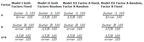
The Critical Value for each of the different F values will be obtained by simply finding the degrees of freedom for the numerator and denominator SS. This was discussed and can be found sources of variation in 2-way ANOVA lecture.
From the formulas, we can see that the major difference is that sometimes the Factor MS is divided by the error MS and sometimes it is divided by the interaction MS.
If the interaction term is NOT statistically significant, then the Interaction MS (mean square) estimates the Error MS. In other words, if the interaction term is not statistically significant it will be similar in magnitude as the Error MS. In this case there will be no large difference in the computed outcomes if the Factor A or B is fixed or random.
However, there will be times when the interaction is not significant but the interaction MS is still larger than the Error MS. Then there could be a difference in the F value for the Factor.
If the interaction term is Significant and the interaction MS is larger than the Error MS then there will be difference in F values for the Factors A and/or B. The F values will be smaller for the Factors MS that are divided by the interaction MS.
It is possible that they will become non-significant with the interaction MS as the denominator. So it will become Harder to detect a significant Factor effect if there is also a significant Interaction effect. A graphical representation will help us understand why we use the interaction MS in some instances as the denominator.
In fact, if the interaction is found to be statistically significant, we must then interpret the effects of factors with caution. In general, if the interaction is significant, then the main factors are generally not interpreted in the 2-way ANOVA. Instead, a series of one-way ANOVA’s are conducted holding one of the factors constant. For example, evaporative water loss (EWL) in frogs in the presence of air pollution (ozone) may depend on the relative humidity (RH) — if the RH is low, the frog may lose less body water at different concentrations of ozone than if the RH is moderate. Therefore, since the interaction is significant, the best thing to do is to look at the effects of ozone concentration on EWL at each level of saturation (RH).
This is a critical point in your understanding of complex ANOVA designs. Let us examine a case where there is a mildly significant interaction effect between two factors. In the first graph below (Fig 1) we see that Genotype 2 performs better on average (combining the two density treatments). If we are only interested in these two density treatments then it might be that the Genotype Factor is significant. This would be the case if Factor A is fixed and Factor B (density) is also fixed.
The Formula for Factor A would be: F = Genotype MS / error MS
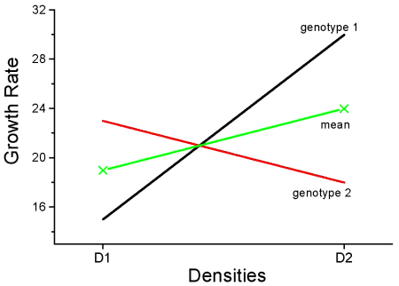
Figure 1. Interaction example. At density D1, genotype 2 (red line) has higher growth rate; at density D2, the ranking switches: now, genotype 1 (black line) has higher growth rate.
However, it is likely that both Factor A (genotype) and Factor B (densities) are actually “samples” of many other possible genotypes and densities that we could examine.
Consider more than two genotypes raised in more than 2 densities (Fig 2). The outcome might look like
Figure 2. Interaction example expanded for multiple genotypes over multiple densities.
The graph (Fig 2) shows that genotype 2 does not do better than genotype 1 if we have more densities. If we also have other genotypes we see that there are other genotypes that have better (higher) responses than genotype 2.

In these cases it would have been more appropriate to calculate the F value for Factor A (genotype) using the interaction MS as the denominator. In Figure 1 there was some interaction this will make it harder to reject the null hypothesis that there is no effect of Factor A (genotype). So you must be careful to think about how you plan to interpret your data before you decide how to analyze the data using a Two-Factor ANOVA.
Questions
- Which of the following statements regarding fixed and random factors is true?
A. With fixed factors, the subjects are selected by the researcher
B. With fixed factors, the treatment levels are selected by the researcher at random from all possible levels
C. With fixed factors, the subjects are selected at random by the researcher
D. With random factors, the treatment levels are selected by the researcher at random from all possible levels - Please write the equation for the one-way ANOVA with four levels of of fixed effects treatment factor A (you may wish to review Chapter 12.2)
- Selecting from all possible levels of a statin drug would be an impossible and meaningless experimental design. Explain why.
- For a multiway ANOVA design, when will the differences in the Random versus Fixed Factor make a difference?
Quiz Chapter 14.3
Fixed effects, random effects