17.3 – Estimation of linear regression coefficients
Introduction
In discussing correlations we made the distinction between inference, testing the statistical significance of the estimate, and the process of getting the estimate of the parameter itself. Estimating parameters is possible for any data set; whether or not the particular model is a good and useful model is another matter. Statisticians speak about the fit of a model… that a model with one or more independent predictor variables explains a substantial amount of the variation in the dependent variable, that it describes the relationship between the predictors and the dependent variable without bias.
Note 1. We introduced the concept of statistical fit in our discussion of Chi-square, goodness of fit, Chapter 9.1.
A number of tools have been developed to assess model fit. For starters, I’ll list just two ways you can approach whether or not a linear model fits your data ore requires some intervention on your part.
Assess fit of a linear model
Recall our R output from the regression of Number of Matings on Body Mass from the bird data set. We used the linear model function.
LinearModel.1 <- lm(Matings ~ Body.Mass, data=bird_matings)
summary(LinearModel.1)
Call: lm(formula = Matings ~ Body.Mass, data = bird_matings)
Residuals:       Min       1Q    Median       3Q      Max
            -2.29237 -1.34322 .-0.03178..1.33792 .2.70763
Coefficients:
             Estimate  Std. Error  t value  Pr(>|t|)
(Intercept)   -8.4746      4.6641   -1.817    0.1026
Body.Mass      0.3623      0.1355    2.673    0.0255 *
---
Signif. codes: 0 '***' 0.001 '**' 0.01 '*' 0.05 '.' 0.1 ' ' 1
Residual standard error: 1.776 on 9 degrees of freedom
Multiple R-squared: 0.4425, Adjusted R-squared: 0.3806
F-statistic: 7.144 on 1 and 9 DF, p-value: 0.02551
Request R to print the ANOVA table.
Anova(RegModel.1, type="II")
Anova Table (Type II tests)
Response: Matings
            Sum Sq   Df   F value    Pr(>F)
Body.Mass   22.528    1    7.1438   0.02551 *
Residuals   28.381    9
With a little rounding we have the following statistical model

and in English, Number of matings equals Body.mass multiplied by 0.36 then subtract 8.5; the intercept was -8.5, the slope was 0.36.
Note 2. The results of the regression analyses were stored in the object called “LinearModel.1“. This is a nice feature of Rcmdr — it automatically provides an object name for you. Note that with each successive run of the linear model function via Rcmdr that it will change the object name by adding numbers successively. For example, after LinearModel.1 the next run of lm() in Rcmdr will automatically be called “LinearModel.2” and so on. In your own work you may specify the names of the objects directly or allow Rcmdr to do it for you, but do keep track of the object names!
From the R output we see that the estimate of the slope was +0.36, statistically different from zero (p = 0.025). The intercept was -8.5, but not statistically significant (p = 0.103), which means the intercept may be zero.
As a general rule, if you make an estimate of a parameter or coefficient, then you should provide a confidence interval of the form.
estimate + critical value X standard error of the estimate
Note 3. Reminder: Approximate 95% CI can be obtained by + twice the standard error for the coefficient.
For confidence interval of regression slope we have a couple of options in R
Option 1.
confint(LinearModel.1, 'Body.Mass', level=0.95)

               2.5 %    97.5 %
Body.Mass 0.05565899 0.6689173
Option 2.
Goal: Extract the coefficients from the output of the linear model and calculate the approximate SE with nine degrees of freedom. This is the big advantage of saving output from functions as objects. Typically, much more information is about the results are available, and, additionally, can be retrieved for additional use. Extracting coefficients from the objects is the best option, but does come with a learning curve. Let’s get started.
First, what information is available in the linear model output beyond the default information? To find out, use the names() function
names(LinearModel.1)
R output
 [1] "coefficients"  "residuals"     "effects"       "rank"
 [5] "fitted.values" "assign"        "qr"            "df.residual"
 [9] "xlevels"       "call"          "terms"         "model"
Another way is to use the summary() function call.
summary(LinearModel.1)$coefficients
              Estimate Std. Error   t value   Pr(>|t|)
(Intercept) -8.4745763  4.6640856 -1.816986 0.10259256
Body.Mass    0.3622881  0.1355472  2.672781 0.02550595
How can we get just the standard error for the slope? Note that the estimates are reported in a 2X4 matrix like so
| 1,1 | 1,2 | 1,3 | 1,4 |
| 2,1 | 2,2 | 2,3 | 2,4 |
Therefore, to get the standard error for the slope we identify that it is stored in cell 2,2 of the matrix and we write
summary(LinearModel.1)$coefficients[2,2]
which returns
[1] 0.1355472
Let’s use this information to calculate confidence intervals
slp=summary(LinearModel.1)$coefficients[2,1]
slpErrs=summary(LinearModel.1)$coefficients[2,2]
slp + c(-1,1)*slpErrs*qt(0.975, 9)
where qt() is the quantile function for the t distribution and “9” is the degrees of freedom from the regression. Results follow
coef + c(-1,1)*errs*qt(0.975, 9)
[1] 0.05565899 0.66891728
And for the intercept
int=summary(LinearModel.1)$coefficients[1,1]
intErrs=summary(LinearModel.1)$coefficients[1,2]
int + c(-1,1)*intErrs*qt(0.975, 9)
Results
int + c(-1,1)*intErrs*qt(0.975, 9)
[1] -19.025471   2.076318
In conclusion, part of fitting a model includes reporting the estimates of the coefficients (model parameters). And, in general, when estimation is performed, reporting of suitable confidence intervals are expected.
Extract additional statistics from R’s linear model function
The summary() function is used to report the general results from ANOVA and linear model function output in R software, but additional functions can be used to extract the rest of the output, e.g., coefficient of determination. To complete our example of extracting information from the summary() function, we next turn to summary.lm() function to see what is available.
At the R prompt type and submit
summary.lm(LinearModel.1)
returns the following R output
Call:
lm(formula = Matings ~ Body.Mass, data = bird_matings)

Residuals:
     Min       1Q   Median       3Q      Max
-2.29237 -1.34322 -0.03178  1.33792  2.70763

Coefficients:
            Estimate Std. Error t value Pr(>|t|)
(Intercept)  -8.4746     4.6641  -1.817   0.1026
Body.Mass     0.3623     0.1355   2.673   0.0255 *
---
Signif. codes:  0 '***' 0.001 '**' 0.01 '*' 0.05 '.' 0.1 ' ' 1

Residual standard error: 1.776 on 9 degrees of freedom
Multiple R-squared:  0.4425,    Adjusted R-squared:  0.3806
F-statistic: 7.144 on 1 and 9 DF,  p-value: 0.02551
Looks exactly like the output from summary(). Let’s look at what is available in the summary.lm() function
names(summary.lm(LinearModel.1))
 [1] "call"          "terms"         "residuals"     "coefficients"
 [5] "aliased"       "sigma"         "df"            "r.squared"
 [9] "adj.r.squared" "fstatistic"    "cov.unscaled"
We see some information we got from summary(), e.g., “coefficients”. If we interrogate the name coefficients like so
summary.lm(LinearModel.1)$coefficients
we get
summary.lm(LinearModel.1)$coefficients
              Estimate Std. Error   t value   Pr(>|t|)
(Intercept) -8.4745763  4.6640856 -1.816986 0.10259256
Body.Mass    0.3622881  0.1355472  2.672781 0.02550595
which, again, is a 2X4 matrix (see above)
So to get the standard error for the slope we identify that it is stored in cell 2,2 of the matrix and call it LinearModel.1$coefficients[2,2].
Questions
1. Write up three learning outcomes for this page. Hint: Point your favorite generative AI to this page and ask for help.
2. What does a small standard error of the slope for a SLR model tell us?
3. For slope, intercept, for just about any statistical estimate, why are we obligated to provide a confidence interval?
Quiz Chapter 17.3
Estimation of linear regression coefficients
Chapter 17 contents
- Introduction
- Simple Linear Regression
- Relationship between the slope and the correlation
- Estimation of linear regression coefficients
- OLS, RMA, and smoothing functions
- Testing regression coefficients
- ANCOVA – analysis of covariance
- Regression model fit
- Assumptions and model diagnostics for Simple Linear Regression
- References and suggested readings (Ch17 & 18)
17.1 – Ordinary least squares regression
-
- Introduction
- Example
- Least squares regression explained
- Models used to predict new values
- R code
- How to extract information from an R object
- Regression equations may be useful to predict new observations
- Regression through the origin
- Assumptions of OLS, an introduction
- Questions
- Quiz
- Chapter 17 contents
Introduction
Linear regression is a toolkit for developing linear models of cause and effect between a ratio scale data type, response or dependent variable, often labeled “Y,” and one or more ratio scale data type, predictor or independent variables, X. Like ANOVA, linear regression is a special case of the general linear model. Regression and correlation both test linear hypotheses: we state that the relationship between two variables is linear (the alternative hypothesis) or it is not (the null hypothesis). The difference?
- Correlation is a test of linear association (are variables correlated, we ask?), but are not tests of causation: we do not imply that one variable causes another to vary, even if the correlation between the two variables is large and positive, for example. Correlations are used in statistics on data sets not collected from explicit experimental designs incorporated to test specific hypotheses of cause and effect.
- Linear regression is to cause and effect as correlation is to association. With regression and ANOVA, which again, are special cases of the general linear model (LM), we are indeed making a case for a particular understanding of the cause of variation in a response variable: modeling cause and effect is the goal.
We start our LM model as 
where “~”, tilda, is an operator used by R in formulas to define the relationship between the response variable and the predictor variable(s).
From R Commander we call the linear model function by Statistics → Fit models → Linear model … , which brings up a menu with several options (Fig 1).
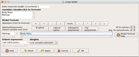
Figure 1. R commander menu interface for linear model.
Our model was
Matings ~ Body.Mass
R commander will keep track of the models created and enter a name for the object. You can, and probably should, change the object name yourself. The example shown in Figure 1 is a simple linear regression, with Body.Mass as the Y variable and Matings the X variable. No other information need be entered and one would simply click OK to begin the analysis.
Example
The purpose of regression is similar to ANOVA. We want a model, a statistical representation to explain the data sample. The model is used to show what causes variation in a response (dependent) variable using one or more predictors (independent variables). In life history theory, mating success is an important trait or characteristic that varies among individuals in a population. For example we may be interested in determining the effect of age (X1) and body size (X2) on mating success for a bird species. We could handle the analysis with ANOVA, but we would lose some information. In a clinical trial, we may predict that increasing Age (X1) and BMI (X2) causes increase blood pressure (Y).
Our causal model looks like

Let’s review the case for ANOVA first.
The response (dependent variable), the number of successful matings for each individual male bird, would be a quantitative (interval scale) variable. (Reminder: You should be able to tell me what kind of analysis you would be doing if the dependent variable was categorical!) If we use ANOVA, then factors have levels. For example, we could have several adult birds differing in age (factor 1) and of different body sizes. Age and body size are quantitative traits, so, in order to use our standard ANOVA, we would have to assign individuals to a few levels. We could group individuals by age (eg, < 6 months, 6 – 10 months, > 12 months) and for body size (eg, small, medium, large). For the second example, we might group the subjects into age classes (20-30, 30-40, etc), and by AMA recommended BMI levels (underweight < 18.5, normal weight 18.5 – 24.9, overweight 25-29.9, obese > 30).
We have not done anything wrong by doing so, but if you are a bit uneasy by this, then your intuition will be rewarded later when we point out that in most cases you are best to leave it as a quantitative trait. We proceed with the test of ANOVA, but we are aware that we’ve lost some information — continuous variables (age, body size, BMI) were converted to categories — and so we suspect (correctly) that we’ve lost some power to reject the null hypothesis. By the way, when you have a “factor” that is a continuous variable, we call it a “covariate.” Factor typically refers to a categorical explanatory (independent) variable.
We might be tempted to use correlation — at least to test if there’s a relationship between Body Mass and Number of Matings. Correlation analysis is used to measure the intensity of association between a pair of variables. Correlation is also used to to test whether the association is greater than that expected by chance alone. We do not express one as causing variation in the other variable, but instead, we ask if the two variables are related (covary). We’ve already talked about some properties of correlation: it ranges from -1 to +1 and the null hypothesis is that the true association between two variables is equal to zero. We will formalize the correlation next time to complete our discussion of the linear relationship between two variables.
But regression is appropriate here because we are indeed making a causal claim: we selected Age and Body Size, and we selected Age and BMI in the second example wish to develop a model so we can predict and maybe even advise.
Least squares regression explained
Regression is part of the general linear model family of tests. If there is one linear predictor variable, then that is a simple linear regression (SLR), also called ordinary least squares (OLS), if there are two or more linear predictor variables, then that is a multiple linear regression (MLR, Chapter 18).
First, consider one predictor variable. We begin by looking at how we might summarize the data by fitting a line to the data; we see that there’s a relationship between mass and mating success in both young and old females (and maybe in older males).
The data set was
Table 1. Our data set of number of matings by male bird by body mass (g).
| Body.Mass | Matings |
|---|---|
| 29 | 0 |
| 29 | 2 |
| 29 | 4 |
| 32 | 4 |
| 32 | 2 |
| 35 | 6 |
| 36 | 3 |
| 38 | 3 |
| 38 | 5 |
| 38 | 8 |
| 40 | 6 |
Note 1: Unfortunately, I’ve lost track where Table 1 data set came from! It’s likely a simulated set inspired by my readings back in 2005.
And a scatterplot of the data (Fig 2)
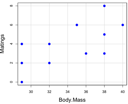
Figure 2. Number of matings by body mass (g) of the male bird.
There’s some scatter, but our eyes tell us that as body size increases, the number of matings also increases. We can go so far as to say that we can predict (imperfectly) that larger birds will have more matings. We fit the best fit line to the data and added the line to our scatterplot (Fig 3). The best fit line meets the requirements that the error about the line is minimized (see below). Thus, we would predict about six matings for a 40 g bird, but only two matings for a 28 g bird. And this is a good feature of regression, prediction, as long as used with some caution.
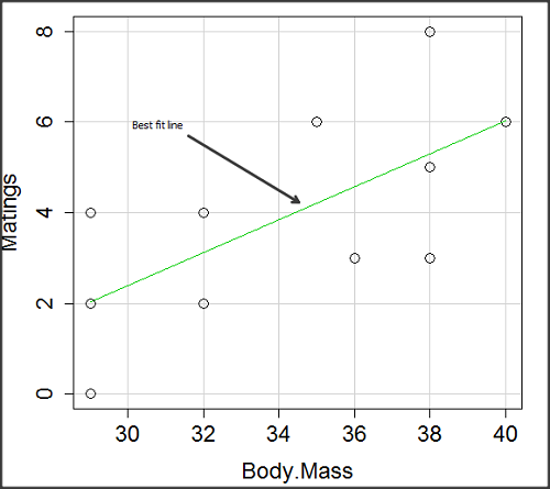
Figure 3. Same data as in Fig 2, but with the “best fit” line.
The prediction works best for the range of data for which the regression model was built. Outside the range of values, we predict with caution.
The simplest linear relationship between two variables is the SLR. This would be the parameter version (population, not samples), where

 = the Y-intercept coefficient and it is defined as

solve for intercept by setting X = 0.
 = the regression coefficient (slope)

Note 2: The denominator is just our corrected sums of squares that we’ve seen many times before. The numerator is the cross-product and is referred to as the covariance.
ε = the error or “residual”

The residual is an important concept in regression. We briefly discussed “what’s left over,” in ANOVA, where an observation Yi is equal to the population mean plus the factor effect of level i plus the remainder or “error”.
In regression, we speak of residuals as the departure (difference) of an actual Yi (observation) from the predicted Y ( , say “why-hat”).
the linear regression predicts Y

and what remains unexplained by the regression equation is called the residual
There will be as many residuals as there were observations.
But why THIS particular line? We could draw lines anywhere through the points. Well, this line is termed the “best fit“ because it is the only line that minimizes the sum of the squared deviations for all values of Y (the observations) and the predicted . The best fit line minimizes the sum of the squared residuals.

Note 3: More technically we justify the OLS as best fit by saying” Following the Gauss–Markov theorem, OLS estimators are the best linear unbiased estimators (BLUE). Gauss (1821) proved that the least squares method produces unbiased estimates with the smallest variance, a key result for regression analysis, while Markov (1900) rediscovered Gauss’ work and showed the conclusions held under less restrictive conditions.
Thus, like ANOVA, we can account for the total sums of squares (SSTot) as equal to the sums of squares (variation), explained by the regression model, SSreg, plus what’s not explained, what’s left over, the residual sums of squares, SSres, aka SSerror.

How well does our model explain — fit — our data? We cover this topic in Chapter 17.3 — Estimation of linear regression coefficients, but for now, we introduce  , the coefficient of determination.

ranges from zero (0%), the linear model fails completely to explain the data, to one (100%), the linear model explains perfectly every datum.
Models used to predict new values
Once a line has been estimated, one use is to predict new observations not previously measured!
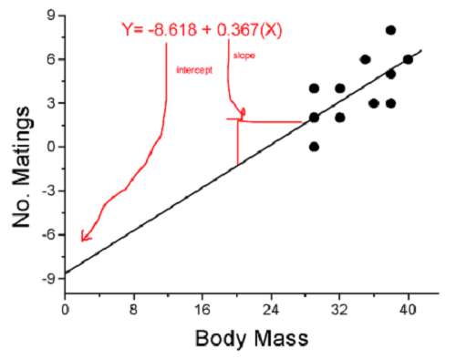
Figure 4. Figure 3 redrawn to extend the line to the Y intercept.
This is an important use of models in statistics: use an equation to fit to some data, then predict Y values from new values of X. To use the equation, simply insert new values of X into the equation, because the slope and intercept are already “known.” Then for any Xi we can determine  (predicted Y value that is on the best fit regression line).
This is what people do when they say
“if you are a certain weight (or BMI) you have this increased risk of heart disease”
“if you have this number of black rats in the forest you will have this many nestlings survive to leave the nest”
“if you have this much run-off pollution into the ocean you have this many corals dying”
“if you add this much enzyme to the solution you will have this much resulting product”.
R Code
We can use the drop down menu in Rcmdr to do the bulk of the work, supplemented with a little R code entered and run from the script window. Scrape data from Table 1 and save to R as bird.matings.
LinearModel.3 <- lm(Matings ~ Body.Mass, data=bird.matings)
summary(LinearModel.3)
Output from R — we’ll pull apart the important parts, color-highlights used to help orient the reader as we go.
Call:
lm(formula = Matings ~ Body.Mass, data = bird.matings)

Residuals:
     Min       1Q   Median      3Q     Max
-2.29237 -1.34322 -0.03178 1.33792 2.70763

Coefficients:
            Estimate Std. Error  t value  Pr(>|t|)
(Intercept)  -8.4746     4.6641   -1.817    0.1026
Body.Mass     0.3623     0.1355    2.673    0.0255 *
---
Signif. codes: 0 '***' 0.001 '**' 0.01 '*' 0.05 '.' 0.1 ' ' 1

Residual standard error: 1.776 on 9 degrees of freedom
Multiple R-squared: 0.4425, Adjusted R-squared: 0.3806
F-statistic: 7.144 on 1 and 9 DF, p-value: 0.02551
What are the values for the coefficients? See Estimate .
Table 2. Coefficient estimates.
| Value | |
 , Y-intercept , Y-intercept |
-8.4746 |
 , Slope , Slope |
0.3623 |
Get the sum of squares from the ANOVA table
myAOV.full <- anova(LinearModel.3); myAOV.full
Output from R, the ANOVA table
Analysis of Variance Table

Response: Matings
           Df  Sum Sq  Mean Sq  F value     Pr(>F)
Body.Mass   1  22.528  22.5277   7.1438   0.02551 *
Residuals   9  28.381   3.1535
---
Signif. codes: 0 '***' 0.001 '**' 0.01 '*' 0.05 '.' 0.1 ' ' 1
Looking for , the coefficient of determination? From the R output identify Multiple R-squared. We find 0.4425. Grab the SSreg and SSTot from the ANOVA table and confirm

Note 2: The value of increases with each additional predictor variable included in the model, whether statistically significant contributor or not, regardless of whether the association between the predictor is simply due to chance. The Adjusted R-squared is an attempt to correct for this bias.
The residual standard error, RSE, is another model fit statistic.

The smaller the residual standard error, the better the model fit to the data. See Residual standard error: 1.776 and MSE = 3.1535 above.
And the “statistical significance?” See Pr(>|t|) .There were tests for each coefficient,  and
and  :
:
Table 3. Coefficient estimates.
| P-value | |
| , Y-intercept |
0.1026 |
| , Slope |
0.0255 |
And, at last, note that p-value, Pr(>F), reported in the Analysis of Variance Table, is the same as the p-value for the slope reported as Pr(>|t|).
Make a prediction:
How many matings expected for a 40 g male?
predict(LinearModel.3, data.frame(Body.Mass=40))
R output
1
6.016949
Answer: we predict 6 matings for a 40g male.
See below for predicting confidence limits.
How to extract information from an R object
We can do more — the lm() returnd a great deal of information about our regression model. Explore all that is available in the objects LinearModel.3 and myAOV.full with the str() command.
Note 3: str() command lets us look at an object created in R. Type ?str or help(str) to bring up the R documentation. Here, we use str() to look at the structure of the objects we created. “Classes” refers to the R programming class attribute inherited by the object. We first used str() in Chapter 8.3.
str(LinearModel.3)
Output from R
List of 12
$ coefficients : Named num [1:2] -8.475 0.362
..- attr(*, "names")= chr [1:2] "(Intercept)" "Body.Mass"
$ residuals : Named num [1:11] -2.0318 -0.0318 1.9682 0.8814 -1.1186 ...
..- attr(*, "names")= chr [1:11] "1" "2" "3" "4" ...
$ effects : Named num [1:11] -12.965 4.746 2.337 1.327 -0.673 ...
..- attr(*, "names")= chr [1:11] "(Intercept)" "Body.Mass" "" "" ...
$ rank : int 2
$ fitted.values: Named num [1:11] 2.03 2.03 2.03 3.12 3.12 ...
..- attr(*, "names")= chr [1:11] "1" "2" "3" "4" ...
$ assign : int [1:2] 0 1
$ qr :List of 5
..$ qr : num [1:11, 1:2] -3.317 0.302 0.302 0.302 0.302 ...
.. ..- attr(*, "dimnames")=List of 2
.. .. ..$ : chr [1:11] "1" "2" "3" "4" ...
.. .. ..$ : chr [1:2] "(Intercept)" "Body.Mass"
.. ..- attr(*, "assign")= int [1:2] 0 1
..$ qraux: num [1:2] 1.3 1.3
..$ pivot: int [1:2] 1 2
..$ tol : num 0.0000001
..$ rank : int 2
..- attr(*, "class")= chr "qr"
$ df.residual : int 9
$ xlevels : Named list()
$ call : language lm(formula = Matings ~ Body.Mass, data = bird_matings)
$ terms :Classes 'terms', 'formula' language Matings ~ Body.Mass
.. ..- attr(*, "variables")= language list(Matings, Body.Mass)
.. ..- attr(*, "factors")= int [1:2, 1] 0 1
.. .. ..- attr(*, "dimnames")=List of 2
.. .. .. ..$ : chr [1:2] "Matings" "Body.Mass"
.. .. .. ..$ : chr "Body.Mass"
.. ..- attr(*, "term.labels")= chr "Body.Mass"
.. ..- attr(*, "order")= int 1
.. ..- attr(*, "intercept")= int 1
.. ..- attr(*, "response")= int 1
.. ..- attr(*, ".Environment")=<environment: R_GlobalEnv>
.. ..- attr(*, "predvars")= language list(Matings, Body.Mass)
.. ..- attr(*, "dataClasses")= Named chr [1:2] "numeric" "numeric"
.. .. ..- attr(*, "names")= chr [1:2] "Matings" "Body.Mass"
$ model :'data.frame': 11 obs. of 2 variables:
..$ Matings : num [1:11] 0 2 4 4 2 6 3 3 5 8 ...
..$ Body.Mass: num [1:11] 29 29 29 32 32 35 36 38 38 38 ...
..- attr(*, "terms")=Classes 'terms', 'formula' language Matings ~ Body.Mass
.. .. ..- attr(*, "variables")= language list(Matings, Body.Mass)
.. .. ..- attr(*, "factors")= int [1:2, 1] 0 1
.. .. .. ..- attr(*, "dimnames")=List of 2
.. .. .. .. ..$ : chr [1:2] "Matings" "Body.Mass"
.. .. .. .. ..$ : chr "Body.Mass"
.. .. ..- attr(*, "term.labels")= chr "Body.Mass"
.. .. ..- attr(*, "order")= int 1
.. .. ..- attr(*, "intercept")= int 1
.. .. ..- attr(*, "response")= int 1
.. .. ..- attr(*, ".Environment")=<environment: R_GlobalEnv>
.. .. ..- attr(*, "predvars")= language list(Matings, Body.Mass)
.. .. ..- attr(*, "dataClasses")= Named chr [1:2] "numeric" "numeric"
.. .. .. ..- attr(*, "names")= chr [1:2] "Matings" "Body.Mass"
- attr(*, "class")= chr "lm"
Yikes! A lot of the output is simply identifying how R handled our data.frame and applied the lm() function.
Note 4: The “how” refers to the particular algorithms used by R. For example, qraux, pivot, and tol refer to arguments used in the QR decomposition of the matrix (derived from our data.frame) used to solve our linear least squares problem.
However, it’s from this command we learn what is available to extract in our object. For example, what were the actual fitted values (, the predicted Y values) from our linear equation? I marked the relevant str() output above in yellow. We call these from the object with the R code
RegModel.1$fitted.values
and R returns
       1        2        3        4        5        6        7        8        9       10       11
2.031780 2.031780 2.031780 3.118644 3.118644 4.205508 4.567797 5.292373 5.292373 5.292373 6.016949
Here’s another look at an object, str(myAOV.full), and how to extract useful values.
Output from R
Classes 'anova' and 'data.frame': 2 obs. of 5 variables:
$ Df : int 1 9
$ Sum Sq : num 22.5 28.4
$ Mean Sq: num 22.53 3.15
$ F value: num 7.14 NA
$ Pr(>F) : num 0.0255 NA
- attr(*, "heading")= chr [1:2] "Analysis of Variance Table\n" "Response: Matings"
Extract the sum of squares: type the object name then $ Sum Sq at the R prompt.
myAOV.full $"Sum Sq"
Output from R
[1] 22.52773 28.38136
Get the residual sum of squares
SSE.myAOV.full <- myAOV.full $"Sum Sq"[2]; SSE.myAOV.full
Output from R
[1] 22.52773
Get the regression sum of squares
SSR.myAOV.full <- myAOV.full $"Sum Sq"[1]; SSR.myAOV.full
Output from R
[1] 50.90909
Now, get the total sums of squares for the model

ssTotal.myAOV.full <- SSE.myAOV.full + SSR.myAOV.full; ssTotal.myAOV.full
Calculate the coefficient of determination
myR_2 <- 1 - (SSE.myAOV.full/(ssTotal.myAOV.full)); myR_2
Output from R
[1] 0.4425091
Which matches what we got before, as it should.
Regression equations may be useful to predict new observations
True. However, you should avoid making estimates beyond the range of the X – values that were used to calculate the best fit regression equation! Why? The answer has to do with the shape of the confidence interval around the regression line.
I’ve drawn an exaggerated confidence interval (CI), for a regression line between an X and a Y variable. Note that the CI is narrow in the middle, but wider at the end. Thus, we have more confidence in predicting new Y values for data that fall within the original data because this is the region where we are most confident.
Calculating the CI for the linear model follows from CI calculations for other estimates. It is a simple concept — both the intercept and slope were estimated with error, so we combine these into a way to generalize our confidence in the regression model as a whole given the error in slope and intercept estimation.

The calculation of confidence interval for the linear regression involves the standard error of the residuals, the sample size, and expressions relating the standard deviation of the predictor variable X — we use the t distribution.
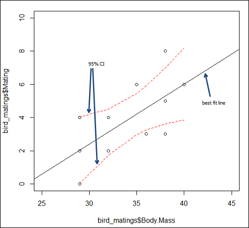
Figure 5. 95% confidence interval about the best fit line.
How I got this graph
plot(bird_matings$Body.Mass,bird_matings$Mating,xlim=c(25,45),ylim=c(0,10))
mylm <- lm(bird_matings$Mating~bird_matings$Body.Mass)
predict(mylm, interval = c("confidence"))
abline(mylm, col = "black")
x<-bird_matings$Body.Mass
lines(x, prd[,2], col= "red", lty=2)
lines(x, prd[,3], col= "red", lty=2)
Nothing wrong with my code, but getting all of this to work in R might best be accomplished by adding another package, a plug-in for Rcmdr called RcmdrPlugin.HH. HH refers to “Heiberger and Holland,” and provides software support for their textbook Statistical Analysis and Data Display, 2nd edition.
Regression through the origin
A regression through the origin in OLS is appropriate when theory dictates that the response must be zero when the predictor is zero, that is, the intercept is known to be exactly 0. In population genetics, for example, if you model pairwise genetic distance as a function of some measure of separation, (eg, time or geographic distance), and the definition of the metric ensures that identical individuals have zero distance, then forcing the regression through the origin can be justified. Doing so reduces parameter estimation to the slope alone and can improve efficiency when the assumption is correct. However, if the true relationship includes a nonzero intercept, constraining it to zero biases the slope.
This choice also affects the coefficient of determination (R²): in a no-intercept model, R² is computed relative to zero rather than the mean of Y, so it is not directly comparable to the standard R² from a model with an intercept and can even appear artificially higher or lower. If the origin constraint is correct, the no-intercept model may show a better (more meaningful) fit; if not, the apparent R² can be misleading despite biased estimates.
R code for regression without the Y-intercept:
noOrigin.model <- lm(formula = Matings ~ 0 + Body.Mass, data = bird.matings)
summary(noOrigin.model)
And the R output:
Call:
lm(formula = Matings ~ 0 + Body.Mass, data = bird.matings)

Residuals:
    Min      1Q  Median      3Q     Max
-3.4112 -1.4406  0.2359  0.9418  3.5301

Coefficients:
          Estimate Std. Error t value Pr(>|t|)
Body.Mass  0.11763    0.01726   6.816 4.65e-05 ***
---
Signif. codes:  0 ‘***’ 0.001 ‘**’ 0.01 ‘*’ 0.05 ‘.’ 0.1 ‘ ’ 1

Residual standard error: 1.97 on 10 degrees of freedom
Multiple R-squared:  0.8229,	Adjusted R-squared:  0.8052
F-statistic: 46.45 on 1 and 10 DF,  p-value: 4.65e-05
Interpretation and comparison between model with and without fit through the origin.
Without an intercept (regression through the origin), the model estimates a slope of 0.1176 (SE = 0.0173, t = 6.82, p = 4.65×10⁻⁵), indicating a strong, statistically significant positive association between Body Mass and the response. Because the intercept is constrained to zero, this slope is effectively forced to account for all variation in Y, which often inflates its magnitude of significance and can bias the estimate if the true relationship does not pass through the origin.
When the intercept was included, the slope increased to 0.3623 (SE = 0.1355, t = 2.67, p = 0.0255), still statistically significant but less so, while the intercept is estimated at –8.47 (SE = 4.66, p = 0.103), which is not significantly different from zero at conventional levels. The change in slope (from 0.12 to 0.36) shows that allowing a nonzero intercept alters the fitted relationship substantially, suggesting that the origin constraint may not be appropriate in this case. Even though the intercept is not statistically significant, its inclusion redistributes variance between intercept and slope, yielding a more reliable slope estimate and a standard R² that is comparable across models, unlike the no-intercept case.
The negative Y-intercept, while statistically justifiable, is also biologically unrealistic, implying a negative number of matings. The statistical justification is simply that the model is used to predict mating success for organisms in the range of body size included in the data set used to make the model — the negative Y-intercept than is interpreted that we are trying to extend the model beyond its range.
In our example with the birds, a biological justification for a non intercept model can be made. For example, mating success is positively associated with body size; therefore, an organism with a hypothetical body size of zero would logically have zero chance of mating success. That said, even when biology suggests the relationship should pass through the origin, it may still be useful to fit a model with an intercept to test that assumption rather than impose it.
Measurement error, in the case of our birds example, chiefly if observed count of matings differs from the true, actual number of matings that occurred, or in a student employing genetic distance, then a number of errors may occur, including sequencing artifacts, alignment bias, or the way genetic distance is computed (eg, corrections for multiple substitutions, cf discussions in Felsenstein 2003, see Legendre and Desdevises 2009 for justifications for through the origin and phylogenetic independent contrasts). As well documented in standard texts on regression and linear models (eg, Introduction to Linear Regression Analysis, by Montgomery et al 2021; An Introduction to Generalized Linear Models, by Dobson and Barnett 2018), measurement error can introduce a small offset, so the estimated intercept serves as a diagnostic for systematic bias. If the intercept is close to zero and not significant, that provides empirical support for the origin constraint; if it is meaningfully different from zero, forcing the regression through the origin would bias the slope and distort inference. Additionally, including the intercept yields a standard R² and residual structure that are comparable across models, helping assess overall model fit before deciding whether the biologically motivated constraint is justified.
Assumptions of OLS, an introduction
We will cover assumptions of Ordinary Least Squares in detail in 17.8, Assumptions and model diagnostics for Simple Linear Regression. For now, briefly, the assumptions for OLS regression include:
- Linear model is appropriate: the data are well described (fit) by a linear model
- Independent values of Y and equal variances. Although there can be more than one Y for any value of X, the Y’s cannot be related to each other (that’s what we mean by independent). Since we allow for multiple Y’s for each X, then we assume that the variances of the range of Ys are equal for each X value (this is similar to our ANOVA assumptions for equal variance by groups).
- Normality. For each X value there is a normal distribution of Ys (think of doing the experiment over and over)
- Error (residuals) are normally distributed with a mean of zero.
Additionally, we assume that measurement of X is done without error (the equivalent, but less restrictive practical application of this assumption is that the error in X is at least negligible compared to the measurements in the dependent variable). Multiple regression makes one more assumption, about the relationship between the predictor variables (the X variables). The assumption is that there is no multicolinearity: the X variables are not related or associated to each other.
In some sense the first assumption is obvious if not trivial — of course a “line” needs to fit the data so why not plow ahead with the OLS regression method, which has desirable statistical properties and let the estimation of slopes, intercept and fit statistics guide us? One of the really good things about statistics is that you can readily test your intuition about a particular method using data simulated to meet, or not to meet, assumptions.
What about assumptions and BLUE? Interestingly, OLS coefficient estimates remain unbiased even if the errors are not normal, as long as other assumptions (like a mean of zero, no correlation, and constant variance) hold. However, the OLS estimators are no longer the “best” linear unbiased estimators (BLUE) because the efficiency property is lost. As we have discussed before, the main consequence is the effects on statistical inference. Without normality, standard errors, t-statistics, confidence intervals, and p-values will be unreliable.
Note 5: The efficiency property means the estimator has the smallest variance among all linear, unbiased estimators. And “unbiased,” again, means the estimator’s expected value is equal to the true parameter value.
Coming up with datasets like these can be tricky for beginners. Thankfully, others have stepped in and provide tools useful for data simulations which greatly facilitate the kinds of testing of assumptions — and more importantly, how assumptions influence our conclusions — statisticians greatly encourage us all to do (see Chatterjee and Firat 2007).
Questions
- Write up three learning outcomes for this page. Hint: Point your favorite generative AI to this page and ask for help.
- Predict new values for number of matings for male birds of 20g and 60g.
- Anscombe’s quartet (Anscombe 1973) is a famous example of this approach and the fictitious data can be used to illustrate the fallacy of relying solely on fit statistics and coefficient estimates.
Here are the data (modified from Anscombe 1973, p. 19) — I leave it to you to discover the message by using linear regression on Anscombe’s data set. Hint: play naïve and generate the appropriate descriptive statistics, make scatterplots for each X, Y set, then run regression statistics, first on each of the X, Y pairs (there were four sets of X, Y pairs).
Anscombe’s quartet
| X | Y1 | Y2 | Y3 | Y4 |
|---|---|---|---|---|
| 10 | 8.04 | 9.14 | 7.46 | 6.58 |
| 8 | 6.95 | 8.14 | 6.77 | 5.76 |
| 13 | 7.58 | 8.74 | 12.74 | 7.71 |
| 9 | 8.81 | 8.77 | 7.11 | 8.84 |
| 11 | 8.33 | 9.26 | 7.81 | 8.47 |
| 14 | 9.96 | 8.10 | 8.84 | 7.04 |
| 6 | 7.24 | 6.13 | 6.08 | 5.25 |
| 4 | 4.26 | 3.10 | 5.39 | 12.50 |
| 12 | 10.84 | 9.13 | 8.15 | 5.56 |
| 7 | 4.82 | 7.26 | 6.42 | 7.91 |
| 5 | 5.68 | 4.74 | 5.73 | 6.89 |
| Mean (±SD) | 7.50 (2.032) | 7.50 (2.032) | 7.50 (2.032) | 7.50 (2.032) |
Quiz Chapter 17.1
Ordinary Least Squares
Chapter 17 contents
- Introduction
- Simple Linear Regression
- Relationship between the slope and the correlation
- Estimation of linear regression coefficients
- OLS, RMA, and smoothing functions
- Testing regression coefficients
- ANCOVA – analysis of covariance
- Regression model fit
- Assumptions and model diagnostics for Simple Linear Regression
- References and suggested readings (Ch17 & 18)
16.6 – Similarity and Distance
Introduction
A measure of dependence between two random variables. Unlike Pearson Product Moment correlation, distance correlation measures strength of association between the variables whether or not the relationship is linear. Distance correlation is a recent addition to the literature, first reported by Gábor J. Székely (e.g., Székely et al. 2007). The package correlation (Makowski et al 2019) offers distance correlation and significance test.
Example, fly wing dataset introduced 16.1 – Product moment correlation
library(correlation)
Area <- c(0.446, 0.876, 0.390, 0.510, 0.736, 0.453, 0.882, 0.394, 0.503, 0.535, 0.441, 0.889, 0.391, 0.514, 0.546, 0.453, 0.882, 0.394, 0.503, 0.535)
Length <- c(1.524, 2.202, 1.520, 1.620, 1.710, 1.551, 2.228, 1.460, 1.659, 1.719, 1.534, 2.223, 1.490, 1.633, 1.704, 1.551, 2.228, 1.468, 1.659, 1.719)
FlyWings <- data.frame(Area, Length)
correlation(FlyWings,method="distance")
Output from R
# Correlation Matrix (distance-method)
Parameter1 | Parameter2 |    r |       95% CI | t(169) |      p
------------------------------------------------------------------
      Area |     Length | 0.92 | [0.80, 0.97] |  30.47 | < .001***

p-value adjustment method: Holm (1979)
Observations: 20
The product-moment correlation was 0.97 with 95% confidence interval (0.92, 0.99). The note about “p-value adjustment method: Holm (1979)” refers to the algorithm used to mitigate the multicomparison problem, which we first introduced in Chapter 12.1. The correction is necessary in this context because of how the algorithm conducts the test of the distance correlation. Please see Székely and Rizzo (2013) for more details.
Which should you report? For cases where it makes sense to test for a linear association, then the Product-moment correlation is the one to use. For other cases where no inference of linearity is expected, then the distance correlation makes sense.
Similarity and Distance
Similarity and distance are related mathematically. When two things are similar, the distance between them is small; When two things are dissimilar, the distance between them is great. Whether similarity (sometimes dissimilarity) or distance, the estimate is a statistic. The difference between the two is that the typical distance measures one sees in biostatistics all obey the triangle inequality rule while similarity (dissimilarity) indices do not necessarily obey the triangle inequality rule.
Distance measures
Distance is a way to talk about how far (or how close) two objects are from each other (Fig. 1). The distance may be relate to physical distance (map distance), or in mathematics, distance is a metric or statistic. Euclidean distance is the distance between two points in either the X-Y plane or 3-dimensional space measures the length of a segment connecting the two points (e.g., x1,y1 = 1, 4 and x2,y2 = 1,4).
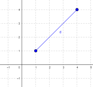
Figure 1. Cartesian plot of two points, the first at x1 = 1 and y1 = 1 and the second at x2 = 4 and y2 = 4.
For two points (x1, y1 and x2, y2) described in two dimensions (e.g., an xy plane), the distance d is given by

For two points described in three (e.g., an xyz-space), or more dimensions, the distance d is given by

Distances of this form are Euclidean distances and can be directly obtained by use of the Pythagorean Theorem. The triangle inequality rule then applies (i.e., the sum of any two sides must be less than the length of the remaining side). Euclidean distance measures also include
- Manhattan distance: the sum of absolute difference between the measures in all dimensions of two points.

- Chebyshev distance: also called the maximum value distance, the distance between two points is the greatest of their differences along any coordinate dimension.

Note: We first met Chebyshev in Chapter 3.5.
Example
There are a number of distance measures. Let’s begin discussion of distance with geographic distance as an example. Consider the distances between cities (Table 1).
Table 1. Distances (miles) among cities.
| Honolulu | Seattle | Manila | Tokyo | Houston | |
| Honolulu | 0 | 2667.57 | 5323.37 | 3849.99 | 3891.82 |
| Seattle | 2667.57 | 0 | 6590.23 | 4776.81 | 1888.06 |
| Manilla | 5323.37 | 6590.23 | 0 | 1835.1 | 8471.48 |
| Tokyo | 3849.99 | 4776.81 | 1835.1 | 0 | 6664.82 |
| Houston | 3891.82 | 1888.06 | 8471.48 | 6664.82 | 0 |
This table is a distance matrix — note that along the diagonal are “zeros,” which should make sense — the distance between an object and itself is, well zero. Above and below the diagonal you see the distance between one city and another. This is a special kind of matrix called a symmetric matrix. Enter the distance in miles (1 mile = 1.609344) between 2 cities (this is “pairwise“). There are many resources “out there,” to help you with this. For example, I found a web site called mapcrow that allowed me to enter the cities and calculate distances between them.
To get the distance matrix, use this online resource, the Geographic Distance Matrix Calculator.
Real world problem, use geodist package. Provide latitude and longitude coordinates
The dist() function in R base will return Manhattan distance and others () on matrices.
R script
HNL <- c(0, 2667.57, 5323.37, 3849.99, 3891.82)
SEA <- c(2667.57, 0, 6590.23, 4776.81, 1888.06)
MAN <- c(5323.37, 6590.23, 0, 1835.1, 8471.48)
TOK <- c(3849.99, 4776.81, 1835.1, 0, 6664.82)
HOU <- c(3891.82, 1888.06, 8471.48, 6664.82, 0)
mat.city <- rbind(HNL, SEA, MAN, TOK, HOU)
colnames(mat.city) <- c("HNL", "SEA", "MAN", "TOK", "HOU")
mat.city
dist(mat.city, method = "manhattan")
R output
        HNL       SEA     MAN      TOK
SEA 9532.58
MAN 21163.95 25361.39
TOK 16070.49 20267.93 8763.66
HOU 14526.09 8769.63 27906.40 22896.60
Other distances, replace “manhattan” with
For example,
dist(mat.city, method = "euclidean")
R output
         HNL       SEA     MAN       TOK
SEA 4550.917
MAN 9853.774 12079.347
TOK 7345.155 9615.750 3931.736
HOU 6980.976 3966.360 13820.922 11883.931
The Chebyshev distance doesn’t seem to be part of base R, but is available in other packages (philentropy, function distance).
Note 1. Need a different distance measure? Chances are philentropy packages can calculate it; use getDistMethods() to explore available measures.
R script
require(philentropy)
distance(mat.city, method = "chebyshev", diag=FALSE, upper=FALSE)
R output
     v1         v2      v3      v4      v5
v1    0.00 2667.57 5323.37 3849.99 3891.82
v2 2667.57    0.00 6590.23 4776.81 1888.06
v3 5323.37 6590.23    0.00 1835.10 8471.48
v4 3849.99 4776.81 1835.10    0.00 6664.82
v5 3891.82 1888.06 8471.48 6664.82    0.00
Distance measures used in biology
It is easy to see how the concept of genetic distance between a group of species (or populations within a species) could be used to help build a network, with genetically similar species grouped together and genetically distant species represented in a way to represent how far removed they are from each other. Here, we speak of distance as in similarity: two species (populations) that are similar are close together, and the distance between them is short. In contrast, two species (populations) that are not similar would be represented by a great distance between them. Genetic distance is the amount of divergence of species from each other. Smaller genetic distances reflects close genetic relationship. Hamming distance is a common choice, good for categorical data.
Here’s an example (Fig. 2), RAPD gel for five kinds of beans. RAPD stands for random amplified polymorphic DNA.
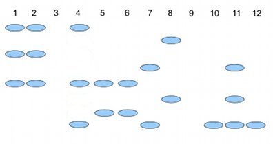
Figure 2. RAPD gel (simulated) five kinds of beans.
Samples were small red beans (SRB), garbanzo beans (GB), split green pea (SGP), baby lima beans (BLB), and black eye peas (BEP). RAPD primer 1 was applied to samples in lanes 1 – 6; RAPD primer 2 was applied to samples in lane 7 – 12. Lane 1 & 7 = SRB; Lane 2 & 8 = GB; Lanes 3 & 9 = SGP; Lane 4 & 10 = BLB; Lane 5 & 11 = BB; Lane 6 & 12 = BEP.
Here’s how to go from gel documentation to the information needed for genetic distance calculations (see below). I’ll use “1” to indicate presence of a band, “0” to indicate absence of a band, and “?” to indicate no information. For simplicity, I ignored the RF value, but ranked the bands by order of largest (= 1) to smallest (=8) fragment.
We need three pieces of information from the gel to calculate genetic distance.
NA = the number of markers for taxon A
NB = the number of markers for taxon B
NAB = the number of markers in common between A and B (this is the pairwise part — we are comparing taxa two at a time.
First, compare the beans against the same primer. My results for primer 1 are in Table 2; results for primer 2 are in Table 3.
Table 2. Bands for Primer 1
| marker | lane 1 | Lane 2 | Lane3 | Lane 4 | Lane 5 | Lane 6 |
| 1 | 1 | 1 | ? | 1 | 0 | 0 |
| 3 | 1 | 1 | ? | 0 | 0 | 0 |
| 5 | 1 | 1 | ? | 1 | 1 | 1 |
| 7 | 0 | 0 | ? | 0 | 1 | 1 |
Table 3 for Primer 2
| marker | Lane 7 | Lane 8 | Lane 9 | Lane 10 | Lane 11 | Lane 12 |
| 2 | 0 | 1 | ? | 0 | 0 | 0 |
| 4 | 1 | 0 | ? | 0 | 1 | 0 |
| 6 | 0 | 1 | ? | 0 | 1 | 0 |
| 8 | 1 | 0 | ? | 1 | 1 | 1 |
From Table 2 and Table 3, count NA (= NB ) for each taxon. Results are in Table 4.
Table 4. Bands for each taxon.
| Taxon | No. markers from Primer1 |
No. markers from Primer2 |
Total |
| SRB | 3 | 2 | 5 |
| GB | 3 | 2 | 5 |
| SGP | ? | ? | ? |
| BLB | 2 | 1 | 3 |
| BB | 2 | 3 | 5 |
| BEP | 2 | 1 | 3 |
To get Hamming distance between SRB and BB (from Table 2 and Table 3), R script as follows.
SRB <- c(1, 1, 1, 0, 0, 1, 0, 1)
GB <- c(0, 0, 1, 1, 0, 1, 1, 1)
# sum the inequality between the two vectors
sum(SRB != GB)
R output
> sum(SRB != GB)
[1] 4
Hamming distance between small red beans and black beans for the markers is 4.
Note 2. h/t https://www.r-bloggers.com/2021/12/how-to-calculate-hamming-distance-in-r/
As you can see, there is no simple relationship among the taxa; there is no obvious combination of markers that readily group the taxa by similarity. So, I need a computer to help me. I need a measure of genetic distance, a measure that indicates how (dis)similar the different varieties are for our genetic markers. I’ll use a distance calculation that counts only the “present” markers, not the “absent” markers, which is more appropriate for RAPD. I need to get the NAB values, the number of shared markers between pairs of taxa.
Table 5. NAB
| SRB | GB | BLB | BB | BEP | |
| SRB | 0 | 3 | 3 | 3 | 2 |
| GB | 0 | 2 | 2 | 1 | |
| BLB | 0 | 2 | 2 | ||
| BB | 0 | 3 | |||
| BEP | 0 |
The equation for calculating Nei’s distance is:

where NA = number of bands in taxon “A”, NB = number of bands in taxon “B”, and NAB is the number of bands in common between A and B (Nei and Li 1979). Here’s an example calculation.
Let A = SRB and B = GB, then

The R package adegenet includes Nei’s distance (and others), but the data set assumes more information than I provided here (e.g., ploidy, alleles).
Which distance measure to use?
Unfortunately, not a simple answer. A quick search of journals will likely return “Euclidean distance” the most common (Evolution = 328, Ecology = 298). The different distance (similarity) measures were developed to solve sometimes related, but often different problems, and so a review of the statistical properties would be warranted before making a choice. Helpful reviews
Questions
1. Write up three learning outcomes for this page. Hint: Point your favorite generative AI to this page and ask for help.
2. Review all of the different correlation estimates we introduced in Chapter 16 and construct a table to help you learn. Product moment correlation is presented as example.
| Name of correlation | variable 1 type | variable 2 type | purpose |
| Product moment | ratio | ratio | estimate linear association |
3. Be able to define and distinguish between similarity measures, dissimilarity measures quantify, and distance.
4. Return to our counts of colored candies from mini bags of Skittles, M&M plain chocolate, and M&M peanut. Which two are most similar? Here’s a data sample. Calculate the Euclidean pairwise distances, then the Manhattan distances among the bags of candies. Do you get the same answer?
The data
| Color | Skittles | mm_plain | mm_peanut |
|---|---|---|---|
| Blue | 0 | 19 | 18 |
| Green | 40 | 43 | 28 |
| Yellow | 30 | 29 | 9 |
| Orange | 26 | 39 | 18 |
| Red | 28 | 15 | 4 |
| Purple | 28 | 0 | 4 |
| Brown | 0 | 16 | 0 |
Example R code
Note 3. The code works. Remember, sometimes when copying code from a website you pickup additional characters. While every effort has been made to provide clean html — if you run into problems, chances are the simplest fix is to type the code fresh rather than trying to figure out why the copied code fails.
mySites <- data.frame(
Site <- c("A","B","C"),
Spp1 <- c(10, 5, 12),
Spp2 <- c(7, 15, 8),
Spp3 <- c(3, 2, 9)
)
# View the matrix
print(mySites)
# Exclude the "Site" column
myAbundances = mySites[,-1]
# Calculate the Euclidean distance matrix
dist(myAbundances,method="euclidean")
The output should be
          1          2
2  9.486833
3  6.403124  12.124356
where “1” refers to site A, “2” refers to site B, and “3” refers to site C. We would conclude that sites A and C are most similar, or have similar species abundance, because they have the smallest Euclidean distance. As you can imagine, there’s more to interpreting these statistics, and in particular, Euclidean distance can lead to some confusing interpretations about abundance and species composition between sites, eg, Orlóci paradox. Interested readers should see Ricotta 2021.
Note 4. Orlóci paradox refers to a problem with Euclidean distances: two sites with no species in common may be interpreted as more similar that two sites that share the same species. This is because Euclidean distance is more sensitive to abundance than presence/absence.
Why then teach Euclidean distance? The Euclidean distance is a standard measure, it helps lay the foundation for understanding geometric concepts. Its limitations are a reminder that students need to be aware that alternative methods are sometimes needed.
Quiz Chapter 16.6
Similarity and Distance
Chapter 16 contents
16.4 – Spearman and other correlations
Introduction
Pearson product moment correlation is used to describe the level of linear association between two variables. There are many types of correlation estimators in addition to the familiar Product Moment Correlation, r.
Spearman rank correlation
If you take the ranks for X 1 and the ranks for X 2, the correlation of ranks is called Spearman rank correlation, rs. Spearman correlation is a nonparametric statistic. Like the product moment correlation, it can take values between -1 and +1.
For variables X 1 and X 2, the rank order correlation may be calculated on the ranks as

where di is the difference between the ranks of X 1 and X 2 for each experimental unit. This formula assumes that there are no tied ranks; if there are, use the equation for the product moment correlation instead (but on the ranks).
R commander has an option to calculate the Spearman rank correlation simply by selecting the check box in the correlation sub menu. However, if the data set is small, it may be easier to just run the correlation in the script window.
Our example for the product moment correlation was between Drosophila fly wing length and wing area (Table 1).
Table 1. Fly wing lengths and area, units mm and mm2, respectively (Dohm pers obs.)
| Obs | Student | Length | Area |
|---|---|---|---|
| 1 | S01 | 1.524 | 0.446 |
| 2 | S01 | 2.202 | 0.876 |
| 3 | S01 | 1.52 | 0.39 |
| 4 | S01 | 1.62 | 0.51 |
| 5 | S01 | 1.71 | 0.736 |
| 6 | S03 | 1.551 | 0.453 |
| 7 | S03 | 2.228 | 0.882 |
| 8 | S03 | 1.46 | 0.394 |
| 9 | S03 | 1.659 | 0.503 |
| 10 | S03 | 1.719 | 0.535 |
| 11 | S05 | 1.534 | 0.441 |
| 12 | S05 | 2.223 | 0.889 |
| 13 | S05 | 1.49 | 0.391 |
| 14 | S05 | 1.633 | 0.514 |
| 15 | S05 | 1.704 | 0.546 |
| 16 | S08 | 1.551 | 0.453 |
| 17 | S08 | 2.228 | 0.882 |
| 18 | S08 | 1.468 | 0.394 |
| 19 | S08 | 1.659 | 0.503 |
| 20 | S08 | 1.719 | 0.535 |
Repeated observations by image analysis (ImageJ) were collected by four students (S01, S03, So5, S08) from fixed wings to glass slides.
Here’s the scatterplot of the ranks of fly wing length and fly wing area (Fig 1).
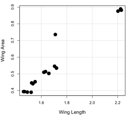
Figure 1. Drosophila wing area (mm2) by wing length (mm).
A nonparametric alternative to the product moment correlation, the Spearman Rank correlation can be obtained directly. The Spearman correlation involves ranking the data, ie, converting data types, from ratio scale data to ordinal scale, then applying the same formula used for the Product moment correlation to the ranked data. The Spearman correlation would be the choice for testing linear association between two ordinal type variables. It is also appropriate in lieu of the parametric product moment correlation when the statistical assumptions are not met, eg, normality assumption.
R code
For the Spearman rank correlation, at the R prompt type
cor.test(Area, Length, alternative="two.sided", method="spearman")

R returns with
    Spearman's rank correlation rho

data:  Area and Length
S = 58.699, p-value = 5.139e-11
alternative hypothesis: true rho is not equal to 0
sample estimates:
      rho
0.9558658
Alternatively, to calculate either correlation, use R Commander.
Rcmdr: Statistics → Summaries→ Correlation test
Example
BM=c(29,29,29,32,32,35,36,38,38,38,40)
Matings=c(0,2,4,4,2,6,3,3,5,8,6)

cor.test(BM,Matings, method="spearman")
Warning in cor.test.default(BM, Matings, method = "spearman") :
  Cannot compute exact p-value with ties

        Spearman's rank correlation rho

data:  BM and Matings
S = 77.7888, p-value = 0.03163
alternative hypothesis: true rho is not equal to 0
sample estimates:
      rho
0.6464143
cor.test(BM,Matings, method="pearson")

        Pearson's product-moment correlation

data:  BM and Matings
t = 2.6728, df = 9, p-value = 0.02551
alternative hypothesis: true correlation is not equal to 0
95 percent confidence interval:
 0.1087245 0.9042515
sample estimates:
      cor
0.6652136
Other correlations
Kendall’s tau
Another nonparametric correlation is Kendall’s tau (τ). Rank the X 1 values, then rank the X 2 values. Count the number of X 1, X 2 pairs that have the same rank (concordant pairs) and the number of X 1, X 2 pairs that do not have the same rank (discordant pairs), Kendall’s tau is then

where n is the number of pairs.
Note 1: The denominator is our familiar number of pairwise comparisons if we take k = n

We introduced concordant and discordant pairs when we presented McNemar’s test and cross-classified experimental design in Chapter 9.6.
Example: Judging of Science Fair posters
What is the agreement between two judges, A and B, who evaluated the same science fair posters? Posters were evaluated on if the student’s project was hypothesis-based and judges used a Likert-like scale Strongly disagree (1), Somewhat disagree (2), Neutral (3), Somewhat agree (4), Strongly agree (5).
Table 2. Two judges evaluated six posters for evidence of hypothesis-based project
| Poster | Judge.A | Judge.B |
| 1 | 5 | 4 |
| 2 | 2 | 3 |
| 3 | 4 | 2 |
| 4 | 3 | 1 |
| 5 | 2 | 1 |
| 6 | 4 | 3 |
A concordant pair represents a poster ranked higher by both judges, while a discordant pair is a poster ranked high by one judge but low by another judge. Poster 1 and poster 5 were concordant pairs,
In R, it is simple to get this correlation directly by invoking the cor.test function and specifying the method equal to kendall. The cor.test assumes that the data are in a matrix, so use the cbind function to bind two vectors together – note the vectors need to have the same number of observations. If the data set is small, it is easier to just enter the data directly in the script window of R commander.
A = c(2,2,3,4,4,5)
B = c(1,3,1,2,3,4)
m = cbind(A,B)
cor.test(A,B, method="kendall")

  Cannot compute exact p-value with ties

        Kendall's rank correlation tau

data:  A and B
z = 1.4113, p-value = 0.1581
alternative hypothesis: true tau is not equal to 0
sample estimates:
      tau
0.5384615
End of R output
There were no ties in this data set, but we can run the product moment correlation just for comparison
cor.test(A,B, method="pearson")

        Pearson's product-moment correlation

data:  A and B
t = 1.4649, df = 4, p-value = 0.2168
alternative hypothesis: true correlation is not equal to 0
95 percent confidence interval:
 -0.4239715  0.9478976
sample estimates:
      cor
0.5909091
End R output
Tetrachoric and Polychoric correlation
Tetrachoric correlations used for binomial outcomes (yes, no), polychoric correlation used for ordinal categorical data like the Likert scale. Introduced by Karl Pearson, commonly applied correlation estimate for Item Analysis in psychometric research. Pyschometrics, a sub-discipline within psychology and now a significant part of education research, is about evaluating assessment tools.
R package psych.
R code: Tetrachoric correlation
tetrachoric(x,y=NULL,correct=.5,smooth=TRUE,global=TRUE,weight=NULL,na.rm=TRUE,
     delete=TRUE)
R code: Polychoric correlation
polychoric(x,smooth=TRUE,global=TRUE,polycor=FALSE,ML=FALSE, std.err=FALSE,
     weight=NULL,correct=.5,progress=TRUE,na.rm=TRUE,  delete=TRUE)
Polyserial correlation
R package polychor. Used to estimate linear association between a ratio scale variable and an ordinal variable.
R code: Polyserial correlation
polyserial(x,y)
Biserial correlation would be a special case of the polyserial correlation, where ordinal variable is replaced by a dichotomous (binomial) variable.
R code: Polyserial correlation
biserial(x,y)
Intra-class correlation coefficient
Both the ICC and the product moment correlation, r, which we introduced in Chapter 16.1, are measures of strength of linear association between two ratio scale variables (Jinyuan et al 2016). But ICC is more appropriate for association between repeat measures of the same thing, eg, repeat measures of running speed. In contrast, the product moment correlation can be used to describe association between any two variables, eg, between repeat measures of running speed, but also between say running speed and maximum jumping height. ICC is used when quantitative measures are organized into paired groups, eg, before and after on same subjects, or cross-classified designs. ICC was introduced in Chapter 12.3 as part of discussion of repeated measures and random effects. ICC is used extensively to assess reliability of a measurement instrument (Shrout and Fleiss 1979; McGraw and Wong 1996).
Example. Data from Table 2
library(psych)
ICC(myJudge, lmer=FALSE)
R output follows
Intraclass correlation coefficients
                         type  ICC   F df1 df2      p lower bound upper bound
Single_raters_absolute   ICC1 0.40 2.3   5   6  0.166      -0.306        0.84
Single_random_raters     ICC2 0.46 3.9   5   5  0.081      -0.093        0.85
Single_fixed_raters      ICC3 0.59 3.9   5   5  0.081      -0.130        0.90
Average_raters_absolute ICC1k 0.57 2.3   5   6  0.166      -0.880        0.91
Average_random_raters   ICC2k 0.63 3.9   5   5  0.081      -0.205        0.92
Average_fixed_raters    ICC3k 0.74 3.9   5   5  0.081      -0.299        0.95

Number of subjects = 6 Number of Judges = 2
See the help file for a discussion of the other 4 McGraw and Wong estimates
Lots of output, lots of “ICC”. However, rather than explaining each entry, reflect on the type and review the data. Were the posters evaluated repeatedly? Posters were evaluated twice, but only once per judge, so there is a repeated design with respect to the posters. Had the judges been randomly selected from a population of all possible judges? No evidence was provided to suggest this, so judges were a fixed factor (see Chapter 12.3 and Chapter 14.3).
The six ICC estimates reported by R follow discussion in Shrout and Fliess (1979), and our description fits their Case 3: “Each target is rated by each of the same k judges, who are the only judges of interest (p. 421)” Thus, we find ICC for single fixed rater, ICC = 0.59. Note that we would fail to reject the hypothesis that the judges evaluations were associated.
Questions
1. Write up three learning outcomes for this page. Hint: Point your favorite generative AI to this page and ask for help.
2. See Homework 10, Mike’s Workbook for biostatistics
Quiz Chapter 16.4
Spearman and other correlations
Chapter 16 contents
16.2 – Causation and Partial correlation
Introduction
Science driven by statistical inference and model building is largely motivated by the the drive to identify pathways of cause and effect linking events and phenomena observed all around us. (We first defined cause and effect in Chapter 2.4) The history of philosophy, from the works of Ancient Greece, China, Middle East and so on is rich in the language of cause and effect. From these traditions we have a number of ways to think of cause and effect, but for us it will be enough to review the logical distinction among three kinds of cause-effect associations:
- Necessary cause
- Sufficient cause
- Contributory cause
Here’s how the logic works. If A is a necessary cause of B, then the mere fact that B is present implies that A must also be present. However, that the presence of A does not imply that B will occur. If A is a sufficient cause of B, then the presence of A necessarily implies the presence of B. However, another cause C may alternatively cause B. Enter the contributory or related cause: A cause may be contributory if the presumed cause A (1) occurs before the effect B, and (2) changing A also changes B. A contributory cause does not need to be necessary nor must it be sufficient; contributory causes play a role in cause and effect.
Thus, following this long tradition of thinking about causality we have the mantra, “Correlation does not imply causation.” The exact phrase was written as early as emphasized by Karl Pearson who invented the statistic back in the late 1800s. This well-worn slogan deserves to be on T-shirts and bumper stickers*, and perhaps to be viewed as the single most important concept you can take from a course in philosophy/statistics. But in practice, we will always be tempted to stray from this guidance. The developments in genome-wide-association studies, or GWAS, are designed to look for correlations, as evidenced by statistical linkage analysis, between variation at one DNA base pair and presence/absence of disease or condition in humans and animal models. These are costly studies to do and in the end, the results are just that, evidence of associations (correlations), not proof of genetic cause and effect. We are less likely to be swayed by a correlation that is weak, but what about correlations that are large, even close to one? Is not the implication of high, statistically significant correlation evidence of causation? No, necessary, but not sufficient.
Note 1. A helpful review on causation in epidemiology is available from Parascandola and Weed (2001); see also Kleinberg and Hripcsak (2011). For more on “correlation does not imply causation”, try the Wikipedia entry. Obviously, researchers who engage in genome wide association studies are aware of these issues: see for example discussion by Hu et al (2018) on causal inference and GWAS.
Causal inference (Pearl 2009; Pearl and Mackenzie 2018), in brief, employs a model to explain the association between dependent and multiple, likely interrelated candidate causal variable, which is then subject to testing — is the model stable when the predictor variables are manipulated, when additional connections are considered (eg, predictor variable 1 covaries with one or more other predictor variables in the model). Wright’s path analysis, now included as one approach to Structural Equation Modeling, is used to relate equations (models) of variation in observed variables attributed to direct and indirect effects from predictor variables.
* And yes, a quick Google search reveals lots of bumper stickers and T-shirts available with the causation  sentiment.
Spurious correlations
Correlation estimates should be viewed as hypotheses in the scientific sense of the meaning of hypotheses for putative cause-effect pairings. To drive the point home, explore the web site “Spurious Correlations” at https://www.tylervigen.com/spurious-correlations , which allows you to generate X-Y plots and estimate correlations among many different variables. Some of my favorite correlations from “Spurious Correlations” include (Table 1):
Table 1. Spurious correlations, https://www.tylervigen.com/spurious-correlations
| First variable | Second variable | Correlation |
| Divorce rate in Maine, USA | Per capita USA consumption of margarine | +0.993 |
| Honey producing bee colonies USA | Juvenile arrests for marijuana possession | -0.933 |
| Per capita USA consumption of mozzarella cheese | Civil engineering PhD awarded USA | +0.959 |
| Total number of ABA lawyers USA | Cost of red delicious apples | +0.879 |
These are some pretty strong correlations (cf. effect size discussion, Ch11.4 and 16.1), about as close to +1 as you can get. But really, do you think the amount of cheese that is consumed in the USA has anything to do with the number of PhD degrees awarded in engineering or that apple prices are largely set by the number of lawyers in the USA? Cause and effect implies there must also be some plausible mechanism, not just a strong correlation.
But that does NOT ALSO mean that a high correlation is meaningless. The primary reason a correlation cannot tell about causation is because of the problem (potentially) of an UNMEASURED variable (a confounding variable) being the real driving force (Fig 1).
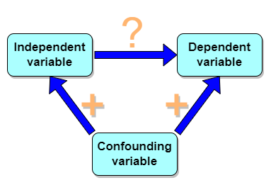
Figure 1. Unmeasured confounding variables influence association between independent and dependent variables, the characters or traits we are interested in.
Here’s a plot of running times for the best, fastest men and women runners for the 100-meter sprint. Running times over 100 meters of top athletes since the 1920s. The data are collated for you and presented at end of this page (scroll or click here).
Here’s a scatterplot (Fig 2).
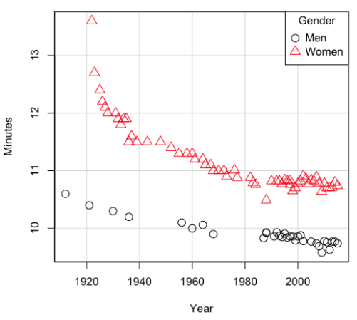
Figure 2. Running times over 100 meters of top athletes since the 1920s.
There’s clearly a negative correlation between years and running times. Is the rate of improvement in running times the same for men and women? Is the improvement linear? What, if any, are the possible confounding variables? Height? weight? Biomechanical differences? Society? Training? Genetics? … Performance enhancing drugs…?
If we measure potential confounding factors, we may be able to determine the strength of correlation between two variables that share variation with a third variable.
The partial correlation
There are several ways to work this problem. The partial correlation is a useful way to handle this problem, i.e., where a measured third variable is positively correlated with the two variable you are interested in.

Without formal mathematical proof presented, r12.3 is the correlation between variables 1 and 2 INDEPENDENT of any covariation with variable 3.
For our running data set, we have the correlation between women’s time for 100m over 9 decades, (r13 = -0.876), between men’s time for 100m over 9 decades (r23 = -0.952), and finally, the correlation we’re interested in, whether men’s and women’s times are correlated (r12 = +0.71). When we use the partial correlation, however, I get r12.3 = -0.819… much less than 0 and significantly different from zero. In other words, men’s and women’s times are not positively correlated independent of the correlation both share with the passage of time (decades)! The interpretation is that men are getting faster at a rate faster than women.
In conclusion, keep your head about you when you are doing analyses. You may not have the skills or knowledge to handle some problems (partial correlation), but you can think simply — why are two variables correlated? One causes the other to increase (or decrease) OR the two are both correlated with another variable.
Testing the partial correlation
Like our simple correlation, the partial correlation may be tested by a t-test, although modified to account for the number of pairwise correlations (Wetzels and Wagenmakers 2012). The equation for the t test statistic is now

with k equal to the number of pairwise correlations and n – 2 – k degrees of freedom.
Examples
Lead exposure and low birth weigh. The data set is numbers of low birth weight births (< 2,500 g regardless of gestational age) and numbers of children with high levels of lead (10 or more micrograms of lead in a deciliter of blood) measured from their blood. Data used for 42 cities and towns of Rhode Island, United States of America (data at end of this page, scroll or click here to access the data).
A scatterplot of number of children with high lead is shown below (Fig 3).
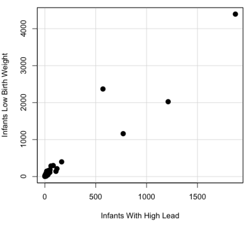
Figure 3. Scatterplot birth weight by lead exposure.
The product moment correlation was r = 0.961, t = 21.862, df = 40, p < 2.2e-16. So, at first blush looking at the scatterplot and the correlation coefficient, we conclude that there is a significant relationship between lead and low birth weight, right?
However, by the description of the data you should recall that counts were reported, not rates (eg, per 100,000 people). Clearly, population size varies among the cities and towns of Rhode Island. West Greenwich had 5085 people whereas Providence had 173,618. We should suspect that there is also a positive correlation between number of children born with low birth weight and numbers of children with high levels of lead. Indeed there are.
Correlation between Low Birth Weight and Population, r = 0.982
Correlation between High Lead levels and Population, r = 0.891
The question becomes, after removing the covariation with population size is there a linear association between high lead and low birth weight? One option is to calculate the partial correlation. To get partial correlations in Rcmdr, select
Statistics → Summaries → Correlation matrix
then select “partial” and select all three variables (select + Ctrl key; (Windows or macOS) (Fig 4).
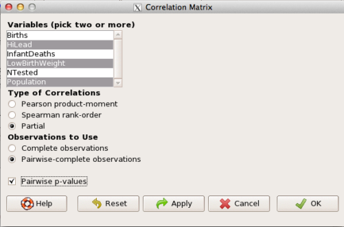
Figure 4. Screenshot Rcmdr partial correlation menu
Results are shown below.
partial.cor(leadBirthWeight[,c("HiLead","LowBirthWeight","Population")], tests=TRUE, use="complete")

Partial correlations:
                 HiLead LowBirthWeight Population
HiLead          0.00000        0.99181   -0.97804
LowBirthWeight  0.99181        0.00000    0.99616
Population     -0.97804        0.99616    0.00000
Thus, after removing the covariation we conclude there is indeed a strong correlation between lead and low birth weights.
Note 2. Some verbiage about correlation tables (matrices). The matrix is symmetric and the information is repeated. I highlighted the diagonal in green. The upper triangle (red) is identical to the lower triangle (blue). When you publish such matrices, don’t publish both the upper and lower triangles; it’s also not necessary to publish the on-diagonal numbers, which are generally not of interest. Thus, the publishable matrix would be
Partial correlations:
                LowBirthWeight Population
HiLead                 0.99181   -0.97804
LowBirthWeight                    0.99616
Another example
Do Democrats prefer cats? The question I was interested in, Do liberals really prefer cats, was inspired by a Time magazine 18 February 2014 article. I collated data on a separate but related question: Do states with more registered Democrats have more cat owners? The data set was compiled from three sources: 2010 USA Census, a 2011 Gallup poll about religious preferences, and from a data book on survey results of USA pet owners (data at end of this page, scroll or click here to access the data).
Note 3: This type of data set involves questions about groups, not individuals. We have access to aggregate statistics for groups (city, county, state, region), but not individuals. Thus, our conclusions are about groups and cannot be used to predict individual behavior, eg, knowing a person votes Green Party does not mean they necessarily share their home with a cat). See ecological fallacy.
This data set also demonstrates use of transformations of the data to improve fit of the data to statistical assumptions (normality, homoscedacity).
The variables, and their definitions, were:
ASDEMS = DEMOCRATS. Democrat advantage: the difference in registered Democrats compared to registered Republicans as a percentage; to improve the distribution qualities the arcsine transform was applied..
ASRELIG = RELIGION. Percent Religious from a Gallup poll who reported that Religion was “Very Important” to them. Also arcsine-transformed to improve normality and homoescedasticity (there you go, throwing $3 words around 🤠 ).
LGCAT = Number of pet cats, log10-transformed, estimated for USA states by survey, except Alaska and Hawaiʻi (not included in the survey by the American Veterinary Association).
LGDOG = Estimated number of pet dogs, log10-transformed for states, except Alaska and Hawaiʻi (not included in the survey by the American Veterinary Association).
LGIPC = Per capita income, log10-transformed.
LGPOP = Population size of each state, log10 transformed.
As always, begin with data exploration. All of the variables were right-skewed, so I applied data transformation functions as appropriate: log10 for the quantitative data and arc sine transform for the frequency variables. Because Democrat Advantage and Percent Religious variables were in percentages, the values were first divided by 100 to make frequencies, then the R function asin() was applied. All analyses were conducted on the transformed data, therefore conclusions apply to the transformed data.
Note 4: As we’ve discussed before, to relate the results to the original scales, back transformations would need to be run on any predictions. Back transformation for log10 would be power of ten; for the arcsine-transform the inverse of the arcsine would be used.
A scatter plot matrix (KMggplo2) plus histograms of the variables along the diagonals shows the results of the transforms and hints at the associations among the variables. A graphic like this one is called a trellis plot; a layout of smaller plots in a grid with the same (preferred) or at least similar axes. Trellis plots (Fig 5) are useful for finding the structure and patterns in complex data. Scanning across a row shows relationships between one variable with all of the others. For example, the first row Y-axis is for the ASDEMS variable; from left to right along the row we have, after the histogram, what look to be weak associations between ASDEMS and ASRELIG, LGCAT, LGDOG, and LGDOG.
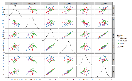
Figure 5. Trellis plot, correlations among variables.
A matrix of partial correlations was produced from the Rcmdr correlation call. Thus, to pick just one partial correlation, the association between DEMOCRATS and RELIGION (reported as “very important”) is negative (r = -0.45) and from the second matrix we retrieve the approximate P-value, unadjusted for the multiple comparisons problem, of p = 0.0024. We quickly move past this matrix to the adjusted P-values and confirm that this particular correlation is statistically significant even after correcting for multiple comparisons. Thus, there is a moderately strong negative correlation between those who reported that religion was very important to them and the difference between registered Democrats and Republicans in the 48 states. Because it is a partial correlation, we can conclude that this correlation is independent of all of the other included variables.
And what about our original question: Do Democrats prefer cats over dogs? The partial correlation after adjusting for all of the other correlated variables is small (r = 0.05) and not statistically different from zero (P-value greater than 5%).
Are there any interesting associations involving pet ownership in this data set? See if you can find it (hint: the correlation you are looking for is also in red).
Partial correlations:
         ASDEMS  ASRELIG LGCAT   LGDOG   LGIPC   LGPOP
ASDEMS   0.0000 -0.4460  0.0487  0.0605  0.1231 -0.0044
ASRELIG -0.4460  0.0000 -0.2291 -0.0132 -0.4685  0.2659
LGCAT    0.0487 -0.2291  0.0000  0.2225 -0.1451  0.6348
LGDOG    0.0605 -0.0132  0.2225  0.0000 -0.6299  0.5953
LGIPC    0.1231 -0.4685 -0.1451 -0.6299  0.0000  0.6270
LGPOP   -0.0044  0.2659  0.6348  0.5953  0.6270  0.0000
Raw P-values, Pairwise two-sided p-values:
         ASDEMS ASRELIG  LGCAT   LGDOG   LGIPC   LGPOP
ASDEMS           0.0024  0.7534  0.6965  0.4259  0.9772
ASRELIG  0.0024          0.1347  0.9325  0.0013  0.0810
LGCAT    0.7534  0.1347          0.1465  0.3473  <.0001
LGDOG    0.6965  0.9325  0.1465          <.0001  <.0001
LGIPC    0.4259  0.0013  0.3473  <.0001          <.0001
LGPOP    0.9772  0.0810  <.0001  <.0001  <.0001
Adjusted P-values, Holm’s method (Benjamini and Hochberg 1995)
         ASDEMS ASRELIG  LGCAT   LGDOG   LGIPC   LGPOP
ASDEMS           0.0241  1.0000  1.0000  1.0000  1.0000
ASRELIG  0.0241          1.0000  1.0000  0.0147  0.7293
LGCAT    1.0000  1.0000          1.0000  1.0000  <.0001
LGDOG    1.0000  1.0000  1.0000          <.0001  0.0002
LGIPC    1.0000  0.0147  1.0000  <.0001          <.0001
LGPOP    1.0000  0.7293  <.0001  0.0002  <.0001
A graph (Fig 6) to summarize the partial correlations: green lines indicate positive correlation, red lines show negative correlations; Strength of association indicated by the line thickness, with thicker lines corresponding to greater correlation.
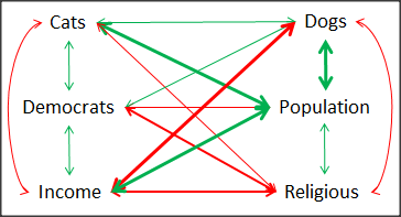
Figure 6. Causal paths among variables.
As you can see, partial correlation analysis is good for a few variables, but as the numbers increase it is difficult to make heads or tails out of the analysis. Better methods for working with these highly correlated data in what we call multivariate data analysis, for example Structural Equation Modeling or Path Analysis.
Questions
- Write up three learning outcomes for this page. Hint: Point your favorite generative AI to this page and ask for help.
- Spurious correlations can be challenging to recognize, and, sometimes, they become part of a challenge to medicine to explain away. A classic spurious correlation is the correlation between rates of MMR vaccination and autism prevalence. Here’s a table of numbers for you
| Year | Herb Supplement Revenue, millions $ | Fertility rate per 1000 births, women age 35 and older+ | MMR per 100K children age 0 -5 | UFC revenue, millions $ | Autism Prevalence per 1000 |
|---|---|---|---|---|---|
| 2000 | 4225 | 47.7 | 179 | 6.7 | |
| 2001 | 4361 | 48.6 | 183 | 4.5 | |
| 2002 | 4275 | 49.9 | 190 | 8.7 | 6.6 |
| 2003 | 4146 | 52.6 | 196 | 7.5 | |
| 2004 | 4288 | 54.5 | 199 | 14.3 | 8 |
| 2005 | 4378 | 55.5 | 197 | 48.3 | |
| 2006 | 4558 | 56.9 | 198 | 180 | 9 |
| 2007 | 4756 | 57.6 | 204 | 226 | |
| 2008 | 4800 | 56.7 | 202 | 275 | 11.3 |
| 2009 | 5037 | 56.1 | 201 | 336 | |
| 2010 | 5049 | 56.1 | 209 | 441 | 14.4 |
| 2011 | 5302 | 57.5 | 212 | 437 | |
| 2012 | 5593 | 58.7 | 216 | 446 | 14.5 |
| 2013 | 6033 | 59.7 | 220 | 516 | |
| 2014 | 6441 | 61.6 | 224 | 450 | 16.8 |
| 2015 | 6922 | 62.8 | 222 | 609 | |
| 2016 | 7452 | 64.1 | 219 | 666 | 18.5 |
| 2017 | 8085 | 63.9 | 213 | 735 | |
| 2018 | 65.3 | 220 | 800 | 25 |
- Make scatterplots of autism prevalence vs
- Herb supplement revenue
- Fertility rate
- MMR vaccination
- UFC revenue
- Calculate and test correlations between autism prevalence vs
- Herb supplement revenue
- Fertility rate
- MMR vaccination
- UFC revenue
- Interpret the correlations — is there any clear case for autism vs MMR?
- What additional information is missing from Table 2? Add that missing variable and calculate partial correlations for autism prevalence vs
- Herb supplement revenue
- Fertility rate
- MMR vaccination
- UFC revenue
- Do a little research: What are some reasons for increase in autism prevalence? What is the consensus view about MMR vaccine and risk of autism?
Quiz Chapter 16.2
Causation and Partial correlation
Data sets
Data used in this page, 100 meter running times since 1900.
| Year | Men | Women |
|---|---|---|
| 1912 | 10.6 | |
| 1913 | ||
| 1914 | ||
| 1915 | ||
| 1916 | ||
| 1917 | ||
| 1918 | ||
| 1919 | ||
| 1920 | ||
| 1921 | 10.4 | |
| 1922 | 13.6 | |
| 1923 | 12.7 | |
| 1924 | ||
| 1925 | 12.4 | |
| 1926 | 12.2 | |
| 1927 | 12.1 | |
| 1928 | 12 | |
| 1929 | ||
| 1930 | 10.3 | |
| 1931 | 12 | |
| 1932 | 11.9 | |
| 1933 | 11.8 | |
| 1934 | 11.9 | |
| 1935 | 11.9 | |
| 1936 | 10.2 | 11.5 |
| 1937 | 11.6 | |
| 1938 | ||
| 1939 | 11.5 | |
| 1940 | ||
| 1941 | ||
| 1942 | ||
| 1943 | 11.5 | |
| 1944 | ||
| 1945 | ||
| 1946 | ||
| 1947 | ||
| 1948 | 11.5 | |
| 1949 | ||
| 1950 | ||
| 1951 | ||
| 1952 | 11.4 | |
| 1953 | ||
| 1954 | ||
| 1955 | 11.3 | |
| 1956 | 10.1 | |
| 1957 | ||
| 1958 | 11.3 | |
| 1959 | ||
| 1960 | 10 | 11.3 |
| 1961 | 11.2 | |
| 1962 | ||
| 1963 | ||
| 1964 | 10.06 | 11.2 |
| 1965 | 11.1 | |
| 1966 | ||
| 1967 | 11.1 | |
| 1968 | 9.9 | 11 |
| 1969 | ||
| 1970 | 11 | |
| 1972 | 10.07 | 11 |
| 1973 | 10.15 | 10.9 |
| 1976 | 10.06 | 11.01 |
| 1977 | 9.98 | 10.88 |
| 1978 | 10.07 | 10.94 |
| 1979 | 10.01 | 10.97 |
| 1980 | 10.02 | 10.93 |
| 1981 | 10 | 10.9 |
| 1982 | 10 | 10.88 |
| 1983 | 9.93 | 10.79 |
| 1984 | 9.96 | 10.76 |
| 1987 | 9.83 | 10.86 |
| 1988 | 9.92 | 10.49 |
| 1989 | 9.94 | 10.78 |
| 1990 | 9.96 | 10.82 |
| 1991 | 9.86 | 10.79 |
| 1992 | 9.93 | 10.82 |
| 1993 | 9.87 | 10.82 |
| 1994 | 9.85 | 10.77 |
| 1995 | 9.91 | 10.84 |
| 1996 | 9.84 | 10.82 |
| 1997 | 9.86 | 10.76 |
| 1998 | 9.86 | 10.65 |
| 1999 | 9.79 | 10.7 |
| 2000 | 9.86 | 10.78 |
| 2001 | 9.88 | 10.82 |
| 2002 | 9.78 | 10.91 |
| 2003 | 9.93 | 10.86 |
| 2004 | 9.85 | 10.77 |
| 2005 | 9.77 | 10.84 |
| 2006 | 9.77 | 10.82 |
| 2007 | 9.74 | 10.89 |
| 2008 | 9.69 | 10.78 |
| 2009 | 9.58 | 10.64 |
| 2010 | 9.78 | 10.78 |
| 2011 | 9.76 | 10.7 |
| 2012 | 9.63 | 10.7 |
| 2013 | 9.77 | 10.71 |
| 2014 | 9.77 | 10.8 |
| 2015 | 9.74 | 10.74 |
| 2016 | 9.8 | 10.7 |
| 2017 | 9.82 | 10.71 |
| 2018 | 9.79 | 10.85 |
| 2019 | 9.76 | 10.71 |
| 2020 | 9.86 | 10.85 |
| 2021 | 9.77 | 10.54 |
| 2022 | 9.76 | 10.62 |
| 2023 | 9.83 | 10.65 |
| 2024 | 9.77 | 10.72 |
Data used in this page, birth weight by lead exposure
| CityTown | Core | Population | NTested | HiLead | Births | LowBirthWeight | InfantDeaths |
|---|---|---|---|---|---|---|---|
| Barrington | n | 16819 | 237 | 13 | 785 | 54 | 1 |
| Bristol | n | 22649 | 308 | 24 | 1180 | 77 | 5 |
| Burrillville | n | 15796 | 177 | 29 | 824 | 44 | 8 |
| Central Falls | y | 18928 | 416 | 109 | 1641 | 141 | 11 |
| Charlestown | n | 7859 | 93 | 7 | 408 | 22 | 1 |
| Coventry | n | 33668 | 387 | 20 | 1946 | 111 | 7 |
| Cranston | n | 79269 | 891 | 82 | 4203 | 298 | 20 |
| Cumberland | n | 31840 | 381 | 16 | 1669 | 98 | 8 |
| East Greenwich | n | 12948 | 158 | 3 | 598 | 41 | 3 |
| East Providence | n | 48688 | 583 | 51 | 2688 | 183 | 11 |
| Exeter | n | 6045 | 73 | 2 | 362 | 6 | 1 |
| Foster | n | 4274 | 55 | 1 | 208 | 9 | 0 |
| Glocester | n | 9948 | 80 | 3 | 508 | 32 | 5 |
| Hopkintown | n | 7836 | 82 | 5 | 484 | 34 | 3 |
| Jamestown | n | 5622 | 51 | 14 | 215 | 13 | 0 |
| Johnston | n | 28195 | 333 | 15 | 1582 | 102 | 6 |
| Lincoln | n | 20898 | 238 | 20 | 962 | 52 | 4 |
| Little Compton | n | 3593 | 48 | 3 | 134 | 7 | 0 |
| Middletown | n | 17334 | 204 | 12 | 1147 | 52 | 7 |
| Narragansett | n | 16361 | 173 | 10 | 728 | 42 | 3 |
| Newport | y | 26475 | 356 | 49 | 1713 | 113 | 7 |
| New Shoreham | n | 1010 | 11 | 0 | 69 | 4 | 1 |
| North Kingstown | n | 26326 | 378 | 20 | 1486 | 76 | 7 |
| North Providence | n | 32411 | 311 | 18 | 1679 | 145 | 13 |
| North Smithfield | n | 10618 | 106 | 5 | 472 | 37 | 3 |
| Pawtucket | y | 72958 | 1125 | 165 | 5086 | 398 | 36 |
| Portsmouth | n | 17149 | 206 | 9 | 940 | 41 | 6 |
| Providence | y | 173618 | 3082 | 770 | 13439 | 1160 | 128 |
| Richmond | n | 7222 | 102 | 6 | 480 | 19 | 2 |
| Scituate | n | 10324 | 133 | 6 | 508 | 39 | 2 |
| Smithfield | n | 20613 | 211 | 5 | 865 | 40 | 4 |
| South Kingstown | n | 27921 | 379 | 35 | 1330 | 72 | 10 |
| Tiverton | n | 15260 | 174 | 14 | 516 | 29 | 3 |
| Warren | n | 11360 | 134 | 17 | 604 | 42 | 1 |
| Warwick | n | 85808 | 973 | 60 | 4671 | 286 | 26 |
| Westerly | n | 22966 | 140 | 11 | 1431 | 85 | 7 |
| West Greenwich | n | 5085 | 68 | 1 | 316 | 15 | 0 |
| West Warwick | n | 29581 | 426 | 34 | 2058 | 162 | 17 |
| Woonsoket | y | 43224 | 794 | 119 | 2872 | 213 | 22 |
Data in this page, Do Democrats prefer cats?
Chapter 16 contents
- Introduction
- Product moment correlation
- Causation and Partial correlation
- Data aggregation and correlation
- Spearman and other correlations
- Instrument reliability and validity
- Similarity and Distance
- References and suggested readings
16.1 – Product moment correlation
Introduction
A correlation is used to describe the direction  magnitude of linear association and the between two variables. There are many types of correlations, some are based on ranks, but the one most commonly used is the product-moment correlation (r). The Pearson product-moment correlation is used to describe association between continuous, ratio-scale data, where “Pearson” is in honor of Karl Pearson (b. 1857 – d. 1936).
There are many other correlations, including Spearman’s and Kendall’s tau (τ) (Chapter 16.4) and ICC, the intraclass correlation (Chapter 12.3 and Chapter 16.4).
The product moment correlation is appropriate for variables of the same kind — for example, two measures of size, like the correlation between body weight and brain weight.
Spearman’s and Kendall’s tau correlation are nonparametric and would be alternatives to the product moment correlation. The intraclass correlation, or ICC, is a parametric estimate suitable for repeat measures of the same variable.
The correlation coefficient

The numerator is the sum of products and it quantifies how the deviates from X and Y means covary together, or change together. The numerator is known as a “covariance.”

The denominator includes the standard deviations of X and Y; thus, the correlation coefficient is the standardized covariance.
The product moment correlation, r, is an estimate of the population correlation, ρ (pronounced rho), the true relationship between the two variables.

where COV(X,Y) refers to the covariance between X and Y.
Effect size
Estimates for r range from -1 to +1; the correlation coefficient has no units. A value of 0 describes the case of no statistical correlation, i.e., no linear association between the two variables. Usually, this is taken as the null hypothesis for correlation — “No correlation between two variables,” with the alternative hypothesis (2-tailed) — “There is a correlation between two variables.”
Like mean difference effect size, we can report the strength of correlation between two variables. Consider the magnitude and not the direction . Like Cohen’s effect size:
| Absolute value | Magnitude of association |
| 0.10 | small, weak |
| 0.30 | moderate |
| > 0.50 | strong, large |
Note that one should not interpret a “strong, large” correlation as evidence that the association is necessarily real. See Ch16.c for more on spurious correlations.
Standard error of the correlation
An approximate standard error for r can be obtained using this simple formula

This standard error can be used for significance testing with the t-test. See below.
Confidence interval
Like all situations in which an estimate is made, you should report the confidence interval for r. The standard error approximation is appropriate when the hull hypothesis is  , because the joint distribution is approximately normal. However, as the estimate approaches the limits of the closed interval
  , the distribution becomes increasingly skewed.
The approximate confidence interval for the correlation is based on Fisher’s z-transformation. We use this transformation to stabilize the variance over the range of possible values of the correlation and, therefore, better meet the assumptions of parametric tests based on the normal distribution.
The transform is given by the equation

where ln is the natural logarithm. In the R language we get the natural log by log(x), where x is a variable we wish to transform.
Equivalently, z can be rewritten as

the inverse hyperbolic tangent function. In R language this function is called by atanh(r) at the R prompt.
The standard error for z is about

We take z to be the estimate of the population zeta, ζ. We take the sampling distribution of z to be approximately normal and thus we may then use the normal table to generate the 95% confidence interval for zeta.

Why 1.96? We want 95% confidence interval, so that at Type I α = 0.05, we want the two tails of the Normal distribution (see Appendix 20.1), or + 0.025. Thus +0.025 is +1.96 and -1.96 corresponds to 0.025 (α = 0.05/2 tails = 0.025).
Significance testing
Significance testing of correlations is straightforward, with the noted caveat about the need to transform in cases where the estimate is close to  . For the typical test of null hypothesis, the correlation, r, is equal to 0, the t distribution can be used (i.e., it’s a t-test).

which has degrees of freedom, DF = n – 2.
Use the t-table critical values to test the null hypothesis involving product moment correlation (e.g., Appendix 20.3; for Spearman rank correlation  , see Table G, p. 686 in Whitlock & Schluter).
Alternatively (and preferred), we’ll just use R and Rcmdr’s facilities without explanation; the t distribution works OK as long as the correlations are not close to , in which case other things need to be done — and this is also true if you want to calculate a confidence interval for the correlation.
You are sufficiently skilled at this point to evaluate whether a correlation is statistically significantly different from zero — just check out whether the associated P-value is less than or greater than alpha (usually set at 5%). A test of whether or not the correlation, r1, is equal to some value, r2, other than zero is also possible. For an approximate test, replace zero in the above test statistic calculation with the value for r2, and calculate the standard error of the difference. Note that use of the t-test for significance testing of the correlation is an approximate test — if the correlations are small in magnitude using the Fisher’s Z transformation approach will be less biased, where the test statistic z now is

and standard error of the difference is

and look up the critical value of z from the normal table.
R code
To calculate correlations in R and Rcmdr, have ratio-scale data ready in the columns of a R and Rcmdr data frame. We’ll introduce the commands with an example data set from my genetics laboratory course.
Question. What is the estimate of the product moment correlation between Drosophila fly wing length and area?
Data (thanks to some of my genetics students!)
Area <- c(0.446, 0.876, 0.390, 0.510, 0.736, 0.453, 0.882, 0.394, 0.503, 0.535, 0.441, 0.889, 0.391, 0.514, 0.546, 0.453, 0.882, 0.394, 0.503, 0.535)
Length <- c(1.524, 2.202, 1.520, 1.620, 1.710, 1.551, 2.228, 1.460, 1.659, 1.719, 1.534, 2.223, 1.490, 1.633, 1.704, 1.551, 2.228, 1.468, 1.659, 1.719)
Create your data frame, e.g.,
FlyWings <- data.frame(Area, Length)
And here’s the scatterplot (Fig. 1). We can clearly see that Wing Length and Wing Area are positively correlated, with one outlier (Fig. 1).
Figure 1. Scatterplot of Drosophila wing area by wing length
The R command for correlation is simply cor(x,y). This gives the “pearson” product moment correlation, the default. To specify other correlations, use method = "kendall", or method = "spearman" (See Chapter 16.4).
Question. What are the Pearson, Spearman, and Kendall’s tau estimates for the correlation between fly Wing Length and Wing Area?
At the R prompt, type
cor(Length,Area)
[1] 0.9693334
cor(Length,Area, method="kendall")
[1] 0.8248008
cor(Length,Area, method="spearman")
[1] 0.9558658
Note that we entered Length first. On your own, confirm that the order of entry does not change the correlation estimate. To both estimate test the significance of the correlation between Wing Area and Wing Length, at the R prompt type
cor.test(Area, Length, alternative="two.sided", method="pearson")
R returns with
Pearson's product-moment correlation

data: Area and Length

t = 16.735, df = 18, p-value = 2.038e-12>
alternative hypothesis: true correlation is not equal to 0
95 percent confidence interval:
0.9225336 0.9880360
sample estimates:
   cor
0.9693334
Alternatively, to calculate and test the correlation, use R Commander, Rcmdr: Statistics → Summaries→ Correlation test
R’s cor.test uses Fisher’s z transformation; note if we instead use the approximate calculation instead how poor the approximation works in this example. The estimated correlation was 0.97, thus the approximate standard error was 0.058. The confidence interval (t-distribution, alpha=0.05/2 and 18 degrees of freedom) was between 0.848 and 1.091, which is greater than the z transform result and returns an out-of-bounds upper limit.
Alternative packages to base R provide more flexibility and access to additional approaches to significance testing of correlations (Goertzen and Cribbie 2010). For example, z_cor_test() from the TOSTER package.
z_cor_test(Area, Length)

Pearson's product-moment correlation
data:  Area and Length
z = 8.5808, N = 20, p-value < 2.2e-16
alternative hypothesis: true correlation is not equal to 0
95 percent confidence interval:
0.9225336 0.9880360
sample estimates:
      cor
0.9693334
To confirm, check the critical value for z = 8.5808, two-tailed, with
> 2*pnorm(c(8.5808), mean=0, sd=1, lower.tail=FALSE)
[1] 9.421557e-18
Note the difference is that Fisher’s z is used for hypothesis testing; cor.test and z_cor_test return same confidence intervals.
and by bootstrap resampling (see Chapter 19.2),
boot_cor_test(Area, Length)

Bootstrapped Pearson's product-moment correlation

data: Area and Length
N = 20, p-value < 2.2e-16
alternative hypothesis: true correlation is not equal to 0
95 percent confidence interval:
0.8854133 0.9984744
sample estimates:
cor
0.9693334
The z-transform confidence interval would be preferred over the bootstrap confidence interval because it is narrower.
Assumptions of the product-moment correlation
Interestingly enough, there are no assumptions for estimating a statistic. You can always calculate an estimate, although of course, this does not mean that you have selected the best calculation to describe the phenomenon in question, it just means that assumptions are not applicable for estimation. Whether it is the sample mean or the correlation, it is important to appreciate that, look, you can always calculate it, even if it is not appropriate!
Statistical assumptions and those technical hypotheses we evaluate apply to statistical inference — being able to correctly interpret a test of statistical significance for a correlation estimate depends on how well assumptions are met. The most important assumption for a null hypothesis test of correlation is that samples were obtained from a “bivariate normal distribution.” It is generally sufficient to just test normality of the variables one at a time (univariate normality), but the student should be aware that testing the bivariate normality assumption can be done directly (e.g., Doornick and Hansen 2008).
Testing two independent correlations
Extending from a null hypothesis of the correlation is equal to zero to the correlation equals a particular value should not be a stretch for you. For example, since we use the t-test to evaluate the null hypothesis that the correlation is equal to zero, you should be able to make the connection that, like the two sample t-test, we can extend the test of correlation to any value. However, using the t-test without considering the need to stabilize the variance.
When two correlations come from independent samples, we can test whether or not the two correlations are equal. Rather than use the t-test, however, we use a modification of Fisher’s Z transformation. Calculate z for each correlation separately, then use the following equation to obtain Z. We then look up Z from our table of standard normal distribution (Appendix 20.1, or better — use the normal distribution functions in Rcmdr) and we can obtain the p-value of the test of the hypothesis that the two correlations are equal.

Example. Two independent correlations are r1 = 0.2 and r2 = 0.34. Sample sizes for group 1 was 14 and for group 2 was 21. Test the hypothesis that the two correlations are equal. Using R as a calculator, here’s what we might write in the R script window and the resulting output. It doesn’t matter which correlation we set as r1 or r2, so I prefer to calculate the absolute value of Z and then get the probability from the normal table for values greater or equal to |Z| (i.e., the upper tail).
z1 = atanh(0.2)
z2 = atanh(0.34)
n1 = 14
n2 = 21
Z = abs((z1-z2)/sqrt((1/(n1-3))+(1/(n2-3))))
Z = 0.3954983
From the normal distribution table we get a p-value of 0.3462 for the upper tail. Because this p-value is not less than our typical Type I error rate of 0.05, we conclude that the two correlations are not in fact significantly different.
Rcmdr: Distributions → Continuous distributions → Normal distribution → Normal probabilities…
pnorm(c(0.3954983), mean=0, sd=1, lower.tail=FALSE)
R returns
[1] 0.3462376
To make this two-tailed, of course all we have to do is multiple the one-tailed p-value by two, in this case two-tailed p-value = 0.69247.
Write a function in R
There’s nothing wrong with running the calculations as written. But R allows users to write their own functions. Here’s one possible function we could write to test two independent correlations. Write the R function in the script window.
test2Corr = function(r1,r2,n1,n2) {
z1=atanh(r1); z2=atanh(r2)
Z = abs((z1-z2)/sqrt((1/(n1-3))+(1/(n2-3))))
pnorm(c(Z), mean=0, sd=1, lower.tail=FALSE)
}
After submitting the function, we then invoke the function by typing at the R prompt
p = test2Corr(0.2,0.34,14,21); p
Again, R returns the one-tailed p-value
[1] 0.3462376
Unsurprisingly, these simple functions are often available in an R package. In this case, the psych package provides a function called r.test() which will accommodate the test of the equality hypothesis of two independent correlations. Assuming that the psych package has been installed, at the R prompt we type
require(psych)
r.test(14,.2,.34,n2=21,twotailed=TRUE)
And R returns
Correlation tests
Call:r.test(n = 14, r12 = 0.20, r34 = 0.34, n2 = 21, twotailed = TRUE)
Test of difference between two independent correlations
z value 0.4 with probability 0.69
More on testing correlations
The discussion above, as stated, assumes the two correlations are independent of each other. In ecological studies, for example, it is not uncommon to have estimates for correlations among multiple pairs of traits. Thus, our approach would not be appropriate for testing whether the difference in correlations between body mass/ornament size and body mass/swimming performance of male killifish because both correlations include the same variable (body mass).
Note: This example was selected from Sowersby et al 2022 — I’m not implying here that the authors analyzed their results incorrectly, I just like the example of traits to illustrate the point!
The r.test() in psyche package can be modified to handle this —
add Diedenhofen and Musch (2015)
cc
Questions
- Write up three learning outcomes for this page. Hint: Point your favorite generative AI to this page and ask for help.
- True or False. Generally, the null hypothesis of a test of a correlation is Ho: r = 0, although in practice, one could test a null of r = any value.
- Return to the fly wing example. What was the estimate of the value of the product moment correlation? The Spearman Rank correlation? The Kendall’s tau?
- OK, you have three correlation estimates for test of the same null hypothesis, i.e., correlation between Length and Area is zero. Which estimate is the best estimate?
- Apply the Fisher z transformation to the estimated correlation, what did you get?
- For the fly wing example, what were the degrees of freedom?
- For the fly wing example, calculate the approximate standard error of the product moment correlation.
- Return one last time to the fly wing example. What was the value of the lower limit of the 95% confidence interval for the estimate of the product moment correlation? And the value of the upper limit?
- Assume that another group of students (n = 15) made measurements on fly wings and the correlation was 0.86. Is the difference between the two correlations for the two groups of students equal? Obtain the probability using the Z calculation and R (Chapter 6.7) or the normal table.
Quiz Chapter 16.1
Product moment correlation
Chapter 16 contents
20.12 – Phylogenetically independent contrasts
Introduction
Assumption of independence among the subjects in a study, key assumption. Comparisons among species common experimental approach in evolutionary biology. Typical approaches statistically, use of ANOVA or linear regression approaches. A basic assumption of ANOVA is that sampling units are independent 13.1 – ANOVA assumptions. Prior to the 1980s, it was rarely appreciated in comparative analysis that species are not independent sample units (Harvey and Pagel 1991); evolution produced nested hierarchical relationships among the species. We recognize this with phylogenies (Felsenstein 1985, Harvey and Pagel 1991, Martins 1996, Garland et al 2005). Mice and rats share more recent common ancestor, and cattle and pigs share more recent common ancestor, than do mice and cattle, for example. Felsenstein (1985, 1988), largely credited for making the argument that Type I error likely if phylogeny ignored, and, importantly, provided an algorithm, Phylogenetic Independent Contrasts, PIC, which provided a simple way to correct for phylogenetic nonindependence. Felsentein’s landmark 1985 paper has been cited more than ten thousand times (Feb 2024). However, like most innovations, PIC should not be blindly applied in all comparative analysis (e.g., unreplicated evolutionary events, Uyeda et al 2018).
Logic of PIC
Treating comparative data, e.g., species, as a collection of independent samples implies that the evolutionary history was a spontaneous burst, or star-like phylogeny.
Figure 1. Star phylogeny (same image shown Figure 5, 20.11 – Plot a Newick tree).
But what nature provides is nonindependence (Fig. 2, for more about star phylogeny in PIC see discussion in Garland et al 2005), which should be accounted for during statistical analysis.
Figure 2. A cladogram for same species, showing the hierarchical, nested relationships among taxa, what nature actually provides (same image shown Figure 2, 20.11 – Plot a Newick tree).
R package, phytools, ape
Lot’s of good references on this important subject. For now, see
Chapter 4.2, Estimating rates using independent contrasts, by Dr Luke Harmon
and a tutorial from same author, available at
https://lukejharmon.github.io/ilhabela/instruction/2015/07/02/phylogenetic-independent-contrasts/
Questions
[pending]
References and suggested readings
Felsenstein, J (1985) Phylogenies and the comparative method. American Naturalist 125(1):1-15.
Felsenstein, J. (1988) Phylogenies and quantitative characters. Annual Review of Ecology and Systematics, 19, 445–471.
Garland Jr, T., Bennett, A. F., & Rezende, E. L. (2005). Phylogenetic approaches in comparative physiology. Journal of experimental Biology, 208(16), 3015-3035.
Harvey, P.H. and Pagel, M.D. (1991) The Comparative Method in Evolutionary Biology. Oxford University Press, Oxford, Oxford Series in Ecology and Evolution.
Martins, E.P. (1996) Phylogenies and the Comparative Method in Animal Behavior. Oxford University Press.
Paradis, E. (2012) Analysis of Phylogenetics and Evolution with R (Second Edition). New York: Springer.
Paradis, E. and Schliep, K. (2019) ape 5.0: an environment for modern phylogenetics and evolutionary analyses in R. Bioinformatics, 35, 526–528.
Revell, L. J. (2012) phytools: An R package for phylogenetic comparative biology (and other things). Methods in Ecology and Evolution, 3, 217-223.
Uyeda, J. C., Zenil-Ferguson, R., & Pennell, M. W. (2018). Rethinking phylogenetic comparative methods. Systematic Biology, 67(6), 1091-1109.
Zhang, J., Pei, N., & Mi, X. (2012). phylotools: Phylogenetic tools for Eco-phylogenetics. R package version 0.1, 2.
Chapter 20 contents
- Additional topics
- Area under the curve
- Peak detection
- Baseline correction
- Surveys
- Time series
- Dimensional analysis
- Estimating population size
- Diversity indexes
- Survival analysis
- Growth equations and dose response calculations
- Plot a Newick tree
- Phylogenetically independent contrasts
- How to get the distances from a distance tree
- Binary classification
- Meta-analysis
20.11 – Plot a Newick tree
Introduction
The phrase “paradigm shift”, attributed to Kuhn (1962, see Wikipedia), may be well-worn and even abused today (Naughton 2012), but the shift in thinking from essential types and group thinking (essentialism) to viewing species as varying individuals in populations (populating thinking) revolutionized biology (O’Hara 1997, Sandvik 2008). Tree thinking is the manifestation of Charles Darwin’s “descent with modification” metaphor (Gregory 2008). Thus, every biology student should have ability to work with, and interpret, phylogenetic trees (tree thinking). The subject of creating and working with phylogenetic graphs is complicated with an extensive library. A good review is available from Holder and Lewis (2003) and readers should know Felsenstein’s book (2004).
Here, I include a modest, incomplete primer on working with trees in R.
- Loading the tree file
- Change tip names
- Write tip names to a text file
- Plot the tree as phylogram or cladogram
- Get node labels
- Re-root the tree
- Write a tree to a file
I assume that the student already has a set of species or other taxa, gathered sequences (DNA or protein), aligned the sequences, estimated gene or phylogeny tree, and wishes to view and manipulate the tree in R. While these kinds of analyses can be done with R and R packages (see Task view: Phylogenetics), other software may be better choice for the student just beginning with phylogenetic tree building (see Unipro UGENE and MEGA, for examples). If the goal is just to view a tree file, or add annotations, then I recommend the iTOL tools.
Data formats
Phylogeny and gene trees are special cases of network graphs. Newick format (Wikipedia) is a common but limited representation of the tree which uses parentheses (groupings) and commas (branching). Other formats permit additional information; examples are Nexus file (Wikipedia) and the extension of Nexus to XML, NeXML (Wikipedia), and phyloXML (Wikipedia) formats. Our example uses Newick format.
Data set
I’ll use a “time tree” for an example. Tree from timetree.org, list of species (copy/paste list to a text file, load the text file Load list of of Species, then save the tree as a Newick file).
Alligator mississippiensis
Felis catus
Bos taurus
Gallus gallus
Pan troglodytes
Canis lupus
Homo sapiens
Anolis carolinensis
Macaca mulatta
Mus musculus
Didelphis virginiana
Sus scrofa
Oryctolagus cuniculus
Rattus norvegicus
R code
Requires the ape package. Phylotools and Phytools packages provide additional handy functions. References for these packages are listed at the end of this page.
require(ape)
require(phytools)
require(phylotools)
#If tree file, then
read.tree(file="tree14.nwk")
or
tree14 <- read.tree(file.choose())
#If no tree file saved, copy the Newick data use text="", replace example tree with your Newick tree
tree14 <-read.tree(text="((Anolis_carolinensis:279.65697667,(Gallus_gallus:236.50266286,Alligator_mississippiensis:236.50266286)'14':43.15431381)'13':32.24694470,(Didelphis_virginiana:158.59758758,(((Felis_catus:54.32144118,Canis_lupus:54.32144118)'11':23.43351523,(Bos_taurus:61.96598852,Sus_scrofa:61.96598852)'10':15.78896789)'19':18.70743276,((Oryctolagus_cuniculus:82.14079889,(Rattus_norvegicus:20.88741740,Mus_musculus:20.88741740)'9':61.25338149)'22':7.68238853,(Macaca_mulatta:29.44154682,(Pan_troglodytes:6.65090500,Homo_sapiens:6.65090500)'8':22.79064182)'6':60.38164060)'30':6.63920175)'29':62.13519841)'27':153.30633379);")
#return information about the object
tree14
Output returned by R
Phylogenetic tree with 14 tips and 13 internal nodes.
Tip labels:
Anolis_carolinensis, Gallus_gallus, Alligator_mississippiensis, Didelphis_virginiana, Felis_catus, Canis_lupus, ...
Node labels:
, 13, 14, 27, 29, 19, ...
Rooted; includes branch lengths.
Change the tip names. Create a data frame with the tip labels and new tip names.
require(phylotools)
timeTreeTips <- tree14$tip.label
replaceTips <- c("Alligator", "Cat", "Chicken", "Chimpanzee", "Cow", "Dog", "Human", "Lizard", "Macaque", "Mouse", "Opossum", "Pig", "Rabbit", "Rat")
myDat <- data.frame(timeTreeTips,replaceTips)
ntree14<- sub.taxa.label(tree14,myDat)
Collect and write the tip names to a text file
#Extract tips from newick file, write to text file
require(ape)
my.tips <- sort(tree14$tip.label)
#option 1
cat(my.tips,file="outfile.txt",sep="\n")
#option 2
my_conn = file("outfile.txt")
writeLines(my.tips,my_conn)
close(my_conn)
Next, make the plot.
plot(ntree14)
Result, a simple phylogram, i.e., a tree diagram with branching patterns and branch lengths proportional to amount of character change.
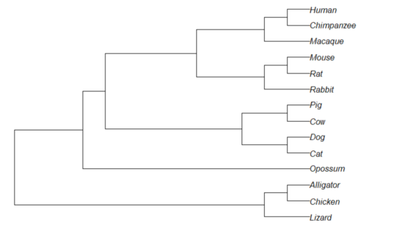
Figure 1. Phylogram plot of 14 taxa
Or, change from default “phylogram” to “cladogram” view.
plot(tree14, type="cladogram")
Figure 2. Cladogram view, same 14 taxa.
Note that while the tree is rooted, it’s a midpoint rooting, the default setting in Newick files. For true root based on outgroup(s), identify the nodes, then select root.
Add node labels; plot() must be run first.
nodelabels()
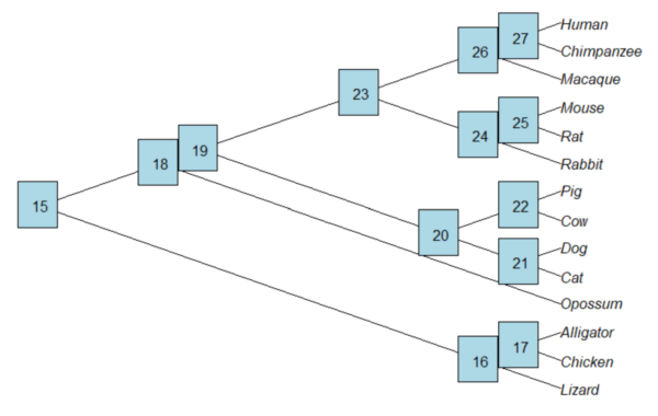
Figure 3. Plot of tree with labeled nodes.
The outgroup(s) were the reptiles (Alligator, Chicken, Lizard), so reroot at node 16.
rrTree<- root(tree14, node=16)
plot(rrTree, type="cladogram")
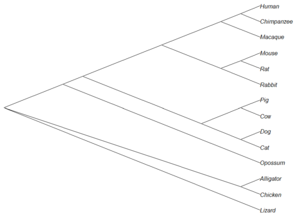
Figure 4. Re-rooted tree.
Write tree to a file
require(ape)
To export tree to Newick format
write.tree(tree14, file = "filename.nwk")
for Nexus format
write.nexus(tree14, file = "filename.nex")
Star phylogeny
Collapse the tree to a star phylogeny, an unlikely evolutionary model in which the species resulted from “… a single explosive adaptive radiation” (Felsenstein 1985). Star phylogeny is an extreme tree shape, or multifurcation (polytomy), where all tips derive from the same node (Colijn and Plazzotta 2018). This type of phylogeny can be viewed as a null model for inference (but see Bayesian “star phylogeny paradox,” cf. Kolaczkowski and Thornton 2006).
require(phytools)
ctree14 <-collapse.to.star(tree14, 15)
plot(ctree14, type="cladogram")
Figure 5. Star phylogeny
Under a star phylogeny model, all taxa are assumed independent of each other, in contrast to the nested hierarchical model of evolution (e.g., Fig. 4), which shows a lack of independence among the taxa. More succinctly, a fitted to uncorrected taxa comparisons may violated the assumption that errors are independent and identically distributed. Phylogenetically correct methods attempt to address the lack of independence among taxa for comparative analysis (Felsenstein 1985, Uyeda et al 2016). Biologists should know about Felsenstein’s 1985 paper. Felsenstein’s paper created a paradigm shift in how to analyze comparative datasets and has been cited more than ten thousand times (1 August 2023, Google Scholar). To put that number in context, the 1986 paper by Kary Mullis et al., which announced invention of PCR with thermally stable polymerase that has revolutionized molecular biology, has been cited 6721 times over that same period.
Additional packages of note
The R package tanggle works with the package ggtree and advantage of the ggplot2 environment. Contains many functions to work with phylogeny graphs including re-rooting and swapping nodes. The package is available from Bioconductor,
if (!requireNamespace("BiocManager", quietly = TRUE))
    install.packages("BiocManager")

BiocManager::install("tanggle")
ggtree is also a Bioconductor package, not available at CRAN.
Online viewers
Many browser-based tree viewers online, including icytree.org and iTOL tools. Additional tree viewers listed at Wikipedia.
References and suggested readings
Colijn C, Plazzotta G. A Metric on Phylogenetic Tree Shapes. Syst Biol. 2018 Jan 1;67(1):113-126.
Felsenstein, J (1985) Phylogenies and the comparative method. American Naturalist 125(1):1-15.
Felsenstein, J. (2004). Inferring phylogenies. Sunderland, MA: Sinauer associates.
Gregory, T. R. (2008). Understanding evolutionary trees. Evolution: Education and Outreach, 1(2), 121-137.
Holder, M., & Lewis, P. O. (2003). Phylogeny estimation: traditional and Bayesian approaches. Nature reviews genetics, 4(4), 275-284.
Kuhn, T. S. (1962). The structure of scientific revolutions. University of Chicago Press: Chicago.
Mullis, K., Faloona, F., Scharf, S., Saiki, R. K., Horn, G. T., & Erlich, H. (1986, January). Specific enzymatic amplification of DNA in vitro: the polymerase chain reaction. In Cold Spring Harbor symposia on quantitative biology (Vol. 51, pp. 263-273). Cold Spring Harbor Laboratory Press.
Naughton, J. (2012, August 18). Thomas Kuhn: The man who changed the way the world looked at science. The Guardian. https://www.theguardian.com/science/2012/aug/19/thomas-kuhn-structure-scientific-revolutions
O’Hara, R. J. (1997). Population thinking and tree thinking in systematics. Zoologica scripta, 26(4), 323-329.
Paradis, E. (2012) Analysis of Phylogenetics and Evolution with R (Second Edition). New York: Springer.
Paradis, E. and Schliep, K. (2019) ape 5.0: an environment for modern phylogenetics and evolutionary analyses in R. Bioinformatics, 35, 526–528.
Revell, L. J. (2012) phytools: An R package for phylogenetic comparative biology (and other things). Methods in Ecology and Evolution, 3, 217-223.
Sandvik, H. (2008). Tree thinking cannot taken for granted: challenges for teaching phylogenetics. Theory in Biosciences, 127(1), 45-51.
Uyeda, J. C., Zenil-Ferguson, R., & Pennell, M. W. (2018). Rethinking phylogenetic comparative methods. Systematic Biology, 67(6), 1091-1109.
Zhang, J., Pei, N., & Mi, X. (2012). phylotools: Phylogenetic tools for Eco-phylogenetics. R package version 0.1, 2.
Chapter 20 contents
- Additional topics
- Area under the curve
- Peak detection
- Baseline correction
- Surveys
- Time series
- Dimensional analysis
- Estimating population size
- Diversity indexes
- Survival analysis
- Growth equations and dose response calculations
- Plot a Newick tree
- Phylogenetically independent contrasts
- How to get the distances from a distance tree
- Binary classification
- Meta-analysis
20.10 – Growth equations and dose response calculations
Introduction
In biology, growth may refer to increase in cell number, change in size of an individual across development, or increase of number of individuals in a population over time. Nonlinear, time-series, several models proposed to fit growth data, including the Gompertz, logistic, and the von Bertalanffy. These models fit many S-shaped growth curves. These models are special cases of generalized linear models, also called Richard curves.
Growth example
This page describes how to use R to analyze growth curve data sets.
| Hours | Abs |
|---|---|
| 0.000 | 0.002207 |
| 0.274 | 0.010443 |
| 0.384 | 0.033688 |
| 0.658 | 0.063257 |
| 0.986 | 0.111848 |
| 1.260 | 0.249240 |
| 1.479 | 0.416236 |
| 1.699 | 0.515578 |
| 1.973 | 0.572632 |
| 2.137 | 0.589528 |
| 2.466 | 0.619091 |
| 2.795 | 0.608486 |
| 3.123 | 0.621136 |
| 3.671 | 0.616850 |
| 4.110 | 0.614689 |
| 4.548 | 0.614643 |
| 5.151 | 0.612465 |
| 5.534 | 0.606082 |
| 5.863 | 0.603933 |
| 6.521 | 0.595407 |
| 7.068 | 0.589006 |
| 7.671 | 0.578372 |
| 8.164 | 0.567749 |
| 8.877 | 0.559217 |
| 9.644 | 0.546451 |
| 10.466 | 0.537907 |
| 11.233 | 0.537826 |
| 11.890 | 0.529300 |
| 12.493 | 0.516551 |
| 13.205 | 0.505905 |
| 14.082 | 0.491013 |
Key to parameter estimates: y0 is the lag, mumax is the growth rate, and K is the asymptotic stationary growth phase. The spline function does not return an estimate for K.
R code
require(growthrates)
#Enter the data. Replace these example values with your own
#time variable (Hours)
Hours <- c(0.000, 0.274, 0.384, 0.658, 0.986, 1.260, 1.479, 1.699, 1.973, 2.137, 2.466, 2.795, 3.123, 3.671, 4.110, 4.548, 5.151, 5.534, 5.863, 6.521, 7.068, 7.671, 8.164, 8.877, 9.644, 10.466, 11.233, 11.890, 12.493, 13.205, 14.082)
#absorbance or concentration variable (Abs)
Abs <- c(0.002207, 0.010443, 0.033688, 0.063257, 0.111848, 0.249240, 0.416236, 0.515578, 0.572632, 0.589528, 0.619091, 0.608486, 0.621136, 0.616850, 0.614689, 0.614643, 0.612465, 0.606082, 0.603933, 0.595407, 0.589006, 0.578372, 0.567749, 0.559217, 0.546451, 0.537907, 0.537826, 0.529300, 0.516551, 0.505905, 0.491013)
#Make a dataframe and check the data; If error, then check that variables have equal numbers of entries
Yeast <- data.frame(Hours,Abs); Yeast
#Obtain growth parameters from fit of a parametric growth model
#First, try some reasonable starting values
p <- c(y0 = 0.001, mumax = 0.5, K = 0.6)
model.par <- fit_growthmodel(FUN = grow_logistic, p = p, Hours, Abs, method=c("L-BFGS-B"))
summary(model.par)
coef(model.par)
#Obtain growth parameters from fit of a nonparametric smoothing spline
model.npar <- fit_spline(Hours,Abs)
summary(model.npar)
coef(spline.md)
#Make plots
par(mfrow = c(2, 1))
plot(Yeast, ylim=c(0,1), cex=1.5,pch=16, main="Parametric Nonlinear Growth Model", xlab="Hours", ylab="Abs")
lines(model.par, col="blue", lwd=2)
plot(model.npar, ylim=c(0,1), lwd=2, main="Nonparametric Spline Fit", xlab="Hours", ylab="Abs")
Results from example code
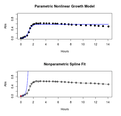
Figure 1. Top: Parametric Nonlinear Growth Model; Bottom: Nonparametric Spline Fit
LD50
In toxicology, the dose of a pathogen, radiation, or toxin required to kill half the members of a tested population of animals or cells is called the lethal dose, 50%, or LD50. This measure is also known as the lethal concentration, LC50, or properly after a specified test duration, the LCt50 indicating the lethal concentration and time of exposure. LD50 figures are frequently used as a general indicator of a substance’s acute toxicity. A lower LD50 is indicative of increased toxicity.
The point at which 50% response of studied organisms to range of doses of a substance (e.g., agonist, antagonist, inhibitor, etc.) to any response, from change in behavior or life history characteristics up to and including death can be described by the methods described in this chapter. The procedures outlined below assume that there is but one inflection point, i.e., an “s-shaped” curve, either up or down; if there are more than one inflection points, then the logistic equations described will not fit the data well and other choices need to be made (see Di Veroli et al 2015). We will use the drc package (Ritz et al 2015).
Example
First we’ll work through use of R. We’ll follow up with how to use Solver in Microsoft Excel.
After starting R, load the drc library.
library(drc)
Consider some hypothetical 24-hour survival data for yeast exposed to salt solutions. Let resp equal the variable for frequency of survival (e.g., calculated from OD660 readings) and NaCl equal the millimolar (mm) salt concentrations or doses.
At the R prompt type
resp <- c(1,1,1,.9,.7,.3,.4,.2,0,0,0)
NaCl=seq(0,1000,100)
#Confirm sequence was correctly created; alternatively, enter the values.
NaCl
[1] 0 100 200 300 400 500 600 700 800 900 1000
#Make a plot
plot(NaCl,resp,pch=19,cex=1.2,col="blue",xlab="NaCl [mm]",ylab="Survival frequency")
And here is the plot (Fig. 2).
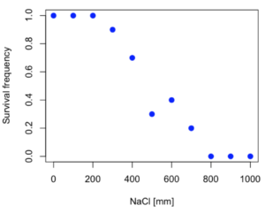
Figure 2. Hypothetical data set, survival of yeast in different salt concentrations.
Note the sigmoidal “S” shape — we’ll need an logistic equation to describe the relationship between survival of yeast and NaCl doses.
The equation for the four parameter logistic curve, also called the Hill-Slope model, is

where c is the parameter for the lower limit of the response, d is the parameter for the upper limit of the response, e is the relative EC50, the dose fitted half-way between the limits c and d, and b is the relative slope around the EC50. The slope, b, is also known as the Hill slope. Because this experiment included a dose of zero, a three parameter logistic curve would be appropriate. The equation simplifies to

EC50 from 4 parameter model
Let’s first make a data frame
dose <- data.frame(NaCl, resp)
Then call up a function, drm, from the drc library and specify the model as the four parameter logistic equation, specified as LL.4(). We follow with a call to the summary command to retrieve output from the drm function. Note that the four-parameter logistic equation
model.dose1 = drm(dose,fct=LL.4())
summary(model.dose1)
And here is the R output.
Model fitted: Log-logistic (ED50 as parameter) (4 parms)
Parameter estimates:
                   Estimate  Std. Error    t-value  p-value
b:(Intercept)      3.753415    1.074050   3.494636   0.0101
c:(Intercept)     -0.084487    0.127962  -0.660251   0.5302
d:(Intercept)      1.017592    0.052460  19.397441   0.0000
e:(Intercept)    492.645128   47.679765  10.332373   0.0000

Residual standard error:
0.0845254 (7 degrees of freedom)
The EC50, technically the LD50 because the data were for survival, is the value of e: 492.65 mM NaCl.
You should always plot the predicted line from your model against the real data and inspect the fit.
At the R prompt type
plot(model.dose1, log="",pch=19,cex=1.2,col="blue",xlab="NaCl [mm]",ylab="Survival frequency")
As long as the plot you made in earlier steps is still available, R will add the line specified in the lines command. Here is the plot with the predicted logistic line displayed (Fig. 3).
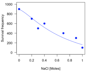
Figure 3. Logistic curve added to Figure 1 plot.
While there are additional steps we can take to decide is the fit of the logistic curve was good to the data, visual inspection suggests that indeed the curve fits the data reasonably well.
More work to do
Because the EC50 calculations are estimates, we should also obtain confidence intervals. The drc library provides a function called ED which will accomplish this. We can also ask what the survival was at 10% and 90% in addition to 50%, along with the confidence intervals for each.
At the R prompt type
ED(model.dose1,c(10,50,90), interval="delta")
And the output is shown below.
Estimated effective doses
(Delta method-based confidence interval(s))
     Estimate Std. Error   Lower   Upper
1:10  274.348     38.291 183.803  364.89
1:50  492.645     47.680 379.900  605.39
1:90  884.642    208.171 392.395 1376.89
Thus, the 95% confidence interval for the EC50 calculated from the four parameter logistic curve was between the lower limit of 379.9 and an upper limit of 605.39 mm NaCl.
EC50 from 3 parameter model
Looking at the summary output from the four parameter logistic function we see that the value for c was -0.085 and p-value was 0.53, which suggests that the lower limit was not statistically different from zero. We would expect this given that the experiment had included a control of zero mm added salt. Thus, we can explore by how much the EC50 estimate changes when the additional parameter c is no longer estimated by calculating a three parameter model with LL.3().
model.dose2 = drm(dose,fct=LL.3())
summary(model.dose2)
R output follows.
Model fitted: Log-logistic (ED50 as parameter) with lower limit at 0 (3 parms)
Parameter estimates:
               Estimate Std. Error   t-value p-value
b:(Intercept)   4.46194    0.76880   5.80378   4e-04
d:(Intercept)   1.00982    0.04866  20.75272   0e+00
e:(Intercept) 467.87842   25.24633  18.53253   0e+00
Residual standard error:
 0.08267671 (8 degrees of freedom)
The EC50 is the value of e: 467.88 mM NaCl.
How do the four and three parameter models compare? We can rephrase this as as statistical test of fit; which model fits the data better, a three parameter or a four parameter model?
At the R prompt type
anova(model.dose1, model.dose2)
The R output follows.
1st mode
fct:      LL.3()
2nd model
fct:      LL.4()
ANOVA table
          ModelDf      RSS Df F value p value
2nd model       8 0.054684
1st model       7 0.050012  1  0.6539  0.4453
Because the p-value is much greater than 5% we may conclude that the fit of the four parameter model was not significantly better than the fit of the three parameter model. Thus, based on our criteria we established in discussions of model fit in Chapter 16 – 18, we would conclude that the three parameter model is the preferred model.
The plot below now includes the fit of the four parameter model (red line) and the three parameter model (green line) to the data (Fig. 4).
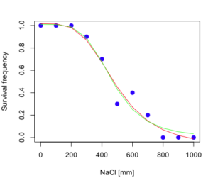
Figure 4. Four parameter (red) and three parameter (green) logistic models fitted to data.
The R command to make this addition to our active plot was
lines(dose,predict(model.dose2, data.frame(x=dose)),col="green")
We continue with our analysis of the three parameter model and produce the confidence intervals for the EC50 (modify the ED() statement above for model.dose2 in place of model.dose1).
Estimated effective doses
(Delta method-based confidence interval(s))
     Estimate Std. Error   Lower  Upper
1:10  285.937     33.154 209.483 362.39
1:50  467.878     25.246 409.660 526.10
1:90  765.589     63.026 620.251 910.93
Thus, the 95% confidence interval for the EC50 calculated from the three parameter logistic curve was between the lower limit of 409.7 and an upper limit of 526.1 mm NaCl. The difference between upper and lower limits was 116.4 mm NaCl, a smaller difference than the interval calculated for the 95% confidence intervals from the four parameter model (225.5 mm NaCl). This demonstrates the estimation trade-off: more parameters to estimate reduces the confidence in any one parameter estimate.
Additional notes of EC50 calculations
Care must be taken that the model fits the data well. What if we did not have observations throughout the range of the sigmoidal shape? We can explore this by taking a subset of the data.
dd = dose[1:6,]
Here, all values after dose 500 were dropped
dd
  resp dose
1  1.0    0
2  1.0  100
3  1.0  200
4  0.9  300
5  0.7  400
6  0.3  500
and the plot does not show an obvious sigmoidal shape (Fig. 5).
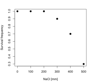
Figure 5. Plot of reduced data set.
We run the three parameter model again, this time on the subset of the data.
model.dosedd = drm(dd,fct=LL.3())
summary(model.dosedd)
Output from the results are
Model fitted: Log-logistic (ED50 as parameter) with lower limit at 0 (3 parms)
Parameter estimates:
                Estimate Std. Error    t-value p-value
b:(Intercept)   6.989842   0.760112   9.195801  0.0027
d:(Intercept)   0.993391   0.014793  67.153883  0.0000
e:(Intercept) 446.882542   5.905728  75.669344  0.0000
Residual standard error:
 0.02574154 (3 degrees of freedom)
Conclusion? The estimate is different, but only just so, 447 vs. 468 mm NaCl.
Thus, within reason, the drc function performs well for the calculation of EC50. Not all tools available to the student will do as well.
NLopt and nloptr
draft
Free open source library for nonlinear optimization.
Steven G. Johnson, The NLopt nonlinear-optimization package, http://github.com/stevengj/nlopt
https://cran.r-project.org/web/packages/nloptr/vignettes/nloptr.html
Alternatives to R
What about online tools? There are several online sites that will allow students to perform these kinds of calculations. Students familiar with MatLab know that it can be used to solve nonlinear equation problems. An open source alternative to MatLab is called GNU Octave, which can be installed on a personal computer or run online at http://octave-online.net. Students also may be aware of other sites, e.g., mycurvefit.com and IC50.tk.
Both of these free services performed well on the full dataset (results not shown), but fared poorly on the reduced subset: mycurvefit returned a value of 747.64 and IC50.tk returned an EC50 estimate of 103.6 (Michael Dohm, pers. obs.).
Simple inspection of the plotted values shows that these values are unreasonable.
EC50 calculations with Microsoft Excel
Most versions of Microsoft Excel include an add-in called Solver, which will permit mathematical modeling. The add-in is not installed as part of the default installation, but can be installed via the Options tab in the File menu for a local installation or via Insert for the Microsoft Office online version of Excel (you need a free Microsoft account). The following instructions are for a local installation of Microsoft Office 365 and were modified from information provided by sharpstatistics.co.uk.
After opening Excel, set up worksheet as follows. Note that in order to use my formulas your spreadsheet values need to be set up exactly as I describe.
- Dose values in column A, beginning with row 2
- Response values in column B, beginning with row 2
- In column F type
bin row 2,cin row 3,din row 4, andein row 5. - In cells G2 – G5, enter the starting values. For this example, I used b = 1, c = 0, d = 1, e = 400.
- For your own data you will have to explore use of different starting values.
- Enter headers in row 1.
- Column A
Dose - Column B
Response - Column C
Predicted - Column D
Squared difference - Column F
Constants
- Column A
- In cell C14 enter
sum squares - In cell D14 enter
=sum(D2:D12)
Here is an image of the worksheet (Fig. 6), with equations entered and values updated, but before Solver run.
Figure 6. Screenshot Microsoft Excel worksheet containing our data set (col A & B), with formulas added and calculated. Starting values for constants in column G, rows 2 – 4.
Next, enter the functions.
- In cell C2 enter the four parameter logistic formula — type everything between the double quotes: “
=$G$3+(($G$4-$G$3)/(1+(A2/$G$5)^$G$2))“. Next, copy or drag the formula to cell C12 to complete the predictions.- Note: for a three parameter model, replace the above formula with “
=(($G$4)/(1+(A2/$G$5)^$G$2))“.
- Note: for a three parameter model, replace the above formula with “
- In cell D2 type everything between the double quotes: “
=(B2-C2)^2“. - Next, copy or drag the formula to cell
D12to complete the predictions. - Now you are ready to run solver to estimate the values for b, c, d, and e.
- Reminder: starting values must be in cells
G2:G5
- Reminder: starting values must be in cells
- Select cell
D14and start solver by clicking on Data and looking to the right in the ribbon.
Solver is not normally installed as part of the default installation of Microsoft Excel 365. If the add-in has been installed you will see Solver in the Analyze box (Fig. 7).
Figure 7. Screenshot Microsoft Excel, Solver add-in available.
If Solver is not installed, go to File → Options → Add-ins (Fig. 8).
Figure 8. Screenshot Microsoft Excel, Solver add-in available and ready for use.
Go to Microsoft support for assistance with add-ins.
With the spreadsheet completed and Solver available, click on Solver in the ribbon (Fig. 7) to begin. The screen shot from the first screen of Solver is shown below (Fig. 9).
Figure 9. Screenshot Microsoft Excel solver menu.
Setup Solver
- Set Objective, enter the absolute cell reference to the sum squares value, \
$D$14 - Set To: Min.
- For By Changing Variable Cells, enter the range of cells for the four parameters, $G$2:$G$5
- Uncheck the box by “Make Unconstrained Variables Non-Negative.”
- Where constraints refers to any system of equalities or inequalities equations imposed on the algorithm.
- Select a Solving method, choose “GRG Nonlinear,” the nonlinear programming solver option (not shown in Fig. 7, select by clicking on the down arrow).
- Click Solve button to proceed.
GRG Nonlinear is one of many optimization methods. In this case we calculate the minimum of the sum of squares — the difference between observed and predicted values from the logistic equation — given the range of observed values. GRG stands for Generalized Reduced Gradient and finds the local optima — in this case the minimum or valley — without any imposed constraints. See solver.com for additional discussion of this algorithm.
If all goes well, this next screen (Fig. 10) will appear which shows the message, “Solver has converged to the current solution. All constraints are satisfied.”
Figure 10. Screenshot solver completed run.
Click OK and note that the values of the parameters have been updated (Table 1).
Table 1. Four parameter logistic model, results from Solver
| Constant | Starting values | Values after solver |
| b | 1 | 3.723008382 |
| c | 0 | -0.088865487 |
| d | 1 | 1.017964505 |
| e | 400 | 493.9703594 |
Note the values obtained by Solver are virtually identical to the values obtained in the drc R package. The differences are probably because of the solver algorithm.
More interestingly, how did Solver do on the subset data set? Here are the results from a three parameter logistic model (Table 2).
Table 2. Three parameter logistic model, results from Solver
| Constant | Starting values | Full dataset, Solver results |
Subset, Solver results |
| b | 1 | 3.723008382 | 6.989855948 |
| d | 1 | 1.017964505 | 0.993391264 |
| e | 400 | 493.9703594 | 446.8819282 |
The results are again very close to results from the drc R package.
Thus, we would conclude that Solver and Microsoft Excel would be a reasonable choice for EC50 calculations, and much better than IC50.tk and mycurvefit.com. The advantages of R over Microsoft Excel is that the model building is more straightforward than entering formulas in the cell reference format required by Excel.
Questions
[pending]
References and suggested readings
Beck B, Chen YF, Dere W, et al. Assay Operations for SAR Support. 2012 May 1 [Updated 2012 Oct 1]. In: Sittampalam GS, Coussens NP, Nelson H, et al., editors. Assay Guidance Manual [Internet]. Bethesda (MD): Eli Lilly & Company and the National Center for Advancing Translational Sciences; 2004-. Available from: www.ncbi.nlm.nih.gov/books/NBK91994/
Di Veroli G. Y., Fornari C., Goldlust I., Mills G., Koh S. B., Bramhall J. L., Richards, F. M., Jodrell D. I. (2015) An automated fitting procedure and software for dose-response curves with multiphasic features. Scientific Reports 5: 14701.
Ritz, C., Baty, F., Streibig, J. C., Gerhard, D. (2015) Dose-Response Analysis Using R PLOS ONE, 10(12), e0146021
Tjørve, K. M., & Tjørve, E. (2017). The use of Gompertz models in growth analyses, and new Gompertz-model approach: An addition to the Unified-Richards family. PloS one, 12(6), e0178691.
Chapter 20 contents
- Additional topics
- Area under the curve
- Peak detection
- Baseline correction
- Surveys
- Time series
- Dimensional analysis
- Estimating population size
- Diversity indexes
- Survival analysis
- Growth equations and dose response calculations
- Plot a Newick tree
- Phylogenetically independent contrasts
- How to get the distances from a distance tree
- Binary classification
- Meta-analysis
/MD
20.9 – Survival analysis
draft
Introduction
As the name suggests, survival analysis is a branch of statistics used to account for death of organisms, or more generally, failure in a system. In general, this kind of analysis models time to event, where event would be death or failure. The basics of the method is defined by the survival function

where t is time, T is a variable that represents time of death or other end point, and Pr is probability of an event occurring later than at time t.
Excellent resources available, series of articles in volume 89 of British Journal of Cancer: Clark et al (2003a), Bradburn et al (2003a), Bradburn et al (2003b), and Clark et al (2003b).
Hazard function
Defined as the event rate at time t based on survival for time times equal to or greater than t.
Censoring
Censoring is a a missing data problem typical of survival analysis. Distinguish right-censored and left-censored.
Kaplan-Meier plot
Kaplan-Meier (KM) estimator of survival function. Other survival function estimators Fleming-Harrington. The KM estimator,  is
is

where di is the number of events that occurred at time ti, ni is the number of individuals known to have survived or not been censored. Because it’s an estimate, a statistic, need an estimate of the error variance. Several options, the default in R is the Greenwood estimator.

The KM plot, censoring times noted with plus.
R code
Download and install the RcmdrPlugin.survival package.
Example
data(heart, package="survival")
attach(heart)
#Get help with the data set
help("heart", package="survival")
head(heart)
 start stop event        age      year surgery transplant id
1    0   50     1 -17.155373 0.1232033       0          0  1
2    0    6     1   3.835729 0.2546201       0          0  2
3    0    1     0   6.297057 0.2655715       0          0  3
4    1   16     1   6.297057 0.2655715       0          1  3
5    0   36     0  -7.737166 0.4900753       0          0  4
6   36   39     1  -7.737166 0.4900753       0          1  4
Run basic survival analysis. After installing the RcmdrPlugin.survival, from Rcmdr select estimate survival function.
Figure 1. Screenshot of menu call for survival analysis in Rcmdr
Get survival estimator and KM plot (Figure 2)
R output
.Survfit <- survfit(Surv(start, event) ~ 1, conf.type="log", conf.int=0.95,
Rcmdr+ type="kaplan-meier", error="greenwood", data=heart)

 .Survfit
Call: survfit(formula = Surv(start, event) ~ 1, data = heart, error = "greenwood",
conf.type = "log", conf.int = 0.95, type = "kaplan-meier")

n events median 0.95LCL 0.95UCL
172 75 26 17 37

plot(.Survfit, mark.time=TRUE)

quantile(.Survfit, quantiles=c(.25,.5,.75))
$quantile
25 50 75
3 26 67

$lower
25 50 75
1 17 46

$upper
25 50 75
12 37 NA

#by default, Rcmdr removes the object
remove(.Survfit)
Figure 2. Kaplan-Meier plot of heart data. Dashed lines are upper and lower confidence intervals about the survival function.
Note: I modified the plot() code with these additions
ylim = c(0,1), ylab="Survival probability", xlab="Days", lwd=2, col="blue"
the data set includes age and whether or not subjects had heart surgery before transplant. Compare.
Variable surgery is recorded 0,1, so need to create a factor
fSurgery <- as.factor(surgery)
Now, to compare
Rcmdr: Statistics → Survival analysis → Compare survival functions…
R output
Rcmdr> survdiff(Surv(start,event) ~ fSurgery, rho=0, data=heart)
Call:
survdiff(formula = Surv(start, event) ~ fSurgery, data = heart,
rho = 0)

              N Observed Expected (O-E)^2/E (O-E)^2/V
fSurgery=No 143       66     58.7     0.902      4.56
fSurgery=Yes 29        9     16.3     3.255      4.56

Chisq= 4.6 on 1 degrees of freedom, p= 0.03
Get the KM estimator and make a KM plot
mySurvfit <- survfit(Surv(start, event) ~ surgery, conf.type="log", conf.int=0.95,
type="kaplan-meier", error="greenwood", data=heart)

plot(mySurvfit, mark.time=TRUE, ylim=c(0,1),lwd=2, col=c("blue","red"), xlab="Number of days", ylab="Survival probability")
legend("topright", legend = paste(c("Surgery - No", "Surgery - Yes")), col = c("blue", "red"), pch = 19, bty = "n")
Figure 3. KM plot
The comparison plot can be made in Rcmdr by selecting our Surgery factor in Strata setting (Fig. 4). Recall that strata refers to subgroups of a population.
Figure 4. Screenshot of Survival estimator menu in Rcmdr.
Questions
[pending]
Chapter 20 contents
- Additional topics
- Area under the curve
- Peak detection
- Baseline correction
- Surveys
- Time series
- Dimensional analysis
- Estimating population size
- Diversity indexes
- Survival analysis
- Growth equations and dose response calculations
- Plot a Newick tree
- Phylogenetically independent contrasts
- How to get the distances from a distance tree
- Binary classification
- Meta-analysis
/MD