4.5 – Scatter plots
Introduction
Scatter plots, also called scatter diagrams, scatterplots, or XY plots, display associations between two quantitative, ratio-scaled variables. Each point in the graph is identified by two values: its X value and its Y value. The horizontal axis is used to display the dispersion of the X variable, while the vertical axis displays the dispersion of the Y variable.
The graphs we just looked at with Tufte’s examples Anscombe’s quartet data were scatter plots (Chapter 4 – How to report statistics).
Here’s another example of a scatter plot, data from Francis Galton, data contained in the R package HistData.
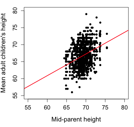
Figure 1. Scatterplot of mid-parent (vertical axis) and their adult children’s (horizontal axis) height, in inches. data from Galton’s 1885 paper, “Regression towards mediocrity in hereditary stature.” The red line is the linear regression fitted line, or “trend” line, which is interpreted in this case as the heritability of height.
Note 1. Sorry about that title — being rather short of stature myself, not sure I’m keen to learn further what Galton was implying with that “mediocrity” quip.
The commands I used to make the plot in Figure 1 were
library(HistData)
data(GaltonFamilies, package="HistData")
attach(GaltonFamilies)

plot(childHeight~midparentHeight, xlab="Mid-parent height", ylab="Mean adult children's height", xlim=c(55, 80), ylim=c(55,80), cex=0.8, cex.axis=1.2, cex.lab=1.3, pch=c(19), data=GaltonFamilies)
abline(lm(childHeight~midparentHeight), col="red", lwd=2)
I forced the plot function to use the same range of values, set by providing values for xlim and ylim; the default values of the plot command picks a range of data that fits each variable independently. Thus, the default X axis values ranged from 64 to 76 and the Y variable values ranged from 55 to 80. This has the effect of shifting the data, reducing the amount of white space, which a naïve reading of Tufte would suggest is a good idea, but at the expense of allowing the reader to see what would be the main point of the graph: that the children are, on average, shorter than the parents, mean height = 67 vs. 69 inches, respectively. Therefore, Galton’s title begins with the word “regression,” as in the definition of regression as a “return to a former … state” (Oxford Dictionary).
For completeness, cex sets the size of the points (default = 1), and therefore cex.axis and cex.lab apply size changes to the axes and labels, respectively; pch refers to the graph elements or plotting characters, further discussed below (see Fig 8); lm() is a call to the linear model function; col refers to color.
Figure 2 shows the same plot, but without attention to the axis scales, and, more in keeping with Tufte’s principle of maximize data, minimize white space.
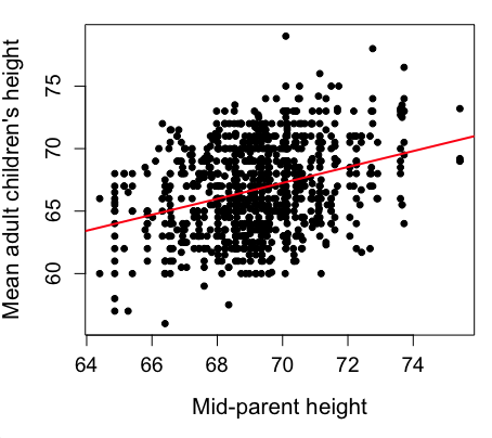
Figure 2. Same plot as Figure 1, but with default settings for axis scales.
Take a moment to compare the graphs in Figure 1 and 2. Setting the scales equal allows you to see that the mid-parent heights were less variable, between 65 and 75 inches, than the mean children height, which ranged from 55 to 80 inches.
And another example, Figure 3. This plot is from the ggplot2() function and was generated from within R Commander’s KMggplot2 plug-in.
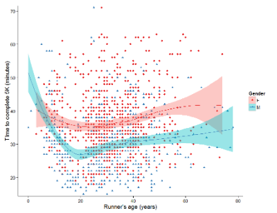
Figure 3. Finishing times in minutes of 1278 runners by age and gender at the 2013 Jamba Juice Banana 5K in Honolulu, Hawaiʻi. Loess smoothing functions by groups of female (red) and male (blue) runners are plotted along with 95% confidence intervals.
Figure 3 is a busy plot. Because there were so many data points, it is challenging to view any discernible pattern, unlike Figure 1 and 2 plots, which featured less data. Use of the loess smoothing function, a transformation of the data to reduce data “noise” to reveal a continuous function, helps reveal patterns in the data:
- across most ages, men completed 5K faster than did females and
- there was an inverse, nonlinear association between runner’s age and time to complete the 5K race.
Take a look at the X-axis. Some runners ages were reported as less than 5 years old (trace the points down to the axis to confirm), and yet many of these youngsters were completing the 5K race in less than 30 minutes. That’s 6-minute mile pace! What might be some explanations for how pre-schoolers could be running so fast?
Design criteria
As in all plotting, maximize information to background. Keep white space minimal and avoid distorting relationships. Some things to consider:
- keep axes same length
- do not connect the dots UNLESS you have a continuous function
- do not draw a trend line UNLESS you are implying causation
Scatter plots in R
We have many options in R to generate scatter plots. We have already demonstrated use of plot() to make scatter plots. Here we introduce how to generate the plot in R Commander.
Rcmdr: Graphs → Scatterplot…
Rcmdr uses the scatterplot function from the car package. In recent versions of R Commander the available options for the scatterplot command are divided into two menu tabs, Data and Options, shown in Figure 4 and Figure 5.
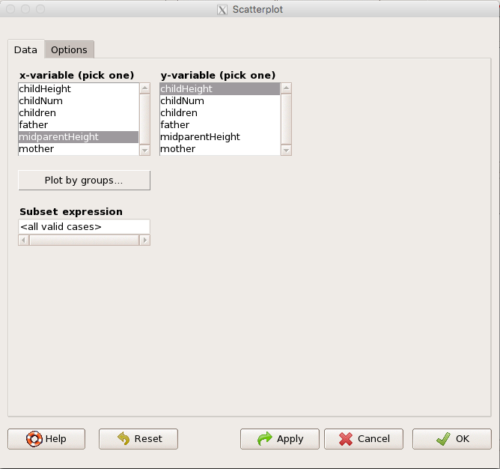
Figure 4. First menu popup in R Commander Scatterplot command, Rcmdr ver. 2.2-3.
Select X and Y variables, choose Plot by groups if multiple grounds are included, eg, male, female, then click Options tab to complete.
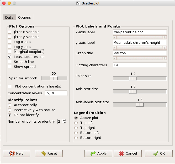
Figure 5. Second menu popup in R Commander scatterplot command., Rcmdr ver. 2.2-3
Set graph options including axes labels and size of the points.
Note 2. Lots of boxes to check and uncheck. Start by unchecking all of the Options and do update the axes labels (see red arrow in image). You can also manipulate the plot “points,” which R refers to as plotting characters (abbreviated pch in plotting commands). The “Plotting characters” box is shown as <auto>, which is an open circle. You can change this to one of 26 different characters by typing in a number between 0 and 25. The default used in Rcmdr scatterplot is “1” for open circle. I typically use “19” for a solid circle.
Here is another example using the default settings in scatterplot() function in the car package, now the default scatter plot command via R Commander (Fig. 4), along with the same graph, but modified to improve the look and usefulness of the graph (Fig. 6). The data set was Puromycin in the package datasets.
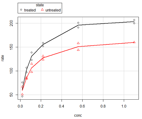
Figure 6. Default scatterplot, package car, from R Commander, version 2.2-4.
Grid lines in graphs should be avoided unless you intend to draw attention to values of particular data points. I prefer to position the figure legend within the frame of the graph, eg, the open are at the bottom right of the graph. Modified graph shown in Figure 7.
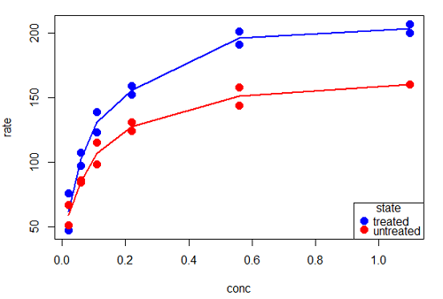
Figure 7. Modified scatterplot, same data from Figure 6
R commands used to make the scatter plot in Figure 7 were
scatterplot(rate~conc|state, col=c("blue", "red"), cex=1.5, pch=c(19,19),
bty="n", reg=FALSE, grid=FALSE, legend.coords="bottomright")
A comment about graph elements in R
In some ways R is too rich in options for making graphs. There are the plot functions in the base package, there’s lattice and ggplot2 which provide many options for graphics, and more. The advice is to start slowly, for example taking advantage of the Figure 8 displays R’s plotting characters and the number you would invoke to retrieve that plotting character.
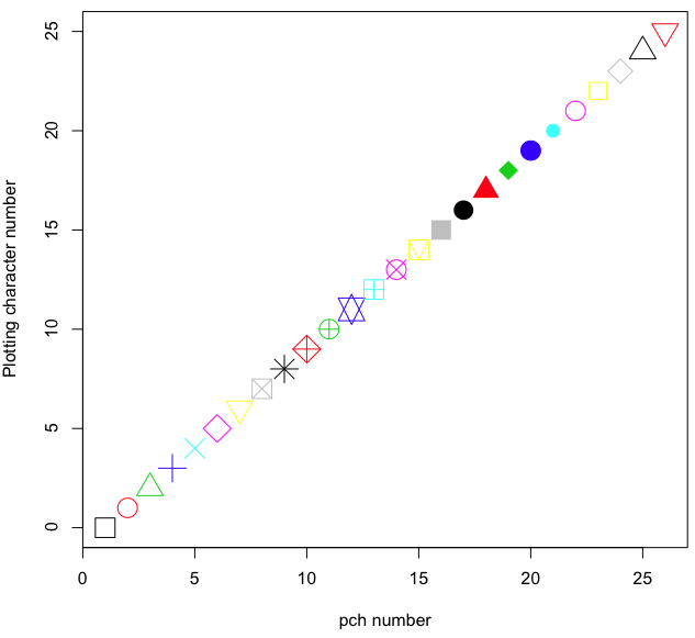
Figure 8. R plotting characters pch = 1 – 25 along with examples of color.
Note 3. To see available colors at the R prompt type
colors()
which returns 667 different colors by name, from
[1] "white" "aliceblue" "antiquewhite"
to
[655] "yellow3" "yellow4" "yellowgreen"
Note 4. There’s a lot more to R plotting. For example, you are not limited to just 25 possible characters. R can print any of the ASCII characters 32:127 or from the extended ASCII code 128:255. See Wikipedia to see the listing of ASCII characters.
Note 5. You can change the size of the plotting character with “cex.”
Here’s the R code used to generate the graph in Figure 8. Remember, any line beginning with # is a comment line, not an R command.
#create a vector with 26 numbers, from 0 to 25
stuff <-c(0:25)
plot(stuff, pch=c(32:58), cex = 2.5, col = c(1:26), 'xlab' = "pch number", 'ylab' = "Plotting character number")
Is it “scatter plot” or “scatterplot”?
Spelling matters, of course, and yet there are many words for which the correct spelling seems to be like “beauty,” it is “in the eye of the beholder” (Molly Bawn, 1878, by Margaret Hungerford). Scatter plot is one of these — is it one word or two, or is it something else entirely?
Scatter plot is one of these terms: you’ll find it spelled as “scatterplot” or as “scatter plot,” in the dictionary (eg, Oxford English dictionary), with no guidance to choose between them. And I’m not just talking about the differences between British and American English spelling traditions.
Note 6. The spell checkers in Microsoft Office and Google Docs do not flag “scatterplot” as incorrect, but the spell checker in LibreOffice Writer does (per obs).
Thus, in these situations as an author, you can turn to which of the spellings is in common use. I first looked at some of the statistics books on my shelves. I selected 14 (bio)statistics textbooks and checked the index and if present, chapters on graphics for term usage.
Table 1. Frequency of use of different terms for scatter plot in 14 (bio)statistics books currently on Mike’s shelves.
| spelling | number of statistical texts | frequency |
|---|---|---|
| scatter diagram | 2 | 0.144 |
| scatter plot | 5 | 0.357 |
| scattergram | 1 | 0.071 |
| scatterplot | 5 | 0.357 |
| XY plot | 0 | 0.071 |
Not much help, basically, it is a tie between “scatter plot” and “scatterplot.”
Next, I searched six journals for the interval 1990 – 2016 for use of these terms. Results presented in Table 6 along with journal impact factor for 2014 and number of issues (Table 2).
Table 2. Impact factor and number of issues 1990 – 2016 for six science journals.
| Journal | Impact factor | Issues |
|---|---|---|
| BMJ | 17.445 | 1374 |
| Ecology | 5.175 | 271 |
| J. Exp. Biol | 2.897 | 540 |
| Nature | 41.456 | 1454 |
| NEJM | 55.873 | 1377 |
| Science | 33.611 | 1347 |
My methods? I used the journal’s online search functions for the various usage for scatter plot and the results are shown in Figure 9.
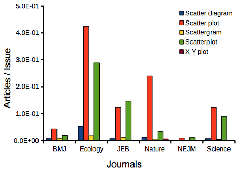
Figure 9. Usage of terms for X Y plots in research articles normalized to number of issues in six journals between 1990 and 2016.
The journals have different numbers of articles; I partially corrected for this by calculating the ratio number of articles with one of the terms divided by the number of issues for the interval 1990 – 2016. It would have been better to count all of the articles, but even I found that to be an excessive effort given the point I’m trying to make here.
Not much help there, although we can see a trend favoring “scatter plot” over any of the other options.
And finally, to completely work over the issue I present results from use of Google’s Ngram Viewer. Ngram Viewer allows you to search words in all of the texts that Google’s folks have scanned into digital form. I searched on the terms in texts between 1950 and 2015, and results are displayed in Figure 10 and Figure 11.
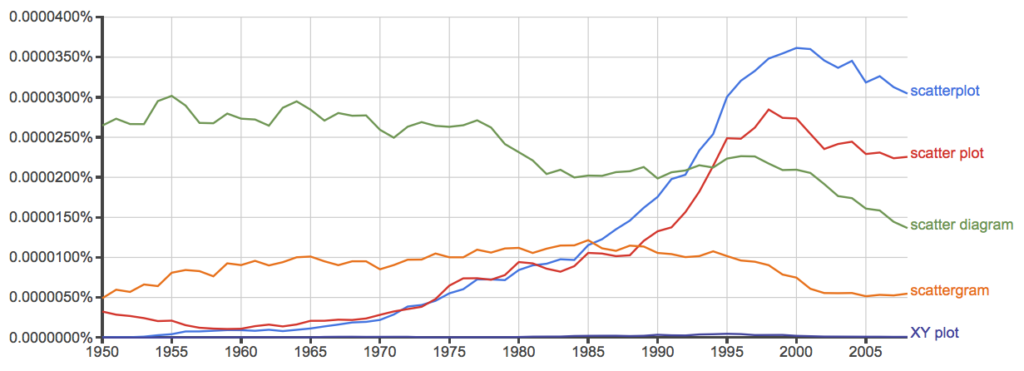
Figure 10. Results from Ngram Viewer for American English, “scatterplot” (blue), “scatter plot” (red), “scatter diagram” (green), “scattergram” (orange), and “XY plot” (purple).
And the same plot, but this time for British sources
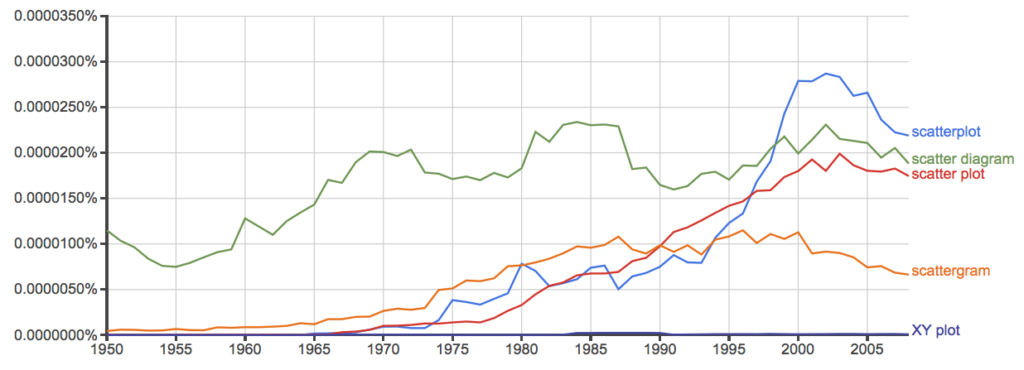
Figure 11. Results from Ngram Viewer for British English. See Figure 10 for key.
Conclusion? It looks like “scatterplot” (blue line) is the preferred usage, but it is close. Except for “scattergram” and “XY plot,” which, apparently, are rarely used. After all of this, it looks like you’re free to make your choice between “scatterplot” or “scatter plot.” I will continue to use “scatter plot.”
Bland-Altman plot
Also known as Tukey mean-difference plot, the Bland-Altman plot is used to describe agreement between two ratio scale variables (Bland and Altman 1986, Giavarina 2015), for example agreement between two different methods used to measure the same samples.
Note 6. Agreement — aka concordance or reproducibility — in the statistical sense is consistent with our everyday conception — consistency among sets of observations on the same object, sample, or unit. We introduce and develop additional agreement statistics in Chapter 9.2 and Chapter 12.3. Additional note for my students — note that I didn’t define agreement by including the term “agree”, thereby avoiding a circular definition (for an amusing clarification on the phrase, see Logically Fallacious). It’s a common short-fall I’ve seen thus far in AI-tools.
Consider use of imageJ by two different observers to record number of pixels of a unit measure (1 cm) on a series of digital images — there’s subjectivity in drawing the lines (where to start, where to end) — do they agree? Data set below. blandr package, blandr.draw function.
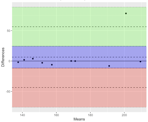
Figure 12. Bland-Altman plot of 1 cm unit measure in pixel number by imageJ from digital images by two independent observers. Purple central region is 95% CI. Lower and upper dashed horizontal lines represent bounds of “acceptable” agreement.
blandr.draw(Obs1, Obs2)
The plot makes it easy to identify questionable points, for example, the one point in upper right quadrant looks suspect.
Volcano plot
Used to show events that differ between two groups of subjects (eg, p-values), and is common in gene expression studies of an exposed group vs a control group (eg, fold changes).
Fold changes (often log2-transformed) are reflected on x-axis, indicating how much the gene expression level has increased or decreased. The y-axis typically represents the negative logarithm of the p-value (-logP) , which indicates the statistical significance of the change.
[insert]
Figure 13. Volcano plot, gene expression fold change (graph pending).
Questions
- Using our Comet assay data set (Table 1, Chapter 4.2), create scatter plots to show associations between tail length, tail percent, and olive moment.
- Explore different settings including size of points, amount of white area, and scale of the axes. Evaluate how these changes change the “story” told by the graph.
Quiz Chapter 4.5
Scatter plots
Data sets
Number of pixels of 1 cm length from unit measure on ten digital images. Recorded by two independent observers, Obs1 and Obs2.
 Obs1, Obs2
171.026, 171.105
136.528, 138.521
148.084, 144.222
142.014, 140.057
150.213, 153.118
187.011, 195.092
168.760, 168.668
154.302 ,160.381
209.022, 209.876
240.067, 161.805
Gene expression
ccc
Chapter 4 contents
4.3 – Box plot
Introduction
Box plots, also called whisker plots, should be your routine choice for exploring ratio scale data. Like bar charts, box plots are used to compare ratio scale data collected for two or more groups. Box plots serve the same purpose as bar charts with error bars, but box plots provide more information.
Purpose and design criteria
Box plots are useful tool for getting a sense of central tendency and spread of data. These types of plots are useful diagnostic plots. Use them during initial stages of data analyses. All summary features of box plots are based on ranks (not sums). So, they are less sensitive to extreme values (outliers). Box plots reveal asymmetry. Standard deviations are symmetric.
The median splits each batch of numbers in half (center line). The “hinge” (median value) splits the remaining halves in half again (the quartiles). The first, second (median), and third quartiles describes the interquartile range, or IQR, 75% of the data (Fig 1). Outlier points can be identified, for example, with an asterisk or by id number (Fig 1).
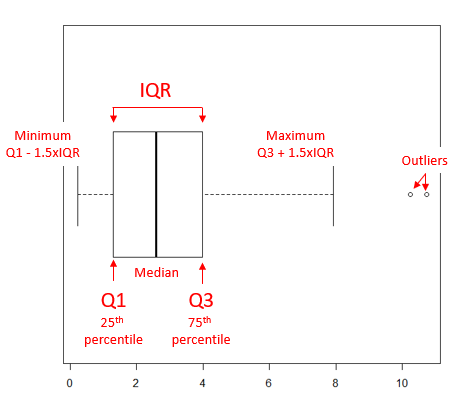
Figure 1. A box plot. Elements of box plot labelled.
We’ll use the data set described in the previous section, so if you have not already done so, get the data from Table 1, Chapter 4.2 into your R software.
Note 1: See Chapter 4.10 — Graph software for additional box plot examples, but made with different R packages or software apps.
R Code
Command line
We’ll provide code for the base graph shown in Figure 2A. At the R prompt, type
boxplot(OliveMoment~Treatment)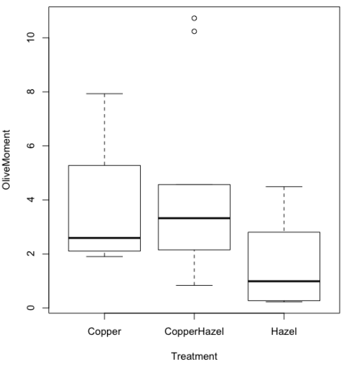
Figure 2A. Box plot, default graph in base package
Boxplot is a common function offered in several packages. In the base installation of R, the function is boxplot(). The car package, which is installed as part of R Commander installation, includes Boxplot(), which is a “wrapper function” for boxplot(). Note the difference: base package is all lower case, car package the “B” is uppercase. One difference, base boxplot() permits horizontal orientation of the plot (Fig 2B).
Note 2: Wrapper functions are code that links to another function, perhaps simplifying working with that function.
boxplot(OliveMoment ~ Treatment, horizontal=TRUE, col="steelblue")

Figure 2B. Same graph, but with color and made horizontal; boxplot(), default graph in base package
Base package boxplot() has additional features and options compared to Note 3: Boxplot() in the car package. i.e., not all barcode() options are wrapped. For example, I had more success adding original points to boxplot() graph (Fig 2C) following the function call with stripchart().
stripchart(OliveMoment ~ Treatment, method = "overplot", pch = 19, add = TRUE)
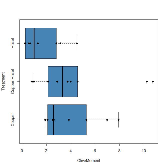
Figure 2C. Same graph, added original points; boxplot(), default graph in base package.
Note 3: boxplot and stripchart functions part of ggplot2 package, part of tidyverse, easily used to generate graphs like Fig 2B and Fig 2C. The overplot option was used to jitter points to avoid overplotting. See below: Apply tidyverse-view to enhance look of boxplot graphic and Fig 9.
Jittering adds random noise to points, which helps view the data better if many points are clustered together. Note however that jitter would add noise to the plot — if the objective is to show an association between two variables, jitter will reduce the apparent association, perhaps even compromising the intent of the graph. Beeswarm also can be used to better visualize clustered points, but uses a nonrandom algorithm to plot points.
Rcmdr: Graph → Boxplot…
Select the response variable, then click on the Plot by: button
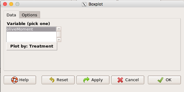
Figure 3. Popup menu in R Commander: Select the response variable and set the Plot by: option.
Next, select the Groups (Factor) variables (Fig 4). Click OK to proceed
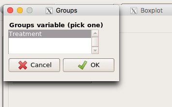
Figure 4. Select the group variable
Back to the Box Plot menu, click “Options” tab to add details to the plot, including a graph title and how outliers are noted (Fig 5),
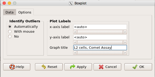
Figure 5. Options tab, enter labels for axes and a title.
And here is the resulting box plot (Fig 6)
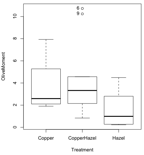
Figure 6. Resulting box plot from car package implemented in R Commander. Outliers are identified by row id number.
The graph is functional, if not particularly compelling. The data set was “olive moments” from Comet Assays of an immortalized rat lung cell line exposed to dilute copper solution (Cu), Hazel tea (Hazel), or Hazel & Copper solution.
Apply Tidyverse-view to enhance look of boxplot graphic
Load the ggplot2 package via the Rcmdr plugin to add options to your graph. As a reminder, to install Rcmdr plugins you must first download and install them from an R mirror like any other package, then load the plugin via Rcmdr Tools → Load Rcmdr plug-in(s)… (Fig 7, Fig 8).
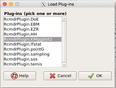
Figure 7. Screen shot of Load Rcmdr plug-ins menu, Click OK to proceed (see Fig 8).
Figure 8. To complete installation of the plug-in, restart R Commander.
Significant improvement, albeit with an “eye of the beholder” caveat, can be made over the base package. For example, ggplot2 provides additional themes to improve on the basic box plot. Figure 8 shows the options available in the Rcmdr plugin KMggplot2, and the default box plot is shown in Fig 9.
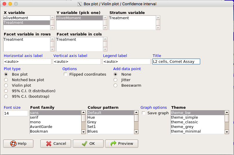
Figure 9. Menu of KMggplot2. A title was added, all else remained set to defaults.
The next series of plots, Fig 10 – 12, explore available formats for the charts.
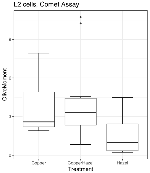
Figure 10. Default box plot from KMggplot.
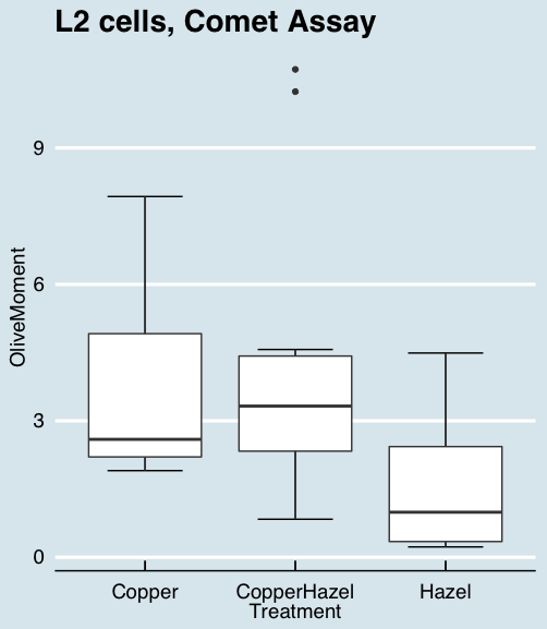
Figure 11. “Economist” theme box plot from KMggplot2.
And finally, since the box plot is often used to explore data sets, some recommend including the actual data points on a box plot to facilitate pattern recognition. This can be accomplished in the KMggplot2 plugin by checking “Jitter” under the Add data points option (see Fig 8). Jitter helps to visualize overlapping points at the expense of accurate representation. I also selected the Tufte theme, which results in the image displayed in Figure 12.
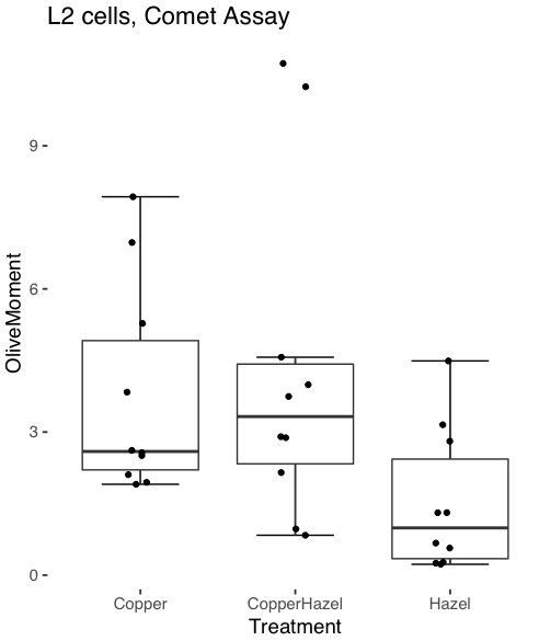
Figure 12. Tufte theme and data points added to the box plot.
Note 4: The Tufte theme is so named for Edward Tufte (2001), Chapter 6 Data-Ink Maximization and Graphical Design.” In brief, the theme follows the “maximal data, minimal ink” principle.
Conclusions
As part of your move from the world of Microsoft Excel graphics to recommended graphs by statisticians, the box plot is used to replace the bar charts plus error bars that you may have learned in previous classes. The second conclusion? I presented a number of versions of the same graph, differing only by style. Pick a style of graphics and be consistent.
Questions
- Why is a box plot preferred over a bar chart for ratio scale data, even if an appropriate error bar is included?
- With your comet data (Table 1, Chapter 4.2), explore the different themes available in the box plot commands available to you in Rcmdr. Which theme do you prefer and why?
Quiz Chapter 4.3
Box plots