20.15 — Meta-analysis
Introduction
Meta-analysis is a type of systematic review (Greenhalgh 1997, Akobeng 2005), a statistical method used to combine the results from multiple independent studies that addressed the same topic. By combining studies, the goal is to calculate a pooled estimate as a measure of overall effectiveness of the treatment. The underlying logic is that multiple studies draw subjects from the same reference population, thus, combining data provides a more powerful test of the hypothesis.
Meta-analysis can increase the overall sample size, which improves the study’s ability to detect an effect if one exists. So, how to combine results from different studies ostensibly addressing the same hypothesis? Inevitably, some subjectivity will come into decisions about including or excluding studies — the goal is to identify quality studies, which may have conflicting conclusions and test whether a single conclusion of effectiveness is warranted based on a summary of evidence.
Meta-analysis is now a routine type of study, conducted in multiple disciplines, including biomedical field (eg, Cochrane Reviews, more than 15K since 1993, Anderson et al 2024), and environmental studies (eg, Resende et al 2021), and sports science (eg, Miyamoto-Mikami et al 2018).
In general, meta-analysis studies return the combined effect size –the single, pooled effect across all included studies — of an intervention and the heterogeneity among the studies — how consistent measured differences. Models may be fixed effects — that is, any observed differences among studies are due to chance or sampling error — or random effects — the true effect size varies from study to study and that these effects are drawn from a distribution.
The purpose of this page is to provide a basic overview and an introduction to the meta-analysis approach. We previously introduced the Cochran’s Q test aka heterogeneity  test in Chapter 9.4. The chi-square test test asks whether results from combined studies are consistent. After discussing inclusion criteria, we provide plotting techniques and additional statistical tests for heterogeneity of studies.
In Chapter 12.4, we introduced a simple meta-analysis combining ten separate one sample t-tests of the hypothesis that inbred mice and genetically diverse mouse strains do not differ for average lifespan. P-values were combined and we used Fisher’s method to evaluate the hypothesis.
Note 1: The most robust and recommended method for meta-analysis is to use effect sizes (eg, standardized mean differences, odds ratios, risk ratios) and their corresponding standard errors or confidence intervals (Nakagawa and Cuthill 2007). This approach avoids the limitations of arbitrary p-value thresholds and provides a more complete picture of the effect’s magnitude and precision.
Selection criteria
Any project, whether an observational study or an experiment, starts with a question that is modified into one or more testable hypothesis. We don’t collect the data then speculate about causes for perceived patterns that may appear. Rather, pattern recognition process can be used to generate hypotheses subject to future testing. Our example was about lifespan and genetic background and genetic diversity: Longevity refers to the capacity to live a long life whereas lifespan is the maximum amount of time an individual can live. We ask if genetic diversity increases longevity across a population; specific genetic background is linked to an individual’s predisposition to long life.
Given the importance such work has in clinical research, as you can imagine, there is plenty of advice and suggested guidelines for how to proceed. Of note, review systematic review Population, Intervention, Comparison, Outcome (PICO) guidelines (Schardt et al 2007). Additionally, see the Cochrane Handbook (2024).
With a clear hypothesis in hand, for both systematic review and meta-analysis, the study begins with a search of the published literature. Search results from the query “inbred mice strain lifespan,” in Pubmed returned about 1134 publications; replacing “longevity” for “lifespan,” returned 654 publications. We want primary literature, not reviews, so we add NOT (Review[Publication Type]) to the query: 1080 and 617, respectively. Further restricting the pool by restricting range to last ten years returned a manageable 197 and 116 results, respectively. We can begin selecting our data from the studies. We now have to decide whether all or only some meet our standards for consideration. Of course, this is not the same thing as looking at the results and selecting only the studies that confirm our thinking! Ideally, reporting of both positive (large effect size, small p-value) and negative (small effect size, large p-value) studies can — and should — be included. Our goal, combine the results of multiple independent studies on the same topic to reach a more powerful and reliable conclusion than a single study could provide.
Note 2: Publication bias concerns likely overestimates of effect size for meta-analysis, just as the tendency for reporting only “statistically significant” p-values (Ioannidis 2008).
Inclusion criteria are the requirements a study must meet to be considered for the review; exclusion criteria are the specific reasons a study is disqualified. Decisions about which studies to include consider demographics, intervention type, and study design. For example, the review may focus only on RCT studies. Likely, the review is focused on experimental work and so, excluding previous systematic reviews would be an example of an exclusion criteria. At the same time we need to be transparent about our approach; that includes defining a clear research question, establishing strict inclusion/exclusion criteria, conducting a comprehensive literature search across multiple databases, and performing a rigorous data extraction and quality assessment of included studies (Meline 2006, Paldam 2015, Cochrane Handbook). For our lifespan and genetic diversity example I found two studies that met my criteria: the studies needed multiple inbred strains or outbred strains and the raw data needed to be available. Two studies met this need: Yuan et al (2009) and Mullis et al (2025).
An imperfect example. To practice applying selection and exclusion criteria for a meta-analysis, I ran a PubMed search using the keywords botox migraine. I limited the results to clinical trials published within the past five years, which gave me 14 papers. I read the abstracts and decided to include studies only if they had a control group, focused on patients with chronic migraine, and reported an exact p-value instead of just saying “P < 0.05.” Table 1 shows what I found, including the PubMed link for each paper, whether it was included, the sample size, the p-value, and my comments on why any studies were excluded.
Table 1. Example data collection for meta-analysis, topic botox and treatment of chronic migraines.
| paper | Include | N | p-value | Why exclude? |
|---|---|---|---|---|
| https://pubmed.ncbi.nlm.nih.gov/37499085/ | No | review | ||
| https://pubmed.ncbi.nlm.nih.gov/38982666/ | Yes | 1384 | 0.01 | |
| https://pubmed.ncbi.nlm.nih.gov/37994890/ | No | 209 | 0.155 | no control group |
| https://pubmed.ncbi.nlm.nih.gov/41091731/ | No | 775 | > 0.05 | no CI, no exact p-value |
| https://pubmed.ncbi.nlm.nih.gov/34404257/ | No | 32 | 0.03 | within subjects design, no control group |
| https://pubmed.ncbi.nlm.nih.gov/37315247/ | Yes | 209 | 0.365 | |
| https://pubmed.ncbi.nlm.nih.gov/33722518/ | No | 60 | < 0.001 | within subjects design, no control group, no exact p-value |
| https://pubmed.ncbi.nlm.nih.gov/36189948/ | No | 0.092 | no sample size, no control | |
| https://pubmed.ncbi.nlm.nih.gov/36189948/ | No | 0.174 | no sample size, no control | |
| https://pubmed.ncbi.nlm.nih.gov/35166150/ | No | method paper | ||
| https://pubmed.ncbi.nlm.nih.gov/33106278/ | Yes | 15 | 0.038 | |
| https://pubmed.ncbi.nlm.nih.gov/37235358/ | No | 139 | < 0.0001 | no CI, no exact p-value |
| https://pubmed.ncbi.nlm.nih.gov/35064733/ | No | overuse, not migraine | ||
| https://pubmed.ncbi.nlm.nih.gov/33241323/ | No | PTH, not migraine | ||
| https://pubmed.ncbi.nlm.nih.gov/32873093/ | No | no control group |
That leaves only three papers, not enough for a meta-analysis. By changing years from five to ten, 40 papers were available to search. By removing all time restrictions, 109 papers were returned since year 2000. Medical use of botox dates to the 1970s (Scott 2023).
R packages
metafor package: provides extensive functions for calculating various effect sizes, fitting different statistical models (e.g., fixed- and random-effects, mixed-effects), conducting meta-regression, and generating numerous meta-analytical plots.
See also metaforGUI package which provides a Graphical User Interface (GUI) for the R metafor Package.
meta package: provides user-friendly and comprehensive collection of functions for conducting standard meta-analyses.
Much has been written about how to conduct meta-analysis and caveat emptor — readers should be on notice that I present here just a fraction of the “how to” and pitfalls of meta-analysis. Interested readers should see Doing meta-analysis with R: A hands-on guide by M. Harrer et al (2021).
I2 or I-squared test
In a meta-analysis, the I-squared test  quantifies the percentage of total variation in a set of study results that is due to differences between studies rather than random sampling error (chance). An of 0% means all variation is due to chance, while a higher percentage indicates that differences between studies are a significant source of variation. As a reminder, the test returns a p-value that can be used to interpret whether that heterogeneity is statistically significant. We run our life span of inbred and genetically diverse outbred mouse strains example in Chapter 12.4; the p-value was small — we used Fisher’s method p-value combination approach to test the main hypothesis.
Here, we calculate ; we first need the effect size; Cohen’s d (Chapter 11.4) will do.
Table 1. Updated Table 1 from Chapter 12.4.
| Strain | n | mean | sd | cohen’s d | V(d) |
| 129S1/SvImJ | 32 | 787.4 | 159.16 | 0.045 | 0.191 |
| A/J | 32 | 630.7 | 130.20 | 1.26 | 0.04 |
| BALB/cByJ | 32 | 734.4 | 154.43 | 0.389 | 0.0368 |
| BUB/BnJ | 24 | 611.3 | 218.34 | 0.839 | 0.0485 |
| C3H/HeJ | 29 | 724.1 | 131.48 | 0.536 | 0.0403 |
| C57BL/6J | 29 | 855.7 | 185.34 | 0.330 | 0.0399 |
| CBA/J | 30 | 622.9 | 181.95 | 0.943 | 0.0405 |
| FVB/NJ | 26 | 750.3 | 230.11 | 0.192 | 0.0438 |
| P/J | 32 | 676.0 | 178.82 | 0.663 | 0.0374 |
| SWR/J | 31 | 831.9 | 181.31 | 0.206 | 0.0376 |
The effect size ranged from practically no difference (Cohen’s d of 4.5%) to substantial effect on average lifespan of inbred vs outbred strains (Cohen’s d of 126%). The simple average of the Cohen’s d values was 0.541; a weighted average accounting for differences in variance needs to be applied. Regardless, the statistic we want is the coefficient from meta-regression, which indicates how a change in that predictor relates to the effect size.
Note 3: The greatest effect size — difference in average lifespan — was reported for the A/J strain — this strain is primarily used in cancer research because of its susceptibility to cancers. The smallest effect size was for the 129S1/SvImJ strain, which is used for creating genetically modified mice.
With effect size calculated, we proceed to get . We use rma() from metafor package. This function performs several tests: a fixed-effects model and therefore we test a model where we assume all studies found the exact same effect, a random-effects model where the assumption is that effects are similar but vary across studies, plus a mixed-effects model uses a combination of both, and finally, a meta-regression. The meta-regression uses the data from those studies to try and explain why the results differ.
R code
library(metafor)
strains <- 1:10
my_effsize <- c(0.0446092, 1.258065, 0.3891731, 0.8390583,
0.5354427, 0.3302039, 0.9431162, 0.192082, 0.6626776, 0.2062765)
my_sample <- c(32, 32, 32, 24, 29, 29, 30, 26, 32, 31)
my_varC <- (my_effsize^2)/(2*my_sample)
myData <- data.frame(strains, my_effsize, my_sample, my_varC)
rma(yi = my_effsize, vi = my_varC, data = myData)
R output
Random-Effects Model (k = 10; tau^2 estimator: REML)

tau^2 (estimated amount of total heterogeneity): 0.1299 (SE = 0.0643)
tau (square root of estimated tau^2 value): 0.3604
I^2 (total heterogeneity / total variability): 99.15%
H^2 (total variability / sampling variability): 117.11

Test for Heterogeneity:
Q(df = 9) = 390.9415, p-val < .0001

Model Results:

estimate     se   zval   pval  ci.lb  ci.ub
  0.5208 0.1169 4.4558 <.0001 0.2917 0.7499 ***
---
Signif. codes: 0 ‘***’ 0.001 ‘**’ 0.01 ‘*’ 0.05 ‘.’ 0.1 ‘ ’ 1
Interpretation.
With an of 99%, which suggests a very high degree of heterogeneity among the comparison between the DO strain and the ten inbred strains for life span. As before, the heterogeneity or Q test was highly statistically significant, suggests that the observed variability is larger than what would be expected due to chance alone. Thus, all of the variability in the observed effects comes from between-strain differences, not random chance — it also justifies use of a random effects model, not a fixed model. Strain A/J, with the greatest difference in lifespan compared to the DO strain, is recognized for its susceptibility to carcinogenic tumors
From the meta regression, the coefficient was 0.52 — inbred strain membership was associated with change in the size of the effect. We conclude that in general, the genetically inbred strains differ substantially for average lifespan compared to the genetically variable DO strain: The true average effect was somewhere between 0.2917 and 0.7499.
Our results conform to our expectations — longevity is likely affected by a combination of effects from many genes along with an individual’s genetic background and interaction with the environment, cf discussion in Mullis et al (2025).
Forest plot of effect size.
A forest plot visually summarizes results from multiple studies, showing each study’s effect size (eg, odds ratio, mean difference, Cohen’s d) and variance or confidence interval as squares and lines, plus the overall pooled estimate (diamond). It helps quickly assess study consistency (heterogeneity), see individual study contributions, and determine if the combined evidence points to a significant overall effect.
For example, our inbred strains vs the outbred DO strain for lifespan shows a clear, overall effect (Fig 1). The diverse genetic strain lifespan is significantly greater than the majority of inbred strains, and the combined effect is about 0.5.
R code
library(metafor)
myData <- data.frame(
Strains = paste("Strains", c("129S1/SvImJ", "A/J", "BALB/cByJ", "BUB/BnJ",
"C3H/HeJ", "C57BL/6J", "CBA/J", "FVB/NJ", "P/J", "SWR/J")),
cohenD = c(0.045, 1.26, 0.389, 0.839, 0.536, 0.33, 0.943, 0.192, 0.663, 0.206),
cohenV = c(0.1910, 0.0400, 0.0368, 0.0485, 0.0403, 0.0399, 0.0405, 0.0438, 0.0374, 0.0376)
)

res2 <- rma(cohenD, cohenV, data = myData, method="REML")
# str(res2)

forest(res2,
slab = myData$Strains,
xlab = "Cohen's d")
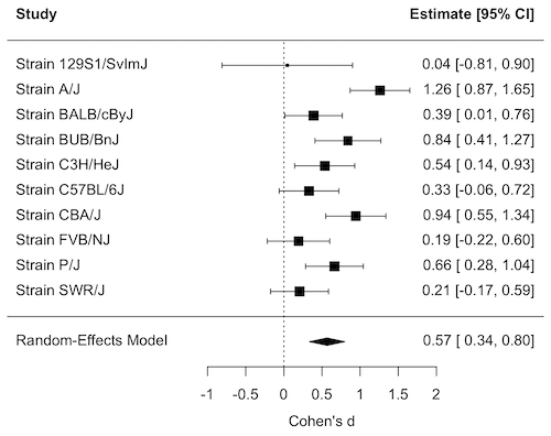
Figure 1. Forest plot, Cohen’s effect size lifespan differences among inbred strains of mice compared to outbred strain.
Questions
1. What’s the difference between a literature review and a systematic review?
2. For which kinds of research goals would a meta-analysis be more appropriate than a systematic review?
Quiz Chapter 20.15
Meta-analysis
References and suggested readings
Akobeng, A. K. (2005). Understanding systematic reviews and meta-analysis. Arch Dis Child, 90:845-848.
Andersen, M. Z., Zeinert, P., Rosenberg, J., & Fonnes, S. (2024). Comparative analysis of Cochrane and non-Cochrane reviews over three decades. Systematic Reviews, 13, 120.
Cochrane reviews, Cochrane Library. (2025). https://www.cochranelibrary.com/
Greenhalgh, T. (1997). How to read a paper: Papers that summarise other papers (systematic reviews and meta-analyses). BMJ, 315(7109), 672–675.
Gurevitch, J., Koricheva, J., Nakagawa, S., & Stewart, G. (2018). Meta-analysis and the science of research synthesis. Nature, 555(7695), 175–182.
Hansen, C., Steinmetz, H., & Block, J. (2022). How to conduct a meta-analysis in eight steps: A practical guide. Management Review Quarterly, 72(1), 1–19.
Harrer, M., Cuijpers, P., Furukawa, T.A., & Ebert, D.D. (2021). Doing Meta-Analysis with R: A Hands-On Guide. Boca Raton, FL and London: Chapman & Hall/CRC Press. Link to website.
Ioannidis, J. P. A. (2008). Why Most Discovered True Associations Are Inflated. Epidemiology, 19(5), 640.
Higgins JPT, Thomas J, Chandler J, Cumpston M, Li T, Page MJ, Welch VA (editors). Cochrane Handbook for Systematic Reviews of Interventions version 6.5 (updated August 2024). Cochrane, 2024. Available from www.cochrane.org/handbook.
Meline, T. (2006). Selecting studies for systemic review: Inclusion and exclusion criteria. Contemporary Issues in Communication Science and Disorders, 33(Spring), 21–27.
Miyamoto-Mikami, E., Zempo, H., Fuku, N., Kikuchi, N., Miyachi, M., & Murakami, H. (2018). Heritability estimates of endurance-related phenotypes: A systematic review and meta-analysis. Scandinavian Journal of Medicine & Science in Sports, 28(3), 834–845.
Mullis, M. N., Wright, K. M., Raj, A., Gatti, D. M., Reifsnyder, P. C., Flurkey, K., Archer, J. R., Robinson, L., Di Francesco, A., Svenson, K. L., Korstanje, R., Harrison, D. E., Ruby, J. G., & Churchill, G. A. (2025). Analysis of lifespan across diversity outbred mouse studies identifies multiple longevity-associated loci. Genetics, 230(4), iyaf081.
Nakagawa, S., & Cuthill, I. C. (2007). Effect size, confidence interval and statistical significance: A practical guide for biologists. Biological Reviews, 82(4), 591–605.
Paldam, M. (2015). Meta-analysis in a nutshell: Techniques and general findings. Economics, 9(1), 20150011.
Resende, P. S., Viana-Junior, A. B., Young, R. J., & Azevedo, C. S. (2021). What is better for animal conservation translocation programmes: Soft- or hard-release? A phylogenetic meta-analytical approach. Journal of Applied Ecology, 58(6), 1122–1132.
Schardt, C., Adams, M. B., Owens, T., Keitz, S., & Fontelo, P. (2007). Utilization of the PICO framework to improve searching PubMed for clinical questions. BMC Medical Informatics and Decision Making, 7, 16.
Scott, A. B., Honeychurch, D., & Brin, M. F. (2023). Early development history of Botox (onabotulinumtoxinA). Medicine, 102(Suppl), e32371.
van Aert, R. C. M., Wicherts, J. M., & van Assen, M. A. L. M. (2016). Conducting Meta-Analyses Based on p Values. Perspectives on Psychological Science, 11(5), 713–729.
Yuan, R., Tsaih, S.-W., Petkova, S. B., de Evsikova, C. M., Xing, S., Marion, M. A., Bogue, M. A., Mills, K. D., Peters, L. L., Bult, C. J., Rosen, C. J., Sundberg, J. P., Harrison, D. E., Churchill, G. A., & Paigen, B. (2009). Aging in inbred strains of mice: Study design and interim report on median lifespans and circulating IGF1 levels. Aging Cell, 8(3), 277–287.
Chapter 20 contents
- Additional topics
- Area under the curve
- Peak detection
- Baseline correction
- Surveys
- Time series
- Dimensional analysis
- Estimating population size
- Diversity indexes
- Survival analysis
- Growth equations and dose response calculations
- Plot a Newick tree
- Phylogenetically independent contrasts
- How to get the distances from a distance tree
- Binary classification
- Meta-analysis
9.4 – Heterogeneity chi-square tests
Planned comparisons and meta-analysis.
After finding evidence to reject the statistical null hypothesis, it may be appropriate to proceed to test a number of data sets against the same theoretical distribution. Provided these are planned comparisons, part of the experiment and not an exercise in data dredging (Norman 2014), you may proceed to test a series of nested models where groups are combined to make new groups for comparison. This approach is analogous to the post-hoc tests one may conduct after a statistically significant ANOVA (see Chapter 12.4) or when identifying a best-fit regression model (see Chapter 18.4).
Combining groups to make new comparisons — this scenario is consistent with a meta-analysis. A type of systematic review (Greenhalgh 1997, Akobeng 2005), meta-analysis is a statistical method that combines the results from multiple independent studies on the same topic to provide a more precise and robust overall conclusion. By combining studies, the goal is to calculate a pooled estimate as a measure of overall effectiveness of the treatment. Meta-analysis can increase the overall sample size, which improves the study’s ability to detect an effect if one exists. So, how to combine results from different studies ostensibly addressing the same hypothesis? Inevitably, some subjectivity will come into decisions about including or excluding studies — the goal is to identify quality studies, which may have conflicting conclusions and test whether a single conclusion of effectiveness is warranted based on a summary of evidence.
Here we introduce the Cochran’s Q test (Cochran 1954, Hoaglin 2016), aka a special case of the more general heterogeneity chi-square test. The null hypothesis is no significant difference in the proportion of “successes” across all groups being compared — any observed differences between the groups are just due to chance. The test statistic, Q, has a chi-square distribution with  degrees of freedom. A large Q value and small p-value suggest significant heterogeneity of results among the studies.
Note 1. As a reminder, “success” as an outcome category in epidemiology studies can represent any result depending on the study’s objective: survival, recovery, symptom improvement, or prevention of infection. The alternative outcome is generally referred to as “failure” (eg, death, non-recovery, no improvement, infection).
Heterogeneity tests ask whether results from combined studies are consistent; other tests exist, and are detailed in our special chapter on conducting meta-analysis. For example, I2 or I-squared test provides a measure of how much variation in the combined studies is due to true differences rather than by chance. In short, the I2 test quantifies how much — the percentage — the different studies agree, while the chi-square test returns a p-value that can be used to interpret whether that heterogeneity is statistically significant. We outline the basics of meta-analysis in Chapter 20.15. Other tests include DerSimonian-Laird test and Mandel-Paule test — these use the Q statistic and its distribution to estimate the between-study variance and provide better estimators with small sample size. Between-study variance is used to determine if a fixed-effect or a random-effects model (Chapter 12.3 and Chapter 14.3), is appropriate for the analysis. A random-effects model is used when significant heterogeneity is present (Higgins et al 2009).
Example.
Imagine a scenario where a population geneticist has collected allele (gene) frequency and genotype frequency data on single nucleotide polymorphisms (SNP) for the BRCA1 locus for three USA groups, African Americans, Asian Americans, and European Americans. Data of this kind can be obtained from the SNP database at NCBI (data retrieved 14 & 15 July 2014), and I collated several SNP involving a Cytosine base for Thymine base change (Table 1). The BRCA1 locus is on chromosome 17 and some of the hundreds of mutations found for this gene are associated with high risk of breast and or ovarian cancer (Couch and Weber 1996, Tram et al 2013).
Table 1. SNP of BRCA1 locus
| SNP | Population | n | C/C | C/T | T/T | C | T |
| rs1060915 | African American | 46 | 0.043 | 0.174 | 0,783 | 0.130 | 0.870 |
| Asian American | 48 | 0.083 | 0.625 | 0.375 | 0.396 | 0.604 | |
| European American | 48 | 0.167 | 0.458 | 0.375 | 0.396 | 0.604 | |
| rs3737559 | African American | 40 | 0.043 | 0.174 | 0.783 | 0.130 | 0.870 |
| Asian American | 48 | 0.083 | 0.625 | 0.292 | 0.396 | 0.604 | |
| European American | 48 | 0.167 | 0.458 | 0.375 | 0.396 | 0.604 | |
| rs799917 | African American | 124 | 0.048 | 0.258 | 0.694 | 0.177 | 0.823 |
| Asian American | 90 | 0.467 | 0.444 | 0.089 | 0.689 | 0.311 | |
| European American | 118 | 0.407 | 0.458 | 0.136 | 0.636 | 0.364 |
We may wish to test the combined data set to see if the large data set differs from Hardy Weinberg expectations before proceeding with a series of sample populations. By combining the data sets, we will be able to test whether one genotype is different from exception.
The goal then is to pool the data so that you have a more powerful test of the null hypothesis (remember our general discussion of statistical power and how increasing sample size increases your chances of correctly rejecting the null hypothesis).
For example, in our test of Hardy-Weinberg expectations (Example C), we calculated a  test of 7.8955. This test has k – 1 = 3 – 1 = 2 degrees of freedom. At alpha 5%, the critical value was 5.991 We clearly would reject the null hypothesis. But do we reject because of a difference in the aa, ab, or bb genotypes? Simply combine categories. Let’s test the homozygotes (aa and bb) versus the heterozygotes (ab).
Table 2. Worksheet
|
Categories
|
|||
| aa + bb | ab | n | |
|
Observed
|
66 | 34 | 100 |
|
Expected
|
52 | 48 | 100 |
 |
 |
||
With one degree of freedom, we clearly reject the null hypothesis because the critical value at 5% and one degree of freedom is equal to 3.841. To get the p-value, use
pchisq(7.852,df=1,lower.tail=FALSE)
which will return
[1] 0.005076452
Oh, and what was the null hypothesis? That there was an equal number of homozygotes and heterozygotes.
Other tests would be possible here, but the point is that you can dissect an experiment to determine which group is causing you to reject the null original hypothesis. While this is an important tool, you should also consider issues of apriori and aposterori decisions in experiments.
Questions.
1. The SNP rs1799971 (A > G) in the μ-opioid receptor (MOR) is associated with opioid dependency. Allele frequencies for different populations are provided in the table. Global frequency for A at this SNP is 0.188 (therefore frequency of G is 0.812).
| Population | n | A | G |
|---|---|---|---|
| African American | 32510 | 0.97 | 0.03 |
| Central American | 2450 | 0.81 | 0.19 |
| European | 18872 | 0.86 | 0.14 |
| Native American | 1260 | 0.86 | 0.14 |
| Native Hawaiian | 4534 | 0.75 | 0.25 |
| South Asian | 856 | 0.59 | 0.41 |
- Combine the data sets and test whether genotype frequency is different from the reported global exception.
- Test each population separately.
2. A behavioral ecologist studies the effect of three diets (high-protein, high-carbohydrate, and mixed) on the growth rate of juvenile frogs. Before collecting any data, she writes a protocol stating that she will compare only the high-protein vs mixed diet, based on a specific hypothesis about amino acid availability.
After analyzing the data, she also notices that frogs on the high-carbohydrate diet seem smaller, so she performs several additional pairwise comparisons that were not part of her original plan, reporting only the ones that are statistically significant.
Which statement best distinguishes the planned comparison from data dredging (p-hacking)?
A. The planned comparison is valid because it uses a larger sample size, while data dredging uses small samples.
B. The planned comparison was specified ahead of time based on a biological hypothesis, while data dredging involves unplanned tests added after seeing the data to search for significant results.
C. The planned comparison uses ANOVA, while data dredging uses regression.
D. The planned comparison must always produce a significant result, while data dredging never does.
Quiz Chapter 9.4
Heterogeneity chi-square tests
Chapter 9 contents
7.3 – Conditional Probability and Evidence Based Medicine
- Conditional probability and risk communication
- Probability and independent events
- Example of multiple, independent events
- Probabilistic risk analysis
- Conditional probability of non-independent events
- Diagnosis from testing
- Standard million
- Per capita rate
- Practice and introduce PPV and test decision criteria
- Evidence Based Medicine
- Software
- Example
- Questions
- Quiz
- Chapter 7 contents
Conditional probability and risk communication.
Conditional probabilities can be used to accurately and effectively convey the risk of specific health outcomes to patients and the public. Tools introduced in this chapter help move from an initial assessment of disease risk to a revised probability after a test result is returned. Although there are other interpretations, here we frame EBM — evidence-based-medicine — as a form of Bayesian decision-making.
This sub-chapter covers a lot of ground. We begin by addressing how probability of multiple events are calculated assuming each event is independent. The assumption of independence is then relaxed, and how to determine probability of an event happening given another event has already occurred, conditional probability, is introduced. Use of conditional probability to interpret results of a clinical test are also introduced, along with the concept of EBM. We also introduce Bayes’ rule and Bayesian probability.
Probability and independent events.
Probability distributions are mathematical descriptions of the probabilities of how often different possible outcomes occur. We also introduced basic concepts related to working with the probabilities involving more than one event.
For review, for independent events, you multiply the individual chance that each event occurs to get the overall probability.
Example of multiple, independent events.

Figure 1. Now that’s a box full of kittens. Creative Commons License, source: https://www.flickr.com/photos/83014408@N00/160490011.
What is the chance of five kittens in a litter of five to be of the same sex? In feral cat colonies, siblings in a litter share the same mother, but not necessarily the same father, superfecundation. Singleton births are independent events, thus the probability of the first kitten is female is 50%; the second kitten is female, also 50%; and so on. We can multiply the independent probabilities (hence, the multiplicative rule), to get our answer:
kittens <- c(0.5, 0.5, 0.5, 0.5, 0.5)
prod(kittens)
[1] 0.03125
Probabilistic risk analysis.
Risk analysis is the use of information to identify hazards and to estimate the risk. A more serious example. Consider the 1986 Space Shuttle Challenger Disaster (Hastings 2003). Among the crew killed was Ellison Onizuka, the first Asian American to fly in space (Fig 2, first on left back row). Onizuka was born and raised on Hawai`i and graduated from Konawaena High School in 1964.

Figure 2. STS-51-L crew: (front row) Michael J. Smith, Dick Scobee, Ronald McNair; (back row) Ellison Onizuka, Christa McAuliffe, Gregory Jarvis, Judith Resnik. Image by NASA – NASA Human Space Flight Gallery, Public Domain.
The shuttle was destroyed just 73 seconds after lift off (Fig 3).

Figure 3. Space Shuttle Challenger launches from launchpad 39B Kennedy Space Center, FL, at the start of STS-51-L. Hundreds of shorebirds in flight. Image by NASA – NASA Human Space Flight Gallery, Public Domain.
This next section relies on material and analysis presented in the Rogers Commission Report June 1986. NASA had estimated that the probability of one engine failure would be 1 in 100 or 0.01; two engine failures would mean the shuttle would be lost. Thus, the probability of two rockets failing at the same time was calculated as 0.01 X 0.01, which is 0.0001 or 0.01%.
NASA had planned to fly the fleet of shuttles 100 times per year, which would translate to a shuttle failure once in 100 years. The Challenger launch on January 28, 1986, represented only the 25th flight of the shuttle fleet.
One difference on launch day was that the air temperature at Cape Canaveral was quite low for that time of year, as low as 22 °F overnight.
Attention was pointed at the large O-rings in the boosters (engines). In all, there were six of these O-rings. Testing suggested that, at the colder air temperatures, the chance that one of the rings would fail was 0.023. Thus, the chance of success was only 0.977. Assuming independence, what is the chance that the shuttle would experience O-ring failure?
shuttle <- c(0.977, 0.977, 0.977, 0.977, 0.977, 0.977)
#probability of success then was
prod(shuttle)
[1] 0.869

#and therefore probability of failure was
1 - prod(shuttle)
[1] 0.1303042
Conditional probability of non-independent events.
But in many other cases, independence of events cannot be assumed. The probability of an event given that another event has occurred is referred to as conditional probability. Conditional probability is used extensively to convey risk. We’ve touched on some of these examples already:
- the risk of subsequent coronary events given high cholesterol;
- the risk of lung cancer given a person smokes tobacco;
- the risk of mortality from breast cancer given that regular mammography screening was conducted.
There are many, many examples in medicine, insurance, you name it. It is even an important concept that judges and lawyers need to be able to handle (eg, discussion in Berry 2008).
A trigger warning: what follows is emotional, traumatic material, provided to emphasize the importance of these concepts, and the far-reaching implications understanding conditional probability can have for us.
A now famous example of conditional probability in the legal arena came from arguments over the chance that a husband or partner who beats his wife will subsequently murder her — this was an argument raised by the prosecution during pre-trial in the 1995 O.J. Simpson trial (The People of the State of California v. Orenthal James Simpson), and successfully argued by O.J. Simpson’s attorneys… judge ruled in favor of the defense and evidence of O.J. Simpson’s prior abuse were not included in trial. Gigerenzer (2002, following discussions by others, eg, Good 1995) and others (eg, Skorupski and Wainer 2015), have called this the Defendent’s Fallacy, the reverse of the Prosecutor’s Fallacy, where the more typical scenario is that the prosecution provides a list of probabilities about characteristics of the defendant, leaving the jury to conclude that no one else could have possibly fit the description ( and 1987).
In the O.J. Simpson case, the argument went something like this. From the CDC we find that the chance of an average woman being murdered by a stranger or an unrelated party was about 1 in 20,000. CDC statistics indicate 1.3 million women are abused each year by their partner or former partner; each year about 1000 women are murdered. One thousand divided by 1.3 million is a small number, so even when there is abuse the argument goes, 99% of the time there is not murder. The Simpson judge ruled in favor of the defense and much of the evidence of prior abuse was excluded.
Something is missing from the defense’s argument. Nicole Brown Simpson did not belong to a population of battered women — she belonged to the population of murdered women. When we ask, if a woman is murdered, what is the chance that she knew her murderer, we find that more than 55% knew their murderer — and of that 55%, 93% were killed by a partner who had a history of prior abuse against the victim.
Instead of looking at all 1.3 million abused women, we isolate a representative cohort of 100,000 abused women to see what mathematically happens to them in a given year:
Group 1: Murdered by their abuser. According to the defense’s rate of 1 in 2,500:
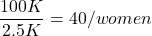
Group 2: Murdered by someone else:
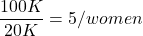
Given that an abused woman was murdered, what is the probability it was done by her abuser?

or 89%.
This is a huge difference from how the Defense portrayed the chance, where they wanted the judge to assume every single one of those 2500 abusers is equally likely to have committed the crime. In reality, we must condition the match on all other available evidence.
The key — Nicole Simpson (and Ron Goldman) were murdered; O.J. Simpson was an ex-partner who had been guilty of assault against Nicole Simpson. Now, it goes from an impossibly small chance, to a much greater chance. Conditional probability, and specifically Bayes’ rule, is used for these kinds of problems. The defense successfully masked a probability that was heavily stacked against their client.
Bayes’ rule provides guidance for how to update the probability of an event based on new evidence. Named after Thomas Bayes (1701- 1761), more generally, Bayes’ rule, described below, is used to quantify conditional probability. Bayesian probability, where probability is interpreted as reasonably expectation instead of frequency of some event. We discuss Bayesian and Frequentist approaches to hypothesis testing in Chapter 8.2.
Note 1: Following our epidemilogy definitions, women murdered by their abuser (Group 2), epidemiology terms, that would be  , the exposure rate in controls, whereas abused woman murdered by her abuser (Group 1), that would be
 , the exposure rate in cases.
Diagnosis from testing.
Let’s turn our attention to medicine. A growing practice in medicine is to claim that decision making in medicine should be based on approaches that give us the best decisions. A search of PubMed texts for “evidence based medicine” found more than 91,944 (13 October 2021, and increase of thirteen thousand since last I looked (10 October, 2019). Evidence based medicine (EBM) is the “conscientious, explicit, judicious and reasonable use of modern, best evidence in making decisions about the care of individual patients” (Masic et al 2008). By evidence, we may mean results from quantitative, systematic reviews, meta-analysis, of research on a topic of medical interest, eg, Cochrane Reviews.
Note 2: Primary research refers to generating or collecting original data in pursuit of tests of hypotheses. Both systematic reviews and meta-analysis are secondary research or “research on research.” As opposed to a literature review, systematic review make explicit how studies were searched for and included; if enough reasonably similar quantitative data are obtained through this process, the reviewer can combine the data and conduct an analysis to assess whether a treatment is effective (De Vries 2018).
As you know, no diagnostic test is 100% fool-proof. For many reasons, test results come back positive when the person truly does not have the condition — this is a false positive result. Correctly identifying individuals who do not have the condition, 100% – false positive rate, is called the specificity of a test.
Think of specificity in this way — provide the test 100 true negative samples (eg, 100 samples from people who do not have cancer) — how many times out of 100 does the test correctly return a “negative”? If 99 times out of 100, then the specificity rate for this test is 99%. Which is pretty good. But the test results mean more if the condition/disease is common; for rare conditions, even 99% is not good enough. Incorrect assignments are rare, we believe, in part because the tests are generally quite accurate. However, what we don’t consider is that detection and diagnosis from tests also depend on the base rate — how frequent the incidence of the condition is in the population. Paradoxically, the lower the base rate, the poorer diagnostic value even a sensitive test may have.
Note 3: This concept, that the base rate effects clinical relevance of interpreting testing — has really important, real-world consequences. It directly bears on clinical testing of cancer and other relatively rare diseases; it also dramatically influences applicability of highly sensitive tests for drug use in clinical samples.
To summarize our jargon for interpreting a test or assay, so far we have
- True positive (a), the person has a disease and the test correctly identifies the person as having the disease.
- False positive (b), test result incorrectly identifies disease; the person does not have the disease, but the test classifies the person as having the disease.
- False negative (c), test result incorrectly classifies person does not have disease, but the person actually has the disease.
- True negative (d), the person does not have the disease and the test correctly categorizes the person as not having the disease.
- Positive predictive value (PPV), the proportion of patients with a positive test result who actually have the disease,
 .
- Negative Predictive Value (NPV), the probability that a person who receives a negative test result really does not have the disease,
 .
- Negative Predictive Value (NPV), the probability that a person who receives a negative test result really does not have the disease,
- Sensitivity of test (Se), the proportion of persons who test positive and do have the disease (true positives):
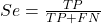
If a test has 75% sensitivity, then out of 100 individuals who do have the disease, then 75 will test positive (TP = true positive). - Specificity of a test (Sp), refers to the rate that a test correctly classifies a person that does not have the disease (TN = true negatives):
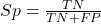
If a test has 90% specificity, then out of 100 individuals who truly do not have the disease, then 90 will test negative (= true negatives).
A worked example. A 50 year old male patient is in the doctor’s office. The doctor is reviewing results from a diagnostic test, eg, a FOBT — fecal occult blood test — a test used as a screening tool for colorectal cancer (CRC). The doctor knows that the test has a sensitivity of about 75% and specificity of about 90%. Prevalence of CRC in this age group is about 0.2% (cf NCI SEER). The prevalence is also the prior probability — the baseline rate of the condition in the population before a test is taken. Figure 4 shows our probability tree using our natural numbers approach (Fig 4).
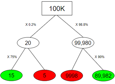
Figure 4. Probability tree for FOBT test; Good test outcomes shown in green: TP stands for true positive and TN stands for true negative. Poor outcomes of a test shown in red: FN stands for false negative and FP stands for false positive.
Note 4: Since U.S. Preventative Task Force (2021), FOBT has largely been replaced by Fecal Immunochemical Test (FIT): sensitivity 74%, specificity 95%, and Multitarget Stool DNA Test: sensitivity 76%, specificity 90%. Cologuard combines both: sensitivity 92%, specificity 97% (cf discussion in Imperiale et al 2014).
- The U.S. Supreme Court (Kennedy v. Braidwood Management, Inc) supported USPSTF’s authority to recommend preventive services covered by insurers (see 2025 article by R. Payerchin in Medical Economics).
The associated probabilities for the four possible outcomes of these kinds of tests (eg, what’s the probability of a person who has tested positive in screening tests actually has the disease?) are shown in Table 1.
Table 1. A 2 X 2 table of possible outcomes of a diagnostic test.
| Person really has the disease | ||
| Test Result | Yes | No |
| Positive | a TP |
b FP |
| Negative | c FN |
d TN |
We want the posterior probability — the chance that a positive test result is a true positive. Bayes’ rule is often given in probabilities,

Bayes’ rule, where truth is represented by either D (the person really does have the disease”) or ND (the person really does not have the disease”) and ⊕ is symbol for “exclusive or” and reads “not D” in this example.
An easier way to see this is to use frequencies and our table instead (Table 1, numbers in Figure 4).
Now, the formula is

Simplified Bayes’ rule, where a is the number of people who test positive and DO HAVE the disease and b is the number of people who test positive and DO NOT have the disease. Thus,  , the posterior probability was

or 0.15%. Because the condition is so rare (0.2% prior) and the test generates a very high number of False Positives (9,998), getting a positive result actually lowers oour confidence slightly from the base rate (from 0.2% down to 0.15%). This occurs because the test is highly unreliable in screening this specific population — it’s known as the base rate fallacy. Thus, the chance that a positive FOBT test for our 50 year old male patient is 99.85% likely wrong.
Standardized million.
Where did the 100,000 come from? We discussed this in chapter 2: it’s a simple trick to adjust rates to the same population size. We use this to work with natural numbers instead of percent or frequencies. You choose to correct to a standardized population based on the raw incidence rate. A rough rule of thumb:
Table 2. Relationship between standard population size and incidence rate.
| Raw IR rate about | IR | Standard population |
| 1/10 | 10% | 1000 |
| 1/100 | 1% | 10,000 |
| 1/1000 | 0.1% | 100,000 |
| 1/10,000 | 0.01% | 1,000,000 |
| 1/100,000 | 0.001% | 10,000,000 |
| 1/1,000,000 | 0.0001% | 100,000,000 |
The raw incident rate is simply the number of new cases divided by the total population.
Per capita rate.
Yet another standard manipulation is to consider the average incidence per person, or per capita rate. The Latin “per capita” translates to “by head” (Google translate), but in economics, epidemiology, and other fields it is used to reflect rates per person. Tuberculosis is a serious infectious disease of primarily the lungs. Incidence rates of tuberculosis in the United States have trended down since the mid 1900s: 52.6 per 100K in 1953 to 2.7 per 100K in 2019 (CDC). Corresponding per capita values are 5.26 x 10⁻⁴ and 2.7 x 10⁻⁵, respectively. Divide the rate by 100,000 to get per person rate.
Practice and introduce PPV and test decision criteria.
Let’s break these problems down, and in doing so, introduce some terminology common to the field of “risk analysis” as it pertains to evaluating assay and diagnotistc tests in biology and epidemiology. Our first example considers the fecal occult blood test, FOBT, test. Blood in the stool may (or may not) indicate polys or colon cancer (Park et al 2010).
A table like the one shown above (Table 1) will appear again and again throughout this and subsequent chapters, but in different forms. We start with Table 3.
Table 3. A 2 X 2 table of possible outcomes of FOBT test.
| Person really has the disease | |||
| Yes | No | ||
| Positive | 15 | 9998 | PPV = 15/(15+9998) = 0.15% |
| Negative | 5 | 89,982 | NPV = 89982/(89982+5) = 99.99% |
We want to know how good is the test, particularly if the goal is early detection? This is conveyed by the PPV, positive predictive value of the test. Unfortunately, the prevalence of a condition is also at play: the lower the prevalence, the lower the PPV must be, because most positive tests will be false when population prevalence is low.
Youden (1950) proposed a now widely adopted index that summarizes how effective a test is. Youden’s J is the sum of specificity and sensitivity minus one.

where Se stands for sensitivity of the test and Sp stands for sensitivity of the test.
Youden’s J takes on values between 0, for a terrible test, and 1, for a perfect test. For our FOBT example, Youden’s J was 0.65. This statistic looks like it’s independent of prevalence, but it’s use as a decision criterion (eg, a cutoff value, above which test is positive, below test is considered negative), assumes that the cost of misclassification (false positives, false negatives) are equal. Prevalence affects number of false positives and false negatives for a given diagnostic test, so any decision criterion based on Youden’s J will also be influenced by prevalence (Smits 2010).
Youden’s J is insensitive to base rates and therefore may be of little practical use in the field. Unsurprisingly, other tools are available, including Matthew’s Correlation Coefficient (MCC),

and the positive and negtive Clinical Utility Index (CUI+, CUI-),

or the F1-score,

epiR will calculate Youden’s J, but the others are either calculated by hand or by way of additional packages. So, we’ll provide a function.
R code to calculate testing decision criteria — code genereated with Gemini AI assistance.
run_screening_wizard <- function() {
# 1. Sequential user prompts starting with cell a
cat("--- 2x2 Matrix Entry Wizard ---\n")
a <- as.numeric(readline(prompt = "Enter cell a (True Positives, TP): "))
b <- as.numeric(readline(prompt = "Enter cell b (False Positives, FP): "))
c <- as.numeric(readline(prompt = "Enter cell c (False Negatives, FN): "))
d <- as.numeric(readline(prompt = "Enter cell d (True Negatives, TN): "))

# 2. Map cells to short variables for calculation
tp <- a
fp <- b
fn <- c
tn <- d

# 3. Construct and print the visual 2x2 matrix
user_matrix <- matrix(
c(tp, fp, fn, tn),
nrow = 2,
byrow = TRUE,
dimnames = list(Test = c("+", "-"), Disease = c("+", "-"))
)
cat("\n[+] Captured Matrix:\n")
print(user_matrix)

# 4. Run background metrics math
sensitivity <- tp / (tp + fn)
specificity <- tn / (tn + fp)
ppv <- tp / (tp + fp)
if (is.nan(ppv)) ppv <- 0

youden_j <- sensitivity + specificity - 1
cui_pos <- sensitivity * ppv

f1_score <- 2 * ((ppv * sensitivity) / (ppv + sensitivity))
if (is.nan(f1_score)) f1_score <- 0

mcc_num <- (tp * tn) - (fp * fn)
mcc_den <- sqrt(as.numeric(tp + fp) * as.numeric(tp + fn) *
as.numeric(tn + fp) * as.numeric(tn + fn))
mcc <- if (mcc_den == 0) 0 else mcc_num / mcc_den

# 5. Compile into the copy/paste ready console matrix
output_matrix <- matrix(
c(round(youden_j, 4), "No", "Good (Overly optimistic baseline)",
round(mcc, 4), "Yes", "Poor (Correctly captures imbalance)",
round(cui_pos, 4), "Yes", "Unacceptable clinical utility",
round(f1_score, 4), "Yes", "Near-total prediction failure"),
nrow = 4, byrow = TRUE
)

dimnames(output_matrix) <- list(
c("Youden's J Index", "MCC", "CUI+", "F1-Score"),
c("Value", "Base_Rate_Dep", "Console_Interpretation")
)

final_df <- as.data.frame(output_matrix)

# 6. Print and invisibly return the dataframe
cat("\n[+] Resulting Metrics Table (Copy/Paste Ready):\n")
print(final_df)
return(invisible(final_df))
}

# Run the function at the R command prompt.
run_screening_wizard()
End R code.
Thus, using a metric sensitive to low base rate, our FOBT tests are (modified from R output)
Table 4. Decision criteria.
| Value | Base rate dependent? | Interpretation | |
 |
0.65 | No | Good |
 |
0.0306 | Yes | Poor |
 |
0.0011 | Yes | Unacceptable clinical utility |
 |
0.0030 | Yes | Near-total prediction failure |
Another worked example. A study on cholesterol-lowering drugs (statins) reported a relative risk reduction of death from cardiac event by 22%. This does not mean that for every 1000 people fitting the population studied, 220 people would be spared from having a heart attack. In the study, the death rate per 1000 people was 32 for the statin versus 41 for the placebo — recall that a placebo is a control treatment offered to overcome potential patient psychological bias (see Chapter 5.4). The absolute risk reduction due to statin is only 41 – 32 or 9 in 1000 or 0.9%. By contrast, relative risk reduction is calculated as the ratio of the absolute risk reduction (9) divided by the proportion of patients who died without treatment (41), which is 22% (LIPID Study Group 1998).
Note that risk reduction is often conveyed as a relative rather than as an absolute number. The distinction is important for understanding arguments based in conditional probability. Thus, the question we want to ask about a test is summarized by absolute risk reduction (ARR) and number needed to treat (NNT), and for problems that include control subjects, relative risk reduction (RRR). We expand on these topics in the next section, 7.4 – Epidemiology: Relative risk and absolute risk, explained.
Evidence Based Medicine.
One culture change in medicine is the explicit intent to make decisions based on evidence (Masic et al 2008). Of course, the joke then is, well, what were doctors doing before, diagnosing without evidence? The comic strip xkcd offers one possible answer (Fig 5).
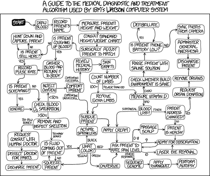
Figure 5. A summary of “evidence based medical” decisions, perhaps? “Watson Medical Algorithm,” https://xkcd.com/1619/.
As you can imagine, there’s considerable reflection about the EBM movement (see discussions in response to Accad and Francis 2018, eg, Goh 2018). More practically, our objective is for you to be able to work your way through word problems involving risk analysis. You can expect to be asked to calculate, or at least set up for calculation, any of the statistics listed above (eg, False negative, false positive, etc.). Practice problems are listed at the end of this section, and additional problems are provided to you (Homework 4). You’ll also want to check your work, and in any real analysis, you’d most likely want to use R.
Software.
R has several epidemiology packages, and with some effort, can save you time. Another option is to run your problems in OpenEpi, a browser-based set of tools. OpenEpi is discussed with examples in the next section, 7.4.
Here, we illustrate some capabilities of the epiR package, expanded more also in the next section, 7.4. We’ll use the example from Table 3.
R code
library(epiR)
Table3 <- matrix(c(15, 5, 9998, 89982), nrow = 2, ncol = 2)
epi.tests(Table3)
R output
         Outcome + Outcome -   Total
Test +          15      9998   10013
Test -           5     89982   89987
Total           20     99980  100000

Point estimates and 95% CIs:
--------------------------------------------------------------
Apparent prevalence *                      0.10 (0.10, 0.10)
True prevalence *                          0.00 (0.00, 0.00)
Sensitivity *                              0.75 (0.51, 0.91)
Specificity *                              0.90 (0.90, 0.90)
Positive predictive value *                0.00 (0.00, 0.00)
Negative predictive value *                1.00 (1.00, 1.00)
Positive likelihood ratio                  7.50 (5.82, 9.67)
Negative likelihood ratio                  0.28 (0.13, 0.59)
False T+ proportion for true D- *          0.10 (0.10, 0.10)
False T- proportion for true D+ *          0.25 (0.09, 0.49)
False T+ proportion for T+ *               1.00 (1.00, 1.00)
False T- proportion for T- *               0.00 (0.00, 0.00)
Correctly classified proportion *          0.90 (0.90, 0.90)
--------------------------------------------------------------
* Exact CIs
Oops! I wanted PPV, which by hand calculation was 0.15%, but R reported “0.00?” This is a significant figure reporting issue. The simplest solution is to submit options(digits=6) before the command, then save the output from epi.tests() to an object and use summary(). For example
options(digits=6)
myEpi <- epi.tests(Table3)
summary(myEpi)
And R returns
     statistic           est        lower        upper
1           ap  0.1001300000 0.0982761568  0.102007072
2           tp  0.0002000000 0.0001221693  0.000308867
3           se  0.7500000000 0.5089541283  0.913428531
4           sp  0.9000000000 0.8981238085  0.901852950
5      diag.ac  0.8999700000 0.8980937508  0.901823014
6      diag.or 27.0000000000 9.8110071871 74.304297826
7         nndx  1.5384615385 1.2265702376  2.456532054
8       youden  0.6500000000 0.4070779368  0.815281481
9       pv.pos  0.0014980525 0.0008386834  0.002469608
10      pv.neg  0.9999444364 0.9998703379  0.999981958
11      lr.pos  7.5000000000 5.8193604069  9.666010707
12      lr.neg  0.2777777778 0.1300251423  0.593427490
13      p.rout  0.8998700000 0.8979929278  0.901723843
14       p.rin  0.1001300000 0.0982761568  0.102007072
15      p.tpdn  0.1000000000 0.0981470498  0.101876192
16      p.tndp  0.2500000000 0.0865714691  0.491045872
17      p.dntp  0.9985019475 0.9975303919  0.999161317
18      p.dptn  0.0000555636 0.0000180416  0.000129662
There we go — pv.pos reported as 0.0014980525, which, after turning to a percent and rounding, we have 0.15%. Note also the additional statistics provided — a good rule of thumb — always try to save the output to an object, then view the object, eg, with summary(). Refer to help pages for additional details of the output (?epi.tests).
What about R Commander menus?
Note 3: Confirmed Fall 2026 — I have not been able to run the EBM plugin successfully! Simply returns an error message — — on data sets which have in the past performed perfectly. Thus, until further notice, do not use the EBM plugin. Instead, use commands in the epiR package. I’m leaving the text here on the chance the error with the plugin is fixed.
Rcmdr has a plugin that will calculate ARR, RRR and NNT. The plugin is called RcmdrPlugin.EBM (Leucuta et al 2014) and it would be downloaded as for any other package via R.
Download the package from your selected R mirror site, then start R Commander.
install.packages("RcmdrPlugin.EBM")
From within R Commander (Fig 6), select
Tools → Load Rcmdr plug-in(s)…
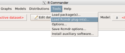
Figure 6. To install an Rcmdr plugin, first go to Rcmdr → Tools → Load Rcmdr plug-in(s)…
Next, select from the list the plug-in you want to load into memory, in this case, RcmdrPlugin.EBM (Fig 7).
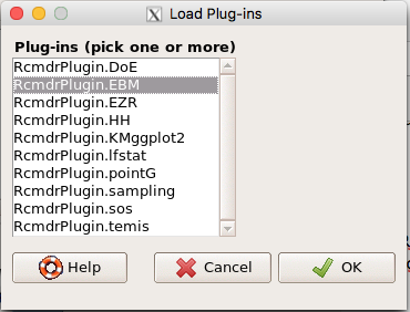
Figure 7. Select the Rcmdr plugin, then click the “OK” button to proceed.
Restart Rcmdr again (Fig 8),
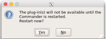
Figure 8. Select “Yes” to restart R Commander and finish installation of the plug-in.
and the menu “EBM” should be visible in the menu bar (Fig 9).
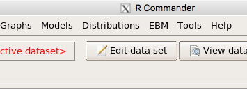
Figure 9. After restart of R Commander the EBM plug-in is now visible in the menu.
Note that you will need to repeat these steps each time you wish to work with a plug-in, unless you modify your .RProfile file. See
Rcmdr → Tools → Save Rcmdr options…
Clicking on the EBM menu item brings up the template for the Evidence Based Medicine module. We’ll mostly work with 2 X 2 tables (eg, see Table 1) , so select the “Enter two-way table…” option to proceed (Fig 10).
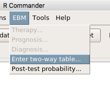
Figure 10. Select “Enter two-way table…”.
And finally, Figure 11 shows the two-way table entry cells along with options. We’ll try a problem by hand then use the EBM plugin to confirm and gain additional insight.
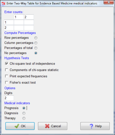
Figure 11. Two-way table Rcmdr EBM plug-in.
For assessing how good a test or assay is, use the Diagnosis option in the EBM plugin. For situations with treated and control groups, use Therapy option. For situations in which you are comparing exposure groups (eg, smokers vs non-smokers), use the Prognosis option.
Example.
Here’s a simple one (problem from Gigerenzer 2002).
About 0.01% of men in Germany with no known risk factors are currently infected with HIV. If a man from this population actually has the disease, there is a 99.9% chance the tests will be positive. If a man from this population is not infected, there is a 99.9% chance that the test will be negative. What is the chance that a man who tests positive actually has the disease?
Start with the reference, or base population (Figure 12). It’s easy to determine the rate of HIV infection in the population if you use numbers. For 10,000 men in this group, exactly one man is likely to have HIV (0.0001X10,000), whereas 9,999 would not be infected.
For the man who has the disease it’s virtually certain that his results will be positive for the virus (because the sensitivity rate = 99.9%). For the other 9,999 men, one will test positive (the false positive rate = 1 – specificity rate = 0.01%).
Thus, for this population of men, for every two who test positive, one has the disease and one does not, so the probability even given a positive test is only 100*1/2 = 50%. This would also be the test’s Positive Predictive Value.
Note that if the base rate changes, then the final answer changes! For example, if the base rate was 10%
It also helps to draw a tree to help you determine the numbers (Fig 12)
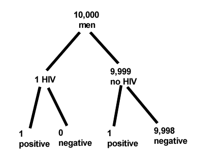
Figure 12. Draw a probability tree to help with the frequencies.
From our probability tree in Figure 12 it is straight-forward to collect the information we need.
- Given this population, how many are expected to have HIV? Two.
- Given the specificity and sensitivity of the assay for HIV, how many persons from this population will test positive? Two.
- For every positive test result, how many men from this population will actually have HIV? One.
Thus, given this population with the known risk associated, the probability that a man testing positive actually has HIV is 50% (=1/(1+1)).
Use the EBM plugin. Select two-way table, then enter the values as shown in Fig 13.
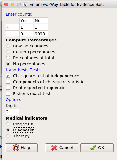
Figure 13. EBM plugin with data entry.
Select the “Diagnosis” option — we are answering the question: How probable is a positive result given information about sensitivity and specificity of a diagnosis test. The results from the EBM functions are given below
Rcmdr> .Table
      Yes No
   +  1    1
   -  0 9998
Rcmdr> fncEBMCrossTab(.table=.Table, .x='', .y='', .ylab='', .xlab='',
Rcmdr+ .percents='none', .chisq='1', .expected='0', .chisqComp='0', .fisher='0',
Rcmdr+ .indicators='dg', .decimals=2)
# Notations for calculations
        Disease + Disease -
Test +      "a"         "b"
Test -      "c"         "d"
# Sensitivity (Se) = 100 (95% CI 2.5 - 100) %. Computed using formula: a / (a + c)
# Specificity (Sp) = 99.99 (95% CI 99.94 - 100) %. Computed using formula: d / (b + d)
# Diagnostic accuracy (% of all correct results) = 99.99 (95% CI 99.94 - 100) %. Computed using formula: (a + d) / (a + b + c + d)
# Youden's index = 1 (95% CI 0.02 - 1). Computed using formula: Se + Sp - 1
# Likelihood ratio of a positive test = 9999 (95% CI 1408.63 - 70976.66). Computed using formula: Se / (Sp - 1)
# Likelihood ratio of a negative test = 0 (95% CI 0 - NaN). Computed using formula: (1 - Se) / Sp
# Positive predictive value = 50 (95% CI 1.26 - 98.74) %. Computed using formula: a / (a + b)
# Negative predictive value = 100 (95% CI 99.96 - 100) %. Computed using formula: d / (c + d)
# Number needed to diagnose = 1 (95% CI 1 - 40.91). Computed using formula: 1 / [Se - (1 - Sp)]
Note that the formulas used to calculate Sensitivity, Specificity, etc., follow our Table 1 (compare to “Notations for calculations”). The use of EBM provides calculations of our confidence intervals.
Questions.
- The sensitivity of the fecal occult blood test (FOBT) is reported to be 0.68. What is the False Negative Rate?
- The specificity of the fecal occult blood test (FOBT) is reported to be 0.98. What is the False Positive Rate?
- For men between 50 and 54 years of age, the rate of colon cancer is 61 per 100,000. If the false negative rate of the fecal occult blood test (FOBT) is 10%, how many persons who have colon cancer will test negative?
- For men between 50 and 54 years of age, the rate of colon cancer is 61 per 100,000. If the false positive rate of the fecal occult blood test (FOBT) is 10%, how many persons who do not have colon cancer will test positive?
- A study was conducted to see if mammograms reduced mortality
Mammogram Deaths/1000 women No 4 Yes 3 data from Table 5-1 p. 60 Gigerenzer (2002)
What is the RRR? - A study was conducted to see if mammograms reduced mortality
Mammogram Deaths/1000 women No 4 Yes 3 data from Table 5-1 p. 60 Gigerenzer (2002)
What is the NNT? - Does supplemental Vitamin C decrease risk of stroke in Type II diabetic women? A study conducted on 1923 women, a total of 57 women had a stroke, 14 in the normal Vitamin C level and 32 in the high Vitamin C level. What is the NNT between normal and high supplemental Vitamin C groups?
- Sensitivity of a test is defined as
A. False Positive Rate
B. True Positive Rate
C. False Negative Rate
D. True Negative Rate - Specificity of a test is defined as
A. False Positive Rate
B. True Positive Rate
C. False Negative Rate
D. True Negative Rate - In thinking about the results of a test of a null hypothesis, Type I error rate is equivalent to
A. False Positive Rate
B. True Positive Rate
C. False Negative Rate
D. True Negative Rate - During the Covid-19 pandemic, number of reported cases each day were published. For example, 155 cases were reported for 9 October 2020 by Department of Health. What is the raw incident rate?
Quiz Chapter 7.3
Conditional Probability and Evidence Based Medicine
Chapter 7 contents
- Introduction
- Epidemiology definitions
- Epidemiology basics
- Conditional Probability and Evidence Based Medicine
- Epidemiology: Relative risk and absolute risk, explained
- Odds ratio
- Confidence intervals
- References and suggested readings
7.2 – Epidemiology basics
Introduction
A principle aim of epidemiology is to identify frequency and causes of illnesses. Kinds of evidence gathered range from case studies to randomized controlled trials, to meta-analysis and systematic reviews. In turn, how these kinds of evidence are evaluated and turned into policy recommendations generally accounts for additional concerns eg, GRADE – Grading of Recommendations Development, Assessment and Evaluation Schünemann et al 2023). Learning about conditional probability in biostatistics is essential for discussing evidence because it provides a rigorous framework for updating strength of evidence based on new, specific information. It allows for the objective assessment of how new evidence — results from a clinical test — influences the likelihood of a hypothesis — presence/absence of disease for a patient. Conditional probability analysis allows interpretation of a positive test result in the context of disease prevalence, which may lead to the paradoxical conclusion that a test with high sensitivity applied to a person belonging to a low at risk group is more likely a false positive than evidence of a true positive.
Thus, to introduce conditional probability, I have elected to push you into epidemiology and risk analysis. We introduced epidemiology definitions and here, we build on basic terminology of epidemiology. Epidemiology is the study of the causes and distribution of health-related events in a population. It is has been called the basic science of public health (p. 16, Decker 2008).
Prevalence rate
Prevalence of a disease (condition), is defined as the proportion of the population that has the disease (condition) at a point or duration in time. The prevalence statistic is the ratio of the number of existing cases divided by the total population.
For example, prevalence of Type 2 diabetes in Hawai`i. The 2020 populations was about 1.4 million. A survey was conducted on a random of 1000 individuals and 80 were reported to have Type 2 diabetes. What is the estimated prevalence of Type 2 diabetes in Hawai`i?
Start from perspective — what if we actually have something close to a census count? For the actual estimates, see the report at the Hawaii State DOH website. With every estimate of a statistic, we need a confidence interval (CI). An approximate (good for large samples) formula for the 95% CI of prevalence is

where  is the 2010 prevalence in the population (8.3%), N is the population size (1,360,301), and z is the standard normal probability. For a 95% CI, then we want z95%.
If you recall, we can get this from our standard normal probability table, or directly from R. We want to know z that is in the ± 2.5% tails of the distribution (that’s 0.05 ÷ 2, see Ch 8.4 – Tails of a test). Our R code then is
qnorm(c(0.025), mean=0, sd=1, lower.tail=FALSE)
which returns
[1] 1.959964
You should confirm that setting lower-tail = TRUE yields -1.96 (rounded).
Alternately, if using Rcmdr: Distributions → Continuous distributions → Normal distribution → Normal quantiles… (Fig 1).
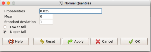
Figure 1. R Commander popup menu for Normal quantiles.
Thus, for our example, the 95% CI was ( ; our confidence in our estimate of the prevalence of diabetes in Hawaii is between 8.25% and 8.35%. Again, note that for our purposes it is OK to calculate the approximate confidence interval, replace
 with
 (for large N, the differences are observed in the 0.001 decimal).
Prevalence: R code
Rather than census counts, more likely we have results of smaller surveys. We use the epi.conf() function from the epiR package. Code adapted from example provided in epiR_descriptive vignette.
Note 1: Many R packages include vignettes, which, together with the package manual, is often helpful to understand what a function is intended to do and how to get the most from the function. R code to call all vignettes available for a package, eg, epiR:
vignette(package="epiR")
which will return names of available vignettes. For epiR, these are
epiR_descriptive Descriptive epidemiology (source, html)
epiR_surveillance Disease surveillance (source, html)
epiR_measures_of_association Measures of association (source, html)
epiR_sample_size Sample size calculations (source, html)
To call up the vignette we need for this example,
vignette("epiR_descriptive", package="epiR")
which brings up the page (assuming you installed the html help files during installation of base R).
library(epiR)
pop.Hawaii = 1.4e06
pop.Survey = 1000
type2.Survey = 80
Table.2 <- as.matrix(cbind(type2.Survey, pop.Survey))
epi.conf(Table.2, ctype = "prevalence", method = "exact", N = pop.Hawaii, design = 1, conf.level = 0.95) * 100
R output
   est    lower    upper
1    8 6.394198 9.857978
Thus, estimated Type 2 diabetes prevalence from the survey was 8, with 95% confidence interval 6.4 to 9.9 cases per 100 individuals. From 2020 U.S. Census, Hawai`i population was 1,455,271.
Note 2: Type 2 diabetes is one of many conditions for which prevalence is greater among Native Hawaiian and Pacific Islander populations compared to other groups in Hawai’i (Galinski et al 2016); these are called health disparitiess.
Incidence rate
Incidence of a disease (or condition) is defined as the occurrence of new cases of a disease. The simplest way to view incidence is that if everyone was followed for the same period of time, then incidence rate is the number of new cases since the start of the study divided by the total population. This is too simplistic, so we define a better metric called person-time. Incidence rate (IR) is then the ratio of the number of new cases divided by total person-time.
Again, incidence rate is an estimate. Therefore, we need a confidence interval. Assuming the population is large, then confidence interval can be calculated as

where IR is the incidence rate, T is the person-time, N is the number of events or cases, and z again is the standard normal probability (z ± 1.96 for 95% confidence interval).
For our example, N = 3 cases, T = 236 p-d, so 95% CI is (11.3%, 14.1%).
Person-time
Person-time can be days, months, years. Person-time is best defined with an example.
Five men join a study that will last 70 days. These men were selected because they had suffered a myocardial infarction (MI) and at the start of the study, they receive the same treatment. The outcome of the study is whether or not the subjects suffer a second MI.
The results are shown below
Subject A, 53 days
Subject B, 70 days
Subject C, 24 days
Subject D, 70 days
Subject E, 19 days
Add up the person days,

Now calculate the incidence rate,

that’s 3 cases (A, C, E) divided by 236 p-d = 0.0127. Multiply this by 1000 and we get our final answer for the incidence rate, 12.7 per person-days.
Incidence rate: R code
Incidence rate of myocardial infarction (MI) study. Code adapted from example provided in epiR_descriptive vignette.
ncas = 3
ntar = 236
tmp <- as.matrix(cbind(ncas, ntar))
epi.conf(tmp, ctype = "inc.rate", method = "exact", N = 1000, design = 1, conf.level = 0.95) * 1000
R output
          est    lower    upper
ncas 12.71186 2.621492 37.14946
The incidence rate of myocardial infarction was 12.7 (95% CI 2.6 to 37.2) cases per 1000 person-days.
Age-specific rates
Incidence or prevalence rates may be reported for specific age groups. For example, we can distinguish between number of live births in Hawaii in 2017, and numbers of live births by age group of the mother.
Age-adjusted rates
If populations with different age demographics, then the convention is to adjust the populations to a standard reference population with known age and other demographic properties. For example, the CDC uses the 2000 census as the standard population (CDC definitions, age adjustment, retrieved January 2023).
Questions
- Calculate the confidence interval of type 2 prevalence in Hawai`i with the 2020 census population value. How much did it change?
- Recalculate the confidence interval for a 99% confidence interval. Which estimate communicates greater confidence in the estimate?
Quiz
Quiz Chapter 7.2
Epidemiology basics