18.1 – Multiple Linear Regression
Introduction
Last time we introduced simple linear regression:
- one independent X variable
- one dependent Y variable.
The linear relationship between Y and X was estimated by the method of Ordinary Least Squares (OLS). OLS minimizes the sum of squared distances between the observed responses,  and responses predicted
 by the line. Simple linear regression is analogous to our one-way ANOVA — one outcome or response variable and one factor or predictor variable (Chapter 12.2).
But the world is complicated and so, our one-way ANOVA was extended to the more general case of two or more predictor (factor) variables (Chapter 14). As you might have guessed by now, we can extend simple regression to include more than one predictor variable. In fact, combining ANOVA and regression gives you the general linear model! And, you should not be surprised that statistics has extended this logic to include not only multiple predictor variables, but also multiple response variables. Multiple response variables falls into a category of statistics called multivariate statistics.
Like multi-way ANOVA, multiple regression is the extension of simple linear regression from one independent predictor variable to include two or more predictors. The benefit of this extension is obvious — our models gain realism. All else being equal, the more predictors, the better the model will be at describing and/or predicting the response. Things are not all equal, of course, and we’ll consider two complications of this basic premise, that more predictors are best; in some cases they are not.
However, before discussing the exceptions or even the complications of a multiple linear regression model, we begin by obtaining estimates of the full model, then introduce aspects of how to evaluate the model. We also introduce and whether a reduced model may be the preferred model.
R code
Multiple regression is easy to do in Rcmdr — recall that we used the general linear model function, lm(), to analyze one-way ANOVA and simple linear regression. In R Commander, we access lm() by
Rcmdr: Statistics → Fit model → Linear model
You may, however, access linear regression through R Commander
We use the same general linear model function for cases of multi-way ANOVA and for multiple regression problems. Simply enter more than one ratio-scale predictor variable and boom!
You now have yourself a multiple regression. You would then proceed to generate the ANOVA table for hypothesis testing
Rcmdr: Models → Hypothesis testing → ANOVA tables
From the output of the regression command, estimates of the coefficients along with standard errors for the estimate and results of t-tests for each coefficient against the respective null hypotheses for each coefficient are also provided. In our discussion of simple linear regression we introduced the components: the intercept, the slope, as well as the concept of model fit, as evidenced by R2, the coefficient of determination. These components exist for the multiple regression problem, too, but now we call the slopes partial regression slopes because there are more than one.
Our full multiple regression model becomes

where the coefficients β1, β2, … βn are the partial regression slopes and β0 is the Y-intercept for a model with 1 – n predictor variables. Each coefficient has a null hypothesis, each has a standard error, and therefore, each coefficient can be tested by t-test.
Now, regression, like ANOVA, is an enormous subject and we cannot do it justice in the few days we will devote to it. We can, however, walk you through a fairly typical example. I’ve posted a small data set diabetesCholStatin at the end of this page. Scroll down or click here. View the data set and complete your basic data exploration routine: make scatterplots and box plots. We think (predict) that body size and drug dose cause variation in serum cholesterol levels in adult men. But do both predict cholesterol levels?
Selecting the best model
We have two predictor variables, and we can start to see whether none, one, or both of the predictors contribute to differences in cholesterol levels. In this case, both contribute significantly. The power of multiple regression approaches is that it provides a simultaneous test of a model which may have many explanatory variables deemed appropriate to describe a particular response. More generally, it is sometimes advisable to think more philosophically about how to select a best model.
In model selection, some would invoke Occam’s razor — given a set of explanations, the simplest should be selected — to justify seeking simpler models. There are a number of approaches (forward selection, backward selection, or stepwise selection), and the whole effort of deciding among competing models is complicated with a number of different assumptions, strengths and weaknesses. I refer you to the discussion below, which of course is just a very brief introduction to a very large subject in (bio)statistics!
Let’s get the full regression model
The statistical model is

As written in R format, our model is ChLDL ~ BMI + Dose + Statin.
Note 1. BMI is ratio scale and Statin is categorical (two levels: Statin1, Statin2). Dose can be viewed as categorical, with five levels (5, 10, 20, 40, 80 mg), interval scale, or ratio scale. If we are make the assumption that the difference between 5, 10, up to 80 is meaningful, and that the effect of dose is at least proportional if not linear with respect to ChLDL, then we would treat Dose as ratio scale, not interval scale. That’s what we did here.
We can now proceed in R Commander to fit the model.
Rmdr: Statistics → Fit models → Linear model
How the model is inputted into linear model menu is shown in Figure 1.
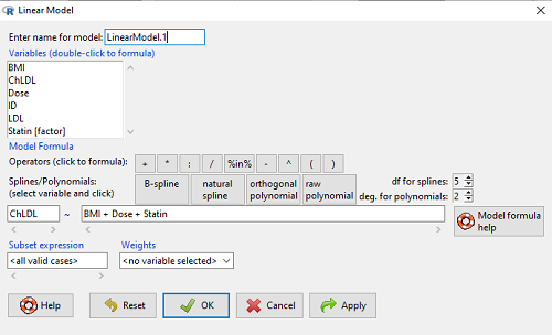
Figure 1. Screenshot of Rcmdr linear model menu with our model elements in place.
The output
summary(LinearModel.1)
Call:
lm(formula = ChLDL ~ BMI + Dose + Statin, data = cholStatins)

Residuals:
    Min      1Q  Median     3Q    Max
-3.7756 -0.5147 -0.0449 0.5038 4.3821

Coefficients:
                      Estimate Std. Error t value Pr(>|t|)
(Intercept)           1.016715   1.178430   0.863 0.39041
BMI                   0.058078   0.047012   1.235 0.21970
Dose                 -0.014197   0.004829  -2.940 0.00411 **
Statin[Statin2]       0.514526   0.262127   1.963 0.05255 .
---
Signif. codes: 0 '***' 0.001 '**' 0.01 '*' 0.05 '.' 0.1 ' ' 1

Residual standard error: 1.31 on 96 degrees of freedom
Multiple R-squared: 0.1231, Adjusted R-squared: 0.09565
F-statistic: 4.49 on 3 and 96 DF, p-value: 0.005407
Question. What are the estimates of the model coefficients (rounded)?
 = intercept = 1.017
 = slope for variable BMI = 0.058
 = slope for variable Dose = -0.014
 = slope for variable Statin = -0.515
Question. Which of the three coefficients were statistically different from their null hypothesis (p-value < 5%)?
Answer: Only coefficient was judged statistically significant at the Type I error level of 5% (p = 0.0041). Of the four null hypotheses we have for the coefficients:
 = 0
 = 0
 = 0; we only reject the null hypothesis for
Dosecoefficient. = 0)
The important take-home concept is about the lack of a direct relationship between the magnitude of the estimate of the coefficient and the likelihood that it will be statistically significant! In absolute value terms  , but was not close to statistical significance (p = 0.220).
We generate a 2D scatterplot and include the regression lines (by group=Statin) to convey the relationship between at least one of the predictors (Fig 2).
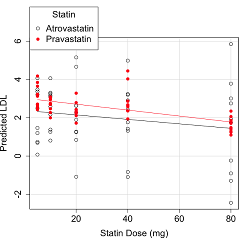
Figure 2. Scatter plot of predicted LDL against dose of a statin drug. Regression lines represent the different statin drugs (Statin1, Statin2).
Question. Based on the graph, can you explain why there will be no statistical differences between levels of the statin drug type, Statin1 (shown open circles) vs. Statin2 (shown closed red circles).
Because we have two predictors (BMI and Statin Dose), you may also elect to use a 3D-scatterplot. Here’s one possible result (Fig 3).
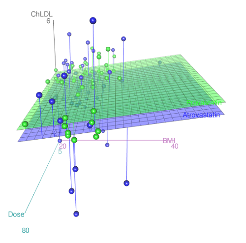
Figure 3. 3D plot of BMI and dose of Statin drugs on change in LDL levels (green Statin2, blue Statin1).
R code for Figure 3.
Graph made in Rcmdr: Graphs → 3D Graph → 3D scatterplot …
scatter3d(ChLDL~BMI+Dose|Statin, data=diabetesCholStatin, fit="linear",
residuals=TRUE, parallel=FALSE, bg="white", axis.scales=TRUE, grid=TRUE,
ellipsoid=FALSE)
Note 2: Figure 3 is a challenging graphic to interpret. I wouldn’t use it because it doesn’t convey a strong message. With some effort we can see the two planes representing mean differences between the two statin drugs across all predictors, but it’s a stretch. No doubt the graph can be improved by changing colors, for example, but I think the 2d plot Figure 2 works better). Alternatively, if the platform allows, you can use animation options to help your reader see the graph elements. Interactive graphics are very promising and, again, unsurprisingly, there are several R packages available. For this example, plot3d() of the package rgl can be used. Figure 4 is one possible version; I saved images and made animated gif.
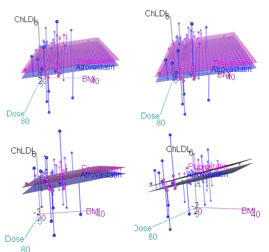
Figure 4. An example of a possible interactive 3D plot; the file embedded in this page is not interactive, just an animation.
Diagnostic plots
While visualization concerns are important, let’s return to the statistics. All evaluations of regression equations should involve an inspection of the residuals. Inspection of the residuals allows you to decide if the regression fits the data; if the fit is adequate, you then proceed to evaluate the statistical significance of the coefficients.
The default diagnostic plots (Fig 5) R provides are available from
Rcmdr: Models → Graphs → Basic diagnostics plots
Four plots are returned
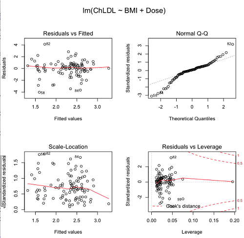
Figure 5. R’s default regression diagnostic plots.
Each of these diagnostic plots in Figure 4 gives you clues about the model fit.
- Plot of residuals vs. fitted helps you identify patterns in the residuals
- Normal Q-Q plot helps you to see if the residuals are approximately normally distributed
- Scale-location plot provides a view of the spread of the residuals
- The residuals vs. leverage plot allows you to identify influential data points.
We introduced these plots in Chapter 17.8 when we discussed fit of simple linear model to data. My conclusion? No obvious trend in residuals, so linear regression is a fit to the data; data not normally distributed Q-Q plot shows S-shape.
Interpreting the diagnostic plots for this problem
The “Normal Q-Q” plot allows us to view our residuals against a normal distribution (the dotted line). Our residuals do no show an ideal distribution: low for the first quartile, about on the line for intermediate values, then high for the 3rd and 4th quartile residuals. If the data were bivariate normal we would see the data fall along a straight line. The “S-shape” suggests log-transformation of the response and or one or more of the predictor variables.
There also seems to be a pattern in residuals vs the predicted (fitted) values. There is a trend of increasing residuals as cholesterol levels increase, which is particularly evident in the “scale-location” plot. Residuals tended to be positive at low and high doses, but negative at intermediate doses. This suggests that the relationship between predictors and cholesterol levels may not be linear, and it demonstrates what statisticians refer to as a monotonic spread of residuals.
The last diagnostic plot looks for individual points that influence, change, or “leverage” the regression — in other words, if a point is removed, does the general pattern change? If so, then the point had “leverage” and thus we need to decide whether or not to include the datum. diagnostic plots Cook’s distance is a measure of the influence of a point in regression. Points with large Cook’s distance values warrant additional checking.
The multicollinearity problem
Statistical model building is a balancing act by the statistician. While simpler models may be easier to interpret and, perhaps, to use, it is a basic truism that the more predictor variables the model includes, the more realistic the statistical model. However, each additional parameter that is added to the statistical model must be independent of all other parameters already in the model. To the extent that this assumption is violated, the problem is termed multicollinearity. If predictor variables are highly correlated, then they are essentially just linear combinations and do not provide independent evidence. For example, one would naturally not include two core body temperature variables in a statistical model on basal metabolic rate, one in degrees Fahrenheit and the other in degrees Celsius, because it is a simple linear conversion between the two units. This would be an example of structural collinearity: the collinearity is because of misspecification of the model variables. In contrast, collinearity among predictor variables may because the data are themselves correlated. For example, if multiple measures of body size are included: weight, height, length of arm, etc., then we would expect these to be correlated, ie, data multicollinearity.
Collinearity in statistical models may have a number of undesirable effects on a multiple regression model. These include
- estimates of coefficients not stable: with collinearity, values of coefficients depend on other variables in the model; if collinear predictors, then the assumption of independent predictor variables is violated.
- precision of the estimates decreases (standard error of estimates increase).
- statistical power decreases.
- p-values for individual coefficients not trust worthy.
Tolerance and Variance Inflation Factor
Absence of multicollinearity is important assumption of multiple regression. A partial test is to calculate product moment correlations among predictor variables. For example, when we calculate the correlation between BMI and Dose for our model, we get r = 0.101 (P = 0.3186), and therefore would tentatively conclude that there was little correlation between our predictor variables.
A number of diagnostic statistics have been developed to test for multicollinearity. Tolerance for a particular independent variable (Xi) is defined as 1 minus the proportion of variance it shares with the other independent variables in the regression analysis (1 − R2i) (O’Brien 2007). Tolerance reports the proportion of total variance explained by adding the Xi–th predictor variable that is unrelated to the other variables in the model. A small value for tolerance indicates multicollinearity — and that the predictor variable is nearly a perfect combination (linear) of the variables already in the model and therefore should be omitted from the model. Because tolerance is defined in relation to the coefficient of determination you can interpret a tolerance score as the unique variance accounted for by a predictor variable.
A second, related diagnostic of multicollinearity is called the Variance Inflation Factor, VIF. VIF is the inverse of tolerance.
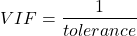
VIF shows how much of the variance of a regression coefficient is increased because of collinearity with the other predictor variables in the model. VIF is easy to interpret: a tolerance of 0.01 has a VIF of 100; a tolerance of 0.1 has a VIF of 10; a tolerance of 0.5 has a VIF of 2, and so on. Thus, small values of tolerance and large values of VIF are taken as evidence of multicollinearity.
Rcmdr: Models → Numerical diagnostics → Variation-inflation factors
vif(RegModel.2)
      BMI     Dose
1.010256 1.010256
A rule of thumb is that if VIF is greater than 5 then there is multicollinearity; with VIF values close to one we would conclude, like our results from the partial correlation estimate above, that there is little evidence for a problem of collinearity between the two predictor variables. They can therefore remain in the model.
Solutions for multicollinearity
If there is substantial multicollinearity then you cannot simply trust the estimates of the coefficients. Assuming that there hasn’t been some kind of coding error on your part, then you may need to find a solution. One solution is to drop one of the predictor variables and redo the regression model. Another option is to run what is called a Principal Components Regression (PCR). One takes the predictor variables and runs a Principal Component Analysis to reduce the number of variables, then the regression is run on the PCA components. By definition, the PCA components are independent of each other. Another option is to use ridge regression approach.
Note 3. Principal Component Analysis (PCA) is a dimensionality reduction technique that finds new uncorrelated variables (principal components) by maximizing variance. Principal Component Regression (PCR) uses PCA as a preprocessing step to create a regression model. The key difference is that PCA is an unsupervised method for data transformation, whereas PCR is a supervised regression technique that uses the components from PCA to predict an outcome. It’s probably not a great idea to use the acronym PCR in our biology reports; easily confused with polymerase chain reaction
Like any diagnostic rule, however, one should not blindly apply a rule of thumb. A VIF of 10 or more may indicate multicollinearity, but it does not necessarily lead to the conclusion that the linear regression model requires that the researcher reduce the number of predictor variables or analyze the problem using a different statistical method to address multicollinearity as the sole criteria of a poor statistical model. Rather, the researcher needs to address all of the other issues about model and parameter estimate stability, including sample size. Unless the collinearity is extreme (like a correlation of 1.0 between predictor variables!), larger sample sizes alone will work in favor of better model stability (by lowering the sample error) (O’Brien 2007).
Questions
- Write up three learning outcomes for this page. Hint: Point your favorite generative AI to this page and ask for help.
- Please explain why the magnitude of the slope is not the key to statistical significance of a slope? Hint: look at the equation of the t-test for statistical significance of the slope.
- Consider the following scenario. A researcher measures his subjects multiple times for blood pressure over several weeks, then plots all of the values over time. In all, the data set consists of thousands of readings. He then proceeds to develop a model to explain blood pressure changes over time. What kind of collinearity is present in his data set? Explain your choice.
- We noted that
Dosecould be viewed as categorical variable. ConvertDoseto factor variable (fDose) and redo the linear model. Compare the summary output and discuss the additional coefficients.- Use Rcmdr: Data → Manage variables in active data set → Convert numeric Variables to Factors to create a new factor variable
fDose. It’s ok to use the numbers as factor levels.
- Use Rcmdr: Data → Manage variables in active data set → Convert numeric Variables to Factors to create a new factor variable
- We flagged the change in LDL as likely to be not normally distributed. Create a log10-transformed variable for
ChLDLand perform the multiple regression again.- Write the new statistical model
- Obtain the regression coefficients — are they statistically significant?
- Run basic diagnostic plots and evaluate for
Quiz Chapter 18.1
Multiple Linear Regression
Data set
| ID | Statin | Dose | BMI | LDL | ChLDL |
|---|---|---|---|---|---|
| 1 | Statin2 | 5 | 19.5 | 3.497 | 2.714778 |
| 2 | Statin1 | 20 | 20.2 | 4.268 | 1.276483 |
| 3 | Statin2 | 40 | 20.3 | 3.989 | 2.677377 |
| 4 | Statin2 | 20 | 20.3 | 3.502 | 2.430618 |
| 5 | Statin2 | 80 | 20.4 | 3.766 | 1.79463 |
| 6 | Statin2 | 20 | 20.6 | 3.44 | 2.234295 |
| 7 | Statin1 | 20 | 20.7 | 3.414 | 2.635305 |
| 8 | Statin1 | 10 | 20.8 | 3.222 | 0.809181 |
| 9 | Statin1 | 10 | 21.1 | 4.04 | 3.259599 |
| 10 | Statin1 | 40 | 21.2 | 4.429 | 1.763997 |
| 11 | Statin1 | 5 | 21.2 | 3.528 | 3.369377 |
| 12 | Statin1 | 40 | 21.5 | 3.01 | -0.827154 |
| 13 | Statin2 | 20 | 21.6 | 3.393 | 2.11172 |
| 14 | Statin1 | 10 | 21.7 | 4.512 | 3.166238 |
| 15 | Statin1 | 80 | 22 | 5.449 | 3.00833 |
| 16 | Statin2 | 10 | 22.2 | 4.03 | 3.05013 |
| 17 | Statin2 | 40 | 22.2 | 3.911 | 2.646034 |
| 18 | Statin2 | 10 | 22.2 | 3.724 | 2.945656 |
| 19 | Statin1 | 5 | 22.2 | 3.238 | 3.209584 |
| 20 | Statin2 | 10 | 22.5 | 4.123 | 3.088763 |
| 21 | Statin1 | 20 | 22.6 | 3.859 | 5.152548 |
| 22 | Statin1 | 10 | 23 | 4.926 | 2.58483 |
| 23 | Statin2 | 20 | 23 | 3.512 | 2.291975 |
| 24 | Statin1 | 5 | 23 | 3.838 | 1.469 |
| 25 | Statin2 | 20 | 23.1 | 3.548 | 2.34079 |
| 26 | Statin1 | 5 | 23.1 | 3.424 | 1.204346 |
| 27 | Statin1 | 40 | 23.2 | 3.709 | 3.238179 |
| 28 | Statin1 | 80 | 23.2 | 4.786 | 2.748643 |
| 29 | Statin1 | 20 | 23.3 | 4.103 | 1.250082 |
| 30 | Statin1 | 40 | 23.4 | 3.341 | 1.432292 |
| 31 | Statin1 | 10 | 23.5 | 3.828 | 1.381755 |
| 32 | Statin2 | 10 | 23.8 | 4.02 | 3.039187 |
| 33 | Statin1 | 20 | 23.8 | 3.942 | 0.848328 |
| 34 | Statin2 | 20 | 23.8 | 2.89 | 1.721163 |
| 35 | Statin1 | 80 | 23.9 | 3.326 | 1.939346 |
| 36 | Statin1 | 10 | 24.1 | 4.071 | 3.090741 |
| 37 | Statin1 | 40 | 24.1 | 4.222 | 1.322305 |
| 38 | Statin2 | 10 | 24.1 | 3.44 | 2.472223 |
| 39 | Statin1 | 5 | 24.2 | 3.507 | 0.076817 |
| 40 | Statin2 | 20 | 24.2 | 3.647 | 2.425758 |
| 41 | Statin2 | 80 | 24.3 | 3.812 | 1.710575 |
| 42 | Statin2 | 40 | 24.3 | 3.305 | 1.940572 |
| 43 | Statin2 | 5 | 24.3 | 3.455 | 2.502214 |
| 44 | Statin2 | 5 | 24.4 | 4.258 | 3.228008 |
| 45 | Statin1 | 5 | 24.4 | 4.16 | 3.477747 |
| 46 | Statin2 | 80 | 24.4 | 4.128 | 2.063247 |
| 47 | Statin1 | 80 | 24.5 | 4.507 | 3.784422 |
| 48 | Statin1 | 5 | 24.5 | 3.553 | 0.695709 |
| 49 | Statin2 | 10 | 24.5 | 3.616 | 2.69987 |
| 50 | Statin2 | 80 | 24.6 | 3.372 | 1.300401 |
| 51 | Statin2 | 80 | 24.6 | 3.667 | 1.418109 |
| 52 | Statin2 | 5 | 24.7 | 3.854 | 3.126671 |
| 53 | Statin1 | 80 | 24.7 | 3.32 | -1.286439 |
| 54 | Statin2 | 5 | 24.7 | 3.756 | 2.423664 |
| 55 | Statin1 | 40 | 24.8 | 4.398 | 2.907473 |
| 56 | Statin2 | 40 | 24.9 | 3.621 | 2.362429 |
| 57 | Statin1 | 10 | 25 | 3.17 | 1.264656 |
| 58 | Statin1 | 80 | 25.1 | 3.424 | -2.436908 |
| 59 | Statin2 | 10 | 25.1 | 3.196 | 2.001465 |
| 60 | Statin2 | 80 | 25.2 | 3.367 | 1.100704 |
| 61 | Statin1 | 80 | 25.2 | 3.067 | -0.23154 |
| 62 | Statin1 | 20 | 25.3 | 3.678 | 4.662866 |
| 63 | Statin2 | 5 | 25.5 | 4.077 | 2.611705 |
| 64 | Statin1 | 20 | 25.5 | 3.678 | 2.633053 |
| 65 | Statin2 | 5 | 25.6 | 4.994 | 4.180082 |
| 66 | Statin1 | 20 | 25.8 | 3.699 | 1.899031 |
| 67 | Statin1 | 10 | 25.9 | 3.507 | 4.063757 |
| 68 | Statin2 | 20 | 25.9 | 3.445 | 2.303761 |
| 69 | Statin1 | 5 | 26 | 4.025 | 2.501427 |
| 70 | Statin1 | 5 | 26.3 | 3.616 | 0.740863 |
| 71 | Statin2 | 40 | 26.4 | 3.937 | 2.573321 |
| 72 | Statin2 | 40 | 26.4 | 3.823 | 2.363839 |
| 73 | Statin1 | 10 | 26.7 | 4.46 | 2.174198 |
| 74 | Statin2 | 5 | 26.7 | 5.03 | 3.845271 |
| 75 | Statin2 | 10 | 26.7 | 3.73 | 2.708896 |
| 76 | Statin2 | 10 | 26.7 | 3.232 | 2.272627 |
| 77 | Statin1 | 80 | 26.8 | 3.693 | 1.751169 |
| 78 | Statin2 | 80 | 27 | 4.108 | 1.86131 |
| 79 | Statin2 | 40 | 27.2 | 5.398 | 4.028977 |
| 80 | Statin2 | 80 | 27.2 | 4.517 | 2.348903 |
| 81 | Statin2 | 20 | 27.3 | 3.901 | 2.790047 |
| 82 | Statin1 | 80 | 27.3 | 5.247 | 5.848545 |
| 83 | Statin2 | 80 | 27.4 | 3.507 | 1.247863 |
| 84 | Statin1 | 20 | 27.4 | 3.807 | -1.079928 |
| 85 | Statin2 | 80 | 27.6 | 3.574 | 1.486789 |
| 86 | Statin1 | 40 | 27.8 | 4.16 | 2.427753 |
| 87 | Statin2 | 20 | 28 | 4.501 | 3.284648 |
| 88 | Statin2 | 5 | 28.1 | 3.621 | 2.699007 |
| 89 | Statin1 | 40 | 28.2 | 3.652 | -1.091256 |
| 90 | Statin2 | 40 | 28.2 | 4.191 | 2.874231 |
| 91 | Statin2 | 40 | 28.4 | 5.791 | 4.445454 |
| 92 | Statin1 | 40 | 28.6 | 4.698 | 3.202874 |
| 93 | Statin1 | 5 | 29 | 4.32 | 4.070753 |
| 94 | Statin2 | 10 | 29.1 | 3.776 | 2.751281 |
| 95 | Statin2 | 5 | 29.2 | 4.703 | 3.64949 |
| 96 | Statin2 | 40 | 29.9 | 4.128 | 2.864691 |
| 97 | Statin1 | 40 | 30.4 | 4.693 | 4.983704 |
| 98 | Statin1 | 20 | 30.4 | 4.123 | 2.273898 |
| 99 | Statin1 | 80 | 30.5 | 3.921 | -0.903438 |
| 100 | Statin1 | 10 | 36.5 | 4.175 | 3.311437 |
Chapter 18 contents
15 – Nonparametric tests
Introduction
T-tests and ANOVA are members of a statistical family of tests called parametric tests. Parametric tests assume that the
- sample of observations come from a particular probability distribution, eg, normal distribution.
- samples among groups have equal variances.
Assumptions for parametric tests were introduced in Chapter 13. In the case of the t-test and ANOVA, we assume that the samples come from a normal probability distribution and that the probabilities of the test statistic follow the t distribution or the F distribution, respectively.
Providing these assumptions hold, we can then proceed to interpret our results as if we are talking about the population as a whole from which the samples were selected.
In other words, the t-test asks (infers) about properties of a population, hence, we are asking about parameters of the population.
T-tests, ANOVA, and other parametric tests are designed to work with quantitative ratio-scale data types. If the data are of this type and the probability distribution is known, they are the best tests to use… they allow you to make conclusions about experiments at a defined Type I error rate of 5%.
But what if you can’t assume that distribution? Your options include
- transforming the data so as the data better meet the assumptions of parametric tests.
- apply nonparametric statistical tests.
- use of distribution-free resampling methods like the bootstrap as an alternative. Bootstrapping offers methods to estimate confidence intervals and perform hypothesis tests without relying on theoretical distributions.
Here, we introduce some of the classic nonparametric statistics as an alternative to parametric tests. Bootstrapping is introduced in Chapter 19.
Nonparametric tests make fewer assumptions
Nonparametric tests do not make the assumption about a particular distribution — distribution free tests — nor are they used to make inferences about population parameters. Instead, nonparametric tests are used when the data type are ranks (ordinal). Now, when you think about it, all quantitative data can be converted to ranks. Hence, this is the argument for why there are nonparametric alternatives for tests like the t-test. There are a number of nonparametric alternatives to parametric tests and we’ll list several in this chapter (randomization methods like the bootstrap, see Ch19.2, are also considered nonparametric — unless, of course the data is assumed to come from a particular distribution, then it’s called parametric bootstrap). Another nonparametric option is to run a permutation test on the data.
However, nonparametric tests lack statistical power
One downside for nonparametric tests is that they tend to have less statistical power compared to the parametric alternatives (see Chapter 11 for review of Statistical Power). Thus, nonparametric tests tend to have higher Type II rates of error — they fail to properly reject the null hypothesis when they should. This problem tends to be less important for large sample sizes.
Note 1: Instead of transformations or other ad hoc manipulations of the data, modern statistical approaches favor modeling the error structure of the data within a Generalized Linear Model framework (St.-Pierre et al 2018). The advantage of the model approach is that parameter estimation occurs on the raw data. Use of transformations may, however, remain a better choice. While statistically justified, the generalized linear model approach may also tend to have higher rates of Type II error compared to simple transformations.
Thus, this chapter covers some of the more popular nonparametric alternative tests. Chapter 19 – Distribution free statistical methods, highlights use of permutation and randomization approaches, which also are alternatives to parametric tests.
Note 1: Bootstrapping can be either parametric or non-parametric. Non-parametric bootstrapping makes no assumptions about the data’s underlying distribution, while the parametric approach requires assuming a specific distribution.
Suggested homework
Homework 9: Common nonparametric tests.
Quizzes in this chapter
A total of 18 questions among the several subchapters, a mix of true or false and multiple choice question format.
Chapter 15 contents
11.5 – Power analysis in R
Introduction
In R, you can estimate the
- Statistical power — how probable are you to correctly reject the null hypothesis
- Sample size — how many samples or observations must we get to have a reasonable chance to correctly reject a null hypothesis
- Effect size (minimum difference) — how different are the two samples?
Power analysis is recommended before conducting an experiment, but it is also valuable after an experiment.
Base R and pwr package
In Chapter 11.4 we presented functions from BSDA package. R (but not Rcmdr — see the EZR plugin described below) provides all of the basic power analysis we would need for t-tests, one-way ANOVA, etc. as part of the base installation (Everitt and Hothorn 2007). However, the package pwr, provides a more comprehensive package for power analysis. Load and install the R package pwr.
For example, to determine the number of samples for an independent sample t-test (two-tailed), the function is pwr.t.test().
pwr.t.test(n = NULL, d = NULL, sig.level = 0.05, power = NULL, type = c("two.sample", "one.sample", "paired"), alternative = c("two.sided", "less","greater"))
Table 1. Components of pwr.t.test().
| n | Number of observations (per sample) |
| d | Effect size |
| sig.level | Significance level (Type I error probability) |
| power | Power of test (1 minus Type II error probability) |
| type | Type of t test : one- two- or paired-samples |
| alternative | a character string specifying the alternative hypothesis, must be one of “two.sided” (default), “greater” or “less |
The basic question is, how many samples (observations) do I need for each group (k) at Type I error of 5% and type II error of 95%?
To run the test, you fill in all of the “NULL” except the one you wanted solved (ie, leave n = NULL).
For an effect size of 0.2, Type I error (significance level) of 5%, and 95% power, how many observations per group do we need for our study?
pwr.t.test(n = NULL, d =0.2, sig.level = 0.05, power = 0.95, type = c("two.sample"), alternative = c("two.sided"))
Two-sample t test power calculation
n = 650.6974
d = 0.2
sig.level = 0.05 power = 0.95 alternative = two.sided
note: n is number “n” in each group
Wow!
The R pwr package is not as convenient as it could be (have to load and run R scripts): for intro level, try one of the many online sites. Here is a website which can help with power analysis based on a variety of situations. The programs are java-coded. http://www.stat.uiowa.edu/~rlenth/Power/index.html
Note 1: You see what I just did? I “complained” about a free program’s performance! Don’t do that — what I mean by this is that there’s a learning curve with the pwr package, and there are other options to explore outside of the R programming world.
Power analysis with the EZR Rcmdr plugin
The EZR plugin for R Commander provides some facilities to do power analysis (Kanda 2013). First, download and install the RcmdrPlugin.EZR package. The EZR plugin for Rcmdr, RcmdrPlugin.EZR, provides an interface to explore power analyses, along with many other statistical functions (Kanda 2013). After loading the plugin to Rcmdr, additional drop down options are added to the menu bar (Fig 1).
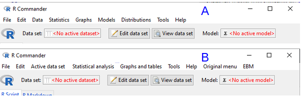
Figure 1. Screenshot of Rcmdr menu bar with (A) and without (B) the EZR plugin.
I’ll demonstrate use of the plugin, but I recommend that you use pwr.t.test() instead. Although EZR uses a drop-down menu system it has many more functions than we need to solve this simple exercise. Thus, EZR is not any easier to apply for what we need here. That said, off we go.
Worked example
Consider a simple data set, wheel running performance in 24-hours for three strains of mice.
Table 2. Wheel running performance in 24-hours for three strains of mice.
| Mouse strain | Average | Standard deviation | n |
| AKR | 395 | 169.7 | 20 |
| CBA | 855 | 77.8 | 20 |
| C57BL/10 | 1135 | 63.6 | 20 |
Consider two groups of mice, AKR vs CBA for wheel running performance. How many samples needed to show a statistical difference for ?
Calculate the pooled standard deviation and calculate a difference between the means (the effect size) for which you wish to say is statistically different. For this example, 132.0 and 460, respectively. With EZR plugin installed and active in R Commander (Fig 2), select
Rcmdr: Statistical analysis → Calculate sample size → Calculate sample size for comparison between two means
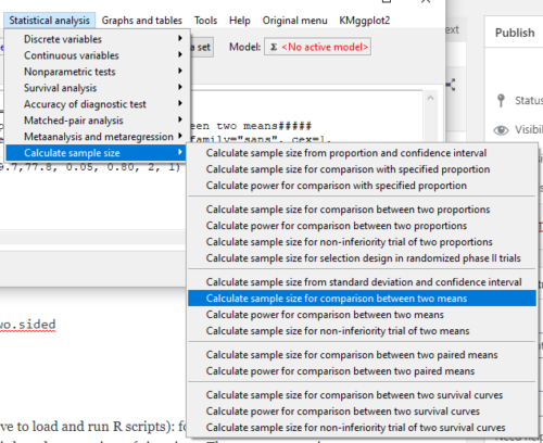
Figure 2. Screenshot of Rcmdr EZR plugin menu.
Select Calculate sample size for comparison between two means, enter the effect size (difference in sample means), standard deviation in each group (or a single value for pooled standard deviation) (Fig 3).
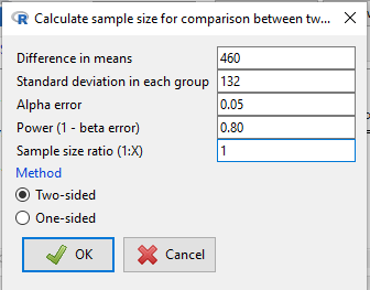
Figure 3. Screenshot of EZR Menu to obtain sample size for the comparison between two (sample) means.
R output from EZR Calculate sample size for comparison between two means
Assumptions
Difference in means 460
Standard deviation 132
Alpha 0.05
two-sided
Power 0.8
N2/N1 1

Required sample size Estimated
N1 2
N2 2
Questions
Recall lizard body mass data set from Chapter 10.1
Geckos <- c(3.186, 2.427, 4.031, 1.995)
Anoles <- c(5.515, 5.659, 6.739, 3.184)
Enter the data into an R data.frame, carry out the independent sample t-test, then
- Calculate power for the comparison between the two means
- Calculate sample size needed to achieve 95% power.
Quiz Chapter 11.5
Power analysis in R
Chapter 11 contents
11.2 – Prospective and retrospective power
Introduction
Statistical power is defined as p = 1 – β. The power of a test is the probability of rejecting a Null Hypothesis when it is false. There is a relationship between Type I error and Type II error. We want β to be Large BUT β is generally not known when we are performing the statistical test. We do know that α is inversely related to β. The smaller the α value we use to Reject the Null Hypothesis the MORE likely we will accept a FALSE Null Hypothesis. If we make α very small (one in a billion) then there would be a very HIGH chance of accepting α Null Hypothesis when it is false (β is high). Note that this is the same discussion that we had about sensitivity of an assay test and the specificity of that assay. If we increase sensitivity of the assay such that we approach 100% detection of the true positives will be detected, we necessarily will increase the number of false positives. The BEST way to reduce both Type I and Type II statistical errors is to INCREASE the sample size!
Power of any statistical test (Z test, T-test, one-way ANOVA…) can be determined BEFORE the experiment is done and data are gathered or AFTER an experiment is completed (Cohen 1992). For now, here’s our first real taste of experimental design — we can evaluate how we can make an experiment to test a particular hypothesis.
Prospective power analysis
Good experimental design should include considerations of power. The design will determine the size of the effect your experiment will be able to detect and the probability of correctly rejecting the null hypothesis. In large part, this will involve decisions of sample size and ways to reduce error variance. Moreover, one needs to decide ahead of time, just how large of an effect does the experiment need to detect??? A one-gram change in body mass before and after a diet treatment is of no concern whatsoever if your study subjects are African elephants, but may be a very large effect for a study of shrews!
Retrospective power analysis
Power analysis can also be done after a test has been conducted and the null hypothesis failed to be rejected. One interpretation that might follow from a retrospective power analysis is that, if the study had low power, the lack of statistical significance could be viewed merely the result of low sample size. However, as forcefully argued Hoenig and Heisey (2001) (see also Colegrave and Ruxton 2003), retrospective or posthoc power tests provide no more information than does the p-value and therefore are redundant. At worse, retrospective power analysis can be misleading as to how well it predicts true power, ie, biologically meaningful differences between different treatment groups (Zhang et al., 2019).
Prospective power is more than effect size between groups
Large effect size, ie, large differences between groups, is not necessarily evidence of important biological differences. The concept of power has limits (Hoenig and Heisey 2001 Yuan and Maxwell 2005). On the other hand, small effect sizes can be important differences, especially if the treatment is difficult or expensive. We work through this conclusion with an example, but emphasize here that providing confidence intervals for the effect size (Colegrave and Ruxton 2003). Suppose the null hypothesis was not rejected from a two sample independent t-test conducted on the test of differences in plant height between two samples of `ohi’a found at different elevations. Was there really no difference or was the sample size in the study simply too small to detect the real and important difference between the samples? By conducting a power analysis, one can determine if a slight increase in sample size would have yielded a statistically significant difference, or it may suggest that the effect size is small enough not to warrant further attention.
R code
Three options for conducting power analysis in R are provided in section 11.5
Questions
- Assuming that a study was done by randomly sampling from a population, and the the primary outcome is found not statistically different with p-value 0.13 between placebo and treatment groups, what can be gained made from a retrospective power analysis?
Quiz Chapter 11.2
Prospective and retrospective power
Chapter 11 contents
- Introduction
- What is Statistical Power?
- Prospective and retrospective power
- Factors influencing statistical power
- Two sample effect size
- Power analysis in R
- References and suggested readings
8.2 – The controversy over proper hypothesis testing
Introduction
Over the next several chapters we will introduce and develop an approach to statistical inference, which has been given the title “Null Hypothesis Significance Testing” or NHST.
In outline, NHST proceeds with
- statements of two hypotheses, a null hypothesis, HO, and an alternative hypothesis, HA
- calculate a test statistic comparison of the null hypothesis (assuming some characteristic of data).
- The value of the test statistic is to be compared to a critical value for the test, identified for the assumed probability distribution at associated degrees of freedom for the statistical function, and assigned Type I error rate.
We will expand on these statements later in this chapter, so stay with me here. Basically, the null hypothesis is often a statement like the responses of subjects from the treatment and control groups are the same, eg, no treatment effect. Note that the alternative hypothesis, eg, hypertensive patients receiving hydalazine for six weeks have lower systolic blood pressure than patients receiving a placebo (Campbell et al 2011), would be the scientific hypothesis we are most interested in. But in the Frequentist NHST approach we test the null hypothesis, not the alternative hypothesis. This framework over proper hypothesis testing is the basis of the Bayesian vs Frequentist controversy.
Consider the independent sample t-test (see Chapter 8.5 and 8.6), our first example of a parametric test.

After plugging in the sample means and the standard error for the difference between the means, we calculate t, the test statistic of the t-test. The critical value is treated as a cut-off value in the NHST approach. We have to set our Type I error rate before we start the experiment, and we have available the degrees of freedom for the test, which follows from the sample size. With these in hand, the critical value is found by looking in the t-table of probabilities (or better, use R).
For example, what is the critical value of t-test with 10 degrees of freedom and Type I error of 5%?
In Rcmdr, choose Distributions → Continuous distributions → t distribution → t quantiles… (Fig 1).
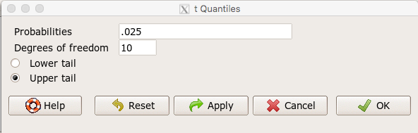
Figure 1. Screenshot t-quantiles Rcmdr menu.
Note we want Type I equal to 5%. Since there are two tails for our test, we divide 5% by two and enter 0.025 and select the Upper tail.
R output
> qt(c(.025), df=10, lower.tail=FALSE)
[1] 2.228139
which is the same thing we would get if we look up on the t-distribution table (Fig 2).
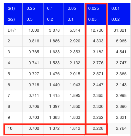
Figure 2. Screenshot of portion of t-table with highlighted (red) critical value for 10 degrees of freedom.
If the test statistic is greater than the critical value, then the conclusion is that the null hypothesis is to be provisionally rejected. We would like to conclude that the alternative hypothesis should favored as best description of the results. However, we cannot — the p-value simply tells us how likely our results would be obtained and if the null hypothesis was true. Confusingly, however, you cannot interpret the p-value as telling you the probability (how likely) that the null hypothesis is true. If however the test statistic is less than the critical value, then the conclusion is that the null hypothesis is to be provisionally accepted.
The test statistic can be assigned a probability or p-value. This p-value is judged to be large or small relative to an a priori error probability level cut off called the Type I error rate. Thus, NHST as presented in this way may be thought of as a decision path — if the test statistic is greater than the critical value, which will necessarily mean that the p value is less than the Type I error rate, then we make one type of conclusion (reject HO). In contrast, if the test statistic is less than the critical value, which will mean that the p-value associated with the test statistic will be greater than the Type I error rate, then we conclude something else about the null hypothesis. The various terms used in this description of NHST were defined in Chapter 8.3.
Sounds confusing, but, you say, OK, what exactly is the controversy? The controversy has to do whether the probability or p-value can be interpreted as evidence for a hypothesis. In one sense, the smaller the p-value, the stronger the case to reject the null hypothesis, right? However, just because the p-value is small — the event is rare — how much evidence do we have that the null hypothesis is true? Not necessarily, and so we can only conclude that the p-value is one part of what we may need for evidence for or against a hypothesis (hint: part of the solution is to consider effect size — introduced in Chapter 9.2 — and the statistical power of the test, see Ch 11). What follows was covered by Goodman (1988) and others. Here’s the problem. Consider tossing a fair coin ten times, with the resulting trial yielding nine out of ten heads (eg, a value of one, with tails equal to zero).
R code
set.seed(938291156)
rbinom(10,1,0.5)
[1] 1 1 1 1 1 1 0 1 1 1
Note 1: To get this result I repeated rbinom() a few times until I saw this rare result. I then used the command get_seed() from mlr3misc package to retrieve current seed of R’s random number generator. Initialize the random seed with the command set.seed().
While rare (binomial probability 0.0098), do we take this as evidence that the coin is not fair? By itself, the p-value provides no information about the alternative hypothesis. More about p-value follows below in sections What’s wrong with the p-value from NHST? and The real meaning and interpretation of P-values.
Statisticians have been aware of limitations of the NHST approach for years (see editorial by Wasserstein et al 2019), but only now is the message getting attention of researchers in the biosciences and other fields. In fact, the New York Times recently had a nice piece by F.D. Flam (“The Odds, Continually Updated,” 29 Sep 2014) on the controversy and the Bayesian alternative. Like most controversies there are strong voices on either side, and it can be difficult as an outsider to know which position to side with (Fig 3).
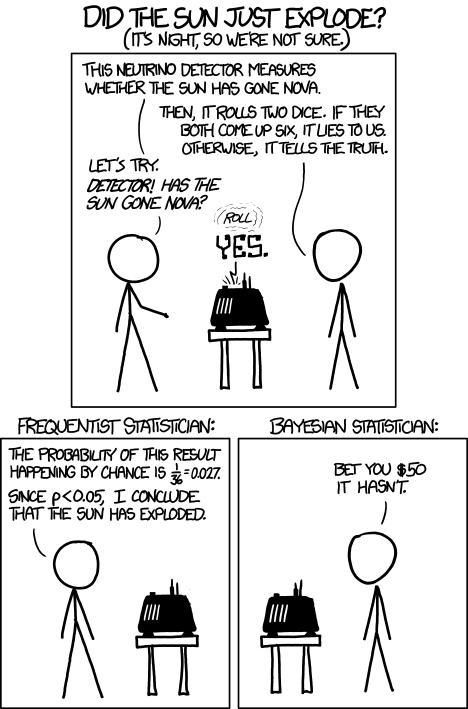
Figure 3. “Frequentists vs. Bayesians,” https://xkcd.com/1132/.
The short answer is — as you go forward do realize that there is a limitation to the frequentist approach and to be on the correct side of the controversy, you need to understand what you can conclude from statistical results. NHST is by far the most commonly used approached in biosciences (eg, out of 49 research articles I checked from four randomly selected issues of 2015 PLoS Biology, 43 used NHST, 2 used a likelihood approach, none used Bayesian statistics). The NHST is also the overwhelming manner in which we teach introductory statistics courses (eg, checking out the various MOOC courses at www.coursera.org, all of the courses related to Basic Statistics or Inferential Statistics are taught primarily from the NHST perspective). However, right from the start I want to emphasize the limits of the NHST approach.
If the purpose of science is to increase knowledge, then the NHST approach by itself is an inadequate framework at best, and in the eyes of some, worthless! Now, I think this latter sentiment is way over the top, but there is a need for us to stop before we begin, in effect, to set the ground rules for what can be interpreted from the NHST approach. The critics of NHST have a very important point, and that needs to be emphasized, but we will also defend use and teaching of this approach so that you are not left with the feeling that somehow this is a waste of time or that you are being cheated from learning the latest knowledge on the subject of statistical inference. The controversy hinges on what probability means.
P-values, statistical power, and replicability of research findings
Science, as a way of knowing how the world works, is the only approach that humans have developed that has been empirically demonstrated to work. Note how I narrowed what science is good for — if we are asking questions about the material world, then science should be your toolkit. Some (eg, Platt 1964), may further argue that there are disciplines in science that have been more successful (eg, molecular biology) than others (eg, evolutionary psychology, cf discussion in Ryle 2006) at advancing our knowledge about the material world. However, to the extent research findings are based solely on statistical results there is reason to believe that many studies in fact have not recovered truth (Ioannidis 2005).
In a review of genomics, it was reported that findings of gene expression differences by many microarray studies were not reproducible (Allison et al 2006). The consensus is that confidence in the findings should hold only for the most abundant gene transcripts of many microarray gene expression profiling studies, a conclusion that undercuts the perceived power of the technology to discover new causes of disease and the basis for individual differences for complex phenotypes. Note that when we write about failure of research reproducibility we are not including cases of alleged fraud (Carlson 2012 on Duke University oncogenomics case), we are instead highlighting that these kinds of studies often lack statistical power; hence, when repeated, the experiments yield different results.
Frequentist and Bayesian Probabilities
Turns out there is a lot of philosophical problems around the idea of “probability,” and three schools of thought. In the Fisherian approach to testing, the researcher devises a null hypothesis, HO, collects the data, then computes a probability (p-value) of the result or outcome of the experiment. If the p-value is small, then this is inferred as little evidence in support of the null hypothesis.
In the Frequentists’ approach, the one we are calling NHST, the researcher devises two hypotheses, the null hypothesis, HO, and an alternative hypothesis, HA. The results are collected from the experiment and, prior to testing, a Type I error rate (α, chance) is defined. The Type I error rate is set to some probability and refers to the chance of rejecting the null hypothesis purely due to random chance. The Frequentist then computes a p-value of result of the experiment and applies a decision criterion: If P-value greater than Type I error rate, then provisionally accept null hypothesis. In both the Fisherian and Frequentist approaches, the probability, again defined at the relative frequency of an event over time, is viewed as a physical, objective and well-defined set of values.
Bayesian approach: based on Bayes conditional probability, one identifies the prior (subjective) probability of an hypothesis, then, adjusts the prior probability (down or up) as new results come in. The adjusted probability is known as posterior probability and it is equal to the likelihood function for the problem. The posterior probability is related to the prior probability and this function can be summarized by the Bayes factor as evidence the evidence against the null hypothesis. And that’s what we want, a metric of our evidence for or against the null hypothesis.
Note 2: A probability distribution function (PDF) is a function of the sample data and returns how likely that particular point will occur in the sample. The distribution is given. The likelihood function approaches this from a different direction. The likelihood function takes the data set as a given and represents how likely are the different parameters for your distribution.
We can calibrate the Bayesian probability to the frequentist p-value (Selke et al 2001; Goodman 2008; Held 2010; Greenland and Poole 2012). Methods to achieve this calibration vary, but the Fagan nomogram Held (2010) proposed is a good tool for us as we go forward. We can calculate our NHST p-value, but then convert the p-value to a Bayes factor by looking at the nomogram. I mention this here not as part of your to do list, but rather as a way past the controversy: the NHST p-value can be interpreted as a Bayesian conditional probability, but they do not test the same hypothesis.
Likelihood
Before we move on there is one more concept to introduce, that of likelihood. We describe a model (an equation) we believe can generate the data we observe. By constructing different models with different parameters (hypotheses), you generate a statistic that yields a likelihood value. If the model fits the data, then the likelihood function has a small value. The basic idea then is to compare related, but different models to see which fits the data better. We will use this approach when comparing linear models when we introduce multiple regression models in Chapter 18.
What’s wrong with the p-value from NHST?
Well, really nothing is “wrong” with the p-value.
Where we tend to get into trouble with the p-value concept is when we try and interpret it. See below, Why is this important to me as a beginning student? The p-value is not evidence for a position, it is a statement about error rates. The p-value from NHST can be viewed as the culmination of a process that is intended to minimize the chance that the statistician makes an error.
In Bayesian terms, the p-value from NHST is the probability that we observe the data (eg, the differences between two sample means), assuming the null hypothesis is true. If we want to interpret the p-value in terms of evidence for a proposition, then we want the conditional error probability.
Sellke et al (2001) provided a calibration of p-values and, assuming that the prior probabilities of the null hypothesis and the alternative hypothesis are equal (that is, that each have a prior probability of 0.5), by using a formula provided by them (equation 3), we can correct our NHST p-value into a probability that can be interpreted as evidence in favor of the interpretation that the null hypothesis is true. In Bayesian terms this is called the posterior probability of the null hypothesis. The formula is

where e is Euler’s number, the base of the natural logarithm (ln), and p is the p-value from the NHST. This calibration works as long as  (Sellke et al 2001).
By convention we set the Type I error at 5% (cf Cohen 1994). How strong of evidence is a p-value near 5% against the null hypothesis being true, again, under the assumption that the prior probability of the null hypothesis being true is 50%? Using the above formula I constructed a plot of the calculated conditional error probability values against p-values (Fig 4).
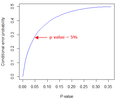
Figure 4. Conditional error probability values plotted against p-values.
As you can see, a p-value of 5% is not strong evidence at just 0.289. Not until p-values are smaller than 0.004 does the conditional error probability value dip below 0.05, suggesting strong evidence against the null hypothesis being true.
R note: For those of you keeping up with the R work, here’s the code for generating this plot. Text after “#” are comments and are not interpreted by R.
At the R prompt type each line
NHSTp = seq(0.00001,0.37,by=0.01)      #create a sequence of numbers between 0.0001 and 0.37 with a step of 0.01
CEP = (1+(-1*exp(1)*NHSTp*log(NHSTp))^-1)^-1    #equation 3 from Sellke et al 2001
plot(NHSTp,CEP,xlab="P-value", ylab="Conditional error probability",type="l",col="blue")
Why is this important to me as a beginning student?
As we go forward I will be making statements about p-values and Type I error rates and null hypotheses and even such things as false positives and false negative. We need to start to grapple with what exactly can be said by p-values in the context of statistical inference, and to recognize that we will sometimes state conclusions that cut some corners when it comes to interpreting p-values. And yet, you (and all consumers of statistics!) are expected to recognize what p-values mean. Always.
The real meaning and interpretation of P-values
This is as good of a time as any to make some clarification about the meaning of p-value and the whole inference concept. Fisher indeed came up with the concept of the p-value, but its use as a decision criterion owes to others and Fisher disagreed strongly with use of the p-value in this way (Fisher 1955; Lehmann 1993).
Here are some common p-value corner-cutting statements to avoid using (after Goodman 2008; Held 2010). P-values are sometimes interpreted, incorrectly, as
Table. Incorrect interpretations of NHST p-values
- the probability of obtaining the observed data under the assumption of no real effect
- an observed type-I error rate
- the false discovery rate, ie, the probability that a significant finding is a “false positive”
- the (posterior) probability of the null hypothesis.
So, if p-values don’t mean any of these things, what does a p-value mean? It means that we begin by assuming that there is no effect of our treatments — the p-value is then the chance we will get as large of a result (our test statistic) and the null hypothesis is true. Note that this definition does not include a statement about evidence of the null hypothesis being true. To get evidence of “truth” we need additional tools, like the Bayes Factor and the correction of the p-value to the conditional error probability (see above). Why not dump all of the NHST and go directly to a Bayesian perspective, as some advise? The single best explanation was embedded in the assumption we made about the prior probability in order to calculate the conditional error probability. We assumed the prior probability was 50%. For many, many experiments, that is simply a guess. The truth is we generally don’t know what the prior probability is. Thus, if this assumption is incorrect, then the justification for the formula by Sellke et al (2001) is weakened, and we are no closer to establishing evidence than before.
The take home message is that it is unlikely that a single experiment will provide strong evidence for the truth. Thus the message is repeat your experiments — and you already knew that! And the Bayesians can tell us that with the addition of more and more data reduces the effect of the particular value of the prior probability on our calculation of the conditional error probability. So, that’s the key to this controversy over the p-value.
Reporting p-values
Estimated p-values can never be zero. Students may come to use software that may return p-values like “0” — I’m looking at you Google Sheets re: default results from CHISQ.TEST() — but again, this does not mean the probability of the result is zero. The software simply reports values to two significant figures and failed to round. Some journals may recommend that 0 should be replaced by p < 0.01 or even < 0.05 inequalities, but the former lacks precision and the latter over-emphasizes the 5% Type I error rate threshold, the “statistical significance” of the result. In general, report p-value to three significant figures and four digits. If a p-value is small, use scientific notation and maintain significant digits. Thus, a p-value of 0.004955794 should be reported as 0.00496 and a p-value of 0.0679 should be reported as 0.0679. Use R’s signif() function, for example p-value reported as 6.334e-05, then
signif(6.334e-05,3)
[1] 6.33e-05
Rounding and significant figures were discussed in Chapter 3.5. See Land and Altman (2015) for guidelines on reporting p-values and other statistical results.
Questions
- Revisit Figure 1 again and consider the following hypothesis — the sun will rise tomorrow.
- If we take the Frequentist position, what would the null hypothesis be?
- If we take the Bayesian approach, identify the prior probability.
- Which approach, Bayesian or Frequentist, is a better approach for testing this hypothesis?
- Consider the pediatrician who, upon receiving a chest X-ray for a child notes the left lung has a large irregular opaque area in the lower quadrant. Based on the X-ray and other patient symptoms, the doctor diagnoses pneumonia and prescribes a broad-spectrum antibiotic. Is the doctor behaving as a Frequentist or a Bayesian?
- With the p-value interpretations listed in the table above in hand, select an article from PLoS Biology, or any of your other favorite research journals, and read how the authors report results of significance testing. Compare the precise wording in the results section against the interpretative phrasing in the discussion section. Do the authors fall into any of the p-value corner-cutting traps?
Quiz Chapter 8.2
The controversy over proper hypothesis testing
Chapter 8 contents
- Introduction
- The null and alternative hypotheses
- The controversy over proper hypothesis testing<.span>
- Sampling distribution and hypothesis testing
- Tails of a test
- One sample t-test
- Confidence limits for the estimate of population mean
- References and suggested readings