4.5 – Scatter plots
Introduction
Scatter plots, also called scatter diagrams, scatterplots, or XY plots, display associations between two quantitative, ratio-scaled variables. Each point in the graph is identified by two values: its X value and its Y value. The horizontal axis is used to display the dispersion of the X variable, while the vertical axis displays the dispersion of the Y variable.
The graphs we just looked at with Tufte’s examples Anscombe’s quartet data were scatter plots (Chapter 4 – How to report statistics).
Here’s another example of a scatter plot, data from Francis Galton, data contained in the R package HistData.
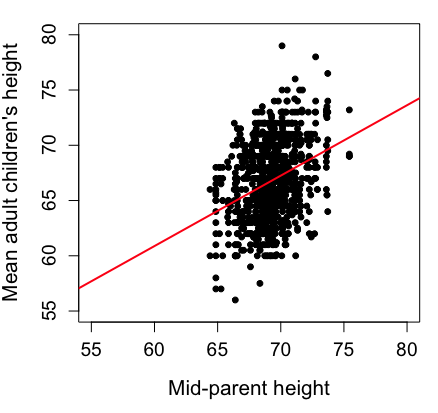
Figure 1. Scatterplot of mid-parent (vertical axis) and their adult children’s (horizontal axis) height, in inches. data from Galton’s 1885 paper, “Regression towards mediocrity in hereditary stature.” The red line is the linear regression fitted line, or “trend” line, which is interpreted in this case as the heritability of height.
Note 1. Sorry about that title — being rather short of stature myself, not sure I’m keen to learn further what Galton was implying with that “mediocrity” quip.
The commands I used to make the plot in Figure 1 were
library(HistData)
data(GaltonFamilies, package="HistData")
attach(GaltonFamilies)

plot(childHeight~midparentHeight, xlab="Mid-parent height", ylab="Mean adult children's height", xlim=c(55, 80), ylim=c(55,80), cex=0.8, cex.axis=1.2, cex.lab=1.3, pch=c(19), data=GaltonFamilies)
abline(lm(childHeight~midparentHeight), col="red", lwd=2)
I forced the plot function to use the same range of values, set by providing values for xlim and ylim; the default values of the plot command picks a range of data that fits each variable independently. Thus, the default X axis values ranged from 64 to 76 and the Y variable values ranged from 55 to 80. This has the effect of shifting the data, reducing the amount of white space, which a naïve reading of Tufte would suggest is a good idea, but at the expense of allowing the reader to see what would be the main point of the graph: that the children are, on average, shorter than the parents, mean height = 67 vs. 69 inches, respectively. Therefore, Galton’s title begins with the word “regression,” as in the definition of regression as a “return to a former … state” (Oxford Dictionary).
For completeness, cex sets the size of the points (default = 1), and therefore cex.axis and cex.lab apply size changes to the axes and labels, respectively; pch refers to the graph elements or plotting characters, further discussed below (see Fig 8); lm() is a call to the linear model function; col refers to color.
Figure 2 shows the same plot, but without attention to the axis scales, and, more in keeping with Tufte’s principle of maximize data, minimize white space.
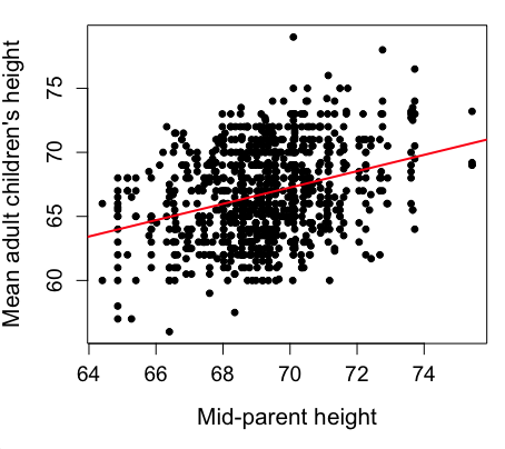
Figure 2. Same plot as Figure 1, but with default settings for axis scales.
Take a moment to compare the graphs in Figure 1 and 2. Setting the scales equal allows you to see that the mid-parent heights were less variable, between 65 and 75 inches, than the mean children height, which ranged from 55 to 80 inches.
And another example, Figure 3. This plot is from the ggplot2() function and was generated from within R Commander’s KMggplot2 plug-in.
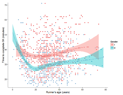
Figure 3. Finishing times in minutes of 1278 runners by age and gender at the 2013 Jamba Juice Banana 5K in Honolulu, Hawaiʻi. Loess smoothing functions by groups of female (red) and male (blue) runners are plotted along with 95% confidence intervals.
Figure 3 is a busy plot. Because there were so many data points, it is challenging to view any discernible pattern, unlike Figure 1 and 2 plots, which featured less data. Use of the loess smoothing function, a transformation of the data to reduce data “noise” to reveal a continuous function, helps reveal patterns in the data:
- across most ages, men completed 5K faster than did females and
- there was an inverse, nonlinear association between runner’s age and time to complete the 5K race.
Take a look at the X-axis. Some runners ages were reported as less than 5 years old (trace the points down to the axis to confirm), and yet many of these youngsters were completing the 5K race in less than 30 minutes. That’s 6-minute mile pace! What might be some explanations for how pre-schoolers could be running so fast?
Design criteria
As in all plotting, maximize information to background. Keep white space minimal and avoid distorting relationships. Some things to consider:
- keep axes same length
- do not connect the dots UNLESS you have a continuous function
- do not draw a trend line UNLESS you are implying causation
Scatter plots in R
We have many options in R to generate scatter plots. We have already demonstrated use of plot() to make scatter plots. Here we introduce how to generate the plot in R Commander.
Rcmdr: Graphs → Scatterplot…
Rcmdr uses the scatterplot function from the car package. In recent versions of R Commander the available options for the scatterplot command are divided into two menu tabs, Data and Options, shown in Figure 4 and Figure 5.
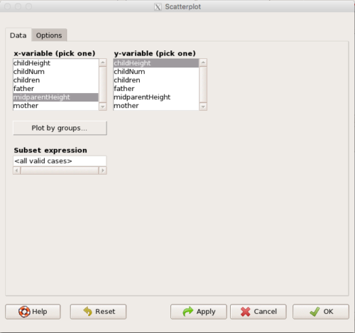
Figure 4. First menu popup in R Commander Scatterplot command, Rcmdr ver. 2.2-3.
Select X and Y variables, choose Plot by groups if multiple grounds are included, eg, male, female, then click Options tab to complete.
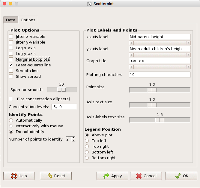
Figure 5. Second menu popup in R Commander scatterplot command., Rcmdr ver. 2.2-3
Set graph options including axes labels and size of the points.
Note 2. Lots of boxes to check and uncheck. Start by unchecking all of the Options and do update the axes labels (see red arrow in image). You can also manipulate the plot “points,” which R refers to as plotting characters (abbreviated pch in plotting commands). The “Plotting characters” box is shown as <auto>, which is an open circle. You can change this to one of 26 different characters by typing in a number between 0 and 25. The default used in Rcmdr scatterplot is “1” for open circle. I typically use “19” for a solid circle.
Here is another example using the default settings in scatterplot() function in the car package, now the default scatter plot command via R Commander (Fig. 4), along with the same graph, but modified to improve the look and usefulness of the graph (Fig. 6). The data set was Puromycin in the package datasets.
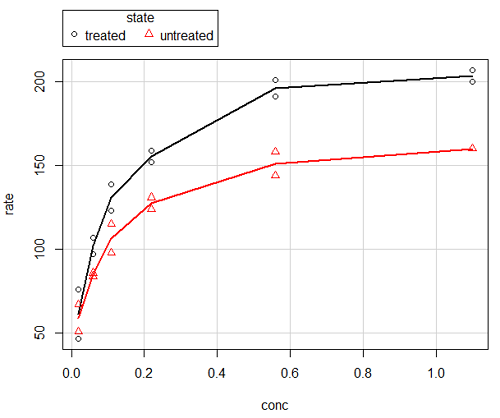
Figure 6. Default scatterplot, package car, from R Commander, version 2.2-4.
Grid lines in graphs should be avoided unless you intend to draw attention to values of particular data points. I prefer to position the figure legend within the frame of the graph, eg, the open are at the bottom right of the graph. Modified graph shown in Figure 7.
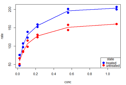
Figure 7. Modified scatterplot, same data from Figure 6
R commands used to make the scatter plot in Figure 7 were
scatterplot(rate~conc|state, col=c("blue", "red"), cex=1.5, pch=c(19,19),
bty="n", reg=FALSE, grid=FALSE, legend.coords="bottomright")
A comment about graph elements in R
In some ways R is too rich in options for making graphs. There are the plot functions in the base package, there’s lattice and ggplot2 which provide many options for graphics, and more. The advice is to start slowly, for example taking advantage of the Figure 8 displays R’s plotting characters and the number you would invoke to retrieve that plotting character.
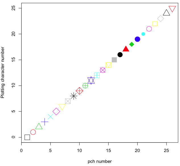
Figure 8. R plotting characters pch = 1 – 25 along with examples of color.
Note 3. To see available colors at the R prompt type
colors()
which returns 667 different colors by name, from
[1] "white" "aliceblue" "antiquewhite"
to
[655] "yellow3" "yellow4" "yellowgreen"
Note 4. There’s a lot more to R plotting. For example, you are not limited to just 25 possible characters. R can print any of the ASCII characters 32:127 or from the extended ASCII code 128:255. See Wikipedia to see the listing of ASCII characters.
Note 5. You can change the size of the plotting character with “cex.”
Here’s the R code used to generate the graph in Figure 8. Remember, any line beginning with # is a comment line, not an R command.
#create a vector with 26 numbers, from 0 to 25
stuff <-c(0:25)
plot(stuff, pch=c(32:58), cex = 2.5, col = c(1:26), 'xlab' = "pch number", 'ylab' = "Plotting character number")
Is it “scatter plot” or “scatterplot”?
Spelling matters, of course, and yet there are many words for which the correct spelling seems to be like “beauty,” it is “in the eye of the beholder” (Molly Bawn, 1878, by Margaret Hungerford). Scatter plot is one of these — is it one word or two, or is it something else entirely?
Scatter plot is one of these terms: you’ll find it spelled as “scatterplot” or as “scatter plot,” in the dictionary (eg, Oxford English dictionary), with no guidance to choose between them. And I’m not just talking about the differences between British and American English spelling traditions.
Note 6. The spell checkers in Microsoft Office and Google Docs do not flag “scatterplot” as incorrect, but the spell checker in LibreOffice Writer does (per obs).
Thus, in these situations as an author, you can turn to which of the spellings is in common use. I first looked at some of the statistics books on my shelves. I selected 14 (bio)statistics textbooks and checked the index and if present, chapters on graphics for term usage.
Table 1. Frequency of use of different terms for scatter plot in 14 (bio)statistics books currently on Mike’s shelves.
| spelling | number of statistical texts | frequency |
|---|---|---|
| scatter diagram | 2 | 0.144 |
| scatter plot | 5 | 0.357 |
| scattergram | 1 | 0.071 |
| scatterplot | 5 | 0.357 |
| XY plot | 0 | 0.071 |
Not much help, basically, it is a tie between “scatter plot” and “scatterplot.”
Next, I searched six journals for the interval 1990 – 2016 for use of these terms. Results presented in Table 6 along with journal impact factor for 2014 and number of issues (Table 2).
Table 2. Impact factor and number of issues 1990 – 2016 for six science journals.
| Journal | Impact factor | Issues |
|---|---|---|
| BMJ | 17.445 | 1374 |
| Ecology | 5.175 | 271 |
| J. Exp. Biol | 2.897 | 540 |
| Nature | 41.456 | 1454 |
| NEJM | 55.873 | 1377 |
| Science | 33.611 | 1347 |
My methods? I used the journal’s online search functions for the various usage for scatter plot and the results are shown in Figure 9.
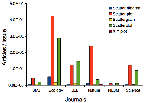
Figure 9. Usage of terms for X Y plots in research articles normalized to number of issues in six journals between 1990 and 2016.
The journals have different numbers of articles; I partially corrected for this by calculating the ratio number of articles with one of the terms divided by the number of issues for the interval 1990 – 2016. It would have been better to count all of the articles, but even I found that to be an excessive effort given the point I’m trying to make here.
Not much help there, although we can see a trend favoring “scatter plot” over any of the other options.
And finally, to completely work over the issue I present results from use of Google’s Ngram Viewer. Ngram Viewer allows you to search words in all of the texts that Google’s folks have scanned into digital form. I searched on the terms in texts between 1950 and 2015, and results are displayed in Figure 10 and Figure 11.
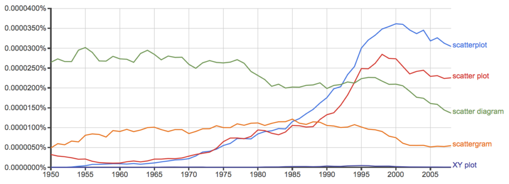
Figure 10. Results from Ngram Viewer for American English, “scatterplot” (blue), “scatter plot” (red), “scatter diagram” (green), “scattergram” (orange), and “XY plot” (purple).
And the same plot, but this time for British sources
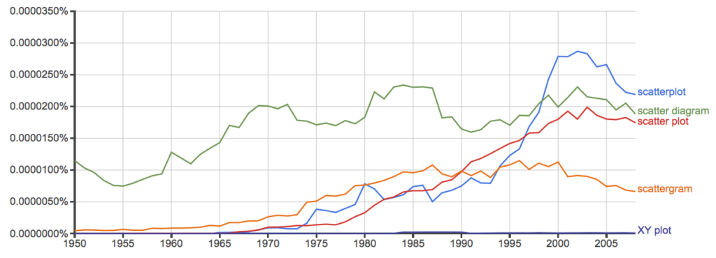
Figure 11. Results from Ngram Viewer for British English. See Figure 10 for key.
Conclusion? It looks like “scatterplot” (blue line) is the preferred usage, but it is close. Except for “scattergram” and “XY plot,” which, apparently, are rarely used. After all of this, it looks like you’re free to make your choice between “scatterplot” or “scatter plot.” I will continue to use “scatter plot.”
Bland-Altman plot
Also known as Tukey mean-difference plot, the Bland-Altman plot is used to describe agreement between two ratio scale variables (Bland and Altman 1986, Giavarina 2015), for example agreement between two different methods used to measure the same samples.
Note 6. Agreement — aka concordance or reproducibility — in the statistical sense is consistent with our everyday conception — consistency among sets of observations on the same object, sample, or unit. We introduce and develop additional agreement statistics in Chapter 9.2 and Chapter 12.3. Additional note for my students — note that I didn’t define agreement by including the term “agree”, thereby avoiding a circular definition (for an amusing clarification on the phrase, see Logically Fallacious). It’s a common short-fall I’ve seen thus far in AI-tools.
Consider use of imageJ by two different observers to record number of pixels of a unit measure (1 cm) on a series of digital images — there’s subjectivity in drawing the lines (where to start, where to end) — do they agree? Data set below. blandr package, blandr.draw function.
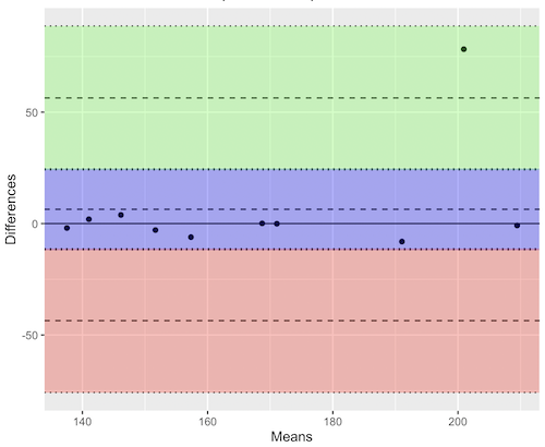
Figure 12. Bland-Altman plot of 1 cm unit measure in pixel number by imageJ from digital images by two independent observers. Purple central region is 95% CI. Lower and upper dashed horizontal lines represent bounds of “acceptable” agreement.
blandr.draw(Obs1, Obs2)
The plot makes it easy to identify questionable points, for example, the one point in upper right quadrant looks suspect.
Volcano plot
Used to show events that differ between two groups of subjects (eg, p-values), and is common in gene expression studies of an exposed group vs a control group (eg, fold changes).
Fold changes (often log2-transformed) are reflected on x-axis, indicating how much the gene expression level has increased or decreased. The y-axis typically represents the negative logarithm of the p-value (-logP) , which indicates the statistical significance of the change.
[insert]
Figure 13. Volcano plot, gene expression fold change (graph pending).
Questions
- Using our Comet assay data set (Table 1, Chapter 4.2), create scatter plots to show associations between tail length, tail percent, and olive moment.
- Explore different settings including size of points, amount of white area, and scale of the axes. Evaluate how these changes change the “story” told by the graph.
Quiz Chapter 4.5
Scatter plots
Data sets
Number of pixels of 1 cm length from unit measure on ten digital images. Recorded by two independent observers, Obs1 and Obs2.
 Obs1, Obs2
171.026, 171.105
136.528, 138.521
148.084, 144.222
142.014, 140.057
150.213, 153.118
187.011, 195.092
168.760, 168.668
154.302 ,160.381
209.022, 209.876
240.067, 161.805
Gene expression
ccc
Chapter 4 contents
2.2 – Why do we use R Software?
- Why R? The case for using R in biostatistics education.
- How to get started with R .
- Why R Commander, why not RStudio? .
- Wait! Why don’t we use Microsoft Excel? .
- Statistics comparisons between R and MS Excel .
- Graphics comparison between R and MS Excel .
- So, you’re telling me I don’t need a spreadsheet application? .
- Still not convinced? .
- Why install R on your computer?.
- Help with R?.
- Questions .
- Quiz .
- Chapter 2 contents.
If this page is TL;DR, and you’re in a rush, then instructions to install R onto your macOS or Windows PC are provided in Install R. To run in the cloud only, see Use R in the cloud.
Why R? The case for using R in biostatistics education.
.
Why do we use R Software? Or put another way: DrD, Why are you making me use R?
Truth? You can use just about any acceptable statistical application to get the work done and achieve the learning objectives we have for beginning biostatistics. However, we will use the R statistical language as our primary statistical software in this course. Part of the justification is that all statistical software applications come with a learning curve, so you’d start at zero regardless of which application I used for the course.
In selecting software for statistics I have several criteria. The software should be:
- if not exactly easy, the software should have a reasonable learning curve
- widely accessible and compatible with
allmost personal computers - well-respected and widely used by professionals
- free software
- open source
- well-supported for the purposes of data analysis and data processing
- really good for making graphics, from the basics to advanced
- capable to handle diverse kinds of statistical tests
R meets all of these criteria. R history began back in 1993 and has always been available as free software under the terms of the Free Software Foundation’s GNU General Public License in source code form. R compiles and runs on a wide variety of UNIX platforms and similar systems, including GNU/LINUX, FreeBSD, and various Linux distros like the popular Ubuntu®, in addition to their more famous Microsoft Windows® and Apple macOS® distributions. To facilitate access to the software, numerous mirror sites are available from sites around the world, with cloud.r-project.org supported by RStudio perhaps the most widely used. From January 2024 to December 2024, more than 8.5 million downloads of base R were made from the RStudio CRAN mirror site (CRAN stands for Comprehensive R Archive Network.
changelog file, which allow one to track numbers of downloads for any package from their mirror site — https://cloud.r-project.org/. Here’s the code and recent counts for downloads of R itself over a four week period .
install.packages("cranlogs")
library(cranlogs)
# How many downloads of base R around start of Fall semester?
 out <- cran_downloads("R", from = "2025-08-01", to = "2025-08-31")
sum(out$count)
R output
[1] 582524
An iterative function returning number of downloads over multiple years is provided at Part05 of Mike’s Workbook for Biostatistics.
R is straightforward to use once you learn how to work with the language, but has a steep learning curve; after all, it’s a programming language. I recommend installing the program onto your computer, but ready to go R is also available at multiple cloud services, including Google CoLab and Posit Cloud. The remainder of this page is directed at users who choose to install R to their computer, although much of the discussion holds regardless of the R environment choice, local or Cloud.
For local installs of R, I also recommend use of the GUI R Commander. Use of R Commander helps with the learning curve, and eventually, your use of code will become second nature. We don’t use RStudio, but as your skills improve, I recommend transitioning to the IDE RStudio; after the initial growing pains are behind you, RStudio likely will be a better solution over R Commander.
This discussion implies learning R programming. However, while we need statistical software to do statistics, students in my BI311 course must keep in mind that learning objectives for a biostatistics course is about the concepts and interpretation of statistics, not just use of the software. In other words, learning how to use R is not the focus of BI311 nor will you likely achieve R programming competency by the end of the semester. I certainly encourage students to strive for competency and I give frequent bonus opportunities to demonstrate coding skills during the semester.
Why R and not some other statistics software?
Thus, you might ask if the purpose of the course isn’t to learn R, why work with R instead of a more familiar app or software, eg, Microsoft Excel® (hereafter simply referred to as Excel), or Google Sheets, or even my favorite open-source office alternative, LibreOffice Calc? Or, perhaps even just one of the many online calculators, if the course learning objective is to “just” learn about statistics?
First, I believe that real data derived from real biology or biomedical problems are essential elements to a first course in biostatistics. That’s not a particularly unique perspective although I don’t have survey results of other statistics instructors to back up the claim. Real problems involve observations on multiple subjects, many variables — large data sets; this alone precludes use of hand calculations and calculators. As a corollary, we will not spend a great deal of time learning the in’s and out’s of the algorithms that form particular statistical tests. Now, do understand that there is a tremendous benefit to understanding statistics by working through the equations, by looking at the algorithms, and there’s no escaping the need for understanding that probability provides the foundation of statistics inference (Chapter 8). Thus, for most of us, the statistical software available to us provides an appropriate framework for applying correct statistical tests to our projects. Therefore, the decision is about which statistical package we should use.
Second, R is perhaps the choice in academia for statistical software. A PUBMED search found more than 1500 citations of R. Visit Robert A. Muenchen’s web page (The popularity of data analysis software, r4stats.com) to see updated statistics on statistical software use. Those of you continuing on to graduate school or to professional schools will find that many of your statistically literate colleagues use R and not one of the commercial programs. While there are many excellent commercial packages (Table 1), and in some cases you can make spreadsheet programs do statistics (typically add-ins are required), all statistical software come with steep learning curves. Thus, part of my selling point to you is that learning to use R is at the cutting-edge in your field and, given that all of the software you could use can have have their challenges, it is best to work with something that will be around and is in wide use, without the burden of a financial investment.
Table 1. A selective list of statistical software.
| Software | Student license? | Limited or full function version | macOS | Windows 11 | Fee* | Academic license type |
|---|---|---|---|---|---|---|
| GraphPad Prism | Subscription, $142 per year | Full | Yes | Yes | $202 | annual subscription |
| JMP | Yes, but with purchase of selected textbook | Limited | Yes | Yes | $100 | monthly subscription |
| Minitab | Subscription, $54.99 per year | Full | Yes | Yes | $1610 | annual subscription |
| IBM SPSS | Rental, $76 per year | Full | Yes | Yes | $260 | annual rental |
| SigmaSTAT | No | NA | No | Yes | $299 | perpetual |
| MySTAT | Yes, free | Limited | No | Yes | NA | |
| SYSTAT | No | NA | No | Yes | $739 | perpetual |
| Stata | Subscription, $94 per year | Full | Yes | Yes | $325 | annual subscription |
see Wikipedia for list of additional software
Third, what about online sites like plot.ly where, for free, you can plot and, in some cases, calculate statistics? What about the web application at Brightstat, which claims to provide an SPSS-like experience online (Stricker 2008)? While it is true that there are many wonderful websites that can perform many of the statistical tests we will use this semester, these sites are not suitable for more than occasional use.
How to get started with R.
.
A few words about my approach to the software in my biostatistics course. I note to students during the semester that our course is not a programming course, but rather, programming skills are acquired along the way. Our focus is how to do statistical analysis, how to design experiments, etc. Coding skills without understanding of the why we’re doing it is not unlike learning to cook by following a great recipe as opposed to learning about the art and science of flavor (NPR Science Friday, March 15, 2024) — the homework is solved but the why we can support our conclusions may be obscure.
We set aside the first couple of class meetings simply to setup student’s Windows PC or Apple macOS computers to do data science; for students with access to Chromebooks or iPad tablets, we need to set them up to run R in the Cloud (eg., Google Colaboratory) — in other words, there’s a lot of pre-work that can present barriers to actual doing statistics in R (or other software). Once we have the environment set up for the students, we utilize a “tell-show-do” approach to learning how to code. The “tell” part includes sharing script; the “do” part is mostly done by students outside of class as part of completing homework.
First work with the language can be frustrating, so I also encourage a “five minute” rule — if it ain’t working, stop. So, by all means when Run through a troubleshooting checklist, but please don’t continue to struggle — the gap is between the instructions and where the student is with the material — it’s a me-as-instructor problem, not a student must work harder problem!
All statistics work follows a similar workflow.
The basic workflow for a data project, using R as the primary statistical programming tool, looks like that illustrated in Figure 1.

Figure 1. A basic workflow with R.
The workflow begins with the assumption that a data set already exists. Getting the data into an R session depends on the source of the data, for example stored in spreadsheet file or from a table on a webpage. Data cleaning and processing of the data may be in order — for small and modest-sized data sets, my own preference is to do most of the data cleaning in my spreadsheet app, but R has full capabilities to handle or “wrangle” data. Next, the raw data should be stored in R session in a data frame object. Once the data frame object is available, exploratory data analysis, including summary statistics and data visualization can proceed. Higher order analytics, including statistical inference and modeling, can then begin.
The R statistical language, accompanied by additional packages to extend its capabilities beyond basic math and statistical functions, provided a complete statistical environment. R is best viewed as a programming language for statistics (data analysis), and data processing. Power users of R learn how to write scripts that do t-tests, ANOVA, regression, etc. The scripts are just lines of code that R understands and it provides the user tremendous control over analysis and inference of data sets. Because of this flexibility and power, however, R can be intimidating at first. So, we’ll start slowly with scripts, introducing just what we need to get started and build from there. We’ll be addressing R issues in more depth over the next several weeks, but for the first week, our goal(s) should be to make sure each of you knows how to start/exit R, how to create and utilize a working directory, and how to use R as a calculator. You obtain your copy of R from the R Project for Statistical Computing, available at https://www.r-project.org. Instructions to install R are provided in Install R. A ten-part tutorial to get started using R is provided in Mike’s Workbook for Biostatistics.
Note 2. A working directory or working folder is something you create on your computer to contain the files and sub-directories of a project. It sets the default location for files you may need to have R read. For example, all of your work for a course (data files, script files, Markdown files), may be stored in a folder called BI311 on your Desktop. For example, on a macOS, the path to the working folder would be
/Users/username/Desktop/BI311
Why R Commander, why not RStudio?
.
We utilize an R package that provides a menu-driven context to much of the typical statistics one needs to do biostatistics. The package is called R Commander (Rcmdr), which provides a graphic user interface or GUI. Rcmdr therefore significantly eases the learning curve for doing statistics with R. We use a package called R Commander, which provides drop down menus for most of the typical kinds of analyses. Rcmdr is in use in many courses across the world (more than 17K downloads in August 2025), and among the other GUI available for R, Rcmdr is among the best supported GUI available for R. R Commander function is extended by plug-ins; as of August 2025, there were 31 plugins that extend Rcmdr’s capabilities. Instructions to install R Commander are provided in Install R Commander.
Note 3. Other options to improve use of R include use of RStudio®, which is an integrated development environment or IDE. RStudio is really nice to use, and, happily, you can run R Commander within RStudio — but with windows popping up outside of the RStudio windowing framework if the default MDI environment to organize is set. (The solution? R Commander runs best when SDI option is selected during RStudio install.) I am also increasingly using shiny apps within the course to help with concept presentation; in the future, I plan to provide a complete shiny app which would allow BI311 students to work interactively with the statistics presented in this text, something like the radiant-rstats project. However, for use in our course, R Commander provides a familiar look as students develop knowledge in the course: simply point and click to access the statistical functions.
Wait! Why don’t we use Excel? My instructor in {insert course here} used Excel…
.
A very reasonable question for you to ask — why don’t we use Microsoft Excel or Google Sheets for statistics? Moreover, it is highly likely that you have gained at least some introduction to descriptive statistics and graphing with spreadsheets in former courses — shouldn’t we learn statistics within a software framework you are already familiar?
After all, “Can’t Microsoft Excel do statistics?” Mostly the answer is, no, not really (Fig 2).
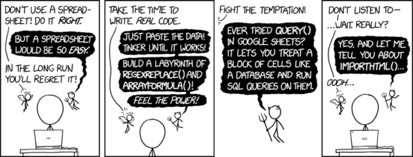
Figure 2. “Spreadsheets,” xkcd.com no. 2180.
MS Excel, Google Sheets, Apple Numbers, and for that matter, Calc, the spreadsheet application in my favorite office app LibreOffice (LibreOffice is a free, open-source alternative to Microsoft Office), can be used to calculate many descriptive statistics. With some effort, these applications can be extended by use of either Analysis ToolPak or Solver Add-ins to do more complicated statistics like regression and analysis of variance, and curve fitting.
Note 4. Perhaps you’re thinking: I’m a data science student — it’s not whether we chose between use of spreadsheet apps or R, we should be using Python, shouldn’t we? DrD — this is an open question, and if you judge the job market as the arbiter, I’d say learn Python over R — if you are primarily aiming for a data science position. However, from the point of view of learning statistics, my vote would be R — far more packages developed to accomplish our tasks, and, at least for this course, we are not teaching coding: our focus is on using statistics to explore (describe) and ask questions about data collected by observation or experimentation.
While we’re on the subject in 2025, it looks like the job market is in Machine Learning, which means R or Python knowledge will be a given, but advantage will go to those who know Alteryx or it’s open source alternative KNIME for data science workflow design — from data collection to model development.
However, use of MS Excel for statistical analysis involves learning a number of commands, syntax, and developing workflows that are neither intuitive nor standard. Some publishers have provided add-ins that are reportedly designed to simplify this process (eg, XLStat, UNISTAT, Real Statistics using Excel). None of these options are free and none are in use in any major way by scientists (see Robert Muenchen’s The popularity of data analysis software). The free add-ins of Analysis ToolPak and Solver may work for you if you own a Windows PC, but only Solver is included for the Mac versions of Excel. MacOS users may download and install StatPlus:MacLE, which is a limited, but free alternative to the Analysis ToolPak add-in; for a complete package a Pro version is available (licenses started at $89, web site: www.analystsoft.com/en/products/statplusmacle/).
An additional caution: you should be aware that there have been reports over the years that algorithms selected by Microsoft for Excel have not always been to industry standards (eg, McCullogh and Wilson 2005). In short, the fit of Excel and other spreadsheet apps for use in statistics is not a simple one. To do the kinds of statistics we will use routinely in class, Excel would need to be modified with add-ins, and the add-ins would be the result of programming by someone. And you would still need to learn how to write the code.
What about graphics? You may like Microsoft Excel’s ability to do graphics. Indeed, Excel, Google Sheets, and LibreOffice Calc can be used to generate many typical kinds of statistical plots. But again, in comparison to R, spreadsheet app graphics are limited and require a deal of effort to generate acceptable plots. I think you’ll be surprised at how straight-forward R is. Here’s an example, first rendered in Microsoft Excel, then in base R. And importantly, the kinds of plots Excel does well at are not necessarily the plots suitable for research publication. For example, Excel allows you to make bar charts easily, but cannot do box plots. Box plots are preferred over bar (column) charts for ratio scale data.
Note 5. base R refers to the core R programming language along with many functions and graphics routines. We extend capabilities of base R by adding packages, like R Commander.
Statistics comparisons between R and MS Excel.
.
About that learning curve. Let’s compare R and MS Excel for basic functions common in data analysis. Similar conclusions hold for comparisons to Google Sheets and LibreOffice Calcs.
Note 6. If you search for variants of this question, you’ll find other’s making the argument that the learning curve for many data science tasks is, perhaps surprisingly, shorter for R than it is for Excel. For example, see Amieroh Abrahams 2023 article at https://www.jumpingrivers.com/blog/comparing-r-excel-data-wrangling/ .
Table 2 lists the observations we can use to conduct comparisons of the applications.
A simple data set
| varA |
|---|
| 12 |
| 14 |
| 20 |
| 25 |
| 28 |
| 29 |
| 32 |
| 34 |
| 35 |
| 39 |
| 47 |
| 47 |
| 50 |
| 53 |
| 54 |
| 71 |
| 79 |
| 87 |
| 89 |
| 96 |
| 105 |
| 122 |
| 130 |
| 132 |
One of the first steps in data analysis is to produce what are called descriptive statistics. Common descriptive statistics are the mean and the sample standard deviation. Let’s compare Excel and R for retrieving these two statistics.
With Excel, to calculate the arithmetic mean of 24 numbers, enter the values into a single column of 24 rows, then enter “=average(A2:A25)“, without the quotes, into a new cell of the spreadsheet. “A2:A25” refers to where data would be contained in column A rows 2 through 25. Typically the first row in a worksheet would contain the name of the variable, eg, “A.” Depending on the significant figures set, the estimate returned by Excel for the mean of A is 59.58333333.
Similarly, to obtain the standard deviation, type =stdev(A2:A25), into a new cell of the spreadsheet. Again, depending on the significant figures set, Excel returns a value of 37.05215674 for the standard deviation of A.
In contrast, to obtain the mean and standard deviation for a variable in an R data set, all you would type at the R prompt (>), or in the script window
Note 7. Always run your code as a script. Entering code at the R prompt means you are working at the command-line interface, and you work one line at a time. This is not an efficient way to interact with R. Instead, I recommend you always create and work from a script document. For beginners, that’s why I recommend R Commander, which includes a script window. Simply type your code in the script window, highlight the code you wish to run, and run by clicking submit button (or Ctrl+R Win11 or Cmd+Enter macOS). When you are ready to move on from R Commander, RStudio is the IDE of choice.
and then submit the code is:
myA <- c(12, 14, 20, 25, 28, 29, 32, 34, 35, 39, 47, 47, 50, 53, 54, 71, 79, 87, 89, 96, 105, 122, 130, 132)where the “c” is a function to combine arguments into a vector and saved to the object myA, followed at the new line by
mean(myA)Hit enter after entering the command) and R returns
[1] 59.58333For the standard deviation, write the R base function sd()
sd(myA)Hit enter after entering the command and R returns
[1] 37.05216It’s not much of a difference, but note that to get the mean (arithmetic average) I typed seven characters in R, but 16 characters in Excel; similarly, for the standard deviation I typed in 5 characters in R, but 13 characters in Excel. That’s a savings of 56% and 62%, respectively. Excel tries to help by using AutoComplete to anticipate what you want to enter, but AutoComplete doesn’t always work properly (eg, see gene name errors generated by use of default Microsoft Excel settings, Ziemann et al 2016).
Note 8. I use spreadsheets all of the time for data entry and data management. Make sure AutoComplete and AutoCorrect options are turned off and these problems are much less.
In conclusion, R is quicker for descriptive statistics.
Graphics comparison between R and MS Excel.
.
MS Excel is often cited for its graphics capabilities (Camões 2016). We can make the familiar scatter plots, bar charts, and pie charts in Excel. These plots and more are easily obtained in R. I won’t elaborate here about graphics, we talk at some length about graphics in Chapter 4. But here’s one example in R.
Let’s plot myB vs myA. We already provided the data for variable A, here’s the data for variable B.
17, 21, 21, 26, 27, 32, 28, 42, 40, 30, 71, 53, 56, 61, 55, 89, 82, 63, 116, 162, 116, 154, 137, 149Don’t recall how to assign a set of numbers to an object, B, in R? See above and look again at how we assigned the numbers to object myA.
To get a simple scatter plot (Fig 3), I may write at the R prompt.
plot(myA,myB)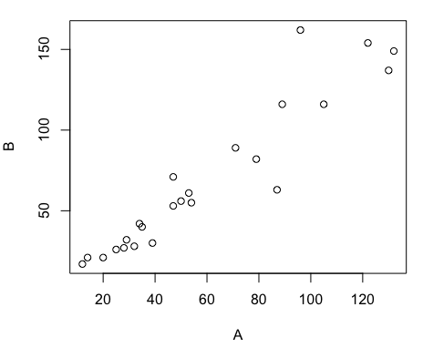
Figure 3. Basic scatter plot made in R, plot(myA,myB).
And here’s the comparable default plot (Fig 4) from Microsoft Excel, Office 365
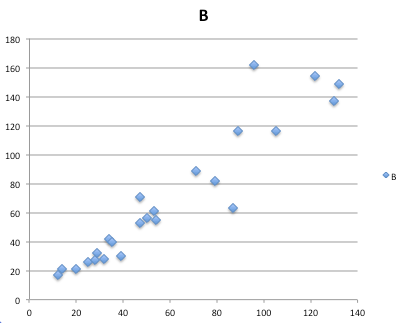
Figure 4. Basic scatterplot made in Microsoft Excel.
Now, both graphs need some work, and to be fair, these are just the defaults. With some effort, you can make an Excel graph look pretty good. But note — the defaults in Excel don’t generate axis labels, while R default plot does. Excel adds a useless title and legend; both need to be removed. Excel also adds grid lines where typically one would not include these in a scientific plot; for example, in the case of scatterplots, grid lines can distract the viewer from the data points and reduce the data-to-ink ratio Tufte 1984).
Count the steps to generate an acceptable scatter plot (Table 3). I’ve also added R Commander (Rcmdr) steps for comparisons (Rcmdr lets you use drop-down menus like Excel or Google Sheets or LibreOffice Calcs).
Table 3. Steps needed to make a simple scatterplot in R, R Commander, or Microsoft Excel.
| Steps | R | Rcmdr | Excel 365 |
| 1 | write the function | Select Graphs | Highlight columns |
| 2 | Select scatterplot | Select from Menu “Insert” | |
| 3 | Select variables | Select scatterplot | |
| 4 | Uncheck options | Select type of scatterplot | |
| 5 | Delete legend | ||
| 6 | Remove grids | ||
| 7 | Insert X-axis label | ||
| 8 | Insert Y-axis label |
Conclusion? R is quicker for routine statistical plots like a scatter plot. And I didn’t even count the steps needed to change MS Excel’s dreadful diamond icon points.
That’s one step in R, four steps in Rcmdr, but eight steps for Microsoft Excel. LibreOffice Calc is a little better at only four steps, but like MS Excel, you’d need to change several components to the graph (Fig 5).
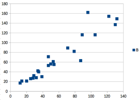
Figure 5. Basic scatterplot made in LibreOffice Calc.
Note 9. In R vernacular, these are referred to as pch, or point characters: pch = 23 returns a blue diamond character; for a blue square like Figure 5, add to the plot() command as
plot(myA,myB, pch = 22)
So, you’re telling me I don’t need a spreadsheet application?
.
No, not at all. We use spreadsheets, and more generally, databases, to store data. Spreadsheets apps are designed to make data entry and data management approachable and efficient. They remain an important tool for researchers (Browman and Woo 2017).
R is not that great of a spreadsheet; packages are available to seamlessly tie your spreadsheet and database data to R via ODBC. We will routinely enter and manipulate data in MS Excel, then import the data into R for analysis.
Spreadsheet apps like MS Excel and Google Sheets (see also LibreOffice Calc) are great at being a spreadsheet program, R is great at being a statistical software program. You should take advantage of what the tools do best.
Still not convinced?
.
R is in use all over the world, by students and professionals alike and if one is going to spend the time to learn how to use a statistics software program, you should learn a standard program, like R.
And it’s not just me. Read about R in this 2009 New York Times piece, “Data analysts captivated by R’s power.” Look who purchased (April 2015) Revolution Analytics, a major player in the development of the R programming language.
Note 10. The answer was Microsoft. For several years Microsoft supported R development via Microsoft Machine Learning Server & Microsoft R Open. However, as of July 2023, this service is no longer available. See Microsoft R application network retirement.
Why install R on your computer?
.
Convenience. Control. Offline.
At the Biology department of Chaminade University, we have installed and maintain R, Rcmdr, and RStudio along with all required packages on our Macbook Pro® Lab computers for your use during class and during optional, proctored biostatistics work sessions. Since 2018, R is increasingly available “in the cloud” (eg, RStudio Cloud), which would mean you could run R in your browser and avoid installation on your computer. You can run significant analysis with R in the cloud via the free Google Colaboratory and CoCalc are now available: I encourage you to look into these platforms. Unfortunately, these services are not quite ready for the classroom. For example, RStudio in the Cloud is free to use on a limited basis, but quickly requires a significant subscription cost with increasing use. Google Colab and GoCalcs require use of Jupyter notebooks, which add yet another layer to the learning curve without focusing on learning statistics. Second, although access to their servers is easy, running simultaneous connections via Chaminade’s single public IP address is likely to lead to problems for us. Third, I want you to use R Commander (Rcmdr) to assist in the learning curve — Rcmdr cannot be run in the Cloud (ie, RStudio in the Cloud, Google Colaboratory, or CoCalc).
Therefore, you are encouraged to install R, Rcmdr, and even RStudio, onto your own computers, in part because of the convenience, but also because R is not generally available to students on campus, ie, only the Biology department’s computers have the up-to-date R software installed.
To get started, go to your Canvas website and view How to install R on your own computer.
An additional benefit to installing a version of R on your computer, you’ll understand more about the software if you take the time to install and if need be, troubleshoot your installation of the software. Moreover, there’s a considerable amount of help out there for R. For example, a simple Google search(keywords: tutorial “install R”), returns more than 700K hits, and more than 40K January 2023 alone (add “after:2023-01-01” to Google search box). In fact, there’s so much out there that you’ll want to sample from several sites and select the voice that works best for you.
Questions
- Write up three learning outcomes for this page. Hint: Point your favorite generative AI to this page and ask for help.
- I listed several spreadsheet apps: Microsoft Excel, Google Sheets, Apple Numbers, LibreOffice Calc. Which of these are free to download and install to your computer? Which are freely available via the Cloud?
- What level of confidence do you have to this statement: I am confident in my ability to use spreadsheet apps for my BI-311 work this semester. Response options:
- Strongly disagree.
- Disagree.
- Agree.
- Strongly agree.
- What level of confidence do you have to this statement: I am confident in my ability to use the R programming software for my BI-311 work this semester. Response options:
- Strongly disagree.
- Disagree.
- Agree.
- Strongly agree.
.
Quiz Chapter 2.2
Why do we use R software?
Chapter 2 contents
.