20.6 – Dimensional analysis, clustering methods
Introduction
This chapter is just a sampling of the many techniques for “reducing the dimensions” of a data set that contains many variables, aka high-dimensional space, without eliminating the information contained among the many variables. The logic is similar to our discussions about model building — we may seek simple models at least in part so that we can see the big picture, not just each tree in an unhealthy forest.
Approaches can be categorized as feature extraction — a processing step to identify key characteristics contained in the larger data set into fewer, now transformed variables — or feature selection — the selection of a subset of the variables from among the full list which, presumably, contain redundant information. Principal Component Analysis is an example of feature extraction approaches. From this perspective, stepwise regression, discussed in Ch18.5, is an example of a feature selection approach. Clustering methods, however, groups objects based on existing features but does not create new features.
Dimensional analysis and clustering are complementary tools for exploring complex data (Ding and He 2004). Clustering methods use features — or their reduced representations — to group similar objects based on shared patterns. Dimensional analysis and clustering methods, presented together, show how we can first simplify biological complexity and then uncover natural groupings within it, whether we are analyzing candies by color and size or cancerous cells from normal cells by gene expression.
Principal component analysis
High dimensional data are reduced by linear transformation to sets of new vectors or coordinates. Each subsequent vector is orthogonal to the one proceeding it. By orthogonal we mean that variables are uncorrelated, completely independent of each other.
For example, consider body weight and height. Tall people tend to be heavier than shorter people, suggestive of the well-known correlation between the two — body weight and height are not orthogonal. For model building, one can’t simply include both as predictors (multicollinearity). Instead, we use PCA to transform body weight and height into a set of orthogonal variables called Principal Components. The first principal component, PC1, contains the largest amount of variation shared along the first linear adjustment, the second component, PC2, contains the next largest amount of variation, and so on. The result? Because PC2 is orthogonal to PC1, it contains completely different information — the weight that is not explained by height, or residuals.
We demonstrate utility of PCA with Bumpus data from MorphoFun/psa, variable names changed.
First, we plot (Fig 1) and add whether or not the individuals survived (TRUE) or not (FALSE). Figure 1 shows substantial overlap — there’s no distinct separation between the two groups — but survival group (blue) appears to be more concentrated in the lower-left to middle area of the plot. The non survival group (red) extends to higher masses and lengths, with several data points falling outside the main cluster and its corresponding ellipse.
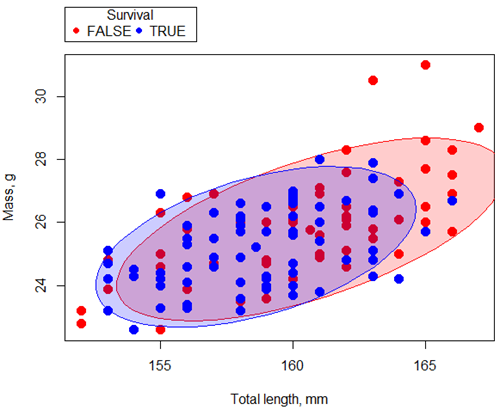
Figure 1. Scatterplot English swallow mass (g) by total length (mm) by survival following winter storm
R code for Figure 1 graph.
car::scatterplot(Weight~Total_length | Survival, regLine=FALSE,
      smooth=FALSE, boxplots=FALSE,
      ellipse=list(levels=c(.9)),
      by.groups=TRUE, grid=FALSE,
      pch=c(19,19), cex=1.5, col=c("red","blue"),
      xlab="Total length, mm", ylab="Mass, g", data=Bumpus)
Note 1: Figure 1 shows 90% of the pairwise points (red, did not survive; blue, did survive), not a confidence ellipse. These circles are called data ellipse, used to mark the center, spread, and correlation (orientation) of bivariate data.
Bumpus measured several traits, we want to use all of the data. However, highly correlated (Fig 2) and therefore multicollinear. Manly (1986) and others (see Vieira 2012) have applied PCA to this data set.
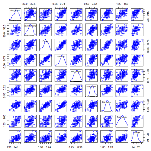
Figure 2. Scatterplot matrix of Bumpus English sparrow traits. Traits were (left-right): Alar extent (mm), length (tip of beak to tip of tail), length of head (mm), length of femur (in.), length of humerus (in.), length of sternum (in.), skull width (in.), length of tibio-taurus (in.), and weight (g)
R code for graph
car::scatterplotMatrix(~Alar_extent+Beak_head_Length+Femur+Humerus+Keel_Length+Skull_width+Tibiotarsus+Total_length+Weight, regLine=FALSE, smooth=FALSE, diagonal=list(method="density"), data=Bumpus)
Note 2: In Chapter 4, we discussed importance of white space and Y-scale for graphs that make comparisons. Figure 2 is a good example of where we trade-off the need for white space and concerns about telling the story — the various traits are positively correlated — against the dictum of an equal Y-scale for true comparisons.
R packages
factoextra
psa package from MorphoFun/psa/
Rcmdr: Statistics > Dimensional analysis > Principal component analysis …
.PC <-
princomp(~Alar_extent+Beak_head_Length+Femur+Humerus+Keel_Length+Skull_width+Tibiotarsus+Total_length+Weight, cor=TRUE, data=Bumpus)
cat("\nComponent loadings:\n")
print(unclass(loadings(.PC)))
cat("\nComponent variances:\n")
print(.PC$sd^2)
cat("\n")
print(summary(.PC))
screeplot(.PC)
Bumpus <<- within(Bumpus, {
PC2 <- .PC$scores[,2]
PC1 <- .PC$scores[,1]
})
})
Importance of components
                              Comp.1     Comp.2
Standard deviation         2.3046882  0.9988978
Proportion of Variance     0.5901764  0.1108663
Cumulative Proportion      0.5901764  0.7010427
Interpretation
Comp.1 has a significantly higher standard deviation — it captures much more data variation than Comp.2.
Comp.1 explains 59% of the total variation, Comp.2 by itself describes an additional 11% of the variation in the data set. Between the two, 70% of the variation in the data set is explained by just these two components — “high data compression.”
Cluster analysis
Cluster analysis or clustering is a multivariate analysis technique that includes a number of different algorithms for grouping objects in such a way that objects in the same group (called a cluster) are more similar to each other than they are to objects in other groups. A number of approaches have been taken, but loosely can be grouped into distance clustering methods (see Chapter 16.6 – Similarity and Distance) and linkage clustering methods: Distance methods involve calculating the distance (or similarity) between two points and whereas linkage methods involve calculating distances among the clusters. Single linkage involves calculating the distance among all pairwise comparisons between two clusters, then
Results from cluster analyses are often displayed as dendrograms. Clustering methods include a number of different algorithms hierarchical clustering: single-linkage clustering; complete linkage clustering; average linkage clustering (UPGMA) centroid based clustering: k-means clustering.
Cluster analysis is common to molecular biology and phylogeny construction and more generally is an approach in use for exploratory data mining. Unsupervised machine learning (see 20.14 – Binary classification) used to classify, for example, methylation status of normal and diseased tissues from arrays (Clifford et al 2011).
K-means clustering
 -means clustering is an unsupervised learning algorithm that automatically partitions data into
  -distinct, nonoverlapping groups (clusters) based on feature similarity. It finds hidden patterns by iteratively assigning data points to the nearest centroid (mean) and updating the centroids until clusters stabilize.
Ahh, the clusters. The -means problem is to find cluster centers that minimize the sum of squared distances from each data point being clustered to its cluster center (the center that is closest to it). Finding the optimal number of clusters is computationally hard,  hard, because it requires finding the absolute best partition of
  points into clusters, which involves searching an exponential number of possible configurations.
Note 3: hard, where  is short for nondeterministc and
  stands for polynomial time. Interested readers can start at Wikipedia.
Number of clusters
Iterations
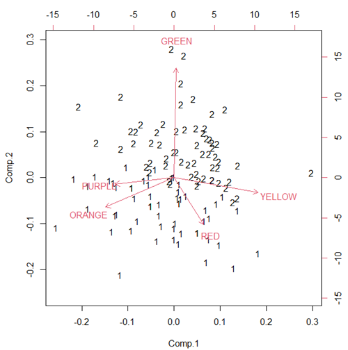
Figure 3. Bi-plot of clusters, Skittles mini bags.
Hierarchical clustering
Ward’s method
Complete linkage
McQuitty’s method
Centroid linkage
A common way to depict the results of a cluster analysis is to construct a dendogram.
Questions
- Write up three learning outcomes for this page. Hint: Point your favorite generative AI to this page and ask for help.
Quiz Chapter 20.6
Dimensional analysis
References and further reading
Bumpus, H. C. (1898). Eleventh lecture. The elimination of the unfit as illustrated by the introduced sparrow, Passer domesticus. (A fourth contribution to the study of variation.). Biology Lectures: Woods Hole Marine Biological Laboratory, 209–255.
Clifford, H., Wessely, F., Pendurthi, S., & Emes, R. D. (2011). Comparison of clustering methods for investigation of genome-wide methylation array data. Frontiers in genetics, 2, 88.
Ferreira, L., & Hitchcock, D. B. (2009). A comparison of hierarchical methods for clustering functional data. Communications in Statistics-Simulation and Computation, 38(9), 1925-1949.
Fraley C, Raftery AE. (2002) Model-based clustering, discriminant analysis, and density estimation. J Am Stat Assoc. 2002; 97(458):611–31.
Ding, C., & He, X. (2004). K-means Clustering via Principal Component Analysis. Proceedings of the 21 St International Conference on Machine Learning.
Vieira, V. M. N. C. S. (2012). Permutation tests to estimate significances on Principal Components Analysis. Computational Ecology and Software, 2.
Chapter 20 contents
- Additional topics
- Area under the curve
- Peak detection
- Baseline correction
- Surveys
- Time series
- Dimensional analysis
- Estimating population size
- Diversity indexes
- Survival analysis
- Growth equations and dose response calculations
- Plot a Newick tree
- Phylogenetically independent contrasts
- How to get the distances from a distance tree
- Binary classification
- Meta-analysis
/MD