5.6 – Sampling from Populations
Introduction
Researchers generally can’t study an entire population. More generally, striving to study each member of a population is not necessary to arrive at answers about the population. For example, consider the question, does taking a multivitamin daily improve health? What are our options? Do we really need to follow every single individual in the United States of America, monitoring their health and noting whether or not the person takes vitamins daily in order to test (inference) this hypothesis? Or, can we get at the same answer by careful experimental design (see Schatzkin et al 2002; Dawsey et al 2014)? Supplement use is wide-spread in the United States, but both health and vitamin use differ by demographics. Young people tend to be healthier than older people and older people tend to take supplements more than younger people.
A subset of the population is measured for some trait or characteristic. From the sample, we hope to refer back to the population. We want to move from anecdote (case histories) to possible generalizations of use to the reference population (all patients with these symptoms). How we sample from the reference population limits our ability to generalize. We need a representative sample: simple to define, hard to achieve.
Statistics becomes necessary if we want to infer something about the entire populations. (Which is usually the point of doing a study!!) Typically tens to thousands of individuals are measured. But in addition, HOW we obtain the sample of individuals from the reference population is CRITICAL.
Kinds of sampling include (adapted from Box 1, Tyrer and Heyman 2016; see also McGarvey et al 2016)
Probability sampling
- random
- stratified
- blocking
- clustered
- systematic
Nonprobability sampling
- convenience, haphazard
- judgement
- quota
- snowball
For an exhaustive, authoritative look at sampling, see Thompson (2012).
How can samples be obtained?
Sampling from a population may be convenient. For one famous example, consider the Bumpus data set. (We introduced this data set in Question 5, Chapter 5.) So the legend goes, Professor Bumpus was walking across the campus of Brown University, the day after a severe winter storm, and came across a number of motionless house sparrows on the ground. Bumpus collected the birds and brought them to his lab. Seventy-two birds recovered; 64 did not (Table1).
Table 1. A subset of Bumpus data set, summarized by sex of birds.
| House sparrows | Lived | Died |
|---|---|---|
| Female | 21 | 28 |
| Male | 51 | 36 |
Bumpus reported differences in body size that correlated with survival (Bumpus 1899), and this report is often taken as an example of Natural Selection (cf. Johnston et al 1972). The Bumpus dataset is clearly convenience sampling. It’s also a case study: a report of a single incident. But given that is is a large sample (n = 136), it is tempting to use the data to inform about about possible characteristics of the birds that survived compared with those that perished.
Another way we collect samples from populations is best termed haphazard. In graduate school I got the opportunity to study locomotor performance of whiptail lizards (Aspidoscelis tigris, A. marmoratus, genus formerly Cnemidophorus**) across a hybrid zone in the Southwest United States (Dohm et al. 1998). During the day we would walk in areas where the lizards were known to occur and capture any individual we saw by hand. (This would sometimes mean sticking our hands down into burrows, which was always exciting — you never really knew if you were going to find your lizard or if you were going to find a scorpion, venomous spider, or …) Lizards collected were returned to the lab for subsequent measures. Clearly, this was not convenience sampling; it involved a lot of work under the hot sun. But just as clearly, we could only catch what we could see and even the best of us would occasionally lose a lizard that had been spotted. Moreover, one suspects we missed many lizards that were present, but not in our view. Lizards that were underground at the time we visited a spot would not be seen nor captured by us; individual lizards that were especially wary of people (Bulova 1994) would also escape us. In other words, we caught the lizards that were catchable and can only assume (hope?) that they were representative of all of these lizards. Applying a grid or quadrant system to the area and then randomly visiting plots within the grid or quadrant might help, but still would not eliminate the potential for biased sampling we faced in this study.
Quota sampling implies selection of subjects by some specific criteria, weighted by the proportions represented in the population. It’s different from stratified sampling because there is no random selection scheme: subjects are selected based on matching some criteria, and collection for that group stops when the sample number matches the proportion in the population. Consider our vitamin supplement survey. If student population at Chaminade University was the reference population, and we have enough money to survey 100 students, then we would want a sample of 70 women students and 30 male students, representing the proportions of the student population.
Snowball sampling implies that you rely on word-of-mouth to complete sampling. After initial recruitment of subjects, sample size for the study increases because early participants refer others to the researchers. This can be a powerful tool for reaching underrepresented communities (eg, Valerio et al 2016).
Types of Probability sampling
Random sampling is an example of probability sampling. As we defined earlier, simple random sampling requires that you know how many subjects are in the population (N) and then each subject has an equal chance of being selected

Examples of nonprobability sampling include
- convenience sampling
- volunteer sampling
- judgement sampling
Convenience sampling (the first 20 people you meet at the library lanai); volunteer sampling (you stand in front of a room of strangers and ask for any ten people to come forward and take your survey — or more seriously, persons with a terminal disease calling a clinic reportedly known to cure the disease with a radical new, experimental treatment), and judgement sampling (to study tastes in fashion, you decide that only persons over six feet tall should be included because .…).
Random in statistics has a very important, strict meaning. As opposed to our day-to-day usage, random sampling from a population means that the probability that any one individual is chosen to be included in a sample is equal. Formally, this is called simple random sampling to distinguish it from more complex schemes. For a sampling procedure to be random requires a formal procedure for sampling a population with known size (N).
For example, at the end of the semester, I may select the order for student presentations at random. Thus, students in the classroom would be considered the population (groups of students are my sample unit, not individual students!). What is the probability that your group will be called first? Second? We need to know how many groups there are to conduct simple random sampling. Let’s take an extreme and say that all groups have a size of one; there are 26 students in this room, so

or
![\[p=0.0385\]](https://biostatistics.letgen.org/wp-content/ql-cache/quicklatex.com-3245def7444e6f340661142b6c6dd9ef_l3.png "Rendered by QuickLaTeX.com")
of being selected first.
Now to determine the probability of your group being selected second, we need to distinguish between two kinds of sampling:
- Sampling with replacement — after I select the first group, the first group is returned to the pool of groups that have not been selected. In other words, with replacement, your group could be selected first and selected second! The probability of being selected second then remains
![\[p= \frac{1}{26}\]](https://biostatistics.letgen.org/wp-content/ql-cache/quicklatex.com-8535b199acd8acd9f2ea6ee217d9c065_l3.png "Rendered by QuickLaTeX.com")
.
- Sampling without replacement — after I select the first group, then I have
![\[26 -1=25\]](https://biostatistics.letgen.org/wp-content/ql-cache/quicklatex.com-2ba74aa260c2d84d22667281ebf95bc8_l3.png "Rendered by QuickLaTeX.com")
groups left to select the second group, so probability that your group will be second is
![\[p= \frac{1}{25}\]](https://biostatistics.letgen.org/wp-content/ql-cache/quicklatex.com-0becdbbdf1fa6ba7a9edee599208ab67_l3.png "Rendered by QuickLaTeX.com")
. The first group has already been selected and is not available.
Random sampling refers to how subjects are selected from the target, reference population. Random assignment, however, describes the process by which subjects are assigned to treatment groups of an experiment. Random sampling applies to the external validity of the experiment: to the extent that a truly random sample was drawn, then results may be generalized to the study population. Random assignment of subjects to treatment however makes the experiment internally valid: results from the experiment may be interpreted in terms of causality.
R code, sample without replacement
sample(26)
[1] 1 10 11 23 17 13 8 6 19 20 21 16 14 15 5 2 12 4 26 22 9 7 25 18 3 24
R code, sample with replacement
mySample <- sample(26, replace = TRUE); mySample
[1] 9 26 24 9 3 1 23 14 26 6 5 19 17 23 11 12 3 8 7 19 2 16 3 11 1 1
How many elements duplicated?
out <- duplicated(mySample); table(out)
out
FALSE TRUE
17 9
More on sampling in R discussed in Sampling with computers below.
Additional sampling schemes
Simple random sampling is not the only option, but in many cases it is the most desirable. Consider our multivitamin study again. Perhaps studying the entire USA population is a bit extreme. How about working from a list of AARP members, sending out questionnaires to millions of persons on this list, getting back about 20% of the questionnaires, sorting through the responses and identifying the respondent to diet categories and multivitamin use. The researchers had nearly 500,000 persons willing and able to participate in their prospective study (Schatzkin et al 2001; Dawsey et al 2014; Lim et al 2021). It’s an enormous study. But is this really much better than our described lizard experiment? Let’s count the ways: Not all older people are members of AARP (that 500,000? That’s less than 1% of the 50 and older persons in the USA); A large majority of AARP members did not return surveys; Some fraction of the returned surveys were not usable; How representative of diverse aged populations in the United States is AARP?
Simple random sampling may not be practical, particularly if sub-populations, or strata, are present and members of the different sub-populations are not available to the researcher in the same numbers. In ecology, habitat-use studies routinely need to account for the patchiness of the environment in space and time (Wiens 1976; Summerville and Crisp 2021). Thus, samples are drawn in such a way to represent the frequency within each sub-population.
For a simple example, researchers conducting a controlled breeding program of mice don’t use simple random sampling to choose pairs of mates; after all, random sampling without regard of sex of the mice would lead to some pairings of males only, or females only (Fig 1).
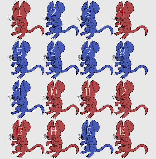
Figure 1. Sixteen mice, eight red and eight blue. Image © 2024 Mia D Graphics
R code
pairs <- c(rep("red", 8), rep("blue", 8))
replicate(2, sample(pairs, 8), simplify = FALSE)
[[1]]
[1] "blue" "blue" "blue" "red" "blue" "red" "blue" "red"

[[2]]
[1] "blue" "blue" "red" "red" "red" "red" "red" "blue"
Oops. If we interpret the output blue = male and red = female, then four out of the eight pairs were same sex pairings.
Thus, the breeding strategy is to random sample from female mice and from male mice and the stratification is sex of the mouse. Alternatively, breeders may select mice to form breeding pairs systematically: From a large colony with dozens of cages, the breeder may select one mouse from every third cage.
Stratified Random Sampling: Individuals in the population are classified into strata or sub-groups: age, economic class, ethnicity, gender, sex …, as many as needed. Then choose a simple random sample from each group, typically in proportion to the size of the sub-groups in the population. Combine those into the overall sample. For example, when I wanted a random sample of mice for my work, I called the supplier and requested that a total of 100 male and female mice be randomly selected from the five colonies they maintained. The reference population is the entire supply of mice at that company (at that time), but I wished to make sure that I got unrelated mice, so I needed to divide the population into groups (the five colonies) before my sample was constructed.
Note 1: The size of the population must be known in advance, just like in simplified random sampling. A more interesting example, the Social Security Administration conducts surveys of popular baby names by year. They post the top ten most popular names based on 1% or 5% (first strata), then by male/female (second strata).
For a simple example of the need for stratified sampling, consider our 16 blue and red mice again. If mice were randomly assigned to treatment group, then by chance unequal samples within strata may be assigned to a treatment group, potentially biasing our conclusions (Fig 2).
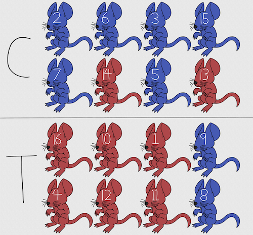
Figure 2. Sixteen mice, randomly assigned to treatment groups C and T; by chance, 75% blue in C and just 25% in T. If color was a confounding factor then our conclusions about the effectiveness of the treatment would be associated with color. Image © 2024 Mia D Graphics
Block sampling: superficially resembles stratified sampling, but refers to how experimental units are assigned to treatment groups. Blocks in experimental design refers to potentially confounding factors for which we wish to control, but are otherwise not interested in. For our example described in Figure 2, mouse color may not be of specific interest for our study and therefore would be considered a blocking effect.
Agricultural research provides a host of other blocking situations: plots distributed across an elevation or hydration gradient (Fig 3), soil types, and many others.
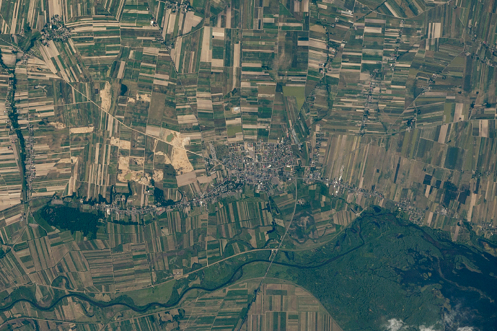
Figure 3. Agricultural fields in Central Poland. NASA https://visibleearth.nasa.gov/images/146593/agriculture-fields-in-central-poland/146595w
For a microbiology example, edge effects of heated culture plates. For a growth experiment it’s unlikely we are specifically interested in the plate layout on the growth characteristics of treated cells. However, it’s also unlikely we can assume placement has no influence on growth (eg, Mansoury et al 2021). A 96-well microplate has 60 inner wells and 36 edge wells (A1 – H1, A12-H12, plus 1st and 12th wells of columns B – H, for a total of 36 wells, Fig 4). Thus, analysis of growth effects should include a block effect for well position.
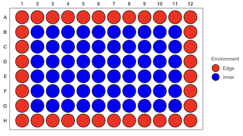
Figure 4. Format of 96-well plate. Red cells = “edge” wells; blue cells = “inner” wells. Plotted with ggplate package.
For long incubation periods it’s not unexpected that edge wells and inner wells may evaporate at different rates, potentially confounding interpretation of treatment effects if, by chance, treatment samples are more commonly assigned to edge wells. Block sampling implies subjects from treatment groups are randomly assigned to each block, in equal numbers if possible.
Cluster Sampling: In many situations, the population is far too large or too dispersed and scattered for a list of the entire population to be known. And, a random approach ignores that there is a natural grouping — people live next to each other, so there is going to be things in common. A multi-stage approach to sampling will be better than simply taking a random sample approach. Most surveys of opinion (when conducted reputably) use a multi-stage method. For example, if a senator wishes to poll his constituents about an issue, he may his pollster will randomly select a few of the counties from his state (first stage), then randomly select among towns or cities (second stage), to obtain a list of 1000 people to call. In some instances, they might use even more stages. At each stage, they might do a stratified random sample on sex, race, income level, or any other useful variable on which they could get information before sampling. If you are interested in this kind of work, for starters, see Couper and Miller (2009).
There are more types of sampling, and entire books written about the best way to conduct sampling. One important thing to keep in mind is that as long as the sample is large relative to the size of the population, each of the above methods generally will get the same answers (= the statistics generated from the samples will be representative of the population).
As long as some attempt is made to randomize, then you can say that the procedure is probability sampling. Nonprobability, or haphazard sampling, describes the other possibility, that is, each element is selected arbitrarily by a non-formal selecting of individual. … all the fish or birds that you catch may not be a random sample of those present in a population. For example,
- wild Pacific salmon do not feed on the surface, hatchery salmon feed on the surface. …
- all the individuals who respond to a survey.
- Phone surveys, web surveys, person on the street surveys… how random, how representative?
Sampling with computers
Now to determine the probability of your group being selected second, we need to distinguish between two kinds of sampling:
Sampling with replacement — after I select the first group, the first group is returned to the pool of groups that have not been selected. In other words, with replacement, your group could be selected first and selected second! The probability of being selected second then remains
Sampling without replacement — after I select the first group, then I have
![\[26 -1\]](https://biostatistics.letgen.org/wp-content/ql-cache/quicklatex.com-a314c642fc0677b3377f14c515483660_l3.png "Rendered by QuickLaTeX.com")
groups left to select the second group, so probability that your group will be second is
![\[p = \frac{1}{26-1}\]](https://biostatistics.letgen.org/wp-content/ql-cache/quicklatex.com-084877df14c9128a49a3f35d237c7b53_l3.png "Rendered by QuickLaTeX.com")
. The first group has already been selected and is not available, and so on.
Sampling is usually easiest if a computer is used. Computers use algorithms to generate pseudo-random numbers. We call the resulting numbers pseudo-random to distinguish them from truly random physical processes (eg, radioactive decay). For more information about random numbers, please see random.org.
If all you wish to do is select a few observations or you need to use a random procedure to select subjects prior to observations, then these websites can provide a very quick, useful tool.
Sampling in Microsoft Excel or LibreOffice Calc
Microsoft’s Excel is pretty good at sampling, but requires knowledge of included functions. Here are the steps to generate random numbers and select with and without replacement in Excel. I’ll give you two cases.
1. For random numbers, enter the function =rand() in a cell, then drag the cell handle to fill in cells to N (in our case = 26, so A1 to A26). This function generates a random (more or less!) number between 0 and 1. We want digits between 1 and 26, not fractions between 0 and 1, so combine INT function with RAND function
=INT(27*RAND())
Note 2: To get between 1 and 9, multiply by 10 instead of 27; to get between 1 and 100, multiply by 101, etc.
In Excel to sample with replacement, simply pick the first two cells (the algorithm Excel used already has conducted sample with replacement. See next item for method to sample without replacement in Excel. You have to have installed the Data Analysis Tool Pak. Here’s instructions for Office 2010.
If you have a Mac and Office 2008, there is no Data Analysis Tool Pak, so to get this function in your Excel, install a third-party add-in program (eg, StatPlus, a free add-in, really nice, adds a lot of function to your Excel). If you have the 2011 version of Office for Mac, then the Data Analysis Tool Pak is included, but like your Windows counterparts, you have to install it (click here for instructions).
2. Let’s say that we have already given each group a number between 1 and 26 and we enter those numbers in sequence in column A.
To sample without replacement, select Tools → Data Analysis… (if this option is not available, you’ll have to add it — see Excel help for instructions, Fig 5).
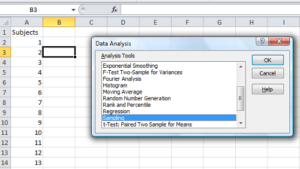
Figure 5. Screenshot of Sampling in Data Analysis menu, Microsoft Excel
Enter the cells with the numbers you wish to select from. In our example, column A has the numbers 1 through 26 representing each group in our class. I entered A:A as the Input Range.
Next, select “Random” and enter the number of samples. I want two.
Click OK and the output will be placed into cell B3 (my choice); I could have just as easily had Excel put the answer into a new worksheet.
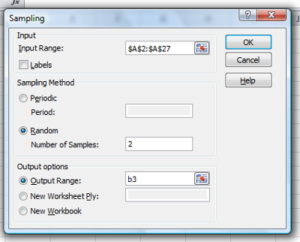
Figure 6. Screenshot of input required for Sampling in Data Analysis menu, Microsoft Excel
To sample with replacement from column A (with our 1 through 26), type in the formula B1
=INT(27*RAND())and the formula C1
=INDEX(A:A,RANK(B1,B:B))then drag the cell handles to fill in the columns (first column B, then column C).
That’ll do it for MS Excel or LibreOffice Calc.
Sampling with R (Rcmdr)
It’s much easier with much more control to get sampling in Rcmdr (R) than in Excel. Sampling in R is based on the function called sample() and sample.int(). I will present just the sample() command here.
sample(x, size, replace = FALSE, prob = NULL)Example
You want to sample ten integers between 1 and 10
sample(10)R output
sample(10)
[1]  5  1 10  8  7  3  4  9  2  6
You have a list of subjects, A1 through A10
subjects = c("A1","A2","A3","A4","A5","A6","A7","A8","A9","A10")
sample(subjects, 3, replace = FALSE, prob = NULL)
R output
sample(subjects, 3, replace = FALSE, prob = NULL)
[1] "A5" "A2" "A9"
Could use this to arrange random order for ten subjects
sample(subjects, 10, replace = FALSE, prob = NULL)
[1] "A9" "A3" "A8" "A2" "A1" "A4" "A10" "A7" "A5" "A6"
Try with replacement; To sample with replacement, type in TRUE after replace in the sample() function. The R output follows
sample(x, 10, replace = TRUE, prob = NULL)
[1]  5  5  3  5  3  7  3  5 10  6
R’s randomness is based on pseudonumbers and is, therefore, not truly random (actually, this is true of just about all computer-based algorithms unless they are based on some chaotic process). We can use this pseudo part to our advantage: if we want to reproduce our “random” process, we can seed the random number algorithm to a value (eg, 100), with the command in the Script Window
set.seed(100)For 10 random integers (eg, observations), type in the Script window
sample(10)R returns the following in the Output Window
sample(10)
[1] 4 5 7 3 10 9 2 1 6 8
Sampling was done without replacement. Here’s another selection round,
First without setting a seed value
sample(10)
[1] 10 4 7 3 8 1 2 9 6 5
Try again to see if get the same 10
sample(10)
[1]  1  4  8  2  9  6  5 10  3  7
Now to demonstrate how setting the seed allows you to draw repeated samples that are the same.
Note 3: If I need to precede the sample command with a set.seed() call, then sampling is repeatable.
set.seed(100)
sample(10)
[1] 4 3 5 1 9 6 10 2 8 7
and try again
set.seed(100)
sample(10)
[1] 4 3 5 1 9 6 10 2 8 7
Additional R packages that help with sampling schemes include: sampling() and spatialsample, which is part of the BiodiversityR package, which is available as a plugin for R Commander.
Quiz Chapter 5.6
Sampling from populations
Questions
- For our two descriptions of experiments in section 6.1 (the sample of patients; the sample of frogs), which sampling technique was used?
- What purpose is served by
set.seed()in a sampling trial? - Consider our question, Does taking a multivitamin daily improve health? Imagine you have a grant willing to support a long-term prospective study to follow up to one thousand people for ten years. List at least three concerns with proposed solutions about how sampling of subjects for the study.
- Imagine you wish to conduct a detailed survey to learn about student preferences. Your survey will include many questions, so you decide to ask just ten students. Student population is 70% female, 30% male.
- Assuming you select at random (simple random sampling), what is the chance that no male students will be included in your survey?
- You are able to increase the number of surveys to 20, 30, 40, or 50. What is the chance that no male students will be included in your survey for each of these increased sample numbers?
- What can you conclude about the effects of increasing survey sample size on representativeness of students for the survey?
- Discuss how you could apply a stratified sampling scheme to this survey and whether or not this approach improves representativeness.
- Why are random numbers generated by a computer called pseudo random numbers?
Chapter 5 contents
5.5 – Importance of randomization in experimental design
Introduction
If the goal of the research is to make general, evidenced-based statements about causes of disease or other conditions of concern to the researcher, then how the subjects are selected for study directly impacts our ability to make generalizable conclusions. The most important concept to learn about inference in statistical science is that your sample of subjects upon which all measurements and treatments are conducted, ideally should be a random selection of individuals from a well-defined reference population.
The primary benefit of random sampling is that it strengthens our confidence in the links between cause and effect. Often after an intervention trial is complete, differences among the treatment groups will be observed. Groups of subjects who participated in sixteen weeks of “vigorous” aerobic exercise training show reduced systolic blood pressure compared to those subjects who engaged in light exercise for the same period of time (Cox et al 1996). But how do we know that exercise training caused the difference in blood pressure between the two treatment groups? Couldn’t the differences be explained by chance differences in the subjects? Age, body mass index (BMI), overall health, family history, etc?
How can we account for these additional differences among the subjects? If you are thinking like an experimental biologist, then the word “control” is likely coming to the foreground. Why not design a study in which all 60 subjects are the same age, the same BMI, the same general health, the same family … history…? Hmm. That does not work. Even if you decide to control age, BMI, and general health categories, you can imagine the increased effort and cost to the project in trying to recruit subjects based on such narrow criteria. So, control per se is not the general answer.
If done properly, random sampling makes these alternative explanations less likely. Random sampling implies that other factors that may causally contribute to differences in the measured outcome, but themselves are not measured or included as a focus of the research study, should be the same, on average, among our different treatment groups. The practical benefits of proper random sampling is that recruiting subjects gets easier — fewer subjects will be needed because you are not trying to control dozens of factors that may (or may not!) contribute to differences in your outcome variable. The downside to random sampling is that the variability of the outcomes within your treatment groups will tends to increase. As we will see when we get to statistical inference, large variability within groups will make it less likely that any statistical difference between the treatment groups will be observed.
Demonstrate the benefits of random sampling as a method to control for extraneous factors.
The study reported by Cox et al included 60 obese men between the ages of 20 and 50. A reasonable experimental design decision would suggest that the 60 subjects be split into the two treatment groups such that both groups had 30 subjects for a balanced design. Subjects who met all of the research criteria and who had signed the informed consent agreement are to be placed into the treatment groups and there are many ways that group assignment could be accomplished. One possibility, the researchers could assign the first 30 people that came into the lab to the Vigorous exercise group and the remaining 30 then would be assigned to the Light exercise group. Intuitively I think we would all agree that this is a suspect way to design an experiment, but more importantly, why shouldn’t you use this convenient method?
Just for argument’s sake, imagine that their subjects came in one at a time, and, coincidentally, they did so by age. The first person was age 21, the second was 22, and so on up to the 30th person who was 50. Then, the next group came in, again, coincidentally in order of ascending age. If you calculate the simple average age for each group you will find that they are identical (35.5 years). On the surface, this looks like we have controlled for age: both treatment groups have subjects that are the same age. A second option is to sort the subjects into the two treatment groups so that a 21 year old is in Group A, and the other 21 year old is in Group B, and so on. Again, the average age of Group A subjects and of Group B subjects would be the same and therefore controlled with respect to any covariation between age and change in blood pressure. However, there are other variables that may covary with blood pressure, and by controlling one, we would need to control the others. Randomization provides a better way.
I will demonstrate how randomization tends to distribute the values in such a way that the groups will not differ appreciably for the nuisance variables like age and BMI differences and, by extension, any other covariable. The R work is attached following the Reading list. The take-home message: After randomly selecting subjects for assignment to the treatment groups, the apparent differences between Group A and Group B for both age and BMI are substantially diminished. No attempt to match by age and by BMI is necessary. The numbers are shown in the table and then in two graphics (Fig. 1, Fig. 2) derived from the table.
Table 1. Mean age and BMI for subjects in two treatment groups A and B where subjects were assigned randomly or by convenience to treatment groups.
| Group | Random assignment of subjects to treatment groups | Convenience assignment of subjects to treatment groups |
|---|---|---|
| A | 35.2 | 28 |
| B | 35.8 | 43 |
| A | 32.49 | 28.99 |
| B | 32.87 | 37.37 |
Just for emphasis, the means from Table 1 are presented in the next two figures (Fig 1 and Fig 2).
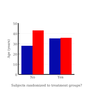
Figure 1. Age of subjects by groups (A = blue, B = red) with and without randomized assignment of subjects to treatment groups
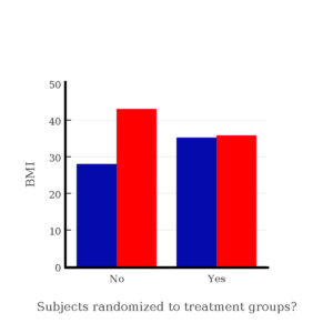
Figure 2. BMI of subjects by groups (A = blue, B = red) with and without randomized assignment of subjects to treatment groups
Note that the apparent difference between A and B for BMI disappear once proper randomization of subjects was accomplished. In conclusion, a random sample is an approach to experimental design that helps to reduce the influence other factors may have on the outcome variable (e.g., change in blood pressure after 16 weeks of exercise). In principle, randomization should protect a project because, on average, these influences will be represented randomly for the two groups of individuals. This reasoning extends to unmeasured and unknown causal factors as well.
This discussion was illustrated by random assignment of subjects to treatment groups. The same logic applies to how to select subjects from a population. If the sampling is large enough, then a random sample of subjects will tend to be representative of the variability of the outcome variable for the population and representative also of the additional and unmeasured cofactors that may contribute to the variability of the outcome variable.
What about observational studies? How does randomization work?
However, if you do cannot obtain a random sample, then conclusions reached may be sample-specific, biased. …perhaps the group of individuals that likes to exercise on treadmills just happens to have a higher cardiac output because they are larger than the individuals that like to exercise on bicycles. This nonrandom sample will bias your results and can lead to incorrect interpretation of results. Random sampling is CRUCIAL in epidemiology, opinion survey work, most aspects of health, drug studies, medical work with human subjects. It’s difficult and very costly to do… so most surveys you hear about, especially polls reported from Internet sites, are NOT conducted using random sampling (included in the catch-all term “probability sampling“)!! As an aside, most opinion survey work involves complex sample designs involving some form of geographic clustering (e.g., all phone numbers in a city, random sample among neighborhoods).
Random sampling is the ideal if generalizations are to be made about data, but strictly random sampling is not appropriate for all kinds of studies. Consider the question of whether or not EMF exposure is a risk factor for developing cancer (Pool 1990). These kinds of studies are observational: at least in principle, we wouldn’t expect that housing and therefore exposure to EMF is manipulated (cf. discussion Walker 2009). Thus, epidemiologists will look for patterns: if EMF exposure is linked to cancer, then more cases of cancer should occur near EMF sources compared to areas distant from EMF sources. Thus, the hypothesis is that an association between EMF exposure and cancer occurs non-randomly, whereas cancers occurring in people not exposed to EMF are random. Unfortunately, clusters can occur even if the process that generates the data is random.
Compare Graph A and Graph B (Fig 3). One of the graphs resulted from a random process and the other was generated by a non-random process. Note that the claim can be rephrased about the probability that each grid has a point, eg, it’s like Heads/Tails of 16 tosses of a coin. We can see clusters of points in Graph B; Graph A lacks obvious clusters of points — there is a point in each of the 16 cells of the grid. Although both patterns could be random, the correct answer in this case is Graph B.
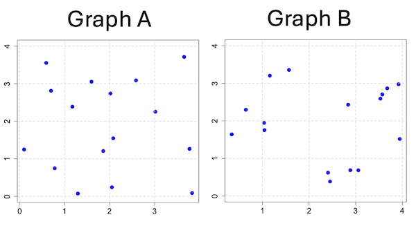
Figure 3. An example of clustering resulting from a random sampling process (Graph B). In contrast, Graph A was generated so that a point was located within each grid.
Hard to tell — and truth be told, random process could generate either one. To convince you, Figure 4 reveals the grouping that was done for Group A, in contrast with Group B which was drawn with the truly random process.
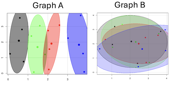
Figure 4. Same graphs as Figure 3, but with ellipses around the grouped data (hard to tell, but the centroids are the larger points).
Implications for sampling
The graphic below shows the transmission grid in the continental United States (Fig 5). How would one design a random sampling scheme overlaid against the obviously heterogeneous distribution of the grid itself? If a random sample was drawn, chances are good that no population would be near a grid in many of the western states, but in contrast, the likelihood would increase in the eastern portion of the United States where the population and therefore transmission grid is more densely placed.
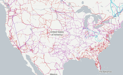
Figure 5. Map of electrical transmission grid for continental United States of America. Image source https://openinframap.org/#3/24.61/-101.16
For example, you want to test whether or not EMF affects human health, and your particular interest is in whether or not there exists a relationship between living close to high voltage towers or transfer stations and brain cancer. How does one design a study, keeping in mind the importance of randomization for our ability to generalize and assign causation? This is a part of epidemiology which strives to detect whether clusters of disease are related to some environmental source. It is an extremely difficult challenge. For the record, no clear link to EMF and cancer has been found, but reports do appear from time to time (e.g., report on a cluster of breast cancer in men working in office adjacent to high EMF, Milham 2004).
Questions
1. Use the sample() with and without replacement on the object (see help with R below)
fruit <- c("apple", "banana", "grape", "kiwi", "pear", "pineapple", "tomato")a) set of 3
b) set of 4
2. Confirm the claim by calculating the probability of Graph A result vs Graph B result (see R script below).
Quiz Chapter 5.5
Importance of randomization in experimental design
R code!
Code you type is shown in red; responses or output from R are shown in blue. Recall that statements preceded by the hash # are comments and are not read by R (i.e., no need for you to type them).
First, create some variables. Vectors aa and bb contain my two age sequences.
 aa = seq(21,50)
 bb = seq(21,50)
Second, append vector bb to the end of vector aa
 age = append(aa,bb)
 age           #submit the vector (variable) name to print the records for verification - looks good!
  [1] 21 22 23 24 25 26 27 28 29 30 31 32 33 34 35 36 37 38 39 40 41 42 43 44 45 46 47 48 49 50 21 22 23 24 25 26 27 28 29 30 31 32 33 34 35 36 37
 [48] 38 39 40 41 42 43 44 45 46 47 48 49 50
Third, get the average age for the first group (the aa sequence) and for the second group (the bb sequence). Lots of ways to do this, I made a two subsets from the combined age variable; could have just as easily taken the mean of aa and the mean of bb (same thing!).
 A = age[1:30]
 mean(A)
 [1] 35.5
 B = age[31:60]
 mean(B)
 [1] 35.5
Fourth, start building a data frame, then sort it by age. Will be adding additional variables to this data frame
 ex.random = data.frame(age)
 AO.all = sort(ex.random$age)
 AO.age           #submit the vector (variable) name to print the records for verification - looks good!
  [1] 21 21 22 22 23 23 24 24 25 25 26 26 27 27 28 28 29 29 30 30 31 31 32 32 33 33 34 34 35 35 36 36 37 37 38 38 39 39 40 40 41 41 42 42 43 43 44
 [48] 44 45 45 46 46 47 47 48 48 49 49 50 50
Fifth, divide the variable again into two subsets of 30 and get the averages
 AO = AO.age[1:30]
 AO
  [1] 21 21 22 22 23 23 24 24 25 25 26 26 27 27 28 28 29 29 30 30 31 31 32 32 33 33 34 34 35 35
 mean(AO)
 [1] 28
 BO = AO.age[31:60]
 BO
  [1] 36 36 37 37 38 38 39 39 40 40 41 41 42 42 43 43 44 44 45 45 46 46 47 47 48 48 49 49 50 50
 mean(BO)
 [1] 43
Sixth, create an index variable, random order without replacement
rand.index = sample(1:60,60,replace=F)Add the new variable to our existing data frame, then print it to check that all is well
 ex.random$rand = rand.index
 ex.random
    age rand
 1   21   43
 2   22   15
 3   23   17
 4   24   35
 5   25   19
 6   26   18
 7   27   22
 8   28   31
 9   29   12
 10  30   44
 11  31   24
 12  32    5
 13  33    2
 14  34   50
 15  35   23
 16  36   20
 17  37   41
 18  38   56
 19  39   36
 20  40    8
 21  41   45
 22  42   38
 23  43   42
 24  44   46
 25  45   16
 26  46   21
 27  47   28
 28  48   10
 29  49   32
 30  50   54
 31  21   57
 32  22   51
 33  23   27
 34  24   40
 35  25   14
 36  26   48
 37  27   26
 38  28   58
 39  29    9
 40  30   11
 41  31    4
 42  32   52
 43  33   37
 44  34   53
 45  35    6
 46  36   34
 47  37   39
 48  38    7
 49  39    1
 50  40   47
 51  41   33
 52  42   60
 53  43   49
 54  44   30
 55  45   29
 56  46   55
 57  47   13
 58  48    3
 59  49   25
 60  50   59
Seventh, select for our first treatment group the first 30 subjects from the randomized index. There are again other ways to do this, but sorting on the index variable means that the subject order will be change too.
AR.age = ex.random[order(ex.random$rand),] #created a new data frame to distinguish it from the presorted version "ex.random"Print the new data frame to confirm that the sorting worked. It did. we can see that the rows have been sorted by ascending order based on the index variable.
 AR.age
    age rand
 49  39    1
 13  33    2
 58  48    3
 41  31    4
 12  32    5
 45  35    6
 48  38    7
 20  40    8
 39  29    9
 28  48   10
 40  30   11
 9   29   12
 57  47   13
 35  25   14
 2   22   15
 25  45   16
 3   23   17
 6   26   18
 5   25   19
 16  36   20
 26  46   21
 7   27   22
 15  35   23
 11  31   24
 59  49   25
 37  27   26
 33  23   27
 27  47   28
 55  45   29
 54  44   30
 8   28   31
 29  49   32
 51  41   33
 46  36   34
 4   24   35
 19  39   36
 43  33   37
 22  42   38
 47  37   39
 34  24   40
 17  37   41
 23  43   42
 1   21   43
 10  30   44
 21  41   45
 24  44   46
 50  40   47
 36  26   48
 53  43   49
 14  34   50
 32  22   51
 42  32   52
 44  34   53
 30  50   54
 56  46   55
 18  38   56
 31  21   57
 38  28   58
 60  50   59
 52  42   60
Eighth, create our new treatment groups, again of n = 30 each, then get the means ages for each group.
 AR = AR.age$age[1:30]
 mean(AR)
 [1] 35.16667
 AR2 = AR.all$all[31:60]
 mean(AR2)
 [1] 35.83333
Get the minimum and maximum values for the groups
 min(AR)
 [1] 22
 min(AR2)
 [1] 21
 max(AR)
 [1] 49
 max(AR2)
 [1] 50
Ninth, create a BMI variable drawn from a normal distribution with coefficient of variation equal to 20%. The first group with we will call cc
cc = rnorm(n=30,m=27.5, sd=5.5) #mean was 27.5 for this group with standard deviation of 5.5The second group called dd
dd = rnorm(n=30,m=37.5, sd=7.5) #mean was 37.5 for this group with standard deviation of 7.5Create a new variable called BMI by joining cc and dd
 BMI=append(cc,dd)
 BMI            #print out BMI to confirm. Looks good!
  [1] 27.87528 27.83250 31.88703 34.99041 24.06751 23.50952 22.57779 31.48394 31.04321 25.60258 25.41081 22.34619 34.62213 36.41348 41.17740
 [16] 20.56529 27.25238 21.85205 32.11690 32.37168 23.11314 33.29110 34.99106 38.22016 18.72105 26.22030 25.13412 27.50475 34.79361 32.81267
 [31] 47.57872 27.58428 40.17211 38.22195 26.91893 37.02784 53.72671 34.94727 30.35245 38.32571 40.52111 36.15627 30.36592 36.20397 47.63142
 [46] 40.30846 36.47643 50.86804 43.63741 37.84994 42.82665 41.71008 28.44976 24.57906 42.37762 38.38512 35.22879 31.34063 34.02996 27.28038
Add the BMI variable to our data frame.
 ex.random$BMI = BMI
 ex.random              #Print out the revised data frame. Looks good. We now have three variables: age, the index "rand," and now BMI
    age rand      BMI
 1   21   43 27.87528
 2   22   15 27.83250
 3   23   17 31.88703
 4   24   35 34.99041
 5   25   19 24.06751
 6   26   18 23.50952
 7   27   22 22.57779
 8   28   31 31.48394
 9   29   12 31.04321
 10  30   44 25.60258
 11  31   24 25.41081
 12  32    5 22.34619
 13  33    2 34.62213
 14  34   50 36.41348
 15  35   23 41.17740
 16  36   20 20.56529
 17  37   41 27.25238
 18  38   56 21.85205
 19  39   36 32.11690
 20  40    8 32.37168
 21  41   45 23.11314
 22  42   38 33.29110
 23  43   42 34.99106
 24  44   46 38.22016
 25  45   16 18.72105
 26  46   21 26.22030
 27  47   28 25.13412
 28  48   10 27.50475
 29  49   32 34.79361
 30  50   54 32.81267
 31  21   57 47.57872
 32  22   51 27.58428
 33  23   27 40.17211
 34  24   40 38.22195
 35  25   14 26.91893
 36  26   48 37.02784
 37  27   26 53.72671
 38  28   58 34.94727
 39  29    9 30.35245
 40  30   11 38.32571
 41  31    4 40.52111
 42  32   52 36.15627
 43  33   37 30.36592
 44  34   53 36.20397
 45  35    6 47.63142
 46  36   34 40.30846
 47  37   39 36.47643
 48  38    7 50.86804
 49  39    1 43.63741
 50  40   47 37.84994
 51  41   33 42.82665
 52  42   60 41.71008
 53  43   49 28.44976
 54  44   30 24.57906
 55  45   29 42.37762
 56  46   55 38.38512
 57  47   13 35.22879
 58  48    3 31.34063
 59  49   25 34.02996
 60  50   59 27.28038
Tenth, repeat our protocol from before: Set up two groups each with 30 subjects, calculate the means for the variables and then sort by the random index and get the new group means.
 AO = ex.random$BMI[1:30]
 mean(AO)
 [1] 28.99333
 BO = ex.random$BMI[31:60]
 mean(BO)
 [1] 37.36943
All we did was confirm that the unsorted groups had mean BMI of around 27.5 and 37.5 respectively. Now, proceed to sort by the random index variable. Go ahead and create a new data frame
 AR.age = ex.random[order(ex.random$rand),]
 AR.age                 #Print out the new data frame to confirm. Looks good.
    age rand      BMI
 49  39    1 43.63741
 13  33    2 34.62213
 58  48    3 31.34063
 41  31    4 40.52111
 12  32    5 22.34619
 45  35    6 47.63142
 48  38    7 50.86804
 20  40    8 32.37168
 39  29    9 30.35245
 28  48   10 27.50475
 40  30   11 38.32571
 9   29   12 31.04321
 57  47   13 35.22879
 35  25   14 26.91893
 2   22   15 27.83250
 25  45   16 18.72105
 3   23   17 31.88703
 6   26   18 23.50952
 5   25   19 24.06751
 16  36   20 20.56529
 26  46   21 26.22030
 7   27   22 22.57779
 15  35   23 41.17740
 11  31   24 25.41081
 59  49   25 34.02996
 37  27   26 53.72671
 33  23   27 40.17211
 27  47   28 25.13412
 55  45   29 42.37762
 54  44   30 24.57906
 8   28   31 31.48394
 29  49   32 34.79361
 51  41   33 42.82665
 46  36   34 40.30846
 4   24   35 34.99041
 19  39   36 32.11690
 43  33   37 30.36592
 22  42   38 33.29110
 47  37   39 36.47643
 34  24   40 38.22195
 17  37   41 27.25238
 23  43   42 34.99106
 1   21   43 27.87528
 10  30   44 25.60258
 21  41   45 23.11314
 24  44   46 38.22016
 50  40   47 37.84994
 36  26   48 37.02784
 53  43   49 28.44976
 14  34   50 36.41348
 32  22   51 27.58428
 42  32   52 36.15627
 44  34   53 36.20397
 30  50   54 32.81267
 56  46   55 38.38512
 18  38   56 21.85205
 31  21   57 47.57872
 38  28   58 34.94727
 60  50   59 27.28038
 52  42   60 41.71008
Get the means of the new groups
 AR = AR.age$BMI[1:30]
 mean(AR)
 [1] 32.49004
 min(AR)
 [1] 18.72105
 max(AR)
 [1] 53.72671
 AR2 = AR.all$BMI[31:60]
 mean(AR2)
 [1] 33.87273
 min(AR2)
 [1] 21.85205
 max(AR2)
 [1] 47.57872
That’s all of the work!
Data set
nonrandom
| X | Y |
| 0.779 | 0.747 |
| 0.098 | 1.248 |
| 0.697 | 2.811 |
| 0.59 | 3.553 |
| 1.295 | 0.075 |
| 1.858 | 1.207 |
| 1.172 | 2.388 |
| 1.597 | 3.051 |
| 2.051 | 0.242 |
| 2.081 | 1.546 |
| 2.016 | 2.738 |
| 2.587 | 3.088 |
| 3.833 | 0.088 |
| 3.776 | 1.264 |
| 3.017 | 2.254 |
| 3.657 | 3.712 |
random
| X1 | Y1 |
| 1.157 | 3.203 |
| 2.407 | 0.62 |
| 1.033 | 1.946 |
| 3.676 | 2.866 |
| 3.57 | 2.703 |
| 3.056 | 0.685 |
| 1.568 | 3.355 |
| 1.041 | 1.753 |
| 0.643 | 2.295 |
| 2.884 | 0.687 |
| 3.53 | 2.591 |
| 2.838 | 2.431 |
| 3.945 | 1.518 |
| 0.34 | 1.64 |
| 2.45 | 0.386 |
| 3.921 | 2.976 |
Chapter 5 contents
- The basics explained
- Experiments
- Experimental and Sampling units
- Replication, Bias, and Nuisance Variables
- Clinical trials
- Importance of randomization in experimental design
- Sampling from Populations
- References and suggested readings
5.4 – Clinical trials
Introduction
Two areas of inquiry have contributed enormously to our understanding of experimental design: agriculture research (Verdooren 2020) and human subject clinical trials. This page outlines types of clinical trial designs and briefly introduces the subject of research ethics with human subject research (Huang and Hadian 2006). After completing this page, the reader will be able to identify key clinical trial types and recognize the fundamental ethical principles governing human subject research.
Although this page does not address the many concerns for ethical research in ecology and environmental studies, many parallels can be drawn (Crozier and Schulte-Hostedde 2014, Samuel and Richie 2022). To name just one example, both disciplines mandate a “do no harm,” principle. In clinical research this amounts to minimizing risks to human subjects; in environmental and ecology studies, acknowledging experimental studies through sampling or chemical releases can damage ecosystems (Resnik 2009).
An outline of clinical trials
Much has been written about biomedical research study design; a couple of accessible articles that can supplement the material presented here include Benson and Hart 2000, Concato et al 2000, Gabriella 2012. Even if you never work in clinical research, understanding how clinical trials are designed and under what circumstances limitations of particular designs arise is helpful to all of us who do experimental work. In Mike’s Workbook for Biostatistics we will present descriptions of research activities and step through situations where you will attempt to align the research by analogy to clinical trials. A second approach to learning about experimental design is to read about someone’s study, and reworking it in terms of a clinical trial design perspective. We will use a discussion of clinical trials, used in biomedical research to investigate effectiveness of treatments of disease, as our starting point for learning how statistics informs experimentation.
Types of clinical trials are distinguished by their design and include:
Case studies are a thorough analysis of an individual patient, or a few individuals (a group), focusing on symptoms, diagnostics, treatments and outcomes. Case studies can utilize quantitative or qualitative research methods. Case studies, of course, are not restricted to medical research. The main disadvantage of case studies is that by definition they are not generalizable to the population and, by their very nature, researcher subjectivity (choice of diagnostics, interpretations) and other kinds of bias may be challenging to control. A 2025 case study received considerable news coverage: a 60 year old man developed bromism — a toxic condition resulting from excessive exposure to bromides — consulting ChatGPT for health information (Eichenberger et al 2025).
Experimental studies are just that, research designs that apply techniques of experimental science — controls, randomization, attempts to account for sources of bias. They are intended to make direct comparisons among subjects assigned by the researcher to treatment groups. By definition experiments are longitudinal studies. Longitudinal studies are experimental or observational studies in which multiple observations are recorded for each individual and individuals are tracked over time. Many excellent resources about experimental design, beginning with R.A. Fisher’s 1935 book, The design of experiments, to Scheiner and Gurevitch (Editors) 2001, Design and Analysis of Ecological Experiments (2nd edition), to the many books on randomized control trials, eg, the 5th edition of Designing clinical research (2022), edited by Browner et al.
Observational (or epidemiological) studies — no direct intervention is administered and so observational studies tend to be retrospective; we identify individuals with and without the condition and attempt to identify associations between the condition and any number of potential causal factors.
Cross-sectional studies are examples of descriptive study designs. They take observations at one point in time on a variety of individuals. It can be used to associate factors with the condition in question, and can be used to estimate the prevalence of a condition in the population. Omair (2015) provides an accessible summary of case and cross-sectional study designs.
Cross-sectional studies are referred to as method = cross.sectional in the package epiR.
Cohort studies involve a group of subjects (eg, patients) who receive the same treatment at the same time. A cohort consists of subjects who are linked in some way. It could be a trivial link, like the cohorting done at university (all incoming Freshmen students who enroll for a class offered at 9:30AM), or it could be based on shared experience due to an exposure event (eg, all passengers on a jet traveling with an index case or “patient zero”).
- Prospective cohort studies enroll people as cohorts at the beginning of a study and follow them over time
- Retrospective cohort studies may utilize archived records.
Cohort and other variations of observational studies (eg, case control, test-negative design), can establish associations between risk factors and conditions or specific adverse events, but cannot by themselves establish cause and effect (Benson and Hartz 2000). A search of PUBMED for “cohort study” reports more than 3.2 million studies since 1914. A 2025 prospective cohort study with more than 1800 pregnant women found no change in risk of major birth defects after maternal mRNA COVID-19 vaccination in the first trimester of pregnancy (Kayser et al 2025).
Cohort studies are referred to as method = cohort.count in the package epiR.
Case control studies are similar to cohort studies, except they are retrospective. Case refers to subjects with one or more characteristics of interest. Used to infer the exposure risk factor by evaluating historical records. Omair (2016) provides an accessible summary of cohort and case control study designs. Designed to identify associations between exposure and particular outcomes, case control studies are retrospective and observational studies: Retrospective because the outcomes are already known, and observational because the event was caused by nature, not experiment. In principle, researchers identify a number of cases with a particular outcome (eg, lung cancer), then attempt to match cases to individuals who do not have the outcome (controls). Work is done to look back to see if the exposure (eg, smoking) is more frequent in the case group than the control group.
Case control studies have several advantageous compared to other approaches: rapid to conduct compared to longitudinal studies (the even has already happened), and efficient because small sample sizes may be enough to reach conclusions. Among their limitations, however, is the problem of how to match cases with controls. Obvious matching accomplished by grouping by age categories, body mass index, gender, socio-economic status, and so on. Three papers authored by Wacholder published in American Journal of Epidemiology 1992 describe in detail, from theory to practice, case control selection (Wacholder 1992abc). A search of PUBMED for “case control” reports more than 400 thousand studies since 1950. A 2025 case control study with more than one million records found no effect of aluminum adjuvant in childhood vaccines on chronic autoimmunity, atopy or allergy, and neurodevelopmental disorders (Andersson et al 2025).
Case control studies are referred to as method = case.control in the package epiR.
Test-negative designs are a kind of case control studies where the cases are those testing positive for the specific agent and controls are those who test negative for the agent, but importantly, both groups are individuals seeking care for symptoms characteristic of exposure to the agent (Kissling et al 2009, Fukushima and Hirota 2017). This design is intended to reduce the effects of health-care seeking behavior, therefore minimizing possible selection bias, and, therefore false associations between exposure and disease. Note however, that test-negative studies rely on test accuracy (discussed in Chapter 7.3 – Conditional Probability and Evidence Based Medicine); false negatives, where a person has the disease but test results return negative, incorrectly assigns the individual to the control group. This leads to underestimation of true effect of the intervention, eg, vaccination Fukushima and Hirota 2017).
Randomized Control (interventional or experimental) Trials (RCT): compares an experimental treatment group with a control) placebo group. The groups are assigned to groups randomly. Another variant of a RCT is a randomized clinical trial, with the only difference that the clinical trial compares different treatments and may not include a control group.
Double-blind: The “gold standard” RCT. Both the patient and those interacting with the patient do not know what treatment the patient has received.
Placebo: a treatment in name only. The placebo is a designed but medically ineffective agent given to a study subject. There is considerable debate about what a placebo should contain and as to the ethics and general merits of its use in clinical trials (Temple and Ellenberg 2000).
- active control or comparator studies are now common in place of placebo studies where treatment is clearly better than not giving the subject something of benefit (i.e., the placebo which is designed to not benefit the subject). Active control is not automatically a better choice than placebo control because they may be less effective in evaluating cause and effect (Temple and Ellenberg 2000).
The controlled clinical trial has a long history: Daniel’s vegetarian diet (Daniel’s training in Babylon, Book of Daniel, Old Testament, discussed in Bhatt 2010, h/t Treece 1990) — after ten days those on Daniel’s diet looked healthier than the others who ate the King’s prescribed meal of meat and wine; James Lind’s scurvy trials on board HMS Salisbury British ship in 1747 (references in Bhatt 2010). Randomized control trials (RCT) were introduced by Hill and others in 1946 study of streptomycin efficacy against tuberculosis. The effectiveness of RCT are now established and integral to regulation of drug development.
Use of clinical trials unfortunately has a longer history than recognition of human rights (Rice 2008). World War II Nazi medical research atrocities are well known (Berger 1990), so too the longitudinal study of Tuskegee syphilis study on African-Americans (Brandt 1978). But there are too many other examples: 1884 Hawaii, inoculation of Keanu by Dr. Arning with leprosy in exchange for commuting Keanu’s death sentence to life imprisonment (Keanu developed leprosy and died in 1890, Binford 1936); many studies of American Indians/Alaskan natives (Hodge 2012). Concerns about ethical treatment of participants in studies remains a challenge; see controversy over prospective randomized control trial (NCT00078182) of safety and efficacy of an HIV prophylactic tenofovir treatment in Cambodia (Singh and Mills 2005, Mills et al 2005).
Rules of conduct were established at Nuremberg, and subsequently extended and codified by Belmont Accords: core principles of respect for persons, beneficence, and justice. Ethical standards of who participates are institutionalized by IRB boards. True informed consent remains challenging (Rothwell et al 2021 and references therein).
Figure 1 shows how common in PUBMED randomized control trials and references to use of double blind design in research (Fig 1).
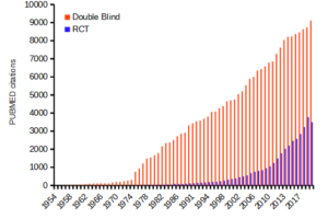
Figure 1. Search of PUBMED for “RCT” and “double blind” studies from 1950 to 2024.
Ethics of clinical and experimental research
Informed consent of subjects before proceeding in a clinical trial is a required, essential component of the design of a clinical trial. Guidelines for research conducted on human subjects originated from The Nuremberg Code (Shuster 1997). The Code was formulated 67 years ago, in August 1947, in Nuremberg, Germany, by American judges sitting in judgment of Nazi doctors accused of conducting torturous experiments on humans in the concentration camps (Shuster 1997). It served as a blueprint for today’s principles that ensure the rights of subjects in medical research. Achieving informed consent is not always straightforward (Nijhawan et al 2013), and we continue to see research that challenges ethical standards (eg, discussion in Suba 2014). Additionally, and perhaps less appreciated, the Nuremberg Code is justification for invasive animal research: animal research must precede human subject testing (Shuster 1997).
While informed consent is required, clearly, it is not enough. Emmanuel et al (2000) provide a framework for evaluating the ethics of a research program involving human subjects:
- Value
- Scientific validity
- Fair subject selection
- Favorable risk-benefit ratio
- Independent review
- Informed consent
- Respect for enrolled subjects
An additional concept, clinical equipoise (Freedman 1987) is relevant. Freedman noted that the researcher must have “genuine uncertainty” with respect to the merits of each treatment, or an “honest null hypothesis.” If a consensus exists that one treatment is better than another, including placebo, then there is no null hypothesis and the research would be invalid (Emmanuel et al 2000). Take, for example, the suggestion that clinicians should withhold angiotensin converting inhibitors (ACE2) from their hypertensive Covid-19 patients (Fang et al 2020; discussed in Tignaneli et al 2020). The hypothesis comes from the observation that SARS-COV2, like SARS-Cov, binds with ACE2 receptor in order to invade the cell. Blocking ACE2 inhibitors then would reduce activation of pulmonary renin angiotensin system and subsequent lung injury. Tignaneli et al (2020) called this a case of clinical equipoise — they argued no evidence supports “routine discontinuation” of ACE inhibitors.
Returning to the framework, Emmanuel et al left the equipoise consideration off their list for a number of reasons — for example, clinical equipoise can lead researchers to view pursuit of research has the same weight as therapy. Importantly, the proposed framework shifts the focus from the researcher views to a structured process of oversight that may minimize exploitation. It emphasizes factors like independent review and informed consent as more reliable ethical safeguards.
Moreover, the Nuremberg Code is foundational but not the current, nor the sole guidance for research conducted on human subjects; modern biomedical research is guided by more comprehensive documents like the Declaration of Helsinki and the Belmont Report, in addition to federal regulations and Institutional Review Boards or IRB.
Guidelines mandate detail about experimental design.
Professional journals expect authors to provide detailed descriptions of all methodology, including aspects of experimental design. Fundamental to the aim of science, to increase our knowledge An essential component of science To improve this kind of communication many journals and professional societies have promoted standards about what must be included in these descriptions. For example, efforts of the CONSORT, which stands for CONsolidated Standards Of Reporting Trials, at www.consort-statement.org, to improve the reporting of clinical trials by authors and provide guidelines for reviewers and editors is endorsed by more than 400 journals. The CONSORT checklist address
- Trial design
- Participants
- Interventions
- Outcomes
- Sample size
- Randomization
- Implementation
- Blinding
- Statistical methods
These nine elements were judged essential for authors to report how their study implemented or did not implement. The purpose of these items is to in order to improve reproducibility of published research. For animal research a similar list is available from ARRIVE (Kilkenny et al 2010). ARRIVE also addresses additional criteria and directs how these should be reported throughout the paper, not just in the methods section. Like CONSORT, hundred of journals have endorsed the ARRIVE 20-item checklist.
Clinical researchers must implement protocols to insure data management guidelines are followed. Clinical data management is a large topic in and of itself, so we won’t discuss this area further. However, good data management practice across disciplines share a number of features. For example, all data records should include metadata, where metadata refers to “information about data,” and would include enough information about the experiment, including
- dates and times of observations
- personnel
- facilities
- protocols used
- number of subjects
- list of variables with definitions
- full name of variable plus any acronym
- measurement units
- instrumentation
- notes about data quality
- conditions
and more (this is hardly an exhaustive list). Metadata therefore explains how data were obtained. Lists of variables are also called data dictionaries. If data are stored in spreadsheets, for example, then good practice includes including a worksheet with the metadata for the data set.
Note 1: We introduced metadata and data dictionaries with our discussion about data types in Chapter 3.1.
Questions
- Be able to define the following terms
- case control
- case study
- cohort study
- cross sectional study
- observational study
- experimental study
- single arm trial
- single blind vs double-blinding in research design
- Early in the Covid-19 pandemic, hydroxycholoquine was suggested for treating Covid-19 patients, and some called for prophylactic use of the malarial drug. Discuss the treatment hypothesis in the context of clinical equipoise.
- Distinguish between case control prospective and case control retrospective studies and the kinds of inferences that can be made.
Quiz Chapter 5.4
Clinical trials
Chapter 5 contents
4.9 – Heat maps
Introduction
A heat map is a graph of data from a matrix (Wilksonson and Friendly 2009). Heat maps are common in many disciplines in biology, from ecology (e.g., diversity analyses) to genomics (e.g., gene expression profiling) to economics and demographics (Fig. 1). Instead of plotting numbers, color is used to communicate associations between cells in the rows and columns of the matrix.
Heat maps are useful for suggesting trends and typically do not require specialized knowledge to interpret. Provided a color scale is defined, then heat maps do a good job communicating trends. Viewers may rapidly make comparisons as they scan colors, from cold to hot.
Figure 1 provides a classic heat map, counties of USA by percent ethnicity compared to “white” from Census.gov based on the 2010 census. Scale reads shades of blue to white, high percentage(greater than 96.3%) of whites to lower percentage (less than 71%) of whites, respectively. Map generated with mapping tool at United States Census Bureau TIGERweb.
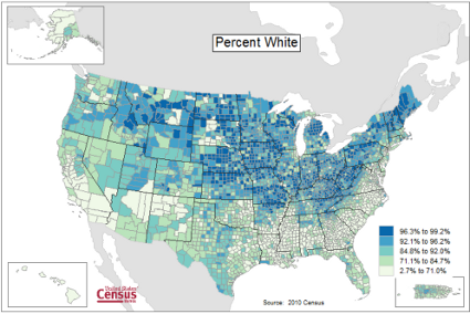
Figure 1. Heat map, USA population by county and percent ethnicity compared to white, graph from census.gov
Note 1: Technically, Figure 1 is an example of a Choropleth Map.
Figure 2 shows gene expression results from a pilot study we did on metal exposure in cultured rat lung cells compared to cells without metal exposure (i.e., the control group). Genes were selected because of their role in the epithelial-mesenchyme transition, EMT. The color scale is typical for such studies: green represents down-regulation, red indicates up-regulation compared to the controls. Black used to show no difference between treatment and control cells.
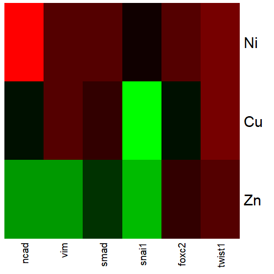
Figure 2. Heat map, gene expression in cultured rat lung cells exposed to metals
Heat maps are good at directing the viewer to areas of strong association between variables, or in the case of comparisons, to draw strong inferences about the association. However, their chief limitations include gradations between colors; like pie charts, it is difficult to interpret the importance of slight changes in color, and the very use of heat map colors does not imply statistical significance (Chapter 8). Some color palettes are poor choices for viewers who may be color blind. A good source about colors is available in the Graphs section of Cookbook for R.
R and heat maps
Lots of specialized packages will do cluster to heat map. Functions include heatmap, heatmap2, heatmap.plus, NeatMap. We’ll step through how to make a heat map with another pilot study data from our lab.
heatmap(). Here’s another heat map, percent DNA in tail from Alkaline Comet Assay (Figure 3). The same cultured cell line, a rat immortalized Type 2-like alveolar lung cell line L2 cells, were grown in media containing witch-hazel tea, a dilute copper solution, or both witch-hazel tea and copper (unpublished data). The hypothesis was that there would be greater DNA damage in cells exposed to copper compared to cells in hazel tea or a combination of copper and hazel tea. Witch hazel is reputed to have antioxidant properties (Pietta et al 1998). A random sample of 10 cells were sampled from each treatment (between 30 and 60 cells counted for each treatment). Within each treatment values were placed in ascending order, so “Cell 1” corresponds to the lowest value for a measured cell in each treatment.
#data arranged in unstacked worksheet
data <- as.matrix(hazelCuUnstack)

#check the import
head(data)

         Copper       Hazel HazelCopper]
[1,] 0.02404672 0.007185706 0.02663191
[2,] 0.06711479 0.027020958 0.03181153
[3,] 0.12196060 0.037725842 0.03743693
[4,] 0.13308991 0.044762867 0.03851548
[5,] 0.13344032 0.045809398 0.18787608
[6,] 0.17537831 0.060942269 0.19494708

#make the heat map
heatmap(data)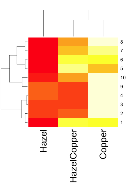
Figure 3. A simple heat map generated by heatmap() function, all default options.
The heatmap() function first runs a cluster analysis to group the cells by columns and rows — so similar cells are grouped together. The row and column dendrograms are default; your data are rearranged by the clustering procedure. To generate the heatmap without the dendrograms, add the following to the R code.
heatmap(data, Rowv = NA, Colv = NA)
ggplot2 and aes(). Not straight forward, but ggplot2 (and therefore the Rcmdr plug-in KMggplot2) can be used. The aes function is part of the “aesthetic mapping” approach (Wickham 2010). The example below takes the same data and introduces use of a custom color palette, brewer.pal. Uses geom_tile, but geom_raster can also be used.
library(RColorBrewer)
#Explore the color profiles available at http://colorbrewer2.org/#type=sequential&scheme=BuGn&n=3
?brewer.pal
hm1.colors <- colorRampPalette(rev(brewer.pal(9, 'RdYlGn')), space='Lab')
#the data set
hazelCu <- read.table("hazelCu.txt", header=TRUE, sep="t", na.strings="NA", dec=".", strip.white=TRUE)
#Confirm the import
head(hazelCu)

Cell Treatment TailPerc
1 1 C 0.02404672
2 2 C 0.06711479
3 3 C 0.12196060
4 4 C 0.13308991
5 5 C 0.13344032
6 6 C 0.17537831

#convert cell number to factor.
hazelCu <- within(hazelCu, {
Cell <- as.factor(Cell)
})

ggplot(hazelCu,aes(x=Treatment,y=Cell,fill=TailPerc)) + geom_tile() + coord_equal() +
scale_fill_gradientn(colours = hm1.colors(100))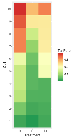
Figure 4. ggplot() and aes() functions used to generate a heat map. Colors from brewer.pal
The color scheme used in Figure 3 is common in gene expression studies: green is negative, cooler, while red is positive, hotter.
Questions
- What are three advantages of heat map for communicating data.
- What are three disadvantages of heat map for communicating data.
- What color pallet is considered “color-friendly” for accessible visualization?
Quiz Chapter 4.9
Heat maps
Chapter 4 contents
4.8 – Ternary plots
Introduction
Ternary plots are used to show composition of a mixture of three components. For example, simple soil composition analysis, a ternary plot is used to display the relative proportions of sand, clay, and silt in a soil sample (eg, Shepard’s diagram). The R package soiltexture contains a number of routines for soil analysis, including generating ternary plots. The package also includes a simple graphical user interface, soiltexture_gui().
Consider a soil sample by a sedimentation procedure (“jar test”). From the image at Clemson Cooperative Extension Home and Garden Information Center page, we get
Table 1. Jar test results from image at Clemson Cooperative Extension.
| CLAY | SILT | SAND | Z |
| 8.3 | 25 | 66.6 |
in percent. Z is used to add an additional variable to plot (eg, TT_plot()), like soild organic carbon or pH.
Follow the prompts offered by the GUI and we get Figure 1.
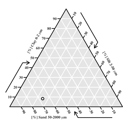
Figure 1. Example of Shepard’s plot with data from Clemson Cooperative Extension using R soiltexture package.
With only one sample, the plot is over kill — The soil is mostly sandy with some silt and very little clay.
To interpret the point on the ternary soil texture diagram:
- Start at the plotted black point near the lower left portion of the triangle.
- Read the sand percentage first:
- Follow lines parallel to the left side of the triangle down toward the bottom axis.
- The point aligns near 67% sand.
- Read the silt percentage:
- Follow lines parallel to the left-bottom side toward the right axis.
- The point corresponds to about 25% silt.
- Read the **clay percentage**:
- Follow horizontal lines toward the left axis.
- The point lies near 8% clay.
Additional fields where ternary plots are common include atmospheric greenhouse gas emissions, CO2 – N2 – O2, from a submarine source Daskalopoulou et al (2002), land cover distribution: urban, agriculture, undeveloped (USGS).
In population genetics, de Finetti diagram is used to display three ratio variables that, together, sum to one. For example, display frequency of the three genotypes of a one gene, two allele system in a population. Download the package Ternary from the R mirror. From the Ternary package, we can get a blank plot by simply calling the function TernaryPlot(). R returns the blank plot to the Graphics window (Fig 2).
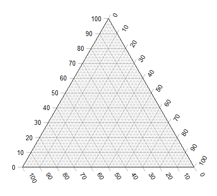
Figure 2. Blank Graphics window with initial ternary plot.
The basic ternary plot is shown in Figure 1. Running from one corner to another you can see how the frequencies range from 0 to 100%. While we can use the Ternary package, other packages allow you to make ternary plots too, including HardyWeinberg. This package includes several useful tests of the Hardy Weinberg model for population genetics data, so we’ll use that package.
Our example will use the HWTernaryPlot function in the HardyWeinberg package. Before proceeding with the example, download and install the package.
A nice site on ternary plots in Microsoft Excel (24 steps!) is provided at chemostratigraphy.com. Instructions also worked for LibreOffice Calc (pers. obs.). Take a look at www.ternaryplot.com for a really nice online plot builder.
Example. Recall your basic population genetics, for a locus with 2 alleles with frequency p and q in the population, and given Hardy-Weinberg assumptions apply (e.g., no evolution!), then expected genotype frequencies are given by expanding (p + q)2 = 1.
Consider a population genetics example using Skittles (Fig 3).
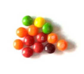
Figure 3. A few Skittles® candies.
For several bags, count the greens (p) and the oranges (q). Data for 17 mini bags reported Table 2.
Table 2. Counts of green and orange Skittles from 17 mini bags.
| Bag | GREEN | ORANGE |
|---|---|---|
| bag1 | 4 | 2 |
| bag2 | 8 | 2 |
| bag3 | 3 | 3 |
| bag4 | 3 | 4 |
| bag5 | 5 | 7 |
| bag6 | 5 | 1 |
| bag7 | 13 | 5 |
| bag8 | 4 | 2 |
| bag9 | 6 | 3 |
| bag10 | 3 | 2 |
| bag11 | 5 | 4 |
| bag12 | 9 | 9 |
| bag13 | 0 | 2 |
| bag14 | 7 | 3 |
| bag15 | 5 | 4 |
| bag16 | 6 | 2 |
| bag17 | 2 | 3 |
Next, we calculate the genotype frequencies from our counts. For example, for bag1, p = 4/6 and q = 2/6. We can imagine a diploids at the locus: GG, GO, and OO, with frequencies p2, 2pq, and q2. The frequencies for the three genotypes are shown in Table 2.
Table 3. Genotype frequencies for our hypothetical population of Skittle diploid critters.
| Bag | p^2 | 2pq | q^2 |
|---|---|---|---|
| bag1 | 0.44 | 0.44 | 0.11 |
| bag2 | 0.64 | 0.32 | 0.04 |
| bag3 | 0.25 | 0.5 | 0.25 |
| bag4 | 0.18 | 0.49 | 0.33 |
| bag5 | 0.17 | 0.49 | 0.34 |
| bag6 | 0.69 | 0.28 | 0.03 |
| bag7 | 0.52 | 0.4 | 0.08 |
| bag8 | 0.44 | 0.44 | 0.11 |
| bag9 | 0.44 | 0.44 | 0.11 |
| bag10 | 0.36 | 0.48 | 0.16 |
| bag11 | 0.31 | 0.49 | 0.2 |
| bag12 | 0.25 | 0.5 | 0.25 |
| bag13 | 0 | 0 | 1 |
| bag14 | 0.49 | 0.42 | 0.09 |
| bag15 | 0.31 | 0.49 | 0.2 |
| bag16 | 0.56 | 0.38 | 0.06 |
| bag17 | 0.16 | 0.48 | 0.36 |
For the plot, the HWTernaryPlot function expects counts, not frequencies of three genotypes of a gene in a population, with genotype frequency that sums to one. Table 3 shows calculated genotype data, assuming 20 Skittle diploid critters per bag.
Table 4. Expected genotype counts.
| Bag | GG | GO | OO |
|---|---|---|---|
| bag1 | 9 | 9 | 2 |
| bag2 | 13 | 6 | 1 |
| bag3 | 5 | 10 | 5 |
| bag4 | 4 | 10 | 7 |
| bag5 | 3 | 10 | 7 |
| bag6 | 14 | 6 | 1 |
| bag7 | 10 | 8 | 2 |
| bag8 | 9 | 9 | 2 |
| bag9 | 9 | 9 | 2 |
| bag10 | 7 | 10 | 3 |
| bag11 | 6 | 10 | 4 |
| bag12 | 5 | 10 | 5 |
| bag13 | 0 | 0 | 20 |
| bag14 | 10 | 8 | 2 |
| bag15 | 6 | 10 | 4 |
| bag16 | 11 | 8 | 1 |
| bag17 | 3 | 10 | 7 |
Example
Create an R data.frame called skittles from Table 4. Because HWTernaryPlot requires input only of the genotype data, remove the first column
dSkittles <- subset(skittles, select = -c(Bag) )
require(HardyWeinberg)
#Create a Ternaryplot
HWTernaryPlot(dLactose,100,pch=19, cex=2, region=1,hwcurve=TRUE, curvecols=c("red", "green"), vbounds=FALSE, vertex.cex=2, verbose=TRUE)
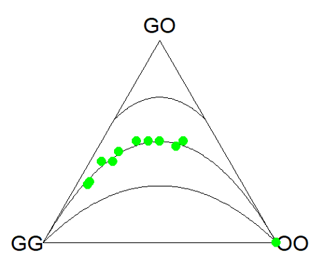
Figure 4. Ternary plot of our Skittle critter data.
What do we have? The function plots three convex curved lines. The green points are the heterozygote (GO) frequencies. They all fall on the middle line, as expected, because I had used HW to calculate frequency of the heterozygotes. If any population had numbers of observed heterozygotes different from expected values, then the population point would be represented by a red point and it would fall in one of the regions above or below the curved lines.
Question
- Repeat the Skittles example, but replace with counts for purple (p) and red (q) candies (scroll down to data below, or click here).
- Optional: A more realistic example would be to draw 2 candies from Skittles bag and record the counts (e,g, how many purple+ purple, purple+red, red+red pairs drawn), then make Ternary plots on the observed and not the expected frequencies.
- Genetic example. The ternary plot is useful for displaying population genetic frequency data. For example, ability to digest lactose, i.e., lactase persistence, is in part due to genotype at SNP rs4988235 (Enattah et al 2002). Genotypes CC tend to be lactose intolerant, genotypes CT and TT are lactose tolerant. I gathered allele frequencies from the ALFA: Allele Frequency Aggregator for several human populations, calculated genotype frequencies assuming Hardy-Weinberg equilibrium. I also created results for a hypothetical population “Madeup.” (Scroll down to data below, or click here). Enter the data into R as a dataframe, eg,
data.SNP, copy R code from this page, make the necessary changes, and recreate the plot shown in Figure 4.- What do you conclude about the heterozygotes in Madeup population?
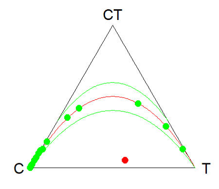
Figure 4. rs4988235 genotype frequencies, data.SNP.
- Add a new row of data to your rs4988235 data set,
data.SNP. CC= 4, CT = 10, TT = 6. The data were derived from frequencies reported in Figure 2, Baffour-Awuah et al 2016 (PMC4308731). To add a new row, modify the code below
data.SNP <- rbind(data.SNP, “PMC4308731” = c(4, 10, 6))
Create another ternary plot, and address whether or not this new data set shows heterozygotes in agreement with Hardy Weinberg assumptions.
Quiz Chapter 4.8
Ternary plots
Data sets
Skittles Data
| Bag | GREEN | ORANGE | RED | PURPLE |
|---|---|---|---|---|
| bag1 | 4 | 2 | 3 | 3 |
| bag2 | 8 | 2 | 4 | 8 |
| bag3 | 3 | 3 | 4 | 2 |
| bag4 | 3 | 4 | 1 | 2 |
| bag5 | 5 | 7 | 6 | 7 |
| bag6 | 5 | 1 | 2 | 3 |
| bag7 | 13 | 5 | 5 | 5 |
| bag8 | 4 | 2 | 5 | 2 |
| bag9 | 6 | 3 | 4 | 4 |
| bag10 | 3 | 2 | 5 | 3 |
| bag11 | 5 | 4 | 2 | 3 |
| bag12 | 9 | 9 | 6 | 8 |
| bag13 | 0 | 2 | 5 | 2 |
| bag14 | 7 | 3 | 6 | 7 |
| bag15 | 5 | 4 | 1 | 3 |
| bag16 | 6 | 2 | 4 | 2 |
| bag17 | 2 | 3 | 1 | 4 |
SNP Data
| Population | C | CT | T |
|---|---|---|---|
| Mambila | 99 | 1 | 0 |
| Ben Amir | 99 | 1 | 0 |
| Zaramo | 100 | 0 | 0 |
| Bedouin | 95 | 5 | 0 |
| Druze | 93 | 7 | 0 |
| Kuwaiti | 86 | 13 | 1 |
| Dutch | 12 | 45 | 43 |
| Finns | 3 | 29 | 68 |
| Swedes | 1 | 13 | 87 |
| Bengali | 87 | 13 | 1 |
| Naga | 100 | 0 | 0 |
| Mala | 88 | 12 | 0 |
| Han | 100 | 0 | 0 |
| Japanese | 100 | 0 | 0 |
| Koreans | 100 | 0 | 0 |
| Cheyene | 93 | 7 | 0 |
| Pima | 98 | 2 | 0 |
| Maya | 90 | 10 | 0 |
| Brazilian | 50 | 42 | 9 |
| Chilean | 60 | 35 | 5 |
| Colombian | 81 | 18 | 1 |
| Madeup | 40 | 5 | 55 |
Chapter 4 contents
4.7 – Q-Q plot
Introduction
Use of graphs by a data analyst may serve different purposes: communication of results or as diagnostics. The Q-Q plot is one example of a graph used as a diagnostic.
The quantile-quantile, or Q–Q plot is a probability plot used to compare graphically two probability distributions. In brief, a set of intervals for the quantiles is chosen for each sample. A point on the plot represents one of the quantiles from the second distribution (y value) against the same quantile from the first distribution (x value).
A common use of Q-Q plot would be to compare data from a sample against a normal distribution. If the sample distribution is similar to a normal distribution, the points in the Q–Q plot will approximately lie on the line y = x.
R code
In R, the Q-Q plot can be obtained directly in Rcmdr.
Figure 1. A Q-Q plot, the default command in Rcmdr
Rcmdr: Graphics → Quantile-comparison plot…
After choosing the variable (in this case, Sales), click on Options tab and make additional selections before making the graph. Here, selected normal distribution.
Figure 2. Screenshot of R Commander menu for Q-Q plot
Another version is available in the KMggplot2 package.
Questions
- What is a Q-Q plot used for in statistics?
- Looking at the plot in Figure 1, explain why the confidence lines get further and further away from the straight line.
Quiz Chapter 4.7
Q-Q plots
Chapter 4 contents
4.6 – Adding a second Y axis
Introduction
Scatter plots are used to show association between two continuous variables. However, it is not uncommon to have a third variable for which association between the same X variable is expected. Thus, a common scatter plot includes a second Y axis. These graphs are a bit more involved to make regardless of which application used. The purpose of this short section is to provide a way to create a plot with two Y axes against a common X axis. Additional plotting options are also provided and explained.
The data set
The first draft of this post was written in September 4, 2019, peak time for hurricanes. Hurricane Dorian passed the Bahamas as a category 4 storm heading for Florida. For context I include a screenshot of imagery from NOAA; you can see Dorian along the Florida coastline as well as four additional storms lined up from the coast of Africa across the Atlantic Ocean (Fig 1).
Figure 1. Screenshot from NOAA GOES-East – Sector view: Tropical Atlantic – GeoColor, 4 September 2019. Click image to view full sized image.
The data set here is the number of Atlantic Ocean Category 1, 2, 3, 4, or 5 storms since 1900, tabulated by decade. Storms are categorized by wind speed according to the Saffir-Simpson Hurricane Wind Scale, or SSHWS.
Note 1: Since September 2019 there have been 36 major hurricanes: 2019, October – December = 3; 2020 = 13; 2021 = 3; 2022 = 3; 2023 = 2; 2024 = 12.
Additional data, average levels of carbon dioxide (CO2), a greenhouse gas, measured at Mauna Loa and average global temperature index from NOAA were also acquired for the same period. (The temperature index is called anomaly data as it is the difference of temperature between the average temperatures between 1950 and 1980).
#Create the time data, 12 decades, with 2010 based on 8 years only -- up to 2018
decade <- seq(1900,2010, by = 10)
#Saffir-Simpson Hurricane Wind Scale; compiled from Wikipedia, checked against NOAA
cat01 <- c(2,0,1,3,0,9,4,11,18,11,27,46)
cat02 <- c(2,0,1,3,10,4,5,4,3,13,9,8)
cat03 <- c(7,2,3,1,4,10,9,5,4,12,11,7)
cat04 <- c(1,6,5,8,9,10,9,5,5,10,15,8)
cat05 <- c(0,0,2,6,0,2,4,3,3,2,9,4)
#land ocean anomaly temperature index, NOAA
tempIndex <- c(-0.317,-0.329,-0.241,-0.123,0.042,-0.048,-0.028,0.034,0.247,0.387,0.591,0.791)
#mauna kea CO2, mean by decade, record starts 1958
co2 <- c(NA,NA,NA,NA,NA,316.0,320.3,330.9,345.5,360.5,378.6,399.0)
Note 2: Corresponding temperature anomalies and CO2 data: cc
Combine all of the variables into a single data frame.
storms <- data.frame(decade,tempIndex,cat01,cat02,cat03,cat04,cat05,co2)
head(storms)
Output from R should look like
  decade tempIndex cat01 cat02 cat03 cat04 cat05 co2
1   1900    -0.317     2     2     7     1     0  NA
2   1910    -0.329     0     0     2     6     0  NA
3   1920    -0.241     1     1     3     5     2  NA
4   1930    -0.123     3     3     1     8     6  NA
5   1940     0.042     0    10     4     9     0  NA
6   1950    -0.048     9     4    10    10     2 316
Create a new variable with all categories of storms summed by decade.
#Sum all of the storms
allHur <- cat01+cat02+cat03+cat04+cat05
#Add new variable to the data frame
storms$allHur <- allHur
#Attach the data frame so you don't have to keep referring to the data frame when you call variables.
attach(storms)
Now, create a simple scatter plot, number of hurricanes by decade (Fig 2).
plot(decade,allHur,pch=16)
Figure 2. Plot of hurricanes from 1900 to present by decade.
Note 3: Best data come from the satellites, which means use of data since the 1980s would be more appropriate. IPCC reports climate change is projected to increase the intensity of hurricanes, with higher wind speeds and more rainfall. While there is not a consensus on the frequency of storms, the proportion of the most intense storms (Category 4 and 5) is expected to increase, and rapid intensification is also likely to become more common (Masson-Delmotte, et al (2021), IPCC Sixth Assessment Report (AR6) – The Physical Science Basis).
A note on data management
This note is not needed for the plots. However, it’s as good a place as any to comment about how to work with your data in R. For the hurricane data, I set the data frame storms as an unstacked (wide) worksheet. The code that follows shows how to use the reshape2 package, part of the tidyverse set of packages for data manipulation, to convert the data frame from unstacked (wide) to stacked (long).
#code modified from examples presented by Thomas Eisfeld
library(reshape2)
library(dplyr)
tryMe <- melt(storms, id.vars=c("decade", "tempIndex", "co2"), variable.name = "SSHWS", value.name = "hurricanes")
head(tryMe)
You can also take a stacked (long) worksheet and convert it to unstacked (wide) with dcast().
tryAgain <- dcast(tryMe, decade + tempIndex + co2 ~ SSHWS)Make the plots
At last, here’s the code for adding a second Y axis. Code modified from https://www.r-bloggers.com/r-single-plot-with-two-different-y-axes/. The work flow begins by setting parameters of the plotting window, creating the first plot, followed up by adding the second plot (par=TRUE), setting graphing elements, then adding labels and a legend.
First plot example: Total number of hurricanes by decades, with Temperature Index by decades. Number of hurricanes represented on first (left) axis and Temperature Index represented on second (right) axis (Fig 3).
par(mar = c(5,5,2,5))
#Create the first plot
plot(tryAgain$decade, tryAgain$allHur, pch=16, cex=1.5, col="black", xlab="Decades", ylab="Hurricanes", main="Atlantic Hurricanes by Decade")
the syntax par(mar = c(bottom, left, top, right))
#Add the second plot
par(new=T)
plot(tryAgain$decade, tryAgain$tempIndex, type="l", lty="dashed", lwd=2, col="red3", axes=F, xlab=NA, ylab=NA)
axis(side=4)
mtext(side=4,line=3,"Temperature Index")

#Add a legend
legend("topleft",legend=c("Hurricanes", "Temperature Index"),lty=c(0,2), pch=c(16,NA), col=c("black", "red3"))
Figure 3. Total number of hurricanes by decades, with Temperature Index by decades. Number of hurricanes represented on first (left) axis and Temperature Index represented on second (right) axis.
Next plot example: Total number of hurricanes by decades, with Atmospheric CO2 measured at Mauna Loa by decades. Number of hurricanes represented on first (left) axis and Atmospheric CO2 represented on second (right) axis (Fig 4).
par(mar = c(5,5,2,5))
plot(tryAgain$decade, tryAgain$allHur, pch=16, cex=1.5, col="black", xlab="Decades", ylab="Hurricanes", main="Atlantic Hurricanes by Decade")
Create space for the second plot in the same frame (use T or TRUE, both work).
par(new=T)Code for the second plot. Note that axes=F (“F” or “FALSE” works) is used to suppress printing axes — Recall that lines were already created by the first plot; if you do not add this, then additional lines are added to the plot.”NA” is used to suppress adding labels; if you do not add this code, then labels will be printed over the existing labels created for the first plot. The code axis=4 sets the right-hand Y axis to active. The next code, mtext() is used to place the axis label for the second Y axis.
plot(tryAgain$decade, tryAgain$co2, type="l", lty="dashed", lwd=2, col="red3", axes=F, xlab=NA, ylab=NA)
axis(side=4)
mtext(side=4,line=3,"Mean CO2, ppm")
Add the legend.
legend("topleft",legend=c("Hurricanes", "CO2"),lty=c(0,2), pch=c(16,NA), col=c("black", "blue"))
Figure 4. Total number of hurricanes by decades, with Atmospheric CO2 measured at Mauna Kea by decades. Number of hurricanes represented on first (left) axis and Atmospheric CO2 represented on second (right) axis.
Go ahead and try these plots. Change the settings (e.g., lty, pch, cex, col), and note how the graphs look.
Bubble (chart) plot
From the basic scatter plot a variety of variants have been developed to convey additional information about ratio scale variables. The bubble chart is one common example and can be used as an alternative to adding a second Y-axis in some cases. A bubble plot uses the area of a bubble to represent a third variable, while a second y-axis is used to display a second set of data with its own scale on the same chart.
In brief, a third variable is added, mapped to circle size. Spreadsheet apps also include options to make bubble charts and the wonderful plot.ly library provides a vehicle to produce sophisticated graphs including bubble charts online or as a package in R — and it works well with the ggplot2 package. A nice bubble chart introduction is available at Atlassian.
Examples of bubble charts with R code are provided in Ch16.3. That said, what’s one more? Here’s example R code:
ggplot(storms, aes(x = decade, y = tempIndex, size = total_storms)) +
  geom_point(alpha = 0.7, color = "lightgreen") + # Added color = "lightgreen"
  scale_size_continuous(range = c(3, 15)) +
  labs(title = "Temperature Index vs. Decade with Total Storms",
       x = "Decade",
       y = "Land Ocean Anomaly Temperature Index",
       size = "Total Storms") +
  theme_classic()
and the plot, Figure 4.
Figure 4. Bubble plot of association between total hurricanes and Land-Ocean Temperature Anomalies by Decade.
If you are interested in trying yourself, a bubble chart yourself, CO2 datas with the hurricane data set is a good candidate for a bubble plot.
Questions
-
Using the
plot()command, make the following graphs- One scatter plot for each category of storm by decade
- Explore the kinds of graph elements available by changing
pchvalues. Create your own - Change point size by changing valued for
cex
- Create a new plot with Decade on X axis, Temperature Index on first Y axis, and CO2 on the second Y axis.
- Include a legend for the plot.
- What is a Q-Q plot used for in statistics?
- Looking at the plot in Figure 5, explain why the confidence lines get further and further away from the straight line.
- What are some advantages and disadvantages of heat map for communicating data.
- What color pallet is considered “color-friendly” for accessible visualization?
- Create a table with three columns.
- In column 1, list the name for each graph type discussed in Chapter 5.
- In column 2, state the kind of data appropriate for each graph.
- In column 3, enter the name of a function in the base R package you can use to make the graph
- In column 4, enter the name of a function from the ggplot2 package you can use to make the graph
Quiz Chapter 4.6
Adding a second Y axis
Chapter 4 contents
4.5 – Scatter plots
Introduction
Scatter plots, also called scatter diagrams, scatterplots, or XY plots, display associations between two quantitative, ratio-scaled variables. Each point in the graph is identified by two values: its X value and its Y value. The horizontal axis is used to display the dispersion of the X variable, while the vertical axis displays the dispersion of the Y variable.
The graphs we just looked at with Tufte’s examples Anscombe’s quartet data were scatter plots (Chapter 4 – How to report statistics).
Here’s another example of a scatter plot, data from Francis Galton, data contained in the R package HistData.
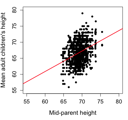
Figure 1. Scatterplot of mid-parent (vertical axis) and their adult children’s (horizontal axis) height, in inches. data from Galton’s 1885 paper, “Regression towards mediocrity in hereditary stature.” The red line is the linear regression fitted line, or “trend” line, which is interpreted in this case as the heritability of height.
Note 1. Sorry about that title — being rather short of stature myself, not sure I’m keen to learn further what Galton was implying with that “mediocrity” quip.
The commands I used to make the plot in Figure 1 were
library(HistData)
data(GaltonFamilies, package="HistData")
attach(GaltonFamilies)

plot(childHeight~midparentHeight, xlab="Mid-parent height", ylab="Mean adult children's height", xlim=c(55, 80), ylim=c(55,80), cex=0.8, cex.axis=1.2, cex.lab=1.3, pch=c(19), data=GaltonFamilies)
abline(lm(childHeight~midparentHeight), col="red", lwd=2)
I forced the plot function to use the same range of values, set by providing values for xlim and ylim; the default values of the plot command picks a range of data that fits each variable independently. Thus, the default X axis values ranged from 64 to 76 and the Y variable values ranged from 55 to 80. This has the effect of shifting the data, reducing the amount of white space, which a naïve reading of Tufte would suggest is a good idea, but at the expense of allowing the reader to see what would be the main point of the graph: that the children are, on average, shorter than the parents, mean height = 67 vs. 69 inches, respectively. Therefore, Galton’s title begins with the word “regression,” as in the definition of regression as a “return to a former … state” (Oxford Dictionary).
For completeness, cex sets the size of the points (default = 1), and therefore cex.axis and cex.lab apply size changes to the axes and labels, respectively; pch refers to the graph elements or plotting characters, further discussed below (see Fig 8); lm() is a call to the linear model function; col refers to color.
Figure 2 shows the same plot, but without attention to the axis scales, and, more in keeping with Tufte’s principle of maximize data, minimize white space.
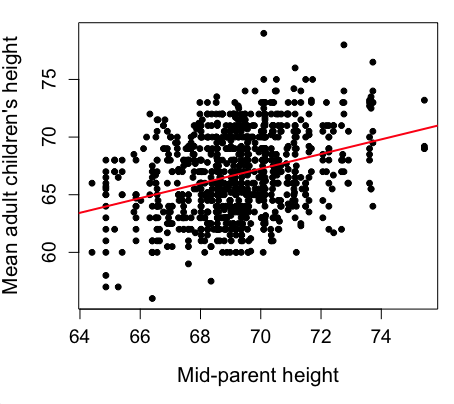
Figure 2. Same plot as Figure 1, but with default settings for axis scales.
Take a moment to compare the graphs in Figure 1 and 2. Setting the scales equal allows you to see that the mid-parent heights were less variable, between 65 and 75 inches, than the mean children height, which ranged from 55 to 80 inches.
And another example, Figure 3. This plot is from the ggplot2() function and was generated from within R Commander’s KMggplot2 plug-in.
Figure 3. Finishing times in minutes of 1278 runners by age and gender at the 2013 Jamba Juice Banana 5K in Honolulu, Hawaiʻi. Loess smoothing functions by groups of female (red) and male (blue) runners are plotted along with 95% confidence intervals.
Figure 3 is a busy plot. Because there were so many data points, it is challenging to view any discernible pattern, unlike Figure 1 and 2 plots, which featured less data. Use of the loess smoothing function, a transformation of the data to reduce data “noise” to reveal a continuous function, helps reveal patterns in the data:
- across most ages, men completed 5K faster than did females and
- there was an inverse, nonlinear association between runner’s age and time to complete the 5K race.
Take a look at the X-axis. Some runners ages were reported as less than 5 years old (trace the points down to the axis to confirm), and yet many of these youngsters were completing the 5K race in less than 30 minutes. That’s 6-minute mile pace! What might be some explanations for how pre-schoolers could be running so fast?
Design criteria
As in all plotting, maximize information to background. Keep white space minimal and avoid distorting relationships. Some things to consider:
- keep axes same length
- do not connect the dots UNLESS you have a continuous function
- do not draw a trend line UNLESS you are implying causation
Scatter plots in R
We have many options in R to generate scatter plots. We have already demonstrated use of plot() to make scatter plots. Here we introduce how to generate the plot in R Commander.
Rcmdr: Graphs → Scatterplot…
Rcmdr uses the scatterplot function from the car package. In recent versions of R Commander the available options for the scatterplot command are divided into two menu tabs, Data and Options, shown in Figure 4 and Figure 5.
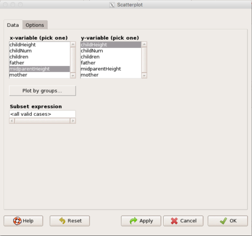
Figure 4. First menu popup in R Commander Scatterplot command, Rcmdr ver. 2.2-3.
Select X and Y variables, choose Plot by groups if multiple grounds are included, eg, male, female, then click Options tab to complete.
Figure 5. Second menu popup in R Commander scatterplot command., Rcmdr ver. 2.2-3
Set graph options including axes labels and size of the points.
Note 2. Lots of boxes to check and uncheck. Start by unchecking all of the Options and do update the axes labels (see red arrow in image). You can also manipulate the plot “points,” which R refers to as plotting characters (abbreviated pch in plotting commands). The “Plotting characters” box is shown as <auto>, which is an open circle. You can change this to one of 26 different characters by typing in a number between 0 and 25. The default used in Rcmdr scatterplot is “1” for open circle. I typically use “19” for a solid circle.
Here is another example using the default settings in scatterplot() function in the car package, now the default scatter plot command via R Commander (Fig. 4), along with the same graph, but modified to improve the look and usefulness of the graph (Fig. 6). The data set was Puromycin in the package datasets.
Figure 6. Default scatterplot, package car, from R Commander, version 2.2-4.
Grid lines in graphs should be avoided unless you intend to draw attention to values of particular data points. I prefer to position the figure legend within the frame of the graph, eg, the open are at the bottom right of the graph. Modified graph shown in Figure 7.
Figure 7. Modified scatterplot, same data from Figure 6
R commands used to make the scatter plot in Figure 7 were
scatterplot(rate~conc|state, col=c("blue", "red"), cex=1.5, pch=c(19,19),
bty="n", reg=FALSE, grid=FALSE, legend.coords="bottomright")
A comment about graph elements in R
In some ways R is too rich in options for making graphs. There are the plot functions in the base package, there’s lattice and ggplot2 which provide many options for graphics, and more. The advice is to start slowly, for example taking advantage of the Figure 8 displays R’s plotting characters and the number you would invoke to retrieve that plotting character.
Figure 8. R plotting characters pch = 1 – 25 along with examples of color.
Note 3. To see available colors at the R prompt type
colors()
which returns 667 different colors by name, from
[1] "white" "aliceblue" "antiquewhite"
to
[655] "yellow3" "yellow4" "yellowgreen"
Note 4. There’s a lot more to R plotting. For example, you are not limited to just 25 possible characters. R can print any of the ASCII characters 32:127 or from the extended ASCII code 128:255. See Wikipedia to see the listing of ASCII characters.
Note 5. You can change the size of the plotting character with “cex.”
Here’s the R code used to generate the graph in Figure 8. Remember, any line beginning with # is a comment line, not an R command.
#create a vector with 26 numbers, from 0 to 25
stuff <-c(0:25)
plot(stuff, pch=c(32:58), cex = 2.5, col = c(1:26), 'xlab' = "pch number", 'ylab' = "Plotting character number")
Is it “scatter plot” or “scatterplot”?
Spelling matters, of course, and yet there are many words for which the correct spelling seems to be like “beauty,” it is “in the eye of the beholder” (Molly Bawn, 1878, by Margaret Hungerford). Scatter plot is one of these — is it one word or two, or is it something else entirely?
Scatter plot is one of these terms: you’ll find it spelled as “scatterplot” or as “scatter plot,” in the dictionary (eg, Oxford English dictionary), with no guidance to choose between them. And I’m not just talking about the differences between British and American English spelling traditions.
Note 6. The spell checkers in Microsoft Office and Google Docs do not flag “scatterplot” as incorrect, but the spell checker in LibreOffice Writer does (per obs).
Thus, in these situations as an author, you can turn to which of the spellings is in common use. I first looked at some of the statistics books on my shelves. I selected 14 (bio)statistics textbooks and checked the index and if present, chapters on graphics for term usage.
Table 1. Frequency of use of different terms for scatter plot in 14 (bio)statistics books currently on Mike’s shelves.
| spelling | number of statistical texts | frequency |
|---|---|---|
| scatter diagram | 2 | 0.144 |
| scatter plot | 5 | 0.357 |
| scattergram | 1 | 0.071 |
| scatterplot | 5 | 0.357 |
| XY plot | 0 | 0.071 |
Not much help, basically, it is a tie between “scatter plot” and “scatterplot.”
Next, I searched six journals for the interval 1990 – 2016 for use of these terms. Results presented in Table 6 along with journal impact factor for 2014 and number of issues (Table 2).
Table 2. Impact factor and number of issues 1990 – 2016 for six science journals.
| Journal | Impact factor | Issues |
|---|---|---|
| BMJ | 17.445 | 1374 |
| Ecology | 5.175 | 271 |
| J. Exp. Biol | 2.897 | 540 |
| Nature | 41.456 | 1454 |
| NEJM | 55.873 | 1377 |
| Science | 33.611 | 1347 |
My methods? I used the journal’s online search functions for the various usage for scatter plot and the results are shown in Figure 9.
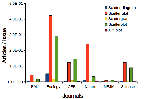
Figure 9. Usage of terms for X Y plots in research articles normalized to number of issues in six journals between 1990 and 2016.
The journals have different numbers of articles; I partially corrected for this by calculating the ratio number of articles with one of the terms divided by the number of issues for the interval 1990 – 2016. It would have been better to count all of the articles, but even I found that to be an excessive effort given the point I’m trying to make here.
Not much help there, although we can see a trend favoring “scatter plot” over any of the other options.
And finally, to completely work over the issue I present results from use of Google’s Ngram Viewer. Ngram Viewer allows you to search words in all of the texts that Google’s folks have scanned into digital form. I searched on the terms in texts between 1950 and 2015, and results are displayed in Figure 10 and Figure 11.
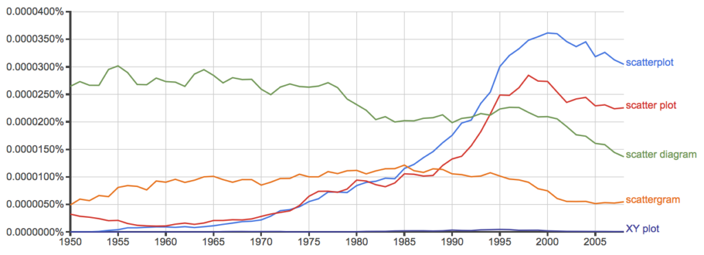
Figure 10. Results from Ngram Viewer for American English, “scatterplot” (blue), “scatter plot” (red), “scatter diagram” (green), “scattergram” (orange), and “XY plot” (purple).
And the same plot, but this time for British sources
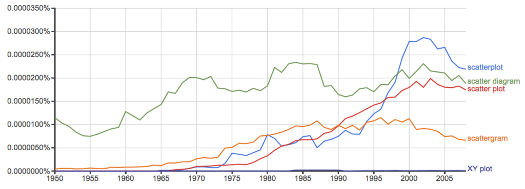
Figure 11. Results from Ngram Viewer for British English. See Figure 10 for key.
Conclusion? It looks like “scatterplot” (blue line) is the preferred usage, but it is close. Except for “scattergram” and “XY plot,” which, apparently, are rarely used. After all of this, it looks like you’re free to make your choice between “scatterplot” or “scatter plot.” I will continue to use “scatter plot.”
Bland-Altman plot
Also known as Tukey mean-difference plot, the Bland-Altman plot is used to describe agreement between two ratio scale variables (Bland and Altman 1986, Giavarina 2015), for example agreement between two different methods used to measure the same samples.
Note 6. Agreement — aka concordance or reproducibility — in the statistical sense is consistent with our everyday conception — consistency among sets of observations on the same object, sample, or unit. We introduce and develop additional agreement statistics in Chapter 9.2 and Chapter 12.3. Additional note for my students — note that I didn’t define agreement by including the term “agree”, thereby avoiding a circular definition (for an amusing clarification on the phrase, see Logically Fallacious). It’s a common short-fall I’ve seen thus far in AI-tools.
Consider use of imageJ by two different observers to record number of pixels of a unit measure (1 cm) on a series of digital images — there’s subjectivity in drawing the lines (where to start, where to end) — do they agree? Data set below. blandr package, blandr.draw function.
Figure 12. Bland-Altman plot of 1 cm unit measure in pixel number by imageJ from digital images by two independent observers. Purple central region is 95% CI. Lower and upper dashed horizontal lines represent bounds of “acceptable” agreement.
blandr.draw(Obs1, Obs2)
The plot makes it easy to identify questionable points, for example, the one point in upper right quadrant looks suspect.
Volcano plot
Used to show events that differ between two groups of subjects (eg, p-values), and is common in gene expression studies of an exposed group vs a control group (eg, fold changes).
Fold changes (often log2-transformed) are reflected on x-axis, indicating how much the gene expression level has increased or decreased. The y-axis typically represents the negative logarithm of the p-value (-logP) , which indicates the statistical significance of the change.
[insert]
Figure 13. Volcano plot, gene expression fold change (graph pending).
Questions
- Using our Comet assay data set (Table 1, Chapter 4.2), create scatter plots to show associations between tail length, tail percent, and olive moment.
- Explore different settings including size of points, amount of white area, and scale of the axes. Evaluate how these changes change the “story” told by the graph.
Quiz Chapter 4.5
Scatter plots
Data sets
Number of pixels of 1 cm length from unit measure on ten digital images. Recorded by two independent observers, Obs1 and Obs2.
 Obs1, Obs2
171.026, 171.105
136.528, 138.521
148.084, 144.222
142.014, 140.057
150.213, 153.118
187.011, 195.092
168.760, 168.668
154.302 ,160.381
209.022, 209.876
240.067, 161.805
Gene expression
ccc
Chapter 4 contents
4.4 – Mosaic plots
Introduction
Mosaic plots are used to display associations among categorical variables. e.g., from a contingency table analysis. Like pie charts, mosaic plots and tree plots (next chapter) are used to show part-to-whole associations. Mosaic plots are simple versions of heat maps (next chapter). Used appropriately, mosaic plots may be useful to show relationships. However, like pie-charts and bar charts, care needs to be taken to avoid their over use; works for a few categories, but quickly loses clarity as numbers of categories increase.
In addition to the function mosaicplot() in the base R package, there are a number of packages in R that will allow you to make these kinds of plots; depending on the analyses we are doing we may use any one of three Rcmdr plugins: RcmdrPlugin.mosaic (depreciated), RcmdrPlugin.KMggplot2, or RcmdrPlugin.EBM.
Example data
Table 1. Records of American and National Leagues baseball teams at home and away midway during 2016 season
| No | Yes | |
|---|---|---|
| AL | 10 | 5 |
| NL | 7 | 8 |
The configuration of major league baseball (MLB) parks differ from city to city. For example, Boston’s American League (AL) Fenway Park has the 30-feet tall “Green Monster” fence in left field and a short distance of only 302 feet along the foul line to right field fence. For comparison, Globe Life Park in Arlington, TX the distance along the foul lines left field (332 feet) and right field (325 feet). So, it suggests that teams may benefit from playing 81 games at their home stadium. To test this hypothesis I selected Win-Loss records of the 30 teams at the midway point of the 2016 season. Data are shown in the Table 1.
mosaicplot() in R base
The function mosaicplot() is included in the base install of R. The following code is one way to directly enter contingency table data like that from Table 1.
myMatrix <- matrix(c(10,  5,  7,  8),  nrow = 2, ncol = 2, byrow = TRUE)
dimnames(myMatrix) <- list(c("AL", "NL"), c("No","Yes"))
myTable <- as.table(myMatrix); myTable
mosaicplot(myTable, color=2:3)
The simple plot is shown in Figure 1. color = “2” is red, color = “3” is green.
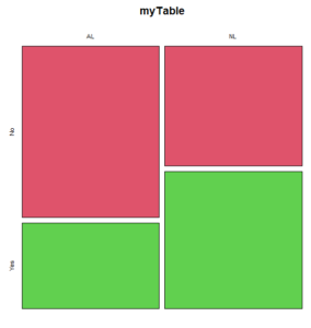
Figure 1. Mosaic plot made with basic function mosaicplot().
mosaic plot from EBM plugin
A good option in Rcmdr is to use the “evidence-based-medicine” or “EBM” plug-in for Rcmdr (RcmdrPlugin.EBM). This plugin generates a real nice mosaic plot for 2 X 2 tables.
After loading the EBM plugin, restart Rcmdr, then select EBM from the menu bar and choose to “Enter two-way table…”
Figure 2. First steps to make mosaic plot in R Commander EBM plug-in.
Complete the data entry for the table as shown in the image below. After entering the values, click the OK button.
Figure 3. Next steps to make mosaic plot in R Commander EBM plug-in.
Along with the requested statistics a mosaic plot will appear in a pop-up window.
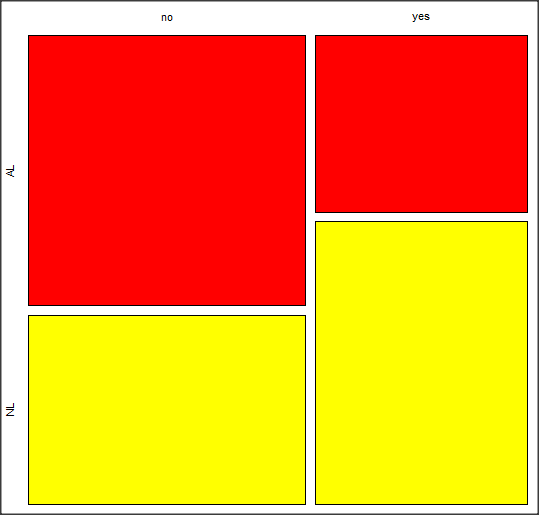
Figure 4. Mosaic plot made from R Commander EBMplug-in
mosaic-like plot KMggplot2 plugin
The KMggplot2 plugin for Rcmdr will also generate a mosaic-like plot. After loading the KMggplot2 plugin, restart Rcmdr, then load a data set with the table (e.g., MLB data in Table 1). Next, from within the KMggplot2 menu select, “Bar chart for discrete variables…”
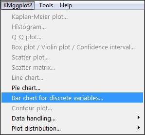
Figure 5. First steps to make mosaic plot in R Commander KMggplot2 plug-in.
From the bar chart context menu make your selections. Note that this function has many options for formatting, so play around with these to make the graph the way you prefer.
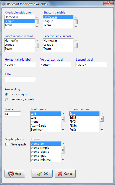
Figure 6. Next steps to make mosaic plot in R Commander KMggplot2 plug-in.
And here is the resulting mosaic-like plot from KMggplot2.
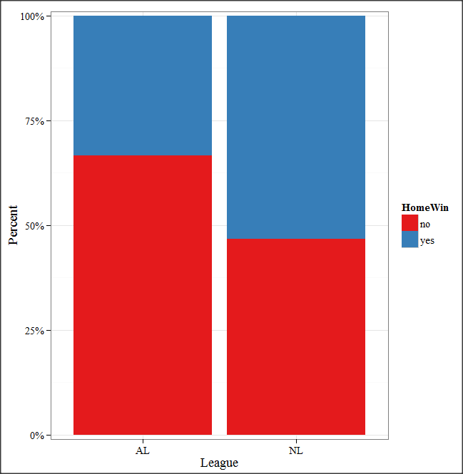
Figure 7. Mosaic-like plot made from R Commander KMggplot2 plug-in.
Questions
1. Most US states have laws that dictate pre-employment drug testing for job candidates; Interestingly, states are increasingly legalizing marijuana use. Data for states plus District of Columbia are presented in the table. Make a mosaic plot of the table.
Table 2. Marijuana use is US states, legal or not legal
| Marijuana-use legal | Marijuana-use not legal | |
|---|---|---|
| Yes | 19 | 12 |
| No | 14 | 6 |
Data adopted from https://www.paycor.com/resource-center/pre-employment-drug-testing-laws-by-state
Quiz Chapter 4.4
Mosaic plots
Depreciated material
As of summer 2020, Rcmdrplugin.mosaic is depreciated. While you can install the archived version, it is not recommended. Therefore, this material is left as is but for information purposes only. For a simple mosaic plot in Rcmdr I recommend working with the RcmdrPlugin.EBM.
Download the RcmdrPlugin.mosaic package, start Rcmdr, then navigate to Tools and choose Load Rcmdr plug-in(s).… Select Rcmdrplugin.mosaic (Fig. 8), then restart Rcmdr (Fig. 9). The plugin adds mosaic plot to the regular Graphics menu of Rcmdr.
Figure 8. Screenshot of popup menu from Rcmdr with mosaic plugin selected.
Figure 9. After clicking OK (Fig 8), click Yes to restart Rcmdr. The plugin will then be available.
Load a data set with 2X2 arranged data, or create the variables yourself (Yikes, 30 rows!). The mosaic plugin requires that you submit data in a table format. We can check whether our data are currently in that format. At the R prompt type
is.table(MLB)
And R will return
[1] FALSE
(To be complete, confirm that the data set is a data.frame: is.data.frame(MLB).)
You will need a table before proceeding with the mosaic plug-in. then create a table using a command like the one shown below.
MLBTable <- xtabs(~League+HomeWin, data=MLB)
Once the table is ready, select “mosaic or assoc plot” from the Rcmdr Graphics menu (Fig. 10)
Figure 10. How to access the mosaic plot in R Commander.
A small window will pop up that will allow you to select the table of data you just created (Fig. 11). Note that you may need to hunt around your desktop to find this menu! Select the table (in this example, “MLBTable), then click on “Create plot” button.
Figure 11. Screenshot of popup menu in mosaic plugin in R Commander.
R Note: The popup from the mosaic menu shown in Fig. 11 will also display the data.frame MLB. If you mistakenly select the dataframe MLB, you’ll get an error message in Rcmdr (Fig. 12). The plugin behaves erratically if you select MLB: On my computer, the function hangs and requires restarting R.
Figure 12. Error message as result of selecting a dataframe for use in mosaic plugin.
After you select the table, two additional windows will pop up: on the left (Fig. 13) is the context menu to change characteristics of the mosaic plot; on the right (not shown) will be a mosaic plot itself in default grey scale colors.
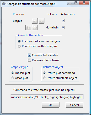
Figure 13. Options for the mosaic plot
At a minimum, change the plot from grey scale to a colorized version by checking the box next to the “Colorize last variable” option. The new plot is shown in Figure 14.
Figure 14. Our new mosaic plot.
OK. Take a moment and look at the plot. What conclusions can be made about our hypothesis — are there any differences between the leagues for home versus road Wins-Loss records?
By default the mosaic command copies the command to the R window. You can change the graph by taking advantage of the options in the brewer palette. Here’s the command for the mosaic image above.
mosaic(structable(MLBTable), highlighting=2, highlighting_fill=brewer.pal.ext(2,"RdYlGn"))
Change the options in the brackets following “brewer.pal.ext.” For example, replace RdYlGn with Blues to make a plot that looks like the following
Figure 15. Mosaic plot with changed color scheme.
The colors are selected from the Rcolorbrewer package. For more, see this blog for starters.
Chapter 4 contents
- Graphs and tables (How to report statistics)
- Bar (column) charts
- Histograms
- Box plot
- Mosaic plots
- Scatter plots
- Add a second Y axis
- Q-Q plot
- Ternary plots
- Heat maps
- Graph software
- References and suggested readings
4.3 – Box plot
Introduction
Box plots, also called whisker plots, should be your routine choice for exploring ratio scale data. Like bar charts, box plots are used to compare ratio scale data collected for two or more groups. Box plots serve the same purpose as bar charts with error bars, but box plots provide more information.
Purpose and design criteria
Box plots are useful tool for getting a sense of central tendency and spread of data. These types of plots are useful diagnostic plots. Use them during initial stages of data analyses. All summary features of box plots are based on ranks (not sums). So, they are less sensitive to extreme values (outliers). Box plots reveal asymmetry. Standard deviations are symmetric.
The median splits each batch of numbers in half (center line). The “hinge” (median value) splits the remaining halves in half again (the quartiles). The first, second (median), and third quartiles describes the interquartile range, or IQR, 75% of the data (Fig 1). Outlier points can be identified, for example, with an asterisk or by id number (Fig 1).
Figure 1. A box plot. Elements of box plot labelled.
We’ll use the data set described in the previous section, so if you have not already done so, get the data from Table 1, Chapter 4.2 into your R software.
Note 1: See Chapter 4.10 — Graph software for additional box plot examples, but made with different R packages or software apps.
R Code
Command line
We’ll provide code for the base graph shown in Figure 2A. At the R prompt, type
boxplot(OliveMoment~Treatment)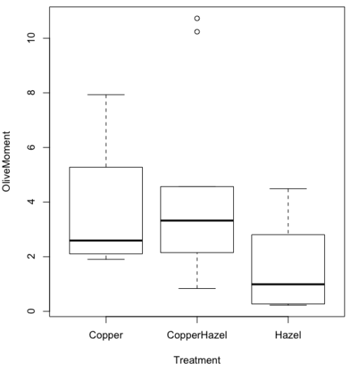
Figure 2A. Box plot, default graph in base package
Boxplot is a common function offered in several packages. In the base installation of R, the function is boxplot(). The car package, which is installed as part of R Commander installation, includes Boxplot(), which is a “wrapper function” for boxplot(). Note the difference: base package is all lower case, car package the “B” is uppercase. One difference, base boxplot() permits horizontal orientation of the plot (Fig 2B).
Note 2: Wrapper functions are code that links to another function, perhaps simplifying working with that function.
boxplot(OliveMoment ~ Treatment, horizontal=TRUE, col="steelblue")

Figure 2B. Same graph, but with color and made horizontal; boxplot(), default graph in base package
Base package boxplot() has additional features and options compared to Note 3: Boxplot() in the car package. i.e., not all barcode() options are wrapped. For example, I had more success adding original points to boxplot() graph (Fig 2C) following the function call with stripchart().
stripchart(OliveMoment ~ Treatment, method = "overplot", pch = 19, add = TRUE)
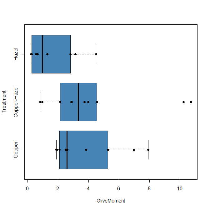
Figure 2C. Same graph, added original points; boxplot(), default graph in base package.
Note 3: boxplot and stripchart functions part of ggplot2 package, part of tidyverse, easily used to generate graphs like Fig 2B and Fig 2C. The overplot option was used to jitter points to avoid overplotting. See below: Apply tidyverse-view to enhance look of boxplot graphic and Fig 9.
Jittering adds random noise to points, which helps view the data better if many points are clustered together. Note however that jitter would add noise to the plot — if the objective is to show an association between two variables, jitter will reduce the apparent association, perhaps even compromising the intent of the graph. Beeswarm also can be used to better visualize clustered points, but uses a nonrandom algorithm to plot points.
Rcmdr: Graph → Boxplot…
Select the response variable, then click on the Plot by: button
Figure 3. Popup menu in R Commander: Select the response variable and set the Plot by: option.
Next, select the Groups (Factor) variables (Fig 4). Click OK to proceed
Figure 4. Select the group variable
Back to the Box Plot menu, click “Options” tab to add details to the plot, including a graph title and how outliers are noted (Fig 5),
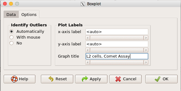
Figure 5. Options tab, enter labels for axes and a title.
And here is the resulting box plot (Fig 6)
Figure 6. Resulting box plot from car package implemented in R Commander. Outliers are identified by row id number.
The graph is functional, if not particularly compelling. The data set was “olive moments” from Comet Assays of an immortalized rat lung cell line exposed to dilute copper solution (Cu), Hazel tea (Hazel), or Hazel & Copper solution.
Apply Tidyverse-view to enhance look of boxplot graphic
Load the ggplot2 package via the Rcmdr plugin to add options to your graph. As a reminder, to install Rcmdr plugins you must first download and install them from an R mirror like any other package, then load the plugin via Rcmdr Tools → Load Rcmdr plug-in(s)… (Fig 7, Fig 8).
Figure 7. Screen shot of Load Rcmdr plug-ins menu, Click OK to proceed (see Fig 8).
Figure 8. To complete installation of the plug-in, restart R Commander.
Significant improvement, albeit with an “eye of the beholder” caveat, can be made over the base package. For example, ggplot2 provides additional themes to improve on the basic box plot. Figure 8 shows the options available in the Rcmdr plugin KMggplot2, and the default box plot is shown in Fig 9.
Figure 9. Menu of KMggplot2. A title was added, all else remained set to defaults.
The next series of plots, Fig 10 – 12, explore available formats for the charts.
Figure 10. Default box plot from KMggplot.
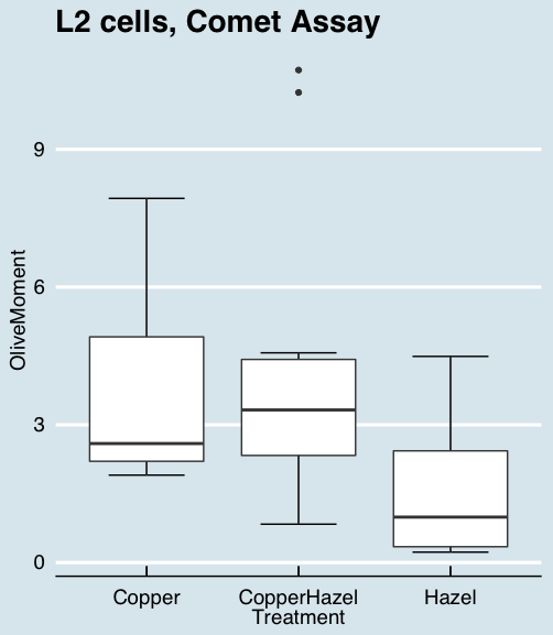
Figure 11. “Economist” theme box plot from KMggplot2.
And finally, since the box plot is often used to explore data sets, some recommend including the actual data points on a box plot to facilitate pattern recognition. This can be accomplished in the KMggplot2 plugin by checking “Jitter” under the Add data points option (see Fig 8). Jitter helps to visualize overlapping points at the expense of accurate representation. I also selected the Tufte theme, which results in the image displayed in Figure 12.
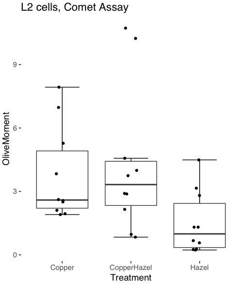
Figure 12. Tufte theme and data points added to the box plot.
Note 4: The Tufte theme is so named for Edward Tufte (2001), Chapter 6 Data-Ink Maximization and Graphical Design.” In brief, the theme follows the “maximal data, minimal ink” principle.
Conclusions
As part of your move from the world of Microsoft Excel graphics to recommended graphs by statisticians, the box plot is used to replace the bar charts plus error bars that you may have learned in previous classes. The second conclusion? I presented a number of versions of the same graph, differing only by style. Pick a style of graphics and be consistent.
Questions
- Why is a box plot preferred over a bar chart for ratio scale data, even if an appropriate error bar is included?
- With your comet data (Table 1, Chapter 4.2), explore the different themes available in the box plot commands available to you in Rcmdr. Which theme do you prefer and why?
Quiz Chapter 4.3
Box plots