14.1 – Crossed, balanced, fully replicated designs
Introduction
“Biology is complicated” (p. 25, National Research Council [2005]), and as researchers we need to balance our need for statistical models that fit the data well and provide insight into the phenomenon in question against compressing that complexity into ways that do not reflect the phenomenon or hinder further progress in understanding the phenomenon. From our view as researchers then, we recognize that an experiment with only one causal variable is not likely to be informative. For example, while diet has a profound effect on weight, clearly, activity levels are also important. At a minimum, when considering a weight loss program, we would want to control or monitor activity of the subjects. This is a two-factor model, the two factors diet and activity, are expected to both affect weight loss, and, perhaps, they may do so in complicated ways (e.g., on DASH diet, weight loss is accelerated when subjects exercise regularly).
Before we proceed, a word of caution is warranted. Prior to the 1990s, one could be excused for implementing experiments with simple designs that are suitable for analysis by contingency tables, t-tests, and one-way ANOVA. Now, with powerful computers available to most of us, and the feature-rich statistical packages installed on these computers, we can do much more complicated analyses on, hopefully, more realistic statistical models. This is surely progress, but caution is warranted nonetheless — just because you have powerful statistical tests available does not mean that you are free to use them — there is much to learn about the error structures of these more complicated models, for example, and how inferences are made across a model with multiple levels of interaction. In general it is preferred that experimental researchers consult and work with knowledgeable statisticians so that the most efficient and powerful experiment can be designed and subsequently analyzed with the correct statistical approach (Quinn and Keough 2002). Our introductory biostatistics textbook is not enough to provide you with all of the tools you would need and while I do advocate self-learning when it comes to statistics I do so provided we all agree that we are likely not getting the full picture this way. What we can do is provide an introduction to the field of experimental design with examples of classical designs so that the language and process of experimental design from a statistical point of view will become familiar and allow you to participate in the discussion with a statistician and read the literature as an informed consumer.
Two-factor ANOVA with replication
Our one factor statistical models can easily be extended to reflect more complicated models of causation, from one factor to two or more. We begin with two factors and the two-way ANOVA. Now we want to extend our discussion to examine how we can analyze data where we have two factors that may cause variation in the one response variable.
Consider the following two way data set.
| Diet A Population 1 |
Diet A Population 2 |
Diet B Population 1 |
Diet B Population 2 |
| 4 | 5 | 12 | 5 |
| 6 | 8 | 15 | 7 |
| 5 | 9 | 11 | 8 |
I’ve included the stacked version of this dataset at the end of this page (scroll to end or click here).
Question: What is the response variable? Which variable is the Factor variable? What are the classes of treatments and the levels of the treatments?
Answer.
Factors: Diet & Population
Levels: A, B for Diet;
Observations from population 1 or 2
Note the replication: for every level of Diet (A or B) there is an equal number of individuals from the 2 populations. Said another way, there are three replicates from population 1 for Diet A, 3 replicated from population 2 for Diet A, etc.
And finally, we say that the experiment is CROSSED: Both levels of Diet have representatives of both levels of Population.
In order to properly analyze this type of research design (2 factor ANOVA, with equal replication), the data must be crossed. “Crossed” means that each level of Factor 1 must occur in each level of Factor 2.
From the example above: each population must have individuals given diet A and diet B.
Each of the collection of observations from the same combination of Factor 1 and Factor 2 is called a CELL:
All individuals in Diet A and Population 1 are in cell 1.
All individuals in Diet A and Population 2 are in cell 2.
All individuals in Diet B and Population 1 are in cell 3.
All individuals in Diet B and Population 2 are in cell 4.
If the data is completely crossed then you can calculate the number of cells:
Number of Levels in Factor 1 x Number of Levels in Factor 2 = Total Number of Cells
From the above example: 2 Diets x 2 Populations = 4 cells.
How to analyze two factors?
One solution (but inappropriate) is to do several separate One-Way ANOVAs.
There are two reasons that this approach is not ideal:
- This approach will increase the number of tests performed and therefore will increase the chance of rejecting a Null Hypothesis when it is true (increase our p value without us being aware that it is changing – R and Rcmdr will not tell you there is a problem). This is analogous to the problems that we have seen if we perform multiple t-tests instead of a Multi-Sample ANOVA.
- More importantly, there may be interactions among the TWO Factors in how they effect the response variable. One of the more interesting possible outcomes is that the influence of one of the Factors DEPENDS on the second FACTOR. In other words, there is an interaction between factor one and factor two on how the organism responds.
Here is a graph that illustrates one possible outcome:
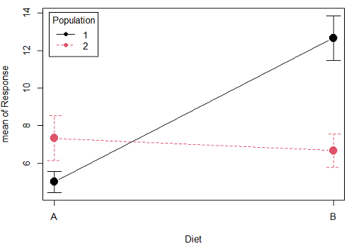
Figure 1A. One of several possible outcome of two treatments (factors). A clear interaction: First Diet level population 1 has greatest weight change, whereas for second diet level, population 2 has greatest weight change.
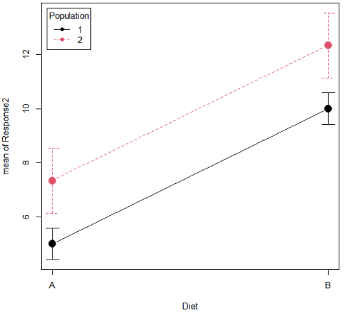
Figure 1B. One of several possible outcome of two treatments (factors). Clearly, no interaction: Population 1 always lower response than Population 2 regardless of Diet.
R code for plots
Rcmdr: Graphs → Plot of means… then added pch=19 and modified legend.pos= from "farright" to "topleft".
Figure 1A.
with(pops2, plotMeans(Response, Diet, Population, pch=19, error.bars="se", connect=TRUE, legend.pos="topleft"))
Figure 1B.
with(pops2, plotMeans(Response2, Diet, Population, pch=19, error.bars="se", connect=TRUE, legend.pos="topleft"))
Figure 1A and 1B shows that BOTH factors, Diet and Population, effect the Response of the subjects. Figure 1A also shows that the effects across Diet are not consistent: the responses are different. Individuals in Population 1 show decreased change in weight going from Diet A(1) to Diet B (2). But, individuals from Population 2 do just the opposite.
Figure 1A, because the effect of Diet cannot be interpreted without knowing which population you’re looking at, this is called an interaction between Factor 1 and Factor 2. It’s the part of the variation in the response NOT accounted for by either factor.
We can see the importance of doing the two-factor ANOVA by showing what would happen if we did two One-Factor (one-way) ANOVAs. For the first One-Factor (multi-sample) ANOVA we can examine the effect of Diet on weight. We could do this by combining the individuals from populations 1 & 2 that are given diet A (Diet A group) and then combining individuals from populations 1 & 2 that are given diet B (Diet B group).
An incorrect analysis of a two-way designed experiment
Statistical software will do exactly what you tell it to do, therefore, there is nothing to stop you from analyzing your two factor experimental design one variable at a time. It is statistical wrong to do so, but, again, there is nothing in the software that will prohibit this. So, we need to show you what happens when you ignore the experimental design in favor of a simple application of statistical analysis.
First, take a look at our two-way example with Diet as a factor and Population as another factor.
Here’s is the one-way ANOVA for Diet only.
aov(Response ~ Diet, data=pops)
| One-way ANOVA table (ignoring the other factor) |
|||||
| Source | DF | Sum of Squares | Mean Squares | F | P |
| Diet | 1 | 36.75 | 36.75 | 4.26 | 0.066 |
| Error | 10 | 86.17 | 8.62 | ||
| Total | 11 | 122.92 | |||
When we ignore (combine) the identity of the two populations in this example we see that it would APPEAR that Diet has NO EFFECT on the weight of the individuals, at least based on our statistical significance cut-off of Type I error set to 5%. Similarly, if we ignore Diet and compare responses by Population, p-value was 0.367, not statistically significant (confirm p-value from one-way ANOVA on your own).
Now let’s do the analysis correctly and pay attention to the main effect Diet.
Here’s the 2-way ANOVA table.
lm(Response ~ Diet*Population, data=pops, contrasts=list(Diet ="contr.Sum", Population
+ ="contr.Sum"))
| Two-way ANOVA (the correct analysis!) | |||||
| Source | DF | SS | MS | F | P |
| Diet | 1 | 36.75 | 36.75 | 12.25 | 0.008 |
| Population | 1 | 10.08 | 10.08 | 3.36 | 0.104 |
| Interaction | 1 | 52.08 | 52.08 | 17.36 | 0.003 |
| Error | 8 | 24.00 | 3.00 | ||
| Total | 11 | 122.92 | |||
We can visualize the results by plotting the means for each treatment group (Fig. 2).
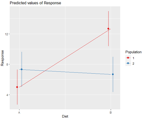
Figure 2. Plots of the main effects for Diet factor, levels A and B, and Population, levels 1 and 2.
R code for plot Fig 2A.
library(sjPlot)
library(sjmisc)
library(ggplot2)
plot_model(LinearModel.1, type = "pred", terms = c("Diet", "Population")) + geom_line()
And then for the interaction (Fig. 3).
Figure 3. Interaction plot between two factors, Diet and Population.
R code: two-way ANOVA
The more general approach to running ANOVA in R is to use the general linear model function, lm(), saved as object MyLinearModel.1, for example, then follow up with
Anova(MyLinearModel.1, type="II")
to obtain the familiar ANOVA table. The lm() menu is obtained in Rcmdr by following Statistics→ Fit models→ Linear model…, and entering the model (Fig. 4). In this case, the model was

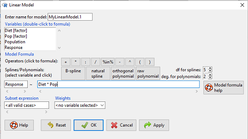
Figure 4. Linear model menu in Rcmdr.
Output from lm() function for this example

LinearModel.2 <- lm(Response ~ Diet * Pop, data=pops)
summary(LinearModel.2)

Call:
lm(formula = Response ~ Diet * Pop, data = pops)

Residuals:
Min 1Q Median 3Q Max
-2.3333 -1.1667 0.1667 1.0833 2.3333

Coefficients:
Estimate Std. Error t value Pr(>|t|)
(Intercept) 5.000 1.000 5.000 0.00105 **
Diet[T.B] 7.667 1.414 5.421 0.00063 ***
Pop[T.2] 2.333 1.414 1.650 0.13757
Diet[T.B]:Pop[T.2] -8.333 2.000 -4.167 0.00314 **
---
Signif. codes: 0 '***' 0.001 '**' 0.01 '*' 0.05 '.' 0.1 ' ' 1

Residual standard error: 1.732 on 8 degrees of freedom
Multiple R-squared: 0.8047, Adjusted R-squared: 0.7315
F-statistic: 10.99 on 3 and 8 DF, p-value: 0.003285
We want the ANOVA table, so run
Anova(MyLinearModel.1, type="II")
or in Rcmdr, Models → Hypothesis tests → ANOVA table… Accept the defaults (Types of tests = Type II, uncheck use of sandwich estimator), and press OK. I’ll leave that for you to do (see Questions).
Interaction, explained
How can we visualize the effects of the Factors and the effects of the interaction? Plot the means of a two-factor ANOVA (Fig. 5). An interaction is present if the lines cross (even if they cross outside the range of the data), but if the lines are parallel, no interaction is present.
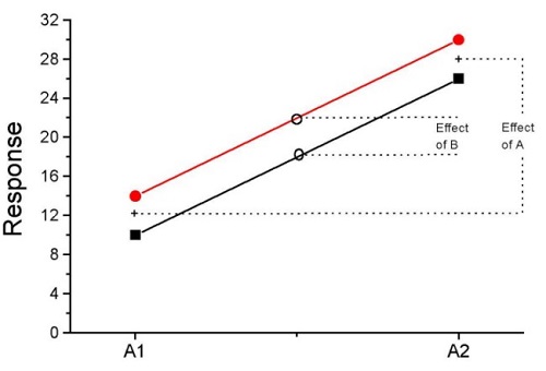
Figure 5. A plot showing no interaction between factor A and factor B for some ratio scale response variable.
A large effect of factor A – compare means
A small effect of factor B – compare means
Little or no interaction – lines are parallel
Three hypotheses for the Two-Factor ANOVA
The important advance in our statistical sophistication (from one to two factors!!) allows us to ask three questions instead of just two question:
- Is there an effect of Factor 1?
- HO: There is no effect of Factor 1 on the response variable.
- HA: There is an effect of Factor 1 on the response variable.
- Is there an effect of Factor 2?
- HO: There is no effect of Factor 2 on the response variable.
- HA: There is an effect of Factor 2 on the response variable.
- Is there an INTERACTION between Factor 1 & Factor 2?
- HO: There is no interaction between Factor 1 & Factor 2 on the response variable.
- HA: There is an interaction between Factor 1 & Factor 2 on the response variable.
Questions
- In the crossed, balanced two-way ANOVA, how many Treatment groups are there if Factor 1 has three levels and Factor 2 has four levels?
A. 3
B. 4
C. 7
D. 9
E. 12 - What is meant by the term “balanced” in a two-way ANOVA design?
A. Within levels of a factor, each level has the same sample size
B. Each level of one factor occurs in each level of the other factor
C. There are no missing levels of a factor.
D. Each level of a factor must have more than one sampling unit. - What is meant by the term “crossed” in a two-way ANOVA design?
A. Within levels of a factor, each level has the same sample size
B. Each level of one factor occurs in each level of the other factor
C. There are no missing levels of a factor.
D. Each level of a factor must have more than one sampling unit. - What is meant by the term “replicated” in a two-way ANOVA design?
A. Within levels of a factor, each level has the same sample size
B. Each level of one factor occurs in each level of the other factor
C. There are no missing levels of a factor.
D. Each level of a factor must have more than one sampling unit. - Use the multi-way ANOVA command in
Rcmdrto generate the ANOVA table for the example data set. - Use the linear model function and Hypothesis tests in
Rcmdrto generate the ANOVA table for the example data set.
Quiz Chapter 14.1
Crossed, balanced, fully replicated designs
Data set
Don’t forget to convert the numeric Population variable to character factor, e.g., a new object called Pop. The R command is simply
Pop <- as.factor(Population)
But easy to use Rcmdr also. From within Rcmdr select Data → Manage variables in active dataset → Convert numeric variables to factors…
| Diet | Population | Response |
| A | 1 | 4 |
| A | 1 | 6 |
| A | 1 | 5 |
| A | 2 | 5 |
| A | 2 | 8 |
| A | 2 | 9 |
| B | 1 | 12 |
| B | 1 | 15 |
| B | 1 | 11 |
| B | 2 | 5 |
| B | 2 | 7 |
| B | 2 | 8 |
Chapter 14 contents
13.4 – Tests for Equal Variances
Introduction
In order to carry out statistical tests correctly, we must test our data first to see if our sample conforms to the assumptions of the statistical test. If our data do not meet these assumptions, then inferences drawn may be incorrect. How far off our inferences may be depends on a number of factors, but mostly it depends on how far from the expectations our data are.
One assumption we make with parametric tests involving ratio scale data is that the data could be from a normally distributed population. The other key assumption introduced, but not described in detail for the two-sample t-test, was that the variability in the two groups must be the same, i.e., homoscedasticity. Thus, in order to carry out the independent sample t-test, we must assume that the variances are equal.
There are two general reasons we may want to concern ourselves with a test for the differences between two variances
- The t-test (and other tests like one-way ANOVA) requires that the two samples compared have the same variances. If the Variances are Not Equal we need to perform a modified t-test (see Welch’s formula).
- We may also be interested in the differences between the variances in two populations.
Example 1: In genetics we might be interested in the difference between the variability of response of inbred lines (little genetic variation but environmental variation) versus an outbred populations (lots of genetic and environmental variation).
Example 2: Environmental stress can cause organisms to have developmental instability. This might cause organisms to be more variable in morphology or the two sides (right & left) of an organism may develop non-symmetrically. Therefore, polluted environments might cause organisms to have greater variability compared to non-polluted environments.
The first way to test the variances is to use the F test. This works for two groups.

For more than two groups, we’ll use different tests (e.g., Bartlett’s test, Levene’s test).
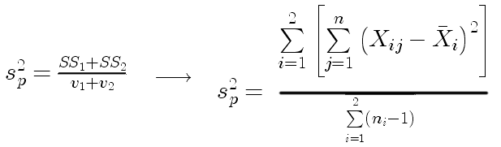
Remember that the formula for the sample variance is
![]()
The Null Hypothesis is that the two samples have the same variances:

The Alternative Hypothesis is that the two samples do not have the same variances:

Note: I prefer to evaluate this as a one-tailed test: identify the larger of the two variances and take that as the numerator Then, the null hypothesis is that

and therefore, the alternative hypothesis is that (i.e., a one-tailed test).

Another way to state equal variance test is that we are testing for homogeneity of variances. You may run across the term homoscedasticity; it is the same thing, just a different three dollar word for “equal variances.”
Stated yet another way, if we reject the null hypothesis, then the variances are unequal or show heterogeneity. An additional and equivalent $3 word for inequality of variances is called heteroscedasticity.
More about the F-test
For the F-test, the null hypothesis is that the variances are equal. This means that the “expected” F value will be one: F = 1.0. (The F-distribution differs from t-distribution because it requires 2 values for DF, and ranges from 1 to infinity for every possible combination of v1 and v2).
To evaluate the null hypothesis we need the degrees of freedom. For the F test we need two different degrees of freedom, one set for each group): from Table 2, Appendix – F distribution, look up 5% Type I error line in this table because we make it one tailed.
I need the F-test statistic at 
Examples of difference between two variances, Table 1.
Sample 1: Aggressiveness of Inbred Mice (number of bites in 30 minutes)
Sample 2: Aggressiveness of Outbred Mice (number of bites in 30 minutes)
Table 1. Aggression by inbred and outbred mice.
| Sample 1
Aggressiveness of Inbred Mice |
Sample 2
Aggressiveness of Outbred Mice |
| 3 | 4 |
| 5 | 10 |
| 4 | 4 |
| 3 | 7 |
| 4 | 7 |
| 5 | 10 |
| 4 = mean | 7 = mean |
- Identify the null and alternative hypotheses
- Calculate Variances
- Calculate F-test
- The “test statistic” for this hypothesis test was F = 7.2 / 0.8 = 9.0
- Determine Critical Value of the F table (Table 2, Appendix – F distribution)
Example of how to find the critical values of the F distribution for  and numerator
  and denominator
  .
.
Table 2. Portion of F distribution, see Appendix – F distribution.
| α = 0.05 | v1 | ||||||||
| 1 | 2 | 3 | 4 | 5 | 6 | 7 | 8 | ||
| v2 | 1 | 230 | |||||||
| 2 | 19.3 | ||||||||
| 3 | 9.01 | ||||||||
| 4 | 6.26 | ||||||||
| 5 | 6.61 | 5.79 | 5.41 | 5.19 | 5.05 | 4.95 | 4.88 | 4.82 | |
| 6 | |||||||||
Or, instead of using tables, use R
Rcmdr: Distributions → F distribution → F probabilities
and enter the numbers as shown below (Fig 1).
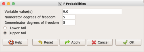
Figure 1. Screenshot R Commander F distribution probabilities.
This will return the p-value, and you would interpret this against your Type I error rate of 5% as you do for other tests.
From Table 2, Appendix – F distribution we find 
And the p-value = 0.015
pf(c(9), df1=5, df2=5, lower.tail=FALSE)
[1] 0.01537472
Question: Reject or Accept null hypothesis?
Question: What is the biological interpretation or conclusion from this result?
R code
Rather than play around with the tables of critical values, which are awkward and old-school (and I am showing you these stats tables so that you get a feel for the process, not so you’d actually use them in real practice), use Rcmdr to generate the F test and therefore return the F distribution probability value. As you may expect, R provides a number of options for testing the equal variances assumption, including the F test. The F test is limited to only two groups and, because it is a parametric test, it also makes the assumption of normality, so the F test should not be viewed as necessarily the best test for the equal variances assumption among groups. We present it here because it is a logical test to understand and because of its relevance to the Mean Square ratios in the ANOVA procedures.
So, without further justification, here is the presentation on how to get the F test in Rcmdr. At the end of this section I present a better procedure than the F test for evaluating the equal variance assumption called the Levene test.
Return to the bite data in the table above and enter the data into an R data frame. Note that the data in the table above are unstacked; R expects the data to be stacked, so either create a stacked worksheet and transcribe the data appropriately into the cells of the worksheet, or, go ahead and enter the values into two separate columns then use the Stack variables in active data set… command from the Data menu in Rcmdr.
Then, proceed to perform the F test.
Rcmdr: Statistics → Variances → Two variances F-test…
The first context menu popup is where you enter the variables (Fig 2).
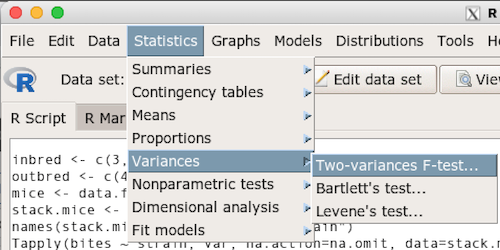
Figure 2. Screenshot data options R Commander F test
Because there are only two variables in the data set and because Strain contains the text labels of inbred or outbred whereas the other variable is numeric data type, R will correctly select the variables for you by default. Select the “Options” tab to set the parameters of the F test (Fig. 3).
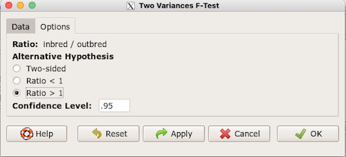
Figure 3. Screenshot menu options R Commander F test.
When you are finished setting the alternative hypothesis and confidence levels, proceed with the F test by clicking the OK button.
    F test to compare two variances

data:  mice.aggression
F = 0.1111, num df = 5, denom df = 5, p-value = 0.03075
alternative hypothesis: true ratio of variances is not equal to 1
95 percent confidence interval:
 0.01554788 0.79404243
sample estimates:
ratio of variances
         0.1111111
End of R output.
Levene’s test of equal variances
We will discuss this test in more detail following our presentation on ANOVA. For now, we note that the test works on two or more groups and is a conservative test of the equal variance assumption. Nonparametric tests in general make fewer assumptions about the data and in particular make no assumption of normality like the F test. It is in this context that the Levene’s test would be preferable over the F test. Below we present only how to calculate the statistic in R and Rcmdr and provide the output for the same mouse data set.
Assuming the data are stacked, obtain the Levene’s test in Rcmdr by clicking on (Fig 4).
Rcmdr: Statistics → Variances → Levene’s test…
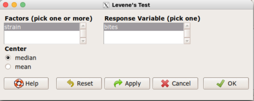
Figure 4. Screenshot menu options R Commander Levene’s test.
Select the median and the factor variable (in our case “Strain”) and the numeric outcome variable (“Bites”), then click OK button.
Tapply(bites ~ strain, var, na.action=na.omit, data=mice.aggression) # variances by group
inbred outbred
   0.8     7.2

leveneTest(bites ~ strain, data=mice.aggression, center="median")
Levene's Test for Homogeneity of Variance (center = median)
      Df F value  Pr(>F)
group  1       4 0.07339 .
      10
---
Signif. codes:  0 '***' 0.001 '**' 0.01 '*' 0.05 '.' 0.1 ' ' 1
End of R output
Compare the p-values. In both cases — F test and Levene’s test — we’re testing the same hypothesis (equal variances), but the p-values do not agree between the parametric F test and the nonparametric Levene’s test! If we were to go by the results of the F test, p-value was 0.031, less than out Type I error of 5% and we would tentatively conclude that the assumption of equal variances may not apply. On the other hand, if we go with the Levene’s test the p-value was 0.074, which is greater than our Type I error rate of 5% and we would therefore conclude the opposite, that the assumption of equal variances might apply! Both conclusions can’t hold, so which test result of equal variances do we prefer, the parametric F test or the nonparametric Levene’s test? Answer — we’d go with Levene’s because the F test is parametric and, therefore, also assumes normality.
Cahoy’s bootstrap method
Draft. Cahoy (2010). Variance-based statistic bootstrap test of heterogeneity of variances. we discuss bootstrap methods in Chapter 19.2; in brief, bootstrapping involves resampling the dataset and computing a statistic on each sample. This method may be more powerful, that is, more likely to correctly reject the null hypothesis when warranted, compared to Levene’s test.
for now, install package testequavar.
Function for testing two samples.
equa2vartest(inbred, outbred, 0.05, 999)
R output
[[1]]
[1] "Decision: Reject the Null"
$Alpha
[1] 0.05
$NumberOfBootSamples
[1] 999
$BootPvalue
[1] 0.006
The output “Decision: Reject the Null” reflects output from a box-type acceptance region.
Compare results from Levene’s test: p-value 0.07339 suggests accept hypothesis of equal variances, whereas bootstrap method indicates variances heterogenous, i.e., reject equal variance hypothesis. However, re-running the test without setting the seed for R’s pseudorandom number generator will result in different p-values. For example, I re-ran Cahoy’s test five times with the following results:
0.008
0.006
0.002
0.01
0.004
Questions
- Test assumption of equal variances by Bartlett’s method and by Levene’s test on
OliveMomentvariable from the Comet tea data set introduced in Chapter 12.1. Do the methods agree? If not, which test result would you choose?- BONUS. Retest homogeneous variance hypothesis by
equa3vartest(Copper.Hazel, Copper, Hazel, 0.05, 999). Reject or fail to reject the null hypothesis by bootstrap method?
- BONUS. Retest homogeneous variance hypothesis by
- Test assumption of equal variances by Bartlett’s method and by Levene’s test on
Heightfrom the O’hia data set introduced in Chapter 12.7. Do the methods agree? If not, which result would you choose?- BONUS. Retest homogeneous variance hypothesis by
equa3vartest(M.1, M.2, M.3, 0.05, 999). Reject or fail to reject the null hypothesis by bootstrap method?
- BONUS. Retest homogeneous variance hypothesis by
Quiz Chapter 13.4
Tests for Equal Variances
R code reminders
The bootstrap method expects the variables in unstacked format. A simple method to extract the variables from the stacked data is to use a command like the following. For example, extract OliveMoment values for Copper-Hazel treatment.
Copper.Hazel <- cometTea$OliveMoment[1:10]
For Copper, Hazel, replace above with [11:20], and [21-30] respectively. Note: changed variable name from Copper-Hazel to Copper.Hazel. The hyphen is a reserved character in R.
Chapter 13 contents
13.3 – Test assumption of normality
Introduction
I’ve commented numerous times that your conclusions from statistical inference are only as good as the validity of making the and applying the correct procedures. This implies that we know the assumptions that go into the various statistical tests, and where possible, we critically test the assumptions. From time to time then I will provide you with “tests of assumptions.”
Here’s one. The assumption of normality, that your data were sampled from a population with a normal distribution for the variable of interest, is key and there are a number of ways to test this assumption. Hopefully as you read through the next section you can extend the logic to any distribution; if the data are presumed to come from a binomial, or a Poisson, or a uniform distribution, then the logic of goodness of fit tests would apply.
How to test normality assumption
It’s not a statistical test per se, but the best is to simply plot (histogram) the data. You can do these graphics by hand, or, install the data mining package rattle which will generate nice plots useful for diagnosing normality issues.
Note 1: rattle (R Analytic Tool To Learn Easily) is a great “data-mining” package. We introduced the package in Chapter 3 — Exploring data.
The rattle histogram plot (Fig 1) superimposes a normal curve over the data, which allows you to “eyeball” the data.
First, the eye test. I used the R-package rattle for this on a data set of comet tail lengths of rat lung cells exposed to different amounts of copper in growth media (scroll to bottom of page or click here to get the data).
In addition to the histogram (Fig 1 top image), I plotted the cumulative function (Fig 1 bottom image). In short, if the data set were normal, then the cumulative frequency plot should look like a straight line.
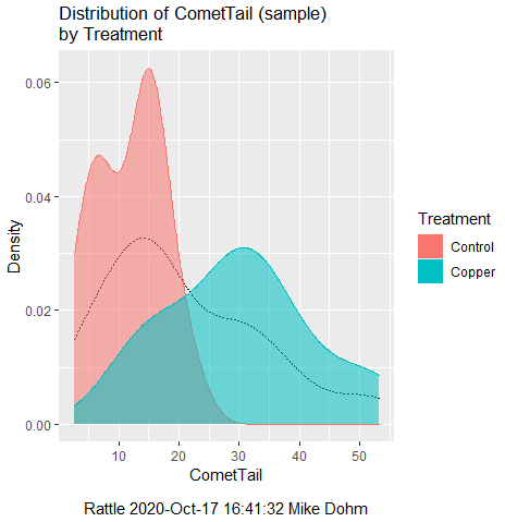
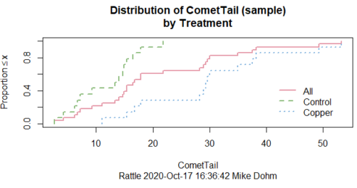
Figure 1. Rattle descriptive graphics on Comet Copper dataset. Dotted line (top image) and red line (bottom image) follow the combined observations regardless of treatment.
So, just looking at the data set, we don’t see clear evidence for a normal-like data set. The top image (Fig 1) looks stacked to the left and the cumulative plot (bottom image) is bumped in the middle, not falling on a straight line. We’ll need to investigate the assumption of normality more for this data set. We’ll begin by discussing some hypothetical points first, then return to the data set.
Goodness of fit tests of normality hypothesis
While graphics and the “eyeball test” are very helpful, you should understand that whether or not your data fits a normal distribution, that’s a testable hypothesis. The null hypothesis is that your sample distribution fits are normal distribution. In general terms, these “fit” hypotheses are viewed as “goodness of fit” tests. Often times, the test is some variation of a  problem: you have your observed (sample distribution) and you compare it to some theoretical expected value (e.g., in this situation, the normal distribution). If your data fit a normal curve, then the test statistics will be close to zero.
We have discussed before that the data should be from a normal distributed population. To the extent this is true, then we can trust our statistical tests are performing the way they are expected to do. We can test the assumption of normality by comparing our sample distribution against a theoretical distribution, the normal curve. I’ve shown several graphs in the past that “looked normal”. What are the alternatives for unimodal (single peak) distributions (Fig 2)?
Kurtosis describes the shape of the distribution, whether it is stacked up in the middle (leptokurtosis), or more spread out and flattened (platykurtosis).
Skewness describes differences from symmetry about the middle. Left skew the tail of the distribution extends to the left, ie, smaller values.
“Leptokurtosis”
“Platykurtosis”
Negative skew, left skewed
Positive skew, right skewed
Figure 2. Graphs describing different distributions. From top to bottom: Leptokurtosis, platykurtosis, negative skew, positive skew.
The easiest procedures for goodness of fit tests of normality are based on the distribution and yield a “goodness of fit” test for normal distribution. We discussed the distribution in Chapter 6.9, and used the test in Chapter 9.1.

where O refers to the observed data (what we’ve got) and E refers to the expected (e.g., data from a normal curve with same mean and standard deviation as our sample).
To illustrate, I simulated a data set in R.
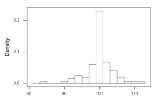
Rcmdr: Distributions → Continuous distributions → Normal distribution → Sample from normal distribution
I created 100 values, stored them in column 1, and set the population mean = 125 and population standard deviation = 10. And therefore the population standard error of the mean was 1.0.
The resulting MIN/MAX was from 99.558 to 146.16; the sample mean was 124.59 with a sample standard deviation of 9.9164. And therefore the sample standard error of the mean was 0.9916.
Question: After completing the steps above, your data will be slightly different from mine… Why?
But getting back to the main concept, Does our data agree with a normal curve? We have discussed how to construct histograms and frequency distributions.
Let’s try six categories (why six? we discussed this when we talked about histograms).
All chi-square tests are based on categorical data, so we use the counts per category to get our data. Group the data, then count the number of OBSERVED in each group. To get the EXPECTED values, use the Z-score (normal deviate) with population mean and standard deviation as entered above.
Table 1. Tabulated values for test of normality.
| Number of observations | Weight | Normal deviate (Z) | Expected Proportion | Expected number | (Obs – Exp)2 / Exp |
| 105 | 3 | less than or equal to -2 | 0.0228 | 2.28 | 0.227368421 |
| 105 < 115 | 17 | between -1 & -2 = 0.1587 – 0.0228 | 0.1359 | 13.59 | 0.855636497 |
| 115 < 125 | 34 | between -0 & -1 = 0.5 – 0.1587 | 0.3413 | 34.13 | 0.000495166 |
| 125 < 135 | 30 | between +0 & +1 = 0.5 – 0.1587 | 0.3413 | 34.13 | 0.499762672 |
| 135 < 145 | 15 | between +1 & +2 = 0.9772 – 0.8413 | 0.1359 | 13.59 | 0.146291391 |
| > 145 | 1 | greater than or equal to +2 = 1 – 0.9772 | 0.0228 | 2.28 | 0.718596491 |
 |
Then obtain the critical value of the with df = 6 – 1 = 5 (see Appendix, Table of chi-square critical values , critical = 11.1 with df = 5).
Thus, we would not reject the null hypothesis and would proceed with the assumption that our data could have come from a normally distributed population.
This would be an OK test, but different approaches, although based on a chi-square-like goodness of fit, have been introduced and are generally preferred. We have just shown how one could use the chi-square goodness of fit approach to testing whether your data fit a normal distribution. A number of modified tests based on this procedure have been proposed; we have already introduced and used one (Wilks-Shapiro), which is easily accessed in R.
Rcmdr: Summaries → Wilks-Shapiro
Like Wilks-Shapiro, another common “goodness-of-fit” test of normality is the Anderson-Darling test. This test is now included with Rcmdr, but it’s also available in the package nortest. After the package is installed and you run the library (you should by now be able to do this!), then at the R prompt (>) type:
ad.test(dataset$variable)
replacing “dataset$variable” with the name of your data set and variable name.
In the context of goodness of fit, a perfect fit means the data are exactly distributed as a normal curve, and the test statistics would be zero. Differences away from normality increase the value of the test statistic.
How do these tests perform on data?
The histogram of our simulated normal data of 100 observations with mean = 125 and standard deviation = 10 (Fig 3).
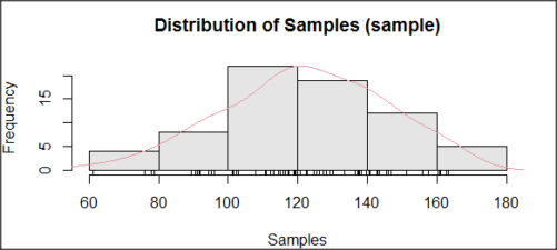
Figure 3. Histogram of simulated normal dataset, μ = 125, σ = 10.
and here’s the cumulative plot (Fig 4).
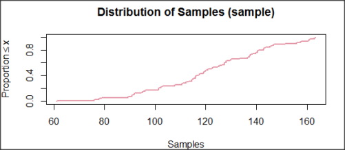
Figure 4. Cumulated frequency of simulated normal dataset, μ = 125, σ = 10.
Results from Anderson-Darling test were A = 0.2491, p-value = 0.7412, where A is the Anderson-Darling test statistic.
Results of the Shapiro-Wilks test on the same data. W = 0.9927, p-value = 0.8716, where W is the Shapiro-Wilks test statistic. We would not reject the null hypothesis in either case because p > 0.05.
Example
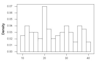
Histogram of a data set, highly skewed to the right. 90 observations in three groups of 30 each, with mean = 0 and standard deviation = 1 (Fig 5).
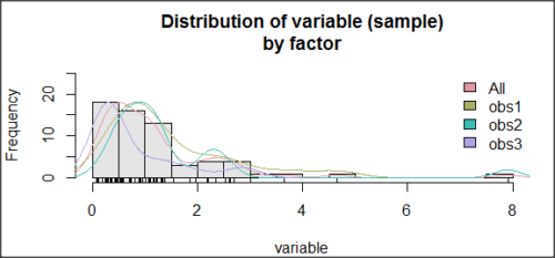
Figure 5. Histogram of simulated normal dataset, μ = 0, σ = 1.
and the cumulative frequency plot (Fig 6).
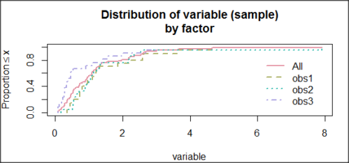
Figure 6. Cumulated frequency of simulated normal dataset, μ = 0, σ = 1.
Results from Anderson-Darling test were A = 9.0662, p-value < 2.2e-16. Results of the Shapiro-Wilks test on the same data. W = 0.6192, p-value = 6.248e-14. Therefore, we would reject the null hypothesis because p < 0.05.
The Shapiro-Wilk test in Rcmdr
Let’s go back to our data set and try tests of normality on the entire data set, i.e., not by treatment groups.
Rcmdr: Statistics → Summaries → Test of normality…
normalityTest(~CometTail, test="shapiro.test", data=CometCopper)

 Shapiro-Wilk normality test

data: CometCopper$CometTail
W = 0.91662, p-value = 0.006038
End of R output
Another test, built on the basic idea of a chi-square goodness of fit is the Anderson Darling test. Some statisticians prefer this test and it is one built-in to some commercial statistical packages (e.g., Minitab). To obtain the Anderson-Darling test in R, you need to install a package. After installing nortest package, run the AD test at the command prompt.
require(nortest)
ad.test(CometCopper$CometTail)

Anderson-Darling normality test

data: CometCopper$CometTail
A = 1.0833, p-value = 0.006787
End of R output.
Note 2: Because you’ve installed Rcmdr the Anderson-Darling test is available (since version 2.6) without installing the nortest package. You can call Anderson-Darling via the menu system, Statistics → Summaries → Test of normality … or type in the script the following command
normalityTest(~CometTail, test="ad.test", data=CometCopper)
In contrast, Shapiro-Wilks test is part of the base R package, so can be called directly
shapiro.test(CometCopper$CometTail)
P-values are both much less than 0.05, so we would reject the assumption of normality for this data set.
Which test of normality?
Why show you two tests for normality, the Shapiro-Wilks and Anderson-Darling? The simple answer is that both are good as general tests of normality, both are widely used in scientific papers, so just pick one and go with it as your general test of normality.
The more complicated answer is that each is designed to be sensitive to different kinds of departure from normality. By some measures, the Shapiro-Wilks test is somewhat better (i.e., more statistical power to test the null hypothesis), than other tests, but this is not something you want to get into as a beginner. So, I show both of them to you so that you are at least introduced to the concept that there are often more than one way to test a hypothesis. The bottom-line is that plots may be best!
Questions
- Work describe in this chapter involves statistical tests of the assumption of normality. It is just as important, maybe more so, to also apply graphics to take advantage of our built-in pattern recognition functions. What graphic techniques, besides histogram, should be used to view the distribution of the data?
- In R, what command would you use so that you can call the variable name,
CometTail, directly instead of having to refer to the variable asCometCopper$CometTail? - Why are Anderson-Darling, Shapiro-Wilks and other related tests referred to as “goodness of fit” tests? You may wish to review discussion in Chapter 9.1.
- The example tests presented for the Comet Copper data set were conducted on the whole set, not by treatment groups. Re-run tests of normality via
Rcmdr, but this time, select the By groups option and select Treatment.
Quiz Chapter 13.3
Test assumption of normality
Data set used in this page
| Treatment | CometTail |
|---|---|
| Control | 17.86 |
| Control | 16.52 |
| Control | 14.93 |
| Control | 14.03 |
| Control | 13.33 |
| Control | 8.81 |
| Control | 14.70 |
| Control | 9.26 |
| Control | 21.78 |
| Control | 6.18 |
| Control | 9.20 |
| Control | 5.54 |
| Control | 6.72 |
| Control | 2.63 |
| Control | 7.19 |
| Control | 5.39 |
| Control | 11.29 |
| Control | 15.44 |
| Control | 17.86 |
| Contro | l4.25 |
| Copper | 53.21 |
| Copper | 38.93 |
| Copper | 18.93 |
| Copper | 30.00 |
| Copper | 28.93 |
| Copper | 15.36 |
| Copper | 17.86 |
| Copper | 17.50 |
| Copper | 21.07 |
| Copper | 29.29 |
| Copper | 28.21 |
| Copper | 16.79 |
| Copper | 21.07 |
| Copper | 37.50 |
| Copper | 38.22 |
| Copper | 17.86 |
| Copper | 29.64 |
| Copper | 11.07 |
| Copper | 35.00 |
| Copper | 49.29 |
Chapter 13 contents
- Introduction
- ANOVA Assumptions
- Why tests of assumption are important
- Test assumption of normality
- Tests for Equal Variances
- References and suggested readings
13.2 – Why tests of assumption are important
Introduction
Note that R (and pretty much all statistics packages) will calculate t-tests or ANOVA or whatever test you ask for, and return a p-value, but it is up to you to recognize that the p-value is accurate only if the assumptions are met. Thus, you can always estimate a parameter, but interpret its significance (biological, statistical) with caution. The great thing about statistics is that you can directly evaluate whether assumptions hold.
Violation of the assumptions of normality or equal variances can lead to Type I errors occurring more often than the 5% level. That means you will reject the null hypothesis more often than you should! If the goal of conducting statistical tests on results of an experiment is to provide confidence in your conclusions, then failing to verify assumptions of the test are no less important than designing the experiment correctly in the first place. Thus, the simple rule is: know your assumptions, test your assumptions. Evaluating assumptions is a learned skill:
- Conduct proper data exploration.
- Use specialized statistical tests to evaluate assumptions.
- data normally distributed? eg, histogram, Shapiro-Wilk test.
- groups equal variance? eg, box-plot, Levene’s median test.
- Evaluate influence of any outlier observations.
What to do if the assumptions are violated?
This is where judgement and critical thinking apply. You have several options.
First, if the violation is due to only a few observations, then you might proceed anyway, in effect invoking the Central Limit Theorem as justification.
Second, you could check your conclusions with and without the few observations that seem to depart from the trend in the rest of the data set — if your conclusion holds without the “outliers”, then you might conclude that your results are robust).
Third, you might apply a data transform reasoning that the distribution from which the data were sampled was log-normal, for example. Applying a log transform (natural log, base 10, etc,) will tend to make the variances less different among the groups and may also improve normality of the samples.
Fourth, if the violated assumption involves variances differ across different groups or levels of the factors or predictors, then there are more sophisticated alternatives, including use of Generalized Linear Models and creating a model to capture the relationship between predictor means and variances. Additionally, Weighted Least Squares (WLS) can be employed, giving more weight to observations with smaller variances.
Fifth, if a nonparametric test is available, you might use it instead of the parametric test. For example, we introduced the Levene’s test of equal variances as a better choice than the parametric F test. Additionally, there are many nonparametric alternatives to parametric tests. For example, t-tests are parametric and their non-parametric alternatives include tests like Wilcoxon and Mann-Whitney. ANOVA, too is parametric, and its nonparametric alternative version is called rank ANOVA (see also Kruskal-Wallis). See Chapter 15 for nonparametric tests.
Finally, a resampling approach could be taken, where the data themselves are used to generate all possible outcomes like the Fisher Exact test; with large sample size, bootstrap or Jackknife procedures are used (Chapter 19).
For now, let’s introduce you to the kinds of nonparametric statistical tests for which the t-test is just one example. For the independent sample t-test, our first method to account for the possible violation of equal variances is a parametric test, Welch’s variation of the Student’s t-test. Instead of the pooled standard deviation, Welch’s test accounts for each group’s variance in the denominator.

The degrees of freedom for the Welch’s test are now

where df for Student’s t-test was  . Note that Welch’s test assumes normal distributed data.
Note 1: In R and therefore R Commander, the default option for conducting the t-test is Welch’s version, not the standard t-test (Fig 1).
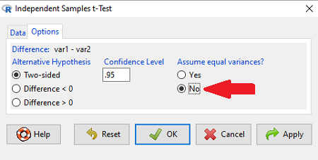
Figure 1. Screenshot of Rcmdr options menu for independent t-test. Red arrow points to default option “No,” which corresponds to Welch’s test.
See discussions in Olsen (2003), Choi (2005), and Hoekstra et al (2012).
How to report choices made about data transformations?
Eventually, with all of the analysis completed, one has to decide what to report. We touched on How to Report Statistics in Chapter 4. However, that chapter emphasized a balance between reporting results in sentences, tables, or as graphics. Here, we need to emphasize a different quality about reporting of statistical methods, that is, transparency. In both reporting contexts — how to report the results and how to report any data transformations — the goal is to provide sufficient detail so that the reader can follow (reproducibility criteria). If guidance presented on Chapter 13.1 and on this page is taken literally, there would seem to be a nearly endless number of graphs and statistical results to report. Clearly, this can’t be the answer.
For students in BI311 there should be clear guidance for what is expected for reporting in homework. More generally, when analysis leads to a completed project ready for reporting at conference or as a journal article, then the goal is to provide enough information so that the reader can evaluate the choices you made.
Consider the body mass data presented on this page. Results of various tests on both raw and log10-transformed data were provided. The context was check of normality assumption, and, based on the results we should conclude that the log10-transformed data better achieved the assumption of normality. Therefore, we would not report all the figures from Chapter 13.1: Figure 2, Figure 3, Figure 4, Figure 5, and Figure 6. I would report only Figure 2 — the raw data– with a few sentences: “The data were log10-transformed to address violations of normality assumption. Normality was assessed by calculation of the moment statistics skewness and kurtosis and Q-Q plots. All subsequent tests were conducted on the log10-transformed data set.” I wouldn’t report the exact results of the Q-Q plots or the moment statistics, but would include names or references to the specific tests used.
Note 2: Log10-transform would also likely improve unequal variances. Therefore, I would need to modify my sentences to account for this, eg, “The data were log10-transformed to address violations of normality and equal variance assumptions.”
Questions
Please skim read articles about statistical assumptions for common statistical tests:
- Choi (2005), click link to article.
- Hoekstra et al. (2012), click link to article.
- Olsen (2003), click link to article.
From the articles and your readings in Mike’s Biostatistics Book, answer the following questions
- What are some consequences if a researcher fails to check statistical assumptions?
- Explain why use of graphics techniques may be more important than results of statistical tests for checks of statistical assumptions.
- Briefly describe graphical and statistical tests of assumptions of (1) normality and (2) equal variances
- Pick a biological research journal for which you have online access to recent articles. Pick ten articles that used statistics (e.g., look for “t-test” or “ANOVA” or “regression”; exclude meta analysis and review articles — stick to primary research articles). Scan the Methods section and note whether or not you found a statement that confirms if the author(s) checked for violation of (1) normality and (2) equal variances. Construct a table.
- Review your results from question 3. Out of the ten articles, how many reported assumption checking? How does your result compare to those of Hoekstra et a; (2012)?
Quiz Chapter 13.2
Why tests of assumption are important
Chapter 13 contents
- Introduction
- ANOVA Assumptions
- Why tests of assumption are important
- Test assumption of normality
- Tests for Equal Variances
- References and suggested readings
13.1 – ANOVA Assumptions
Introduction
Like all parametric tests, assumptions are made about the data in order to justify and trust estimates and inferences drawn from ANOVA. While acknowledging the “experimental design” message suggested by the xkcd panel in Figure 1 — the presence of a large effect size between groups mitigates the technical necessities of inferential statistics — of course, not all of our projects will have such obvious results. Understanding the impact of assumptions on inference is a key concept in (bio)statistics: when the p-value is close to the Type I error rate, deviations from assumptions may reduce our confidence in the “statistical significance” of the result.

Figure 1. xkcd.com “Statistics,” https://xkcd.com/2400/.
ANOVA assumptions include:
- Data come from normal distributed population. View with a histogram or Q-Q plot. Test with Shapiro-Wilks or other appropriate goodness of fit test (see Question 1 below). Normality tests are the subject of Chapter 13.3.
- Sample size equal among groups.
- This is an example of a potentially confounding factor — If sample sizes differ, then any difference in means could be simply because of differences in sample size! This gets us into weighted versus unweighted means.
- You shouldn’t be surprised that modern implementations of ANOVA in software easily handle (adjust for) these known confounding factors. Depending on the program, you’ll see “Adjusted means,” “least squares means,” “Marginal means” etc. This just implies that the group means are compared after accounting for confounding factors.
- Importantly, as long as sample sizes among the groups are roughly equivalent, normality assumption is not a big deal (low impact on risk of Type I error).
- Independence of errors. One consequence of this assumption is that you would not view 100 repeated observations of a trait on the same subject as 100 independent data points. We’ll return to this concept more in the next two lectures. Some examples:
-
- Colorimetric assay where the signal changes over time, and you measure in order (eg, samples from group 1 first, samples from group 2 second, etc.) — this confounds group with time.
- The consequence is that you are far more likely to reject the null hypothesis, committing a Type I error.
- Let’s say you are observing running speeds of ten mongoose. However, it turns out that five of your subjects are actually from the same family, identical quintuplets! Do you really have ten subjects?
- Compare brain-body mass ratio among different species; this is a classic comparative method problem (Fig. 3). Since 1985 (Felsenstein 1985), it was recognized that the hierarchical evolutionary relationships among the species must be accounted for to control for lack of independence among the taxa tested. See Phylogenetically independent contrasts, Chapter 20.12.
- Colorimetric assay where the signal changes over time, and you measure in order (eg, samples from group 1 first, samples from group 2 second, etc.) — this confounds group with time.
- Equal variances (homogeneity) among groups. See Chapter 13.4 for how to test this for multiple groups.
Impact of assumptions
R — and pretty much all statistics packages — will calculate the ANOVA table and the p-value, but it is up to you to recognize that the P-value is accurate only if the assumptions are met. Violation of the assumption of normality can lead to Type I errors occurring more often than the 5% level. What to do if the assumptions are violated?
If the violation is due to only a handful of the data, you might proceed anyway. But following a significant test for normality, we could avoid the ANOVA in favor of nonparametric alternatives (Chapter 15), or, we might try to transform the data.
Consider a histogram of brains weight measures in grams for a variety of mammals (Fig 2).
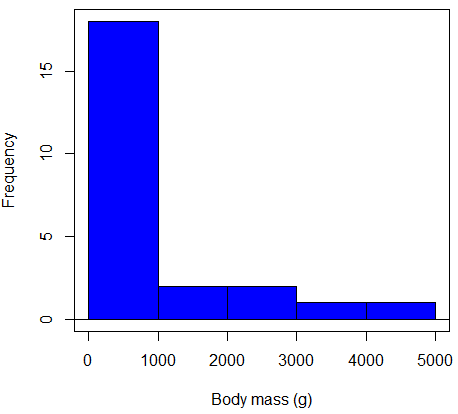
Figure 2. Histogram of body mass (g) for 24 mammals (data from Boddy et al 2012).
We will introduce a variety of statistical tests of the assumption of normality in Chapter 13.3, but looking at a histogram as part of our data exploration, we clearly see the data are right-skewed (Fig 2). Is this an example of normal distributed sample of observations? Clearly not. If we proceed with statistical tests on the raw data set, then we are more likely to commit a Type I error (ie, we will reject the null hypothesis more often than we should).
A comment on normality and biology. It is very possible that data may not be normally distributed or have equal variances on the original scale, but a simple mathematical manipulation may take care of that. In fact, in many case in biology that involve growth, many types of variables are expected to not be normal on the original scale. For example, while the relationship between body mass,  , and metabolic rate,
  , in many groups of organisms is allometric and increases positively, the relationship

is not directly proportional (linear) on the original scale. By taking the logarithm of both body mass and metabolic rate, however, the relationship is linear

In fact, taking the logarithm (base 10, base 2, or base e) is often a common solution to both non-normal data (Fig 2) and unequal variances.
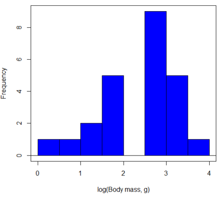
Figure 3. Histogram of log10-transformed body mass observations from Figure 2.
Other common transformations include taking the square root or the inverse of the square-root for skewed or kurtotic sample distributions, and the arcsine for frequencies (since frequencies can only be from 0 to 1 — need to “stretch the data” to make frequencies fit procedures like ANOVA). There are many issues about data transformation, but keep in mind three points. After completing the transformation, you should check the assumptions (normality, equal variances) again.
You may need to recode the data before applying a transform. For example, you cannot take the square root or logarithm of negative numbers. If you do not recode the data, then you will lose these observations in your subsequent analyses. In many cases, this problem is easily solved by adding 1 to all data points before making the transform. I prefer to make the minimum value 1 and go from there. The justification for data transformation is basically to realize that there is no necessity to use the common arithmetic or linear scale: many relationships are multiplicative or nonadditive (eg, rates in biology and medicine).
Note 1: Instead of transformations or other ad hoc manipulations of the data, modern statistical approaches favor modeling the error structure of the data within a Generalized Linear Model framework (St.-Pierre et al 2018). The advantage of the model approach is that parameter estimation occurs on the raw data. Use of transformations may, however, remain a better choice. While statistically justified, the generalized linear model approach may also tend to have higher rates of Type II error compared to simple transformations.
Statistical outlier
Another topic we should at least mention here is the concept of outliers. While most observations tend to cluster around the mean or middle of the sample distribution, occasionally one or more observations may differ substantially from the others. Such values are called outliers, and we note that there are two possible explanations for an outlier
- the value could be an error.
- it is a true value.
Note 2: “it is a true value,” and there may be an interesting biological explanation for its cause, ie, extraordinary individuals.
We encountered a clear outlier in the BMI homework. If the reason is (1), then we go back and either fix the error or delete it from the worksheet. If (2), however, then we have no objective reason to exclude the point from our analyses.
We worry if the outlier influences our conclusions — so it is a good idea to run your analyses with and without the outlier. If your conclusions remain the same, then no worries. If your conclusions change based on one observation, then this is problematic. For the most part you are then obligated to include the outlier and the more conservative interpretation of your statistical tests.
ANOVA is robust to modest deviations from assumptions
A comment about ANOVA assumptions ANOVA turns out to be robust to violations of item (1) or (2). That means unless the data are really skewed or the group sizes are very different, ANOVA will perform well (Type I error rate stays close to the specified 5% level). We worry about this however when p-value is very close to alpha!!
The third assumption is more important in ANOVA.
Like the t-test, ANOVA makes the assumption of equal variances among the groups, so it will be helpful to review why this assumption is important to both the t-test and ANOVA. In the two-sample independent t-test, the pooled sample variance,  , is taken as an estimate of the population variance,
  . If you recall,
where  refers to the sum of squares for the first group and
  refers to the second group sum of squares (see our discussion on measures of dispersion) and
  refers to the degrees of freedom for the first group and
  refers to the second group degrees of freedom. We make a similar assumption in ANOVA. We assume that the variances for each sample are the same and therefore that they all estimate the population variance . To say it in another way, we are assuming that all of our samples have identical variability
Once we make this assumption, we may pool (or combine) all of the SSs and DFs for all groups as our best estimate of the population variance, . The trick to understanding ANOVA is to realize that there can be two types of variability: there is variability due to being part of a group (e.g., even though ten human subjects receive the same calorie-restricted diet, not all ten will loose the same amount of weight) and there is variability among or between groups (e.g., on average, all subjects who received the calorie-restricted diet lost more weight than did those subjects who were on the non-restricted diet).
Example
The encephalization index (or encephalization quotient) is defined as the ratio of size the brain compared to body size. While there is a well-recognized increase in brain size given increased body size, encephalization describes a shift of function to cortex (frontal, occipital, parietal, temporal) from noncortical parts of the brain (cerebellum, brainstem). Increased cortex is associated with increased complexity of brain function; for some researchers, the index is taken as a crude estimate of intelligence. Figure 4A shows plot of brain mass in grams versus body size (grams) for 24 mammal species (data sampled from Boddy et al 2012); Figure 4B shows the same data, but following log10-transform of both variables.
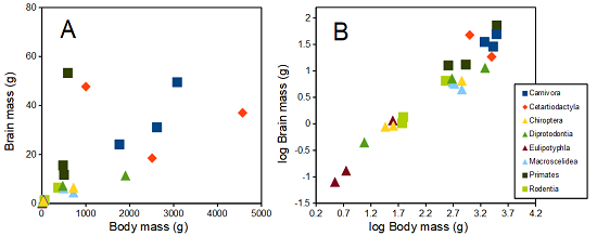
Figure 4. Plot of brain and body weights (A) and log10-log10 transform (B) for a variety of species (data from Boddy et al 2012). The ratio is called encephalization index.
Looking at the two figures the linear relationship between the two variables is obvious in Figure 4B, less so for Figure 4A. Thus, one biological justification for transformation of the raw data is exemplified with the brain-body mass dataset: the association is allometric not additive. The other reason to apply a transform is statistical; the log10-transform improves the normality of the variables. Take a look at the Q-Q plot for the raw data (Fig 5) and for the log10-transformed data (Fig 6).
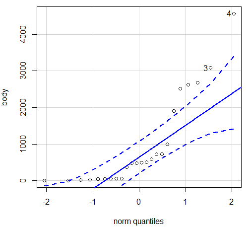
Figure 5. Q-Q plot, body mass, raw data. Compare to Figure 2.
Figure 5 is a good test of your observation skills — what are you supposed to look for in a Q-Q plot? Follow the dots — the data don’t fall on the straight line. A few even fall outside of the confidence interval (the curved dashed lines), which suggests the data were not normally distributed (see histogram, Fig 2). And for the transformed data, the Q-Q plot is shown in Figure 6.
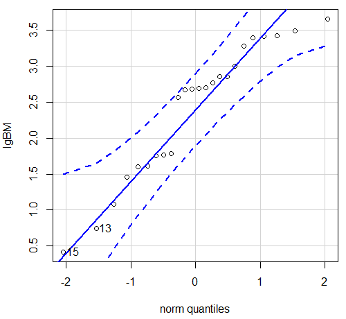
Figure 6. Q-Q plot same data, log10-transformed, compare to Figure 2.
Compared to the raw data, the transformed data now fall on the line and none are outside of the confidence interval. We would conclude that the transformed data are more normal, thus, better meeting the assumptions of our parametric tests.
Lack of independence among data
Species comparisons are common in evolutionary biology and related fields. As noted earlier, comparative data should not be treated as independent data points (discussed in 20.12 – Phylogenetically independent contrasts). For our 24 species, I plotted the estimate of the phylogeny (timetree.org), represented in Figure 7. Some species are closely related (eg the two elephant shrews, Rhynchocyon genus). Thus, because of the hierarchical, nested nature of evolution — first articulated by Charles Darwin — instead of 24 independent data points, we have eight clusters of points (see Question 4).
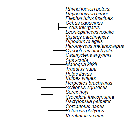
Figure 7. Phylogenetic tree of 24 species used in this report.
Note 3: The relevant quote from Charles Darwin: “… the inevitable result is that the modified descendants proceeding from one progenitor become broken up into groups subordinate to groups,” and was illustrated by the only figure in Origin of Species (both quote and illustration are in Chapter 4).
The conclusion? We don’t have 24 data points, more like 8 points. Because the species are more or less related, there are fewer than 24 independent data points. Statistically, this would mean that the errors are correlated. Various approaches to account for this lack of independence have been developed; perhaps the most common approach is to apply phylogenetically independent contrasts, a topic discussed in Chapter 20.12. (Boddy et al 2012 used this approach.)
Note 4: See 20.11 – Plot a Newick tree for how to plot phylogeny trees in R.
Questions
- Make a histogram for the brain mass data set.
- Shapiro-Wilks is one test of normality.
- Can you recall the name of the other normality tests we named?
- Run tests of normality on both body mass and brain mass data. Interpret the results, frame your response with keywords: “central tendency,” “outliers,” “shape,” and “symmetry.”
- Calculate moment statistics for the body mass and brain mass data set, both raw and log10-transformed data. Interpret your results, taking care to frame your answer with the following keywords: “shape,” “symmetry,” and “peakedness” (aka “tailedness”).
- We introduced the lack of independence for comparative data attributed to the evolutionary process. Statistically, the impact is on degrees of freedom; for example, if we ignore the lack of independence in the data set, df = 22 for the slope coefficient in a linear regression. However, given the degrees of freedom would be closer to six! What are the effects on Type I error rate of lack of independence?
Quiz Chapter 13.1
ANOVA assumptions
Data set and R code used in this page
species, order, body, brain
'Herpestes ichneumon', Carnivora, 1764, 24.1
'Potos flavus', Carnivora, 2620, 31.05
'Vulpes vulpes', Carnivora, 3080, 49.5
'Madoqua kirkii', Cetartiodactyla, 4570, 37
'Sus scrofa', Cetartiodactyla, 1000, 47.7
'Tragulus napu', Cetartiodactyla, 2510, 18.5
'Casinycteris argynnis', Chiroptera, 40.5, 0.92
'Cynopterus brachyotis', Chiroptera, 29, 0.88
'Potorous platyops', Chiroptera, 718, 6.5
'Cercartetus nanus', Diprotodontia, 12, 0.44548
'Dactylopsila palpator', Diprotodontia, 474, 7.15876
'Vombatus ursinus', Diprotodontia, 1902, 11.396
'Crocidura fuscomurina', Eulipotyphla, 5.6, 0.13
'Scalopus aquaticus', Eulipotyphla, 39.6, 1.48
'Sorex hoyi', Eulipotyphla, 2.6, 0.107
'Elephantulus fuscipes', Macroscelidea, 57, 1.33
'Rhynchocyon cirnei', Macroscelidea, 490, 6.1
'Rhynchocyon petersi', Macroscelidea, 717.3, 4.46
'Aotus trivirgatus', Primates, 480, 15.5
'Cebus capucinus', Primates, 590, 53.28
'Leontopithecus rosalia', Primates, 502.5, 11.7
'Dipodomys agilis', Rodentia, 61.4, 1.34
'Peromyscus melanocarpus', Rodentia, 58.8, 1.03
'Sciurus carolinensis', Rodentia, 367, 6.49
The Newick code for the tree in Figure 6.
((Vombatus_ursinus:48.94499077,((Potorous_platyops:47.59556667,Cercartetus_nanus:47.59556667)'14':0.66887333,Dactylopsila_palpator:48.26444000)'13':0.68055077)'11':109.65259681,(((((Crocidura_fuscomurina:33.74066667,Sorex_hoyi:33.74066667)'10':33.03022424,Scalopus_aquaticus:66.77089091)'19':22.55292749,(((Herpestes_brachyurus:54.32144118,(Vulpes_vulpes:45.52834967,Potos_flavus:45.52834967)'9':8.79309151)'22':23.43351523,((Tragulus_napu:43.96862857,Madoqua_kirkii:43.96862857)'8':17.99735995,Sus_scrofa:61.96598852)'6':15.78896789)'30':0.77378567,(Casinycteris_argynnis:35.20000000,Cynopterus_brachyotis:35.20000000)'29':43.32874208)'27':10.79507632)'35':7.13857077,(((Peromyscus_melanocarpus:69.89837667,Dipodomys_agilis:69.89837667)'43':0.64655123,Sciurus_carolinensis:70.54492789)'42':19.27825952,((Leontopithecus_rosalia:18.38385647,Aotus_trivirgatus:18.38385647)'40':1.29720005,Cebus_capucinus:19.68105652)'48':70.14213090)'51':6.63920175)'47':8.99739162,(Elephantulus_fuscipes:39.23366667,(Rhynchocyon_cirnei:15.34500000,Rhynchocyon_petersi:15.34500000)'39':23.88866667)'56':66.22611412)'55':53.13780679);
Chapter 13 contents
12.7 – Many tests one model
Introduction
In our introduction to parametric tests we so far have covered one and two sample t-tests and now the multiple sample or one-way analysis of variance (ANOVA). In subsequent sections we will cover additional tests, each with their own name. It is time to let you in on a little secret. All of these tests, t-tests, ANOVA, and linear and multiple regression we will work on later in the book belong to one family of statistical models. That model is called the general Linear Model (LM), not to be confused with the Generalized Linear Model (GLM) (Burton et al 1998; Guisan et al 2002). This greatly simplifies our approach to learning how to implement statistical tests in R (or other statistical programs) — you only need to learn one approach: the general Linear Model (LM) function lm().
Brief overview of linear models
With the inventions of correlation, linear regression, t-tests, and analysis of variance in the period between 1890 and 1920, subsequent work led to the realization that these tests (and many others!) were special cases of a general model, the general linear model, or LM. The LM itself is a special case of the generalized linear model, or GLM; among the differences between LM and GLM, in LM, the dependent variable is ratio scale and errors in the response (dependent) variable(s) are assumed to come from a Gaussian (normal) distribution. In contrast, for GLM, the response variable may be categorical or continuous, and error distributions other than normal (Gaussian), may be applied. The GLM user must specify both the error distribution family (eg, Gaussian) and the link function, which specifies the relationship among the response and predictor variables. While we will use the GLM functions when we attempt to model growth functions and calculate EC50 in dose-response problems, we will not cover GLM this semester.
The general Linear Model, LM
In matrix form, the LM can be written as

where  is a matrix of response variables predicted by independent variables contained in matrix
  and weighted by linear coefficients in the vector b. Basically, all of the predictor variables are combined to produce a single linear predictor
  . By adding an error component we have the complete linear model.

In the linear model, the error distribution is assumed to be normally distributed, or “Gaussian.”
R code
The bad news is that LM in R (and in any statistical package, actually) is a fairly involved set of commands; the good news is that once you understand how to use this command, and can work with the Options, you will be able to conduct virtually all of the tests we will use this semester, from two-sample t-tests to multiple linear regression. In the end, all you need is the one Rcmdr command to perform all of these tests.
We begin with a data set, ohia.ch12. Scroll down this page or click here to get the R code.
I found a nice report on a common garden experiment with o`hia (Corn and Hiesey 1973). O`hia (Metrosideros polymorpha) is an endemic, but wide-spread tree in the Hawaiian islands (Fig 1). O`hia exhibits pronounced intraspecific variation: individuals differ from each other. O`hia grows over wide range of environments, from low elevations along the ocean right up the sides of the volcanoes, and takes on many different growth forms, from shrubs to trees. Substantial areas of o`hia trees on the Big Island are dying, attributed to two exotic fungal species of the genus Ceratocystis (Asner et al., 2018).

Figure 1. O’hia, Metrosideros polymorpha. Public domain image from Wikipedia.
The Biology. Individuals from distinct populations may differ because the populations differ genetically, or because the environments differ, or, and this is more realistic, both. Phenotypic plasticity is the ability of one genotype to produce more than one phenotype when exposed to different environments. Environmental differences are inevitable when populations are from different geographic areas. Thus, in population comparisons, genetic and environmental differences are confounded. A common garden experiment is a crucial genetic experiment to separate variation in phenotypes, P, among populations into causal genetic or environmental components.
If you recall from your genetics course, 
where G stands for genetic (alleles) differences among individuals and E stands for environmental differences among individuals. In brief, the common garden experiment begins with individuals from the different populations are brought to the same location to control environmental differences. If the individuals sampled from the populations continue to differ despite the common environment, then the original differences between the populations must have a genetic basis, although the actual genetic scenario may be complicated (the short answer is that if “genotype by environment interaction exists, then results from a common garden experiment cannot be generalized back to the natural populations/locations — this will make more sense when we talk about two-way ANOVA). For more about common garden experiments, see de Villemereuil et al (2016). Nuismer and Gandon (2008) discuss statistical aspects of the common garden approach to studying local adaptation of populations and the more powerful “reciprocal translocation” experimental design.
Managing data for linear models
First, your data must be stacked in the worksheet. That means one column is for group labels (independent variable), the other column is for the response (dependent) variable.
If you have not already downloaded the data set, ohia.ch12, do so now. Scroll down this page or click here to get the R code.
Confirm that the worksheet is stacked. If it is not, then you would rearrange your data set using Rcmdr: Data → Active data set → Stack variables in data set…
The data set contains one factor, “Site” with three levels (M-1, 2, 3). M stands for Maui, and collection sites were noted in Figure 2 of Corn and Hiesey (1973). Once the dataset is in Rcmdr, click on View to see the data (Fig 2). There are two response variables, Height (shown in red below) and Width (shown in blue below).
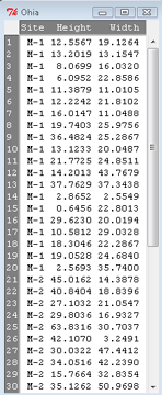
Figure 2. The o`hia dataset as viewed in R Commander.
The data are from Table 5 of Corn and Hiesey 1973. (I simulated data based on their mean/SD reported in Table 5). This was a very cool experiment: they collected o`hia seeds from three elevations on Maui, then grew the seeds in a common garden in Honolulu. Thus, the researchers controlled the environment; what varied, then were the genotypes.
As always, you should look at the data. Box plots are good to compare central tendency (Fig 3).
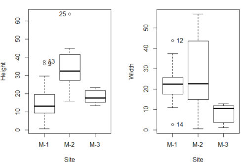
Figure 3. Box plots of growth responses of o`hia seedlings collected from three Maui sites, M-1 (elevation 750 ft), M-2 (elevation 1100 ft), and M-3 (elevation 6600 ft). Data adapted from Table 5 of Corn and Hiersey 1973.
R code to make Figure 4 plots
par(mfrow=c(1,2))
Boxplot(Height ~ Site, data = ohia, id = list(method = "y"))
Boxplot(Width ~ Site, data = ohia, id = list(method = "y"))
This dataset would typically be described as a one-way ANOVA problem. There was one treatment variable (population source) with three levels (M-1, M-2, M-3). From Rcmdr we select the one-way ANOVA: Statistics → Means → One-way ANOVA… and after selecting the Groups (from the Site variable) and the Response variable (eg, Height), we have
AnovaModel.1 <- aov(Height ~ Site, data = ohia.ch12)
summary(AnovaModel.1)
           Df Sum Sq   Mean Sq  F value          Pr(>F)
Site        2   4070    2034.8    22.63 0.000000131 ***
Residuals  47   4227      89.9
---
Signif. codes: 0 '***' 0.001 '**' 0.01 '*' 0.05 '.' 0.1 ' ' 1
Let us proceed to test the null hypothesis (what was it???) using instead the lm() function. Four steps in all.
Step 1. Rcmdr: Statistics → Fit models → Linear model … (Fig 4).
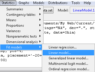
Figure 4. R Commander, select to fit a Linear model.
Step 2. The pop up menu below (Fig 5) follows.
First, What is our response (dependent) variable? What is our predictor (independent) variable? We then input our model. In this case, with only the one predictor variable, Sites, our model formula is simple to enter (Fig 5): Height ~ Site.
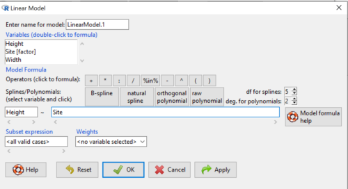
Figure 5. Input linear model formula, Height ~ Site.
Step 3. Click OK to carry out the command.
Here is the R output and the statistical results from the application of the linear model.
LinearModel.1 <- lm(Height ~ Site, data=ohia.ch12)
summary(LinearModel.1)

Call:
lm(formula = Height ~ Site, data = ohia.ch12)

Residuals:
    Min     1Q   Median     3Q     Max
-18.808 -4.761   -1.755  4.758  29.257

Coefficients:
             Estimate  Std. Error  t value      Pr(>|t|)
(Intercept)    15.314       2.121    7.222 0.00000000377 ***
Site[T.M-2]    19.261       2.999    6.423 0.00000006153 ***
Site[T.M-3]     2.924       3.673    0.796          0.43
---
Signif. codes:  0 '***' 0.001 '**' 0.01 '*' 0.05 '.' 0.1 ' ' 1
Residual standard error: 9.483 on 47 degrees of freedom
Multiple R-squared:  0.4905,	Adjusted R-squared:  0.4688
F-statistic: 22.63 on 2 and 47 DF,  p-value: 0.0000001311
End R output
The linear model has produced a series of estimates of coefficients for the linear model, statistical tests of the significance of each component of the model, and the coefficient of determination, R2, which is a descriptive statistic of how well model fits the data. Instead of our single factor variable for Source Population like in ANOVA we have a series of what are called dummy variables or contrasts between the populations. Thus, there is a coefficient for the difference between M-1 and M-2. “Site[T.M-2]” in the output, between M-1 and M-3, and between M-2 and M-3.
Note 1: Brief description of linear model output; these will be discussed fuller in Chapter 17 and Chapter 18. The residual standard error is a measure of how well a model fits the data. The Adjusted R-squared is calculated by dividing the residual mean square error by the total mean square error. The result is then subtracted from 1.
It also produced our first statistic that assesses how well the model fits the data called the coefficient of determination, R2. An of of 1.0 would indicate that all variation in the data set can be explained by the predictor variable(s) in the model with no residual error remaining. Our value of 49% indicates that nearly 50% of the variation in height of the seedlings grown under common environments are due to the source population (= genetics).
Step 4. But we are not quite there — we want the traditional ANOVA results (recall the ANOVA table).
To get the ANOVA Table we have to ask Rcmdr (and therefore R) to give us this. Select
Rcmdr: Models → Hypothesis tests → ANOVA table … (Fig 6).
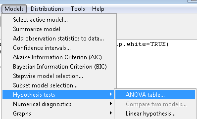
Figure 6. To retrieve an ANOVA table, select Models, Hypothesis tests, then ANOVA table…
Here’s the type of tests for the ANOVA table, select the default (Fig 7).
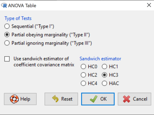
Figure 7. Options for types of tests.
Now, in the future when we work with more complicated experimental designs, we will also need to tell R how to conduct the test. For now, we will accept the default Type II type of test and ignore sandwich estimators. You should confirm that for a one-way ANOVA, Type I and Type II choices give you the same results.
The reason they do is because there is only one factor — when there are more than one factors, and if one or both of the factors are random effects, then Type I, II, and III will give you different answers. We will discuss this more as needed, but see the note below about default choices.
Note 2: Marginal or partial effects are slopes (or first derivatives): they quantify the change in one variable given change in one or more independent variables. Type I tests are sequential: sums of squares are calculated in the order the predictor variables are entered into the model. Type II tests the sums of squares are calculated after adjusting for some of the variables in the model. Type III, every sum of square calculation is adjusted for all other variables in the model. Sandwich estimator refers to algorithms for calculating the structure of errors or residuals remaining after the predictor variables are fitted to the data. The assumption for ordinary least square estimation (See Chapter 17) is that errors across the predictors are equal, ie, equal variances assumption. HC refers to “heteroscedasticity consistent” (Hayes and Chai 2007), which infers fitting of a model does not assume equal error variance across all observations.
By default, Rcmdr makes Type II. In most of the situations we will find ourselves this semester, this is the correct choice.
Below is the output from the ANOVA table request. Confirm that the information is identical to the output from the call to aov() function.
Anova(LinearModel.1, type = "II")
Anova Table (Type II tests)
Response: Height
          Sum Sq  Df   F value        Pr(>F)
Site      4069.7   2    22.626  0.0000001311 ***
Residuals 4226.9  47
---
Signif. codes: 0 '***' 0.001 '**' 0.01 '*' 0.05 '.' 0.1 ' ' 1
And the other stuff we got from the linear model command? Ignore for now but make note that this is a hint that regression and ANOVA are special cases of the same model, the linear model.
We do have some more work to do with ANOVA, but this is a good start.
Why use the linear model approach?
Chief among the reasons to use the lm() approach is to emphasize that a model approach is in use. One purpose of developing a model is to provide a formula to predict new values. Prediction from linear models is more fully developed in Chapter 17 and Chapter 18, but for now, we introduce the predict() function with our O`hia example.
myModel <- predict(LinearModel.1, interval = "confidence")
head(myModel, 3)    #print out first 3 rows
#Add the output to the data set
ohiaPred <- data.frame(ohia,myModel)
with(ohiaPred, tapply(fit, list(Site), mean, na.rm = TRUE))   #print out predicted values for the three sites
Output from R
myModel <- predict(LinearModel.1, interval = "confidence")
head(myModel, 3)
       fit      lwr      upr
1 15.31374 11.04775 19.57974
2 15.31374 11.04775 19.57974
3 15.31374 11.04775 19.57974
with(myModel, tapply(fit, list(Site), mean, na.rm = TRUE))
     M-1      M-2      M-3
15.31374 34.57474 18.23796
Questions
1. Revisit ANOVA problems in homework and questions from early parts of this chapter and apply lm() followed by Hypothesis testing (Rcmdr: Models → Hypothesis tests → ANOVA table) approach instead of one-way ANOVA command. Compare results using lm() to results from One-way ANOVA and other ANOVA problems.
Quiz Chapter 12.7
Many tests one model
Data set and R code used in this page
Corn and Hiesey (1973)
| Site | Height | Width |
|---|---|---|
| M-1 | 12.5567 | 19.1264 |
| M-1 | 13.2019 | 13.1547 |
| M-1 | 8.0699 | 16.032 |
| M-1 | 6.0952 | 22.8586 |
| M-1 | 11.3879 | 11.0105 |
| M-1 | 12.2242 | 21.8102 |
| M-1 | 16.0147 | 11.0488 |
| M-1 | 19.7403 | 25.9756 |
| M-1 | 36.4824 | 25.2867 |
| M-1 | 13.1233 | 20.0487 |
| M-1 | 21.7725 | 24.8511 |
| M-1 | 14.2013 | 43.7679 |
| M-1 | 37.7629 | 37.3438 |
| M-1 | 2.8652 | 2.5549 |
| M-1 | 0.6456 | 22.8013 |
| M-1 | 29.623 | 20.0194 |
| M-1 | 10.5812 | 29.0328 |
| M-1 | 18.3046 | 22.2867 |
| M-1 | 19.0528 | 24.684 |
| M-1 | 2.5693 | 35.74 |
| M-2 | 45.0162 | 14.3878 |
| M-2 | 40.8404 | 18.8396 |
| M-2 | 27.1032 | 21.0547 |
| M-2 | 29.8036 | 16.9327 |
| M-2 | 63.8316 | 30.7037 |
| M-2 | 42.107 | 3.2491 |
| M-2 | 30.0322 | 47.4412 |
| M-2 | 34.0516 | 42.239 |
| M-2 | 15.7664 | 32.8354 |
| M-2 | 35.1262 | 50.9698 |
| M-2 | 43.6988 | 19.3897 |
| M-2 | 26.7585 | 13.8168 |
| M-2 | 36.7895 | 0.5817 |
| M-2 | 30.9458 | 53.7757 |
| M-2 | 26.8465 | 15.4137 |
| M-2 | 40.3883 | 9.2161 |
| M-2 | 30.6555 | 56.8456 |
| M-2 | 19.9736 | 44.9411 |
| M-2 | 27.676 | 36.8543 |
| M-2 | 44.084 | 24.3396 |
| M-3 | 15.2646 | 11.4999 |
| M-3 | 19.6745 | 9.7757 |
| M-3 | 23.275 | 12.7825 |
| M-3 | 16.1161 | 2.4065 |
| M-3 | 16.8393 | 1.1253 |
| M-3 | 23.107 | 3.7349 |
| M-3 | 21.5322 | 6.9725 |
| M-3 | 13.4191 | 12.2867 |
| M-3 | 14.7273 | 11.4841 |
| M-3 | 18.4245 | 11.9078 |
Chapter 12 contents
12.6 – ANOVA posthoc tests
Introduction
Tests of the null hypothesis in a one-way ANOVA yields one answer: either you reject the null, or you do not reject the null hypothesis — with the usual caveats about “provisionally reject,” etc (Ch8.2 and Ch8.3). But while there was only one factor (population, drug treatment, etc) in a one-way ANOVA, there are usually many treatments (eg, multiple levels, four different populations, three doses of a drug plus a placebo).
ANOVA plus posthoc tests solves the multiple comparison problem we discussed: you still get your tests of all group differences, but with adjustments to the procedures so that these tests are conducted without suffering the increase in Type I error = the multiple comparison problem. If the null hypothesis is rejected, you may then proceed to posthoc tests among the groups to identify differences without increasing the chance of rejecting the null hypothesis too often.
Consider the following example of four populations scored for some outcome, sim.ch12 (scroll down the page, or click here to get the R code).
Bring the data frame, sim.ch12, into current memory in Rcmdr by selecting the data set. Next, run the one-way ANOVA.
Rcmdr: Statistics → Means → One-way ANOVA…
which brings up the following menu (Fig 1).
Figure 1. One-way ANOVA menu in R Commander.
Note 1: If you look carefully in Figure 1, you can see model name was AnovaModel.8. There’s nothing sacred about that name, it just means this was the 8th model I had run up to that point. For consistency I renamed all instances of model objects reported in the text as AnovaModel.1 — after all, they were the same model run with different commands. As a reminder, Rcmdr will provide names for models for you; it is better practice to provide model names yourself.
Notice that Rcmdr menu correctly identifies the Factor variable, which contains text labels for each group, and the Response variable, which contains the numerical observations.
Note 2: If your factor is numeric, you’ll first have to tell R that the variable is a factor and hence nominal. this can be accomplished within Rcmdr via the Data → Manage variables… options, or simply submit the command
newName <- as.factor(oldVariable)
Similarly, you may need to change a variable from character to factor. For example, check a variable with class(). If it returns anything but “factor,” then use as.factor() as before.
If your data set contains more variables, then you would need to sort through these and select the correct model (Fig 1).
To get the default Tukey posthoc tests simply check the Pairwise comparisons box and then click OK.
For a test of the null that four groups have the same mean, a publishable ANOVA table would look like Table 1.
Note 3: the ANOVA table is something you put together from the output of R (or other statistical programs). After running one-way ANOVA in Rcmdr, go to Models → Hypothesis tests → ANOVA table…, accept the defaults (marginality, sandwich estimators and are explained in the next chapter 12.7).
Table 1. The ANOVA table
| Df | Mean Square |
F | P† | |
| Label | 3 | 389627 | 76.44 | < 0.0001 |
| Error | 36 | 61167 |
1.108357e-15 to a threshold < 0.0001.Note 4: To automatically replace a small p-value with a threshold cutoff requires conditional formatting, to highlight results by their content. This is a great ability of spreadsheet apps, and, unsurprisingly, R can do this too. For example, the pvalue() function in scales package, which can report p-values rounded to a threshold value.
R code
pvalue(1.108357e-15, accuracy=0.0001, decimal.mark = ".", add_p=TRUE)
Output
[1] "p<0.0001"
h/t norbert at Scripts & Statistics
Here’s the R output for ANOVA
AnovaModel.1 <- aov(Values ~ Label, data = sim.Ch12)
summary(AnovaModel.1)
          Df  Sum Sq Mean Sq  F value     Pr(>F)
Label      3  389627  129876    76.44   1.11e-15 ***
Residuals 36   61167    1699
---
Signif. codes: 0 '***' 0.001 '**' 0.01 '*' 0.05 '.' 0.1 ' ' 1
with(sim.Ch12, numSummary(Values, groups = Label, statistics = c("mean", "sd")))
      mean       sd data:n
Pop1 150.3 35.66838 10
Pop2  99.0 43.25634 10
Pop3 130.9 42.36469 10
Pop4 350.7 43.10723 10
End of R output.
When to conduct posthoc tests.
Recall that all we can say is that a difference has been found and we reject the null hypothesis. However, we do not know if group 1 = group 2, but both are different from group 3, or some other combination. So we may want additional tools. We can conduct posthoc tests (also called multiple comparisons tests).
Once a difference has been detected (F test statistic > F critical value, therefore P < 0.05), then posteriori tests, also called unplanned comparisons, can be used to tell which means differ.
There are also cases for which some comparisons were planned ahead of time and these are called a priori or planned comparisons; even though you conduct the tests after the ANOVA, you were always interested in particular comparisons. This is an important distinction: planned comparisons are more powerful, more aligned with what we understand to be the scientific method. An argument — transparency, avoids Type II errors — can be made that if comparisons are planned, and only a few tests are conducted, no correction for “multiple tests” is warranted. Moreover, it is defensible to report all p-values from a hundred tests without correction, acknowledging that if all null hypotheses were “true,” then 5 would be expected to be less than Type I of 5% by chance alone.
Posthoc tests.
ANOVA was introduced by Fisher in 1918, and, as readers know by know, returns whether or not significant differences are present among groups, but no which groups may differ. Unsurprisingly, given the needs of researchers to compare groups, many tests were developed since Fisher’s ANOVA to conduct multiple comparison tests. Collectively, they are often referred to as posthoc tests (Ruxton and Beauchamp 2008).
There are many different flavors of these tests, and R offers several, but I will hold you responsible only for three such comparisons: Tukey’s, Dunnett’s, and Bonferroni (Dunn). These named tests are among the common ones (Table 2, Midway et al 2020), but you should be aware that the problem of multiple comparisons and inflated error rates has received quite a lot of recent attention because the size of data sets has increased in many fields, eg, genome wide-association studies in genetics or data mining in economics or business analytics. A related topic then is the issue of “false positives.” New approaches include Holm-Bonferroni. There are others — it is a regular “cottage industry” in applied statistics to a problem that, while recognized, has not achieved a universal agreed solution. Best we can do is be aware and deal with it and know that the problem is one mostly of big data (eg, microarray and other high-throughput approaches). Equally important, some of these tests are better than others, and some may not be consistent with best practices.
Let’s take a look at these procedures.
Performing multiple comparisons and the one-way ANOVA
Note 5: In order to do most of the posthoc tests you will need to install the multcomp package; after installing the package, load the library(multcomp). Just using the default option from the one-way ANOVA command yields the Tukey’s HSD test.
a. Tukey’s: “honestly (wholly) significant difference test”
Tests  versus
  where A and B can be any pairwise combination of two means you wish to compare. Thus, this is likely a case of unplanned comparisons. There are
  comparisons.

where

and n is the harmonic mean of the sample sizes of the two groups being compared. If the sample sizes are equal, then the simple arithmetic mean is the same as the harmonic mean.
Note 6: q is like t for when we are testing means from two samples.
- The significance level is the probability of encountering at least one Type I error (probability of rejecting Ho when it is true). This is called the experimentwise (familywise) error rate whereas before we talked about the comparisonwise (individual) error rate.
Three options to get the posthoc test Tukey:
(1) TukeyHSD() function is included in base statistics.
(2) use a function called mcp or in Rcmdr, Tukey is the default option in the one-way ANOVA command. The function mcp is part of the multcomp package, which is included in the Rcmdr package.
(3) specify method = "HSD" in PostHocTest function in DescTools package.
In brief, run the anova first, save the output to an object, then call an appropriate command from a package to conduct the posthoc test.
Rcmdr: Statistics → Means → One-way ANOVA
Check “Pairwise comparisons of means” to get the Tukey’s HSD test (Fig 2).
Figure 2. Screenshot Rcmdr menu: Select Tukey posthoc tests with the one-way ANOVA.
Tukey’s honestly significant difference is available without installing additional packages. Simply run
AnovaModel.1 <- aov(formula = Values ~ Label, data = sim.Ch12)
TukeyHSD(AnovaModel.1)
and R output returned is
Tukey multiple comparisons of means
95% family-wise confidence level

Fit: aov(formula = Value ~ Label, data = sim.Ch12)

$Label
           diff        lwr        upr     p adj
Pop2-Pop1 -51.3 -100.94731  -1.652695 0.0406116
Pop3-Pop1 -19.4  -69.04731  30.247305 0.7200796
Pop4-Pop1 200.4  150.75269 250.047305 0.0000000
Pop3-Pop2 31.9   -17.74731  81.547305 0.3232616
Pop4-Pop2 251.7  202.05269 301.347305 0.0000000
Pop4-Pop3 219.8  170.15269 269.447305 0.0000000
Installation of R Commander also includes installation of the multcomp package, which contains several post hoc tests, including Tukey and Dunnett’s tests.
R output follows. There’s a lot, but much of it is repeat information. Take your time, here we go.
.Pairs <- glht(AnovaModel.1, linfct = mcp(Label = "Tukey"))
summary(.Pairs) # pairwise tests
     Simultaneous Tests for General Linear Hypotheses
Multiple Comparisons of Means: Tukey Contrasts
 Fit: aov(formula = Values ~ Label, data = sim.Ch12)

 Linear Hypotheses:
                  Estimate Std. Error t value Pr(>|t|)
 Pop2 - Pop1 == 0   -51.30      18.43  -2.783   0.0405 *
 Pop3 - Pop1 == 0   -19.40      18.43  -1.052   0.7201
 Pop4 - Pop1 == 0   200.40      18.43  10.871   <0.001 ***
 Pop3 - Pop2 == 0    31.90      18.43   1.730   0.3233
 Pop4 - Pop2 == 0   251.70      18.43  13.654   <0.001 ***
 Pop4 - Pop3 == 0   219.80      18.43  11.924   <0.001 ***
 ---
 Signif. codes:  0 '***' 0.001 '**' 0.01 '*' 0.05 '.' 0.1 ' ' 1
 (Adjusted p values reported -- single-step method)

 confint(.Pairs) # confidence intervals
      Simultaneous Confidence Intervals

 Multiple Comparisons of Means: Tukey Contrasts

 Fit: aov(formula = Values ~ Label, data = sim.Ch12)

 Quantile = 2.6927
 95% family-wise confidence level

 Linear Hypotheses:
                  Estimate  lwr       upr
 Pop2 - Pop1 == 0  -51.3000 -100.9382   -1.6618
 Pop3 - Pop1 == 0  -19.4000  -69.0382   30.2382
 Pop4 - Pop1 == 0  200.4000  150.7618  250.0382
 Pop3 - Pop2 == 0   31.9000  -17.7382   81.5382
 Pop4 - Pop2 == 0  251.7000  202.0618  301.3382
 Pop4 - Pop3 == 0  219.8000  170.1618  269.4382
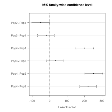
Figure 3. Plot of confidence intervals of Tukey HSD.
R Commander includes a default 95% CI plot (Fig 3). From this graph, you can quickly identify the pairwise comparisons for which 0 (zero, dotted vertical line) is included in the interval, ie, there is no difference between the means (eg, Pop1 is different from Pop4, but Pop1 is not different from Pop3).
b. Dunnett’s Test for comparisons against a control group
- There are situations where we might want to compare our experimental Populations to one control Population or group. Thus, this is likely a case of planned comparisons.
- This is common in medical research where there is a placebo (control pill with no drug) or sham operations (operations where everything but the critical operation is done).
- This is also a common research design in ecological or agricultural research where some animal or plant populations are exposed to an environmental factor (eg, fertilizer, pesticide, pollutant, competitors, herbivores) and other animal or plant populations are not exposed to these environmental factor.
- The difference in the statistical procedure for analyzing this type of research design is that the experimental groups may only be compared to the control group.
- This results in fewer comparisons.
- The formula is the same as for the Tukey’s Multiple Comparison test, except for the calculation of the SE.
Standard Error is changed by multiplying the MSError by 2.
And n is the harmonic mean of the sample sizes of the two groups being compared.

where

R Commander doesn’t provide a simple way to get Dunnett, but we can get it simply enough if we are willing to write some script. Fortunately (OK, by design!), Rcmdr prints commands.
Look at the Output window from the one-way ANOVA with pairwise comparisons: it provides clues as to how we can modify the mcp command (mcp stands for multiple comparisons).
First, I had run the one-way ANOVA command and noted the model (AnovaModel.3). Second, I wrote the following script, modified from above.
Pairs <- glht(AnovaModel.1, linfct = mcp(Label = c("Pop2 - Pop1 = 0", "Pop3 - Pop1 = 0", "Pop4 - Pop1 = 0")))
where Label was my name for the Factor variable. Note that I specified the comparisons I wanted R to make. When I submit the script, nothing shows up in the Output window because the results are stored in Pairs.
Next, I then need to ask R to provide confidence intervals
confint(Pairs)
R output window
Pairs <- glht(AnovaModel.1, linfct = mcp(Label = c("Pop2 - Pop1 = 0", "Pop3 - Pop1 = 0", "Pop4 - Pop1 = 0")))
confint(Pairs)

Simultaneous Confidence Intervals

 Multiple Comparisons of Means: User-defined Contrasts

 Fit: aov(formula = Values ~ Label, data = sim.Ch12)

 Estimated Quantile = 2.4524
 95% family-wise confidence level

 Linear Hypotheses:
  ...... lwr ....... upr
 Pop2 - Pop1 == 0  .. -51.3000  . -96.5080  ... -6.0920
 Pop3 - Pop1 == 0  .. -19.4000  . -64.6080  ... 25.8080
 Pop4 - Pop1 == 0  .. 200.4000  . 155.1920  .. 245.6080
Look for intervals that include zero, therefore, the group does not differ from the Control group (Pop1). How many groups differed from the Control group?
Alternatively, I may write
Tryme <- glht(AnovaModel.1, linfct = mcp(Label = "Dunnett"))
confint(Tryme)
It’s the same — in fact, the default mcp test is Dunnett’s test.
Tryme <- glht(AnovaModel.1, linfct = mcp(Label = "Dunnett"))
confint(Tryme)

Simultaneous Confidence Intervals

Multiple Comparisons of Means: Dunnett Contrasts

Fit: aov(formula = Values ~ Label, data = sim.Ch12)

Estimated Quantile = 2.4514
95% family-wise confidence level

Linear Hypotheses:
Estimate lwr upr
Pop2 - Pop1 == 0 -51.3000 -96.4895 -6.1105
Pop3 - Pop1 == 0 -19.4000 -64.5895 25.7895
Pop4 - Pop1 == 0 200.4000 155.2105 245.5895
Note 7: Use relevel() command* to set the order of levels in the data set. By default Dunnett procedure in mcp assumes the first level of the factor is the control or reference level. R sorts levels alphabetically, so clearly one option is to always provide a sort-friendly name for the reference level. Naturally, R has you covered if you need to specify a different level as the reference, the relevel() command. For example, instead of Pop1, set reference to Pop2 as follows:
Level
[1] Pop1 Pop2 Pop3 Pop4
Levels: Pop1 Pop2 Pop3 Pop4
Set new order
Level <- relevel(Level, ref = "Pop2"); Level
[1] Pop1 Pop2 Pop3 Pop4
Levels: Pop2 Pop1 Pop3 Pop4
relevel() works only on unordered factors; if you get this error message it just means you need to specify your character variable as a factor. As you may recall, to confirm a character variable is factor
is.factor(Level)
[1] TRUE
If FALSE, then set character variable to factor.
Level <- as.factor(Level)
* Yes, you could change the order any way you want with level(). For example,
Level <- factor(Level, levels = c("Pop2", "Pop4", "Pop1", "Pop3")); Level
returns
[1] Pop1 Pop2 Pop3 Pop4
Levels: Pop2 Pop4 Pop1 Pop3
c. Bonferroni t
The Bonferroni t test is a popular tool for conducting multiple comparisons. This, too, is consistent with an unplanned comparisons approach. The rationale for this particular test is that the MSerror is a good estimate of the pooled variances for all groups in the ANOVA.

and DF = N – k.
Note 8: In order to achieve a Type I error rate of 5% for all tests, you must divide the 0.05 by the number of comparisons conducted.
Thus, for k = 4 groups,

Here’s a simplified version if you prefer to get all pairwise tests
Use this information then to determine how many total comparisons will be made, then if necessary, use to adjust Type I error rate for one test (the exerimentwise error rate).
For our example, is 0.05/6 = 0.00833. Thus, for a difference between two means to be statistically significant, the P-value must be less than 0.00833.
For Bonferroni, we will use the following script.
- Set up one-way ANOVA model (ours has been saved as AnovaModel.1),
- Collect all pairwise comparisons with the
mcp(~"Tukey")stored in a vector (I called mineWhynot), - and finally, get the Bonferroni adjusted test of the comparisons with the summary command, but add
test = adjusted("bonferroni").
It’s a bit much, but we end up with a very nice output to work with.
Whynot <- glht(AnovaModel.1, linfct = mcp(Label = "Tukey"))
summary(Whynot, test = adjusted("bonferroni"))

 Simultaneous Tests for General Linear Hypotheses

Multiple Comparisons of Means: Tukey Contrasts

Fit: aov(formula = Values ~ Label, data = sim.Ch12)

Linear Hypotheses:
Estimate Std. Error t value Pr(>|t|)
Pop2 - Pop1 == 0 -51.30 18.43 -2.783 0.0512 .
Pop3 - Pop1 == 0 -19.40 18.43 -1.052 1.0000
Pop4 - Pop1 == 0 200.40 18.43 10.871 3.82e-12 ***
Pop3 - Pop2 == 0 31.90 18.43 1.730 0.5527
Pop4 - Pop2 == 0 251.70 18.43 13.654 5.33e-15 ***
Pop4 - Pop3 == 0 219.80 18.43 11.924 2.77e-13 ***
  ---
 Signif. codes: 0 '***' 0.001 '**' 0.01 '*' 0.05 '.' 0.1 ' ' 1
 (Adjusted p values reported -- bonferroni method)
Questions
- Be able to define and contrast experiment-wise and family-wise error rates.
- Read and interpret R output
- Refer back to the Tukey HSD output. Among the four populations, which pairwise groups were considered “statistically significant” following use of the Tukey HSD?
- Refer back to the Dunnett’s output. Among the four populations, which population was taken as the control group for comparison?
- Refer back to the Dunnett’s output. Which pairwise groups were considered “statistically significant” from the control group?
- Refer back to the Bonferroni output. Among the four populations, which pairwise groups were considered “statistically significant” following use of the Bonferroni correction?
- Compare and contrast interpretation of results for posthoc comparisons among the four populations based on the three different posthoc methods
- Be able to distinguish when Tukey HSD and Dunnet’s post hoc tests are appropriate.
- Some microarray researchers object to use of Bonferroni correction because it is too “conservative.” In the context of statistical testing, what errors are the researchers talking about when they say the correction is “conservative.”
Quiz Chapter 12.6
ANOVA posthoc tests
Data set used in this page
| Label | Value |
|---|---|
| Pop1 | 105 |
| Pop1 | 132 |
| Pop1 | 156 |
| Pop1 | 198 |
| Pop1 | 120 |
| Pop1 | 196 |
| Pop1 | 175 |
| Pop1 | 180 |
| Pop1 | 136 |
| Pop1 | 105 |
| Pop2 | 100 |
| Pop2 | 65 |
| Pop2 | 60 |
| Pop2 | 125 |
| Pop2 | 80 |
| Pop2 | 140 |
| Pop2 | 50 |
| Pop2 | 180 |
| Pop2 | 60 |
| Pop2 | 130 |
| Pop3 | 130 |
| Pop3 | 95 |
| Pop3 | 100 |
| Pop3 | 124 |
| Pop3 | 120 |
| Pop3 | 180 |
| Pop3 | 80 |
| Pop3 | 210 |
| Pop3 | 100 |
| Pop3 | 170 |
| Pop4 | 310 |
| Pop4 | 302 |
| Pop4 | 406 |
| Pop4 | 325 |
| Pop4 | 298 |
| Pop4 | 412 |
| Pop4 | 385 |
| Pop4 | 329 |
| Pop4 | 375 |
| Pop4 | 365 |
R code # copy the data from the full table to clipboard and paste between the double quotes in text=””)
sim.ch12 <- read.table(header=TRUE, sep=",",text="")

#check the dataframe
head(sim.ch12)
Chapter 12 contents
12.5 – Effect size for ANOVA
Introduction
As noted in the t-test chapter and our discussion of statistical power, an effect size is a measure of the strength of a phenomenon. An effect size calculated from data is a descriptive statistic that indicates how large (or small) the difference is between two or more samples. Effect size measures help to provide context between statistical significance, i.e., p-values. Among other uses, effect size measures play an important role in meta-analysis studies biological significance (i.e., importance of the measured difference).
Estimation of effect size
eta-squared (η2)

where SSB and SST are from the one-way ANOVA and refer to the sum of squared among (between) groups and the total sum of squares, respectively.  measures the proportion of the variation in the response variable that can be explained by membership in one of the groups.
For example, of 0.15 or 15% is interpreted to mean that just 15% of the variation in the response variable can be attributed to membership in the groups (i.e., whether a subject was in control group or treatment group, only 15% of the differences between individuals can be attributed to having received control).
Note 1: η2 is just the unadjusted coefficient of determination, R2.
omega-squared (ω2)
A similar, but “less biased” effect size estimate is given by omega-squared (ω2) (Okada 2013). (The bias comes in because sample estimates were used.) Interpretation of  is the same as : measures the proportion of variation explained by membership in the groups. is given as

The bias for is more pronounced with small sample size, so omega-squared is preferred. will always be less than or equal to (Okada 2013).
R code
If you have not already done so, please install the package effectsize.
We’ll use the example one-way ANOVA problem from Chapter 12.2. I’ve added the data as example.ch12 and some R script to load the data, scroll to bottom of this page or click on the link).
Get 
First, get the ANOVA model. There are several ways to do this within R (and Rcmdr), the most general is to use the general linear model function, lm(),
#Get the model
AnovaModel.4 <- lm(Difference~Group, data=example.ch12)
#turn it into format that the next command needs
aov_fit <- anova(AnovaModel.4)
#get eta
effectsize(aov_fit)
R output
Parameter | Eta2 (partial) | 9e+01% CI
-----------------------------------------
Group | 0.95 | [0.88, 0.97]
is 0.95 for the Difference group.
Get
R code
omega_squared(aov_fit, partial = FALSE, ci = 0.95)
R output
Parameter | Omega2 | 1e+02% CI
---------------------------------
Group | 0.93 | [0.82, 0.97]
This is a case of a large effect due to group membership. The differences between A, B, and C means account for 93% of the variation. Note that both and  are close; note also that is greater than .
Questions
- In Chapter 7.4 we introduced the concept of number needed to treat, NNT. Discuss the concept of “important differences” between sample means of a control group and a treatment group to NNT.
- This question refers to hypothetical data presented in Chapter 12.2. For the “No difference” group, calculate and . Use the boxplots shown in Figure 1, together with effect size statistics to discuss the relationship between statistical significance (p-value) and important difference.
Quiz Chapter 12.5
Effect size for ANOVA
Data set
example.ch12 <- read.table(header=TRUE, sep=",",text="
Group, No.difference, Difference
A, 12.04822, 11.336161
A, 12.67584, 13.476142
A, 12.99568, 12.961210
A, 12.01745, 11.746712
A, 12.34854, 11.275492
B, 12.17643, 7.167262
B, 12.77201, 5.136788
B, 12.07137, 6.820242
B, 12.94258, 5.318743
B, 12.07670, 7.153992
C, 12.58212, 3.344218
C, 12.69263, 3.792337
C, 12.60226, 2.444438
C, 12.02534, 2.576014
C, 12.60420, 4.575672")
#check the dataframe
head(example.ch12)
Chapter 12 contents
12.4 – ANOVA from “sufficient statistics”
Introduction
By now you should be able to run a one-way ANOVA using R (and R Commander) with ease. As a reminder, You should also be aware that, if you need to, you could use spreadsheet software like Microsoft Excel or LibreOffice Calc to run one way ANOVA on a small data set. Still, there are times when you may need to run a one-way ANOVA on a small data set, and doing so by hand calculator may be just as convenient. What are your available options?
Following the formulas I have given would be one way to calculate ANOVA by hand, but it would be tedious and subject to error. Instead of working with the standard formulas, calculator shortcuts can be derived with a little algebra and this is where I want to draw your attention now. This technique will come in handy in lab classes or other scenarios where you collect some data among a set number of groups and calculate means and standard deviations. The purpose of this posting is to show you how to obtain the necessary statistics to calculate a one-way ANOVA from the available descriptive statistics: means, standard deviations, and sample sizes. In other words, these are the sufficient statistics for one-way ANOVA.
Note 1: In Chapter 11.5, we introduced use of summary statistics, ie, “sufficient statistics,” to calculate the independent sample t-test.
As you recall, a one-way ANOVA yields a single F test of the null hypothesis that all group means are equal. To calculate the F test, you need
- Mean Square Between Groups,

- Mean Squares Within Groups or Error,

F is then calculated as

with degrees of freedom k – 1 for the numerator and N – 1 for the denominator. can also appear as 
We can calculate as

where k is the number of i th groups, ni is the sample size of the ith group,  refers to the overall mean for all of the
  sample means.
Next, for the Error Mean Square, , all we need is the average of the sample variances (the square of the sample standard deviation, s).

ANOVA from sufficient statistics
Consider an example data set (Table 1) for which only summary statistics are available (mean and standard deviation, sd). The data set is for life span(days) for several inbred strains of laboratory mice from a study (. Sample size for each group was seven mice.
Table 1. Descriptive statistics female life span (days) for ten different inbred strains of mice (Mus domesticus).
| Strains | n | mean | sd |
|---|---|---|---|
| 129S1/SvImJ | 32 | 787.4 | 159.16 |
| A/J | 32 | 630.7 | 130.20 |
| BALB/cByJ | 32 | 734.4 | 154.43 |
| BUB/BnJ | 24 | 611.3 | 218.34 |
| C3H/HeJ | 29 | 724.1 | 131.48 |
| C57BL/6J | 29 | 855.7 | 185.34 |
| CBA/J | 30 | 622.9 | 181.95 |
| FVB/NJ | 26 | 750.3 | 230.11 |
| P/J | 32 | 676.0 | 178.82 |
| SWR/J | 31 | 831.9 | 181.31 |
Data from Yuan et al (2021; https://phenome.jax.org).
Spreadsheet calculations.
You have several options at this point, ranging from using your calculator and the formulas above (don’t forget to square the standard deviation to get the variances!), or you could use Microsoft Excel or LibreOffice Calc and enter the necessary formulas by hand (Table 2). You’ll also find many online calculators for one-way ANOVA by sufficient statistics (eg, https://www.danielsoper.com/statcalc/calculator.aspx?id=43).
Table 2. Spreadsheet with formulas for calculating one-way ANOVA from means and standard deviations from statistics presented in Table 1.
| A | B | C | D | E | F | G | H | I | |
| 1 | Strain | n | Mean | sd | squared | variance | grand mean |
=AVERAGE(C:C) | |
| 2 | 129S1/SvImJ | 32 | 787.4 | 159.16 | =B2*(C2-$I$1)^2 | =D2^2 | dfB | =COUNT(B:B)-1 | |
| 3 | A/J | 32 | 630.7 | 130.2 | =B2*(C3-$I$1)^2 | =D3^2 | dfE | =SUM(B:B)-I2 | |
| 4 | BALB/cByJ | 32 | 734.4 | 154.43 | =B2*(C4-$I$1)^2 | =D4^2 | Msb | =SUM(E:E)/(COUNT(E:E)-1) | |
| 5 | BUB/BnJ | 24 | 611.3 | 218.34 | =B2*(C5-$I$1)^2 | =D5^2 | Mse | =SUM(F:F)/COUNT(F:F) | |
| 6 | C3H/HeJ | 29 | 724.1 | 131.48 | =B2*(C6-$I$1)^2 | =D6^2 | F | =I4/I5 | |
| 7 | C57BL/6J | 29 | 855.7 | 185.34 | =B2*(C7-$I$1)^2 | =D7^2 | P-value | =FDIST(I6,I2,I3) | |
| 8 | CBA/J | 30 | 622.9 | 181.95 | =B2*(C8-$I$1)^2 | =D8^2 | |||
| 9 | FVB/NJ | 26 | 750.3 | 230.11 | =B2*(C9-$I$1)^2 | =D9^2 | |||
| 10 | P/J | 32 | 676.0 | 178.82 | =B2*(C10-$I$1)^2 | =D10^2 | |||
| 11 | SWR/J | 31 | 831.9 | 181.31 | =B2*(C11-$I$1)^2 | =D11^2 |
For this example, you should get the following
MSB = 219899.5
MSE = 31634.1
F = 6.951
P-value = 4.45E-09
Note 2: The number of figures reported for the P-value implies a precision that the data simply do not support. For a report, recommend writing the P-value < 0.001. But note — truncating the p-value diminishes the value to others who may wish to conduct a meta analysis using your work (Chapter 20.15)!
But, R can do it better.
Here’s how. Install the HH package (or RcmdrPlugin.HH for use in Rcmdr) and call the ?aovSufficient function.
Step 1. Install the HH package from a CRAN mirror, e.g., cloud.r-project.org, in the usual way.
chooseCRANmirror()
install.packages("HH")
library(HH)
Step 2. Enter the data. Do this in the usual way (eg, from a text file), or enter directly using the read.table command as follows.
MouseData <- read.table(header=TRUE, sep = ",", text= "
Strain, n.size, average, stdev
129S1, 32, 787.4, 159.16
A.J, 32, 630.7, 130.20
BALB.c, 32, 734.4, 154.43
BUB.BnJ, 24, 611.3, 218.34
C3H.HeJ, 29, 724.1, 131.48
C57BL.6J, 29, 855.7, 185.34
CBA.J, 30, 622.9, 181.95
FVB.NJ, 26, 750.3, 230.11
P.J, 32, 676.0, 178.82
SWR.J, 31, 831.9, 181.31")
#Check import
head(MouseData)
End of R input
I know, a little hard to read, but from the MouseData to the end bracket ") before the comment line #Check import, that’s all one command.
Of course, you could copy the data and import the data from your computer’s clipboard in Rcmdr: Data → Import data → from text file, clipboard, or URL…
Note 3: Hint: for field separator, try comma; if that fails, try Tabs
Once the data set is loaded, proceed to Step 3.
Step 3. In our example, sample size was included for each group. Skip to step 4. If, however, the table lacked the sample size information, you can always add a new variable. For example, if we needed to add sample size to the data frame, we would use the repeat element function, rep().
MouseData$n <- rep(7, 10)
If you check the View data set button in Rcmdr, you will see that the command in Step 3 has added a new variable “n” for each of the eleven rows. The function rep() stands for “replicate elements in vectors” and what it did here was enter a value of 7 for each of the ten rows in the data set. Again, this step is not necessary for this example because sample size is already part of the data frame. Proceed to step 4.
Step 4. Run the one way ANOVA using the sufficient statistics and the HH function aovSufficient
MouseData.aov <- aovSufficient(average ~ Strain, data=MouseData)
Step 5. Get the ANOVA table
summary(MouseData.aov)
Here’s the R output
           Df  Sum Sq Mean Sq F value   Pr(>F)
Strain      9 1977732  219748   7.123 2.54e-09 ***
Residuals 287 8853743   30849
---
Signif. codes:  0 '***' 0.001 '**' 0.01 '*' 0.05 '.' 0.1 ' ' 1
End R output
To explore other features of the package, type ?aovSufficient at the R prompt (like all R functions, extensive help is generally available for each function in a package).
Meta-analysis and sufficient statistics.
Meta-analysis (see Chapter 20.15 — Meta-analysis), can be performed using sufficient statistics from different tests. Combining sufficient statistics allows for a more precise overall estimate by effectively merging the information from multiple studies, which can be especially useful when individual studies have small sample sizes or lack a unified outcome measure. Common methods include creating summary effect sizes like the standardized mean difference or using p-value combination methods, while ensuring the underlying statistical assumptions are met through goodness-of-fit tests.
Fisher’s method combines the p-values from multiple independent studies into a single overall p-value to test a joint null hypothesis. The method’s test statistic is calculated as the sum of the negative log-transformed p-values. P-values from  number of tests are combined; each p-value,
  , contributes to a variable,
  , with
  degrees of freedom. The chi-square distribution is used to evaluate the significance of the Fisher’s method test statistic.
Fisher’s method is available in several R packages (eg,poolr package); here, we’ll just create a simple R code.
Note 4: Not to be confused with Fisher’s exact test, Chapter 9.5.
Limitations: Methods that only use p-values or test statistics may not adequately address the effects of heterogeneity and potential publication bias among studies. Because many older studies do not report effect sizes and confidence intervals, using test statistics or p-values is often the only available method to combine their results.
Example.
One hypothesis about longevity is that the greater the genetic diversity can lead to longer life. The mice in Table 1 were all from inbred mouse strains. By definition, genetic diversity is restricted in inbred mice, compared to outbred strains. Jackson Labs produced a “Diverse Outbred” line of mice, and a few individuals have lived nearly five years, well past the typical 1 – 2 year lifespan of mice (Cohen 2017, Mullis et al 2025). Thus, a natural comparison is to ask: is there a difference in average lifespan between the DO and inbred mouse strains? We’ll run a series of one-sample t-tests against the mean lifespan for the diverse outbred stock of mice, save the p-values, and apply Fisher’s method. While not strictly a meta-analysis, which would draw from multiple studies, this example outlines the basic steps to take given a series of hypothesis of the same kind.
Note 4: Used another R package, BSDA, for a series of one-sample t-tests. DO mean of 794.5 + 262.85 days (n = 192 females), calculated from supplement data in Mullis et al 2025). R code example:
do_avg= 794.5
# dataset MouseData
tsum.test(average[1], stdev[1], n.size[1], mu=do_avg)
Abbreviated R results
t = -0.25235, df = 31, p-value = 0.8024
Repeat for all ten strains from Table 1; p-values were saved to Table 2.
Obviously, a for loop would be appropriate here! The R code extracts p-values from each of the ten tests and saves to p_values object.
p_values <- numeric(length(average))

for (i in 1:length(average)) {
     suppressWarnings({
      test_result <- tsum.test(
      mean.x = average[i],
      s.x = stdev[i],
      n.x = n.size[i],
      mu = do_avg
      )
      p_values[i] <- test_result$p.value
      })
     }

print(p_values)
I’ve wrapped the tsum.test in a suppressWarnings({}) line to prevent multiple, but harmless warnings the code causes. Use of tidyverse would help clean this code up.
The p-values from all ten tests are sorted by strain in Table 2.
Table 2. Results of one sample t-tests inbred strains (Table 1) compared to average lifespan of the J:DO diversity outbred mouse strain from Jackson labs
| Strains | p-value | Strains | p-value | |
| 129S1/SvImJ | 0.8204 | C57BL/6J | 0.08623 | |
| A/J | 5.367e-08 | CBA/J | 1.601e-05 | |
| BALB/cByJ | 0.03527 | FVB/NJ | 0.3368 | |
| BUB/BnJ | 0.0004274 | P/J | 0.0007307 | |
| C3H/HeJ | 0.007479 | SWR/J | 0.2598 |
R-code for Fisher’s method
my_pValues <- c(0.08623, 1.601e-05, 0.3368, 0.0007307, 0.2598)
X_squared <- -2 * sum(log(my_pValues),base = exp(1))
myDf <- 2 * length(my_pValues)
combinedP <- pchisq(X_squared, myDf, lower.tail = FALSE)
result_table <- as.data.frame(rbind(X_squared, myDf, combinedP))
rownames(result_table) <- c("chi_sqr", "df", "P-value")
colnames(result_table) <- c("Value")
print(result_table)
and the R output
                Value
chi_sqr 44.7017431931
     df 16.0000000000
P-value 0.0001541831
With the small p-value, we would reject the null hypothesis of no difference in lifespan among the inbred strains compared to the genetically diverse DO strain of mice.
Limitations of ANOVA from sufficient statistics.
This was pretty easy, so it is worth asking — Why go through the bother of analyzing the raw data, why not just go to the summary statistics and run the calculator formula? First, the chief reason against the calculator formula and use of only sufficient statistics loses information about the individual values and therefore you have no access to the residuals. The residual of an observation is the difference between the original observation and the model prediction. The residuals are important for determining whether the model fits the data well and are, therefore, part of the toolkit that statisticians need to do proper data analysis. We will spend considerable time looking at residual patterns and it is an important aspect of doing statistics correctly.
Secondly, while it is possible to extend this approach to more complicated ANOVA problems like the two-way ANOVA (Cohen 2002), the statistical significance of the interaction term(s) calculated in this way are only approximate (the main effects are OK to interpret). Thus, ANOVA from sufficient statistics has its place when all you have is access to descriptive statistics, but its use is limited and not at all the preferred option for data analysis when the original, raw observations are in hand.
Questions
1. Calculate the one-way ANOVA for body weight of 47 female (F) and 97 male (M) cats (kilograms, dataset cats in MASS R package) from the following summary statistics.
| n | Mean | sd | |
| F | 47 | 2.36 | 0.274 |
| M | 97 | 2.9 | 0.468 |
2. Bonus: Load the cats data set (package MASS, loaded with Rcmdr) and run a one-way ANOVA using the aov() function via Rcmdr. Are the ANOVA from sufficient statistics the same as results from the direct ANOVA calculation? If not, why not.
Quiz Chapter 12.4
ANOVA from “sufficient statistics”
Chapter 12 contents
12.3 – Fixed effects, random effects, and agreement
Introduction
Within discussions of one-way ANOVA models the distinction between two general classes of models needs to be made clear by the researcher. The distinction lies in how the levels of the factor are selected. If the researcher selects the levels, then the model is a Fixed Effects Model, also called a Model I ANOVA. On the other hand, if the levels of the factor were selected by random sampling from all possible levels of the factor, then the model is a Random Effects Model, also called a Model II ANOVA. This page is about such models and I’ll introduce the intraclass correlation coefficient, abbreviated as ICC, as a way to illustrate applications of Model II ANOVA.
Here’s an example to help the distinction. Consider an experiment to see if over the counter painkillers are as good as prescription pain relievers at reducing numbers of migraines over a six week period. The researcher selects Tylenol®, Advil®, Bayer® Aspirin, and Sumatriptan (Imitrex®), the latter an example of a medicine only available by prescription. This is clearly an example of fixed effects; the researcher selected the particular medicines for use.
Random effects, in contrast, implies that the researcher draws up a list of all over the counter pain relievers and draws at random three medicines; the researcher would also randomly select from a list of all available prescription medicines.
Fixed effects are probably the more common experimental approaches. To be complete, there is a third class of ANOVA called a Mixed Model or Model III ANOVA, but this type of model only applies to multidimensional ANOVA (eg, two-way ANOVA or higher), and we reserve our discussion of the Model III until we discuss multidimensional ANOVA (Table 1).
Table 1. ANOVA models
| ANOVA model | Treatments are |
| I | Fixed effects |
| II | Random effects |
| III | Mixed, both fixed & random effects |
Although the calculations for the one-way ANOVA under Model I or Model II are the same, the interpretation of the statistical significance is different between the two.
In Model I ANOVA, any statistical difference applies to the differences among the levels selected, but cannot be generalized back to the population. In contrast, statistical significance of the Factor variable in Model II ANOVA cannot be interpreted as specific differences among the levels of the treatment factor, but instead, apply to the population of levels of the factor. In short, Model I ANOVA results apply only to the study, whereas Model II ANOVA results may be interpreted as general effects, applicable to the population.
This distinction between fixed effects and random effects can be confusing, but it has broad implications for how we interpret our results in the short-term. This conceptual distinction between how the levels of the factor are selected also has general implications for our ability to acquire generalizable knowledge by meta-analysis techniques (Hunter and Schmidt 2000). Often we wish to generalize our results: we can do so only if the levels of the factor were randomly selected in the first place from all possible levels of the factor. In reality, this may not often be the case. It is not difficult to find examples in the published literature in which the experimental design is clearly fixed effects (ie, the researcher selected the treatment levels for a reason), and yet in the discussion of the statistical results, the researcher will lapse into generalizations.
Random Effects Models and agreement
Model II ANOVA is common in settings in which individuals are measured more than once. For example, in behavioral science or in sports science, subjects are typically measured for the response variable more than once over a course of several trials. Another common setting of Model II ANOVA is where more than one raters are judging an event or even a science project. In all of these cases what we are asking is about whether or not the subjects are consistent, in other words, we are asking about the precision of the instrument or measure.
In the assessment of learning by students, for example, different approaches may be tried and the instructor may wish to investigate whether the interventions can explain changes in test scores. To assess instrument validity — an item score from a grading rubric (Goertzen and Klaus 2023), tumor budding as biomarker for colorectal cancer (Bokhorst et al 2020) — agreement or concordance among two or more raters or judges (inter-rater reliability) needs to be established (same citations and references therein). For binomial data, we would be tempted to use the phi coefficient, Is it actually reliable Cohen’s kappa (two judges) or Fleiss Kappa (two or more judges) is a better tool. Phi coefficient and both assessment scores were introduced in Chapter 9.2.
For ratio scale data, agreement among scores of two or more scores from judges There is an enormous number of articles on reliability measures in the social sciences and you should be aware of a classical paper on reliability by Shrout and Fleiss (1979) (see also McGraw and Wong, 1996). Both the ICC and the Pearson product moment correlation, r, which we will introduce in Chapter 16, are measures of strength of linear association between two ratio scale variables (Jinyuan et al 2016). But ICC is more appropriate for association between repeat measures of the same thing, eg, repeat measures of running speed or agreement between judges. In contrast, the product moment correlation can be used to describe association between any two variables, eg, between repeat measures of running speed, but also between say running speed and maximum jumping height. The concept of repeatability of individual behavior or other characteristics is also a common theme in genetics and so you should not be surprised to learn that the concept actually traces to RA Fisher and his invention of ANOVA. Just as in the case of the sociology literature, there are many papers on the use and interpretation of repeatability in the evolutionary biology literature (eg, Lessels and Boag 1987; Boake 1989; Falconer and Mackay 1996; Dohm 2002; Wolak et al 2012).
Agreement and repeatability are Model II (random effects) because the subjects, items, or raters being studied are treated as a random sample from a larger population rather than specific, fixed levels of interest. In reliability studies, subjects are not chosen for their specific characteristics but as representatives of the population variability. The goal is to infer whether a measurement tool works for any future subject or rater, not just the ones tested in the study. These factors are designed to estimate variance components and generalize results beyond the specific sample used. Put another way, the goal of Model II is often to estimate how much variance is due to differences between subjects versus within subjects (repeatability), which requires treating the subject effect as random.
There are many ways to analyze these kinds of data but a good way is to treat this problem as a one-way ANOVA with Random Effects. Thus, the Random Effects model permits the partitioning of the variation in the study into two portions: the amount that is due to differences among the subjects or judges or intervention versus the amount that is due to variation within the subjects themselves. The Factor is the Subjects and the levels of the factor are how ever many subjects are measured twice or more for the response variable.
If the subjects performance is repeatable, then the Mean Square Between (Among) Subjects, , component will be greater than the Mean Square Error component, , of the model. There are many measures of repeatability or reliability, but the intraclass correlation coefficient or ICC is one of the most common. The ICC may be calculated from the Mean Squares gathered from a Random Effects one-way ANOVA. ICC can take any value between zero and one.

where

and

B and W refers to the among group (between or among groups mean square) and the within group components of variation (error mean square), respectively, from the ANOVA, MS refers to the Mean Squares, and k is the number of repeat measures for each experimental unit. In this formulation k is assumed to be the same for each subject.
By example, when a collection of sprinters run a race, if they ran it again, would the outcome be the same, or at least predictable? If the race is run over and over again and the runners cross the finish lines at different times each race, then much of the variation in performance times will be due to race differences largely independent of any performance abilities of the runners themselves and the Mean Square Error term will be large and the Between subjects Mean Square will be small. In contrast, if the race order is preserved race after race: Jenny is 1st, Ellen is 2nd, Michael is third, and so on, race after race, then differences in performance are largely due to individual differences. In this case, the Between-subjects Mean Square will be large as will the ICC, whereas the Mean Square for Error will be small, and so will the ICC.
Can the intraclass correlation be negative?
In theory, no. Values for ICC range between zero and one. The familiar Pearson product moment correlation, Chapter 16, takes any value between -1 and +1. However, in practice, negative values for ICC will result if  .
.
In other words, if the within group variability is greater than the among group variability, then negative ICC are possible. The question is whether negative estimates are ever biologically relevant or, simply result of limitations of the estimation procedure. Small ICC values and few repeats increases the risk of negative ICC estimates. Thus, a negative ICC would be “simply a(n) “unfortunate” estimate (Liljequist et al 2019). However, there may be situations in which negative ICC is more than unfortunate. For example, repeatability, a quantitative genetics concept (Falconer and Mackay 1996), can be negative (Nakagawa and Schielzeth 2010).

Repeatability reflects the consistency of individual traits over time (or spatially, eg, scales on on a snake), is defined as the ratio of within individual differences and among individuals differences. Thus, within individual variance is attributed to general environmental effects,  , whereas variance among individuals is both genetic and environmental. Scenarios for which repeated measures on the same individual may occur under environmental conditions, termed specific environmental effects or
  by Falconer and Mackay (1996), that negatively affect performance are not hard to imagine — it remains to be determined how common these conditions are and whether or not estimates of repeatability are negative.
ICC Example
I extracted 15 data points from a figure about nitrogen metabolism in kidney patients following treatment with antibiotics (Figure 1, Mitch et al 1977). I used a web application called WebPlot Digitizer (https://apps.automeris.io/wpd/), but you can also accomplish this task within R via the digitize package. I was concerned about how steady my hand was using my laptop’s small touch screen, a problem that very much can be answered by thinking statistically, and taking advantage of the ICC. So, rather than taking just one estimate of each point I repeated the protocol for extracting the points from the figure three times generating a total of three points for each of the 15 data points or 45 points in all. How consistent was I?
Let’s look at the results just for three points, #1, 2, and 3.
In the R script window enter
points = c(1,2,3,1,2,3,1,2,3)
Change points to character so that the ANOVA command will treat the numbers as factor levels.
points = as.character(points)
extracts = c(2.0478, 12.2555, 16.0489, 2.0478, 11.9637, 16.0489, 2.0478, 12.2555, 16.0489)
Make a data frame, assign to an object, eg, “digitizer”
digitizer = data.frame(points, extracts)
The dataset “digitizer” should now be attached and available to you within Rcmdr. Select digitizer data set and proceed with the one-way ANOVA.
Output from oneway ANOVA command
Model.1 <- aov(extracts ~ points, data=digitizer)

 summary(Model.1)
            Df    Sum Sq   Mean Sq  F value     Pr(>F)
points       2 313.38895 156.69448 16562.49 5.9395e-12 ***
Residuals    6   0.05676   0.00946
---
Signif. codes:  0 '***' 0.001 '**' 0.01 '*' 0.05 '.' 0.1 ' ' 1

numSummary(extracts , groups = points,
+   statistics=c("mean", "sd"))
         mean           sd data:n
1  2.04780000 0.0000000000      3
2 12.15823333 0.1684708085      3
3 16.04890000 0.0000000000      3
End R output. We need to calculate the ICC

I’d say that’s pretty repeatable and highly precise measurement!
But is it accurate? You should be able to disentangle accuracy from precision based on our previous discussion (Chapter 3.5), but now in the context of a practical way to quantify precision.
ICC calculations in R
We could continue to calculate the ICC by hand, but better to have a function. Here’s a crack at the function to calculate ICC along with a 95% confidence interval.
myICC <- function(m, k, dfN, dfD) {
 testMe <- anova(m)
 MSB <- testMe$"Mean Sq"[1]
 MSE <- testMe$"Mean Sq"[2]
 varB <- MSB - MSE/k
 ICC <- varB/(varB+MSE)
 fval <- qf(c(.025), df1=dfN, df2=dfD, lower.tail=TRUE)
 CI = (k*MSE*fval)/(MSB+MSE*(k-1)*fval)
 LCIR = ICC-CI
 UCIR = ICC+CI
 myList = c(ICC, LCIR, UCIR)
 return(myList)
}
The user supplies the ANOVA model object (eg, Model.1 from our example), k, which is the number of repeats per unit, and degrees of freedom for the among groups comparison (2 in this example), and the error mean square (6 in this case). Our example, run the function
m2ICC = myICC(Model.1, 3, 2,6); m2ICC
and R returns
[1] 0.9999396 0.9999350 0.9999442
with the ICC reported first, 0.9999396, followed by the lower limit (0.9999350) and the upper limit (0.9999442) of the 95% confidence interval.
Instead of writing your own function, several R packages can calculate the intraclass correlation coefficient (ICC) and its variants. These packages include: irr, psy, psych, and rptR. For complex experiments involving multiple predictor variables, these packages are helpful for obtaining the correct ICC calculation (cf Shrout and Fleiss 1979; McGraw and Wong 1996). For the one-way ANOVA it is easier to just extract the information you need from the ANOVA table and run the calculation directly. We do so for a couple of examples.
Example: Are marathon runners consistent more consistent than my commute times?

Figure 1.Honolulu Marathon 2024 participant. Image credit: Pdubs.94, licensed under CC BY 4.0 (Creative Commons Attribution 4.0 International License), via Wikipedia.
A marathon is 26 miles, 385 yards (42.195 kilometers) long (World Athletics.org). And yet, tens of thousands of people choose to run in these events. For many, running a marathon is a one-off, the culmination of a personal fitness goal. For others, it’s a passion and a few are simply extraordinary, elite runners who can complete the courses in 2 to 3 hours (Table 3). That’s about 12.5 miles per hour. For comparison, my 20 mile commute on the H1 freeway on Oahu typically takes about 40 minutes to complete, or 27 miles per hour (Table 2, yes, I keep track of my commute times, per Galton’s famous maxim: “Whenever you can, count”).

Figure 2. View west along Interstate H-1 (Lunalilo Freeway) at 6:30AM on a weekday, Honolulu, Oahu, Hawaii. Image used with permission, credit: S. Dohm.
Table 2. A sampling of average commute speeds, miles per hour (mph), on the H1 freeway during DrD’s morning commute (distance about 19.3 miles).
| Week | Monday | Tuesday | Wednesday | Thursday | Friday |
|---|---|---|---|---|---|
| 1 | 28.5 | 23.8 | 28.5 | 30.2 | 26.9 |
| 2 | 25.8 | 22.4 | 29.3 | 26.2 | 27.7 |
| 3 | 26.2 | 22.6 | 24.9 | 24.2 | 34.3 |
| 4 | 23.3 | 26.9 | 31.3 | 26.2 | 30.2 |
Try on your own.
Calculate the ICC for my commute speeds.
Run the one-way ANOVA to get the necessary mean squares and input the values into our ICC function. We have
require(psych)
m2ICC = myICC(AnovaModel.1, 4, 4,11); m2ICC
[1] 0.7390535 0.6061784 0.8719286
Repeatability, as estimated by the ICC, was 0.74 (95% CI 0.606, 0.872), for repeat measures of commute times.
We can ask the same about marathon runners — how consistent from race to race are these runners? The following data are race times drawn from a sample of runners who completed the Honolulu Marathon in both 2016 and 2017 in 2 to 3 hours (times recorded in minutes). In other words, are elite runners consistent?
Table 3. Honolulu marathon running times (min) for eleven repeat, elite runners.
| ID | Time |
|---|---|
| P1 | 179.9 |
| P1 | 192.0 |
| P2 | 129.9 |
| P2 | 130.8 |
| P3 | 128.5 |
| P3 | 129.6 |
| P4 | 179.4 |
| P4 | 179.7 |
| P5 | 174.3 |
| P5 | 181.7 |
| P6 | 177.2 |
| P6 | 176.2 |
| P7 | 169.0 |
| P7 | 173.4 |
| P8 | 174.1 |
| P8 | 175.2 |
| P9 | 175.1 |
| P9 | 174.2 |
| P10 | 163.9 |
| P10 | 175.9 |
| P11 | 179.3 |
| P11 | 179.8 |
Stacked worksheet, P refers to person, therefore P1 is person ID 1, P2 is person ID 2, and so on.
After running a one-way ANOVA, here are results for the marathon runners
m2ICC = myICC(Model.1, 2, 10,11); m2ICC
[1] 0.9780464 0.9660059 0.9900868
Repeatability, as estimated by the ICC, was 0.98 (95% CI 0.966, 0.990), for repeat measures of marathon performance. Put more simply, knowing what a runner did in 2016 I would be able to predict their 2017 race performance with high confidence, 98%!
And now, we compare: the runners are more consistent!
Clearly this is an apples-to-oranges comparison, but it gives us a chance to think about how we might make such comparisons. The ICC will change because of differences among individuals. For example, if individuals are not variable, if everyone finishes the race at the same time, then the ICC will be low (or even zero). Because there is no variance to be attributed to individual differences, the proportion of total variance explained by those differences will be being minimal.
Visualizing repeated measures.
Waterfall plot.
If just two measures, then a profile plot will do. We introduced profile plots in the paired t-test chapter (Ch10.3). For more than two repeated measures, a line graph will do (see question 9 below). Another graphic increasingly used is the waterfall plot (waterfall chart), particularly for before and after measures or other comparisons against a baseline. For example, it’s a natural question for our eleven marathon runners — how much did they improve on the second attempt of the same course? Figure 3 shows my effort to provide a visual.
Figure 3. Simple waterfall plot of race improvement for Table 3 data. Dashed horizontal line at zero.
R code
Data wrangling: Create a new variable, eg, race21, by subtracting the first time from the second time. Multiply by -1 so that improvement (faster time in second race) is positive. Finally, apply descending sort so that improvement is on the left and increasingly poorer times are on the right.
df <- data.frame(
ID = rep(paste0("P", 1:11), each = 2),
Time = c(179.9,192.0,
129.9,130.8,
128.5,129.6,
179.4,179.7,
174.3,181.7,
177.2,176.2,
169.0,173.4,
174.1,175.2,
175.1,174.2,
163.9,175.9,
179.3,179.8)
)

# Convert to wide format
df_wide <- reshape(df, idvar = "ID", timevar = "ID",
direction = "wide")

# Extract first and second times manually
time_matrix <- matrix(df$Time, ncol = 2, byrow = TRUE)
colnames(time_matrix) <- c("Time1", "Time2")

# Calculate improvement (second - first)
base21 <- time_matrix[,2] - time_matrix[,1]

# Sort for waterfall display
base21 <- sort(base21, decreasing = TRUE)

# Waterfall plot
barplot(base21, col="blue", border="blue", space=0.5,
ylim=c(-20,20),
ylab="Improvement from first race (min)")
abline(h=0, lty=2)
Interpretation.
From the graph (Fig 3) we see that few of the racers improved their times the second time around — a few had decreased times.
Spaghetti plots.
Spaghetti plots, which display individual trajectories over time or multiple measurements, is a specialized line plot effective for visualizing the consistency of performance. The vertical thickness or spread of a single subject’s line across measurements indicates their level of repeatability. A “flat” line indicates high repeatability, while a volatile, zig-zagging line indicates low repeatability. Spaghetti plots are useful to visualize growth, decline, or stability over time for a single performance measure.
Figure 4. A spaghetti plot of average commute speeds from Table 2 data.
R code
# 1. Enter the data from Table 2.
commute <- data.frame(
Week = 1:4,
Monday = c(28.5, 25.8, 26.2, 23.3),
Tuesday = c(23.8, 22.4, 22.6, 26.9),
Wednesday = c(28.5, 29.3, 24.9, 31.3),
Thursday = c(30.2, 26.2, 24.2, 26.2),
Friday = c(26.9, 27.7, 34.3, 30.2)
)

head(commute)

# 2. Set the X-axis points
days <- 1:5
day_names <- c("Mon", "Tue", "Wed", "Thu", "Fri")

# 3. Create empty plot
# Find range of Y to ensure all data fits
ymin <- min(commute[, 2:6]) - 2
ymax <- max(commute[, 2:6]) + 2

plot(NA, xlim = c(1, 5), ylim = c(ymin, ymax),
xlab = "Day of Week", ylab = "Average Speed (mph)",
main = "Weekly Commute Speeds", xaxt = "n")

# Add X-axis labels
axis(1, at = 1:5, labels = day_names)

# 4. Add lines for each week (spaghetti)
colors <- c("red", "blue", "darkgreen", "purple")
for (i in 1:nrow(commute)) {
# Plot lines
lines(days, commute[i, 2:6], col = colors[i], lwd = 2, type = "b", pch = 19)
}

# 5. Add legend
legend("topleft", legend = paste("Week", 1:4), col = colors, lwd = 2, pch = 19)
Parallel coordinates plots.
Parallel coordinates plot allows each entity to be represented by a unique, continuous line traced across several vertical axes (each representing a different measurement or variable). High repeatability is indicated when a line remains roughly horizontal across all axes, while poor repeatability is visualized as lines that zig-zag or change direction between measurements.
Figure 5. A parallel coordinates plot of average commute speeds from Table 2 data.
Both spaghetti plots and parallel coordinate plots can be used to visualize consistency of performance over multiple measures, but they differ significantly in their handling of data, scale, and context. Spaghetti plots are best for tracking within-subject variability over time, but quickly become a mess — like pasta tossed and sticking to a wall — when subject count increases. Parallel coordinate plots are a multivariate generalization — each line represents an individual’s profile across different tests, eg, accuracy, speed, VO2max.
R code.
# 1. Create the data frame
# see above

# 2. Extract only the numerical commute data for plotting
commute_data <- commute[, 2:6]

# 3. Setup the plot area
# Define range for y-axis
y_range <- range(commute_data)
# Define number of days (5)
num_days <- ncol(commute_data)

# Create empty plot
plot(NA, xlim = c(1, num_days), ylim = y_range,
xaxt = "n", xlab = "Day of Week", ylab = "Average Speed (mph)",
main = "Average Commute Speed: Weekly Comparison")

# Add x-axis labels
axis(1, at = 1:num_days, labels = colnames(commute_data))

# 4. Draw vertical lines for each day
for (i in 1:num_days) {
lines(c(i, i), y_range, col = "grey", lty = 2)
}

# 5. Add lines for each week (repeated measures)
colors <- c("red", "blue", "darkgreen", "orange")
for (i in 1:nrow(commute_data)) {
lines(1:num_days, commute_data[i, ], col = colors[i], lwd = 2, type = "b", pch = 19)
}

# 6. Add legend
legend("topleft", legend = paste("Week", commute$Week), col = colors, lwd = 2, pch = 19)
Heat map.
Heat map quickly identify patterns, such as an individual’s performance improving, degrading, or remaining stable over time. For example, uniform, solid colors across rows (individuals) or columns (time/trials) indicate high consistency, while varied colors indicate poor repeatability.
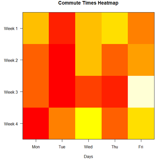
Figure 6. A heat map of the commute speeds data set.
R code.
# 1. Create the data
# Week is excluded from matrix to only include numerical commute times
commute_data <- matrix(c(
28.5, 23.8, 28.5, 30.2, 26.9,
25.8, 22.4, 29.3, 26.2, 27.7,
26.2, 22.6, 24.9, 24.2, 34.3,
23.3, 26.9, 31.3, 26.2, 30.2
), nrow = 4, byrow = TRUE)

# 2. Add row and column names
rownames(commute_data) <- c("Week 1", "Week 2", "Week 3", "Week 4")
colnames(commute_data) <- c("Mon", "Tue", "Wed", "Thu", "Fri")

# 3. Create the heatmap
# Use t() to transpose so weeks are rows and days are columns
# Use rev() on rows to have Week 1 at the top
image_data <- t(apply(commute_data, 2, rev))

# Set up the plotting area (margins for labels)
par(mar = c(5, 6, 4, 2))

# Plot the matrix
# Option 1
image(1:nrow(image_data), 1:ncol(image_data), image_data,
col = heat.colors(12),
axes = FALSE, xlab = "Days", ylab = "",
main = "Commute Times Heatmap")

# Add axes labels
axis(1, at = 1:5, labels = colnames(commute_data))
axis(2, at = 1:4, labels = rev(rownames(commute_data)), las = 1)
box()
Interpretation.
The graphs (Fig 4 – 6) show a lack of trends in consistency of drive speeds. The heat map suggests more consistency on Monday — low speeds (Fig 4 & Fig 5), but that’s a stretch.
An example for you to work, from our Measurement Day
If you recall, we had you calculate length and width measures on shells from samples of gastropod and bivalve species. In the table are repeated measures of shell length, by caliper in mm, for a sample of Conus shells (Fig 7 and Table 4).
Figure 7. Conus shells, image by M. Dohm.
Repeated measures of the same 12 Conus shells.
Table 4. Unstacked dataset of repeated length measures on 12 shells
| Sample | Measure1 | Measure2 | Measure3 |
|---|---|---|---|
| 1 | 45.74 | 46.44 | 46.79 |
| 2 | 48.79 | 49.41 | 49.67 |
| 3 | 52.79 | 53.45 | 53.36 |
| 4 | 52.74 | 53.14 | 53.14 |
| 5 | 53.25 | 53.45 | 53.15 |
| 6 | 53.25 | 53.64 | 53.65 |
| 7 | 31.18 | 31.59 | 31.44 |
| 8 | 40.73 | 41.03 | 41.11 |
| 9 | 43.18 | 43.23 | 43.2 |
| 10 | 47.1 | 47.64 | 47.64 |
| 11 | 49.53 | 50.32 | 50.24 |
| 12 | 53.96 | 54.5 | 54.56 |
Maximum length from from anterior end to apex with calipers. Repeated measures were conducted blind to shell id, sampling was random over three separate time periods.
Questions
- Consider data in Table 2, Table 3, and Table 4. True or False: The arithmetic mean is an appropriate measure of central tendency. Explain your answer.
- Enter the shell data into R; Best to copy and stack the data in your spreadsheet, then import into R or R Commander. Once imported, don’t forget to change Sample to character, otherwise R will treat Sample as ratio scale data type. Run your one-way ANOVA and calculate the intraclass correlation (ICC) for the dataset. Is the shell length measure repeatable?
- The marathon results in Table 2 are paired data, results of two races run by the same individuals. Make a profile plot for the data (see Ch10.3 for help).
- A profile plot is used to show paired data; for two or more repeat measures, use a line graph instead.
A. Produce a line graph for data in Table 4. The line graph is an option in R Commander (Rcmdr: Graphs Line graph…), and can be generated with the following simple R code:
lineplot(Sample, Measure1, Measure2, Measure3)
B. What trends, if any, do you see? Report your observations.
C. Make another line plot for data in Table 2. Report any trend and include your observations.
Quiz Chapter 12.3
Fixed effects, random effects, and agreement
Chapter 12 contents
- Introduction
- The need for ANOVA
- One way ANOVA
- Fixed effects, random effects, and agreement
- ANOVA from “sufficient statistics”
- Effect size for ANOVA
- ANOVA posthoc tests
- Many tests one model
- References and suggested readings