19.2 – Bootstrap sampling
Introduction
Bootstrapping is a general approach to estimation or statistical inference that utilizes random sampling with replacement (Kulesa et al. 2015). In classic frequentist approach, a sample is drawn at random from the population and assumptions about the population distribution are made in order to conduct statistical inference. By resampling with replacement from the sample many times, the bootstrap samples can be viewed as if we drew from the population many times without invoking a theoretical distribution. A clear advantage of the bootstrap is that it allows estimation of confidence intervals without assuming a particular theoretical distribution and thus avoids the burden of repeating the experiment.
Base install of R includes the boot package. The boot package allows R users to work with most functions, and many authors have provided helpful packages. I highlight a couple packages
install packages lmboot, confintr
Example data set, Tadpoles from Chapter 14, copied to end of this page for convenience (scroll down or click here).
Bootstrapped 95% Confidence interval of population mean
Recall classic frequentist (large-sample) approach to confidence interval estimates of mean by R
x = round(mean(Tadpole$Body.mass),2); x
n = length(Tadpole$Body.mass); n
s = sd(Tadpole$Body.mass); s
error = qt(0.975,df=n-1)*(s/sqrt(n)); error
lower_ci = round(x-error,3)
upper_ci = round(x+error,3)
paste("95% CI of ", x, " between:", lower_ci, "&", upper_ci)
Output results are
> n = length(Tadpole$Body.mass); n
[1] 13
> s = sd(Tadpole$Body.mass); s
[1] 0.6366207
> error = qt(0.975,df=n-1)*(s/sqrt(n)); error
[1] 0.384706
> paste("95% CI of ", x, " between:", lower_ci, "&", upper_ci)
[1] "95% CI of 2.41 between: 2.025 & 2.795"
We used the t-distribution because both  the population mean and
  the population standard deviation were unknown. Thus, 95 out of 100 confidence intervals would be expected to include the true value.
Bootstrap equivalent
library(confintr)
ci_mean(Tadpole$Body.mass, type=c("bootstrap"), boot_type=c("stud"), R=999, probs=c(0.025, 0.975), seed=1)
Output results are
Two-sided 95% bootstrap confidence interval for the population mean based on 999 bootstrap replications
and the student method

Sample estimate: 2.412308
Confidence interval:
    2.5%    97.5%
2.075808 2.880144
where stud is short for student t distribution (another common option is the percentile method — replace stud with perc), R = 999 directs the function to resample 999 times. We set seed=1 to initialize the pseudorandom number generator so that if we run the command again, we would get the same result. Any integer number can be used. For example, I set seed = 1 for output below
Confidence interval:
    2.5%    97.5%
2.075808 2.880144
compared to repeated runs without initializing the pseudorandom number generator:
Confidence interval:
    2.5%    97.5%
2.067558 2.934055
and again
Confidence interval:
    2.5%    97.5%
2.067616 2.863158
Note that the classic confidence interval is narrower than the bootstrap estimate, in part because of the small sample size (i.e., not as accurate, does not actually achieve the nominal 95% coverage). Which to use? The sample size was small, just 13 tadpoles. Bootstrap samples were drawn from the original data set, thus it cannot make a small study more robust. The 999 samples can be thought as estimating the sampling distribution. If the assumptions of the t-distribution hold, then the classic approach would be preferred. For the Tadpole data set, Body.mass was approximately normally distributed (Anderson-Darling test = 0.21179, p-value = 0.8163). For cases where assumption of a particular distribution is unwarranted (e.g., what is the appropriate distribution when we compare medians among samples?), bootstrap may be preferred (and for small data sets, percentile bootstrap may be better). To complete the analysis, percentile bootstrap estimate of confidence interval are presented.
The R code
ci_mean(Tadpole$Body.mass, type=c("bootstrap"), boot_type=c("perc"), R=999, probs=c(0.025, 0.975), seed=1)
and the output
Two-sided 95% bootstrap confidence interval for the population mean based on 999 bootstrap replications
and the percent method
Sample estimate: 2.412308
Confidence interval:
    2.5%    97.5%
2.076923 2.749231
In this case, the bootstrap percentile confidence interval is narrower than the frequentist approach.
Model coefficients by bootstrap
R code
Enter the model, then set B, the number of samples with replacement.
myBoot <- residual.boot(VO2~Body.mass, B = 1000, data = Tadpoles)
R returns two values:
bootEstParam, which are the bootstrap parameter estimates. Each column in the matrix lists the values for a coefficient. For this model,bootEstParam$[,1]is the intercept andbootEstParam$[,2]is the slope.origEstParam, a vector with the original parameter estimates for the model coefficients.seed, numerical value for the seed; use seed number to get reproducible results. If you don’t specify the seed, then seed is set to pick any random number.
While you can list the $bootEstParam, not advisable because it will be a list of 1000 numbers (the value set with B)!
Get necessary statistics and plots
#95% CI slope
quantile(myBoot$bootEstParam[,2], probs=c(.025, .975))
R returns
    2.5%    97.5%
335.0000 562.6228
#95% CI intercept
quantile(myBoot$bootEstParam[,1], probs=c(.025, .975))
R returns
     2.5%     97.5%
-881.3893 -310.8209
Slope
#plot the sampling distribution of the slope coefficient
par(mar=c(5,5,5,5)) #setting margins to my preferred values
hist(myBoot$bootEstParam[,2], col="blue", main="Bootstrap Sampling Distribution",
xlab="Slope Estimate")
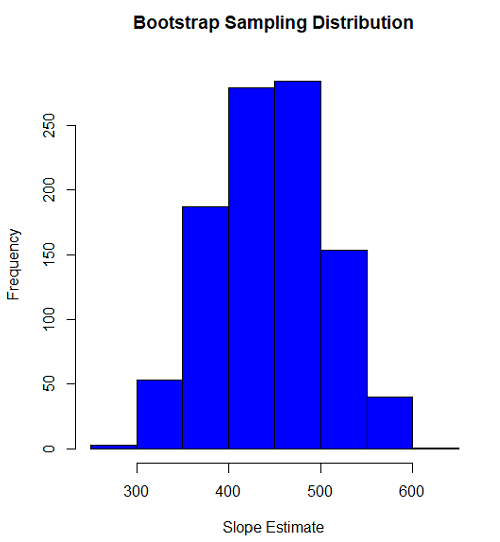
Figure 1. histogram of bootstrap estimates for slope
Intercept
#95% CI intercept
quantile(myBoot$bootEstParam[,1], probs=c(.025, .975))
par(mar=c(5,5,5,5))
hist(myBoot$bootEstParam[,1], col="blue", main="Bootstrap Sampling Distribution",
xlab="Intercept Estimate")
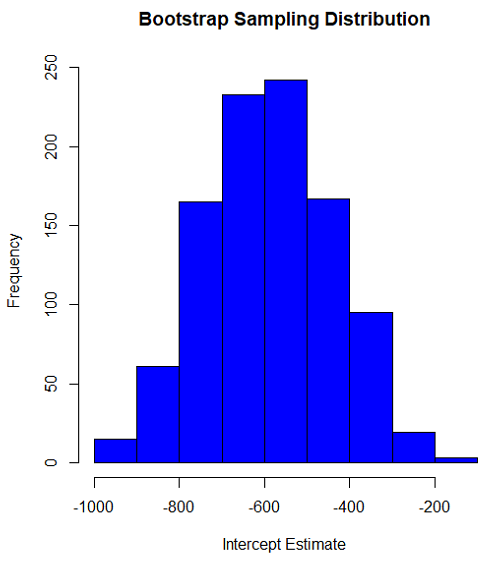
Figure 2. Histogram of bootstrap estimates for intercept.
Questions
edits: pending
Data set used this page (sorted)
| Gosner | Body mass | VO2 |
| I | 1.76 | 109.41 |
| I | 1.88 | 329.06 |
| I | 1.95 | 82.35 |
| I | 2.13 | 198 |
| I | 2.26 | 607.7 |
| II | 2.28 | 362.71 |
| II | 2.35 | 556.6 |
| II | 2.62 | 612.93 |
| II | 2.77 | 514.02 |
| II | 2.97 | 961.01 |
| II | 3.14 | 892.41 |
| II | 3.79 | 976.97 |
| NA | 1.46 | 170.91 |
Chapter 19 contents
- Introduction
- Jackknife sampling
- Bootstrap sampling
- Monte Carlo methods
- Ch19 References and suggested readings
19.1 – Jackknife sampling
Introduction
edits: — under construction —
R packages
There are several R packages one could use. The package bootstrap may be the the most general, and includes a jackknife routine suitable for any function. This page demonstrates jackknife estimate of correlation.
Example data set, cars, stopping distance by speed of car (scroll down or click here).
install package bootstrap
Jackknife estimates on linear models
These procedures can be done with the bootstrap package, but lmboot is a specific package to solve the problem
install package lmboot
Example data set, Tadpoles from Chapter 14, copied to end of this page for your convenience (scroll down or click here).
R code
jackknife(VO2~Body.mass, data = Tadpoles)
R returns two values:
bootEstParam, which are the jackknife parameter estimates. Each column in the matrix lists the values for a coefficient. For this model,bootEstParam$[,1]is the intercept andbootEstParam$[,2]is the slope.origEstParam, a vector with the original parameter estimates for the model coefficients.
$bootEstParam
     (Intercept) Body.mass
[1,]   -660.8403  472.6841
[2,]   -539.5951  430.3990
[3,]   -612.8495  454.5188
[4,]   -512.5914  423.0815
[5,]   -543.1577  434.2789
[6,]   -572.3895  442.9176
[7,]   -613.7873  451.2656
[8,]   -594.0366  446.2571
[9,]   -582.1833  443.5404
[10,]  -598.2244  456.0599
[11,]  -531.3152  415.2467
[12,]  -555.7287  430.5604
[13,]  -726.8522  512.1268

$origEstParam
[,1]
(Intercept) -583.0454
Body.mass 444.9512
Get necessary statistics and plots
#95% CI slope
quantile(jack.model.1$bootEstParam[,2], probs=c(.025, .975))
R returns
    2.5%    97.5%
417.5971 500.2940
#95% CI intercept
quantile(jack.model.1$bootEstParam[,1], probs=c(.025, .975))
R returns
     2.5%     97.5%
-707.0486 -518.2085
Coefficient estimates
Slope
#plot the sampling distribution of the slope coefficient
par(mar=c(5,5,5,5)) #setting margins to my preferred values
hist(jack.model.1$bootEstParam[,2], col="blue", main="Jackknife Sampling Distribution",
xlab="Slope Estimate")
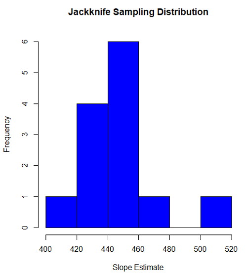
Figure 1. histogram of jackknife estimates for slope
Intercept
#95% CI intercept
quantile(jack.model.1$bootEstParam[,1], probs=c(.025, .975))
par(mar=c(5,5,5,5))
hist(jack.model.1$bootEstParam[,1], col="blue", main="Jackknife Sampling Distribution",
xlab="Intercept Estimate")
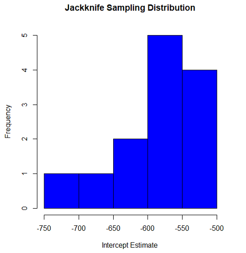
Figure 2. Histogram of jackknife estimates for intercept.
Questions
edits: pending
cars data set used this page
| speed | dist |
| 4 | 2 |
| 4 | 10 |
| 7 | 4 |
| 7 | 22 |
| 8 | 16 |
| 9 | 10 |
| 10 | 18 |
| 10 | 26 |
| 10 | 34 |
| 11 | 17 |
| 11 | 28 |
| 12 | 14 |
| 12 | 20 |
| 12 | 24 |
| 12 | 28 |
| 13 | 26 |
| 13 | 34 |
| 13 | 34 |
| 13 | 46 |
| 14 | 26 |
| 14 | 36 |
| 14 | 60 |
| 14 | 80 |
| 15 | 20 |
| 15 | 26 |
| 15 | 54 |
| 16 | 32 |
| 16 | 40 |
| 17 | 32 |
| 17 | 40 |
| 17 | 50 |
| 18 | 42 |
| 18 | 56 |
| 18 | 76 |
| 18 | 84 |
| 19 | 36 |
| 19 | 46 |
| 19 | 68 |
| 20 | 32 |
| 20 | 48 |
| 20 | 52 |
| 20 | 56 |
| 20 | 64 |
| 22 | 66 |
| 23 | 54 |
| 24 | 70 |
| 24 | 92 |
| 24 | 93 |
| 24 | 120 |
| 25 | 85 |
Data set used this page (sorted)
| Gosner | Body mass | VO2 |
| I | 1.76 | 109.41 |
| I | 1.88 | 329.06 |
| I | 1.95 | 82.35 |
| I | 2.13 | 198 |
| I | 2.26 | 607.7 |
| II | 2.28 | 362.71 |
| II | 2.35 | 556.6 |
| II | 2.62 | 612.93 |
| II | 2.77 | 514.02 |
| II | 2.97 | 961.01 |
| II | 3.14 | 892.41 |
| II | 3.79 | 976.97 |
| NA | 1.46 | 170.91 |
Chapter 19 contents
- Introduction
- Jackknife sampling
- Bootstrap sampling
- Ch19 References and suggested readings
17.6 – ANCOVA – analysis of covariance
Introduction
Analysis of covariance (ANCOVA) is intended to help with analysis of designs with categorical treatment variables on some response (dependent) variable, but a known confounding variable is also present. Thus, the researcher is also likely to know of additional ratio scale variables that covary with the response variable and, moreover, must be included in the experimental design in some way.
Take for example the well-known relationship between body size and whole-animal metabolic rate as measured by rates of carbon dioxide production or rates of oxygen consumption for aerobic organisms. We may be interested in how addition or blocking of stress hormones affects resting metabolism; we may be interested in comparing men and women for activity metabolism, and so on. We’d like to know if the regressions were the same (eg, metabolic rate covaried with body mass in the same way — that is, the slope of the relationship was the same).
This situation arises frequently in biology. For example, we might want to know if male and female birds have different mean field metabolic rates, in which case we might be tempted to use a one-way ANOVA or t-test (since one factor with two levels). However, if males and females also differ for body size, then any differences we might see in metabolic rate could be due to differences in metabolic rate are confounded by differences in the covariable body size. We already discussed one approach to correction: calculate a ratio. Thus, a logical approach to correcting or normalizing for the covariation would be to divide body mass (units of kilograms) into metabolic rate (eg, volume of oxygen, O2, consumed), and make comparisons, say, among different species, on mass-specific trait ( ). However, because the regression between mass and metabolic rate is allometric, i.e., not equal to one, the ratio does not, in fact normalize for body mass. We made this point in Chapter 6.2, and remarked that analysis of covariance ANCOVA was a solution.
ANCOVA allows you to test for mean differences in traits like metabolic rate between two or more groups, but only after first accounting for covariation due to another variable (eg, body size). However, ANCOVA makes the assumption that relationship between the covariable and the response variable is the same in the two groups. This is the same as saying that the regression slopes are the same. We discussed how to use t-test to test hypothesis of equal slopes between regression models in Chapter 17.5, but a more elegant way is to include this in your model.
Example
We return to our sample of 13 tadpoles (Rana pipiens), hatched in the laboratory. I’ve repeated the data set in this page, scroll or click here.
Our linear model was  and a scatterplot of the data set is shown in Figure 1 (a repeat of Figure 3 from Chapter 17.5, but now points identified to developmental group).
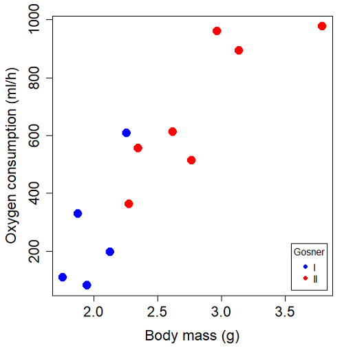
Figure 1. Scatterplot of oxygen consumption by R. pipiens tadpoles vs body mass (g) by developmental group (Gosner stages I or II).
The project looked at whether metabolism as measured by oxygen consumption was consistent across two developmental stages. Metamorphosis in frogs and other amphibians represents profound reorganization of the organism as the tadpole moves from water to air. Thus, we would predict some cost as evidenced by change in metabolism associated with later stages of development. Figure 2 shows a box plot of tadpole oxygen consumption by Gosner (1960) developmental stage (Figure 2 is a repeat of Figure 4 Chapter 17.5).
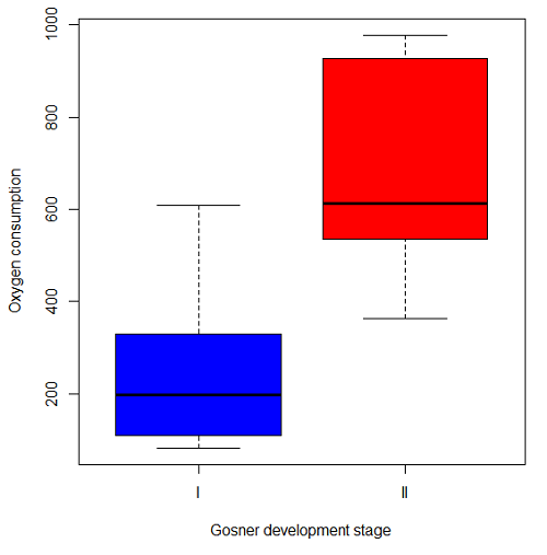
Figure 2. Copy of Figure 4, Chapter 17.5; boxplot of oxygen consumption of R. pipiens tadpoles by Gosner developmental stages.
Looking at Figure 2 we see a trend consistent with our prediction; developmental stage may be associated with increased metabolism. However, older tadpoles also tend to be larger, and the plot in Figure 2 does not account for that. Thus, body mass is a confounding variable in this example. There are several options for analysis here (eg, ANCOVA), but one way to view this is to compare the slopes for the two developmental stages. While this test does not compare the means, it does ask a related question: is there evidence of change in rate of oxygen consumption relative to body size between the two developmental stages? The assumption that the slopes are equal is a necessary step for conducting the ANCOVA.
So, divide the data set (Table 1) into two groups by developmental stage (12 tadpoles could be assigned to one of two developmental stages; one was at a lower Gosner stage than the others and so is dropped from the subset.
Table 1.  and
and  of 12 R. pipiens tadpole larvae by Gosner developmental stage.
Gosner stage I
|
|
| 1.76 | 109.41 |
| 1.88 | 329.06 |
| 1.95 | 82.35 |
| 2.13 | 198 |
| 2.26 | 607.7 |
Gosner stage II
| Body mass | |
| 2.28 | 362.71 |
| 2.35 | 556.6 |
| 2.62 | 612.93 |
| 2.77 | 514.02 |
| 2.97 | 961.01 |
| 3.14 | 892.41 |
| 3.79 | 976.97 |
The slopes and standard errors we obtained in Chapter 17.5 were
| Gosner Stage I | Gosner stage II | |
| slope | 750.0 | 399.9 |
| standard error of slope | 444.6 | 111.2 |
Make a plot (Figure 3).
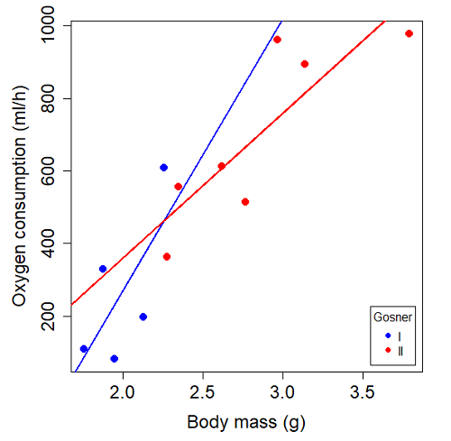
Figure 3. Scatterplot with best-fit regression lines of by for Gosner State I (closed circle, solid line) and Gosner Stage II (open circle, dashed line) R. pipiens tadpoles.
R code for plot in Figure 3.
#Used Rcmdr scatterplot(), then modified code
scatterplot(VO2~Body.mass | Gosner, regLine=FALSE, smooth=FALSE,
boxplots=FALSE, xlab="Body mass (g)", ylab="Oxygen consumption (ml/h)",
main="", cex=1.4, cex.axis=1.5, cex.lab=1.5, pch=c(19,19), by.groups=TRUE,
col=c("blue","red"), grid=FALSE,
legend=list(coords="bottomright"), data=Tadpoles)
#Get regression equations for groups, subset by Gosner
abline(lm(VO2~Body.mass, data=Stage01), lty=1, lwd=2, col="blue")
abline(lm(VO2~Body.mass, data=Stage02), lty=1, lwd=2, col="red")
Returning to the important question, are the two slopes statistically indistinguishable (Ho: bI = bII), where bI is the slope for the Gosner Stage I subset and bII is the slope for the Gosner Stage II subset? We look at the plot, and since the lines cross, we tend to see a difference. Of course, we need to consider that our perception of slope differences may simply be chance, especially because the sample size is small. Proceed to test.
R code
The ANCOVA is a new ANOVA model where the factor variables are adjusted or corrected for the effects of the continuous variable.
R code for ANCOVA example, crossed or interaction model.
tadpole.1 <- lm(VO2 ~ Body.mass*Gosner, data=example.Tadpole)
summary(tadpole.1)
Anova(tadpole.1, type="II")
Output
summary(tadpole.1)

Call:
lm(formula = VO2 ~ Body.mass * Gosner, data = example.Tadpole)

Residuals:
    Min      1Q   Median      3Q      Max
-167.80 -117.93    13.81   94.66   214.65

Coefficients:
                       Estimate   Std. Error   t value    Pr(>|t|)
(Intercept)             -1231.6       783.0     -1.573    0.1544
Body.mass                 750.0       390.7      1.919    0.0912 .
Gosner[T.II]              790.4       859.2      0.920    0.3845
Body.mass:Gosner[T.II]   -350.1       409.5     -0.855    0.4174
---
Signif. codes: 0 '***' 0.001 '**' 0.01 '*' 0.05 '.' 0.1 ' ' 1

Residual standard error: 155.8 on 8 degrees of freedom
(1 observation deleted due to missingness)
Multiple R-squared: 0.821, Adjusted R-squared: 0.7539
F-statistic: 12.23 on 3 and 8 DF, p-value: 0.002336
The coefficients for the first factor (GII) and then the differences in the coefficient for the second factor. You can just add the second coefficient to the first so they’re on the same scale.
Anova Table (Type II tests)

Response: VO2
                  Sum Sq   Df    F value     Pr(>F)
Body.mass         330046    1    13.6030   0.006146 **
Gosner              5630    1     0.2321   0.642908
Body.mass:Gosner   17736    1     0.7310   0.417423
Residuals 194102 8
---
Signif. codes: 0 '***' 0.001 '**' 0.01 '*' 0.05 '.' 0.1 ' ' 1
Suggests interaction is not significant, i.e., the slopes are not different.
We can then proceed to check to see if the intercepts are different, now that we’ve confirmed no significant difference in slope.
R code for ANCOVA as additive model
tadpole.2 <- lm(VO2 ~ Body.mass + Gosner, data=example.Tadpole)
summary(tadpole.2)
Anova(tadpole.2, type="II")
Output
> summary(tadpole.2)

Call:
lm(formula = VO2 ~ Body.mass + Gosner, data = example.Tadpole)

Residuals:
    Min       1Q    Median      3Q      Max
-163.12  -125.53    -20.27   83.71   228.56

Coefficients:
                   Estimate   Std. Error     t value    Pr(>|t|)
(Intercept)         -595.37       239.87      -2.482     0.03487 *
Body.mass            431.20       115.15       3.745     0.00459 **
Gosner[T.II]          64.96       132.83       0.489     0.63648
---
Signif. codes: 0 '***' 0.001 '**' 0.01 '*' 0.05 '.' 0.1 ' ' 1

Residual standard error: 153.4 on 9 degrees of freedom
(1 observation deleted due to missingness)
Multiple R-squared: 0.8047, Adjusted R-squared: 0.7613
F-statistic: 18.54 on 2 and 9 DF, p-value: 0.0006432

Anova(tadpole.2, type="II")
Anova Table (Type II tests)

Response: VO2
              Sum Sq    Df    F value      Pr(>F)
Body.mass     330046     1    14.0221   0.004593 **
Gosner          5630     1     0.2392   0.636482
Residuals     211839     9
---
Signif. codes: 0 '***' 0.001 '**' 0.01 '*' 0.05 '.' 0.1 ' ' 1
Note 1. There is no test of interaction in the added model. This model would be appropriate IF the slopes are equal.
Instead of the interaction, or as added, try a nested model, with body mass nested within stage.
tadpole.3 <- lm(VO2 ~ Body.mass/Gosner, data=example.Tadpole)

summary(tadpole.3)

Call:
lm(formula = VO2 ~ Body.mass/Gosner, data = example.Tadpole)

Residuals:
    Min       1Q    Median      3Q      Max
-168.66  -131.14    -20.28   90.33   225.36

Coefficients:
                 Estimate      Std. Error    t value Pr(>|t|)
(Intercept)           -575.10      319.51     -1.800   0.1054
Body.mass              423.65      162.50      2.607   0.0284 *
Body.mass:Gosner[T.II]  21.95       63.73      0.344   0.7384
---
Signif. codes: 0 '***' 0.001 '**' 0.01 '*' 0.05 '.' 0.1 ' ' 1

Residual standard error: 154.4 on 9 degrees of freedom
(1 observation deleted due to missingness)
Multiple R-squared: 0.8021, Adjusted R-squared: 0.7581
F-statistic: 18.24 on 2 and 9 DF, p-value: 0.0006823
Gets the true coefficient (nested lm() version).
The two test different hypotheses.
lm(VO2 ~ Body.mass * Gosner) tests whether or not the regression has a nonzero slope.
lm(VO2 ~ Body.mass */Gosner) test whether or not the slopes and intercepts from different factors are statistically significant.
Questions
- Write up three learning outcomes for this page. Hint: Point your favorite generative AI to this page and ask for help.
- An OLS approach was used for the analysis of tadpole oxygen consumption body mass. Consider the RMA approach — would that be a more appropriate regression model? Explain why or why not.
- Consider an experiment in which you plan to administer a treatment that has a carry-over effect. For example, Compare and contrast “crossed” and “nested” designs.
- True or False. The nested design option for the ANCOVA assumes the slopes for the two groups of tadpoles for the regression line of by are equal. Explain your choice.
- Metabolic rates like oxygen consumption over time are well-known examples of allometric relationships. That is, many biological variables (eg, is related as aMb, where M is body mass, slope b is scaling exponent), and best evaluated on log-log scale. Repeat the analysis above on log10-transformed and for
- crossed design (eg, tadpole.1 model)
- added design (eg, tadpole.2 model)
- nested design (eg, tadpole.3 model)
- Create the plot and add the fitted lines from crossed design to the plot.
Note 2. About log-transform of a variable. The most straight-forward tact is to create two new variables. For example,
lgVO2 <- log10(VO2)
Another option is to transform the variables within the call to lm() function. For example, try
lm(log10(VO2) ~ log10(Body.mass ), data=example.Tadpole)
Hint: don’t forget to attach your data set to avoid having to call the variable as, for example, example.Tadpole$VO2
Quiz Chapter 17.6
ANCOVA - analysis of covariance
Data sets
Oxygen consumption,  , of Anuran tadpoles, dataset=
example.Tadpole
| Gosner | Body mass | VO2 |
|---|---|---|
| NA | 1.46 | 170.91 |
| I | 1.76 | 109.41 |
| I | 1.88 | 329.06 |
| I | 1.95 | 82.35 |
| I | 2.13 | 198 |
| II | 2.28 | 362.71 |
| I | 2.26 | 607.7 |
| II | 2.35 | 556.6 |
| II | 2.62 | 612.93 |
| II | 2.77 | 514.02 |
| II | 2.97 | 961.01 |
| II | 3.14 | 892.41 |
Gosner refers to Gosner (1960), who developed a criteria for judging metamorphosis staging.
Chapter 17 contents
- Introduction
- Simple Linear Regression
- Relationship between the slope and the correlation
- Estimation of linear regression coefficients
- OLS, RMA, and smoothing functions
- Testing regression coefficients
- ANCOVA – Analysis of covariance
- Regression model fit
- Assumptions and model diagnostics for Simple Linear Regression
- References and suggested readings (Ch17 & 18)
18.6 – Compare two linear models
Introduction
Rcmdr (R) provides a very useful tool to compare models. Now, you can compare any two models, but this would be a poor strategy. Use this tool to perform in effect a stepwise test by hand. As one of the models, select for example the saturated model, then for the second model, select one in which you drop one model factor. In the example below, I dropped the two-way interaction from the saturated model (a logistic regression model, actually):
The model was Type.II diabetes = Treatment + Samples + Gender + BMI + Age + Gender:Treatment
where Type.II diabetes is a binomial (Yes,No) dependent variable and Treatment and Gender were categorical factors. The ANOVA table is shown below.
Anova(GLM.1, type="II", test="LR")
Analysis of Deviance Table (Type II tests)
Response: Type.II
                LR Chisq  Df Pr(>Chisq)
Treatment          0.266  7    0.9999
Samples           38.880  1    4.508e-10 ***
Gender             0.671  1    0.4127
BMI                2.259  1    0.1329
Age                2.064  1    0.1508
Treatment:Gender   1.803  1    0.1794
From this output we see that there are a number of terms that are not significant (P < 0.05), but with one exception (Treatment) they seem to contribute to the total variation (P values are between 0.13 and 0.4). So, we conclude that the saturated model is not the best fit model, and proceed to evaluate alternative models in search of the best one.
As a matter of practice I first drop the interaction term. Here’s the ANOVA table for the second model now without the interaction
Anova(GLM.1, type="II", test="LR")
Analysis of Deviance Table (Type II tests)
Response: Type.II
              LR Chisq Df Pr(>Chisq)
Treatment        0.266  7    0.9999
Samples         37.086  1    1.13e-09 ***
Gender           0.671  1    0.4127
BMI              2.017  1    0.1556
Age              1.794  1    0.1804
Both models look about the same. Which one is best? We now wish to know if dropping the interaction harms the model in any way. We will use the AIC (Akaike Information Criterion) to evaluate the models. AIC provides a way to assess which among a set of nested models is better. The preferred model is the one with the lowest AIC value.
To access the AIC calculation, just enter the script AIC(model name), where model name refers to one of the models you wish to evaluate (e.g., GLM.1), then submit the code
AIC(GLM.1)
50.65518

AIC(GLM.2)
50.45793
Thus, we prefer the second model (GLM.2) because the AIC is lower.
AIC does not provide a statistical test of model fit. To access the model comparison tool, simply select
Models → Hypothesis tests → Compare two models…
and the following screen will appear (Fig 1).
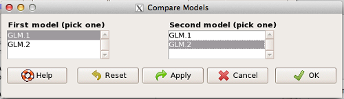
Figure 1. Screenshot Rcmdr compare models menu.
Select the two models to compare (in this case, GLM1 and GLM2), then press OK button. R output
anova(GLM.1, GLM.2, test="Chisq")
Analysis of Deviance Table
Model 1: Type.II ~ Treatment + Samples + Gender + BMI + Age + Gender:Treatment
Model 2: Type.II ~ Treatment + Samples + Gender + BMI + Age
    Resid. Df  Resid. Dev  Df  Deviance P(>|Chi|)
1          49      24.655
2          50      26.458  -1   -1.8027   0.1794
We see that P >0.05 (= 0.1794), which means the fit of the model is fine if we lose the one term.
Deviance
Those of you working with logistic regressions will see this new term, “deviance.” Deviance is a statistical term relevant to model fitting. Think of it like a chi-square test statistic. The idea is that you compare your fitted model against the data in which the only thing estimate is the intercept. Do the additional components of the model add significantly to the prediction of the original data? If they do, dropping the term will have a significant effect on the model fit and the P-value would be less than 0.05. In this example, we see that dropping the interaction term had little effect on the deviance score and in agreement, the P value is larger than 0.05. It means we can drop the term and the new model lacking the term is in some sense better: fewer predictors, a simpler model.
Questions
- Write up three learning outcomes for this page. Hint: Point your favorite generative AI to this page and ask for help.
Quiz Chapter 18.6
Compare two linear models
Chapter 18 contents
18.5 – Selecting the best model
Introduction
This is a long entry in our textbook, many topics to cover. We discuss aspects of model fitting, from why model fitting is done to how to do it and what statistics are available to help us decide on the best model. Model selection very much depends on what the intent of the study is. For example, if the purpose of model building is to provide the best description of the data, then in general one should prefer the full (also called the saturated) model. On the other hand, if the purpose of model building is to make a predictive statistical model, then a reduced model may prove to be a better choice. The text here deals mostly with the later context of model selection, finding a justified reduced model.
From Full model to best Subset model
Model building is an essential part of being a scientist. As scientists, we seek models that explain as much of the variability about a phenomenon as possible, but yet remain simple enough to be of practical use.
Having just completed the introduction to multiple regression, we now move to the idea of how to pick best models.
We distinguish between a full model, which includes as many variables (predictors, factors) as the regression function can work with, returning interpretable, if not always statistically significant output, and a saturated model.
The saturated model is the one that includes all possible predictors, factors, interactions in your experiment. In well-behaved data sets, the full model and the saturated model will be the same model. However, they need not be the same model. For example, if two predictor variables are highly collinear, then you may return an error in regression fitting.
For those of you working with meta-analysis problems, you are unlikely to be able to run a saturated model because some level of a key factor are not available in all or at least most of the papers. Thus, in order to get the model to run, you start dropping factors, or you start nesting factors. If you were unable to get more things in the model, then this is your “full” model. Technically we wouldn’t call it saturated because there were other factors, they just didn’t have enough data to work with or they were essentially the same as something else in the model.
Identify the model that does run to completion as your full model and proceed to assess model fit criteria for that model, and all reduced models thereafter.
In R (Rcmdr) you know you have found the full model when the output lacks “NA” strings (missing values) in the output. Use the full model to report the values for each coefficient, i.e., conducting the inferential statistics.
Get the estimates directly from the output from running the regression function. You can tell if the effect is positive (look at the estimate for sample — it is positive) so you can say — more samples, greater likelihood to see more cases of cancer.
Remember, the experimental units are the papers themselves, so studies with larger numbers of subjects are going to find more cases of diabetes. We would worry big time with your project if we did not see statistically significant and positive for sample size.
Example: A multiple linear model
For illustration, here’s an example output following a run with the linear model function on a portion of the Kaggle Cardiovascular disease data set.
Note: For my training data set I simply took the first 100 rows — from the 70,000 rows! in the dataset. A more proper approach would include use of stratified random sampling, for example, by gender, alcohol use, and other categorical classifications.
The variables (and data types) were
SBP = systolic blood pressure (from ap_hi)
age.years = Independent variable, ratio scale (calculated from age in days)
BMI = Dependent variable, ratio scale (calculated from height and weight variables)
active = Independent variable, physical activity, binomial
alcohol = Independent variable, alcohol use, binomial
cholesterol = Independent variable, cholesterol levels (scored 1 = “normal,” 2 = “above normal, and 3 = “well above normal”)
gender = Independent variable, binomial
glucose = Independent variable, glucose levels (scored 1 = “normal,” 2 = “above normal, and 3 = “well above normal”)
smoke = Independent variable, binomial
R output
Call:
lm(formula = SBP ~ BMI + gender + age.years + active + alcohol +
cholesterol + gluc + smoke, data = kaggle.train)

Residuals:
Min 1Q Median 3Q Max
-33.359 -9.701 -1.065 8.703 45.242

Coefficients:
             Estimate Std. Error t value   Pr(>|t|)
(Intercept)   76.7664    14.9311   5.141  0.00000155 ***
BMI            0.8395     0.2933   2.862  0.00522 **
gender        -2.0744     1.6102  -1.288  0.20092
age.years      0.2742     0.2403   1.141  0.25672
active         7.1411     3.4934   2.044  0.04383 *
alcohol       -7.9272     9.1854  -0.863  0.39039
cholesterol    7.4539     2.3200   3.213  0.00182 **
gluc          -1.2701     2.9533  -0.430  0.66817
smoke         11.4132     6.7015   1.703  0.09197 .
---
Signif. codes: 0 '***' 0.001 '**' 0.01 '*' 0.05 '.' 0.1 ' ' 1

Residual standard error: 14.96 on 91 degrees of freedom
Multiple R-squared: 0.2839, Adjusted R-squared: 0.221
F-statistic: 4.51 on 8 and 91 DF, p-value: 0.0001214
Question. Write out the equation in symbol form.
We see from the modest R2 (adjusted) that the model explains little variation in systolic blood pressure; only BMI, physical activity (yes, no), and serum cholesterol levels, were statistically significant at 5% level. Smoker (yes, no) approached significance (p-value = 0.092), but I wouldn’t go on and on about positive or negative coefficients and effects.
Note: For my training data set I simply took the first 100 rows — from the 70,000 rows! in the dataset. A more proper approach would include use of stratified random sampling, for example, by gender, alcohol use, and other categorical classifications.
We report the value (I would round to 7.5) for cholesterol on SBP (Table 1), and note that those who had elevated serum cholesterol levels tended to have higher systolic blood pressure (e.g., the sign of the coefficient — and I related the coefficient back to the most important thing about your study — the biological interpretation). Repeat the same for the other significant coefficients.
Now’s a good time to be clear about HOW you report statistical results. DO NOT SIMPLY COPY AND PASTE EVERYTHING into your report. Now, for the estimates above, you would report everything, but not all of the figures. Here’s how the output should be reported in your Project paper.
Table 1. Coefficients from full model.
term     Coefficient Error  P-value*
Intercept       76.8  14.93 < 0.00001
BMI              0.8   0.29   0.00522
gender          -2.1   1.61   0.20092
age.years        0.3   0.24   0.25672
active           7.1   3.49   0.04383
alcohol         -7.9   9.19   0.39039
cholesterol      7.5   2.32   0.00182
gluc            -1.3   2.95   0.66817
smoke           11.4   6.70   0.09197
* t-test
Looks better, doesn’t it?
Note: Obviously, don’t round for calculations!
Once you have the full model, we should run simple diagnostics on the regression fit to the data (VIF, Cook’s Distance, basic diagnostic plots), then proceed to use this model for the inferential statistics.
> vif(model.1)
BMI gender age.years active alcohol cholesterol gluc smoke
1.112549 1.091154 1.081641 1.048519 1.096382 1.178635 1.168442 1.131081
No VIF was greater than 2, suggesting little multicollinearity among the predictor variables.
> cooks.distance(model.1)[which.max(cooks.distance(model.1))]
60
0.355763
This person had high SBP (180), was a smoker, but active and normal BMI.
Use the significance tests of each parameter in the model from the corresponding ANOVA table. Now, where is the ANOVA table? Remember, right after running the linear regression,
Rcmdr: Models → Hypothesis testing → ANOVA tables
Accept the default (partial marginality), and, Boom! … the ANOVA table you should be familiar with.
From the ANOVA table you will tell me whether a Factor is significant or not. You report the ANOVA table in your paper. You describe it.
Now, the next step is to decide what is the best model. It then guides you to the next step which is to decide whether a better model (fewer parameters, Occam’s razor) can be found. Identify the parameter from the ANOVA table with the highest P-value and remove it from the model when you run the regression again. Repeat the steps above, return the ANOVA table, checking the estimates and P-values, until you have a model with only statistically significant parameters.
Find the best model
We may be tempted to run the linear model again, but with non-significant predictors excluded. For example, re-run the model on SBP but with just BMI, active, cholesterol and excluding smoke.
We can calculate the AIC, Akaike Information Criterion, the lower value is considered the better model.
AIC(model.1)
[1] 835.4938
AIC(model.2)
[1] 834.0782
The full model had eight predictor variables, excluding the intercept, whereas the reduced model had just three predictor variables, again, not including the intercept. Unsurprisingly, the reduced model is better. But now, a stronger test — what about smoking, where the p-value approached 5%? We ran the linear model (model.3).
> AIC(model.3)
[1] 831.9495
We can use an anova test or the likelihood ratio test to compare the models. The anova test, the models must be nested.
stats::anova(model.2, model.3)
Analysis of Variance Table

Model 1: SBP ~ BMI + active + cholesterol
Model 2: SBP ~ BMI + active + cholesterol + smoke
  Res.Df   RSS Df Sum of Sq      F   Pr(>F)
1     96 22205
2     95 21307  1     898.1 4.0043 0.04824 *
---
Signif. codes: 0 '***' 0.001 '**' 0.01 '*' 0.05 '.' 0.1 ' ' 1
and
lmtest::lrtest((model.2,model.3)
Likelihood ratio test

Model 1: SBP ~ BMI + active + cholesterol
Model 2: SBP ~ BMI + active + cholesterol + smoke
 #Df  LogLik Df  Chisq Pr(>Chisq)
1  5 -412.04
2  6 -409.97  1 4.1286 0.04216 *
---
Signif. codes: 0 '***' 0.001 '**' 0.01 '*' 0.05 '.' 0.1 ' ' 1
Both tests tell us the same thing — our model with four predictors, including smoking, is better.
2 December 2024 — Past this point, edits pending
But first, I want to take up an important point about your models that you may not have had a chance to think about. The order of entry of parameters in your model can effect the significance and value of the estimates themselves. The order of parameter model entry above can be read top to bottom. Age was first, followed in sequence by CalsPDay, CholPDay, and so on. By convention, enter the covariates first (the ratio-scale predictors), that’s what I did above.
Here’s the output from a model in which I used a different order of parameters.
Anova(LinearModel.2, type="II")
Anova Table (Type II tests)

Response: BMI
              Sum Sq    Df    F value     Pr(>F)
Sex             1.52     1     0.0478    0.82764
Smoke           8.84     1     0.2782    0.59964
Age             0.62     1     0.0196    0.88918
CalsPDay       10.79     1     0.3394    0.56215
CholPDay       92.37     1     2.9065    0.09286 .
Sex:Smoke       3.35     1     0.1055    0.74631
Residuals    2129.34    67
The output is the same!!! So why did I give you a warning about parameter order? Run the ANOVA table summary command again, but this time select Type III type of test, i.e., ignore marginality
> Anova(LinearModel.2, type="III")
Anova Table (Type III tests)

Response: BMI
               Sum Sq    Df    F value       Pr(>F)
(Intercept)   1544.34     1    48.5929   1.708e-09 ***
Sex              4.69     1     0.1475     0.70214
Smoke           11.82     1     0.3720     0.54400
Age              0.62     1     0.0196     0.88918
CalsPDay        10.79     1     0.3394     0.56215
CholPDay        92.37     1     2.9065     0.09286 .
Sex:Smoke        3.35     1     0.1055     0.74631
Residuals     2129.34    67
The output has changed — and in fact it now reports the significance test of the intercept. This output is the same as the output from the linear model. Try again, this time selecting Type I, sequential
> anova(LinearModel.2)
Analysis of Variance Table

Response: BMI
           Df   Sum Sq    Mean Sq  F value    Pr(>F)
Sex         1     0.68      0.681   0.0214   0.88402
Smoke       1     2.82      2.816   0.0886   0.76690
Age         1     3.44      3.436   0.1081   0.74333
CalsPDay    1     2.27      2.272   0.0715   0.78998
CholPDay    1    96.30     96.299   3.0301   0.08633
Sex:Smoke   1     3.35      3.354   0.1055   0.74631
Residuals  67  2129.34     31.781
Here, we see the effect of order. So, as we are working to learn all of the issues of statistics and in particular mode fitting, I have purposefully restricted you to Type II analyses — obeying marginality correctly handles most issues about order of entry.
Easy there…. Take a deep breath, and guess what? Your best model needs to have significant parameters in it, right? Your best fit model then is Model 5. And that model will be your candidate for best fit as we proceed to complete our model building.
![]()
Now we proceed to gain some support evidence for our candidate best model. We are going to use an information criterion approach.
Use a fit criterion for determining model fit
To help us evaluate evidence in favor of one model over another there are a number of statistics one may calculate to provide a single number for each model for comparison purposes. The criteria model evaluators available to us include Mallow’s Cp, adjusted R2, Akaike Information Criterion (AIC) or the Bayesian Information Criterion (BIC) to select best model.
We already introduced the coefficient of determination R2 as a measure of fit – in general we favor models with larger values of R2. However, values of R2 will always be larger for models with more parameters. Thus, the other evaluators attempt to adjust for the parameters in the model and how they contribute to increased model fit. For illustrative purposes we will use Mallow’s Cp. The equation for Mallow’s Cp in linear regression is
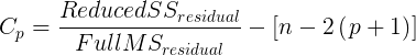
where p is the number of parameters in the model. Mallow’s Cp is thus equal to the number of parameters in the model plus an additional amount due to lack of fit of the model (i.e., large residuals). All else being equal we favor the model in which the Cp is close to the number of parameters in the model.
In Rcmdr, select Models → Subset model selection … (Fig. 1)
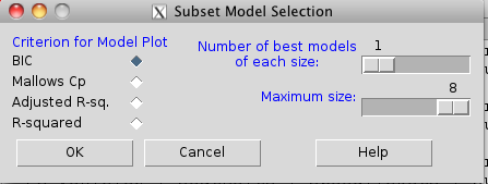
Figure 1. Rcmdr popup menu, Subset model selection…
From the menu, select the criterion and how many models to return. The function returns a graph that can be used to interpret which model is best given the selection criterion used. Below is an example (although for a different data set!) for Mallow’s Cp (Fig. 2).
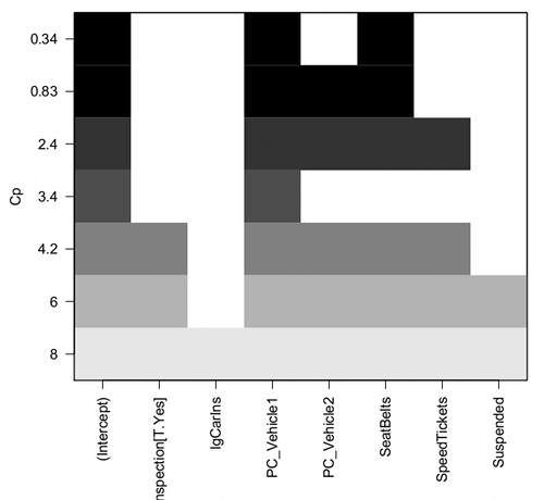
Figure 2. Mallow’s Cp plot
Lets break down the plot. First define the axes. The vertical axis is the range of values for the Cp calculated for each model. The horizontal axis is categorical and reads from left to right: Intercept, Inspection[T.Yes], etc., up to Suspended. Looking into the graph itself we see horizontal bars — the extent of shading indicates which model corresponds to the Cp value. For example, the lowest bar which is associated with the Cp value of 8 extends all the way to the right of the graph. This says that the model evaluated included all of the variables and therefore was the saturated or full model. The next bar from the bottom of the graph is missing only one block (lgCarIns), which tells us the Cp value 6 corresponds to a reduced model, and so forth.
Cross-validation
Once you have identified your Best Fit model, then, your proceed to run the diagnostics plots. For the rest of the discussion we return to our first example.
Rcmdr: Models → Graphs → Basic diagnostic plots.
We’ll just concern ourselves with the first row of plots (Fig. 3).
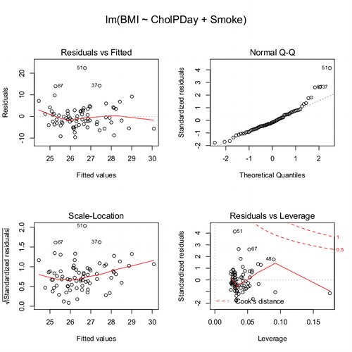
Figure 3. Diagnostic plots
The left one shows the residuals versus the predicted values — if you see a trend here, the assumption of linearity has been violated. The second plot is a test of the assumption of normality of the residuals. Interpret them (residuals OK, Residuals normally distributed? Yes/ No), and you’re done. Here, I would say I see no real trend in the residuals vs fitted plot, so assumption of linear fit is OK. For normality, there is a tailing off at the larger values of residuals, which might be of some concern (and I would start thinking about possible leverage problems), but nothing dramatic. I would conclude that our Model 6 is a good fitting model and one that could be used to make predictions.
Now, if you think a moment, you should identify a logical problem. We used the same data to “check” the model fit as we did to make the model in the first place. In particular if the model is intended to make predictions it would be advisable to check the performance of the model (e.g., does it make reasonable predictions?) by supplying new data, data not used to construct the model, into the model. If new data are not available, one acceptable practice is to divide the full data set into at least two subsets, one used to develop the model (sometimes called the calibration or training dataset) and the other used to test the model. The benefits of cross-validation include testing for influence points, over fitting of model parameters, and a reality check on the predictions generated from the model.
A note on best practices
In the 1980s, researchers often “removed” the effect of a covariate by first fitting a regression and then saving the residuals to use in separate analyses, such as t-tests, ANOVAs, or variance component estimates (eg, Dohm et al 2001). For example, in a study of plant growth, scientists might regress final plant height on initial size to remove the effect of size, then compare the residuals between fertilizer groups. While this approach adjusts for the covariate, it is problematic because residuals are not raw data: they are correlated, have constrained sums, and underestimate uncertainty. This can distort group differences, especially if the covariate distributions differ among groups, and it ignores the variability introduced by the first regression. This approach was common in ecology, evolutionary biology, physiology, and psychology before modern mixed modeling and generalized regression workflows became standard.
Modern best practices instead recommend fitting a single unified model that includes both the covariate and the grouping variable directly. Using the same plant growth example, a linear model such as  estimates the effect of fertilizer while properly accounting for initial plant size. This approach provides valid standard errors, allows correct inference about group differences, and can accommodate interactions (eg, if the relationship between
  and
and  differs by group) or hierarchical data structures using mixed-effects models. Additionally, modern workflows include diagnostics such as residual plots, Cook’s Distance, and variance inflation factors to check model assumptions and influential points. Use mixed models when data are hierarchical or repeated data. Random effects handle variation among groups, individuals, years, etc., in a single coherent model. When covariates need to be “controlled for,” we use partial regression. This happens inside the model, not by subtracting covariate effects first. By analyzing all relevant predictors in a single model, researchers obtain more accurate estimates, properly reflect uncertainty, and avoid the statistical pitfalls of the old residual-based two-stage approach.
Thus, there are several statistical reasons the older approach fails under modern scrutiny. First, Residuals are not independent observations. Residuals are model-dependent quantities, not raw data. Once you fit a regression, the residuals are correlated with each other, constrained to sum to zero, and, likely heteroscedastic if the model was imperfect. Using them in a new test violates standard assumptions of the second test.
Second, you underestimate uncertainty. If you perform tests on residuals, the standard errors do not include uncertainty from the first regression, which may lead to inflated Type I error and an overly confident “adjusted” group comparisons.
Third, the old approach creates a “two-stage model” that breaks the likelihood framework. A two-stage analysis discards the correct joint likelihood and therefore produces biases p-values, and interferes with valid confidence intervals or predictions.
Under the modern one-stage models include ML/REML, generalized estimating equations, and fully integrated Bayesian models, which keeps the model coherent. Use of mixed models make residualization unnecessary. In studies with repeated measures, blocks, sites, subjects, or years, the old approach cannot partition sources of variation correctly.
In short, the advantages of the one-stage approach is that resulting models have valid uncertainty, correct group comparisons, better handling of interactions and hierarchy, full likelihood-based inference. They fit a single unified regression or mixed-effects model with all relevant predictors, examine diagnostics, and make inferences directly. This is one more benefit of the increased power and availability of more powerful computers and more complete development of mixed methods modeling.
Questions
- Write up three learning outcomes for this page. Hint: Point your favorite generative AI to this page and ask for help.
Quiz Chapter 18.5
Selecting the best regression model
Chapter 18 contents
18.2 – Nonlinear regression
Introduction
The linear model is incredibly relevant in so many cases. A quick look “linear model” in PUBMED returns about 22 thousand hits; 3.7 million in Google Scholar; 3 thousand hits in ERIC database. These results compare to search of “statistics” in the same databases: 2.7 million (PUBMED), 7.8 million (Google Scholar), 61.4 thousand (ERIC). But all models are not the same.
Fit of a model to the data can be evaluated by looking at the plots of residuals (Fig 1), where we expect to find random distribution of residuals across the range of predictor variable.
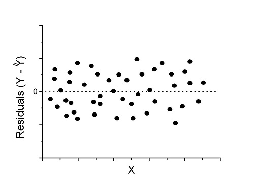
Figure 1. Ideal plot of residuals against values of X, the predictor variable, for a well-supported linear model fit to the data.
However, clearly, there are problems for which assumption of fit to line is not appropriate. We see this, again, in patterns of residuals, eg, Figure 2.
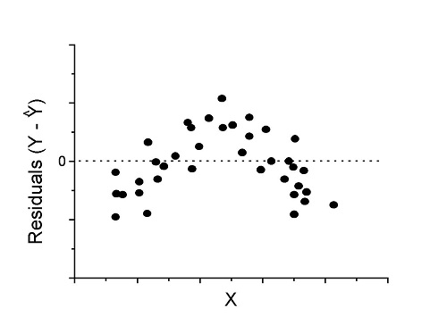
Figure 2. Example of residual plot; pattern suggests nonlinear fit.
Fitting of polynomial linear model
Fit simple linear regression, data set Yuan et al lifespan, listed below.
R code
LinearModel.1 <- lm(cumFreq~Months, data=yuan)

summary(LinearModel.1)

Call:
lm(formula = cumFreq ~ Months, data = yuan)

Residuals:
     Min       1Q   Median      3Q     Max
-0.11070 -0.07799 -0.01728 0.06982 0.13345

Coefficients:
                 Estimate Std. Error t value Pr(>|t|)
(Intercept)     -0.132709   0.045757   -2.90  0.0124 *
Months           0.029605   0.001854   15.97  6.37e-10 ***
---
Signif. codes: 0 '***' 0.001 '**' 0.01 '*' 0.05 '.' 0.1 ' ' 1

Residual standard error: 0.09308 on 13 degrees of freedom
Multiple R-squared: 0.9515, Adjusted R-squared: 0.9477
F-statistic: 254.9 on 1 and 13 DF, p-value: 6.374e-10
We see from the R2 (95%), a high degree of fit to the data. However, residual plot reveals obvious trend (Fig 3)
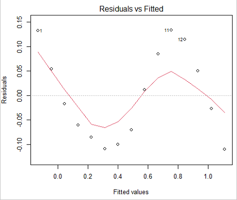
Figure 3. Residual plot, residuals against fitted values.
We can fit a polynomial regression.
First, a second order polynomial
LinearModel.2 <- lm(cumFreq ~ poly( Months, degree=2), data=yuan)

summary(LinearModel.2)

Call:
lm(formula = cumFreq ~ poly(Months, degree = 2), data = yuan)

Residuals:
     Min       1Q   Median      3Q     Max
-0.13996 -0.06720 -0.02338 0.07153 0.14277

Coefficients:
                           Estimate Std. Error  t value   Pr(>|t|)
(Intercept)                 0.48900    0.02458   19.891   1.49e-10 ***
poly(Months, degree = 2)1   1.48616    0.09521   15.609   2.46e-09 ***
poly(Months, degree = 2)2   0.06195    0.09521    0.651   0.528
---
Signif. codes: 0 '***' 0.001 '**' 0.01 '*' 0.05 '.' 0.1 ' ' 1

Residual standard error: 0.09521 on 12 degrees of freedom
Multiple R-squared: 0.9531, Adjusted R-squared: 0.9453
F-statistic: 122 on 2 and 12 DF, p-value: 0.0000000106
Second, try a third order polynomial
LinearModel.3 <- lm(cumFreq ~ poly(Months, degree = 3), data=yuan)

summary(LinearModel.3)

Call:
lm(formula = cumFreq ~ poly(Months, degree = 3), data = yuan)

Residuals:
      Min        1Q   Median       3Q      Max
-0.052595 -0.021533 0.001023 0.025166 0.048270

Coefficients:
                           Estimate Std. Error t value   Pr(>|t|)
(Intercept)                0.488995   0.008982  54.442   9.90e-15 ***
poly(Months, degree = 3)1  1.486157   0.034787  42.722   1.41e-13 ***
poly(Months, degree = 3)2  0.061955   0.034787   1.781   0.103
poly(Months, degree = 3)3 -0.308996   0.034787  -8.883   2.38e-06 ***
---
Signif. codes: 0 '***' 0.001 '**' 0.01 '*' 0.05 '.' 0.1 ' ' 1

Residual standard error: 0.03479 on 11 degrees of freedom
Multiple R-squared: 0.9943, Adjusted R-squared: 0.9927
F-statistic: 635.7 on 3 and 11 DF, p-value: 1.322e-12
Which model is best? We are tempted to compare R-squared among the models, but R2 turn out to be untrustworthy here. Instead, we compare using Akaike Information Criterion, AIC
R code/results
AIC(LinearModel.1,LinearModel.2, LinearModel.3)
              df       AIC
LinearModel.1  3 -24.80759
LinearModel.2  4 -23.32771
LinearModel.3  5 -52.83981
Smaller the AIC, better fit.
anova(RegModel.5,LinearModel.3, LinearModel.4)
Analysis of Variance Table

Model 1: cumFreq ~ Months
Model 2: cumFreq ~ poly(Months, degree = 2)
Model 3: cumFreq ~ poly(Months, degree = 3)
  Res.Df   RSS    Df Sum of Sq       F      Pr(>F)
1     13 0.112628
2     12 0.108789  1  0.003838  3.1719 0.1025
3     11 0.013311  1  0.095478 78.9004 0.000002383 ***
---
Signif. codes: 0 '***' 0.001 '**' 0.01 '*' 0.05 '.' 0.1 ' ' 1
Logistic regression
The Logistic regression is a classic example of nonlinear model.
R code
logisticModel <-nls(yuan$cumFreq~DD/(1+exp(-(CC+bb*yuan$Months))), start=list(DD=1,CC=0.2,bb=.5),data=yuan,trace=TRUE)
5.163059 : 1.0 0.2 0.5
2.293604 : 0.90564552 -0.07274945 0.11721201
1.109135 : 0.96341283 -0.60471162 0.05066694
0.429202 : 1.29060000 -2.09743525 0.06785993
0.3863037 : 1.10392723 -2.14457296 0.08133307
0.2848133 : 0.9785669 -2.4341333 0.1058674
0.1080423 : 0.9646295 -3.1918526 0.1462331
0.005888491 : 1.0297915 -4.3908114 0.1982491
0.004374918 : 1.0386521 -4.6096564 0.2062024
0.004370212 : 1.0384803 -4.6264657 0.2068853
0.004370201 : 1.0385065 -4.6269276 0.2068962
0.004370201 : 1.0385041 -4.6269822 0.2068989
summary(logisticModel)

Formula: yuan$cumFreq ~ DD/(1 + exp(-(CC + bb * yuan$Months)))

Parameters:
      Estimate  Std. Error  t value      Pr(>|t|)
DD    1.038504    0.014471    71.77   < 2e-16 ***
CC   -4.626982    0.175109   -26.42  5.29e-12 ***
bb    0.206899    0.008777    23.57  2.03e-11 ***
---
Signif. codes: 0 '***' 0.001 '**' 0.01 '*' 0.05 '.' 0.1 ' ' 1

Residual standard error: 0.01908 on 12 degrees of freedom

Number of iterations to convergence: 11
Achieved convergence tolerance: 0.000006909

> AIC(logisticModel)
[1] -71.54679
Logistic regression is a statistical method for modeling the dependence of a categorical (binomial) outcome variable on one or more categorical and continuous predictor variables (Bewick et al 2005).
The logistic function is used to transform a sigmoidal curve to a more or less straight line while also changing the range of the data from binary (0 to 1) to infinity (-∞,+∞). For event with probability of occurring p, the logistic function is written as

where ln refers to the natural logarithm.
The logit link function is used in models to transform a probability, which is restricted between 0 and 1, into the log-odds scale, which ranges from negative infinity to positive infinity. This transformation makes the relationship between predictors and the outcome linear. In other words, this is an odds ratio. It represents the effect of the predictor variable on the chance that the event will occur. Much of our contingency table work in Chapter 7 would be best analyzed with the logistic regression.
The logistic regression model then very much resembles the same as we have seen before.

In R and Rcmdr we use the glm() function to model the logistic function. Logistic regression is used to model a binary outcome variable. What is a binary outcome variable? It is categorical! Examples include: Living or Dead; Diabetes Yes or No; Coronary artery disease Yes or No. Male or Female. One of the categories could be scored 0, the other scored 1. For example, living might be 0 and dead might be scored as 1. (By the way, for a binomial variable, the mean for the variable is simply the number of experimental units with “1” divided by the total sample size.)
With the addition of a binary response variable, we are now really close to the Generalized Linear Model. Now we can handle statistical models in which our predictor variables are either categorical or ratio scale. All of the rules of crossed, balanced, nested, blocked designs still apply because our model is still of a linear form.
We write our generalized linear model

just to distinguish it from a general linear model with the ratio-scale Y as the response variable.
Think of the logistic regression as modeling a threshold of change between the 0 and the 1 value. In another way, think of all of the processes in nature in which there is a slow increase, followed by a rapid increase once a transition point is met, only to see the rate of change slow down again. Growth is like that. We start small, stay relatively small until birth, then as we reach our early teen years, a rapid change in growth (height, weight) is typically seed (well, not in my case … at least for the height). The fitted curve I described is a logistic one (other models exist too). Where the linear regression function was used to minimize the squared residuals as the definition of the best fitting line, now we use the logistic as one possible way to describe or best fit this type of a curved relationship between an outcome and one or more predictor variables. We then set out to describe a model which captures when an event is unlikely to occur (the probability of dying is close to zero) AND to also describe when the event is highly likely to occur (the probability is close to one).
A simple way to view this is to think of time being the predictor (X) variable and risk of dying. If we’re talking about the lifetime of a mouse (lifespan typically about 18-36 months), then the risk of dying at one months is very low, and remains low through adulthood until the mouse begins the aging process. Here’s what the plot might look like, with the probability of dying at age X on the Y axis (probability = 0 to 1) (Fig 4).
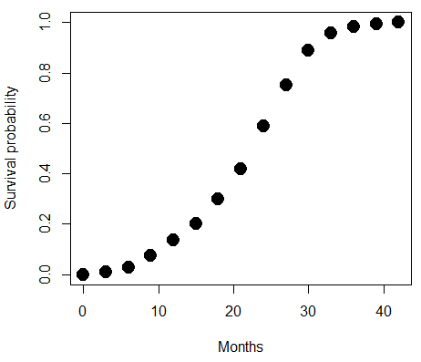
Figure 4. Lifespan of 1881 mice from 31 inbred strains (Data from Yuan et al (2012) available at https://phenome.jax.org/projects/Yuan2).
We ask — of all the possible models we could draw, which best fits the data? The curve fitting process is called the logistic regression.
With some minor, but important differences, running the logistic regression is the same as what you have been doing so far for ANOVA and for linear regression. In Rcmdr, access the logistic regression function by invoking the Generalized Linear Model (Fig 5).
Rcmdr: Statistics → Fit models → Generalized linear model.
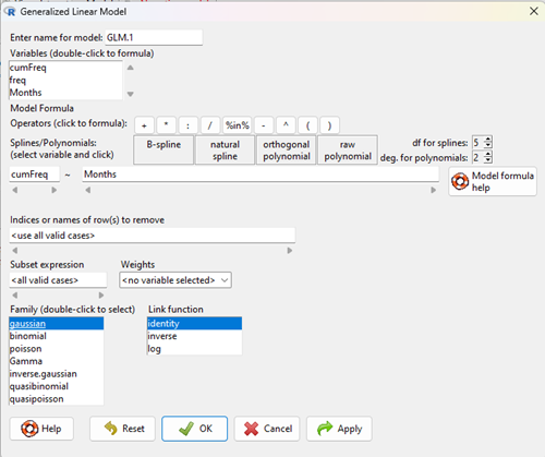
Figure 5. Screenshot Rcmdr GLM menu. For logistic on ratio-scale dependent variable, select gaussian family and identity link function.
Select the model as before. The box to the left accepts your binomial dependent variable; the box at right accepts your factors, your interactions, and your covariates. It permits you to inform R how to handle the factors: Crossed? Just enter the factors and follow each with a plus. If fully crossed, then the interactions may be specified with “:” to explicitly call for a two-way interaction between two (A:B) or a three-way interaction between three (A:B:C) variables. In the later case, if all of the two way interactions are of interest, simply typing A*B*C would have done it. If nested, then use %in% to specify the nesting factor.
R output
> GLM.1 <- glm(cumFreq ~ Months, family=gaussian(identity), data=yuan)

> summary(GLM.1)

Call:
glm(formula = cumFreq ~ Months, family = gaussian(identity),
data = yuan)

Deviance Residuals:
Min 1Q Median 3Q Max
-0.11070 -0.07799 -0.01728 0.06982 0.13345

Coefficients:
Estimate Std. Error t value Pr(>|t|)
(Intercept) -0.132709 0.045757 -2.90 0.0124 *
Months 0.029605 0.001854 15.97 6.37e-10 ***
---
Signif. codes: 0 '***' 0.001 '**' 0.01 '*' 0.05 '.' 0.1 ' ' 1

(Dispersion parameter for gaussian family taken to be 0.008663679)

Null deviance: 2.32129 on 14 degrees of freedom
Residual deviance: 0.11263 on 13 degrees of freedom
AIC: -24.808

Number of Fisher Scoring iterations: 2
Assessing fit of the logistic regression model
Some of the differences you will see with the logistic regression is the term deviance. Deviance in statistics simply means compare one model to another and calculate some test statistic we’ll call “the deviance.” We then evaluate the size of the deviance like a chi-square goodness of fit. If the model fits the data poorly (residuals large relative to the predicted curve), then the deviance will be small and the probability will also be high — the model explains little of the data variation. On the other hand, if the deviance is large, then the probability will be small — the model explains the data, and the probability associated with the deviance will be small (significantly so? You guessed it! P < 0.05).
The Wald test statistic

where n and β refers to any of the n coefficient from the logistic regression equation and SE refers to the standard error if the coefficient. The Wald test is used to test the statistical significance of the coefficients. It is distributed approximately as a chi-squared probability distribution with one degree of freedom. The Wald test is reasonable, but has been found to give values that are not possible for the parameter (eg, negative probability).
Likelihood ratio tests are generally preferred over the Wald test. For a coefficient, the likelihood test is written as
![]()
where L0 is the likelihood of the data when the coefficient is removed from the model (ie, set to zero value), whereas L1 is the likelihood of the data when the coefficient is the estimated value of the coefficient. It is also distributed approximately as a chi-squared probability distribution with one degree of freedom.
Questions
- Write up three learning outcomes for this page. Hint: Point your favorite generative AI to this page and ask for help.
- What is the primary difference between linear regression and logistic regression?
- What type of dependent variable is used in logistic regression?
- What is the purpose of the sigmoid (or logistic) function in this model?
- What is the role of a significance test (eg, a Wald test) in logistic regression?
- Why is the LRT generally considered more reliable than the Wald test for logistic regression, especially with smaller sample sizes?
Quiz Chapter 18.2
Nonlinear regression
Data set
Yuan data
| Months | freq | cumFreq |
|---|---|---|
| 0 | 0 | 0 |
| 3 | 0.010633 | 0.010633 |
| 6 | 0.017012 | 0.027645 |
| 9 | 0.045189 | 0.072834 |
| 12 | 0.064327 | 0.137161 |
| 15 | 0.064859 | 0.20202 |
| 18 | 0.09782 | 0.299841 |
| 21 | 0.118554 | 0.418394 |
| 24 | 0.171186 | 0.58958 |
| 27 | 0.162148 | 0.751728 |
| 30 | 0.137161 | 0.888889 |
| 33 | 0.069644 | 0.958533 |
| 36 | 0.024455 | 0.982988 |
| 39 | 0.011696 | 0.994684 |
| 42 | 0.005316 | 1 |
Chapter 18 content
18.1 – Multiple Linear Regression
Introduction
Last time we introduced simple linear regression:
- one independent X variable
- one dependent Y variable.
The linear relationship between Y and X was estimated by the method of Ordinary Least Squares (OLS). OLS minimizes the sum of squared distances between the observed responses,  and responses predicted
  by the line. Simple linear regression is analogous to our one-way ANOVA — one outcome or response variable and one factor or predictor variable (Chapter 12.2).
But the world is complicated and so, our one-way ANOVA was extended to the more general case of two or more predictor (factor) variables (Chapter 14). As you might have guessed by now, we can extend simple regression to include more than one predictor variable. In fact, combining ANOVA and regression gives you the general linear model! And, you should not be surprised that statistics has extended this logic to include not only multiple predictor variables, but also multiple response variables. Multiple response variables falls into a category of statistics called multivariate statistics.
Like multi-way ANOVA, multiple regression is the extension of simple linear regression from one independent predictor variable to include two or more predictors. The benefit of this extension is obvious — our models gain realism. All else being equal, the more predictors, the better the model will be at describing and/or predicting the response. Things are not all equal, of course, and we’ll consider two complications of this basic premise, that more predictors are best; in some cases they are not.
However, before discussing the exceptions or even the complications of a multiple linear regression model, we begin by obtaining estimates of the full model, then introduce aspects of how to evaluate the model. We also introduce and whether a reduced model may be the preferred model.
R code
Multiple regression is easy to do in Rcmdr — recall that we used the general linear model function, lm(), to analyze one-way ANOVA and simple linear regression. In R Commander, we access lm() by
Rcmdr: Statistics → Fit model → Linear model
You may, however, access linear regression through R Commander
We use the same general linear model function for cases of multi-way ANOVA and for multiple regression problems. Simply enter more than one ratio-scale predictor variable and boom!
You now have yourself a multiple regression. You would then proceed to generate the ANOVA table for hypothesis testing
Rcmdr: Models → Hypothesis testing → ANOVA tables
From the output of the regression command, estimates of the coefficients along with standard errors for the estimate and results of t-tests for each coefficient against the respective null hypotheses for each coefficient are also provided. In our discussion of simple linear regression we introduced the components: the intercept, the slope, as well as the concept of model fit, as evidenced by R2, the coefficient of determination. These components exist for the multiple regression problem, too, but now we call the slopes partial regression slopes because there are more than one.
Our full multiple regression model becomes

where the coefficients β1, β2, … βn are the partial regression slopes and β0 is the Y-intercept for a model with 1 – n predictor variables. Each coefficient has a null hypothesis, each has a standard error, and therefore, each coefficient can be tested by t-test.
Now, regression, like ANOVA, is an enormous subject and we cannot do it justice in the few days we will devote to it. We can, however, walk you through a fairly typical example. I’ve posted a small data set diabetesCholStatin at the end of this page. Scroll down or click here. View the data set and complete your basic data exploration routine: make scatterplots and box plots. We think (predict) that body size and drug dose cause variation in serum cholesterol levels in adult men. But do both predict cholesterol levels?
Selecting the best model
We have two predictor variables, and we can start to see whether none, one, or both of the predictors contribute to differences in cholesterol levels. In this case, both contribute significantly. The power of multiple regression approaches is that it provides a simultaneous test of a model which may have many explanatory variables deemed appropriate to describe a particular response. More generally, it is sometimes advisable to think more philosophically about how to select a best model.
In model selection, some would invoke Occam’s razor — given a set of explanations, the simplest should be selected — to justify seeking simpler models. There are a number of approaches (forward selection, backward selection, or stepwise selection), and the whole effort of deciding among competing models is complicated with a number of different assumptions, strengths and weaknesses. I refer you to the discussion below, which of course is just a very brief introduction to a very large subject in (bio)statistics!
Let’s get the full regression model
The statistical model is

As written in R format, our model is ChLDL ~ BMI + Dose + Statin.
Note 1. BMI is ratio scale and Statin is categorical (two levels: Statin1, Statin2). Dose can be viewed as categorical, with five levels (5, 10, 20, 40, 80 mg), interval scale, or ratio scale. If we are make the assumption that the difference between 5, 10, up to 80 is meaningful, and that the effect of dose is at least proportional if not linear with respect to ChLDL, then we would treat Dose as ratio scale, not interval scale. That’s what we did here.
We can now proceed in R Commander to fit the model.
Rmdr: Statistics → Fit models → Linear model
How the model is inputted into linear model menu is shown in Figure 1.
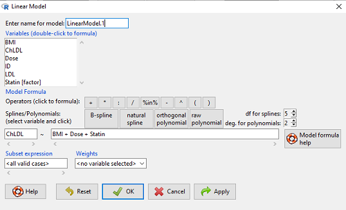
Figure 1. Screenshot of Rcmdr linear model menu with our model elements in place.
The output
summary(LinearModel.1)
Call:
lm(formula = ChLDL ~ BMI + Dose + Statin, data = cholStatins)

Residuals:
    Min      1Q  Median     3Q    Max
-3.7756 -0.5147 -0.0449 0.5038 4.3821

Coefficients:
                      Estimate Std. Error t value Pr(>|t|)
(Intercept)           1.016715   1.178430   0.863 0.39041
BMI                   0.058078   0.047012   1.235 0.21970
Dose                 -0.014197   0.004829  -2.940 0.00411 **
Statin[Statin2]       0.514526   0.262127   1.963 0.05255 .
---
Signif. codes: 0 '***' 0.001 '**' 0.01 '*' 0.05 '.' 0.1 ' ' 1

Residual standard error: 1.31 on 96 degrees of freedom
Multiple R-squared: 0.1231, Adjusted R-squared: 0.09565
F-statistic: 4.49 on 3 and 96 DF, p-value: 0.005407
Question. What are the estimates of the model coefficients (rounded)?
 = intercept = 1.017
 = slope for variable BMI = 0.058
 = slope for variable Dose = -0.014
 = slope for variable Statin = -0.515
Question. Which of the three coefficients were statistically different from their null hypothesis (p-value < 5%)?
Answer: Only coefficient was judged statistically significant at the Type I error level of 5% (p = 0.0041). Of the four null hypotheses we have for the coefficients:
 = 0
= 0 = 0
= 0 = 0; we only reject the null hypothesis for
 Dosecoefficient. = 0)
= 0)
The important take-home concept is about the lack of a direct relationship between the magnitude of the estimate of the coefficient and the likelihood that it will be statistically significant! In absolute value terms  , but was not close to statistical significance (p = 0.220).
We generate a 2D scatterplot and include the regression lines (by group=Statin) to convey the relationship between at least one of the predictors (Fig 2).
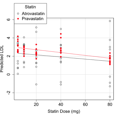
Figure 2. Scatter plot of predicted LDL against dose of a statin drug. Regression lines represent the different statin drugs (Statin1, Statin2).
Question. Based on the graph, can you explain why there will be no statistical differences between levels of the statin drug type, Statin1 (shown open circles) vs. Statin2 (shown closed red circles).
Because we have two predictors (BMI and Statin Dose), you may also elect to use a 3D-scatterplot. Here’s one possible result (Fig 3).
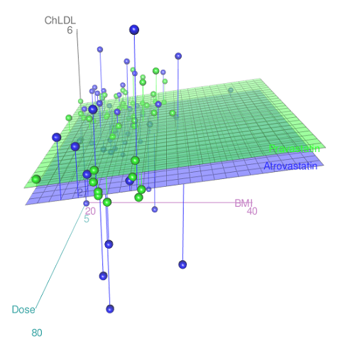
Figure 3. 3D plot of BMI and dose of Statin drugs on change in LDL levels (green Statin2, blue Statin1).
R code for Figure 3.
Graph made in Rcmdr: Graphs → 3D Graph → 3D scatterplot …
scatter3d(ChLDL~BMI+Dose|Statin, data=diabetesCholStatin, fit="linear",
residuals=TRUE, parallel=FALSE, bg="white", axis.scales=TRUE, grid=TRUE,
ellipsoid=FALSE)
Note 2: Figure 3 is a challenging graphic to interpret. I wouldn’t use it because it doesn’t convey a strong message. With some effort we can see the two planes representing mean differences between the two statin drugs across all predictors, but it’s a stretch. No doubt the graph can be improved by changing colors, for example, but I think the 2d plot Figure 2 works better). Alternatively, if the platform allows, you can use animation options to help your reader see the graph elements. Interactive graphics are very promising and, again, unsurprisingly, there are several R packages available. For this example, plot3d() of the package rgl can be used. Figure 4 is one possible version; I saved images and made animated gif.
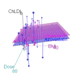
Figure 4. An example of a possible interactive 3D plot; the file embedded in this page is not interactive, just an animation.
Diagnostic plots
While visualization concerns are important, let’s return to the statistics. All evaluations of regression equations should involve an inspection of the residuals. Inspection of the residuals allows you to decide if the regression fits the data; if the fit is adequate, you then proceed to evaluate the statistical significance of the coefficients.
The default diagnostic plots (Fig 5) R provides are available from
Rcmdr: Models → Graphs → Basic diagnostics plots
Four plots are returned
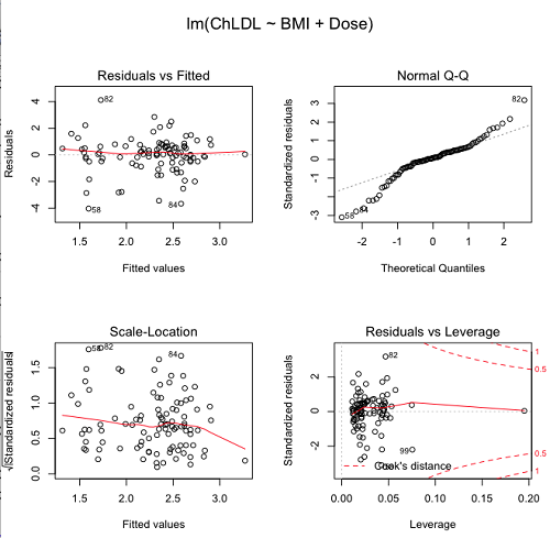
Figure 5. R’s default regression diagnostic plots.
Each of these diagnostic plots in Figure 4 gives you clues about the model fit.
- Plot of residuals vs. fitted helps you identify patterns in the residuals
- Normal Q-Q plot helps you to see if the residuals are approximately normally distributed
- Scale-location plot provides a view of the spread of the residuals
- The residuals vs. leverage plot allows you to identify influential data points.
We introduced these plots in Chapter 17.8 when we discussed fit of simple linear model to data. My conclusion? No obvious trend in residuals, so linear regression is a fit to the data; data not normally distributed Q-Q plot shows S-shape.
Interpreting the diagnostic plots for this problem
The “Normal Q-Q” plot allows us to view our residuals against a normal distribution (the dotted line). Our residuals do no show an ideal distribution: low for the first quartile, about on the line for intermediate values, then high for the 3rd and 4th quartile residuals. If the data were bivariate normal we would see the data fall along a straight line. The “S-shape” suggests log-transformation of the response and or one or more of the predictor variables.
There also seems to be a pattern in residuals vs the predicted (fitted) values. There is a trend of increasing residuals as cholesterol levels increase, which is particularly evident in the “scale-location” plot. Residuals tended to be positive at low and high doses, but negative at intermediate doses. This suggests that the relationship between predictors and cholesterol levels may not be linear, and it demonstrates what statisticians refer to as a monotonic spread of residuals.
The last diagnostic plot looks for individual points that influence, change, or “leverage” the regression — in other words, if a point is removed, does the general pattern change? If so, then the point had “leverage” and thus we need to decide whether or not to include the datum. diagnostic plots Cook’s distance is a measure of the influence of a point in regression. Points with large Cook’s distance values warrant additional checking.
The multicollinearity problem
Statistical model building is a balancing act by the statistician. While simpler models may be easier to interpret and, perhaps, to use, it is a basic truism that the more predictor variables the model includes, the more realistic the statistical model. However, each additional parameter that is added to the statistical model must be independent of all other parameters already in the model. To the extent that this assumption is violated, the problem is termed multicollinearity. If predictor variables are highly correlated, then they are essentially just linear combinations and do not provide independent evidence. For example, one would naturally not include two core body temperature variables in a statistical model on basal metabolic rate, one in degrees Fahrenheit and the other in degrees Celsius, because it is a simple linear conversion between the two units. This would be an example of structural collinearity: the collinearity is because of misspecification of the model variables. In contrast, collinearity among predictor variables may because the data are themselves correlated. For example, if multiple measures of body size are included: weight, height, length of arm, etc., then we would expect these to be correlated, ie, data multicollinearity.
Collinearity in statistical models may have a number of undesirable effects on a multiple regression model. These include
- estimates of coefficients not stable: with collinearity, values of coefficients depend on other variables in the model; if collinear predictors, then the assumption of independent predictor variables is violated.
- precision of the estimates decreases (standard error of estimates increase).
- statistical power decreases.
- p-values for individual coefficients not trust worthy.
Tolerance and Variance Inflation Factor
Absence of multicollinearity is important assumption of multiple regression. A partial test is to calculate product moment correlations among predictor variables. For example, when we calculate the correlation between BMI and Dose for our model, we get r = 0.101 (P = 0.3186), and therefore would tentatively conclude that there was little correlation between our predictor variables.
A number of diagnostic statistics have been developed to test for multicollinearity. Tolerance for a particular independent variable (Xi) is defined as 1 minus the proportion of variance it shares with the other independent variables in the regression analysis (1 − R2i) (O’Brien 2007). Tolerance reports the proportion of total variance explained by adding the Xi–th predictor variable that is unrelated to the other variables in the model. A small value for tolerance indicates multicollinearity — and that the predictor variable is nearly a perfect combination (linear) of the variables already in the model and therefore should be omitted from the model. Because tolerance is defined in relation to the coefficient of determination you can interpret a tolerance score as the unique variance accounted for by a predictor variable.
A second, related diagnostic of multicollinearity is called the Variance Inflation Factor, VIF. VIF is the inverse of tolerance.

VIF shows how much of the variance of a regression coefficient is increased because of collinearity with the other predictor variables in the model. VIF is easy to interpret: a tolerance of 0.01 has a VIF of 100; a tolerance of 0.1 has a VIF of 10; a tolerance of 0.5 has a VIF of 2, and so on. Thus, small values of tolerance and large values of VIF are taken as evidence of multicollinearity.
Rcmdr: Models → Numerical diagnostics → Variation-inflation factors
vif(RegModel.2)
      BMI     Dose
1.010256 1.010256
A rule of thumb is that if VIF is greater than 5 then there is multicollinearity; with VIF values close to one we would conclude, like our results from the partial correlation estimate above, that there is little evidence for a problem of collinearity between the two predictor variables. They can therefore remain in the model.
Solutions for multicollinearity
If there is substantial multicollinearity then you cannot simply trust the estimates of the coefficients. Assuming that there hasn’t been some kind of coding error on your part, then you may need to find a solution. One solution is to drop one of the predictor variables and redo the regression model. Another option is to run what is called a Principal Components Regression (PCR). One takes the predictor variables and runs a Principal Component Analysis to reduce the number of variables, then the regression is run on the PCA components. By definition, the PCA components are independent of each other. Another option is to use ridge regression approach.
Note 3. Principal Component Analysis (PCA) is a dimensionality reduction technique that finds new uncorrelated variables (principal components) by maximizing variance. Principal Component Regression (PCR) uses PCA as a preprocessing step to create a regression model. The key difference is that PCA is an unsupervised method for data transformation, whereas PCR is a supervised regression technique that uses the components from PCA to predict an outcome. It’s probably not a great idea to use the acronym PCR in our biology reports; easily confused with polymerase chain reaction
Like any diagnostic rule, however, one should not blindly apply a rule of thumb. A VIF of 10 or more may indicate multicollinearity, but it does not necessarily lead to the conclusion that the linear regression model requires that the researcher reduce the number of predictor variables or analyze the problem using a different statistical method to address multicollinearity as the sole criteria of a poor statistical model. Rather, the researcher needs to address all of the other issues about model and parameter estimate stability, including sample size. Unless the collinearity is extreme (like a correlation of 1.0 between predictor variables!), larger sample sizes alone will work in favor of better model stability (by lowering the sample error) (O’Brien 2007).
Questions
- Write up three learning outcomes for this page. Hint: Point your favorite generative AI to this page and ask for help.
- Please explain why the magnitude of the slope is not the key to statistical significance of a slope? Hint: look at the equation of the t-test for statistical significance of the slope.
- Consider the following scenario. A researcher measures his subjects multiple times for blood pressure over several weeks, then plots all of the values over time. In all, the data set consists of thousands of readings. He then proceeds to develop a model to explain blood pressure changes over time. What kind of collinearity is present in his data set? Explain your choice.
- We noted that
Dosecould be viewed as categorical variable. ConvertDoseto factor variable (fDose) and redo the linear model. Compare the summary output and discuss the additional coefficients.- Use Rcmdr: Data → Manage variables in active data set → Convert numeric Variables to Factors to create a new factor variable
fDose. It’s ok to use the numbers as factor levels.
- Use Rcmdr: Data → Manage variables in active data set → Convert numeric Variables to Factors to create a new factor variable
- We flagged the change in LDL as likely to be not normally distributed. Create a log10-transformed variable for
ChLDLand perform the multiple regression again.- Write the new statistical model
- Obtain the regression coefficients — are they statistically significant?
- Run basic diagnostic plots and evaluate for
Quiz Chapter 18.1
Multiple Linear Regression
Data set
| ID | Statin | Dose | BMI | LDL | ChLDL |
|---|---|---|---|---|---|
| 1 | Statin2 | 5 | 19.5 | 3.497 | 2.714778 |
| 2 | Statin1 | 20 | 20.2 | 4.268 | 1.276483 |
| 3 | Statin2 | 40 | 20.3 | 3.989 | 2.677377 |
| 4 | Statin2 | 20 | 20.3 | 3.502 | 2.430618 |
| 5 | Statin2 | 80 | 20.4 | 3.766 | 1.79463 |
| 6 | Statin2 | 20 | 20.6 | 3.44 | 2.234295 |
| 7 | Statin1 | 20 | 20.7 | 3.414 | 2.635305 |
| 8 | Statin1 | 10 | 20.8 | 3.222 | 0.809181 |
| 9 | Statin1 | 10 | 21.1 | 4.04 | 3.259599 |
| 10 | Statin1 | 40 | 21.2 | 4.429 | 1.763997 |
| 11 | Statin1 | 5 | 21.2 | 3.528 | 3.369377 |
| 12 | Statin1 | 40 | 21.5 | 3.01 | -0.827154 |
| 13 | Statin2 | 20 | 21.6 | 3.393 | 2.11172 |
| 14 | Statin1 | 10 | 21.7 | 4.512 | 3.166238 |
| 15 | Statin1 | 80 | 22 | 5.449 | 3.00833 |
| 16 | Statin2 | 10 | 22.2 | 4.03 | 3.05013 |
| 17 | Statin2 | 40 | 22.2 | 3.911 | 2.646034 |
| 18 | Statin2 | 10 | 22.2 | 3.724 | 2.945656 |
| 19 | Statin1 | 5 | 22.2 | 3.238 | 3.209584 |
| 20 | Statin2 | 10 | 22.5 | 4.123 | 3.088763 |
| 21 | Statin1 | 20 | 22.6 | 3.859 | 5.152548 |
| 22 | Statin1 | 10 | 23 | 4.926 | 2.58483 |
| 23 | Statin2 | 20 | 23 | 3.512 | 2.291975 |
| 24 | Statin1 | 5 | 23 | 3.838 | 1.469 |
| 25 | Statin2 | 20 | 23.1 | 3.548 | 2.34079 |
| 26 | Statin1 | 5 | 23.1 | 3.424 | 1.204346 |
| 27 | Statin1 | 40 | 23.2 | 3.709 | 3.238179 |
| 28 | Statin1 | 80 | 23.2 | 4.786 | 2.748643 |
| 29 | Statin1 | 20 | 23.3 | 4.103 | 1.250082 |
| 30 | Statin1 | 40 | 23.4 | 3.341 | 1.432292 |
| 31 | Statin1 | 10 | 23.5 | 3.828 | 1.381755 |
| 32 | Statin2 | 10 | 23.8 | 4.02 | 3.039187 |
| 33 | Statin1 | 20 | 23.8 | 3.942 | 0.848328 |
| 34 | Statin2 | 20 | 23.8 | 2.89 | 1.721163 |
| 35 | Statin1 | 80 | 23.9 | 3.326 | 1.939346 |
| 36 | Statin1 | 10 | 24.1 | 4.071 | 3.090741 |
| 37 | Statin1 | 40 | 24.1 | 4.222 | 1.322305 |
| 38 | Statin2 | 10 | 24.1 | 3.44 | 2.472223 |
| 39 | Statin1 | 5 | 24.2 | 3.507 | 0.076817 |
| 40 | Statin2 | 20 | 24.2 | 3.647 | 2.425758 |
| 41 | Statin2 | 80 | 24.3 | 3.812 | 1.710575 |
| 42 | Statin2 | 40 | 24.3 | 3.305 | 1.940572 |
| 43 | Statin2 | 5 | 24.3 | 3.455 | 2.502214 |
| 44 | Statin2 | 5 | 24.4 | 4.258 | 3.228008 |
| 45 | Statin1 | 5 | 24.4 | 4.16 | 3.477747 |
| 46 | Statin2 | 80 | 24.4 | 4.128 | 2.063247 |
| 47 | Statin1 | 80 | 24.5 | 4.507 | 3.784422 |
| 48 | Statin1 | 5 | 24.5 | 3.553 | 0.695709 |
| 49 | Statin2 | 10 | 24.5 | 3.616 | 2.69987 |
| 50 | Statin2 | 80 | 24.6 | 3.372 | 1.300401 |
| 51 | Statin2 | 80 | 24.6 | 3.667 | 1.418109 |
| 52 | Statin2 | 5 | 24.7 | 3.854 | 3.126671 |
| 53 | Statin1 | 80 | 24.7 | 3.32 | -1.286439 |
| 54 | Statin2 | 5 | 24.7 | 3.756 | 2.423664 |
| 55 | Statin1 | 40 | 24.8 | 4.398 | 2.907473 |
| 56 | Statin2 | 40 | 24.9 | 3.621 | 2.362429 |
| 57 | Statin1 | 10 | 25 | 3.17 | 1.264656 |
| 58 | Statin1 | 80 | 25.1 | 3.424 | -2.436908 |
| 59 | Statin2 | 10 | 25.1 | 3.196 | 2.001465 |
| 60 | Statin2 | 80 | 25.2 | 3.367 | 1.100704 |
| 61 | Statin1 | 80 | 25.2 | 3.067 | -0.23154 |
| 62 | Statin1 | 20 | 25.3 | 3.678 | 4.662866 |
| 63 | Statin2 | 5 | 25.5 | 4.077 | 2.611705 |
| 64 | Statin1 | 20 | 25.5 | 3.678 | 2.633053 |
| 65 | Statin2 | 5 | 25.6 | 4.994 | 4.180082 |
| 66 | Statin1 | 20 | 25.8 | 3.699 | 1.899031 |
| 67 | Statin1 | 10 | 25.9 | 3.507 | 4.063757 |
| 68 | Statin2 | 20 | 25.9 | 3.445 | 2.303761 |
| 69 | Statin1 | 5 | 26 | 4.025 | 2.501427 |
| 70 | Statin1 | 5 | 26.3 | 3.616 | 0.740863 |
| 71 | Statin2 | 40 | 26.4 | 3.937 | 2.573321 |
| 72 | Statin2 | 40 | 26.4 | 3.823 | 2.363839 |
| 73 | Statin1 | 10 | 26.7 | 4.46 | 2.174198 |
| 74 | Statin2 | 5 | 26.7 | 5.03 | 3.845271 |
| 75 | Statin2 | 10 | 26.7 | 3.73 | 2.708896 |
| 76 | Statin2 | 10 | 26.7 | 3.232 | 2.272627 |
| 77 | Statin1 | 80 | 26.8 | 3.693 | 1.751169 |
| 78 | Statin2 | 80 | 27 | 4.108 | 1.86131 |
| 79 | Statin2 | 40 | 27.2 | 5.398 | 4.028977 |
| 80 | Statin2 | 80 | 27.2 | 4.517 | 2.348903 |
| 81 | Statin2 | 20 | 27.3 | 3.901 | 2.790047 |
| 82 | Statin1 | 80 | 27.3 | 5.247 | 5.848545 |
| 83 | Statin2 | 80 | 27.4 | 3.507 | 1.247863 |
| 84 | Statin1 | 20 | 27.4 | 3.807 | -1.079928 |
| 85 | Statin2 | 80 | 27.6 | 3.574 | 1.486789 |
| 86 | Statin1 | 40 | 27.8 | 4.16 | 2.427753 |
| 87 | Statin2 | 20 | 28 | 4.501 | 3.284648 |
| 88 | Statin2 | 5 | 28.1 | 3.621 | 2.699007 |
| 89 | Statin1 | 40 | 28.2 | 3.652 | -1.091256 |
| 90 | Statin2 | 40 | 28.2 | 4.191 | 2.874231 |
| 91 | Statin2 | 40 | 28.4 | 5.791 | 4.445454 |
| 92 | Statin1 | 40 | 28.6 | 4.698 | 3.202874 |
| 93 | Statin1 | 5 | 29 | 4.32 | 4.070753 |
| 94 | Statin2 | 10 | 29.1 | 3.776 | 2.751281 |
| 95 | Statin2 | 5 | 29.2 | 4.703 | 3.64949 |
| 96 | Statin2 | 40 | 29.9 | 4.128 | 2.864691 |
| 97 | Statin1 | 40 | 30.4 | 4.693 | 4.983704 |
| 98 | Statin1 | 20 | 30.4 | 4.123 | 2.273898 |
| 99 | Statin1 | 80 | 30.5 | 3.921 | -0.903438 |
| 100 | Statin1 | 10 | 36.5 | 4.175 | 3.311437 |
Chapter 18 contents
17.8 – Assumptions and model diagnostics for Simple Linear Regression
Introduction
The assumptions for all linear regression:
- Linear model is appropriate.
The data are well described (fit) by a linear model. - Independent values of Y and equal variances.
Although there can be more than one Y for any value of X, the Y‘s cannot be related to each other (that’s what we mean by independent). Since we allow for multiple Y‘s for each X, then we assume that the variances of the range of Y‘s are equal for each X value (this is similar to our ANOVA assumptions for equal variance by groups). Another term for equal variances is homoscedasticity. - Normality.
For each X value there is a normal distribution of Y‘s (think of doing the experiment over and over). - Error
The residuals (error) are normally distributed with a mean of zero.
Note the mnemonic device: Linear, Independent, Normal, Error or LINE.
Each of the four elements will be discussed below in the context of Model Diagnostics. These assumptions apply to how the model fits the data. There are other assumptions that, if violated, imply you should use a different method for estimating the parameters of the model.
Ordinary least squares makes the additional assumption about the quality of the independent variable that e that measurement of X is done without error. Measurement error is a fact of life in science, but the influence of error on regression differs if the error is associated with the dependent or independent variable. Measurement error in the dependent variable increases the dispersion of the residuals but will not affect the estimates of the coefficients; error associated with the independent variables, however, will affect estimates of the slope. In short, error in X leads to biased estimates of the slope.
The equivalent, but less restrictive practical application of this assumption is that the error in X is at least negligible compared to the measurements in the dependent variable.
Multiple regression makes one more assumption, about the relationship between the predictor variables (the X variables). The assumption is that there is no multicollinearity, a subject we will bring up next time (see Chapter 18).
Model diagnostics
We just reviewed how to evaluate the estimates of the coefficients of the model. Now we need to address a deeper meaning — how well the model explains the data. Consider a simple linear regression first. If Ho: b = 0 is not rejected — then the slope of the regression equation is taken to not differ from zero. We would conclude that if repeated samples were drawn from the population, on average, the regression equation would not fit the data well (lots of scatter) and it would not yield useful prediction.
However, recall that we assume that the fit is linear. One assumption we make in regression is that a line can, in fact, be used to describe the relationship between X and Y.
Here are two very different situations where the slope = 0.
Example 1. Linear Slope = 0, No relationship between X and Y
Example 2. Linear Slope = 0, A significant relationship between X and Y
But even if Ho: b = 0 is rejected (and we conclude that a linear relationship between X and Y is present), we still need to be concerned about the fit of the line to the data — the relationship may be more nonlinear than linear, for example. Here are two very different situations where the slope is not equal to 0.
Example 3. Linear Slope > 0, a linear relationship between X and Y
Example 4. Linear Slope > 0, curve-linear relationship between X and Y
How can you tell the difference? There are many regression diagnostic tests, many more than we can cover, but you can start with looking at the coefficient of determination (low R2 means low fit to the line), and we can look at the pattern of residuals plotted against the either the predicted values or the X variables (my favorite). The important points are:
- In linear regression, you fit a model (the slope + intercept) to the data;
- We want the usual hypothesis tests (are the coefficients different from zero?) and
- We need to check to see if the model fits the data well. Just like in our discussions of chi-square, a “perfect fit would mean that the difference between our model and the data would be zero.
Graph options
Using residual plots to diagnose regression equations
Yes, we need to test the coefficients (intercept Ho = 0; slope Ho = 0) of a regression equation, but we also must decide if a regression is an appropriate description of the data. This topic includes the use of diagnostic tests in regression. We address this question chiefly by looking at
- scatterplots of the independent (predictor) variable(s) vs. dependent (response) variable(s).
what patterns appear between X and Y? Do your eyes tell you “Line”? “Curve”? “No relation”? - coefficient of determination
closer to zero than to one? - patterns of residuals plotted against the X variables (other types of residual plots are used to, this is one of my favorites)
Our approach is to utilize graphics along with statistical tests designed to address the assumptions.
One typical choice is to see if there are patterns in the residual values plotted against the predictor variable. If the LINE assumptions hold for your data set, then the residuals should have a mean of zero with scatter about the mean. Deviations from LINE assumptions will show up in residual plots.
Here are examples of POSSIBLE outcomes:
Figure 1. An ideal plot of residuals
Solution: Proceed! Assumptions of linear regression met.
Compare to plots of residuals that differ from the ideal.
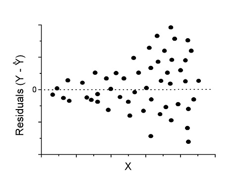
Figure 2. We have a problem. Residual plot shows a “funnel” shape — unequal variance (aka heteroscedasticity).
Solution. Try a transform like the log10-transform.
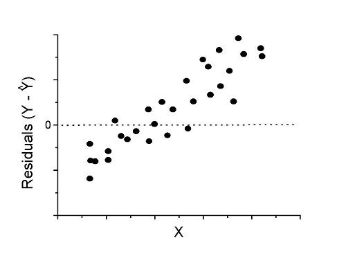
Figure 3. Problem. Residual plot shows systematic trend.
Solution. Linear model a poor fit; May be related to measurement errors for one or more predictor variables. Try adding an additional predictor variable or model the error in your general linear model.
Figure 4. Problem. Residual plot shows nonlinear trend.
Solution. Transform data or use more complex model
This is a good time to mention that in statistical analyses, one often needs to do multiple rounds of analyses, involving description and plots, tests of assumptions, tests of inference. With regression, in particular, we also need to decide if our model (e.g., linear equation) is a good description of the data.
Diagnostic plot examples
Return to our example.Tadpole dataset. To obtain residual plots, Rcmdr: Models → Graphs → Basic diagnostic plots yields four graphs. Graph A is
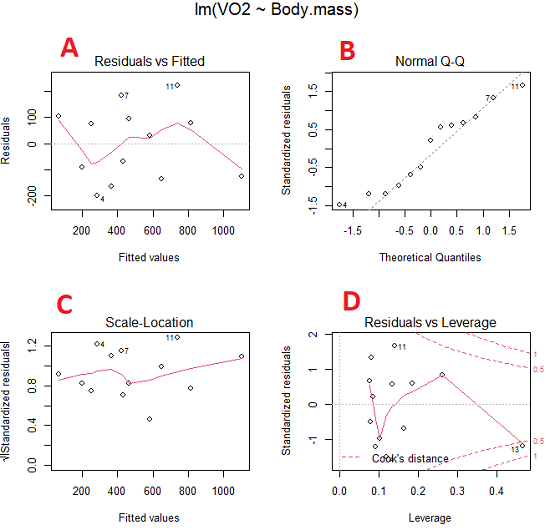
Figure 5. Basic diagnostic plots. A: residual plot; B: Q-Q plot of residuals; C: Scale-location (aka spread-location) plot; D: leverage residual plot.
In brief, we look at plots
A, the residual plot, to see if there are trends in the residuals. We are looking for a spread of points equally above and below the mean of zero. In Figure 5 we count seven points above and six points below zero so there’s no indication of a trend in the residuals vs the fitted VO2 (Y) values.
B, the Q-Q plot is used to see if normality holds. As discussed before, if our data are more or less normally distributed, then points will fall along a straight line in a Q-Q plot.
C, the Scale- or spread-location plot is used to verify equal variances of errors.
D, Leverage plot — looks to see if an outlier has leverage on the fit of the line to the data, i.e., changes the slope. Additionally, provides location of Cook’s distance measure (dashed red lines). Cook’s distance measures the effect on the regression by removing one point at a time and then fitting a line to the data. Points outside the dashed lines have influence.
A note of caution about over-thinking with these plots. R provides a red line to track the points. However, these lines are guides, not judges. We humans are generally good at detecting patterns, but with data visualization, there is the risk of seeing patterns where none exits. In particular, recognizing randomness is not easy. If anything, we may tend to see patterns where none exist, termed apophenia. So yes, by all means look at the graphs, but do so with a plan: red line more or less horizontal? Then no pattern and the regression model is a good fit to the data.
Statistical test options
After building linear models, run statistical diagnostic tests that compliment graphics approaches. Here, simply to introduce the tests, I included the Gosner factor as potential predictor — many of these numerical diagnostics are more appropriate for models with more than one predictor variable, the subject of the next chapter.
Results for the model  were:
were:
lm(formula = VO2 ~ Body.mass + Gosner, data = frogs)

Residuals:
    Min      1Q Median    3Q    Max
-163.12 -125.53 -20.27 83.71 228.56

Coefficients:
           Estimate Std. Error t value  Pr(>|t|)
(Intercept) -595.37     239.87  -2.482 0.03487 *
Body.mass    431.20     115.15   3.745 0.00459 **
Gosner[T.II]  64.96     132.83   0.489 0.63648
---
Signif. codes: 0 '***' 0.001 '**' 0.01 '*' 0.05 '.' 0.1 ' ' 1

Residual standard error: 153.4 on 9 degrees of freedom
  (1 observation deleted due to missingness)
Multiple R-squared: 0.8047, Adjusted R-squared: 0.7613
F-statistic: 18.54 on 2 and 9 DF, p-value: 0.0006432
Question. Note the p-value for the coefficients — do we include a model with both body mass and Gosner Stage? See Chapter 18.5 – Selecting the best model
In R Commander, the diagnostic test options are available via
Rcmdr: Models → Numerical diagnostics
Variance inflation factors (VIF): used to detect multicollinearity among the predictor variables. If correlations are present among the predictor variables, then you can’t rely on the the coefficient estimates — whether predictor A causes change in the response variable depends on whether the correlated B predictor is also included in the model. If correlation between predictor A and B, the statistical effect is increased variance associated with the error of the coefficient estimates. There are VIF for each predictor variable. A VIF of one means there is no correlation between that predictor and the other predictor variables. A VIF of 10 is taken as evidence of serious multicollinearity in the model.
R code:
vif(RegModel.2)
R output
Body.mass Gosner
2.186347 2.186347

round(cov2cor(vcov(RegModel.2)), 3) # Correlations of parameter estimates
         (Intercept) Body.mass Gosner[T.II]
(Intercept)    1.000    -0.958        0.558
Body.mass     -0.958     1.000       -0.737
Gosner[T.II]   0.558    -0.737        1.000
Our interpretation
The output shows a matrix of correlations; the correlation between the two predictor variables in this model was 0.558, large per our discussions in Chapter 16.1 . Not really surprising as older tadpoles (Gosner stage II), are larger tadpoles. We’ll leave the issue of multicollinearity to Chapter 18.1.
Breusch-Pagan test for heteroscedasticity… Recall that heteroscedasticity is another name for unequal variances. This tests pertains to the residuals; we used the scale (spread) location plot (C) above. The test statistic can be calculated as  . The function call is part of the car package, which we download as part of the Rcmdr package. R Commander will pop up a menu of choices for this test. For starters, accept the defaults, enter nothing, and click OK.
R code:
library(zoo, pos=16)
library(lmtest, pos=16)
bptest(VO2 ~ Body.mass + Gosner, varformula = ~ fitted.values(RegModel.2), studentize=FALSE, data=frogs)
R output
Breusch-Pagan test

data:  VO2 ~ Body.mass + Gosner
BP = 0.0040766, df = 1, p-value = 0.9491
Our interpretation
A p-value less than 5% would be interpreted as statistically significant unequal variances among the residuals.
Durbin-Watson for autocorrelation… used to detect serial (auto)correlation among the residuals, specifically, adjacent residuals. Substantial autocorrelation can mean Type I error for one or more model coefficients. The test returns a test statistic that ranges from 0 to 4. A value at midpoint (2) suggests no autocorrelation. Default test for autocorrelation is r > 0.
R code:
dwtest(VO2 ~ Body.mass + Gosner, alternative="greater", data=frogs)
R output
Durbin-Watson test

data:  VO2 ~ Body.mass + Gosner
DW = 2.1336, p-value = 0.4657
alternative hypothesis: true autocorrelation is greater than 0
Our interpretation
The DW statistic was about 2. Per our definition, we conclude no correlations among the residuals.
RESET test for nonlinearity… The Ramsey Regression Equation Specification Error Test is used to interpret whether or not the equation is properly specified. The idea is that fit of the equation is compared against alternative equations that account for possible nonlinear dependencies among predictor and dependent variables. The test statistic follows an F distribution.
R code:
resettest(VO2 ~ Body.mass + Gosner, power=2:3, type="regressor", data=frogs)
R output
RESET test

data:  VO2 ~ Body.mass + Gosner
RESET = 0.93401, df1 = 2, df2 = 7, p-value = 0.437
Our interpretation
Also a nonsignificant test — adding a power term to account for a nonlinear trend gained no model fit benefits, p-value much greater than 5%.
Bonferroni outlier test. Reports the Bonferroni p-values for testing each observation to see if it can be considered to be a mean-shift outlier (a method for identifying potential outlier values — each value is in turn replaced with the mean of its nearest neighbors, Lehhman et al 2020). Compare to results of VIF. The objective of outlier and VIF tests is to verify that the regression model is stable, insensitive to potential leverage (outlier) values.
R code:
outlierTest(LinearModel.3)
R output
No Studentized residuals with Bonferroni p < 0.05
Largest |rstudent|:
  rstudent unadjusted p-value Bonferroni p
7 1.958858        0.085809              NA
Our interpretation
We ran the outlierTest() function on LinearModel.3 to check for influential outliers using Studentized residuals with Bonferroni correction.
The output shows “No Studentized residuals with Bonferroni p < 0.05”, which means no data points were statistically flagged as outliers after adjusting for multiple comparisons. The largest Studentized residual was 1.96 (point 7), with an unadjusted p-value of 0.086. Although this is the largest deviation from the regression line, it is not statistically significant. Therefore, we conclude that no single observation is exerting undue influence on the model fit, and we can be confident that our regression results are not driven by outliers.
Response transformation… The concept of transformations of data to improve adherence to statistical assumptions was introduced in Chapters 3.2, 13.1, and 15.
R code:
summary(powerTransform(LinearModel.3, family="bcPower"))
R output
bcPower Transformation to Normality
    Est Power Rounded Pwr Wald Lwr Bnd Wald Upr Bnd
Y1     0.9987           1       0.2755       1.7218

Likelihood ratio test that transformation parameter is equal to 0
   (log transformation)
                           LRT df      pval
LR test, lambda = (0) 7.374316  1 0.0066162

Likelihood ratio test that no transformation is needed
                                LRT df    pval
LR test, lambda = (1) 0.00001289284  1 0.99714
Our interpretation
The Box-Cox analysis suggests that the response variable for LinearModel.3 can remain on its original scale. No power transformation was needed, and any standard linear regression inference is appropriate. The estimated transformation parameter was close to one, which suggests that the original response variable did not need a transformation. The LRT tests whether a log transformation (lambda = 0) would improve normality. The significant p-value, 0.0066, for the LRT indicates that a log transformation would not be the best choice, consistent with lambda ≈ 1. And last, the very high p-value, 0.99714, confirms that no transformation is necessary; the model residuals were close to normal.
Questions
- Write up three learning outcomes for this page. Hint: Point your favorite generative AI to this page and ask for help.
- Referring to Figures 1 – 4 on this page, which plot best suggests a regression line fits the data?
- Return to the electoral college data set and your linear models of Electoral vs. POP_2010 and POP_2019. Obtain the four basic diagnostic plots and comment on the fit of the regression line to the electoral college data.
- residual plot
- Q-Q plot
- Scale-location plot
- Leverage plot
- With respect to your answers in question 2, how well does the electoral college system reflect the principle of one person one vote?
Quiz Chapter 17.8
Assumptions and model diagnostics for Simple Linear Regression
Chapter 17 contents
- Introduction
- Simple Linear Regression
- Relationship between the slope and the correlation
- Estimation of linear regression coefficients
- OLS, RMA, and smoothing functions
- Testing regression coefficients
- Regression model fit
- Assumptions and model diagnostics for Simple Linear Regression
- References and suggested readings (Ch17 & 18)
17.7 – Regression model fit
Introduction
In Chapter 17.5 and 17.6 we introduced the example of tadpoles body size and oxygen consumption. We ran a simple linear regression, with the following output from R
RegModel.1 <- lm(VO2~Body.mass, data=example.Tadpole)

summary(RegModel.1)

Call:
lm(formula = VO2 ~ Body.mass, data = example.Tadpole)

Residuals:
    Min      1Q    Median       3Q       Max
-202.26 -126.35     30.20    94.01    222.55

Coefficients:
                Estimate     Std. Error    t value    Pr(>|t|)
(Intercept)      -583.05         163.97     -3.556     0.00451 **
Body.mass         444.95          65.89      6.753   0.0000314 ***
---
Signif. codes: 0 '***' 0.001 '**' 0.01 '*' 0.05 '.' 0.1 ' ' 1

Residual standard error: 145.3 on 11 degrees of freedom
Multiple R-squared: 0.8057, Adjusted R-squared: 0.788
F-statistic: 45.61 on 1 and 11 DF, p-value: 0.00003144
You should be able to pick out the estimates of slope and intercept from the table (intercept was -583 and slope was 445). Additionally, as part of your interpretation of the model, you should be able to report how much variation in VO2 was explained by tadpole body mass (coefficient of determination,  , was 0.81, which means about 81% of variation in oxygen consumption by tadpoles is explained by knowing the body mass of the tadpole.
What’s left to do? We need to evaluate how well our model fits the data, i.e., we evaluate regression model fit. By fit we mean, how well does our model agree to the raw data? A poor fit and the model predictions are far from the raw data; a good fit, the model accurately predicts the raw data. In other words, if we draw a line through the raw data, a good fit line crosses through most of the points — a poor fit the line rarely passes through the cloud of points.
How to judge fit? This we can do by evaluating the error components relative to the portion of the model that explains the data. Additionally, we can perform a number of diagnostics of the model relative to the assumptions we made to perform linear regression. These diagnostics form the subject of Chapter 17.8. Here, we ask how well does the model,

fit the data?
Model fit statistics
The second part of fitting a model is to report how well the model fits the data. The next sections apply to this aspect of model fitting. The first area to focus on is the magnitude of the residuals: the greater the spread of residuals, the less well a fitted line explains the data.
In addition to the output from lm() function, which focuses on the coefficients, we typically generate the ANOVA table also.
Anova(RegModel.1, type="II")
Anova Table (Type II tests)

Response: VO2
                Sum Sq   Df    F value       Pr(>F)
Body.mass       962870    1     45.605   0.00003144 ***
Residuals       232245   11
---
Signif. codes: 0 '***' 0.001 '**' 0.01 '*' 0.05 '.' 0.1 ' ' 1
Standard error of regression
S, the Residual Standard Error (aka Standard error of regression), is an overall measure to indicate the accuracy of the fitted line: it tells us how good the regression is in predicting the dependence of response variable on the independent variable. A large value for S indicates a poor fit. One equation for S is given by

In the above example, S = 145.3 (underlined, bold in regression output above). We can see how if  is large, S will be large indicating poor fit of the linear model to the data. However, by itself S is not of much value as a diagnostic as it is difficult to know what to make of 145.3, for example. Is this a large value for S? Is it small? We don’t have any context to judge S, so additional diagnostics have been developed.
Coefficient of determination
, the coefficient of determination, is also used to describe model fit. can take on values between 0 and 1 (0% to 100%). A good model fit has a high value. In our example above,  or 80.57%. One equation for is given by

A value of close to 1 means that the regression “explains” nearly all of the variation in the response variable, and would indicate the model is a good fit to the data. As we mentioned in Chapter 17.2, the coefficient of determination, , is the squared value of r, the product moment correlation.
Adjusted R-squared
Before moving on we need to remark on the difference between and adjusted . For Simple Linear Regression there is but one predictor variable, X; for multiple regression there can be many additional predictor variables. Without some correction, will increase with each additional predictor variables. This doesn’t mean the model is more useful, however, and in particular, one cannot compare between models with different numbers of predictors. Therefore, an adjustment is used so that the coefficient of determination remains a useful way to assess how reliable a model is and to permit comparisons of models. Thus, we have the Adjusted  , which is calculated as

In our example above, Adjusted R 2 = 0.3806 or 38.06%.
Which should you report? Adjusted ,because it is independent of the number of parameters in the model.
Both and S are useful for regression diagnostics, a topic which we will discuss next (Chapter 17.8).
Questions
- Write up three learning outcomes for this page. Hint: Point your favorite generative AI to this page and ask for help.
- As you may know, the US census is used to reapportion congress and also to determine the number of electoral college votes. In honor of the election for US President that’s just days away, in the next series of questions in this Chapter and subsequent sections of Chapter 17 and 18, I’ll ask you to conduct a regression analysis on the electoral college. For starters, make the regression of Electoral votes on 2010 census population. (Ignore for now the other columns, just focus on POP_2019 and Electoral.) Report the
- regression coefficients (slope, intercept)
- percent of the variation in electoral college votes explained by the regression ( ).
- Make a scatterplot and add the regression line to the plot
Quiz Chapter 17.7
Regression model fit
Data set
USA population year 2010 and year 2019 with Electoral College counts
| State | Region | Division | POP_2010 | POP_2019 | Electoral |
|---|---|---|---|---|---|
| Alabama | South | East South Central | 4779736 | 4903185 | 9 |
| Alaska | West | Pacific | 710231 | 731545 | 3 |
| Arizona | West | Mountain | 6392017 | 7278717 | 11 |
| Arkansas | South | West South Central | 2915918 | 3017804 | 6 |
| California | West | Pacific | 37253956 | 39512223 | 55 |
| Colorado | West | Mountain | 5029196 | 5758736 | 9 |
| Connecticut | Northeast | New England | 3574097 | 3565287 | 7 |
| Delaware | South | South Atlantic | 897934 | 982895 | 3 |
| District of Columbia | South | South Atlantic | 601723 | 705749 | 3 |
| Florida | South | South Atlantic | 18801310 | 21477737 | 29 |
| Georgia | South | South Atlantic | 9687653 | 10617423 | 16 |
| Hawaii | West | Pacific | 1360301 | 1415872 | 4 |
| Idaho | West | Mountain | 1567582 | 1787065 | 4 |
| Illinois | Midwest | East North Central | 12830632 | 12671821 | 20 |
| Indiana | Midwest | East North Central | 6483802 | 6732219 | 11 |
| Iowa | Midwest | West North Central | 3046355 | 3155070 | 6 |
| Kansas | Midwest | West North Central | 2853118 | 2913314 | 6 |
| Kentucky | South | East South Central | 4339367 | 4467673 | 8 |
| Louisiana | South | West South Central | 4533372 | 4648794 | 8 |
| Maine | Northeast | New England | 1328361 | 1344212 | 4 |
| Maryland | South | South Atlantic | 5773552 | 6045680 | 10 |
| Massachusetts | Northeast | New England | 6547629 | 6892503 | 11 |
| Michigan | Midwest | East North Central | 9883640 | 9883635 | 16 |
| Minnesota | Midwest | West North Central | 5303925 | 5639632 | 10 |
| Mississippi | South | East South Central | 2967297 | 2976149 | 6 |
| Missouri | Midwest | West North Central | 5988927 | 6137428 | 10 |
| Montana | West | Mountain | 989415 | 1068778 | 3 |
| Nebraska | Midwest | West North Central | 1826341 | 1934408 | 5 |
| Nevada | West | Mountain | 2700551 | 3080156 | 6 |
| New Hampshire | Northeast | New England | 1316470 | 1359711 | 4 |
| New Jersey | Northeast | Mid-Atlantic | 8791894 | 8882190 | 14 |
| New Mexico | West | Mountain | 2059179 | 2096829 | 5 |
| New York | Northeast | Mid-Atlantic | 19378102 | 19453561 | 29 |
| North Carolina | South | South Atlantic | 9535483 | 10488084 | 15 |
| North Dakota | Midwest | West North Central | 672591 | 762062 | 3 |
| Ohio | Midwest | East North Central | 11536504 | 11689100 | 18 |
| Oklahoma | South | West South Central | 3751351 | 3956971 | 7 |
| Oregon | West | Pacific | 3831074 | 4217737 | 7 |
| Pennsylvania | Northeast | Mid-Atlantic | 12702379 | 12801989 | 20 |
| Rhode Island | Northeast | New-England | 1052567 | 1059361 | 4 |
| South Carolina | South | South-Atlantic | 4625364 | 5148714 | 9 |
| South Dakota | Midwest | West-North-Central | 814180 | 884659 | 3 |
| Tennessee | South | East-South-Central | 6346105 | 6829174 | 11 |
| Texas | South | West-South-Central | 25145561 | 28995881 | 38 |
| Utah | West | Mountain | 2763885 | 3205958 | 6 |
| Vermont | Northeast | New-England | 625741 | 623989 | 3 |
| Virginia | South | South-Atlantic | 8001024 | 8535519 | 13 |
| Washington | West | Pacific | 6724540 | 7614893 | 12 |
| West Virginia | South | South-Atlantic | 1852994 | 1792147 | 5 |
| Wisconsin | Midwest | East-North-Central | 5686986 | 5822434 | 10 |
| Wyoming | West | Mountain | 563626 | 578759 | 3 |
Chapter 17 contents
- Introduction
- Simple Linear Regression
- Relationship between the slope and the correlation
- Estimation of linear regression coefficients
- OLS, RMA, and smoothing functions
- Testing regression coefficients
- ANCOVA – Analysis of covariance
- Regression model fit
- Assumptions and model diagnostics for Simple Linear Regression
- References and suggested readings (Ch17 & 18)
17.4 – OLS, RMA, and smoothing functions
Introduction
OLS or ordinary least squares is the most commonly used estimation procedure for fitting a line to the data. For both simple and multiple regression, OLS works by minimizing the sum of the squared residuals. OLS is appropriate when the linear regression assumptions LINE apply. In addition, further restrictions apply to OLS including that the predictor variables are fixed and without error. OLS is appropriate when the goal of the analysis is to retrieve a predictive model. OLS describes an asymmetric association between the predictor and the response variable: the slope bX for Y ~ bXX will generally not be the same as the slope bY for X ~ bYY.
OLS is appropriate for assessing functional relationships (i.e., inference about the coefficients) as long as the assumptions hold. In some literature, OLS is referred to as a Model I regression.
Generalized Least Squares
Generalized linear regression is an estimation procedure related to OLS but can be used either when variances are unequal or multicollinearity is present among the error terms.
Weighted Least Squares
A conceptually straightforward extension of OLS can be made to account for situation where the variances in the error terms are not equal. If the variance of Yi varies for each Xi, then a weighting function based on the reciprocal of the estimated variance may be used.

then, instead of minimizing the squared residuals as in OLS, the regression equation estimates in weighted least squares minimizes the squared residuals summed over the weights.

Weighted least squares is a form of generalized least squares. In order to estimate wi, however, multiple values of Y for each observed X must be available.
Reduced Major Axis
There are many alternative methods available when OLS may not be justified. These approaches, collectively, may be called Model II regression methods. These methods are invariably invoked in situations in which both Y and X variables have random error associated with them. In other words, the OLS assumption that the predictor variables are measured without error is violated. Among the more common methods is one called Reduced Major Axis or RMA.
Smoothing functions
data set: atmospheric carbon dioxide (CO2) readings Mauna Loa. Source: https://gml.noaa.gov/ccgg/trends/data.html
Fit curves without applying a known formula. This technique is called smoothing and, while there are several versions, the technique involves taking information from groups of observations — weighted averaged — and using these groups to estimate how the response variable changes with values of the independent variable. Smoothing is used to help reveal patterns, to emphasize trends by reducing noise — clearly, caution needs to be employed as smoothing necessarily hides outlier data, which can themselves be important. Smoothing techniques by name include kernel, loess, and spline. Default in the scatter plot command is loess.
CO2 in parts per million (ppm) plotted by year from 1958 to 2014 the first CO2 readings were recorded in April 1958 (Fig 1).
Note 1: When I worked on this set, the last data available for this plot was April 2014. CO2 421.86 ppm December 2023, 399.08 ppm December 2014 — a 5.7% increase. https://www.esrl.noaa.gov/gmd/ccgg/trends/
A few words of explanation for Figure 1. The green line shows the OLS line, the red line shows the loess smoothing with a smoothing parameter of 0.5 (in Rcmdr the slider value reads “5”).
Figure 1. CO2 in parts per million (ppm) plotted by year from 1958 to 2014
R command was started with option settings available in Rcmdr context menu for scatterplot, then additional commands were added
scatterplot(CO2~Year, reg.line=lm, grid=FALSE, smooth=TRUE, spread=FALSE, boxplots=FALSE, span=0.05, lwd=2, xlab="Months since 1958", ylab="CO2 ppm", main="CO2 at Mauna Loa Observatory, April 1958 - April 2014", cex=1, cex.axis=1.2, cex.lab=1.2, pch=c(16), data=StkCO2MLO)
The next plot is for ppm CO2 by month for the year 2013. The plot shows the annual cycle of atmospheric CO2 in the northern hemisphere.
Figure 2. Plot of ppm CO2 by month for the year 2013.
Again, the smoothing parameter was set to 0.5 and the loess function is plotted in red (Fig 2).
Loess is an acronym short for local regression. Loess is a weighted least squares approach which is used to fit linear or quadratic functions of the predictors at the centers of neighborhoods. The radius of each neighborhood is chosen so that the neighborhood contains a specified percentage of the data points. This percentage of data points is referred to as the smoothing parameter and this parameter may differ for different neighborhoods of points. The idea of loess, in fact, any smoothing algorithm, is to reveal pattern within a noisy sequence of observations. The smoothing parameter can be set to different values, between 0 and 1 is typical.
Note 2: Noisy data in this context refers to data comes with random error independent of the true signal, i.e., noisy data has low signal-to-noise ratio. The concept is most familiar in communication.
To get a sense of what the parameter does, Figure 3 takes the same data as in Figure 2, but with different values of the smoothing parameter (Fig 3).
Figure 3. Plot with different smoothing values (0.5 to 10.0).
plot key:
| parameter | color |
| 0.5 | black |
| 0.75 | red |
| 1.0 | dark green |
| 2.0 | blue |
| 10.0 | light blue |
The R code used to generate Figure 3 plot was
spanList = c(0.5, 0.75, 1, 2, 10)
reg1 = lm(ppm~Month)
png(filename = "RplotCO2mo.png", width = 400, height = 400, units = "px", pointsize = 12, bg = "white")
plot(Month,ppm, cex=1.2, cex.axis=1.2, cex.lab=1.2, pch=c(16), xlab="Months", ylab="CO2 ppm", main="CO2 levels 2013")
abline(reg1,lwd=2,col="green")
for (i in 1:length(spanList))
{
ppm.loess <- loess(ppm~Month, span=spanList[i], Dataset)
ppm.predict <- predict(ppm.loess, Month)
lines(Month,ppm.predict,lwd=2,col=i)
}
Note 3: This is our first introduction to use of a “for” loop.
The CO2 data constitutes a time series. Instead of loess, a simple moving average would be a more natural way to reveal trends. In principle, take a set of nearby points (odd number of points best, keeps the calculation symmetric) and calculate the average. Next, shift the points by a specified time interval (eg, 7 days), and recalculate the average for the new set of points. See Chapter 20.5 for Time series analysis.
Questions
- Write up three learning outcomes for this page. Hint: Point your favorite generative AI to this page and ask for help.
- This is bio-statistics, so I gotta ask: What ecological/environmental process explains the shape of the relationship between ppm CO2 and months of the year as shown in Figure 2? Hint: NOAA Global Monitoring Laboratory responsible for the CO2 data is located at Mauna Loa Observatory, Hawaiʻi (lat: 19.52291, lon: -155.61586).
- As I wrote this question (January 2022), we were 22 months since WHO declared Covid-19 a pandemic (CDC timeline). Omicron variant is now dominant; Daily case counts State of Hawaiʻi from 1 November 2021 to 15 January 2022 reported in data set table.
- Make plot like Figure 2 (days instead of months)
- Apply different loess smoothing parameters and re-plot the data. Observe and describe the change to the trend between case reports and days.
Quiz Chapter 17.4
OLS, RMA, and smoothing functions
Data set
Covid-19 cases reported State of Hawaiʻi from 1 November 2021 to 15 January 2022 (data extracted from Wikipedia)
| Date | Cases reported |
|---|---|
| 11/01/21 | 69 |
| 11/02/21 | 38 |
| 11/03/21 | 176 |
| 11/04/21 | 112 |
| 11/05/21 | 124 |
| 11/06/21 | 97 |
| 11/07/21 | 134 |
| 11/08/21 | 94 |
| 11/09/21 | 79 |
| 11/10/21 | 142 |
| 11/11/21 | 130 |
| 11/12/21 | 138 |
| 11/13/21 | 81 |
| 11/14/21 | 0 |
| 11/15/21 | 146 |
| 11/16/21 | 93 |
| 11/17/21 | 142 |
| 11/18/21 | 226 |
| 11/19/21 | 206 |
| 11/20/21 | 218 |
| 11/21/21 | 107 |
| 11/22/21 | 92 |
| 11/23/21 | 52 |
| 11/24/21 | 115 |
| 11/25/21 | 77 |
| 11/26/21 | 27 |
| 11/27/21 | 135 |
| 11/28/21 | 169 |
| 11/29/21 | 71 |
| 11/30/21 | 79 |
| 12/01/21 | 108 |
| 12/02/21 | 126 |
| 12/03/21 | 125 |
| 12/04/21 | 124 |
| 12/05/21 | 148 |
| 12/06/21 | 90 |
| 12/07/21 | 55 |
| 12/08/21 | 72 |
| 12/09/21 | 143 |
| 12/10/21 | 170 |
| 12/11/21 | 189 |
| 12/12/21 | 215 |
| 12/13/21 | 150 |
| 12/14/21 | 214 |
| 12/15/21 | 282 |
| 12/16/21 | 395 |
| 12/17/21 | 797 |
| 12/18/21 | 707 |
| 12/19/21 | 972 |
| 12/20/21 | 840 |
| 12/21/21 | 707 |
| 12/22/21 | 961 |
| 12/23/21 | 1511 |
| 12/24/21 | 1828 |
| 12/25/21 | 1591 |
| 12/26/21 | 2205 |
| 12/27/21 | 1384 |
| 12/28/21 | 824 |
| 12/29/21 | 1561 |
| 12/30/21 | 3484 |
| 12/31/21 | 3290 |
| 01/01/22 | 2710 |
| 01/02/22 | 3178 |
| 01/03/22 | 3044 |
| 01/04/22 | 1592 |
| 01/05/22 | 2611 |
| 01/06/22 | 4789 |
| 01/07/22 | 3586 |
| 01/08/22 | 4204 |
| 01/09/22 | 4578 |
| 01/10/22 | 3875 |
| 01/11/22 | 2929 |
| 01/12/22 | 3512 |
| 01/13/22 | 3392 |
| 01/14/22 | 3099 |
| 01/15/22 | 5977 |
Chapter 17 contents
- Introduction
- Simple Linear Regression
- Relationship between the slope and the correlation
- Estimation of linear regression coefficients
- OLS, RMA, and smoothing functions
- Testing regression coefficients
- ANCOVA – analysis of covariance
- Regression model fit
- Assumptions and model diagnostics for Simple Linear Regression
- References and suggested readings (Ch17 & 18)