4.2 – Histograms
Introduction
Displaying interval or continuously scaled data. A histogram (frequency or density distribution), is a useful graph to summarize patterns in data, and is commonly used to judge whether or not the sample distribution approximates a normal distribution. Three kind of histograms, depending on how the data are grouped and counted. Lump the data into sequence of adjacent intervals or bins (aka classes), then count how many individuals have values that fall into one of the bins — the display is referred to as a frequency histogram. Sum up all of the frequencies or counts in the histogram and they add to the sample size. Convert from counts to percentages, then the heights of the bars are equal to the relative frequency (percentage) — the display is referred to as a percentage histogram (aka relative frequency histogram). Sum up all of the bin frequencies and they equal one (100%).
Figure 1 shows two frequency histograms of the distribution of ages for female (left panel) and male (right panel) runners at the 2013 Jamba Juice Banana 5K race in Honolulu, Hawaii (link to data set).
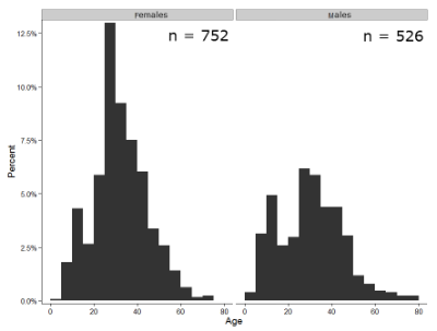
Figure 1. Histograms of age distribution of runners who completed the 2103 Jamba Juice 5K race in Honolulu
The graphs in Fig 1 were produced using R package ggplot2.
The third kind of histogram is referred to as a probability density histogram. The height of the bars are the probability densities, generally expressed as a decimal. The probability density is the bin probability divided by the bin width (size). The area of the bar gives the bin probability and the total area under the curve sums to one.
Which to choose? Both relative frequency histogram and density histogram convey similar messages because both “sum to one (100%), i.e., bin width is the same across all intervals. Frequency histograms may have different bin widths, with more numerous observations, the bin width is larger than cases with fewer observations.
Purpose of the histogram plot
The purpose of displaying the data is to give you or your readers a quick impression of the general distribution of the data. Thus, from our histogram one can see the range of the data and get a qualitative impression of the variability and the central tendency of the data.
Kernel density estimation
Kernel density estimation (KDE) is a non-parametric approach to estimate the probability distribution function. The “kernel” is a window function, where an interval of points is specified and another function is applied only to the points contained in the window. The function applied to the window is called the bandwidth. The kernel smoothing function then is applied to all of the data, resulting in something that looks like a histogram, but without the discreteness of the histogram.
The chief advantage of kernel smoothing over use of histograms is that histogram plots are sensitive to bin size, whereas KDE plot shape are more consistent across different kernel algorithms and bandwidth choices.
Today, statisticians use kernel smoothing functions instead of histograms; these reduce the impact that binning has on histograms, although kernel smoothing still involves choices (smoothing function? default is Gaussian. Widths or bandwidths for smoothing? Varies, but the default is from the variance of the observations). Figure 2 shows smoothed plot of the 752 age observations.
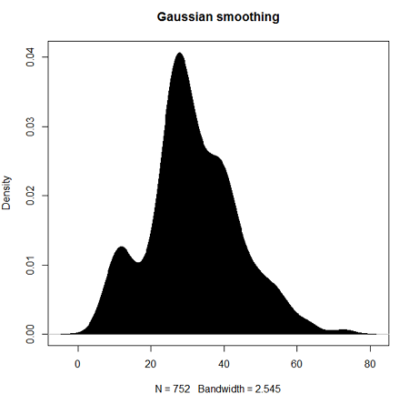
Figure 2. KDE plot of age distribution of female runners who completed the 2103 Jamba Juice 5K race in Honolulu.
Note 1: Remember: the hashtag # preceding R code is used to provide comments and is not interpreted by R
R commands typed at the R prompt were, in order
d <- density(w) #w is a vector of the ages of the 752 females
plot(d, main="Gaussian smoothing")
polygon(d, col="black", border="black") #col and border are settings which allows you to color in the polygon shape, here, black with black border.
Conclusion? A histogram is fine for most of our data. Based on comparing the histogram and the kernel smoothing graph I would reach the same conclusion about the data set. The data are right skewed, maybe kurtotic (peaked), and not normally distributed (see Ch 6.7).
Design criteria for a histogram
The X axis (horizontal axis) displays the units of the variable (e.g., age). The goal is to create a graph that displays the sample distribution. The short answer here is that there is no single choice you can make to always get a good histogram — in fact, statisticians now advice you to use a kernel function in place of histograms if the goal is to judge the distribution of samples.
For continuously distributed data the X-axis is divided into several intervals or bins:
- The number of intervals depends (somewhat) on the sample size and (somewhat) on the range of values. Thus, the shape of the histogram is dependent on your choice of intervals: too many bins and the plot flattens and stretches to either end (over smoothing); too few bins and the plot stacks up and the spread of points is restricted (under smoothing). For both you lose the
- A general rule of thumb: try to have 10 to 15 different intervals. This number of intervals will generally give enough information.
- For large sample size (N=1000 or more) you can use more intervals.
The intervals on the X-axis should be of equal size on the scale of measurement.
- They will not necessarily have the same number of observations in each interval.
- If you do this by hand you need to first determine the range of the data and then divide this number by the number of categories you want. This will give you the size of each category (e.g., range is 25; 25 / 10 = 2.5; each category would be 2.5 unit).
For any given X category the Y-axis then is the Number or Frequency of individuals that are found within that particular X category.
Software
Rcmdr: Graphs → Histogram…
Accepting the defaults to a subset of the 5K data set we get (Fig 3)
Figure 3. Histogram of 752 observations, Sturge’s rule applied, default histogram
The subset consisted of all females or n = 752 that entered and finished the 5K race with an official time.
R Commander plugin KMggplot2
Install the RcmdrPlugin.KMggplot2as you would any package in R. Start or restart Rcmdr and load the plugin by selecting Rcmdr: Tools → Load Rcmdr plug-in(s)… Once the plugin is installed select Rcmdr: KMggplot2 → Histogram… The popup menu provides a number of options to set to format the image. Settings for the next graph were No. of bins “Scott,” font family “Bookman,” Colour pattern “Set 1,” Theme “theme_wsj2.”
Figure 4. Histogram of 752 observations, Scott’s rule applied, ggplot2 histogram
Selecting the correct bin number
You may be saying to yourself, wow, am I confused. Why can’t I just get a graph by clicking on some buttons? The simple explanation is that the software returns defaults, not finished products. It is your responsibility to know how to present the data. Now, the perfect graph is in the eye of the beholder, but as you gain experience, you will find that the default intervals in R bar graphs have too many categories (recall that histograms are constructed by lumping the data into a few categories, or bins, or intervals, and counting the number of individuals per category => “density” or frequency). How many categories (intervals) should we use?
Figure 5. Default histogram with different bin size.
R’s default number for the intervals seems too much to me for this data set; too many categories with small frequencies. A better choice may be around 5 or 6. Change number of intervals to 5 (click Options, change from automatic to number of intervals = 5). Why 5? Experience is a guide; we can guess and look at the histograms produced.
Improving estimation of bin number
I gave you a rough rule of thumb. As you can imagine there have been many attempts over the years to come up with a rational approach to selecting the intervals used to bin observations for histograms. Histogram function in Microsoft’s Excel (Data Analysis plug-in installed) uses the square root of the sample size as the default bin number. Sturge’s rule is commonly used, and the default choice in some statistical application software (e.g., Minitab, Prism, SPSS). Scott’s approach (Scott 2009), a modification to Sturge’s rule, is the default in the ggplot() function in the R graphics package (the Rcmdr plugin is RcmdrPlugin.KMggplot2). And still another choice, which uses interquartile range (IQR), was offered by Freedman and Diacones (1981). Scargle et al (1998) developed a method, Bayesian blocks, to obtain optimum binning for histograms of large data sets.
What is the correct number of intervals (bins) for histograms?
- Use the square root of the sample size, e.g., at R prompt sqrt∗n∗ = 4.5, round to 5). Follow Sturges’ rule (to get the suggested number of intervals for a histogram, let k = the number of intervals, and k = 1 + 3.322(log10n),
- where n is the sample size. I got k = 5.32, round to nearest whole number = 5).
- Another option was suggested by Freedman and Diacones (1981): find IQR for the set of observations and then the solution to the bin size is k = 2IQRn-1/3, where n is the sample size.
Select Histogram Options, then enter intervals. Here’s the new graph using Sturge’s rule…
Figure 6. Default histogram, bin size set by Sturge’s rule.
OK, it doesn’t look much better. And of course, you’ll just have to trust me on this — it is important to try and make the bin size appropriate given the range of values you have in order that the reader/viewer can judge the graphic correctly.
Two histograms on same plot
In many cases you may wish to compare sample distributions among two or more groups.
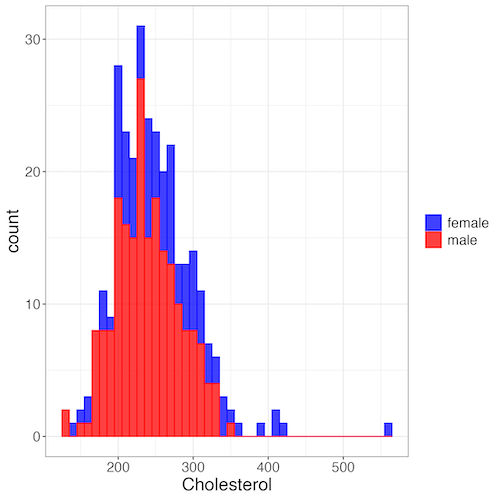
Figure 7. Two histograms on same plot with ggplot2.
R code
Stacked data set, data from Kaggle.
myColors=c(female="blue", male="red")
ggplot(sexChol, aes(chol, fill = sex, color=sex)) +
  geom_histogram(binwidth = 10, alpha=0.75) +
  labs(x = "Cholesterol") +
  theme_bw() +
  theme(legend.title= element_blank(),legend.text=element_text(size=14),
     axis.text=element_text(size=14),axis.title=element_text(size=18)) +
  scale_color_manual(values=myColors) +
  scale_fill_manual(values=myColors)
Base graphics version
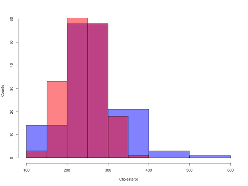
Figure 8. Same data as Fig 7, but using base hist() and plot() functions.
Not an aesthetically pleasing graph (Fig 8), but the idea was to recreate Figure 7 and show regions of overlap. We do this by setting transparent colors (h/t DataAnalytics.org.uk).
First, pick you colors. I like blue and red. Next, we identify how the colors are declared in the three rgb channels. Use the col2rgb() function.
col2rgb("blue")
[,1]
red 0
green 0
blue 255
Create my transparent blue with the alpha setting (125 = 50%). Note the command asks for names, but we won’t use it further.
myBlue <- rgb(0, 0, 255, max = 255, alpha = 125, names = "blue50")
Repeat for 50% transparent red.
col2rgb("red")
[,1]
red 255
green 0
blue 0
myRed <- rgb(255, 0, 0, max = 255, alpha = 125, names = "red50")
Now, we make the plots. Data unstacked, a column with cholesterol values for females (fChol), and another for male cholesterol values mChol). Bin size is different from Figure 7.
hist1 <- hist(fChol, breaks=6, plot=FALSE)
hist2 <- hist(mChol, add=T, breaks=6, plot=FALSE)
Open a Graphics Device so that we can save image to png format. I’ve set width and height in numbers of pixels.
png("base_histograms_two_chol.png", width = 800, height = 600)
Make the graph
plot(hist1, col = myBlue, main="", xlab="Cholesterol", ylab="Counts")
plot(hist2, col = myRed, add = TRUE)
Close the device, the image file is saved to working folder.
dev.off()
Draw region on a histogram
From time to time it may be necessary to highlight a region on a histogram (eg., see Chapters 6.7 – Normal distribution and the normal deviate (Z) and 8 – Inferential statistics). Various solutions to this, but here’s example code using only base R graph options.
First, generate some data from a normal distribution with mean 50 and standard deviation of 10. We show two examples: highlight regions between 40 and 60, and highlight regions
set.seed(123)
data <- rnorm(1000, mean = 50, sd = 10)
As always, a good idea to view at least a portion of the data, stored in object data.
head(data)
R returns
[1] 44.39524 47.69823 65.58708 50.70508 51.29288 67.15065
Next, create the histogram. It’s a good idea to set plot = FALSE, which prevents immediate plotting.
h <- hist(data, breaks = 20, plot = FALSE)
plot(h, main = "Histogram with Highlighted Regions",
     xlab = "Value", ylab = "Frequency")
And last, as the goal was to highlight a region from 40 to 60, we set color to red and impose 30% transparency, no border. The plot is shown in Figure 9.
rect(xleft = 40, ybottom = 0, xright = 60, ytop = max(h$counts),
col = rgb(1, 0, 0, 0.3), border = NA)

Figure 9. Using only base R graphics, a lot with region between 40 and 60 highlighted in red.
The second example, we highlight another region from 70 to 80 in blue, and this time 50% transparency, no border.
rect(xleft = 70, ybottom = 0, xright = 80, ytop = max(h$counts),
col = rgb(0, 0, 1, 0.5), border = NA)
Other options
The base graphs are OK for teaching purposes (and homework answers!), but not examples of data visualization excellence. As part of the tidyverse approach to R programming, ggplot2 includes options to accomplish highlighting regions on plots, including histograms.To draw regions on a histogram plot using ggplot2 in R, you can use geom_rect() or geom_ribbon(). geom_rect() is a good choice to highlight a specific rectangular areas; geom_ribbon() is useful for shading areas under a curve, such as a density plot overlaid on a histogram.

Figure 10. Using geom_ribbon() and ggplot2 package, a plot with region between 40 and 60 highlighted in red.
R code with # comments was:
set.seed(123)
data_normal <- data.frame(rnorm(1000, mean = 50, sd = 10))
# View the dataframe
head(data_normal)
# Output shows need to rename the column.
colnames(data_normal) <- "value"
Note 2: If you use R Commander: Distributions > Continuous distributions > Normal distribution > Sample from normal, the column name will be updated for you. The name will be “obs,” not “value,” however, so where the following code asks for value, replace with obs.
Get the histogram. first, create the plot object, but don’t draw it yet.
myPlot <- ggplot(data_normal, aes(x = value)) +
geom_histogram(bins = 30)
Next, use ggplot_build to extract the bin data.
bin_data <- ggplot_build(myPlot)$data[[1]]
Create a new data frame for the geom_ribbon layer. The ribbon needs x, ymin, and ymax values.
ribbon_data <- bin_data
Set ymin to 0 for the shaded area.
ribbon_data$ymin <- 0
Next, set ymax to the height of the bars (the ‘count’ or ‘y’ column from bin_data).
ribbon_data$ymax <- ribbon_data$count
Filter the ribbon data so that only the region between 40 and 60 is included.
ribbon_data <- ribbon_data[ribbon_data$x >= 40 & ribbon_data$x <= 60, ]
Plot with both layers. Draw the main histogram first (optional: fill to distinguish). Overlay the shaded region using geom_ribbon with the filtered data. Add axes labels. I selected the classic theme; try other themes on your own.
ggplot(data_normal, aes(x = value)) +
     geom_histogram(aes(y = after_stat(count)),
     bins = 30, fill = "lightblue", color = "white") +
     geom_ribbon(data = ribbon_data, aes(x = x,
     ymin = ymin, ymax = ymax), fill = "red",
     alpha = 0.5) +
     labs(x = "Value",y = "Count") +
     theme_classic()
A package tigerstats, now removed from CRAN, was a nice set of tools to accomplish adding regions to a histogram plot with base R graphics. I leave an example which was used to draw regions on a standard normal curve for Chapter 8.
library(tigerstats)
pnormGC(1.645, region="above", mean=0, sd=1,graph=TRUE)
pnormGC(-1.645, region="below", mean=0, sd=1,graph=TRUE)
Questions
Example data set, comet tails and tea

Figure 11. Examples of comet assay results.
The Comet assay, also called single cell gel electrophoresis (SCGE) assay, is a sensitive technique to quantify DNA damage from single cells exposed to potentially mutagenic agents. Undamaged DNA will remain in the nucleus, while damaged DNA will migrate out of the nucleus (Figure 11). The basics of the method involve loading exposed cells immersed in low melting agarose as a thin layer onto a microscope slide, then imposing an electric field across the slide. By adding a DNA selective agent like Sybr Green, DNA can be visualized by fluorescent imaging techniques. A “tail” can be viewed: the greater the damage to DNA, the longer the tail. Several measures can be made, including the length of the tail, the percent of DNA in the tail, and a calculated measure referred to as the Olive Moment, which incorporates amount of DNA in the tail and tail length (Kumaravel et al 2009).
The data presented in Table 1 comes from an experiment in my lab; students grew rat lung cells (ATCC CCL-149), which were derived from type-2 like alveolar cells. The cells were then exposed to dilute copper solutions, extracts of hazel tea, or combinations of hazel tea and copper solution. Copper exposure leads to DNA damage; hazel tea is reported to have antioxidant properties (Thring et al 2011).
| Treatment | Tail | TailPercent | OliveMoment* |
|---|---|---|---|
| Copper-Hazel | 10 | 9.7732 | 2.1501 |
| Copper-Hazel | 6 | 4.8381 | 0.9676 |
| Copper-Hazel | 6 | 3.981 | 0.836 |
| Copper-Hazel | 16 | 12.0911 | 2.9019 |
| Copper-Hazel | 20 | 15.3543 | 3.9921 |
| Copper-Hazel | 33 | 33.5207 | 10.7266 |
| Copper-Hazel | 13 | 13.0936 | 2.8806 |
| Copper-Hazel | 17 | 26.8697 | 4.5679 |
| Copper-Hazel | 30 | 53.8844 | 10.238 |
| Copper-Hazel | 19 | 14.983 | 3.7458 |
| Copper | 11 | 10.5293 | 2.1059 |
| Copper | 13 | 12.5298 | 2.506 |
| Copper | 27 | 38.7357 | 6.9724 |
| Copper | 10 | 10.0238 | 1.9045 |
| Copper | 12 | 12.8428 | 2.5686 |
| Copper | 22 | 32.9746 | 5.2759 |
| Copper | 14 | 13.7666 | 2.6157 |
| Copper | 15 | 18.2663 | 3.8359 |
| Copper | 7 | 10.2393 | 1.9455 |
| Copper | 29 | 22.6612 | 7.9314 |
| Hazel | 8 | 5.6897 | 1.3086 |
| Hazel | 15 | 23.3931 | 2.8072 |
| Hazel | 5 | 2.7021 | 0.5674 |
| Hazel | 16 | 22.519 | 3.1527 |
| Hazel | 3 | 1.9354 | 0.271 |
| Hazel | 10 | 5.6947 | 1.3098 |
| Hazel | 2 | 1.4199 | 0.2272 |
| Hazel | 20 | 29.9353 | 4.4903 |
| Hazel | 6 | 3.357 | 0.6714 |
| Hazel | 3 | 1.2528 | 0.2506 |
Tail refers to length of the comet tail, TailPercent is percent DNA damage in tail, and OliveMoment refers to Olive's (1990), defined as the fraction of DNA in the tail multiplied by tail length
Copy the table into a data frame.
- Create histograms for tail, tail percent, and olive moment
- Change bin size
- Repeat, but with a kernel function.
- Looking at the results from question 1 and 2, how “normal” (i.e., equally distributed around the middle) do the distributions look to you?
- Plot means to compare Tail, Tail percent, and olive moment. Do you see any evidence to conclude that one of the teas protects against DNA damage induced by copper exposure?
Quiz Chapter 4.2
Histograms
Chapter 4 contents
4.1 – Bar (column) charts
Introduction
Bar chart, also called a bar graph, or column chart in many spreadsheet apps (e.g., Google Sheets, Microsoft Excel, Libreoffice Calc — “bar charts” is reserved for horizontal bar plots), are used to compare counts among two or more categories, i.e., an alternative to pie charts (Fig. 1).
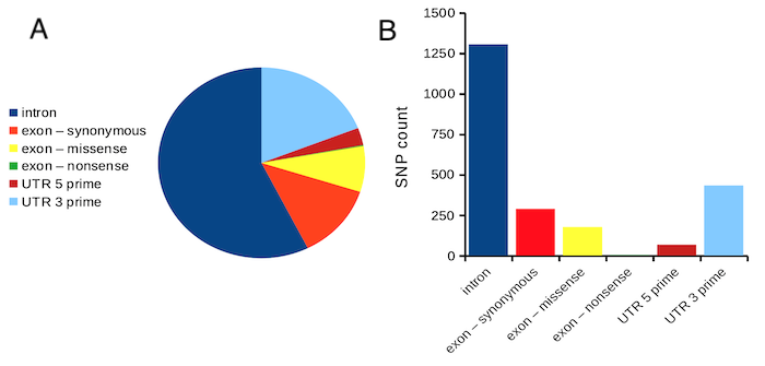
Figure 1. Single nucleotide variants for human gene ACTB by DNA and functional element (data collected 19 May 2022 from NCBI SNP database with Advanced search query). A. Pie chart. Note that slide for “exon – nonsense” is not visible. B. Bar chart – color coded bars to facilitate comparison with pie chart.
Although bar charts are common in the literature (Cumming et al 2007; Streit and Gehlenborg 2014), bar charts may not be a good choice for comparisons of ratio scale data (Streit and Gehlenbor 2014). Bar charts for ratio data are misleading. Parts of the range implied by the bar may never have been observed: the bars of the chart always start at zero. Box (whisker) plots are better for comparisons of ratio scale data and are presented in the next section of this chapter. That said, I will go ahead and present how to create bar charts for both count — generally considered acceptable — and ratio scale data, for which their use is controversial.
Purpose of the bar chart
Like all graphics, a bar chart should tell a story. The purpose of displaying data is to give your readers a quick impression of the general differences among two or more groups of the data. For counts, that’s where the bar chart comes in. The bar chart is preferred over the pie chart because differences are represented by lengths of the bars in the bar chart. Differences among categories in a pie chart are reflected by angles, and it seems that humans are much better at judging lengths than angles.
Bar chart with counts
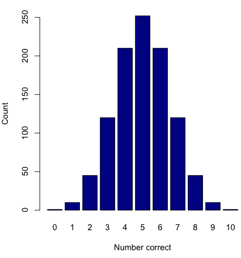
Figure 2. A simple bar chart
myCombo <- seq(0,10, by=1)
myCounts <- choose(10, myCombo)    #combinations
barplot(myCounts, names.arg = myCombo, xlab = "Number correct", ylab = "Count",col = "darkblue")
A stacked bar chart is used to
myCombo <- seq(0,10, by=1)
myCounts <- choose(10, myCombo)    #combinations
barplot(myCounts, names.arg = myCombo, xlab = "Number correct", ylab = "Count",col = "darkblue")
Figure 3. The luxury ship RMS Titanic, which sunk 15 April 1912, More than 1500 souls were lost. Public domain image, Wikipedia. Click image to view full sized image.
Stacked bar chart, data set TitanicSurvival in package carData.
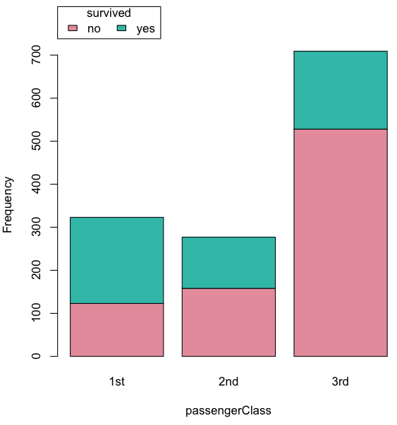
Figure 4. A stacked bar chart, survival Titanic
Barplot(passengerClass, by=survived, style="divided", legend.pos="above", xlab="passengerClass", ylab="Frequency")Bar charts with error bars
Although many data visualization specialists argue against the bar chart — they tend to obscure data — their use is well established. For the familiar bar chart with ratio scale data, the X (horizontal) axis displays the categories of one variable (e.g., location, or treatment group). You plot groups to emphasize comparisons. The Y (vertical) axis then is the mean for each group.
You need error bars with your bar chart to convey variability. A bar chart plus error bars is sometimes called (pejoratively) a dynamite plot. If the mean is displayed, some measure of precision should be (must be?) displayed (Cumming et al 2007). And, as you should recall by now, your choices are standard deviation (Chapter 3.2), standard error of the mean (SEM) (Chapters 3.2, 3.4), or confidence interval (see Chapter 3.4). It is strongly advised, that without a representation of precision, one should not interpret trends or group differences from representations of means (i.e., height of bars) alone.
The bar charts on this page are means plus or minus the standard error of the mean, + SEM. I’m not advocating here for the bar chart — box plots with efforts to show the actual data are better. However, bar charts remain common and may be more familiar to certain audiences. We’ll discuss which choice to make.
Examples
The Copper_rats_PMID3357063 dataset will be used for the next series of graphs (Data set). Refer to Mike’s Workbook for Biostatistics Part07 to review how to import the data.
A portion of the data set is shown below
head(Copper)
         Diet     Body    Heart    Liver
1 Adequate-Cu 320.1381 1.125037 10.259657
2 Adequate-Cu 329.6879 1.158982 9.843295
3 Adequate-Cu 327.9838 1.090374 9.855975
4 Adequate-Cu 334.6669 1.118183 9.942997
5 Adequate-Cu 338.3134 1.172636 9.860971
6 Adequate-Cu 345.4608 1.056183 8.885820
The data set consists of organ weights (heart, liver) from rats fed a diet adequate in copper, deficient in copper, and then a third group who received the adequate diet from perspective of amount of copper, but calorie restricted to match the decreased feeding rates of the rats fed the copper deficient diet. Copper is an essential trace element in our diet. The data set was simulated from descriptive statistics (means, standard deviation, number of subjects) of published data by sampling from a normal distribution. (Table 1, Ovecka et al 1988).
On we go with some graphs.
Note 1: R has many options to create bar charts, and especially ggplot2 can be used to great advantage, but there is a learning curve. One of the great things about R is that folks help each other by sharing code. For example, http://www.cookbook-r.com/Graphs/Plotting_means_and_error_bars_(ggplot2)/
But, I’m still learning about R graphics, and for bar charts with error bars, I find other packages more straight-forward. So, I’ll use this moment to point out that making a good graph is more about the end product then the particular tools. I have been using other tools for years to make my graphics, so I tend to default on these options first. Graphs presented here are mostly from Veusz software program (pronounced “views”). I like it because the software allows me to edit any of the elements of the graph.
Here’s a typical looking bar chart with ratio scale data: means ± SEM. Let’s look at them more critically.
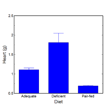
Figure 5. A bar chart with error bars (standard error of the mean).
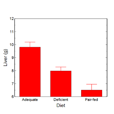
Figure 6. Another bar chart. with standard errors of mean
When making comparisons, make sure the axes have the same scale, or consider putting the graphs together.
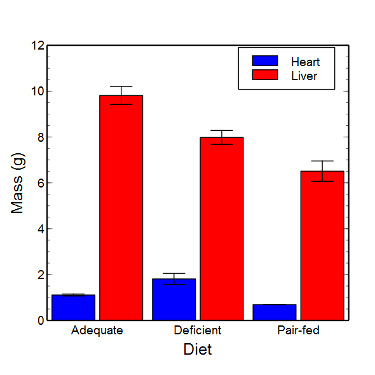
Figure 7. Bar chart that allows for a comparison among levels of a a factor (organs, liver vs. heart).
Analysis note: For variables that covary with body size (for example, on average, tall people generally are heavier too), is how to present (and analyze) the data in such a way that body size is accounted for. Here, the solution was to express organ weight as the ratio of organ weight to body weight for the mice. This may or may not be a good solution, and the answer is too complicated for us now (has to do with a thing called allometric scaling), but I wanted to at least present the issue and show how the graphics can be improved to handle some of these concerns.
Here’s the organ weights again, but taken as ratio of body mass.
Figure 8. Same chart as in Figure 6, but on ratios.
Note 2. Lets be clear about expectations of you for statistics class. Now, R (and Rcmdr) do lots of graphics, pretty much anything you want, but it is not as friendly as it could be. For BI311 homework, the default graphics available via Rcmdr will generally be adequate for assignments. R and Rcmdr has many bar chart options, but there isn’t a straightforward way to get the error bars, unless you are willing to enter some code to the command line or learn a particular package (like gplots or ggplot2).
How to make a bar chart with error bars in R
Option 1. First, let’s try a work-around. Instead of an error bar option for bar chart menu, Rcmdr provides a plot of means that allows you to plot with error bars. These are equivalent graphs, the “bar chart” and the “plot of means”, though you should favor the bar chart format for publishing.
Rcmdr: Graphs → Plot of means…
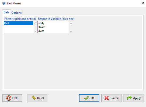
Figure 9. Rcmdr menu popup for Plots Means
Here, Rcmdr takes the data and calculates the mean and your choice of standard errors or deviations, confidence intervals, or no error bars. the resulting graph is below.
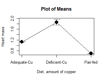
Figure 10. Plot of means
That’s an ugly graph (Fig. 10). Functional, good enough for data exploration and preliminary results, and certainly good enough for a Biostatistics homework or report. Additionally, connecting the dots here is a no-no. It implies that if we had measured categories between “adequate copper” and “deficient copper,” then the points would fall on those lines. That would be a complete guess. So, why did I include the connecting lines? That was the default setting for the command, and it makes the point — think before you click. One argument for connecting points in a graph is that it makes it easier for the reader to visualize trends.
This graph (Fig. 10) is fine for exploring data, but you will want to do better for publication.
Let’s make some better graphs with R
Once you are ready to go beyond the default settings available in Rcmdr, there is tremendous functionality in R for graphics. To access R’s potential, you’ll need to get into the commands a bit. I’m going to continue to try and shield you from the programming aspects of R, but from time to time you really need to see what is possible with R. Graphics is one such area. I use the package gplots, with 23 different graphing functions (type at R prompt ?gplots to call up the manual pages).
gplots should be among the packages on your R installation; if not, then install the package and run library(gplots) to complete the installation. We’ll try the barchart2 function.
But first, we need to get means for each of our groups.
At the R command prompt:
hrtWt <- tapply(Dataset$HeartWt, list(Group=Dataset$Group), mean, na.rm=TRUE) This code extracts means from our HeartWt variable for each Group, then stores the three (in this case, because our data set has 3 groups) in the place holder I had called hrtWt. To verify that the three means are there, type “hrtWt” without the quotes then enter.
You should see
hrtWt Group Cu adequate Cu deficient Pair-fed
               1.200000     1.566667 0.900000
R functions used: tapply, list, mean; na.rm was not needed but would be used to remove all missing values (recall during our import phase we were asked how missing observations were noted in our file; the default is NA).
Next, I want to apply standard error bars
stdDEV <- tapply(Dataset$HeartWt, list(Group=Dataset$Group), sd, na.rm=TRUE)
cil <- hrtWt-(stdDEV/sqrt(3))
ciu <- hrtWt+(stdDEV/sqrt(3))
I used cil and ciu to designate the lower cil and upper ciu values for my ± SEM (standard error of the mean). ciu stands for “confidence interval lower;” ciu stands for “confidence interval upper.”
Finally, here’s the plot command
barplot2(hrtWt, beside = TRUE, main=c("Mice fed different amounts of copper in diet"), col = c("blue", "red", "green"), xlab="Copper in diet", ylab="Heart mass (g)", ylim = c(0, 2), plot.ci=TRUE, ci.l=cil, ci.u=ciu)Now, draw a box around the graphic
box()Whew!
What does your new graph look like? My graph is below (Fig. 11).
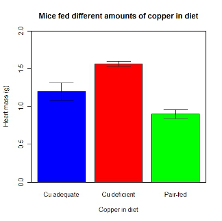
Figure 11. A bar chart using barplot2.
This works and the point is that once the script is written it easy to make small changes as you need in the future to make nice graphs.
If you are impatient like me, I like a GUI option, at least to start crafting the graph. The Rcmdr plugin KMggplot2 provides a good set of tools to make bar charts with error bars. An even better option I think is to use a software package that is designed for graphics, at least simple graphics like a bar chart. I use SciDAVis and Veusz for simple graphs like pie charts and bar charts; much easier to control.
ggplot2 bar charts with error bars
Nevertheless, here’s how to make a bar chart with error bars using ggplot2 (Fig. 11). First, we need to create a statistics summary. The script printed here was modified from scripts at R Graph Cookbook website.
require(plyr)
summarySE <- function(data=NULL, measurevar, groupvars=NULL, na.rm=FALSE,
     conf.interval=.95, .drop=TRUE) {
length2 <- function (x, na.rm=FALSE) {
     if (na.rm) sum(!is.na(x))
     else length(x)
}

#returns a vector with N, mean, and sd
datac <- ddply(data,groupvars, .drop=.drop,
    .fun = function(xx,col){
      c(N=length2(xx[[col]],na.rm=na.rm),
      mean=mean(xx[[col]],na.rm=na.rm),
      sd=sd(xx[[col]],na.rm=na.rm)
     )
    },
    measurevar
   )

#Rename the "mean" column
datac <- rename(datac,c("mean"=measurevar))

#Calculate the standard error of the mean
datac$se <- datac$sd/sqrt(datac$N)

#Get confidence interval
ciMult <- qt(conf.interval/2 + .5, datac$N-1)
datac$ci <- datac$se*ciMult

return(datac)
}
Applying this function to the BMI dataset yields the following output.
sumBMI <- summarySE(BMI, measurevar="BMI", groupvars=c("Sex", "Smoke"));sumBMI

   Sex Smoke   N      BMI       sd        se       ci
1    F    No  23 26.83567 7.610271 1.5868511 3.290928
2    F   Yes  14 25.76133 4.658625 1.2450698 2.689810
3    M    No  10 26.35731 3.363575 1.0636557 2.406156
4    M   Yes  27 26.71879 4.675631 0.8998256 1.849618
Now we are ready to make the bar chart with error bars
ggplot(tgc,aes(x=Smoke,y=BMI,fill=Sex)) +
 geom_bar(position=position_dodge(),stat="identity",color="black") +
 geom_errorbar(aes(ymin=BMI,ymax=BMI+se),width=.2,position=position_dodge(.9))
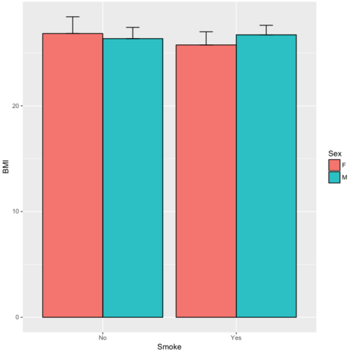
Figure 12. A barchart from ggplot2
Questions
1. Why should you use box plots and not bar charts to display comparisons for a ratio scale variable between categories? Obtain a copy of the article by Streit and Gehlenbor 2014 — it’s free! After reading, summarize the pro and cons for box plots over bar charts with error bars.
2. Enter the following data into R. The data are sulfate levels in water, parts per million.
type = c("Palolo Stream","Chaminade tap water", "Aquafina","Dasani")
sulfateppm =c(11, 14, 5, 12)
try = data.frame(type,sulfateppm)
byWater = tapply(try$sulfateppm,list(Group=try$type),mean)
Make a simple bar chart using the boxplot2 function in gplots package.
3. Change the range of values on the vertical axis to 0, 20
4. Change the color of the bars from gray to blue
5. Add a label to the vertical axis, “Sulfates, ppm” (without the quotes)
6. Add a box around the graph.
Quiz – Chapter 4.1
Bar charts
Data set
| Diet | Body | Heart | Liver |
|---|---|---|---|
| Adequate-Cu | 320.1381 | 1.125037 | 10.259657 |
| Adequate-Cu | 329.6879 | 1.158982 | 9.843295 |
| Adequate-Cu | 327.9838 | 1.090374 | 9.855975 |
| Adequate-Cu | 334.6669 | 1.118183 | 9.942997 |
| Adequate-Cu | 338.3134 | 1.172636 | 9.860971 |
| Adequate-Cu | 345.4608 | 1.056183 | 8.88582 |
| Adequate-Cu | 343.089 | 1.081261 | 10.166647 |
| Adequate-Cu | 328.3403 | 1.111278 | 10.124185 |
| Adequate-Cu | 324.9723 | 1.189194 | 10.158402 |
| Adequate-Cu | 325.2378 | 1.14715 | 9.939521 |
| Deficient-Cu | 195.5052 | 1.90973 | 7.907565 |
| Deficient-Cu | 182.7809 | 1.823672 | 8.430167 |
| Deficient-Cu | 184.3701 | 1.632249 | 7.619104 |
| Deficient-Cu | 193.7867 | 1.831765 | 8.742489 |
| Deficient-Cu | 180.0417 | 1.710367 | 7.975879 |
| Deficient-Cu | 208.5349 | 2.495623 | 8.652445 |
| Deficient-Cu | 182.3048 | 1.262053 | 7.257726 |
| Deficient-Cu | 203.0413 | 2.153639 | 8.081782 |
| Deficient-Cu | 193.3829 | 1.986028 | 7.807328 |
| Deficient-Cu | 195.0523 | 1.76975 | 8.297611 |
| Pair-fed | 211.0858 | 0.6911343 | 6.251177 |
| Pair-fed | 210.4041 | 0.6928067 | 7.696669 |
| Pair-fed | 208.5969 | 0.6911901 | 6.973803 |
| Pair-fed | 209.3333 | 0.7039211 | 6.629303 |
| Pair-fed | 208.8889 | 0.7077486 | 6.038704 |
| Pair-fed | 208.2994 | 0.7004535 | 6.606877 |
| Pair-fed | 209.4524 | 0.6915543 | 6.228888 |
| Pair-fed | 210.2699 | 0.6984497 | 6.638466 |
| Pair-fed | 208.8142 | 0.7214847 | 6.353705 |
| Pair-fed | 209.2977 | 0.6848656 | 6.536642 |
Chapter 4 contents
3.3 – Measures of dispersion
More about summary statistics.
The statistics of data exploration involve calculating estimates of the middle, central tendency, and the variability, or dispersion, about the middle. Statistics about the middle were presented in the previous section, Chapter 3.1. Statistics about measures of dispersion, and how to calculate them in R, are presented in this page. Use of Z score to standardize or normalize scores is introduced. Statistical bias is also introduced.
Describing the middle of the data gives your reader a sense of what was the typical observation for that variable. Next, your reader will want to know something about the variation about the middle value — what was the smallest value observed? What was the largest value observed? Were data widely scattered or clumped about the middle?
Measures of dispersion or variability are descriptive statistics used to answer these kinds of questions. Variability statistics are very important and we will use them throughout the course. A key descriptive statement of your data, how variable?
Note 1: Data is plural = a bunch of points or values; datum is the singular and rarely used.
Examine the two figures below (Fig 1 and Fig 2): the two sample frequency distributions (put data into several groups, from low to high, and membership is counted for each group) have similar central tendencies (mean), but they have different degrees of variability (standard deviation).
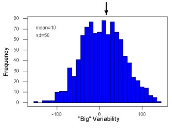
Figure 1. A histogram which displays a sampling of data with a mean of 10 (arrow marks the spot) and standard deviation (sd) of 50 units.
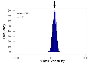
Figure 2. A histogram which displays a sampling of data with the same mean of 10 (arrow marks the spot) displayed in Fig. 1, but with a smaller standard deviation (sd) of 5 units.
Clearly, knowing something about the middle of a data set is only part of the required information we need when we explore a data set; we need measures of dispersion as well. Provided certain assumptions about the frequency of observations hold, estimates of the middle (eg, mean, median) and the dispersion (eg, standard deviation) are adequate to describe the properties of any observed data set.
For measures of dispersion or variability, the most common statistics are: Range, Mean Deviation, Variance, Standard Deviation, and Coefficient of Variation.
The range.
The range is reported as one number, the difference between maximum and minimum values.

Arrange the data from low to high, subtract the minimum, Xmin, from the maximum, Xmax, value and that’s the range.
For example, the minimum height of a collection of fern trees might be 1 meter whereas the maximum height might be 2.2 meters. Therefore, the range is 1.2 meters (= 2.2 – 1).
The range is useful, but may be misleading (as index of true variability in population) if there is one or more exceptional “outlier” (one individual that has an exceptionally large or small value). I often just report Xmin and Xmax. That’s the way R does it, too.
If you recall, we used the following as an example data set.
x = c(4,4,4,4,5,5,6,6,6,7,7,8,8,8,15)The command for range in R is simply range().
range(x)
[1] 4 15
There is apparently no universally accepted symbol for “range,” so we report the statistic as range = 15 – 4 = 11.
You may run into an interquartile range, which is abbreviated as IQR. It is a trimmed range, which means, like the trimmed mean, it will be robust to outlier observations. To calculate this statistic, divide the data into fourths, termed quartiles. For our example variable, x, we can get the quartiles in R
quantile(x)
  0%  25%  50%  75% 100%
 4.0  4.5  6.0  7.5 15.0
Thus, we see that 25% of the observations are 4.5 (or less), the second quartile is the median, and 75% of the observations are less than 7.5. The IQR is the difference between the first quartile, Q1, and the third quartile, Q3.
The command for obtaining the IQR in R is simply IQR(). Yes. You have to capitalize “IQR” — R is case sensitive; that means IqR is not the same as IQR or iqr.
IQR(x)
[1] 3.5
and we report the statistic as IQR = 3.5. Thus, 75% of the observations are within 3.5 points of the median. The IQR is used in box plots (Chapter 4). Quartiles are special cases of the more general quantile; quantiles divide up the range of values into groups with equal probabilities. For quartiles, four groups at 25% intervals. Other common quantiles include deciles (ten equal groups, 10% intervals) and percentiles (100 groups, 1% intervals).
The mean deviation.

Subtract each observation from the sample mean; each  is called a deviate: some observations will be positive (greater than
  ) and some will be negative (less than ).
Take the absolute value of the deviation and then add up the absolute values of the deviations from the mean. At the end, divide by the sample size, n. Large values for this statistic implies that much of the data is spread out, far from the mean. Small values in turn imply that each observation is close to the mean.
Note 2: The mean deviation will always be positive, which is why we take the absolute. By taking the absolute value of each deviate, then the sum is greater than zero. Now, we rarely use this statistic by itself — but that difference is integral to much of the statistical tests we will use. Look for this difference in other equations!
In R, we can get the mean deviation with the mad() function. At the R prompt, then
mad(x)
[1] 2.9652
Population variance and population standard deviation.
The population variance is appropriate for describing variability about the middle for a census. Again, a census implies every member of the population was measured. Equation of the population variance is

The population standard deviation also describes the variability about the middle, but has the advantage of being in the same units as the quantity (ie, no “squared” term). Equation of the population standard deviation is

Sample variance and sample standard deviation.
The above statements about the population variance and standard deviation hold for the sample statistics. Equation of the sample variance

and the equation of the sample standard deviation

Of course, instead of taking the square-root of the sample variance, the sample standard deviation could be calculated directly.
*** QuickLaTeX cannot compile formula:
\begin{align*}s = \sqrt{\frac{\sum \left ( X_{i} - \bar{X} \right )^2}{n-1}\end{align*}

*** Error message:
File ended while scanning use of \align*.
Emergency stop.
n - 1 instead of N. This is Bessel’s correction and we will take a few moments here and in class to show you why this correction makes sense. Bessel’s correction to the sample variance illustrates a basic issue in statistics: when estimating something, we want the estimator (ie, the equation), to be an unbiased value for the population parameter it is intended to estimate.Statistical bias is an important concept in its own right; bias is a problem because it refers to a situation in which an estimator consistently returns a value different from the population parameter for which it is intended to estimate. Thus, the sample mean is said to be an unbiased estimator of the population mean. Here, bias means that the formula will give you a good estimate of the value. This turns out not to be the case for the sample variance if you divide by n instead of n - 1. Now, for very large values of n, this is not much of an issue, but it shows up when n is small. In R you get what you ask for — if you ask for the sample standard deviation, the software will return the correct value; calculators, go to watch out for this — not all of them are good at communicating which standard deviation they are calculating, the population or the sample standard deviation.
Winsorized variances.
Like the trimmed mean and winsorized mean (Ch3.2), we may need to construct a robust estimate of variability less sensitive to extreme outliers. Winsorized refers to procedures to replace extreme values in the sample with a smaller value. As noted in Chapter 3.2, we chose the level ahead of time, eg, 90%. Winsorized values then The winsorized variance is just the sample variance of the winsorized values. winvar() from the WRS2 package.
Making use of the sample standard deviation.
Given an estimate of the mean and an estimate of the standard deviation, one can quickly determine the kinds of observations made and how frequently they are expected to be found in a sample from a population (assuming a particular population distribution). For example, it is common in journal articles for authors to provide a table of summary statistics like the mean and standard deviation to describe characteristics of the study population (aka the reference population), or samples of subjects drawn from the study population (aka the sample population). The CDC provides reports of attributes of for a sample of adults (more than forty thousand) from the USA population (Fryar et al 2018). Table 1 shows a sample of results for height, weight, and waist circumference for men aged 20 – 39 years.
Table 1. Summary statistics mean ( standard deviation) of height, weight, and waist circumference of 20-39 year old men USA.
| Years | Height, inches | Weight, pounds | Waist Circumference, inches |
|---|---|---|---|
| 1999 – 2000 | 69.4 (0.1) | 185.8 (2.0) | 37.1 (0.3) |
| 2007 – 2008 | 69.4 (0.2) | 189.9 (2.1) | 37.6 (0.3) |
| 2015 – 2016 | 69.3 (0.1) | 196.9 (3.1) | 38.7 (0.4) |
We introduced the normal deviate as a way to normalize scores, and which we we will use extensively in our discussion of the normal distribution in Chapter 6.7, as a way to standardize a sample distribution, assuming a normal curve.

For data that are normally distributed, the standard deviation can be used to tell us a lot about the variability of the data:
62.26% of the data will lie between  of
of
95.46% of the data will lie between  of
of
99.0% of the data will lie between  of
of
This is known as the empirical rule, where 68% of the observations will be within one standard deviation, 95% of observations will be within two standard deviations, and 99% of observations will be within three standard deviations.
For example, men aged 20 years in the USA are on average μ = 5 feet 11 inches tall, with a standard deviation of σ = 3 inches. Consider a sample of 1000 men from this population. Assuming a normal distribution, we predict that 623 (62.26%) will be between 5 ft. 8 in. and 6 ft. 2 in. ( ).
).
Where did the 5 ft. 8 in. and the 6 ft. 2 in. come from /? We add or subtract multiples of standard deviations. Thus, 6 ft. 2 in. = 5 ft. 11 in.  (replace σ = 3) and 5 ft. 8 in. = 5 ft. 11 in.
  (again, replace σ = 3″).
Can generalize to any distribution. Chebyshev’s inequality (or theorem) guarantees that no more than a particular fraction  of observations can be a specified
  standard deviations distance away from the mean ( needs to be greater than 1). Thus, for
  standard deviations, we expect a minimum of 75% of values within (
 ) two standard deviations away from the mean, or for
  , then 89% of values will be within (
 ) three standard deviations from the mean.
Hopefully you are now getting a sense how this knowledge allows you to plan an experiment.
For example, for a sample of 1000 observations of height of men, how many do we expect to be greater than 6 ft. 7 in. tall? Apply the empirical rule and do a little math — 79 inches (6 ft. 7 in) minus 71 inches (the mean) is equal to 8. Divide 8 by 3 (our value of  ) you’ll get 2.66667; so, 6 ft. 7 in. tall is about 2.67 X standard deviations greater than the mean. From Chebyshev’s inequality we have
  , or 14% of observations less than or greater than the mean (
 ).
).
Our question asks only about expected number of observations greater than  ; divide 14% in half — we therefore expect about 70 individuals out of 1000 men sampled to be 6 ft. 7 in. or taller. Note we made no assumption about the shape of the distribution. If we assume the sample of observations comes from the normal distribution, then we can apply the Z score: about 4 individuals out of 1000 expected to be from the mean (see R code in Note box). We extend the Z-score work in Chapter 6.7.
Note 4: R code:
round(1000*(pnorm(c(79), mean=71, sd=3,lower.tail=FALSE)),0)
or alternatively
round(1000*(pnorm(c(2.67), mean=0, sd=1,lower.tail=FALSE)),0)
R output
[1] 4
R Commander command
Rcmdr: Distributions → Continuous distributions → Normal distribution → Normal probabilities …, select Upper tail.
Another example, this time with a data set available in R, the diabetic retinopathy data set in the survival package.
data(diabetic, package="survival")
Ages of the 394 subjects ranged from 1 to 58. Mean was 20.8 + 14.81 years. How many out of 100 subjects do we expect greater than 50 years old? With Chebyshev’s inequality we have  , or 25.7% of observations less than or greater than the mean, so about 13. If we assume normality, then Z score (Upper tail) is 28.5% and we expect 28 subjects older than 50. Checking the data set, only eight subjects were older than 50. Our estimate by Chebyshev’s inequality was closer to the truth. Why /? Take a look at the histogram (Ch4) of the ages (Fig 3).
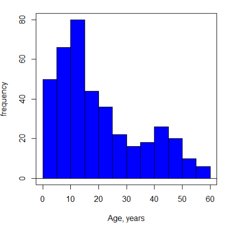
Figure 3. Histogram of ages of subjects in the diabetic retinopathy data set in the survival package.
Doesn’t look like a normal distribution, does it/?.
Z-score or Chebyshev’s inequality, which to use /? Chebyshev’s inequality is more general — it can be used whether the variables is discrete or continuous and without assumption about the distribution. In contrast, the Z score assumes more is known about the variable: random, continuous, drawn from a normally distributed population. Thus, as long as these assumptions hold, the Z score approach will give a better answer. Makes intuitive sense — if we know more, our predictions should be better.
In summary from the above points, and perhaps more formally for our purposes, the standard deviation is a good statistic to describe variability of observations on subjects, it’s integral to the concept of precision of an estimate and is part of any equation for calculating confidence intervals (CI). For any estimated statistic, a good rule of thumb is to always include a confidence interval calculation. We introduced these intervals in our discussion of risk analysis (approximate CI of NNT), and we will return to confidence intervals more formally when we introduce t-tests.
When you hear people talk about “margin of error” in a survey, typically they are referring to the standard deviation — to be more precise, they are referring to a calculation that includes the standard deviation, the standard error and an accounting for confidence in the estimate (see also Chapter 3.5 – Statistics of error).
Corrected Sums of Squares.
Now, take a closer look at the sample variance formula. We see a deviate

The variance is the average of the squared deviations from the mean. Because of the “squared” part, this statistic will always be positive and greater (or typically, equal to) zero. The variance has squared units (eg, if the units were grams, then the variance units are grams2). The sample standard deviation has the same units as the quantity (ie, no “squared” term). The numerator is called a sums of squares, and will be abbreviated as SS. Much like the deviate, will show up frequently as we move forward in statistics (eg, it’s key to understanding ANOVA).
Other standard deviations of means.
Just as we discussed for the arithmetic average, there will be corresponding standard deviations for the other kinds of means. With the geometric mean, one would calculate the standard deviation of the geometric mean, sgm, as

where exp is the exponential function, ln refers to natural logarithm, and  refers to the sample geometric mean.
For the sample harmonic mean, it turns out there isn’t a straight-forward formula, only an approximation (which I will spare you — it involves use of expectations and moments).
Base R, and therefore Rcmdr, doesn’t have built in functions for these, although you could download and install some R packages which do (eg, package NCStats, and the function is geosd() ).
If we run into data types appropriate for the geometric or harmonic means and standard deviations I will point these out; for now, I present these for completeness only.
Coefficient of variation (CV).
An unfortunate property of the standard deviation is that it is related (= “correlated”) to the mean — a fact recognized by Pearson (1896, p 276). Thus, if the mean of a sample of 100 individuals is 5 and variability is about 20%, then the standard deviation is about 1; compare to a sample of 100 individuals with mean = 25 and 20% variability, the standard deviation is about 5. For means ranging from 1 to 100, here’s a plot to show you what I am talking about.
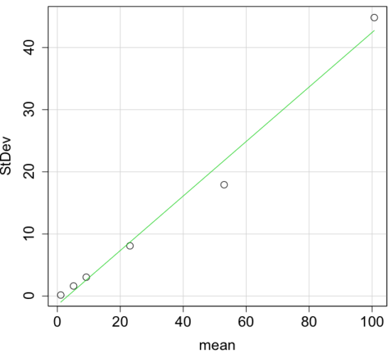
Figure 4. Scatter plot of the standard deviation (StDev) by the mean. Data sets were simulated.
The data presented in the Figure 4 graph were simulated. Is this bias, a correlation between mean and standard deviation, something you’d see in “real” data? Here’s a plot of height in inches at withers for dog breeds (Fig 5). A line is drawn (ordinary linear regression, see Chapter 17) and as you can see, as the mean increases, the variability as indicated by the standard deviation also increases.
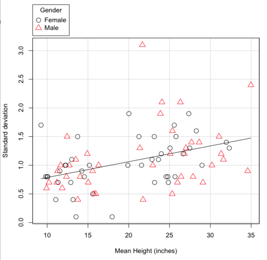
Figure 5. Plot of the standard deviation by the mean for heights of different breeds of dogs.
So, to compare variability estimates among groups when the means also vary, we need a new statistic, the coefficient of variation, abbreviated CV (Pearson 1896). The coefficient of variation is also known as the relative standard deviation, RSD. Many statistics textbooks not aimed at biologists do not provide this estimator (eg, check your statistics book).

This is simply the standard deviation of the sample divided by the sample mean, then multiplied by 100 to give a percent. The CV is useful when comparing the distributions of different types of data with different means.
Many times, the standard deviation of a distribution will be associated with the mean of the data.
Example. The standard deviation in height of elephants will be larger on the centimeter scale than the standard deviation of the height of mice. However, the amount of variability RELATIVE to the mean may be similar between elephants and mice. The CV might indicate that the relative variability of the two organisms is the same.
The standard deviation will also be influenced by the scale of measurement. If you measure on the mm scale versus the meter scale the magnitude of the SD will change. However, the CV will be the same!
By dividing the standard deviation by the mean you remove the measurement scale dependence of the standard deviation and generally, you also remove the relationship of the standard deviation with the mean. Therefore, CV is useful when comparing the variability of the data from distributions with different means.
One disadvantage is that the CV is only useful for ratio scale data (ie, those with a true zero).
The coefficient of variation is also one of the statistics useful for describing the precision of a measurement. See Chapter 3.4 Estimating parameters.
Standard error of the mean (SEM).
All estimates should be accompanied by a statistic that describes the accuracy of the measure. Combined with the confidence interval (Chapter 3.4), one such statistic is called the standard error of the mean, or SEM for short. For the error associated with calculation of our sample mean, it is defined as the sample standard deviation divided by the square root of n, the sample size.
sem → 
The concept of error for estimates is a crucial concept. All estimates are made with error and for many statistics, a calculation is available to estimate the error (see Chapter 3.4).
Although related to each other, the concepts of sample standard deviation and sample standard error have distinct interpretations in statistics. The standard deviation quantifies the amount of variation of observations from the mean, while the standard error quantifies the difference between the sample mean and the population mean. The standard error will always be smaller than the standard deviation and is best left for reporting accuracy of a measure and statistical inference rather than description.
Questions.
- For a sample data set like
myY <- c(1,1,3,6), you should now be able to calculate, by hand, the
• range
• mean
• median
• mode
• standard deviation
• coefficient of variation - For our example data set,
myX <- c(4,4,4,4,5,6,6,6,7,7,8,8,8,8,8)calculate
• IQR
• sample standard deviation, s
• coefficient of variation - Use the
sample()command in R to draw samples of size 4, 8, and 12 from your example data set stored inmyX. Repeat the calculations from question 4. For examplex4 <- sample(x,4)will randomly select four observations from x, and will store it in the object x4, like so (your numbers probably will differ!)x4 <- sample(x,4); x4 [1] 8 6 8 6 - Repeat the exercise in question 4 again using different samples of 4, 8, and 12. For example, when I repeat sample(
x,4) a second time I getsample(x,4) [1] 8 4 8 6 - For Table 1, determine how many multiples of the standard deviation for observations greater than 95-percentile (eg, determine the observation value for a person who is in the 95-percentile for Height in the different decades, etc.
- Calculate the sample range, IQR, sample standard deviation, and coefficient of variation for the following data sets
• Height in inches of mothers,mom <- c(67, 66.5, 64, 58.5, 68, 66.5) #(data from GaltonFamilies in R package HistData)
and fathers,dad <- c(78.5, 75.5, 75, 75, 74, 74) #(data from GaltonFamilies in R package HistData)
• Carbon dioxide (CO2) readings from Mauna Loa for the month of December for
years <-c (1960, 1965, 1970, 1975, 1980, 1985, 1990, 1995, 2000, 2005, 2010, 2015, 2020)years <-c (1960, 1965, 1970, 1975, 1980, 1985, 1990, 1995, 2000, 2005, 2010, 2015, 2020) #obviously, do not calculate statistics on years; you can use to make a plotco2 <- c(316.19, 319.42, 325.13, 330.62, 338.29, 346.12, 354.41, 360.82, 396.83, 380.31, 389.99, 402.06, 414.26) #(data from Dr. Pieter Tans, NOAA/GML (gml.noaa.gov/ccgg/trends/) and Dr. Ralph Keeling, Scripps Institution of Oceanography (scrippsco2.ucsd.edu/))
• Body mass of Rhinella marina (formerly Bufo marinus) (see Fig. 1),bufo <- c(71.3, 71.4, 74.1, 85.4, 85.4, 86.6, 97.4, 99.6, 107, 115.7, 135.7, 156.2)
Quiz – Chapter 3.3
Measures of dispersion
Chapter 3 contents
3.2 – Measures of Central Tendency
- Introduction to summary statistics.
- Other “means”.
- How to calculate these other means.
- Do try on your own!.
- Other measures of central tendency.
- Why the median may be a better middle than the mean.
- Scaling and transformation of data.
- R operators.
- Creating objects in R.
- R code calculate central tendency.
- There’s an R package for that.
- Use aggregate() to calculate summary statistics by group.
- Questions.
- Quiz.
- Chapter 3 contents .
Introduction to summary statistics.
For a sample of observations we can begin the summary by identifying the “typical” value. Various statistics are used to describe the middle and collectively these are referred to as measures of central tendency. The mean, the median, and the mode are the most common measures of central tendency. In the situation in which we work with data from a population census, we would calculate population descriptive statistics — not inferential statistics; because we more often work with samples from populations, we report sample descriptive statistics.
First we review the familiar arithmetic mean and introduce the weighted mean. Next we introduce “other means,” which you may not be as familiar with.
Means.
There are several means beyond the simple arithmetic average or mean. Here we review a few. We use this topic also to start introducing standard notation we will use throughout the book.
The population mean, μ (pronounced “mu”) is given by
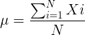
Xi, an observation on the i-th individual
Σ, or “sigma,” which instructs you to add them up (the X’s), from i = 1 (the first observation) to i = N (the last observation).
The sample mean, , pronounced “eks bar,” of a collection of observations is given by
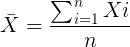
Note 1: Parameters (aka random variables) get Greek letters and sample variables get Roman letters. See Chapter 3.4
Weighted arithmetic mean.
In some cases you may have several samples from the same population. If the sample sizes are the same, you can calculate the average of averages without any fuss — just take all of the sample means and add them up, then divide by the total number of samples. If the sample sizes differ, then you needs to weight (W) each sample mean by its sample size. Simply divide each sample mean by its appropriate sample size, then add all of these up. That is the weighted average.
More generally, we can write

For example, consider a variable containing the following observations, for example, over the course of watching birds gathering at a drinking source (eg, recorded over 20 days, a single 5 minute interval per day), we can count how many times zero, one, two, etc birds are observed.
Table 1. A sample of counts of observations, eg, how many birds
| Observation | Frequency |
|---|---|
| 1 | 0 |
| 2 | 0 |
| 3 | 2 |
| 4 | 4 |
| 5 | 2 |
| 6 | 3 |
| 7 | 2 |
| 8 | 3 |
| 9 | 1 |
The observation “4” was observed four times; the observation “5” was observed twice, and so on for a total of 15 observations.
What is the arithmetic mean of these 15 observations? To solve this, well, you have a couple of choices. You could copy the numbers down as often as they appear and then calculate the mean in the usual way.
Other “means”.
The arithmetic average (illustrated above) is not the only way to estimate the mean.
The trimmed mean, also called the truncated mean, is a useful approach when data is widely dispersed — data spread away from the middle (see Chapter 3.3). Thus, the trimmed mean will be less influenced compared to the arithmetic mean by outlier data points, ie, data far from other data points in the set.
You would use the trimmed mean to describe the middle of a data set in which a plot shows most of the values are clumped together around a middle – and yet you see a few values that are much smaller or much greater. A specified percentage of the smallest and largest values are removed from the data set and then the simple arithmetic mean is calculated for the trimmed data set. For example, given a data set of daily rainfall for different cities, you might wish to remove the driest 5% and wettest 5% of the days in order to better compare the rainfall trends for the cities.
Calculating the trimmed mean is straight-forward in R: use the same built-in function, mean(), but add some options.
Note 2: This is a good time to remind you how to get help with R commands. Do you recall how to get help in R?
At the R prompt type
help(mean) or
?mean
The R Documentation page for mean() will pop up (assuming you allowed R to install help pages as html). Figure 1 shows a screenshot of a portion of the help page for mean()
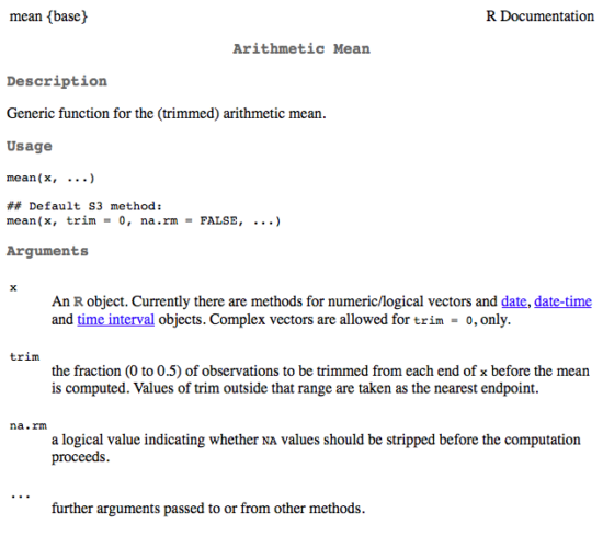
Figure 1. A portion of the R help page about the function mean.
From the help page (Fig 1) we can see that we can specify a trimmed mean by adding options to the mean(x, ...) command. For our x variable defined above, get the trimmed mean after 25% of the data are removed.
mean(x, trim=0.25)[1] 6From the help page we see that the only required option you need to feed the mean command is the name of the variable, in this case, “x” (it can be, of course, any name provided the data are attached). In this case we removed 25% of the values – 12.5% of the smallest values and 12.5% of the largest values – that’s also called the interquartile mean. We use a dot plot to show these trends (Fig 2).
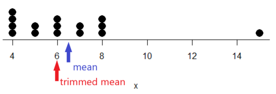
Figure 2. Dot plot of our x variable with locations of the mean (blue) and the trimmed mean (red). The Dotplot(x) function in package RcmdrMisc was used in Rcmdr to make this graphic. Arrows were added by hand. Dotplot() example code presented in Chapter 3.4.
If we recalculate a trimmed mean after dropping 10% of the points, or even 40% of the points, we get the same mean value of 6. The trimmed mean is an example of a robust estimator; it’s resistant to the influence of outliers.
Another useful descriptor of the middle is the geometric mean. The geometric mean is useful for calculating the average of ratios. Geometric mean would be used when you want to compare central tendency for different variables, each differing in scale. For example, gene expression results, reported as fold-changes, for different genes often shows tremendous differences among genes and would be best described by logarithmic scale, not arithmetic scale. Geometric mean expression values would be better choice for central tendency. Other examples are found in economics: for example, calculating compound interest or interest. The geometric mean applies whenever the scale is multiplicative and not additive
The geometric mean is given by the equation

The geometric mean (gm) is equivalent to log-transforming your data, then calculating the arithmetic mean, and transforming the result back (with the antilog exponent.) As you recall, for our simple data set the arithmetic mean was 6.2. The geometric mean for this data was 5.977. Taking the natural log for each of the values from our simple data set, then calculating the arithmetic mean we have 1.788.
The antilog of this value is
exp(1.788)[1] 5.977Another frequently encountered mean is the harmonic mean, which is defined by the equation

Harmonic mean is appropriate for averaging rates. For example, what is the average speed traveled if you travel 30 miles per hour (mph) between point A and B, then on the return trip, your speed was 40 mph? If you think (30 + 40)/2 = 35 mph, then this would be incorrect — after all, the distance covered has not changed, just the time. The harmonic mean returns 34.2 mph. Let
y = c(30,40)The harmonic mean returns 34.2 mph ( see below “How to calculate these other means”)
Both harmonic and geometric means apply for values greater than zero.
How to calculate these “other” means.
In Microsoft Excel, calculate geometric mean via the function GEOMEAN(); calculate harmonic mean via the function HARMEAN().
The base R (and Rcmdr) doesn’t have built in functions for these, although you could download and install some R packages which do (eg, package psych, geometric.mean(variable), harmonic.mean(variable)). It is quicker to just to calculate these by submitting a snippet of code into the script window
For geometric mean of variable “x” at the R prompt type
exp(mean(log(x)))For harmonic mean of variable “x” at the R prompt type
1/mean(1/x)where is the base of the natural logarithm, Euler’s number, and log is the natural logarithm (in R, to get log to other bases you can use log10 for base 10 logarithm or log2 for base 2 logarithm, or log(x, base = n) for any base n of the variable x, and variable is the name of the variable you wish to do the calculations on.
R code: Do try on your own!
Here’s some numbers to try your hand. For example, create a variable containing a few numbers, any numbers. and write it to the variable named z
myZ = c(3,4,6,7,9,11,4)Now, calculate the arithmetic mean, the geometric mean, and the harmonic mean for the variable myZ. You should get Table 4.2)}
Table 2. Comparison of different means for myZ.
| mean | value |
|---|---|
| Arithmetic | 6.285714 |
| Geometric | 5.716403 |
| Harmonic | 5.204936 |
Try three more. In R (or R Commander script window), create three new variables.
varA = c(3,3,3,3)varB = c(1,2,3,12)varC = c(-3,0,1,3)Now, calculate the arithmetic mean, geometric mean, and harmonic mean for each variable.
For the simple arithmetic mean
mean(varA)For the geometric mean, use the formula above
exp(mean(log(varA)))For the harmonic mean, use the formula above
1/mean(1/varA)What did you get?
Other measures of central tendency
Median
The median, which lacks an accepted notation — we’ll go with  , divides a set of observed numbers into two equal halves. Half the observations are above the median, half of the observations are below the median. Arrange data from lowest to highest, take the middle measurement:

odd number of measurements minus the middle value minus even number of measurements minus average of the 2 middle values

Or, more succinctly, we have
![\begin{align*}Med(X) = \left\{\begin{matrix} X\left [ \frac{n+1}{n} \right ] & if \ n \ is \ odd\\ \frac{X\frac{n}{2}+X\frac{n}{2}+1}{2} & if \ n \ is \ even \end{matrix}\right. \end{align*}](https://biostatistics.letgen.org/wp-content/ql-cache/quicklatex.com-9a1a58dc16fffb57b1de96b28c65f0dc_l3.png "Rendered by QuickLaTeX.com")
To get the median in R type at the R prompt
median(variable)and of course, replace variable with the name of the variable containing the numbers. For our x variable created earlier, the function median returns in R
[1] 6[Note that the median for x was the same as the trimmed mean for x, which is consistent with with our view that the trimmed mean is a robust estimator of the middle of a data set.
Mode
Mode is another way to express the middle and it refers to the most frequent occurring measurement. Use of mode makes most sense for discrete or countable numbers. For a normal distribution, the mean, median and mode will be the same value. Note that a data set may have more than one mode. For example, what is the mode for the variable we created earlier?
myX = c(4,4,4,4,5,5,6,6,6,7,7,8,8,8,15)For this small data set we see that “4” is the most frequent with a count of four occurrences in the set.
Mode would seem like a straightforward function in R. However, it turns out there is not a mode function in the base package.
A little explanation is in order. In R, typing mode at the R prompt like so
mode(myX)returns
[1] "numeric" Not the answer we were expecting. In R, mode command is used to tell you what the mode (ie, way or manner in which some task is accomplished) of storage is for the variables.
In order to get the statistical mode we want, we either hunt down a package that contains mode estimation (eg, install the package DescTools use the Mode function — see below), or we can write a little code.
Note 3: A reminder — what we are attempting is to estimate a statistic. DescTools includes about 80 different statistics functions, including functions to calculate every statistic described in this chapter, chapter 3.3, and most other chapters in this book.
A quick Google search found a number of answers at stackoverflow.com (eg, question 2547402). The simplest response was to use names and max commands like so
temp = table(as.vector(myX))names (temp)[temp==max(temp)]Why the median may be a better middle than the mean
Comparing the two measures of central tendency can tell you without plotting how your data are distributed about the middle. Sample distributions are discussed in Chapter 6.
- When the distribution of the data is symmetric or normally distributed (discussed in Chapter 6.7) then the mean and the median will be about the same value
- When data are right-skewed (a few large values), then the mean will be greater than the median.
- When the data are left-skewed (a few small values), then the mean will be less than the median.
Here’s an illustration (Fig 3). I sampled 100 points from a random normal distribution with mean zero and standard deviation 0ne and another 100 points from a log-normal distribution also with mean zero and standard deviation one. In Figure 3, the histograms (see Chapter 4.2 – Histograms), along with summary statistics (see Note 4). Means are indicated with red arrows and medians are indicated with blue arrows.
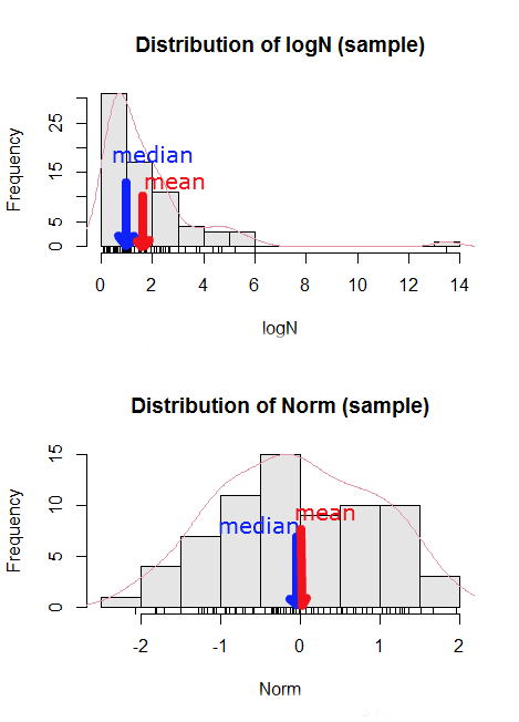
Figure 3. Normal and lognormal distributions with mean (red) and median (blue) noted for comparison.
So the median is a better descriptor or the central tendency of a sample distribution when the distribution is NOT normally distributed.
Note 4: “Summary statistics” refers to reporting of one or more descriptive statistics on a data set. The mean, median, standard deviation, range are common reported statistics. R Commander provides a menu to select from descriptive statistics, returning a table of the estimates. Rcmdr: Statistics → Summaries → Numerical summaries…
Scaling and transformation of data
Sometimes it is useful to standardize your data so that the variables all have the same scale. One algorithm for standardization is called normalization. Normalization implies that you correct the data so that data has a mean, μ, of zero, and a standard deviation, σ, of 1 (unit variance). There are several ways to standardize, each with strengths and limitations. To normalize we use the Z-score equation (see Chapter 6.7 for other uses of Z score).

where Xi is each observation in your data set.
Normalization will make outliers, the few points in a data set that are noticeably different from the central tendency of the rest of the data, smaller and less influential. When you normalize multiple sets of data, then each will have the same mean (0) and variance (unit variance), but the ranges will differ. An example of this is the simple product moment correlation — by standardizing you change the variances for the different variables to have the same unit variance.
As we will see later in class it is also useful to expand or contract the variability of the data or to change the shape of the distribution (if the data is not normally distributed). For example, if you compare individuals of a population for many morphological traits (eg body size, growth rate), the spread of points (called a distribution) will look more like a Poisson distribution (not symmetrical about the mean, a few individuals may be much larger…). This is partly due to the way in which morphological traits are measured. We normally measure body size on a linear scale (inches or centimeters). However, body size is affected by physiological processes that are more related to volume. Therefore, the more appropriate scale of measurement is on a log scale. We can transform the data measured on a linear scale to a log scale. For morphological traits this can produce a distribution that is normally distributed (bell shape). There are many more statistical procedures for data that is normally distributed than there are statistical procedures for Poisson distributions or any other type of distribution. Additional discussion about data transformation is introduced in Chapter 13.3.
You can always uncode or unstandardize your data after performing the statistical procedures and return to the original scale. In fact, when reporting descriptive statistics you should report the untransformed, uncoded data. Moreover, you will find it useful to report means adjusted for other variables (eg, from ANOVA or regression); if the ANOVA or regression equations are performed on transformed or coded data you would want to back calculate to the original scale after applying the ANOVA or regression adjustments. This advise will make more sense after we’ve discussed ANOVA (Chapter 12) and linear regression (Chapter 17).
R operators
The names command can be used to retrieve the names contained in the variable (if text types) or to set the names of the observations, which is what we are using it for here. We set the numbers to text names “4”, “5”, etc. then find the maximum count of named items in the temp table. The double equals operator (==) is used to tell R to find the object that is “equal to” something we specify, in this case, the max value (R Language Definition 2014). Table 3 shows common operators in R.
Table 3. Common arithmetic* and comparison** operators
| Operator | Description |
|---|---|
| ? | help |
| + | plus |
| - | minus |
| * | multiply |
| / | divide |
| : | series |
| > | greater than |
| < | less than |
| >= | greater than or equal to |
| <= | less than or equal to |
| = | left assignment |
| <- | left assignment |
== | equal to |
** To list and get help with use of comparison operators enter at the R prompt
help(Arithmetic)
help(Comparison)
The R package modeest has a number of algorithms for calculating the mode, depending on the kind of data you are working with. After installing the package and its dependencies, type at the R prompt
require(modeest)
mfv(myX)
[1] 4
Creating objects in R
Everything in R is an object (Chambers 2008). We provide many worked examples in Part 07. Working with your own data – Mike’s Workbook for Biostatistics. In brief, create a variable in R by assigning the vector x, either directly at the R prompt or in a script window (Rcmdr, RStudio), like so
myX = c(4,4,4,4,5,5,6,6,6,7,7,8,8,8,15)
The function c(), which stands for combine is used to combine the set of numbers into the object, myX. For small sets like this you may find it convenient to enter the values one by one and let R store it into the vector for you. For R installed on your computer, use the scan() function and your keyboard — scan() doesn’t work consistently in serverless R instances (eg., Google CoLab). Careful! Make sure that you remember to assign the results from scan to a vector.
I’ll create the object tryScan just to distinguish it from x, although I will enter the same values. Until R receives an interrupt signal from you, it will prompt you to enter numbers one row at a time. When you’ve reached the end, use the keyboard shortcut Ctrl + q (Windows) or Cmd + q (macOS) to interrupt keyboard input.
tryScan = scan()
1: 4
2: 4
3: 4
4: 4
5: 5
6: 5
7: 6
8: 6
9: 6
10: 7
11: 7
12: 8
13: 8
14: 8
15: 15
Read 15 items
tryScan
 [1] 4 4 4 4 5 5 6 6 6 7 7 8 8 8 15
The function tryScan is a very useful command, with many options, and can be used for more than keyboard entry. For example, you can paste from your computer’s clipboard a column of numbers from your spreadsheet.
R code calculate central tendency
Once we have the vectormyX, calculate the mean by entering at the R prompt
mean(myX)
and you should get the answer of 6.466667
And of course, you don’t type in the R prompt >, right?
Or, for the better option, create two variables, one containing the list of observed numbers and the second that contains the frequency for each observed number in the series. You would then use the command for weighted mean.
myY = c(4,5,6,7,8,15)
myW = c(4/15, 1/15, 3/15, 2/15, 4/15, 1/15)
Note — you can check that the frequencies sum to 1 by using the sum command like so
sum(myW)
For the weighted mean, the command is
weighted.mean(myY,myW)
and, the answer returned is 6.466667, the same as before.
There’s an R package for that.
We list code examples for all of the statistics described on this page, but as you can imagine, there are packages that include these and other useful functions, or “wrapper functions” that make writing code easier in R. A good example is the DescTools package. One advantage of using a package like DescTools is that it cuts through the need to remember specific commands for basic data exploration. For example, just call the Desc() function to yield several measures of central tendency and dispersion (see Chapter 3.3).
The R code and output follows, along with a plot (Fig 4). The mean and median are highlighted in orange.
Desc(myX)
────────────────────────────────────────────────────────────────────────────────
myX (numeric)

length      n   NAs unique   0s  mean meanCI'
    15     15     0      6    0  6.47    4.92
       100.0%  0.0%        0.0%          8.02

   .05    .10   .25 median  .75   .90     .95
  4.00   4.00  4.50   6.00 7.50  8.00   10.10

range      sd vcoef    mad  IQR  skew    kurt
11.00    2.80  0.43   2.97 3.00  1.72    2.94

  value freq   perc cumfreq cumperc
1     4    4  26.7%       4   26.7%
2     5    2  13.3%       6   40.0%
3     6    3  20.0%       9   60.0%
4     7    2  13.3%      11   73.3%
5     8    3  20.0%      14   93.3%
6    15    1   6.7%      15  100.0%

' 95%-CI (classic)

Figure 4. Histogram, box plot, and cumulative distribution function plot generated by default by Desc() call.
Lots of output! This is a good example of how to explore data — describe the middle (eg, mean and median), but also the variability about the middle (eg, range, standard deviation — sd, mean absolute deviation — mad, coefficient of variation — vcoef), and distribution shape (quantiles — 0.05, 0.25 etc, kurt, skew). The plots — histogram, box plot, and cumulative distribution plots — are explained in Chapter 4.
Use aggregate() to calculate summary statistics by group.
So far, all code presumes need to calculate descriptive statistics one vector at a time. In general, we need summary statistics for more than one group or strata. For example, we may ask, what are the average body temperature readings measured by IR device on different body areas from several subjects (question 8a, Homework 2A: Descriptive statistics in Mike’s Workbook for Biostatistics).
The aggregate() function in R simplifies calculating means by groups by providing a concise and efficient way to apply a summary function (like mean()) to a variable, grouped by one or more other variables. The format for aggregate is
aggregate(x = variable_to_aggregate ~ grouping_variable, FUN = mean, data = your_dataframe)
Questio8a had two levels of body regions, “Forehead” and “Throat.” Assuming the variable is named bodyTemp and the grouping variable is called bodyGroup and stored in the attached data.frame question08a, then the following R code provides the requested summary statistics by groups.
aggregate(bodyTemp ~ bodyGroup, data = question08a,
function(x) c(mean = mean(x)))
Additional statistics can be requested by adding one after the other following mean(x), eg, median = median(x).
Note 5: aggregate() is part of the base R installation. Additional functions are available, including dplyr and data.table packages, which the user is encouraged to explore!
The advantage of use of R Commander, it’s easy to get multiple statistics by groups by following the drop down menus, beginning with Statistics > Summaries > Table of statistics… (Fig 5).

Figure 5. Screenshot R Commander, summary statistics by group.
Questions
- Find the help page in R for the median function. How does the function handle missing values?
- For a simple data set like the following
myY <- c(1,1,3,6)you should now be able to calculate, by hand, the
• mean • median • mode - If the observations for a ratio scale variable are normally (symmetrically) distributed, which statistic of central tendency is best (eg, less sensitive to outlier values)?
- In the
names()command, what do you think the result will be if you replacemaxin the command withmin? - If data are right skewed, what will be the order of the mean, median, and mode?
- Body mass of Rhinella marina (formerly Bufo marinus, Fig 6),
bufo <- c(71.3, 71.4, 74.1, 85.4, 85.4, 86.6, 97.4, 99.6, 107, 115.7, 135.7, 156.2)

Figure 6. Female Rhinella marina (formerly Bufo marinus), Chaminade University campus. Body length 23.5 cm. Click image to view full sized image.
- Under what circumstances is it appropriate to transform raw data?
- What does “standardize” or “normalize” imply as actions to take with data?
Quiz Chapter 3.2
Measures of Central Tendency
Chapter 3 contents
- Exploring data
- Data types
- Measures of Central Tendency
- Measures of dispersion
- Estimating parameters
- Statistics of error
- References and suggested readings
1.1 – A quick look at R and R Commander
A first look at R.
R is a programming language for statistical computing (Venables et al 2009). R is an interpreted language — when you run (execute) an R program — the R interpreter intercepts and runs the code immediately through its command-line interface, one line at time. Python is another popular interpreted language common in data science. Interpreted languages are in contrast to compiled languages, like C++ and Rust, where program code is sent to a compiler to a machine language application. R is free to use and available via many platforms, from local installations on a person’s laptop to running on cloud servers (Fig 1). 
Figure 1. Choose how you will interact with R: on your computer (Blue box) or in the cloud (Red box). Users of Linux, macOS, and WinPC can either install R to their computer or choose to access R in the cloud (and/or, black arrow).
Before you begin, you have a choice: how do you want to work with R (Fig 1)? In part, the choice depends on your computing device. If you have a desktop or laptop computer, running Linux, Apple macOS, or Microsoft Windows, then R can be installed onto your computer (blue box, Fig 1). If, however, you have a ChromeBook, Apple iPad or iPhone, or any Android Tablet or Smartphone, you would go with the second option (red box, Fig 1).
For those going with installing R to their computer, the second choice is to pick the environment for creating and running scripts and managing file input and output during a session. Working environments for R in the cloud include RStudio and Jupyter Notebooks (eg, Google CoLab) (red box, Fig 1 — see Note 2 below). For installed R, two suggested environments are R Commander and RStudio, an Integrated Development Environment or IDE, RStudio (Fig 1). The choice depends on your needs — an IDE is helpful when you plan to write a lot of code, it’s a comprehensive programming environment, which includes many tools that support writing code from scratch.
For our course at Chaminade University, I recommend R Commander because of the drop-down menu approach to accessing statistical functions in R; R Commander is not a comprehensive environment, but it provides the necessary scripting window along with access to markdown editing. R Commander, Rcmdr, is an R package that provide a graphical user interface or GUI for R. It is based on the tcltk package. R must be installed first before installing the R Commander package. R Commander provides familiar menu functions, like many commercial statistical software. R Commander, like the IDE RStudio, is not necessary for R programming or conducting statistical analysis or even generating reports via markdown. R Commander, however, shrinks the learning curve with R programming basics so that students can focus on learning statistics, which is the chief objective of the Biostatistics course at Chaminade.
The following steps user through use of R and R Commander, from installation to writing and running commands. Mike’s Workbook for Biostatistics has a ten-part tutorial, A quick look at R and R Commander, which I recommend.
Note 1: Getting started? By all means rely on Mike’s Biostatistics Book (Appendix: Install R, Install R Commander, Use R in the cloud) and blogs or other online tutorials to point you in the right direction. You’ll also find many free and online books that may provide the right voice to get you working with R. However, the best way to learn is to go to the source. The R team has provided extensive documentation, all included as part of your installation of R. In R, run the command RShowDoc("doc name"). replace doc name with the name of the R manual or R user guide. For example, the Venables publication is accessed as RShowDoc("R-intro"). Similarly, the manual for installation is RShowDoc("R-admin") and the manual for R data import/export is RShowDoc("R-data").
Install R.
.
Full installation instructions are available at Install R, and for the R Commander package, at Install R Commander. Here, we provide a brief overview of the installation process.
Note 2: The instructions at Mike’s Biostatistics Book assume use of R on a personal computer running updated Microsoft Windows or Apple macOS operating systems. For Linux instructions, eg, Ubuntu distro, see How to install R on Ubuntu 22.04. For Chromebook users, if you can install a Linux subsystem, then you can also install and run R although it’s not a trivial installation. For instructions to install R see Levi’s excellent write up at levente.littvay.hu/chromebook/. (This works best with Intel-based CPUs — see my initial attempts with an inexpensive Chromebook at Install R.)
Another option is to run R in the cloud via service like Google’s Colab or CoCalc hosted by SageMath. Both support Jupyter Notebooks, a “web-based interactive computational environment.” Neither cloud-based service supports use of R Commander (because R Commander interacts with your local hardware). Colab is the route I’d choose if I don’t have access to a local installation of R. See Use R in the cloud for more details.
Download a copy of the R installation file appropriate for your computer from one of the Comprehensive R Archive Network (CRAN) mirror site of the r-project.org. For Hawaii, the most convenient mirror site is provided by the folks at RStudio (https://cloud.r-project.org/. In brief, Windows 11 users download and install the base distribution. MacOS users must first download and install XQuartz (https://Xquartz.org), which provides the X Window System needed by R’s GUI (graphic user interface). Once XQuartz is installed, proceed to install R to your computer. MacOS users — don’t forget to drag the R.app to your Applications folder!
Start R.
.
The following is a minimal look at how to use R and R Commander. Please refer to tutorials at Mike’s Workbook for Biostatistics (R work, part 1 – 10) to learn use of R and R Commander.
We’re just getting started, so the next thing to learn is how to set your working environment for your R sessions. Although we’ll discuss the R environment more as we proceed, it’s a good idea to start with a best practice action common in data science — always create and work from a working folder. This can be a local folder on your computer or pointed to a folder in your cloud storage. On my mac I usually create a folder on the desktop, example BI-311, and point to that as my working folder for a project. Now, we need to point R to use the working folder — we do this at start of each R session (or modify some code R needs during start up to always point to the folder — for now, we leave that for a later exercise).
Once R is installed on your computer, start R as you would any program on your computer. For example, the icon for the R.app as it appears in the dock on a MacBook is shown in Figure 2.

Figure 2. R.app icon shown on a MacBook dock.
To point R to our working folder, there are several options. For now, we’ll go with writing and submitting a simple function in R. Recall that R has a command-line. The R prompt appears on the command line in the RGUI as the greater-than typographical symbol “>” at the beginning of a line (Fig 2). The prompt is returned by R to indicate the interpreter is ready to accept the next line of code.
First, discover where R is pointing to by submitting (type the command exactly as written then select keyboard shortcuts on Windows enter, or on macOS return key) the function getwd() at the prompt.
Note 3: Unfamiliar with keyboard shortcuts? I created a page just for you at Keyboard shortcuts in Mike’s Workbook for Biostatistics.
Ready to
On my MacBook, R returns
> getwd()
[1] "/Users/[username]/Documents"
To point to my working folder, I submit setwd("/Users/[username]/Desktop/BI311". When I run getwd() again, R returns the update
> getwd()
[1] "/Users/[username]/Desktop/BI311"
Note 4: Windows users will recognize that, unlike macOS and Linux, they will need to write paths with the backslash, not the forward slash. This is discussed further in Mike’s Workbook.
[username] is just a placeholder here — no reason to share my actual user name!
Ready to do some work?
R coding practices in this book and in the companion workbook roughly follow guidance outlined in a September 2018 R-Bloggers post, “R Code — Best practices,” by The R Trader. Of note, naming conventions: variables are nouns, variable names are written in lowerCamelCase; functions are verbs, function names are period separated, eg, my.function; script file names all end with .R and are written snake_case.R. Comments, preceded by # and a single space, eg, # A brief comment, are sparingly included in code, but reserved for explanatory sentences in the text. We use <- and not = for assignment statements.
Where discussion requires reference to instructions on use of the R programming language, R code (instructions) the user needs to enter at the R prompt are shown in code blocks.
Courier New font within a “code block.”Until you write your own functions, the general idea is, you enter one set of commands at a time, one line at a time. For example, to create a new variable, curryPoints, containing points scored by the NBA’s Steph Curry during the 2016 playoffs, type the following code at the R prompt (displayed as >, the “greater than” sign)
curryPoints <- c(24,6,40,29,26,28,24,19,31,31,11,18,19).
and to obtain the mean, or arithmetic average, for curryPoints at the R prompt type and enter
.
mean(curryPoints).
Output from R function mean will look like the following
.
[1] 24.42857.
Functions in R, or any other data science programming language, are intended to automate a task.
Note 5: A good data management habit — store the variable as an R object called a data.frame.
df.curryPoints <- data.frame(curryPoints)
The R prompt appears in the RGUI as the greater-than typographical symbol “>” at the beginning of a line (Fig 3). The prompt is returned by R to indicate the interpreter is ready to accept the next line of code.
![Screenshot of the R GUI on a macOS system; red arrow points to the R prompt. The visible code reads curry.points and some numbers between parentheses, next line calls for the mean of the object, and the last line begins with [1] and the result.](https://biostatistics.letgen.org/wp-content/uploads/2020/09/RGUI_prompt.png "Figure 1. The R GUI on a macOS system; red arrow points to the R prompt.")
Figure 3. The R GUI on a macOS system; red arrow points to the R prompt.
Note 6: We just demonstrated one of several ways data can be brought into an R session, by creating a data.frame directly from a vector. Other methods include
- Reading a text file from your computer, eg, CSV, by
read.csv() - Importing a spreadsheet (Excel file) from your computer
using readxl::read_excel() - Entering small datasets directly using
read.table()with thetext= argument
Everything that exists is an object.
.
A brief programmer’s note — John M. Chambers, creator of the S programming language and a member of the R-project team, once wrote that sub-header phrase about R and objects. What that means for us: programming objects can be a combination of variables, functions, and data structures. During an R session the user creates and uses objects. The ls() function is a useful R command to list objects in memory. If you have been following along with your own installed R app, then how many objects are currently available in your session of R? Answer by submitting ls(). Hint: the answer should be one object.
A routine task during analysis is to calculate an estimate then use the result in subsequent work. For example, instead of simply printing the result of mean(curryPoints), we can assign the result to an object.
myResult <- mean(curryPoints)
.
To confirm the new object was created, try ls() again. And, of course, there’s no particular reason to use the object name, myResult, I provided! Like any programming language, creating good object names will make your code easier to understand.
When you submit the above code, R returns the prompt, and the result of the function call is not displayed. View the result by submitting the object’s name at the R prompt, in this case, myResult. Alternatively, a simple trick is to string commands on the same line by adding ; (semicolon) at the end of the first command. For example,
myResult <- mean(curryRoints); myResult
.
Objects created during an R session, like curryPoints, are stored in memory within the Global Environment. To remove an object, use the command rm(myVariable). Why remove objects during an R session? If you are attempting multiple tasks in a homework assignment, removing unneeded objects helps maintain a clean and organized workspace, improving code readability and reducing the chance of accidental errors.
Write your code as script.
.
While it is possible to submit code one line at a time, a much better approach is to create and manage code in a script file. A script file is just a text file with one command per line, but potentially containing many lines of code. Script files help automate R sessions. Once the code is ready, the user submits code to R from the script file.
Note 7: Working with scripts eliminates the R prompt, but code is still interpreted one line at a time. The user does not type the prompt in a script file.
Figure 4 shows how to create a new script file via the RGUI menu: File → New script.

Figure 4. Screenshot of drop down menu RGUI, create new script, Windows 11.
The default text editor opens (Fig 5).

Figure 5. Screenshot of portion of R Script editor, Windows 11. A simple R command is visible.
Submit code by placing cursor at start of the code or, if code consists of multiple lines, select all of the code, then hit keyboard keys Ctrl + R (Windows 11) or for macOS, Cmd + Enter.
I recommend starting with a clean environment, by using rm(list = ls()) at the beginning of a script.
By default, save R script files for reuse with the file extension .R, eg, my_script.R. Because the scripts are just text files you can use other editors that may make coding more enjoyable (see RStudio in particular, but there are many alternatives, some free to use. A good alternative is ESS).
Install R Commander package.
.
By now, you have installed the base package of the R statistical programming language (see for detailed instructions). The base package contains all of the components you would need to create and run data analysis and statistics on sets of data. However, you would quickly run into the need to develop functions, to write your own programs to facilitate your work. One of the great things about R is that a large community of programmers have written and contributed their own code; chances are high that someone has already written a function you would need. These functions are submitted in the form of packages. Throughout the semester we will install several R packages to extend R capabilities. R packages discussed in this book are listed at R packages of the Appendix.
Our first package to install is R Commander, Rcmdr for short. R Commander is a package that adds function to R; it provides a familiar point-and-click interface to R, which allows the user to access functions via a drop-down menu system (Fox 2017). Thus, instead of writing code to run a statistical test, Rcmdr provides a simple menu driven approach to help students select and apply the correct statistical test. R Commander also provides access to Rmarkdown and a menu approach to rendering reports.
install.packages("Rcmdr")
.
In addition, download and install the plugin
install.packages("RcmdrMisc")
See Install R Commander for detailed installation instructions.
Note 8: Plugins are additional software which add function to an existing application.
Start R Commander.
.
After installing Rcmdr, to start R Commander, type library(Rcmdr) at the R prompt and enter to load the library
library(Rcmdr).
On first run of R Commander you may see instructions for installing additional packages needed by R Commander. Accept the defaults and proceed to complete the installation of R Commander. Next time you start R commander the start up will be much faster since the additional packages needed by R Commander will already be present on your computer.
Note that you don’t type the R prompt and, indeed, in R Commander Script window you won’t see the prompt (Fig 6). Instead, you enter code in the R Script window, then click “Submit” button (or Win11: Ctrl+R or for macOS: Cmd+Enter), to send the command to the R interpreter. Results are sent to Output window (Fig 6).
 Rcmdr ver. 2.4-4.")
Figure 6. The windows of R Commander, macOS. From bottom to top: Messages, Output, Script (tab, Markdown) Rcmdr ver. 2.4-4.
Figure 6 shows how the R Commander GUI looks on a macOS computer. The look is similar on Microsoft Windows 11 machines (Fig 7).
 Rcmdr ver. 2.5-1.")
Figure 7. The windows of R Commander, Win11. From bottom to top: Messages, Output, Script (tab, R Markdown) Rcmdr ver. 2.5-1.
We use R Commander because it gives us access to code from drop-down menus, which at least initially, helps learn R (Fox 2005, Fox 2016). Later, you’ll want to write the code yourself, and RStudio provides a nice environment to accomplish your data analysis.
Improve Rcmdr experience.
Windows users: R Commander works best in Windows if SDI option is set. This can be accomplished during R installation (“Startup options” popup, change from default “No” to “Yes” to customize), but you can also change after installing R. Win11 users should change from MDI to SDI — from one big window to separate windows — (see Do explore settings, WinPC see Fig 9; macOS see Fig 10). The downside of SDI is that while multiple Windows may appear during an R session, one or more windows may be hidden by an open window. For example, plots will popup in a new window and may be obscured by the Rcmdr window if full screen. A simple trick to view active windows on Win11 is to use the keyboard shortcut s Alt + Tab to view and cycle between windows. What about SDI and RStudio? RStudio experience will be similar whether MDI (default) or SDI was selected.
macOS users: To improve R Commander performance, turn off Apple’s app nap (see Do explore settings, Figures 6), which should improve a Mac user’s experience with R Commander and other X Window applications.
Complete R setup by installing LaTeX and pandoc for Markdown.
.
LaTeX is a system for document preparation. pandoc is a document converter system. Markdown is a language used to create formatted writing from simple text code. Once these supporting apps are installed, sophisticated reports can be generated from R sessions, by-passing copy and paste methods one might employ. See Install R Commander for instructions to add these apps.
Note 9: If you successfully installed R and are running R Commander, but may be having problems installing pandoc or LaTeX, then this note is for you. While there’s advantages to getting pandoc etc working, it is not essential for BI311 work.
Assuming you have Rcmdr and RcmdrMisc installed, and if you have started Rcmdr and have it up and running, then we can skip pandoc and LaTeX installation and use features of your browser to save to pdf.
R Markdown by default will print to a web page (an html document called RcmdrMarkdown.html) and display it in your default browser. To meet requirements of BI311 — you submit pdf files — we can print the html document generated from “Generate Report” in R Commander to a pdf.
- Chrome browser, right click in the web page, from the popup menu select Print, then change destination to Save as pdf.
- Safari browser, right click then select Print page (or if an option, Save page as pdf), then find at lower left find PDF and option to Save as PDF.
R Markdown.
.
Markdown is a syntax for plain text formatting and is really helpful for generating clean html (web) files. R Commander also helps us with our reporting. R Markdown is provided as a tab (Fig 6, Fig 7). Provided you have also installed pandoc on your computer, you can also convert or “render” the work into other formats including pdf and epub. Unsure if your computer has pandoc installed? If you are unsure than most likely it is not installed. 😁 Rcmdr provides a quick check — go to Tools and if you see Install auxiliary software, then click on it and a link to pandoc website to find and download installation file. You can also confirm install of pandoc by opening a terminal on your computer (eg, search “terminal” on macOS or “cmd” on Win11), then enter pandoc –version at the shell prompt. Figure 8 shows version pandoc is installed on my Win11 HP laptop.
 on win11 computer, checking for installed pandoc on a win10 pc.")
Figure 8. Screenshot of terminal window (cmd) on win11 computer, checking for installed pandoc on a win10 pc.
Enter your R code in the script window, submit your code, and your results (code, output, graphs) are neatly formatted for you by Markdown. Once the Markdown file is created in R Commander, you can then export to an html file for a a web browser, an MS Word document, or other modes.
Do explore settings!
.
After installation, R and R Commander are ready to go. However, students are advised that a few settings may need to be changed to improve performance. For example, on Win11 PCs, R Commander recommends changing from the default MDI (Multiple Document Interface) to SDI (Single Document Interface). Check the SDI button via Edit menu, select GUI preferences menu. Click save, which will make changes to .RProfile, then exit and restart R. Check to make sure the changes have been made (Fig 9).

Figure 9. Screenshot of GUI preferences settings after changing from default MDI to SDI, win10
For macOS users, both R and Rcmdr will run better if you turn off Apple’s power saving feature called nap. From Rcmdr go to Tools and select Manage Mac OS X app nap for R.app… (Fig 10).

Figure 10. Screenshot Rcmdr Tools popup menu, macOS 10.15.6
A dialog box appears; select off to turn off app nap (Fig 11).

Figure 11. Screenshot Rcmdr Set app nap dialog box, macOS 10.15.6
Exit R Commander.
.
Click on Rcmdr: File → Exit, then choose to exit from just R Commander, or both R Commander and R.
If you exit just R Commander or both R and R Commander, you’ll receive a pop-up request to confirm you want to quit R Commander (click yes), and a second prompt asking if you want to save your script. In general, select yes and then you’ll be able to take up where you left off. Similarly, if asked to save your workspace, choose no. If you save workspace, this creates an .RProfile text file with settings for how R and R Commander will behave the next time you start R. The file will be saved to your current working folder, which R will use the next time R starts. At least while you are getting started, you should avoid creating these .RProfile files.
As long as the current session of R is active, then the library for Rcmdr, as well as any other library loaded during the R session, is in memory. To start R Commander again while R is running, at the R prompt, type and submit
Commander()
Questions.
- Biostatistics students should work through my ten R lessons, A quick look t R and R Commander, available in Mike’s Workbook for Biostatistics.
- Students should also search Internet for R tutorials and R Commander tutorials. Find recent tutorials and work through several of them. We get better when we practice.
Quiz Chapter 1.1
A quick look at R and R Commander
Chapter 1 contents
.
- Getting started
- A quick look at R and R Commander
- Chapter 1 – References