4.8 – Ternary plots
Introduction
Ternary plots are used to show composition of a mixture of three components. For example, simple soil composition analysis, a ternary plot is used to display the relative proportions of sand, clay, and silt in a soil sample (eg, Shepard’s diagram). The R package soiltexture contains a number of routines for soil analysis, including generating ternary plots. The package also includes a simple graphical user interface, soiltexture_gui().
Consider a soil sample by a sedimentation procedure (“jar test”). From the image at Clemson Cooperative Extension Home and Garden Information Center page, we get
Table 1. Jar test results from image at Clemson Cooperative Extension.
| CLAY | SILT | SAND | Z |
| 8.3 | 25 | 66.6 |
in percent. Z is used to add an additional variable to plot (eg, TT_plot()), like soild organic carbon or pH.
Follow the prompts offered by the GUI and we get Figure 1.
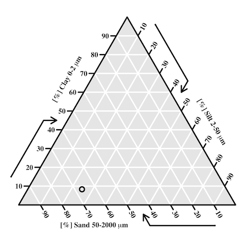
Figure 1. Example of Shepard’s plot with data from Clemson Cooperative Extension using R soiltexture package.
With only one sample, the plot is over kill — The soil is mostly sandy with some silt and very little clay.
To interpret the point on the ternary soil texture diagram:
- Start at the plotted black point near the lower left portion of the triangle.
- Read the sand percentage first:
- Follow lines parallel to the left side of the triangle down toward the bottom axis.
- The point aligns near 67% sand.
- Read the silt percentage:
- Follow lines parallel to the left-bottom side toward the right axis.
- The point corresponds to about 25% silt.
- Read the **clay percentage**:
- Follow horizontal lines toward the left axis.
- The point lies near 8% clay.
Additional fields where ternary plots are common include atmospheric greenhouse gas emissions, CO2 – N2 – O2, from a submarine source Daskalopoulou et al (2002), land cover distribution: urban, agriculture, undeveloped (USGS).
In population genetics, de Finetti diagram is used to display three ratio variables that, together, sum to one. For example, display frequency of the three genotypes of a one gene, two allele system in a population. Download the package Ternary from the R mirror. From the Ternary package, we can get a blank plot by simply calling the function TernaryPlot(). R returns the blank plot to the Graphics window (Fig 2).
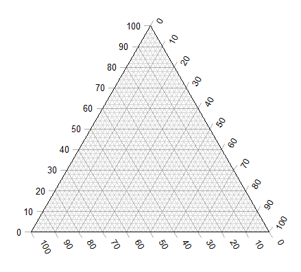
Figure 2. Blank Graphics window with initial ternary plot.
The basic ternary plot is shown in Figure 1. Running from one corner to another you can see how the frequencies range from 0 to 100%. While we can use the Ternary package, other packages allow you to make ternary plots too, including HardyWeinberg. This package includes several useful tests of the Hardy Weinberg model for population genetics data, so we’ll use that package.
Our example will use the HWTernaryPlot function in the HardyWeinberg package. Before proceeding with the example, download and install the package.
A nice site on ternary plots in Microsoft Excel (24 steps!) is provided at chemostratigraphy.com. Instructions also worked for LibreOffice Calc (pers. obs.). Take a look at www.ternaryplot.com for a really nice online plot builder.
Example. Recall your basic population genetics, for a locus with 2 alleles with frequency p and q in the population, and given Hardy-Weinberg assumptions apply (e.g., no evolution!), then expected genotype frequencies are given by expanding (p + q)2 = 1.
Consider a population genetics example using Skittles (Fig 3).
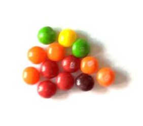
Figure 3. A few Skittles® candies.
For several bags, count the greens (p) and the oranges (q). Data for 17 mini bags reported Table 2.
Table 2. Counts of green and orange Skittles from 17 mini bags.
| Bag | GREEN | ORANGE |
|---|---|---|
| bag1 | 4 | 2 |
| bag2 | 8 | 2 |
| bag3 | 3 | 3 |
| bag4 | 3 | 4 |
| bag5 | 5 | 7 |
| bag6 | 5 | 1 |
| bag7 | 13 | 5 |
| bag8 | 4 | 2 |
| bag9 | 6 | 3 |
| bag10 | 3 | 2 |
| bag11 | 5 | 4 |
| bag12 | 9 | 9 |
| bag13 | 0 | 2 |
| bag14 | 7 | 3 |
| bag15 | 5 | 4 |
| bag16 | 6 | 2 |
| bag17 | 2 | 3 |
Next, we calculate the genotype frequencies from our counts. For example, for bag1, p = 4/6 and q = 2/6. We can imagine a diploids at the locus: GG, GO, and OO, with frequencies p2, 2pq, and q2. The frequencies for the three genotypes are shown in Table 2.
Table 3. Genotype frequencies for our hypothetical population of Skittle diploid critters.
| Bag | p^2 | 2pq | q^2 |
|---|---|---|---|
| bag1 | 0.44 | 0.44 | 0.11 |
| bag2 | 0.64 | 0.32 | 0.04 |
| bag3 | 0.25 | 0.5 | 0.25 |
| bag4 | 0.18 | 0.49 | 0.33 |
| bag5 | 0.17 | 0.49 | 0.34 |
| bag6 | 0.69 | 0.28 | 0.03 |
| bag7 | 0.52 | 0.4 | 0.08 |
| bag8 | 0.44 | 0.44 | 0.11 |
| bag9 | 0.44 | 0.44 | 0.11 |
| bag10 | 0.36 | 0.48 | 0.16 |
| bag11 | 0.31 | 0.49 | 0.2 |
| bag12 | 0.25 | 0.5 | 0.25 |
| bag13 | 0 | 0 | 1 |
| bag14 | 0.49 | 0.42 | 0.09 |
| bag15 | 0.31 | 0.49 | 0.2 |
| bag16 | 0.56 | 0.38 | 0.06 |
| bag17 | 0.16 | 0.48 | 0.36 |
For the plot, the HWTernaryPlot function expects counts, not frequencies of three genotypes of a gene in a population, with genotype frequency that sums to one. Table 3 shows calculated genotype data, assuming 20 Skittle diploid critters per bag.
Table 4. Expected genotype counts.
| Bag | GG | GO | OO |
|---|---|---|---|
| bag1 | 9 | 9 | 2 |
| bag2 | 13 | 6 | 1 |
| bag3 | 5 | 10 | 5 |
| bag4 | 4 | 10 | 7 |
| bag5 | 3 | 10 | 7 |
| bag6 | 14 | 6 | 1 |
| bag7 | 10 | 8 | 2 |
| bag8 | 9 | 9 | 2 |
| bag9 | 9 | 9 | 2 |
| bag10 | 7 | 10 | 3 |
| bag11 | 6 | 10 | 4 |
| bag12 | 5 | 10 | 5 |
| bag13 | 0 | 0 | 20 |
| bag14 | 10 | 8 | 2 |
| bag15 | 6 | 10 | 4 |
| bag16 | 11 | 8 | 1 |
| bag17 | 3 | 10 | 7 |
Example
Create an R data.frame called skittles from Table 4. Because HWTernaryPlot requires input only of the genotype data, remove the first column
dSkittles <- subset(skittles, select = -c(Bag) )
require(HardyWeinberg)
#Create a Ternaryplot
HWTernaryPlot(dLactose,100,pch=19, cex=2, region=1,hwcurve=TRUE, curvecols=c("red", "green"), vbounds=FALSE, vertex.cex=2, verbose=TRUE)
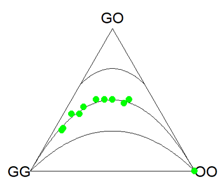
Figure 4. Ternary plot of our Skittle critter data.
What do we have? The function plots three convex curved lines. The green points are the heterozygote (GO) frequencies. They all fall on the middle line, as expected, because I had used HW to calculate frequency of the heterozygotes. If any population had numbers of observed heterozygotes different from expected values, then the population point would be represented by a red point and it would fall in one of the regions above or below the curved lines.
Question
- Repeat the Skittles example, but replace with counts for purple (p) and red (q) candies (scroll down to data below, or click here).
- Optional: A more realistic example would be to draw 2 candies from Skittles bag and record the counts (e,g, how many purple+ purple, purple+red, red+red pairs drawn), then make Ternary plots on the observed and not the expected frequencies.
- Genetic example. The ternary plot is useful for displaying population genetic frequency data. For example, ability to digest lactose, i.e., lactase persistence, is in part due to genotype at SNP rs4988235 (Enattah et al 2002). Genotypes CC tend to be lactose intolerant, genotypes CT and TT are lactose tolerant. I gathered allele frequencies from the ALFA: Allele Frequency Aggregator for several human populations, calculated genotype frequencies assuming Hardy-Weinberg equilibrium. I also created results for a hypothetical population “Madeup.” (Scroll down to data below, or click here). Enter the data into R as a dataframe, eg,
data.SNP, copy R code from this page, make the necessary changes, and recreate the plot shown in Figure 4.- What do you conclude about the heterozygotes in Madeup population?
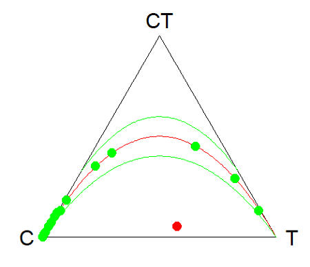
Figure 4. rs4988235 genotype frequencies, data.SNP.
- Add a new row of data to your rs4988235 data set,
data.SNP. CC= 4, CT = 10, TT = 6. The data were derived from frequencies reported in Figure 2, Baffour-Awuah et al 2016 (PMC4308731). To add a new row, modify the code below
data.SNP <- rbind(data.SNP, “PMC4308731” = c(4, 10, 6))
Create another ternary plot, and address whether or not this new data set shows heterozygotes in agreement with Hardy Weinberg assumptions.
Quiz Chapter 4.8
Ternary plots
Data sets
Skittles Data
| Bag | GREEN | ORANGE | RED | PURPLE |
|---|---|---|---|---|
| bag1 | 4 | 2 | 3 | 3 |
| bag2 | 8 | 2 | 4 | 8 |
| bag3 | 3 | 3 | 4 | 2 |
| bag4 | 3 | 4 | 1 | 2 |
| bag5 | 5 | 7 | 6 | 7 |
| bag6 | 5 | 1 | 2 | 3 |
| bag7 | 13 | 5 | 5 | 5 |
| bag8 | 4 | 2 | 5 | 2 |
| bag9 | 6 | 3 | 4 | 4 |
| bag10 | 3 | 2 | 5 | 3 |
| bag11 | 5 | 4 | 2 | 3 |
| bag12 | 9 | 9 | 6 | 8 |
| bag13 | 0 | 2 | 5 | 2 |
| bag14 | 7 | 3 | 6 | 7 |
| bag15 | 5 | 4 | 1 | 3 |
| bag16 | 6 | 2 | 4 | 2 |
| bag17 | 2 | 3 | 1 | 4 |
SNP Data
| Population | C | CT | T |
|---|---|---|---|
| Mambila | 99 | 1 | 0 |
| Ben Amir | 99 | 1 | 0 |
| Zaramo | 100 | 0 | 0 |
| Bedouin | 95 | 5 | 0 |
| Druze | 93 | 7 | 0 |
| Kuwaiti | 86 | 13 | 1 |
| Dutch | 12 | 45 | 43 |
| Finns | 3 | 29 | 68 |
| Swedes | 1 | 13 | 87 |
| Bengali | 87 | 13 | 1 |
| Naga | 100 | 0 | 0 |
| Mala | 88 | 12 | 0 |
| Han | 100 | 0 | 0 |
| Japanese | 100 | 0 | 0 |
| Koreans | 100 | 0 | 0 |
| Cheyene | 93 | 7 | 0 |
| Pima | 98 | 2 | 0 |
| Maya | 90 | 10 | 0 |
| Brazilian | 50 | 42 | 9 |
| Chilean | 60 | 35 | 5 |
| Colombian | 81 | 18 | 1 |
| Madeup | 40 | 5 | 55 |